Performant Components
Through customisation

Maya Shavin
@mayashavin
Sr. Developer @
Sr. Developer @

@mayashavin
Sr. Front-end Developer
Core maintainer @StorefrontUI
Founder @VueJSIsrael
Blogger


🇻🇳
🇮🇱
Nuxt.js Ambassador
Blogger
Maya Shavin
@mayashavin
Sr. Developer @
console.log( )
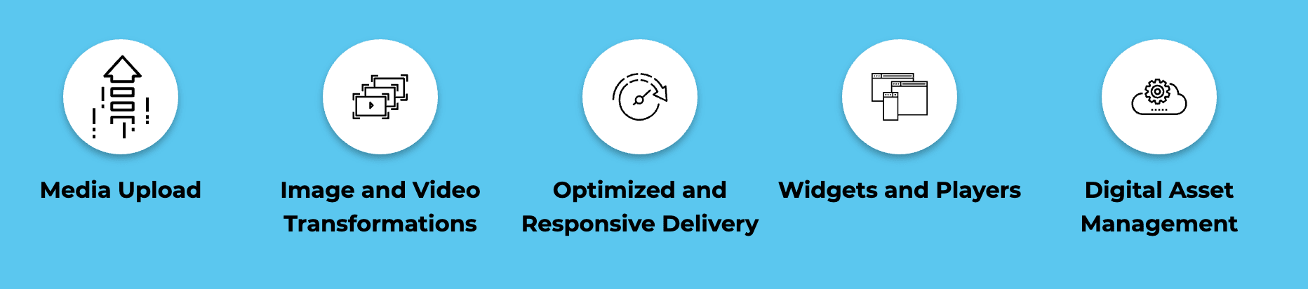


1200x800
1MB
1200x800
300kB
500x500
crop: thumb
500x500
{gravity: auto}
500x500
Hokusai effect
{radius: max, dpr: auto, art effect: hokusai}
500x500
Stamp effect
{e_red: 50, e_vectorize: 2:0.2 }
https://res.cloudinary.com/mayashavin/image/upload/v1576101486/maya_shavin.jpg
https://res.cloudinary.com/mayashavin/image/upload/w_500,h_500,c_thumb/v1576101486/maya_shavin.jpg
https://.../image/upload/w_500,h_500,c_crop,g_auto/v1576101486/maya_shavin.jpg
https://.../image/upload/w_500,h_500,c_thumb,r_max,dpr_auto,g_auto,e_art:hokusai/v1576101486/maya_shavin.png
https://res.cloudinary.com/mayashavin/image/upload/q_auto/v1576101486/maya_shavin.jpg
https://.../image/upload/w_500,h_500,c_thumb,r_max,dpr_auto,g_auto,e_red:50/e_vectorize:2:0.2/.../maya_shavin.png
Maya Shavin
@mayashavin
Sr. Developer @
UI Components library


Maya Shavin
@mayashavin
Sr. Developer @
Reusable
UI_component_lib.component
Stylable
Customizable
Responsive

Isolate & Testable
Maya Shavin
@mayashavin
Sr. Developer @


Visual consistency
Functional consistency

UI_component_lib.component
UI
UX
Maya Shavin
@mayashavin
Sr. Developer @

Maya Shavin
@mayashavin
Sr. Developer @
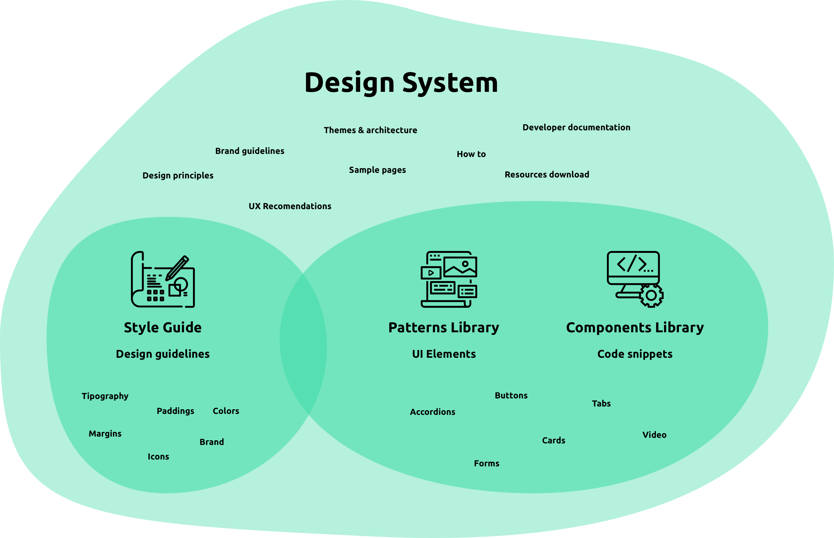
Build a good component library
===
Build a design system
That's the talk!
Maya Shavin
@mayashavin
Sr. Developer @
select(UI_component_lib)
Meet the goal
Performance
Customizability
Simplicity
Ease of use
Maya Shavin
@mayashavin
Sr. Developer @
Meet the goal
How do you know what I am looking for?
Maya Shavin
@mayashavin
Sr. Developer @
Define goal
Style guides
Planning
Implementation
Good planning === less breaking changes
Maya Shavin
@mayashavin
Sr. Developer @
StorefrontUI.defineGoals()
PRIORITIZE customization
Code-compatible for ~80% design cases
FOR-EVERY-NEED components?
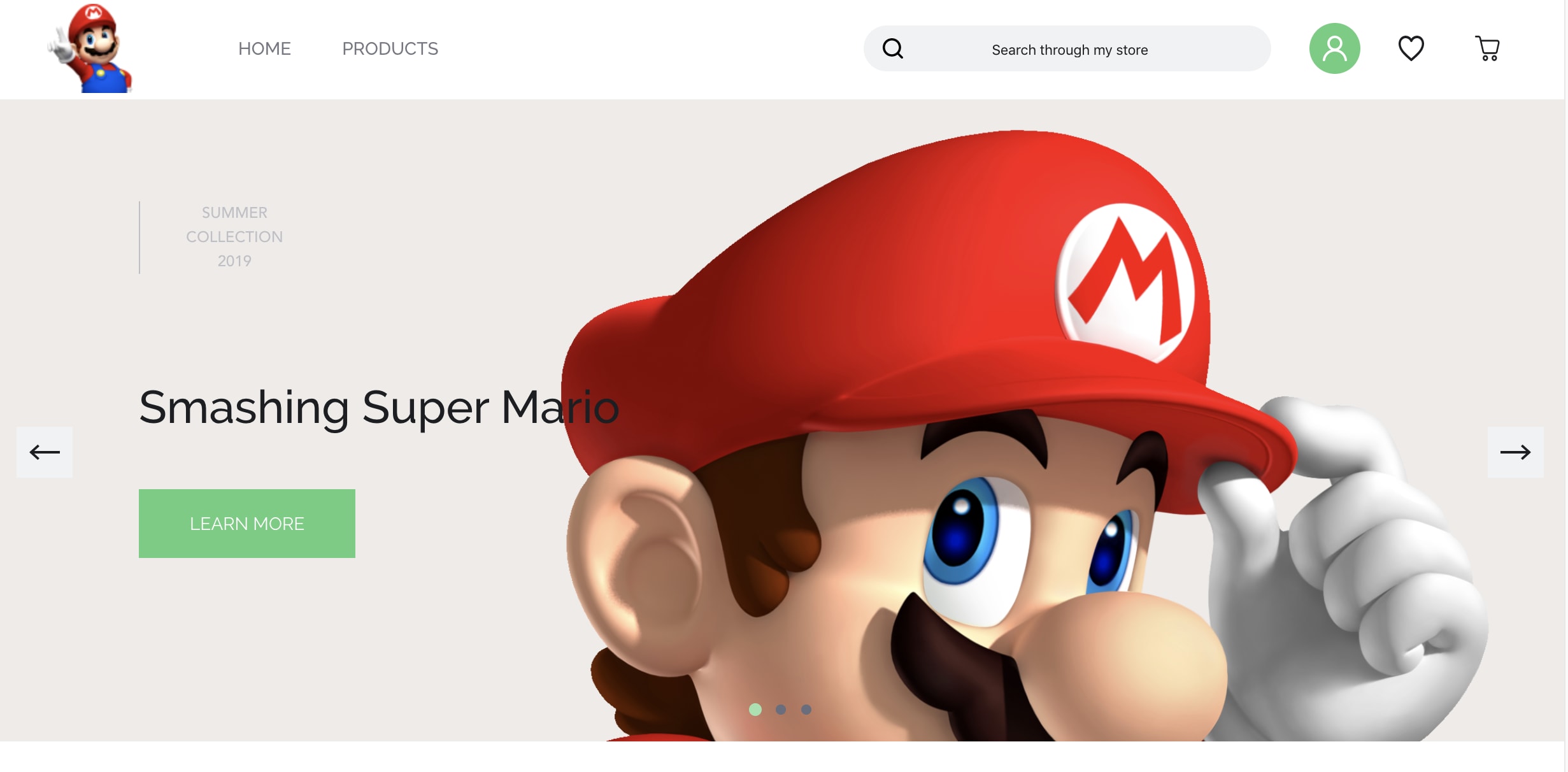
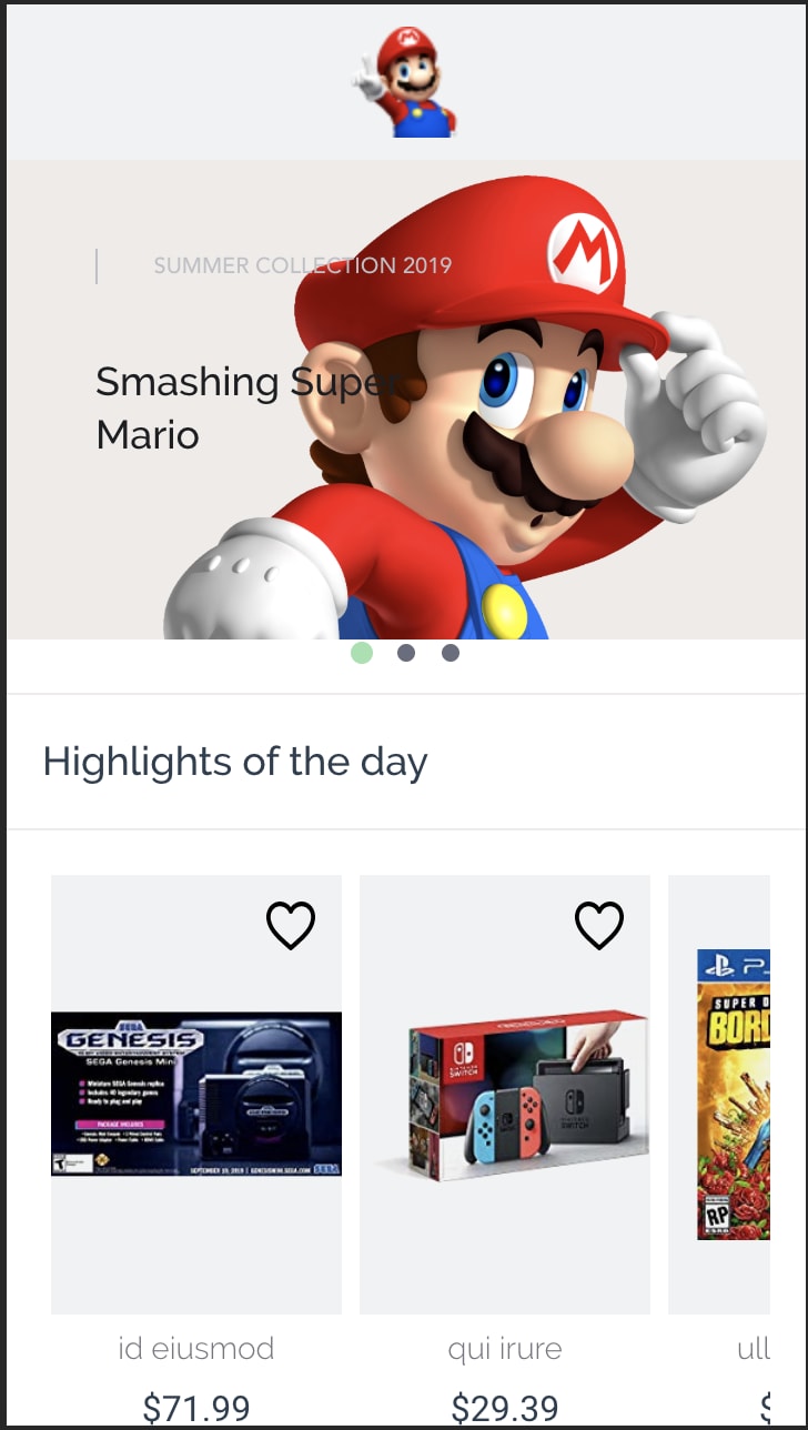
E-commerce component focus
HAS-EVERYTHING library?
Desktop-then-mobile
Mobile-FIRST
Maya Shavin
@mayashavin
Sr. Developer @
Performance
Faster loading is everything about performance?
Maya Shavin
@mayashavin
Sr. Developer @
console.log(performance)
Delivery
Development
Stand-alone component
Number of props
Dependencies
Implementation direction
Code structure
Simpler structure
Faster development
Faster delivery
Consumed size
Bundling speed
Loading time
Installing effort
Maya Shavin
@mayashavin
Sr. Developer @
Customizability
Are you ready for me to turn component upside down?
Maya Shavin
@mayashavin
Sr. Developer @
console.log(customizability)
Icons
Content design
Out of scope functionality design
Style guides
Component-based


Colors & Themes
Typography
Paddings, margins, sizes


Maya Shavin
@mayashavin
Sr. Developer @
style_guides.customize()
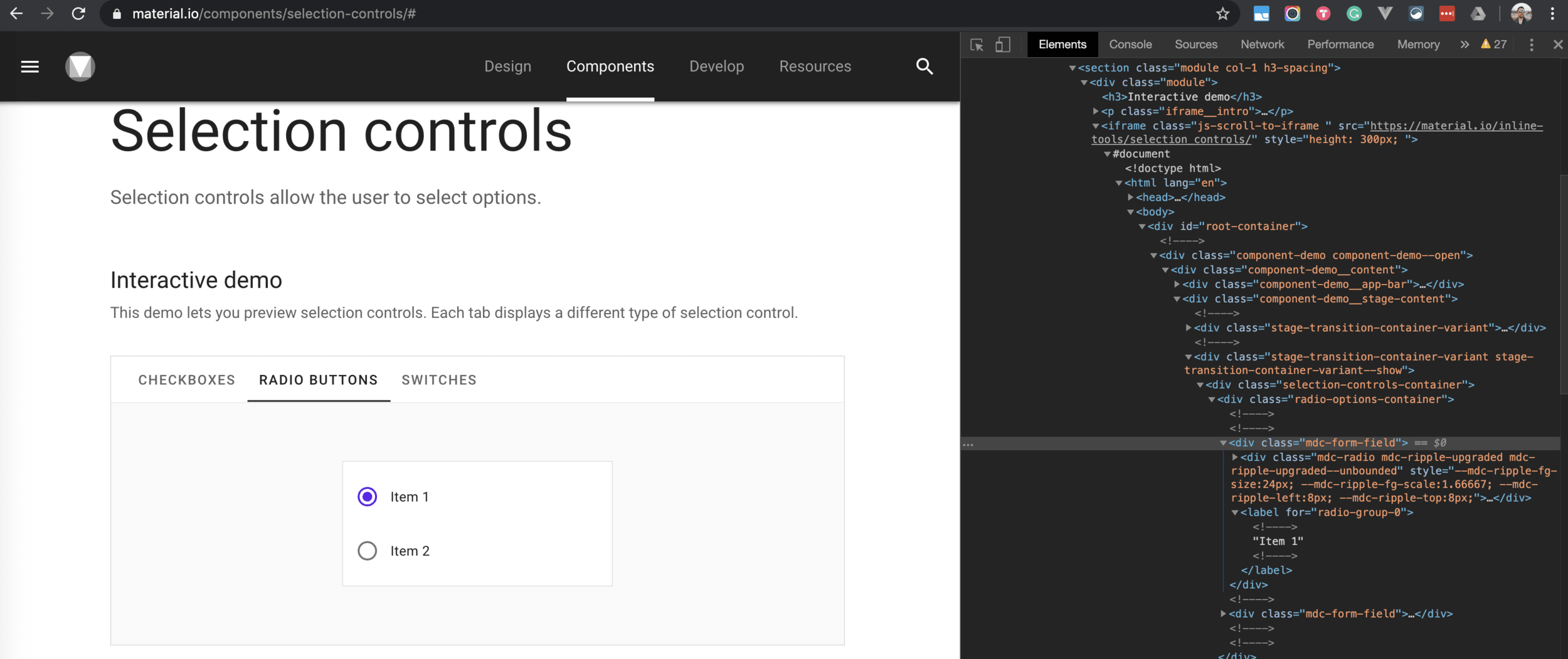
CSS class?
SCSS variables
CSS variables
:root {
  // Font Family
  --body-font-family-primary: 'Roboto', serif;
  --body-font-family-secondary: 'Raleway', sans-serif;
  // Font weight
  --body-font-weight-primary: 300;
  --body-font-weight-secondary: 400;
  // Font sizes
  --font-size-extra-small: .625rem;
  --font-size-small: .75rem;
  --font-size-regular: .875rem;
  --font-size-big: 1rem;
  --font-size-extra-big: 1.125rem;
 }
.my-awesome-theme {
	--body-font-family-secondary: CURSIVE;
}
Maya Shavin
@mayashavin
Sr. Developer @
component.customize(template)

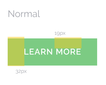
<SfButton
  class="color-primary"
>
Learn More
</SfButton>
<SfButton
  class="color-primary"
  icon="chevron-right"
  icon-pos="left"
>
Learn More
</SfButton>
<SfButton
class="color-primary"
icon="chevron-right"
icon-pos="left"
icon-color="red"
@on-icon-click="onIconClick"
>
Learn More
</SfButton><SfButton
class="color-primary"
icon="chevron-right"
icon-pos="left"
icon-size="lg"
>
Learn More
</SfButton><SfButton
class="color-primary"
>
<SfIcon
icon="chevron_right"
size="xxs"
color="white"/>
Learn More
</SfButton><button
class="sf-button"
v-bind="$attrs"
:disabled="disabled"
v-on="$listeners"
>
<!--@slot Use this slot to place content inside the button.-->
<slot />
</button>Cover MOST COMMON use cases
(~80% users)
Use <slot> for 20% left
SfButton.vue
Endless props !== cover ALL cases
Maya Shavin
@mayashavin
Sr. Developer @
component.customize(icon)
Single color

SVG paths
Minimal form
Scale in size
<svg aria-hidden="true" focusable="false" data-prefix="fas"
     data-icon="cloud" class="svg-inline--fa fa-cloud fa-w-20"
     role="img" xmlns="http://www.w3.org/2000/svg"
     viewBox="0 0 640 512"
>
  <path
    fill="currentColor"
    d="M537.6 226.6c4.1-10.7 6.4-22.4 6.4-34.6 0-53-43-96-96-96-19.7
       0-38.1 6-53.3 16.2C367 64.2 315.3 32 256 32c-88.4 0-160 71.6-160
       160 0 2.7.1 5.4.2 8.1C40.2 219.8 0 273.2 0 336c0 79.5 64.5 144
       144 144h368c70.7 0 128-57.3 128-128 0-61.9-44-113.6-102.4-125.4z">
  </path>
</svg>
<SfIcon
icon="home"
size="lg"
color="primary"
/><SfIcon
icon="M537.6 226.6c4.1-10.7 6.4-22.4 6.4-34.6 0-53-43-96-96-96-19.7
0-38.1 6-53.3 16.2C367 64.2 315.3 32 256 32c-88.4 0-160 71.6-160
160 0 2.7.1 5.4.2 8.1C40.2 219.8 0 273.2 0 336c0 79.5 64.5 144
144 144h368c70.7 0 128-57.3 128-128 0-61.9-44-113.6-102.4-125.4z"
viewBox="0 0 640 512"
size="lg"
color="#7714b3"
/><SfIcon
icon="M537.6 226.6c4.1-10.7 6.4-22.4 6.4-34.6 0-53-43-96-96-96-19.7
0-38.1 6-53.3 16.2C367 64.2 315.3 32 256 32c-88.4 0-160 71.6-160
160 0 2.7.1 5.4.2 8.1C40.2 219.8 0 273.2 0 336c0 79.5 64.5 144
144 144h368c70.7 0 128-57.3 128-128 0-61.9-44-113.6-102.4-125.4z"
viewBox="0 0 640 512"
size="10rem"
color="#7714b3"
/>

<svg viewBox="0 0 14 10" preserveAspectRatio="none">
  <path d="M11.8125 9.8125H2.1875C1.46289 9.8125 0.875 9.22461
        0.875 8.5V1.5C0.875 0.775388 1.46289 0.1875 2.1875
        0.1875H11.8125C12.5371 0.1875 13.125 0.775388 13.125
        1.5V8.5C13.125 9.22461 12.5371 9.8125 11.8125 9.8125ZM2.1875
        1.0625C1.94578 1.0625 1.75 1.25828 1.75 1.5V8.5C1.75 8.61594
        1.79594 8.7275 1.87797 8.80953C1.96 8.89156 2.07156 8.93749
        2.18749 8.93749H11.8125C11.9284 8.93749 12.04 8.89156 12.122
        8.80953C12.2041 8.72749 12.25 8.61593 12.25 8.5V1.5C12.25 1.38406
        12.2041 1.2725 12.122 1.19047C12.04 1.10844 11.9284 1.06251
        11.8125 1.06251L2.1875 1.0625Z"
        style="height: 100%;"></path>
  <path d="M7.00088 5.21008C6.71158 5.21063 6.42995 5.11492 6.20025
        4.93883L1.33959 1.19817C1.14763 1.05051 1.111 0.775439 1.25865
        0.583485C1.40631 0.391531 1.68138 0.354893 1.87334 0.502549L6.734
        4.24321C6.8915 4.36407 7.11025 4.36407 7.26775 4.24321L12.1284
        0.502549C12.3204 0.354891 12.5954 0.391533 12.7431 0.583485C12.8907
        0.775438 12.8541 1.05051 12.6622 1.19817L7.80149 4.93883C7.57181
        5.11492 7.29017 5.21062 7.00086 5.21008H7.00088Z"
        style="height: 100%;"></path>
</svg>
<SfIcon
:icon="[
`M11.8125 9.8125H2.1875C1.46289 9.8125 0.875 9.22461 0.875 8.5V1.5C0.875
0.775388 1.46289 0.1875 2.1875 0.1875H11.8125C12.5371 0.1875 13.125
0.775388 13.125 1.5V8.5C13.125 9.22461 12.5371 9.8125 11.8125 9.8125ZM2.1875
1.0625C1.94578 1.0625 1.75 1.25828 1.75 1.5V8.5C1.75 8.61594 1.79594 8.7275
1.87797 8.80953C1.96 8.89156 2.07156 8.93749 2.18749 8.93749H11.8125C11.9284
8.93749 12.04 8.89156 12.122 8.80953C12.2041 8.72749 12.25 8.61593 12.25
8.5V1.5C12.25 1.38406 12.2041 1.2725 12.122 1.19047C12.04 1.10844 11.9284
1.06251 11.8125 1.06251L2.1875 1.0625Z`,
`M7.00088 5.21008C6.71158 5.21063 6.42995 5.11492 6.20025 4.93883L1.33959
1.19817C1.14763 1.05051 1.111 0.775439 1.25865 0.583485C1.40631 0.391531
1.68138 0.354893 1.87334 0.502549L6.734 4.24321C6.8915 4.36407 7.11025
4.36407 7.26775 4.24321L12.1284 0.502549C12.3204 0.354891 12.5954 0.391533
12.7431 0.583485C12.8907 0.775438 12.8541 1.05051 12.6622 1.19817L7.80149
4.93883C7.57181 5.11492 7.29017 5.21062 7.00086 5.21008H7.00088Z`
]"
color="black"
size="lg"
viewBow="0 0 24 24"
/>Maya Shavin
@mayashavin
Sr. Developer @
component.customize(functionality)
Maya Shavin
@mayashavin
Sr. Developer @
Ease of use
You have 5 mins to make me happy when trying it
Maya Shavin
@mayashavin
Sr. Developer @
StorefrontUI.deliver()
Bundled code
Raw-source code
Include the WHOLE library in production bundle
NO CONTROL over bundled code and CSS code (SCSS variables, polyfills)
import Vue from 'vue';
import StorefrontUI from '@storefront-ui/vue';

Vue.use(StorefrontUI);
import SfAccordion from "../SfAccordion.vue"
import SfAddToCart from "../SfAddToCart.vue"
import SfAlert from "../SfAlert.vue"
import SfArrow from "../SfArrow.vue"
/*...*/
export default {
install: function(Vue) {
Vue.component('SfAccordion', SfAccordion);
Vue.component('SfAddToCart', SfAddToCart);
Vue.component('SfAlert', SfAlert);
Vue.component('SfArrow', SfArrow);
/*...*/
}
}import { SfButton } from '@storefront-ui/vue';
export default {
component: {
SfButton,
},
data() {
return { /*...*/ }
}
}NOT WORKING on browser as-is
FULL CONTROL on bundled code
NEED bundle tool (webpack) to compile
FULL TREE-SHAKING for optimization
EVERYONE uses Webpack (kindof)
main.js
Product.vue
Maya Shavin
@mayashavin
Sr. Developer @
StorefrontUI.organize_code()
Template
Stand-alone blocks
BEM convention
CSS selectors?
Props?
Clear & concise names
Slot
Scoped slot
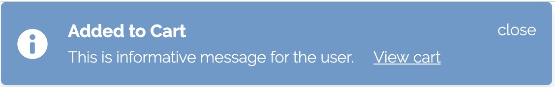
<div :class="`sf-alert--${type}`" class="sf-alert">
  <!--@slot Custom alert icon.
Slot content will replace default icon <SfIcon/> tag.-->
  <slot name="icon" v-bind="{ icon }">
    <SfIcon :icon="icon"
            size="24px"
            color="white"
            class="sf-alert__icon" />
  </slot>
  <!--@slot Custom message .
Slot content will replace default message <span> tag.-->
  <slot name="message" v-bind="{ message }">
    <span v-if="message"
          class="sf-alert__message">
      {{ message }}
    </span>
  </slot>
</div>
<div :class="`sf-alert--${type}`" class="sf-alert">
<!--@slot Custom alert icon.
Slot content will replace default icon <SfIcon/> tag.-->
<slot name="icon" v-bind="{ icon }">
<SfIcon :icon="icon"
size="24px"
color="white"
class="sf-alert__icon" />
</slot>
<!--@slot Custom message .
Slot content will replace default message <span> tag.-->
<slot name="message" v-bind="{ message }">
<span v-if="message"
class="sf-alert__message">
{{ message }}
</span>
</slot>
</div><div :class="`sf-alert--${type}`" class="sf-alert">
<!--@slot Custom alert icon.
Slot content will replace default icon <SfIcon/> tag.-->
<slot name="icon" v-bind="{ icon }">
<SfIcon :icon="icon"
size="24px"
color="white"
class="sf-alert__icon" />
</slot>
<!--@slot Custom message .
Slot content will replace default message <span> tag.-->
<slot name="message" v-bind="{ message }">
<span v-if="message"
class="sf-alert__message">
{{ message }}
</span>
</slot>
</div>props: {
/**
* Message that will be displayed in Alert.
*/
message: {
type: String,
default: ""
},
/**
* Alert type ("secondary", "info", "success",
* "warning", "danger").
* Check "Knobs" section to see how they look like.
*/
type: {
type: String,
default: "secondary",
validator: function(value) {
/*..*/
}
}
}Maya Shavin
@mayashavin
Sr. Developer @
StorefrontUI.integrate()
Static-site generator support
Server-side rendering support
Client side rendering


Maya Shavin
@mayashavin
Sr. Developer @
StorefrontUI.document()
HOW good about the component?
HOW to use a component?
See (Play) to BELIEVE

HOW to set up?
HOW to contribute?
Are you the ONE?


AUTOMATE, AUTOMATE and AUTOMATE your documentation!
Maya Shavin
@mayashavin
Sr. Developer @

Traverse directory

Extract markdown & SCSS/CSS variables (REGEX)

Fill in placeholders in final generated docs
Auto-generate process
Maya Shavin
@mayashavin
Sr. Developer @
Simplicity
Is your library simple enough for me to use?
Maya Shavin
@mayashavin
Sr. Developer @
Maya Shavin
@mayashavin
Sr. Developer @
What's else?
Any other tips? Who are you? Demo?
Maya Shavin
@mayashavin
Sr. Developer @
console.log(Other_Tips)
Lazy-load whenever and wherever possible
Adopt external optimized solution (images handling)
Think developer first (developer === user)
Maya Shavin
@mayashavin
Sr. Developer @
console.log(Storefront UI)
FIRST component library for E-commerce
100% customizable design system
FULL tree-shakable support
Performance oriented
MOBILE-first design

Maya Shavin
@mayashavin
Sr. Developer @
console.log(Storefront UI.team)

Filip Rakowski
Founder
@Vue-Storefront

Eduard Dopler
Sr. Developer

Maya Shavin
Sr. FE Developer

Nicolò Maria Mezzopera
Sr. FE Developer
Cloudinary
IFM Electronics
Gitlab/Vue-leaflet

Leonardo Matos
CEO
E-com Club

Przemysław Spaczek
FE Developer
DivanteLtd
Maya Shavin
@mayashavin
Sr. Developer @
console.log(Storefront UI.team)

Anna Musiał
Jr. FE Developer

Marta Radziszewska
FE Developer
DivanteLtd
DivanteLtd
Maya Shavin
@mayashavin
Sr. Developer @
StorefrontUI.demo()


Maya Shavin
@mayashavin
Sr. Developer @
StorefrontUI.next()
DEMOs
Stable release
Production-ready
Stable style-guides
A11y compliance
Maya Shavin
@mayashavin
Sr. Developer @
Support StorefrontUI
Give us a ⭐
Contribute
Join our team
Maya Shavin
@mayashavin
Sr. Developer @
THANK YOU