Data Visualization
A primary goal of data visualization is to communicate information clearly and efficiently via statistical graphics, plots and information graphics. Numerical data may be encoded using dots, lines, or bars, to visually communicate a quantitative message. Effective visualization helps users analyze and reason about data and evidence. It makes complex data more accessible, understandable and usable.
communicate information clearly
visually communicate a quantitative message
helps users analyze and reason about data and evidence.
It makes complex data more accessible, understandable and usable.
Good and Bad Examples

A pie chart that shows the top 100 active tweeters

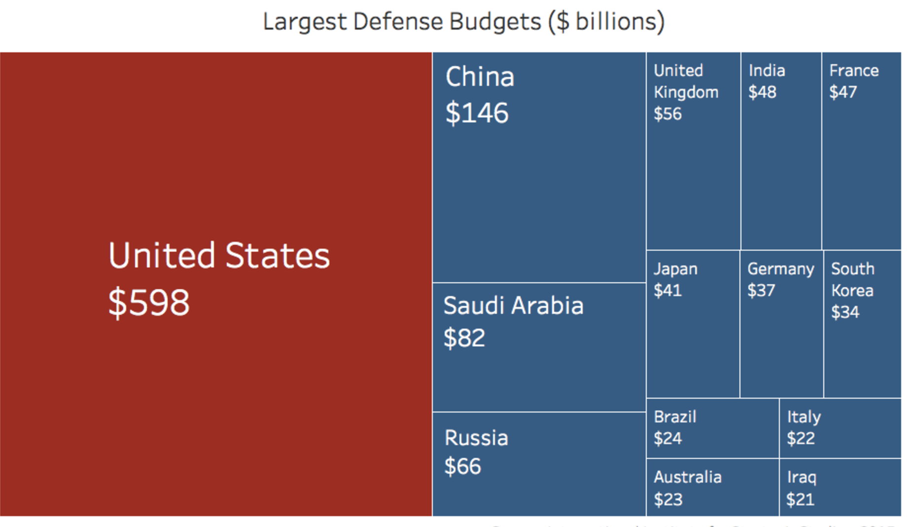
Graphic of national defense budgets

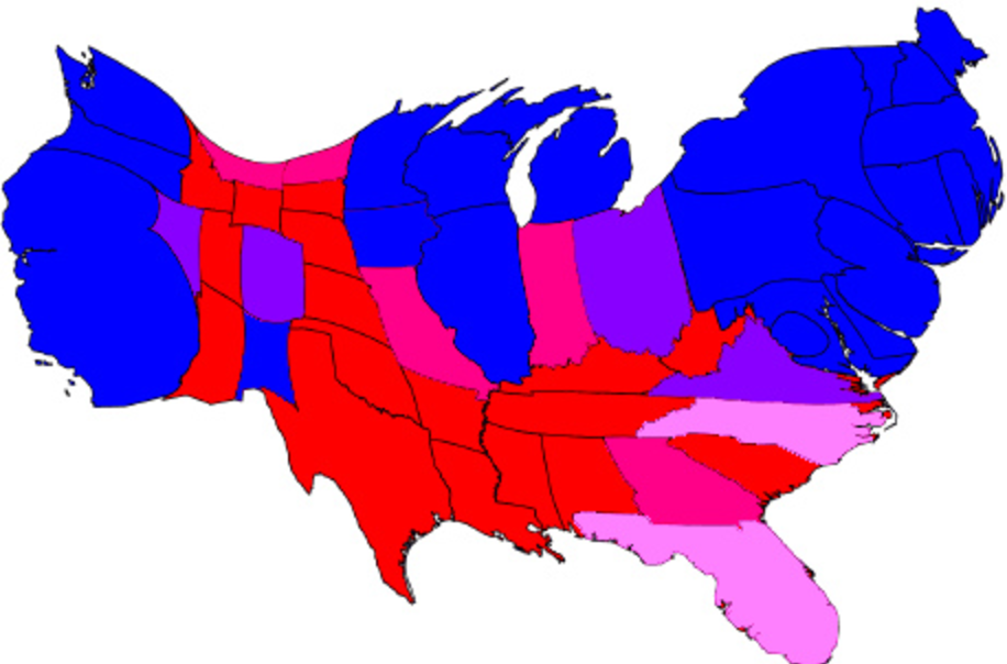
Electoral College map
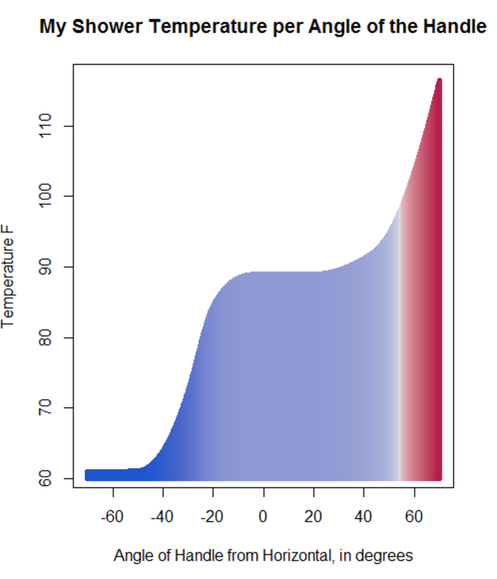
Shower Temperature per handle angle
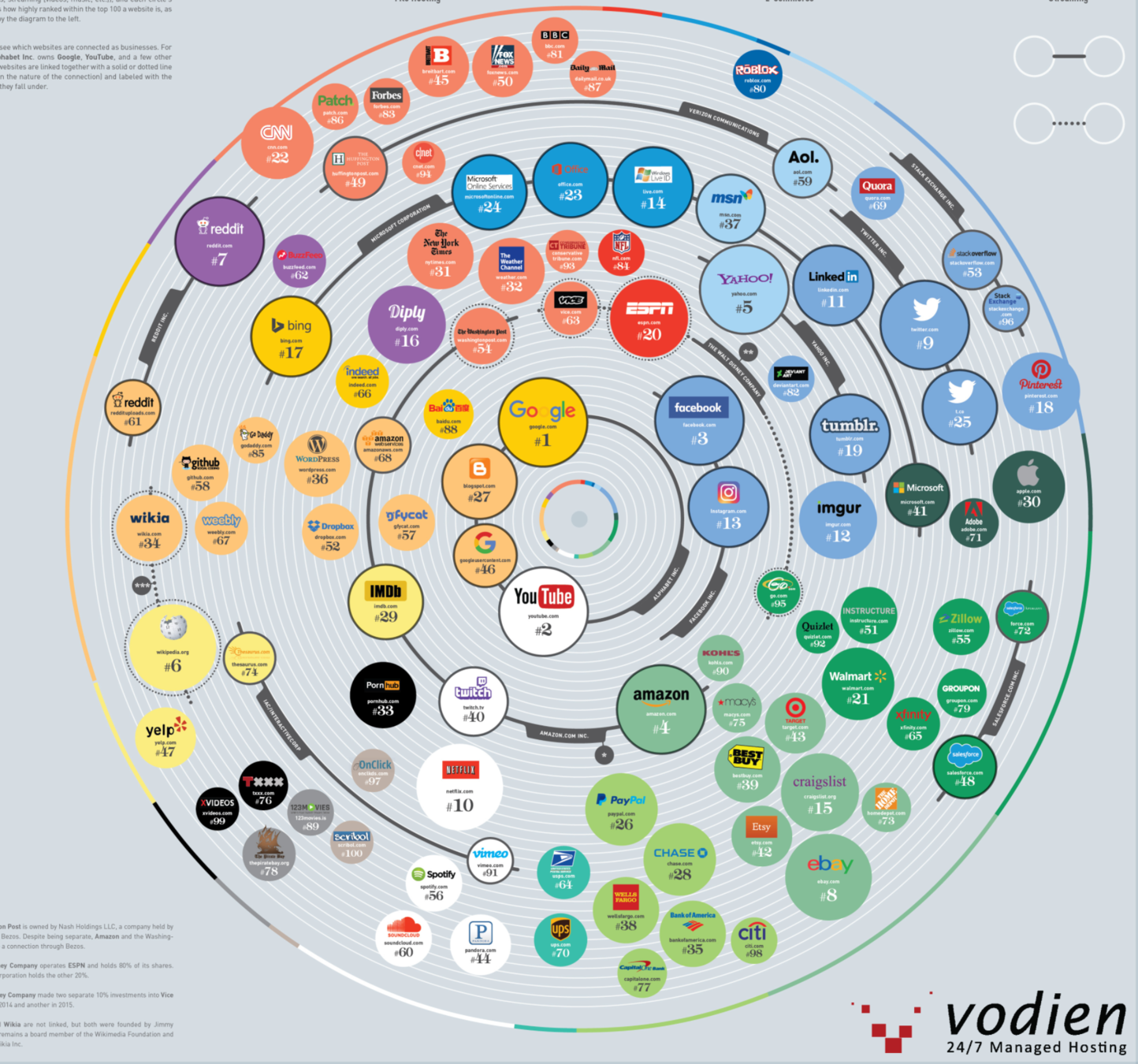
Most popular websites per month

Gun Deaths in Florida

Largest employers in every state


Types of data visualizations
How to do on the web?
Images
Visualization is design in a tool like photoshop, illustrator, or tableu
CSS
CSS properties (width, height) determine shape, size of objects
Javascript
Use a javascript library that will create SVG elements or canvas tags