Let me take you to the place...
(or; story about menus)
Mihael Tomić @tomic_mihael
Ivan Bašić @ivanronga


Where member— ship's a smiling
face...
Navigation basics
- Innovate, but don’t break rules.
- Keep it simple - navigation shouldn’t be obtrusive.
- Navigation should be clean and easy to use. It must be self-explanatory.
- Location - users must always know where are they.
- Consistency - don’t change navigation. Once designed keep it same on all pages.
@tomic_mihael
@ivanronga
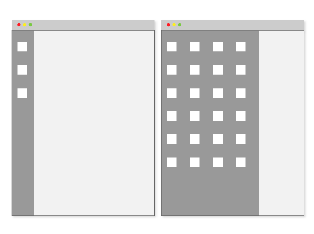
Vertical navigation
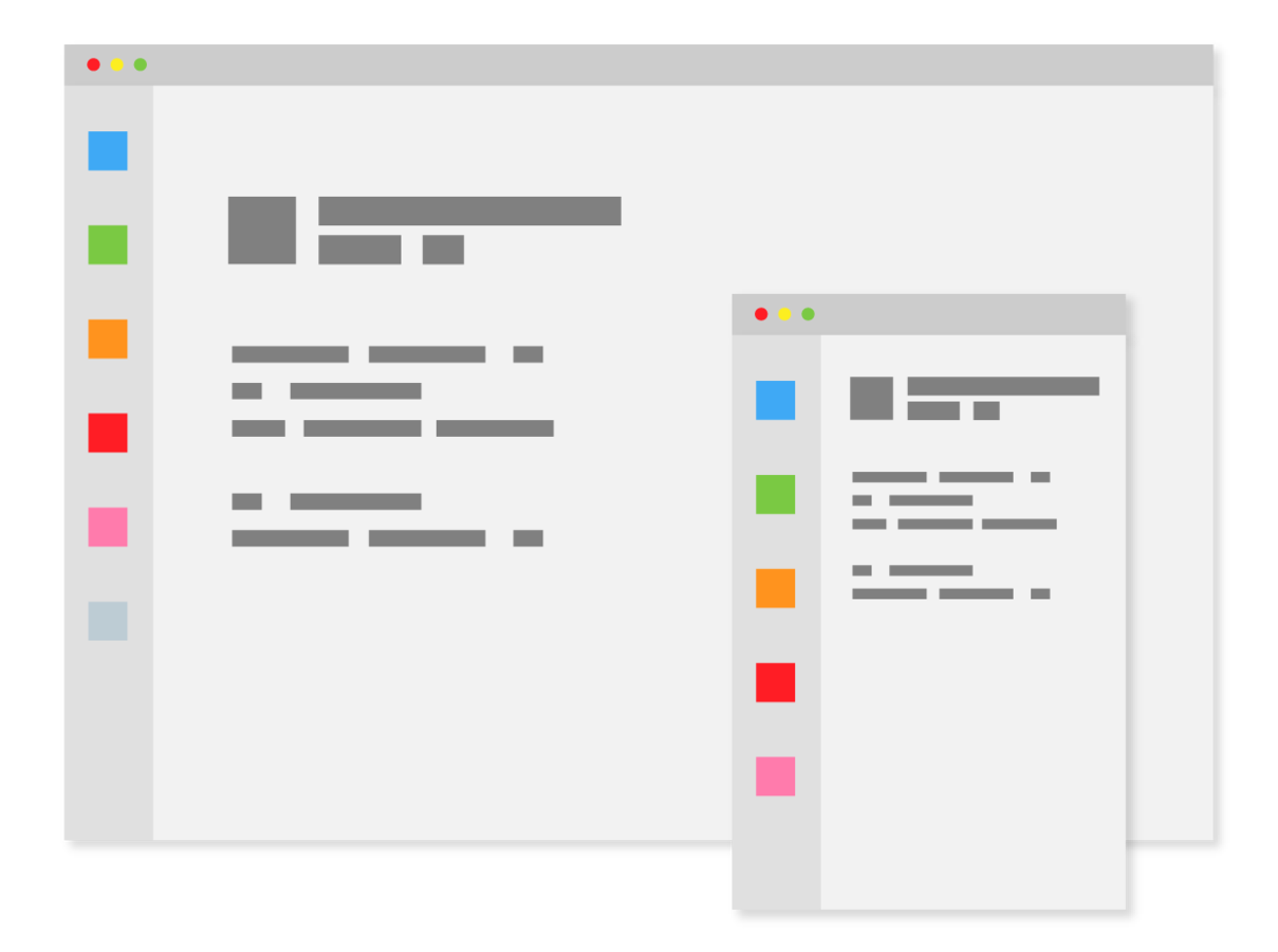
Be different
- Good solution for breaking a horizontal pattern.
- Effective and useful when having many menu items to show (e.g. dashboard, e-commerce etc.)
@tomic_mihael
@ivanronga
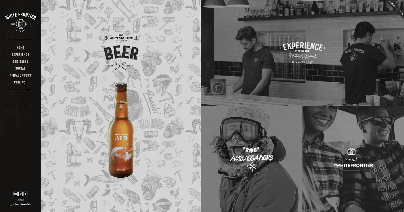
The White Frontier Brewery
Horizontal navigation
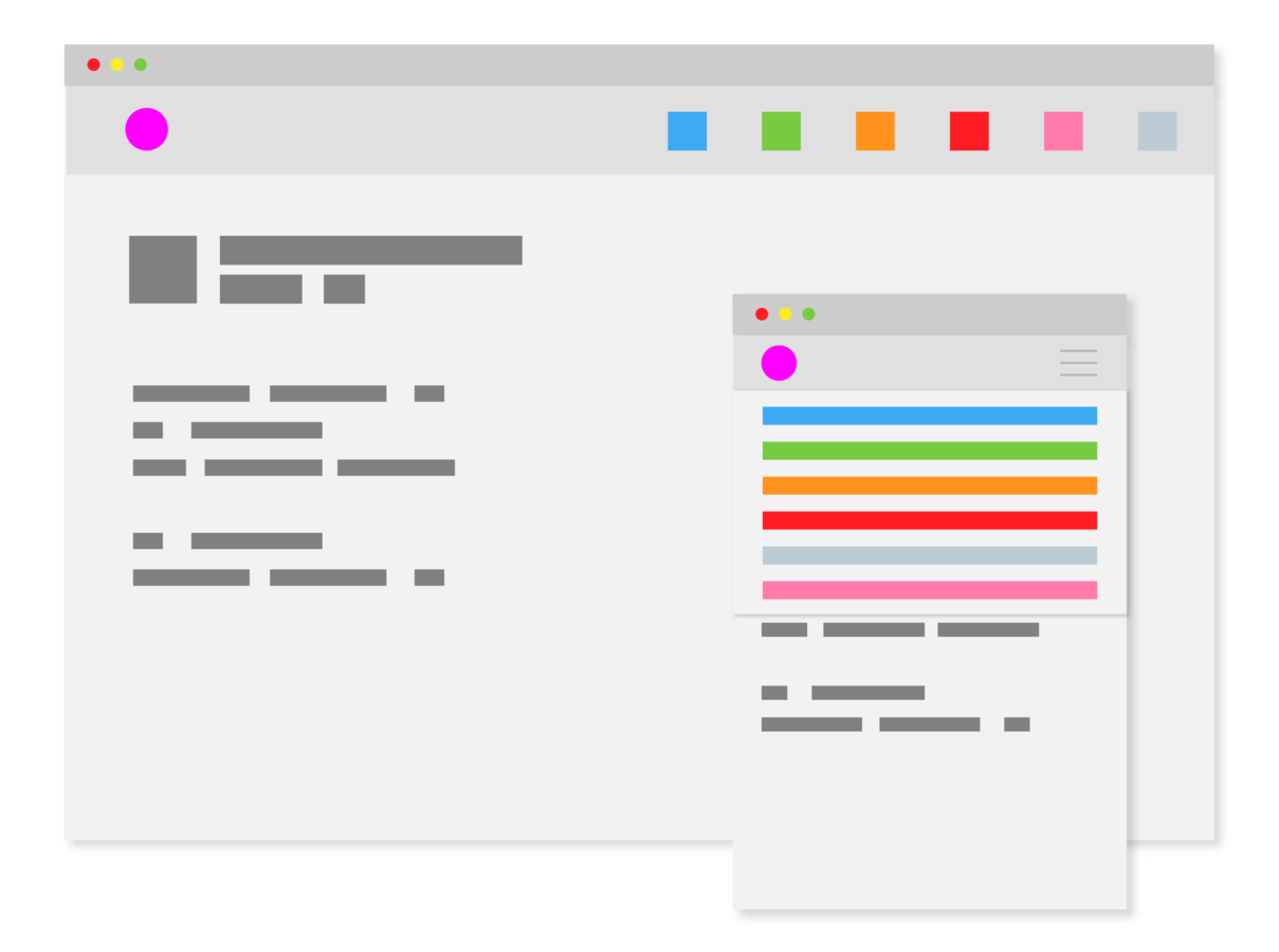
Stay consistent
- Usability - users are used to find navigation on top.
- More successful in drawing the eyes as opposed to left sidebars*
- Limited space for menu items.
- Useful for static menu.
@tomic_mihael
@ivanronga

Full screen navigation
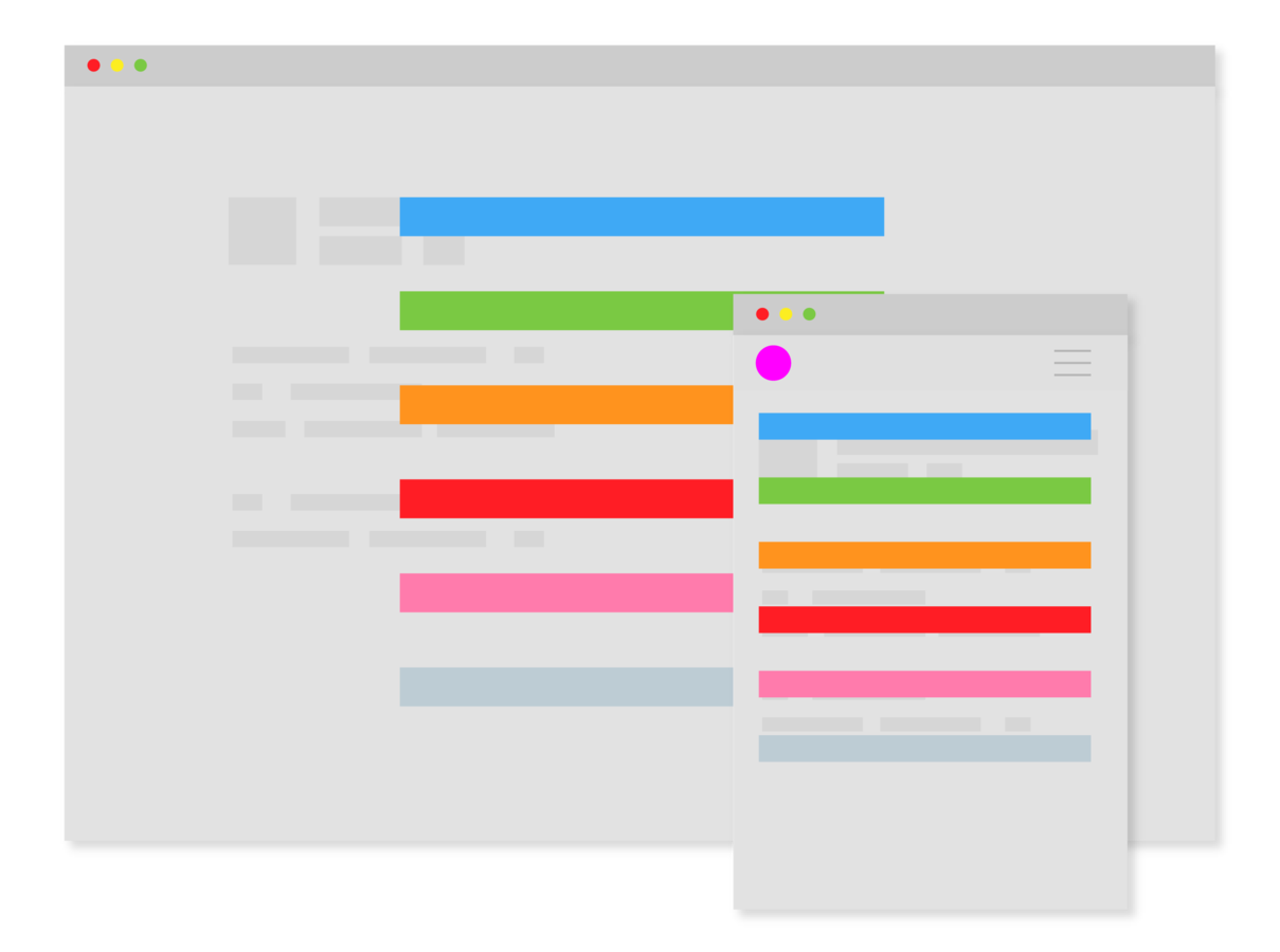
Be bold
- Triggered (usually) by (hamburger) icon.
- It's hidden and (important) menu content is sacrificed for design.
- When activated it’s hiding the website content from user.
- Can be bold, beautiful and in your face.
@tomic_mihael
@ivanronga

Mega menu navigation
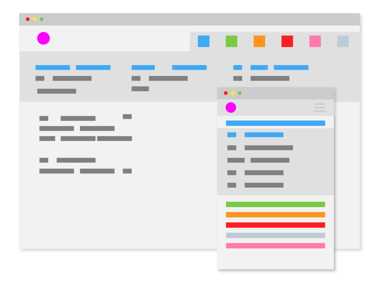
Be clear
- Used for handling complex site navigation.
- For large sites with many features.
- If not organized well, menu can confuse user.
- Takes a lot of space on screen.
- Can be difficult to maintain.
- Problematic for smaller resolutions.
@tomic_mihael
@ivanronga

Mobile navigation

Usability first
- Faster interaction and results.
- Increased app usage.
- Brings speed and performance to users.
- Great overall user satisfaction.
@tomic_mihael
@ivanronga
Facebook on iOS 6.4 vs iOS 9.3 (image on the right - iOS 10 beta 7)
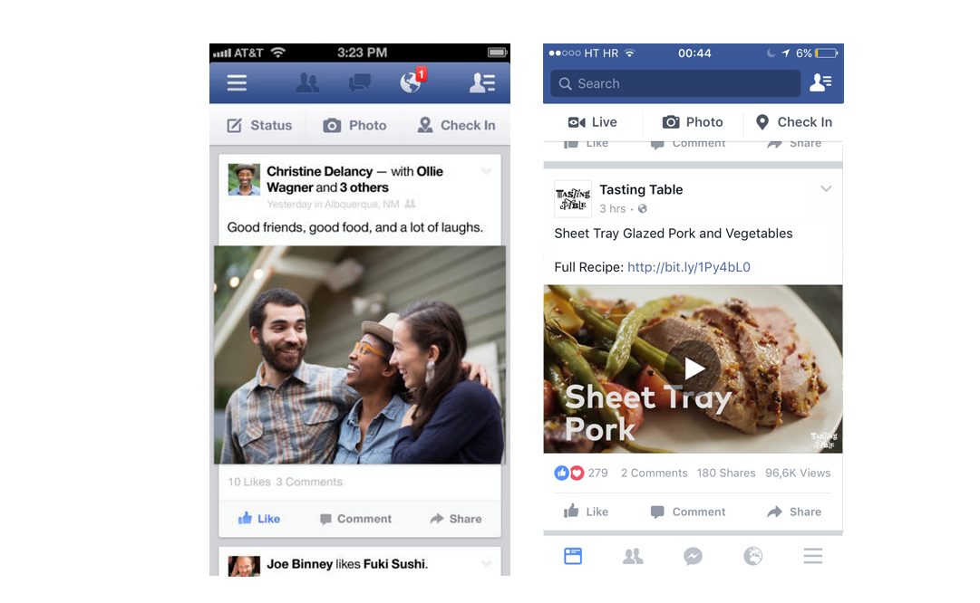
(In)famous hamburger

Extra cheese
- Space saver.
- Lots of room to show off your content.
- Users can get lost.
- Multiple actions instead of one click.
- Can lead to cluttered menu.
- Replace with label.
@tomic_mihael
@ivanronga
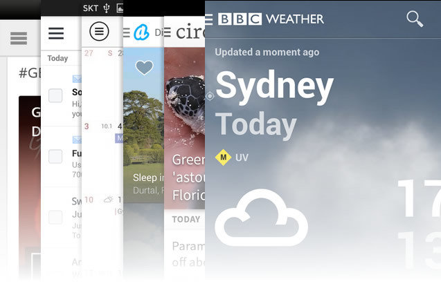
Menu as part of the navigation

Navigation
Navigation Basics
- Menu – The first place people look to understand what is included on the site
- Breadcrumbs – Orientational element. Many users do not land on the homepage, so orientation is essential
- Filters – Information-heavy sites can be made manageable with filters
- Links – Help users make connections between related content
Principles
- Consistency — meet user expectations
- Simplicity — don’t do more than you need to
- Clean interaction — keep out of your users’ way
Consistency
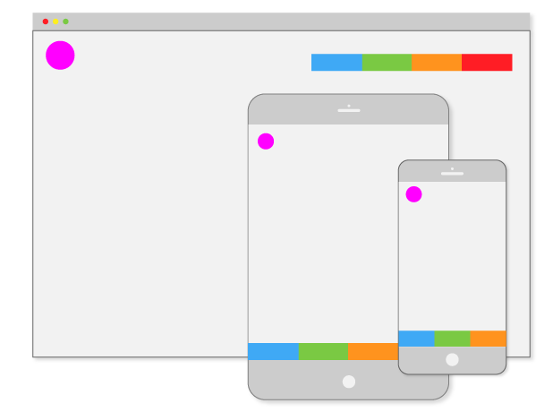
- Navigation should be consistent with user expectations, leaning on standard conventions for icons, location and styling
Consistency accros devices
Simplicity
- The more options there are, the slower user interactions with them will be, particularly when users are exploring a new app
Simplicity of menu
Clean interaction
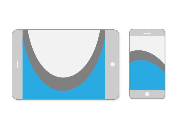
- A physical way that users interact with navigation across a variety of contexts
- Rule of Thumbs
- Avoid deep navigational hierarchies.
- Avoid too many navigational options.
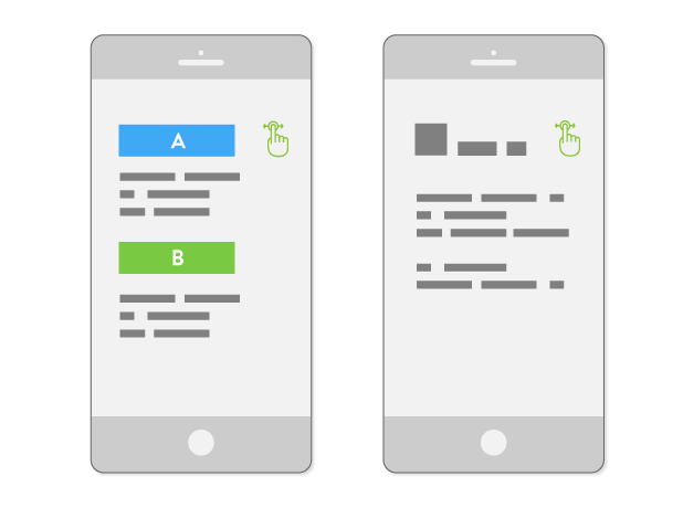
- Avoid pogo-sticking.
Thumb safe zone
Pogo-sticking

Pogo-sticking solution
What about the content?
- The first step to safely guiding users to the right content, is to aggregate and categorize the types of items on the website
- use metadata fot dividing categories into three groups:
- crucial
- optional
Crucial categories on clothing website

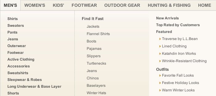
Adding optional categories to menu

What about design?
- use symbols
- form the target areas
- pick right interaction event
- create levels
- pick right layout
Symbols
- Creating a system of symbolic communication throughout the website that is consistent is important.
Common symbols for menu design

Target Areas
- Legibility
- Size
- Consistency of location
Interaction Event
- hovering
- clicking/tapping
- scrolling
- typing
- swiping
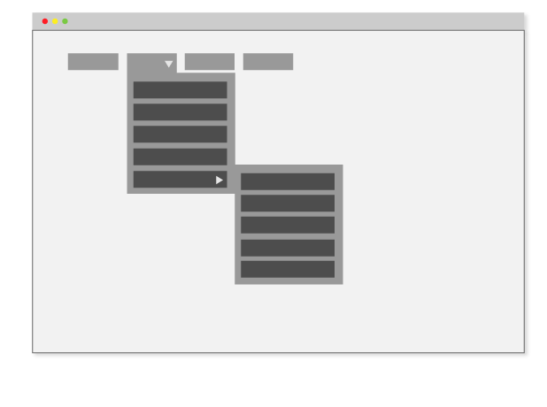
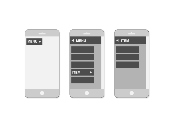
Levels
- Designing a single-level navigation menu is hard enough as it is
- Incorporating multiple levels complicates the matter, especially on small screens
Levels - desktop view
Levels - mobile view
Layout
- horizontal menu
- vertical menu
- visible/hidden
- position at top/bottom/left/right
So, what should I do?
- put yourself in users role
- think about your content - organize things
- keep all the principals and rules in mind
- don't overdesign
- combine navigational elements for better UX
Facebook - combination of navigation elements

What shouldn't I do?
- use non-standard style or location
- use generic labels
- have too many items in your menu
- get the order wrong
Conclusion
Collect your information and follow the rules.

Thank you!
Questions?
