Deep Learning
CSS 3

Multiple Background Image
background-image: url(../images/niam.jpg), url(../images/logo.jpg);background-size: 150px 150px, 100% 100%;
Gradien

.gradien {
  background: #29C9D9; /* For browsers that do not support gradients */
  background: -webkit-linear-gradient(top, #29C9D9 , #0F0F0F); /* For Safari */
  background: -o-linear-gradient(bottom, #29C9D9, #0F0F0F); /* For Opera */
  background: -moz-linear-gradient(bottom, #29C9D9, #0F0F0F); /* For Firefox */
  background: linear-gradient(to bottom, #29C9D9 , #0F0F0F); /* Standard syntax */
}
Text Shadow
h1 {
    text-shadow: 2px 2px;
}
Box Shadow

box-shadow: 0 4px 8px 0 rgba(0, 0, 0, 0.2), 0 6px 20px 0 rgba(0, 0, 0, 0.19);2D Transform
- translate()
- rotate()
- scale()
- skewX()
- skewY()
- matrix()
3D Transform
- translate3d(x,y,z)
- translateX(x)
- translateY(y)
- translateZ(z)
- scale3d(x,y,z)
- scaleX(x)
- scaleY(y)
- scaleZ(z)
- rotate3d(x,y,z,angle)
- rotateX(angle)
- rotateY(angle)
- rotateZ(angle)
Transition
transition: width 1s height 2s;
transition-timing-function: ease-in;
transition-delay: 1s;
-webkit-transition: width 1s, height 1s, -webkit-transform 2s;
Animation
/* Define Keyframe */

@keyframes changecolor {
    from {background-color: gray;}
    to {background-color: black;}
}

/* bind keyframe to element */
a.my-link{
  padding: 20px;
  text-decoration: none;
  background-color: black;
  color: white;
  transition: background 2s;
  animation-name: changecolor;
  animation-duration: 2s;
}
Media Query
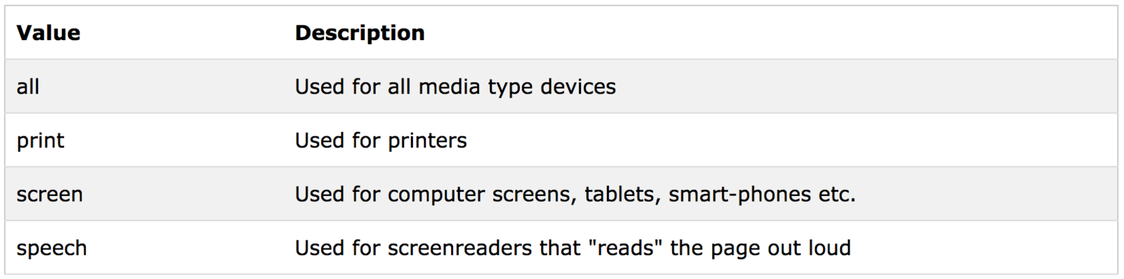
Media Query
List of media queries :
1. https://css-tricks.com/snippets/css/media-queries-for-standard-devices/
2. http://nmsdvid.com/snippets/
Purpose :
To make responsive website
Media Query
Remember :
- Max Width
- Min Width
Media Query
Example
/* for screen smaller than 320px */
@media screen and (max-width: 320px) {

}
<meta name="viewport" content="width=device-width, initial-scale=1">Add Viewport Inside <head>