FINAL TASK: MAGAZINE COVER
CONSTRUCTION DETAIL
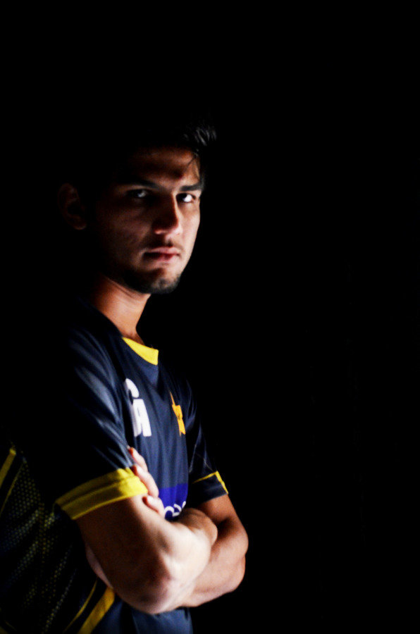
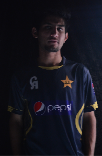
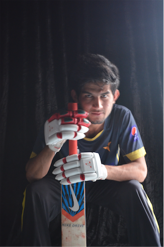
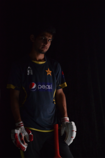
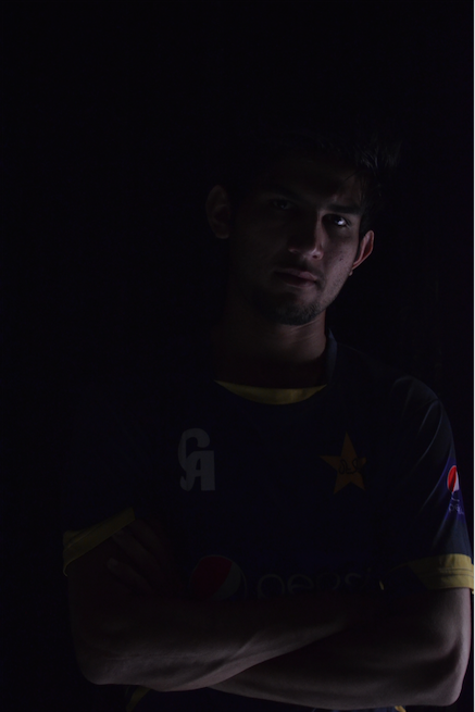
REJECTED PICTURES
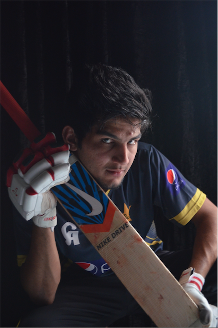
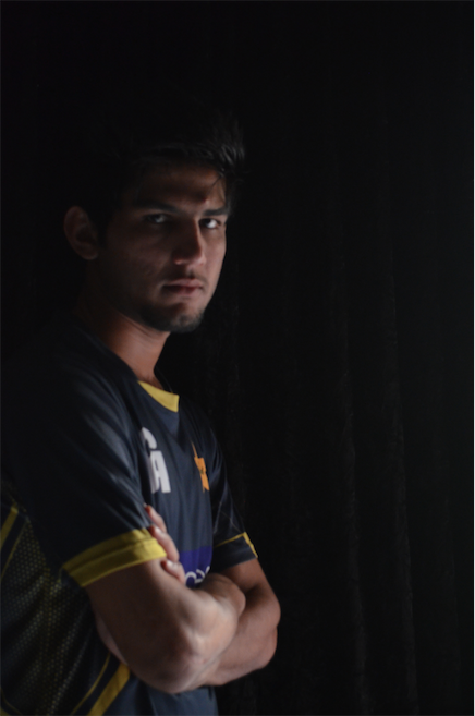
SELECTED
These pictures were rejected due to following reasons:
1. Shadows and Highlights
2. Less headroom
3. Less room on either sides
4. Not proper attitude
FINAL PRODUCT
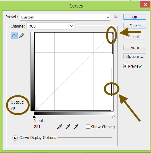
ABOUT FINAL PRODUCT - PICTURE
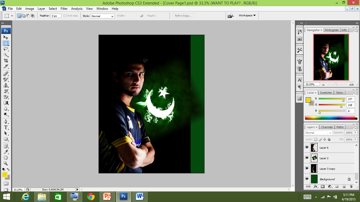
After opening the picture into adobe photoshop, I made a copy. I applied the simple focused lighting effect. Making the background black and putting light on the image and adjusting the contrast.
Method
1. I selected the curves adjustment layer.
2. I drag the white point to darken the image. I kept the output in the curves box to 70
3. Next I drew a selection on the area i wanted to highlight using the lasso tool.
4. Then I filled the selection with black heading to edit menu and selecting fill.
5. Then I applied the gaussian blur keeping the radius to 40 pixels
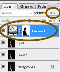
6. I lowered the opacity of the curves adjustment layer to 60% - FINAL PRODUCT
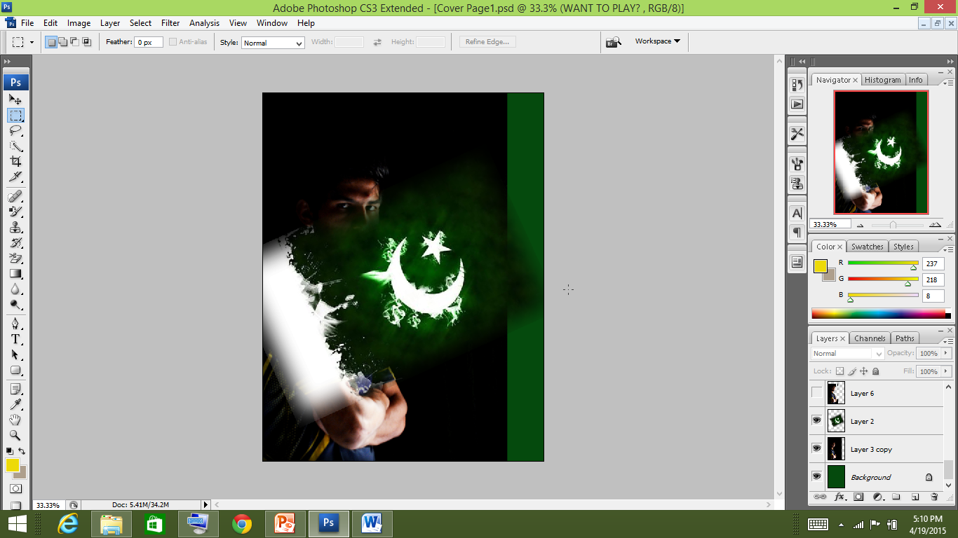
Reason for which I selected this image -
1. It had the proper attitude that I wanted to show - the eyes seem to really connect with the audience. They had the mystery of being determined, filled with passion and energy to cross every barrier that came in the way but simultaneously seem to ask the question whether the nation is there to support ‘Us’ in bad times.
2. The light in this picture seem to fall perfectly - one eye bright and the other in dark. Symbolising victory and failure.
3. The positioning was perfect and the body was straight depicting the model to be strong.
This is how I started
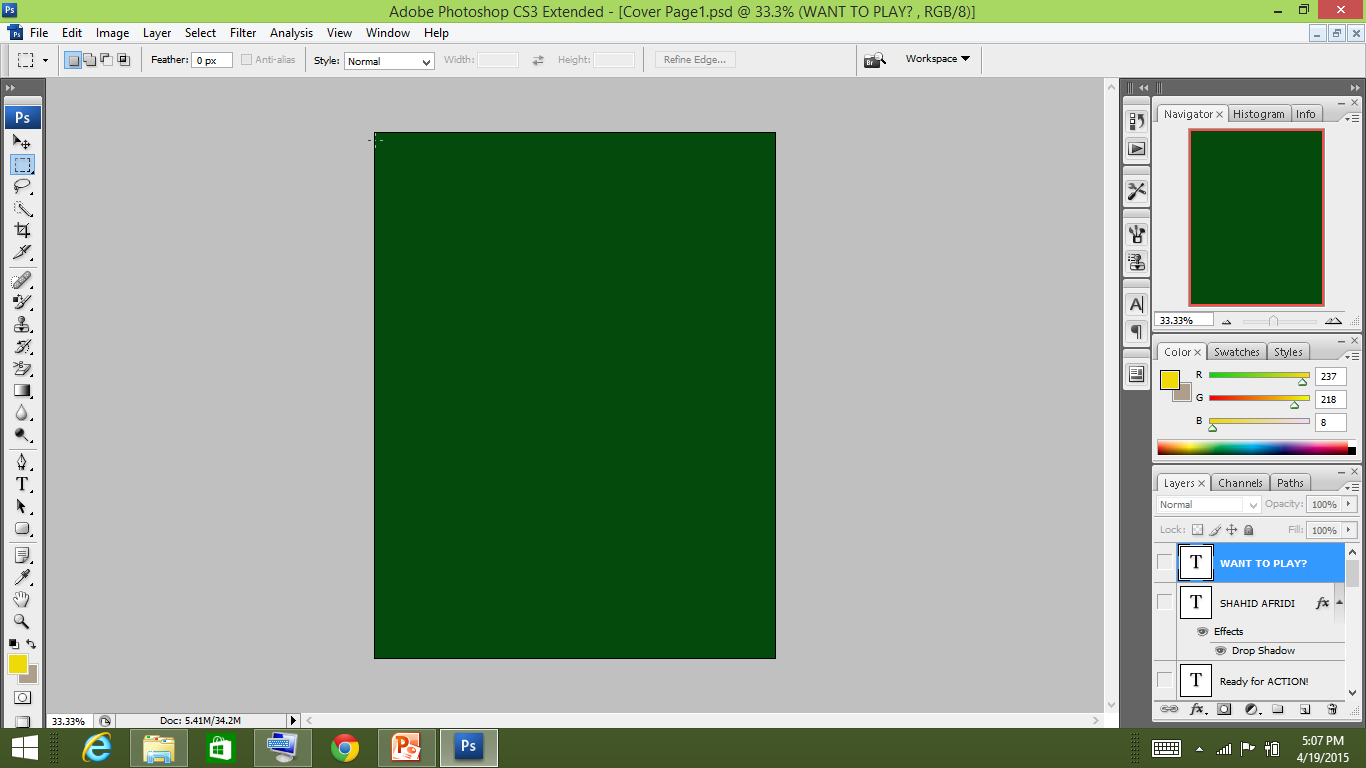
First, I went to the edit menu and selected edit in which I chose ‘fill’. I filled it dark green.
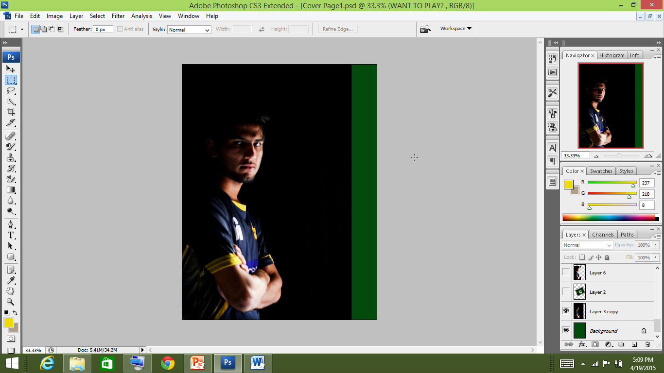
Then I added the Picture.
Then i added the picture of the Pakistan flag to connect the motion
of the target audience
which was
taken from the net.
Then I feathered the background green layer and the Pakistan flag hiding the main image keeping it to 50.
I opened the selected image again and with the rectangle marquee tool made a copy and paste it on here. I aldo enlarged the picture.
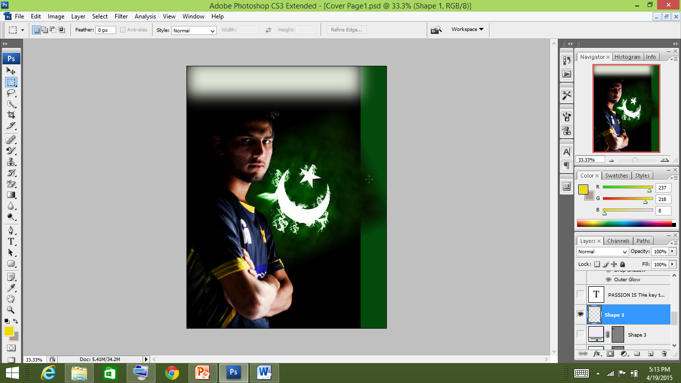
Next, I added the white rectangle and used the gaussian blur tool in filters - blur.
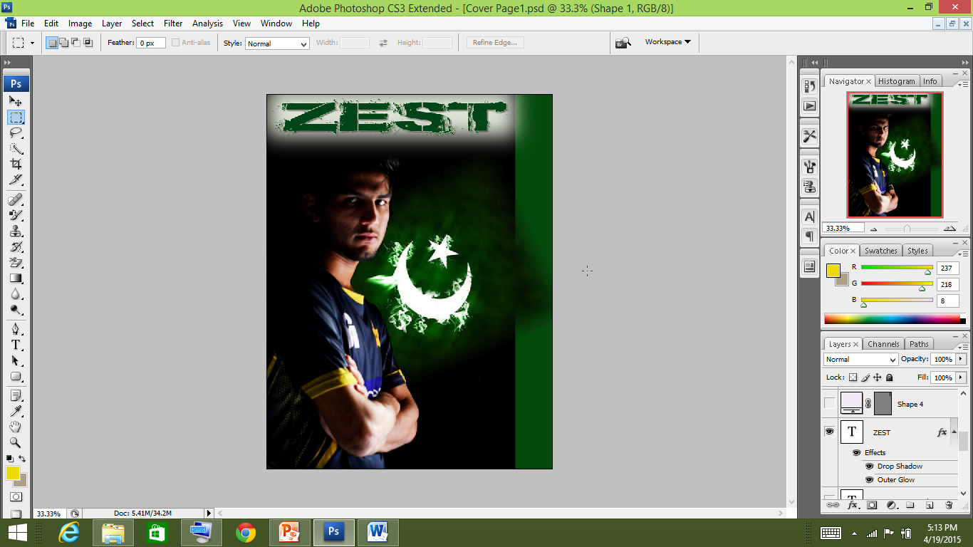
Next I added the title using ‘Bronx Bystreets’ font. The reason I selected this font was because it falls in the category of ‘Army’. It is a bold font easily visible and is im-pactful due to being a little distorted. Also to me it represents the ups and downs faced by the Pakistan Team yet we need to support them.
Then I added he strip which is a normal convention is ‘Sports Magazines’. I used the hominis font which falls in the decorative category, simple and yet conveying the feel of energy.

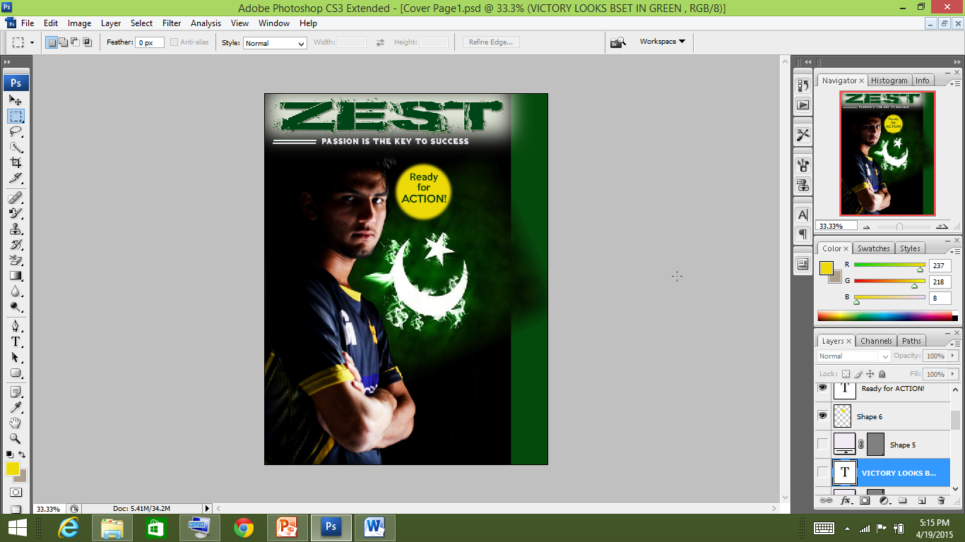
I added the circular shape and applied gaussian blur and wrote text in it using simple font keeping it green resembling Pakistan cricket
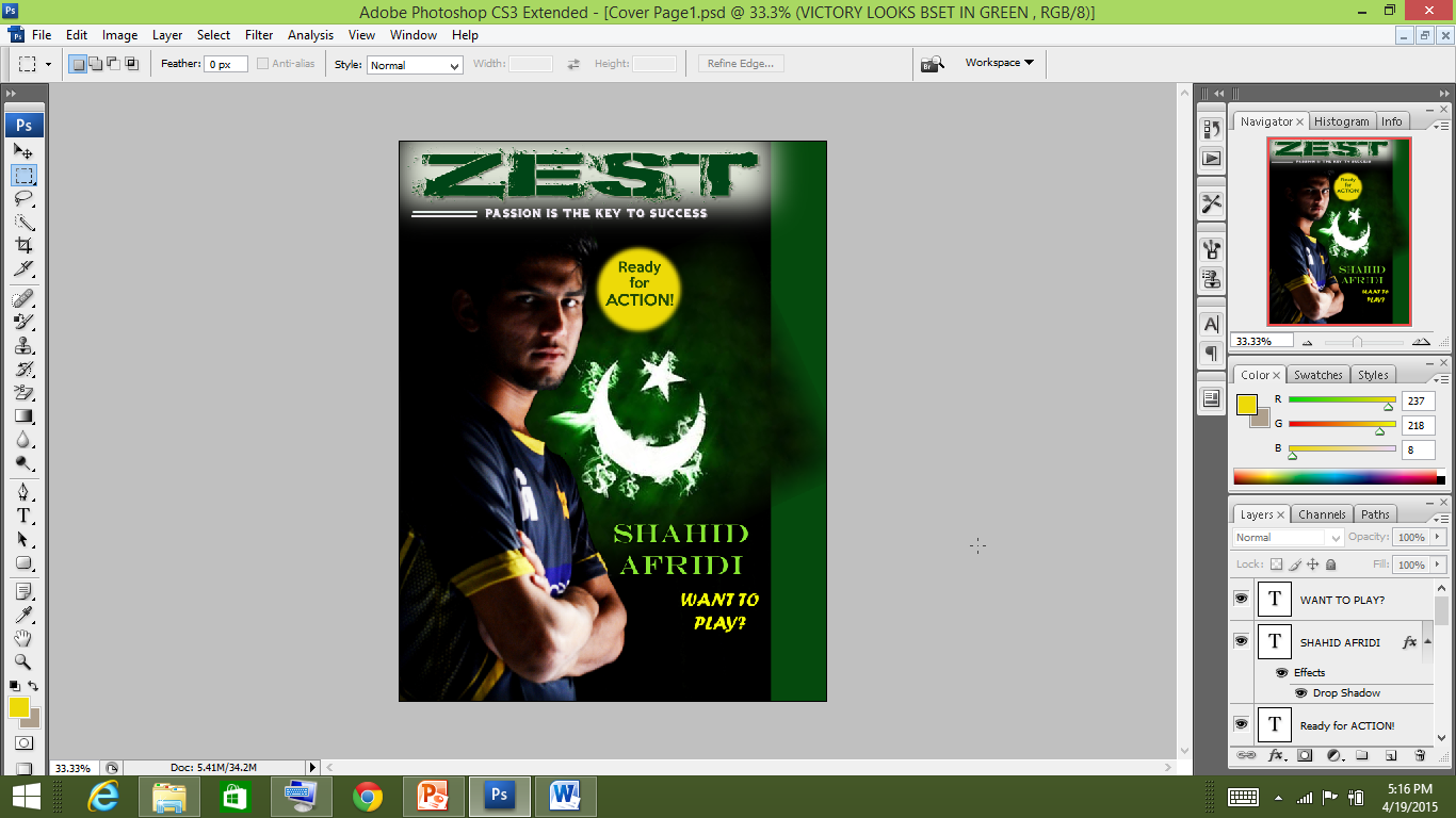
I added text including the name of the player using ‘Engravers MT’ font keeping colour green. It is again a simple font the structure seems a little bold as if it stand out. I added a cover line as well ‘ want to play?’ a question for viewers to connect. Here I used the ‘Forte’ font which is a basic sanssarrif in italic. Also this question is also connected with the eyes of the main image with seem to be asking it.
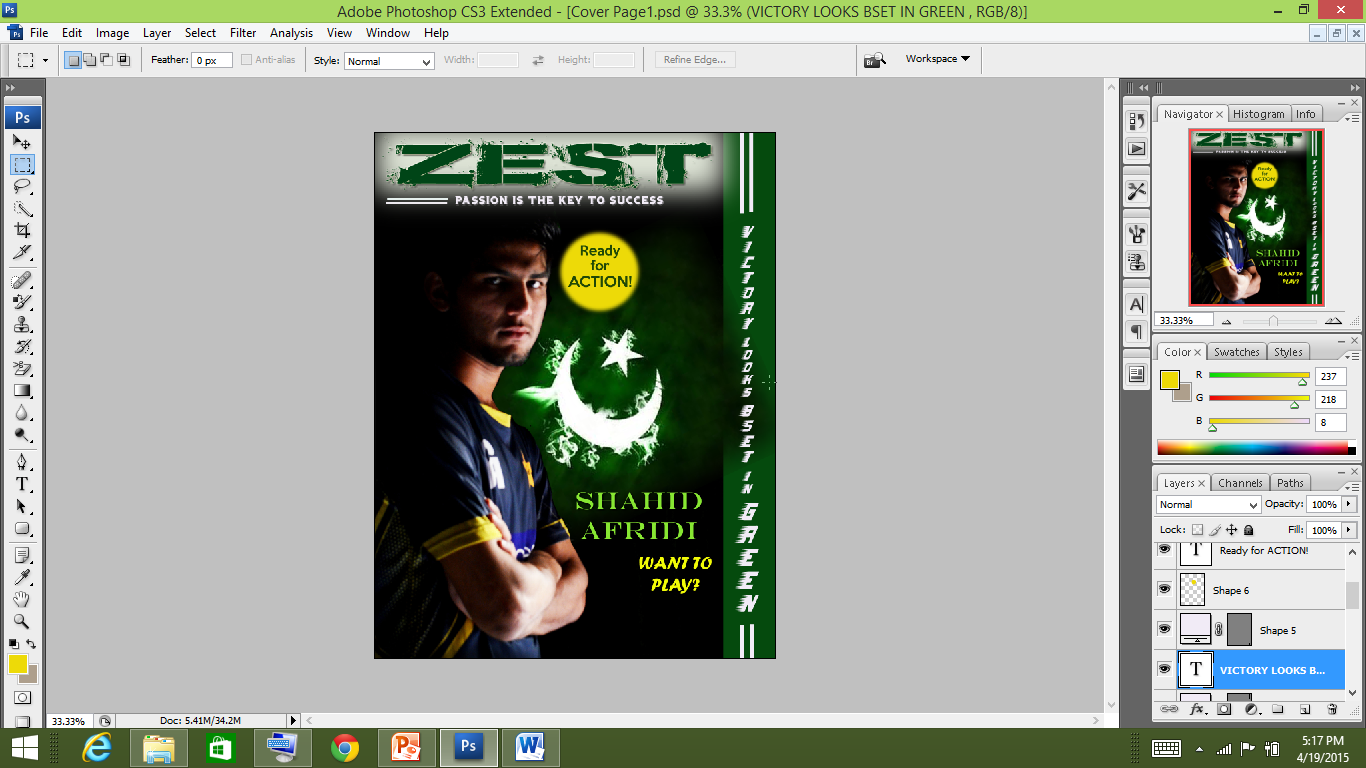
Lastly, I inserted the ‘tag line’ vertically using the barbatrick font falling in the decorative category. The letters in this font seem to have a motion to move forward. In this case towards ‘Victory.’ Therefore, I used this font.
I haven’t used much cover lines as the image itself conveys a lot. I wanted to make it simple but yet effective to the viewer.

THE
END :)