FINAL TASK - MAGAZINE
MAGAZINE DOUBLE SPREAD PAGE
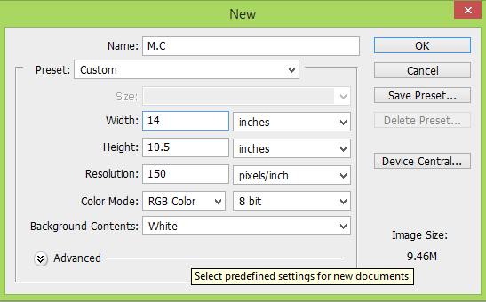
I started by setting the size of the page
I filled it the layer with black
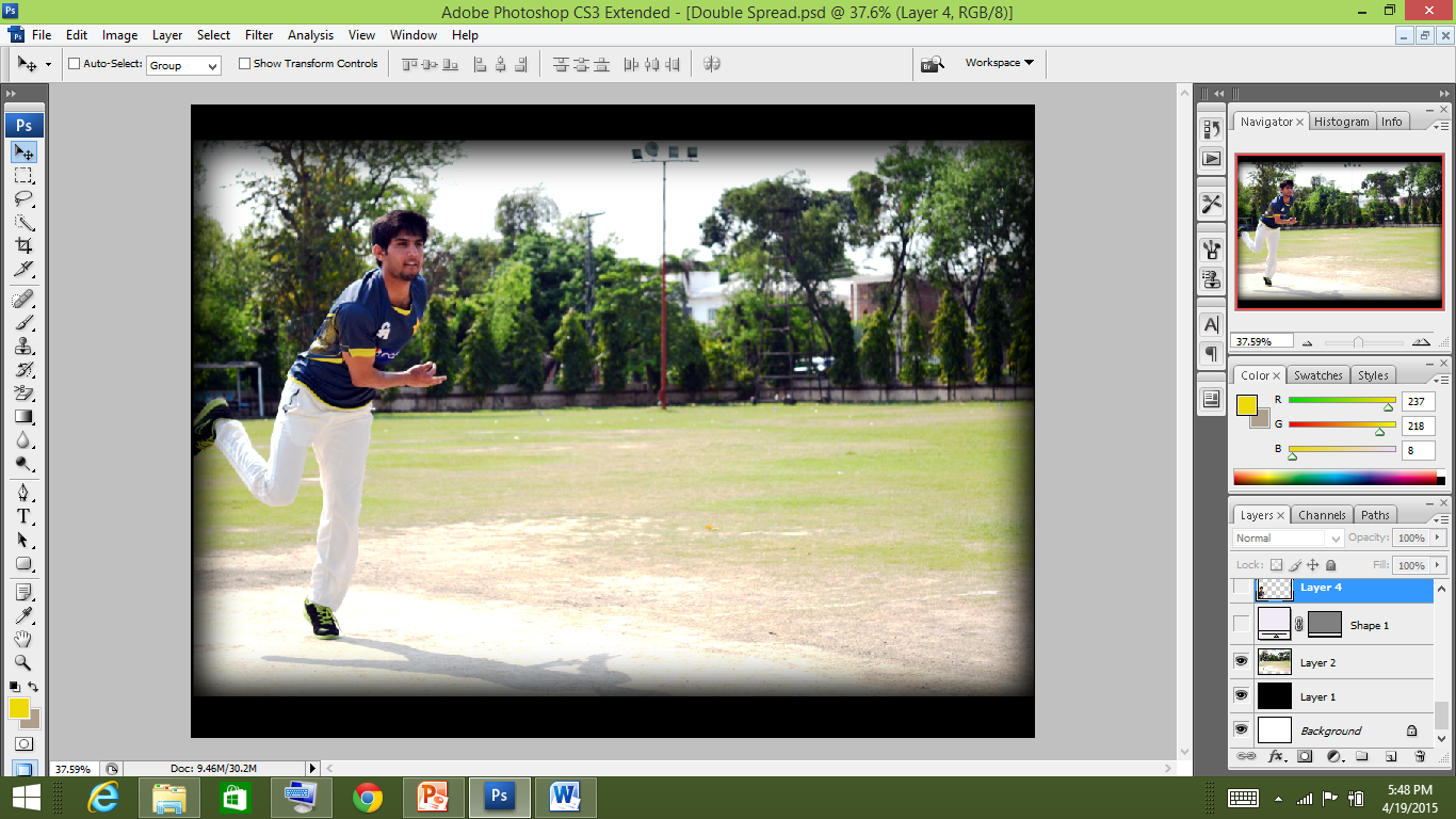
I added a picture of my model bowling. This picture was taken by DSLR obviously keeping it to sports mode.
I applied the feather effect keeping it to 50 to blend it with the background
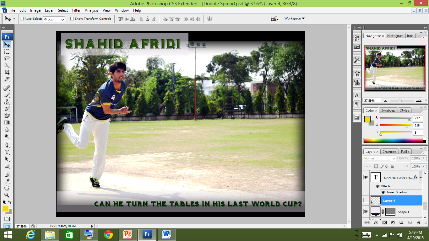
Next, I made inserted a rectangular shape for the title and the main cover line. I used the hominid font for the title making it stand out with green colour to resemble the team. For the main cover line the same font is used but in decreased size to signify it’s importance.
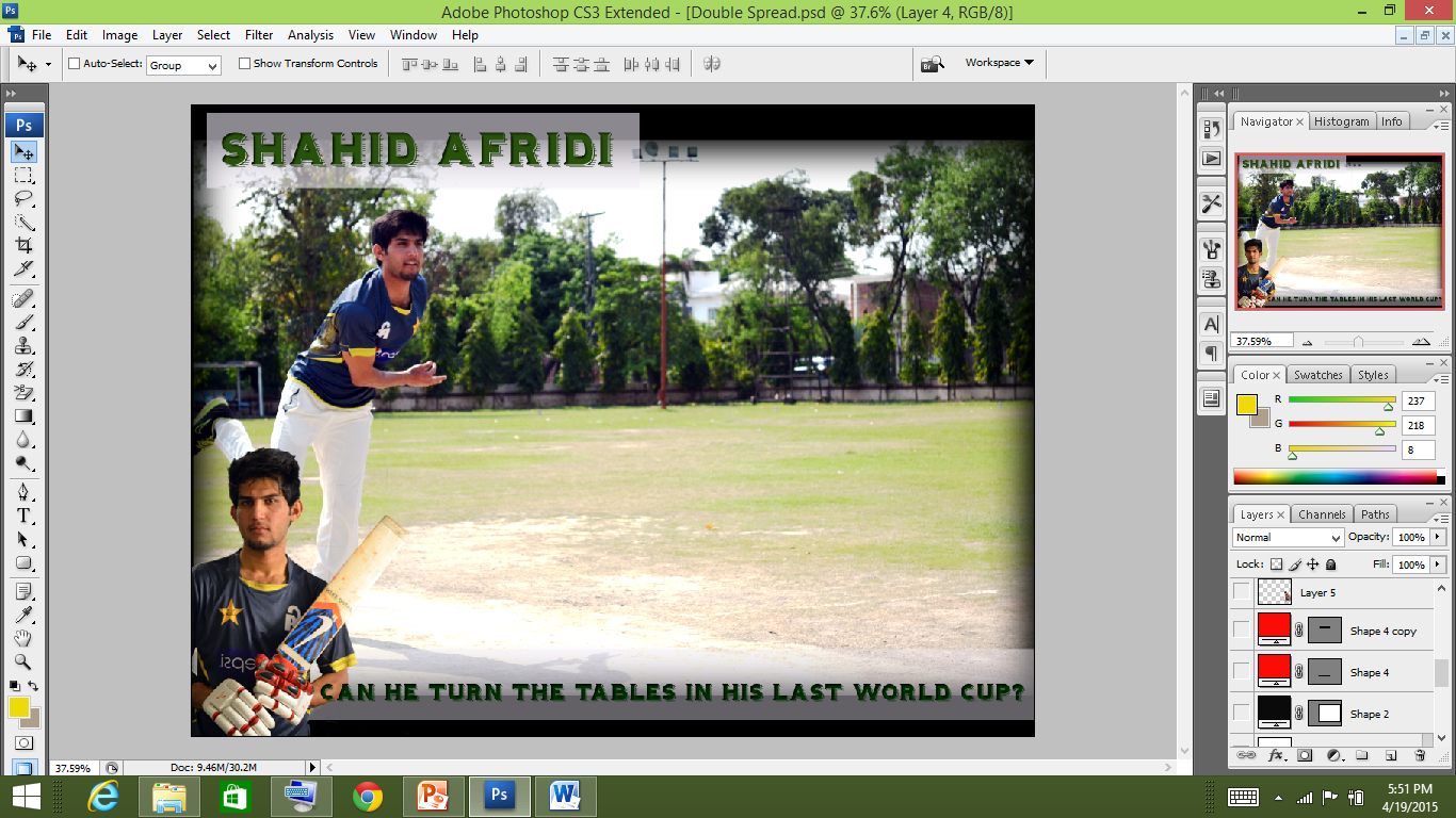
Then I added the picture erasing it’s background with background eraser tool and enlarged it little
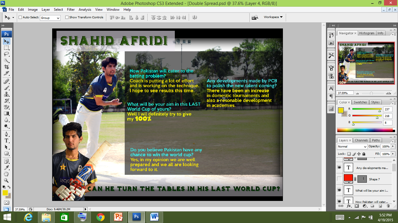
After that, I inserted the questions and answers keeping different colours for question and answer making easy for the reader. I used the simple ‘keep calm’ font.
Next I inserted the square lowering it’s opacity make it easy for the reader to read text
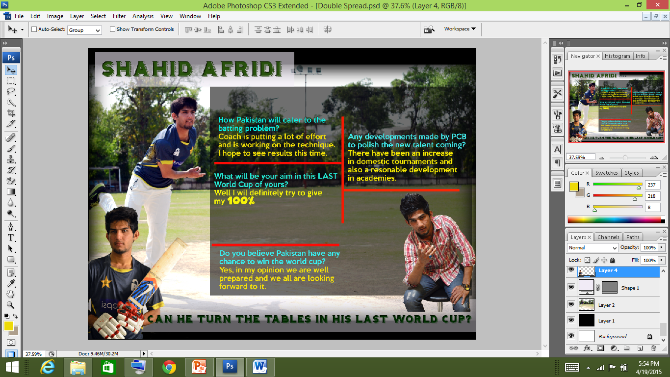
Last, I inserted the lines withdraw orange colour keeping each question separate from each other. Lastly, I inserted the picture taking by me where my model acts as if he is giving the interview again erasing the background with background eraser tool in the tool box

THE
END
:)