Data/Persuasion
What is Data Storytelling?
Data storytelling is not data visualization
Data storytelling connects your narrative with data visualization
Data Storytelling makes data meaningful for the audience
It works on the why aspect of data - why is the data relevant to your audience? What should they do with it?
Current context of data revolution. There is too much information. If you want to make an impact, you have to contextualize your data.
Data storytelling is personal, relevant and useful
Concepts
Exploratory/Explanatory
Iconic/Short Term/Long Term
Simple Text
Tables?
Heat Map: Colour Intensity
Scatter Plot: Relations
Line: Time/Change
Slope: Change between two points
BAR GRAPHS
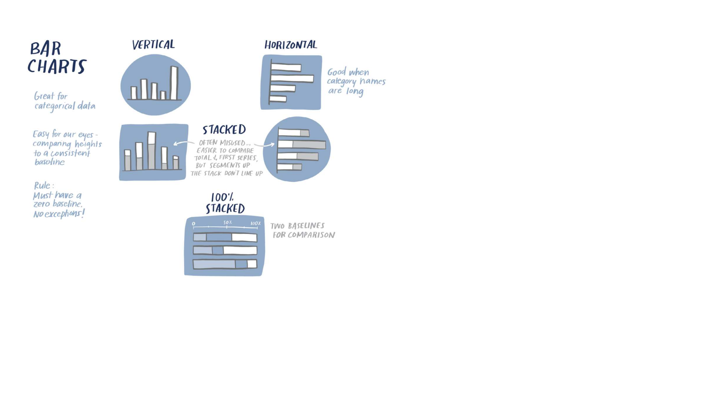
Visualise
| Year | Pet Adoptions |
|---|---|
| 2010 | 20309 |
| 2011 | 40286 |
| 2012 | 125897 |
| 2013 | 156236 |
| 2014 | 142278 |
| 2015 | 201022 |
| 2016 | 243210 |
| 2017 | 265789 |
| 2018 | 208213 |
| 2019 | 225890 |
Effort in processing?
Attention is divided?
Visualise
Heatmapping - Great for picking up big differences, not so great for minor ones
Bar Graph: See the change
Line Graph: Best for end point comparisons
Visualise
Avoid clutter to reduce cognitive load
Leverage white space and align elements
Use contrast strategically - tell your audience where to look
Gestalt Principles: Proximity, Similarity, Enclosure, Closure, Continuity and Connection
Gestalt Principles
Proximity: Cluster, Tie in
Similarity: Of colour. Visually tie data points to description
Closure: We automatically fill in gaps between elements. (IBM, WWF)
Common Region: Group elements in the same closed region
UX/UI
Declutter
Declutter
Remove heavy lines
Remove gridlines
Stop trailing zeroes
Delete diagonal text
Thicken bars
Put data labels into bars
Remove data labels
Declutter

Declutter
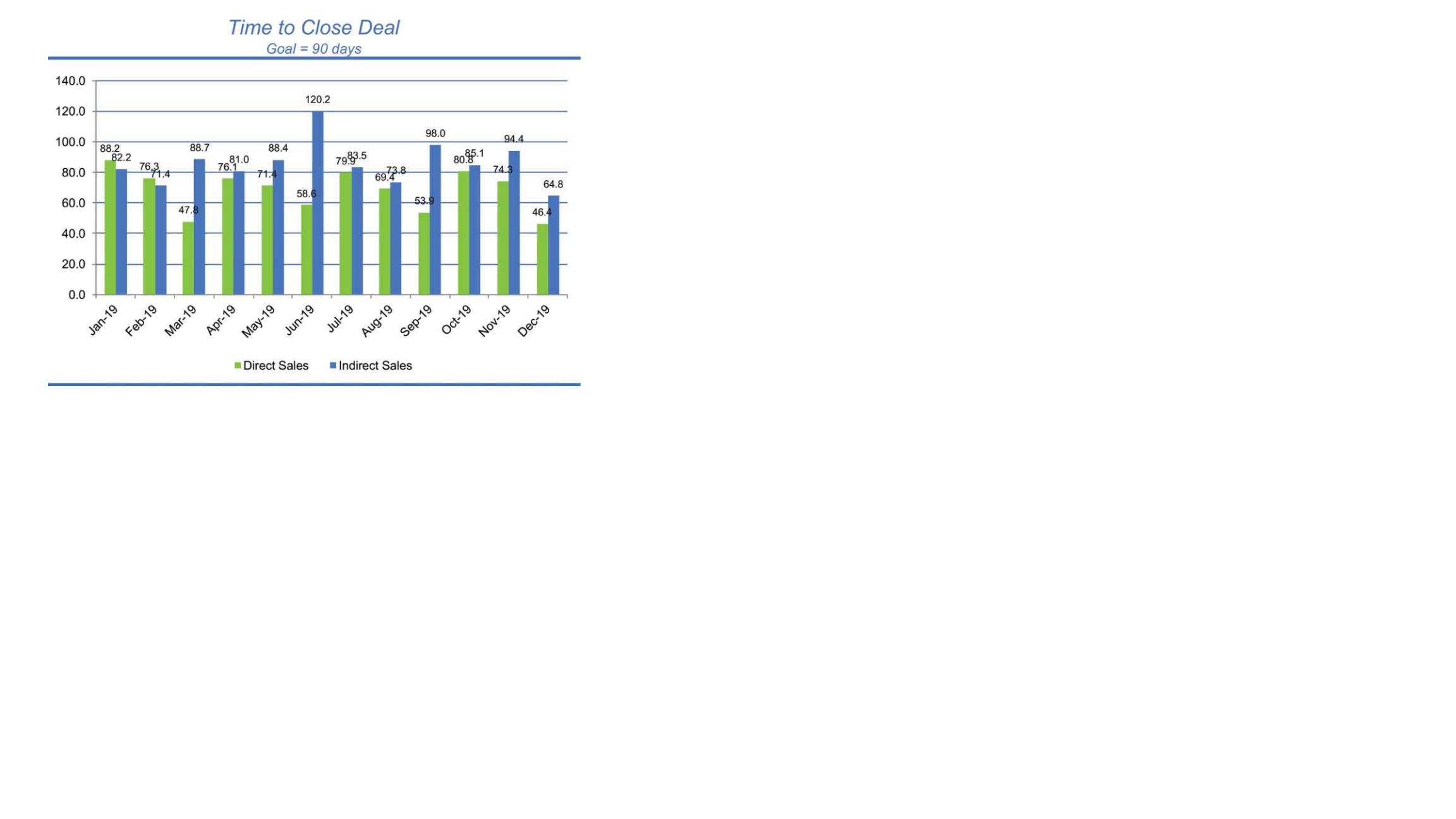
Data over time... line graph maybe?
Less ink, cleaner design
24 bars - 2 lines
Put data labels next to lines
Orient graph title
Remove colour from title
Put the goal in the graph!
Focus attention on takeaways
Pre-attentive Attributes
Orientation
Shape
Line Length
Line Width
Size
Curvature
Added Marks
Enclosure
Hue
Intensity
Spatial Position
Motion