How did you attract/address your audience?
fashion
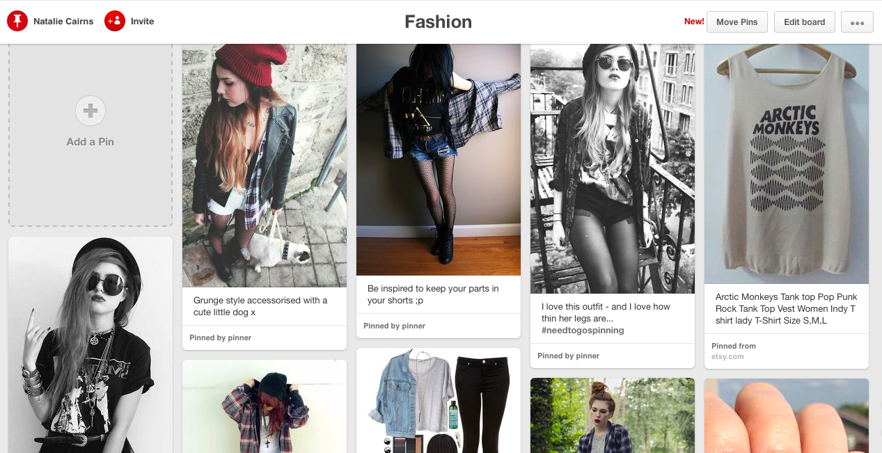
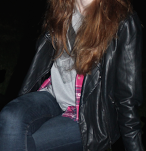
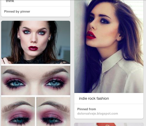
Using pinterest, I found the typical clothing worn my indie rock fans. I then incorporated the fashion into the clothing on the model featured in my magazine so it is easy to be identified quickly by the target audience.
makeup
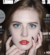
Looking online, I found that makeup worn by indie rock fans often emphasised the eyes and lips. For the makeup on my model I used my information to make the model look as though she was also a fan of indie rock music through the way her makeup was done.
colour
This is the colour scheme that I created for my magazine. I have been able to use this in order to keep my magazine consistent. The colours used are all very dark or pale and are not bright. This attracts my target audience as from the research I have collected, they prefer darker and calmer colours over bright ones. It also appeals to the target audience as it is organised and controlled which rock music can often be associated with.
Types of imagery
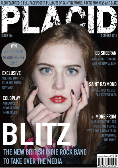
The dominant image used on the front cover uses direct mode of address and is taken at eye level. This attracts the audience as it looks as though the model is looking straight at them and the features on the face stand out and are easily noticed.
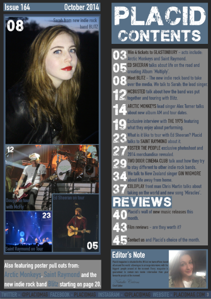
The dominant image on the contents page also uses direct mode of address and eye level but uses a medium close up shot which allows the audience to see more of the clothing attracting them to the magazine.
The dominant image on the DPS uses indirect mode of address which makes the reader question what the model is looking at which makes them think of the magazine, encouraging them to buy it. It also is eye level but uses a medium long shot which once again allows the reader to see the clothing that the model is wearing which allows them to relate to the magazine.


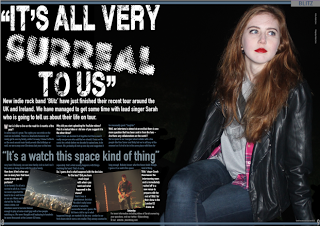
I have been able to attract my target audience by making my article include a Q&A, which was seen to be the most popular preference in my survey.
I also featured two pull quotes, one of which was used for the masthead. These have been able to attract the target audience as
DPS
they give you an insight into what is featured in the article. They also are very eye catching and encourage the reader to read the rest of the article to find out what the pull quotes relate to. The sub images also enhance the attention taken from the reader as they will look at them to find out what they are about which also encourages them to want to read the article. The strap line also encourages the reader to want to read the rest of the magazine as it provides an introduction to the content of the article.
content
To attract my target audience, I have included multiple popular indie rock artists to encourage people to purchase my magazine.
Bands like Arctic Monkeys and Two Door Cinema Club have been included in my contents as they are very popular and will encourage the target audience to buy the magazine.
USP
To increase sales for my magazine, I have included a USP (Unique Selling Point) which is a chance to win 4 tickets to the Glastonbury festival.
This would attract my target audience as many indie rock bands attend Glastonbury so it would be a great chance to get free tickets to see many different artists.

social media
Social media links have also been featured in the magazine as they attract the audience as they are then aware of the other places that they can access articles and extra information from the magazine and the content of it.
They have also helped to address the target audience because, since they mainly include teenagers and young adults, they often use social media on a daily basis which shows who the magazine is aimed at.

genre conventions
- Colour
- Expressions
- Clothing
- Font
- Image Background
Here are the most important conventions in my magazine which prove that the magazine represents and attracts indie rock music fans. The font I have used throughout for example is easy to read and comprehend which was important because I found that in my research most people prefer images over the text so it had to look appealing to read. To make the images more attracting, I used photoshop to edit out the background so the reader is focused on the model rather than the background.