Glamour Website
Opening Page
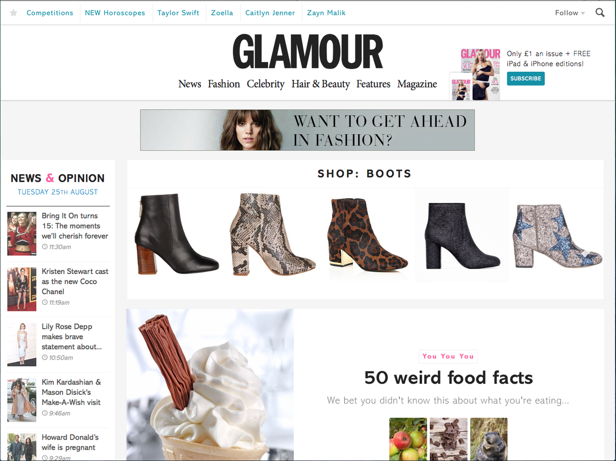
Masthead
The masthead for this website is at the top centre of the page and uses the same font as the magazine which enables the reader to associate the website with my magazine quickly and efficiently.
Advertisements
With this being a website, it is possible for the designer to feature advertisements. The magazine company will ensure to advertise other web pages that are relevant to the magazine. Here we see an advert for a fashion course which corresponds with the fashion magazine.
Colours
The colours used on this website are very bright and with the use of a plain white background, this ensures all focus remains on the articles involved. The website only shows certain images that the producers think would engage the reader and therefore encourage them to use the interactive features and click onto the webpage.
Links
The main links to other webpages involved in the glamour magazine are directly beneath the masthead. This has been done as it ensures that the reader will notice them. they are also in a black bold font which is similar to that used for the masthead which makes the whole piece work well together and also makes them easier to be noticed.
Text
Throughout the whole website, celebrities are featured. As this is seen as a woman's magazine, stereotypically woman enjoy reading about celebrities and the fashion of those celebrities. Therefore, the website is reaching out to the target audience by featuring these articles.
Social Media
Social Media links have been featured on this website as most people recently have some form of social media so this is a good way for companies to reach out to people that they may have been unable to reach previously. The links have been stored under another link which brings up a drop down box of the particular links that people can reach glamour magazine on.
Glamour Website
Linked Pages
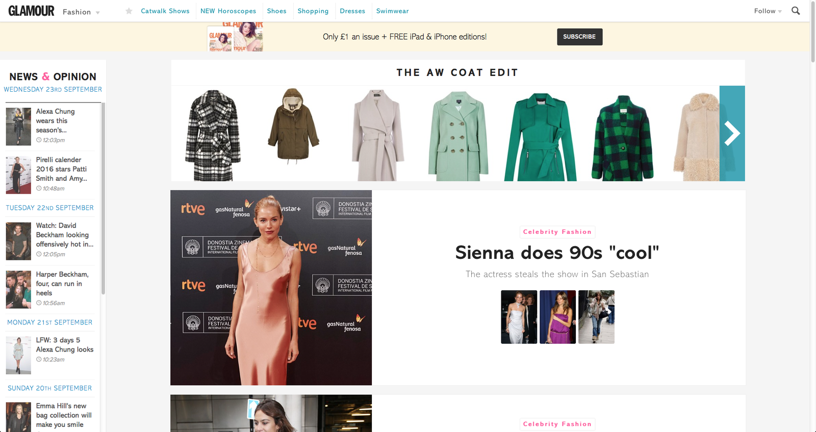

Logo
Placing the logo of the magazine in the top left corner of the page shows that the designer wanted most of the audiences attention to go to the articles rather than the name of the magazine. However, by still placing the logo on the sir shows that the website is still a part of that magazine but it is not the most important section.

Further Links
By adding more links to the page, it makes the website look as though a lot of time has been sent when designing it and creating the articles for the page. This makes the reader think that it is worth reading as there will be a lot of information included. I will use these in my website for that reason.

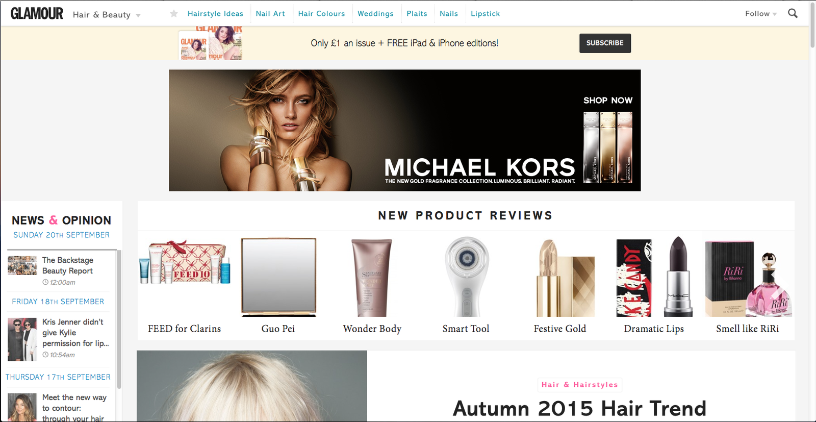
Images
Images have been used throughout the page to make it seem as though there is not a lot of text which could bore the reader. by adding images, it creates a dimension that cannot be reached by text. I will use a lot of images on my website as I think that they will appeal more to my target audience than chunks of text would as this can be seen in the actual magazine.
Subscription
The subscription link has been placed at the top of the page in the centre as this is guaranteed to attract the attention of the reader. I will add a link like this to my page as it is another way to reach my audience and to ensure that my product reaches as them as soon as it is released.

Search bar
Using a search bar shows that there is a lot of other articles included in the website which makes the magazine seem as though it is a well established magazine. I will use this in my website for the same reason.
