Linvo new design
This is the current Linvo Dashboard
Everything is changeable.
Just keep the same layout.
Use your creativity, don't stuck with the current color / icons / dashboard.
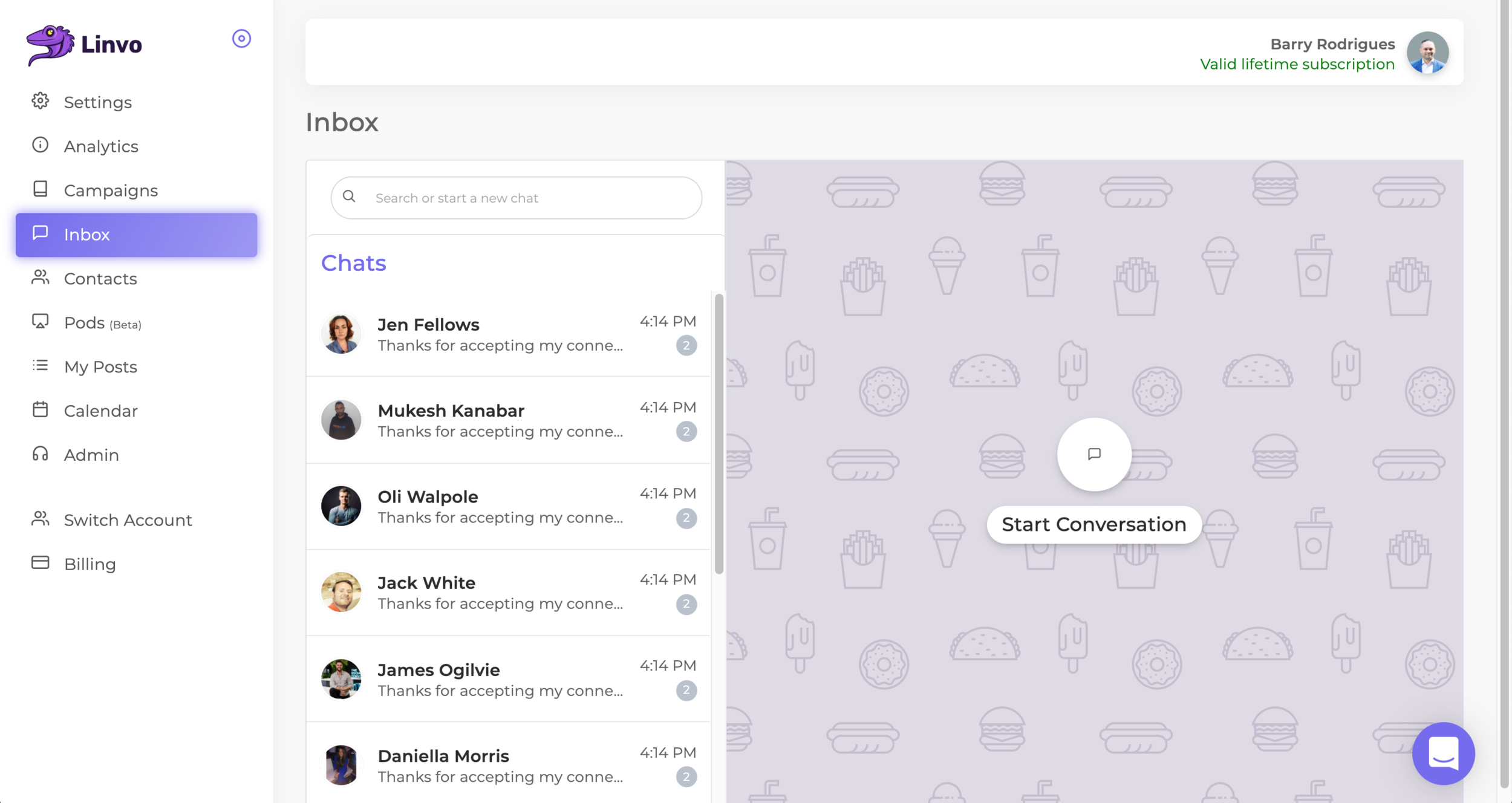
Side Menu
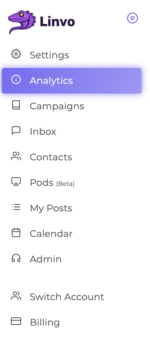
Sometimes Linvo is not working
There should be another icon with a "sleeping hat" and and maybe some "zzz"
The Menu items should have the same name, but the design is totally changeable, try to make the icons look a little bit like the logo? maybe our mascot lags or eyes, something with feeling.
No Need

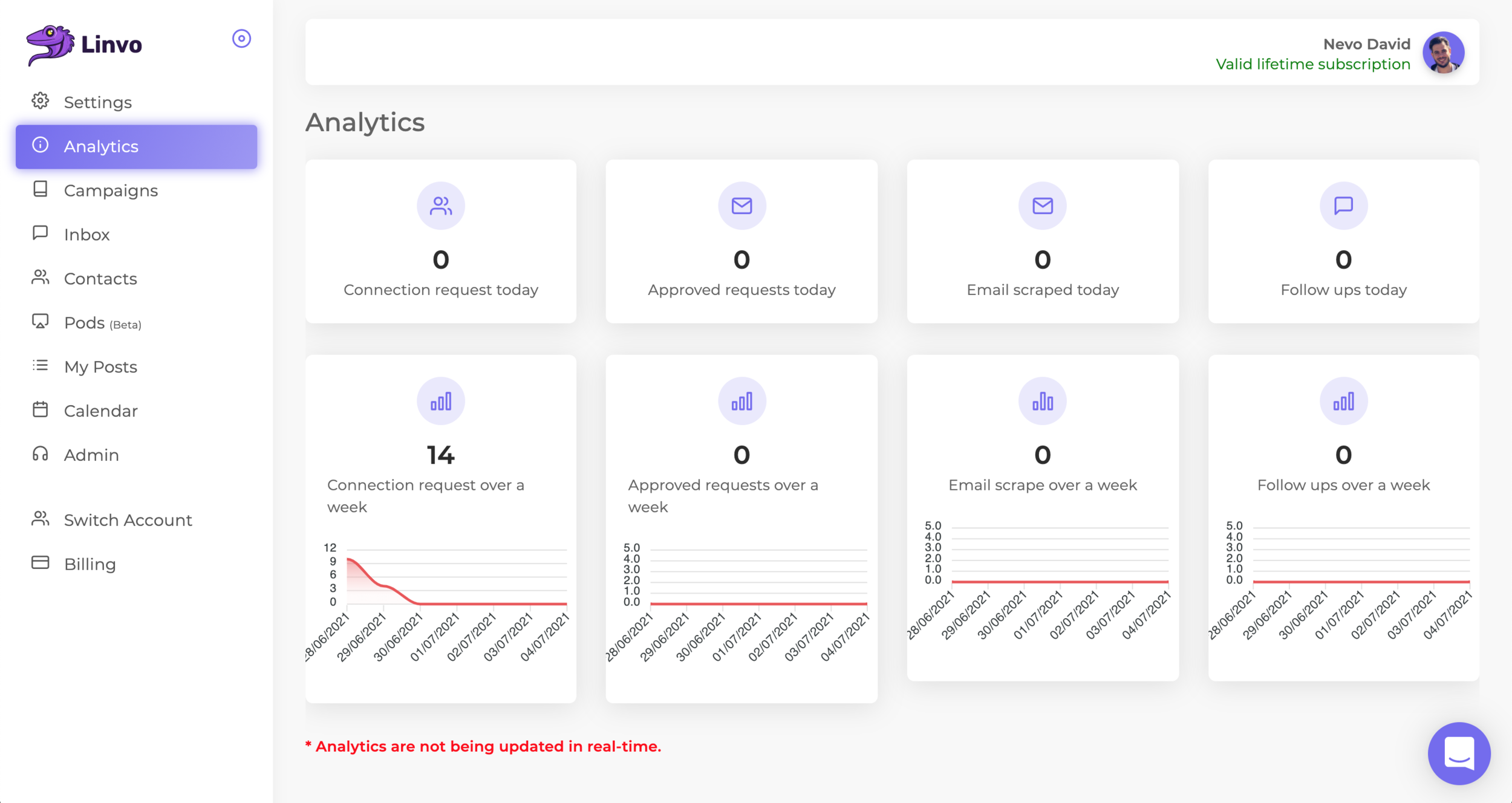
Analytics page.
You can position the boxes in any way you want. Make sure there are different icons.
The Graphs are also changables.
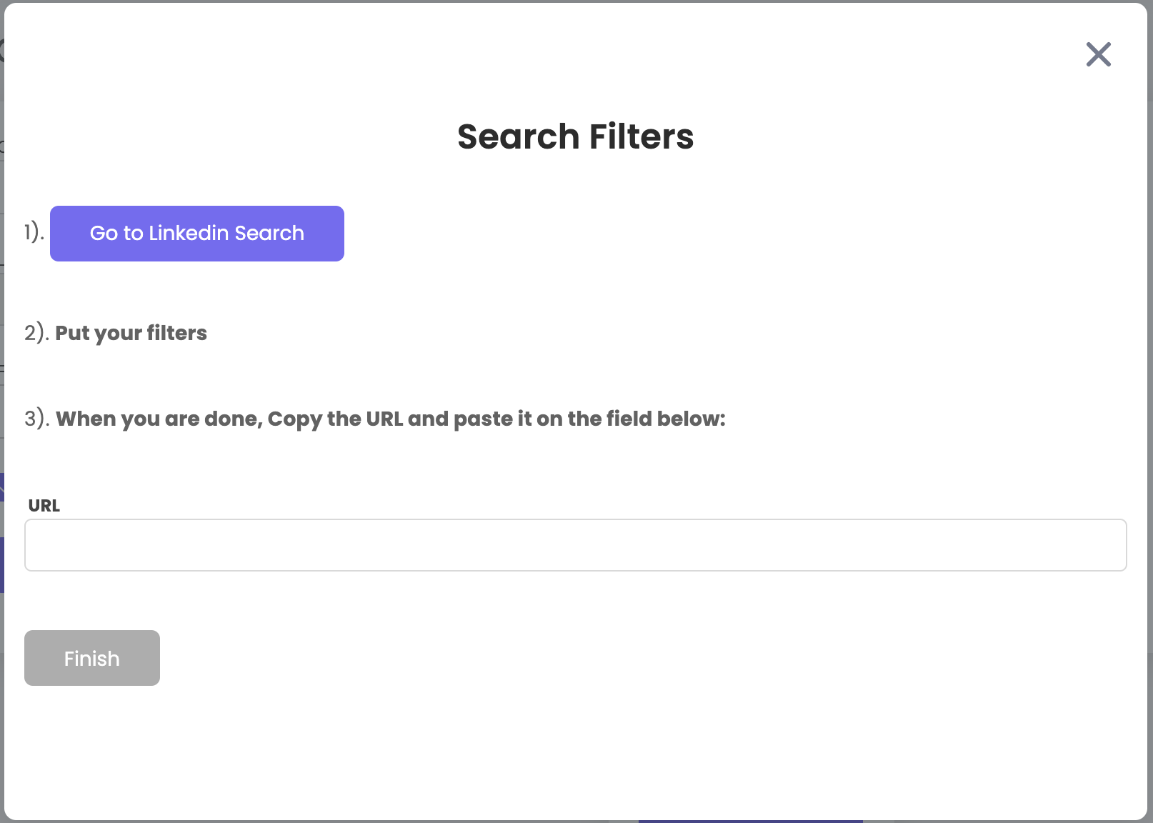
Also we need to add filters.
From Date to Date
List of campaigns
Go Back One Week
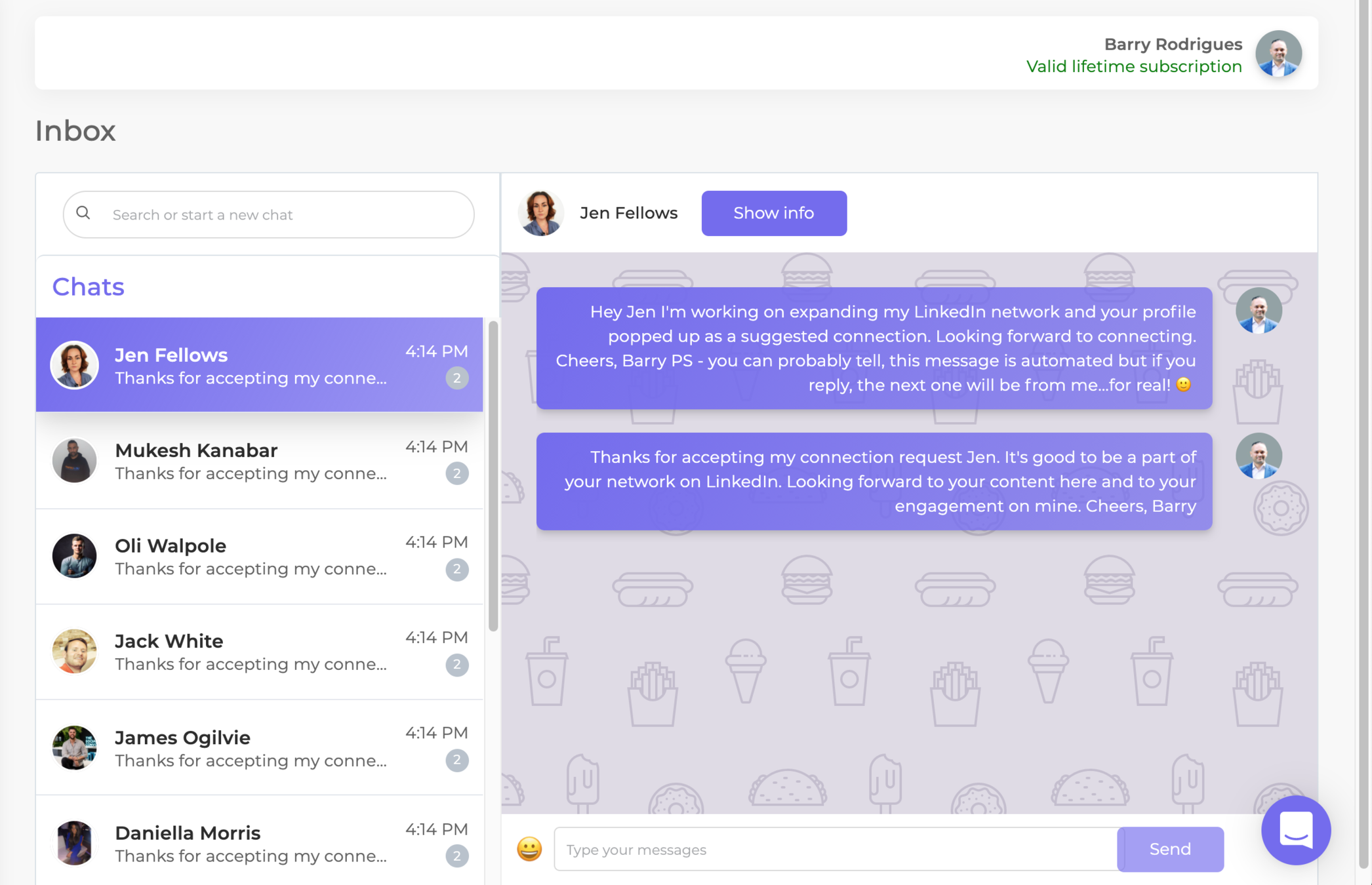
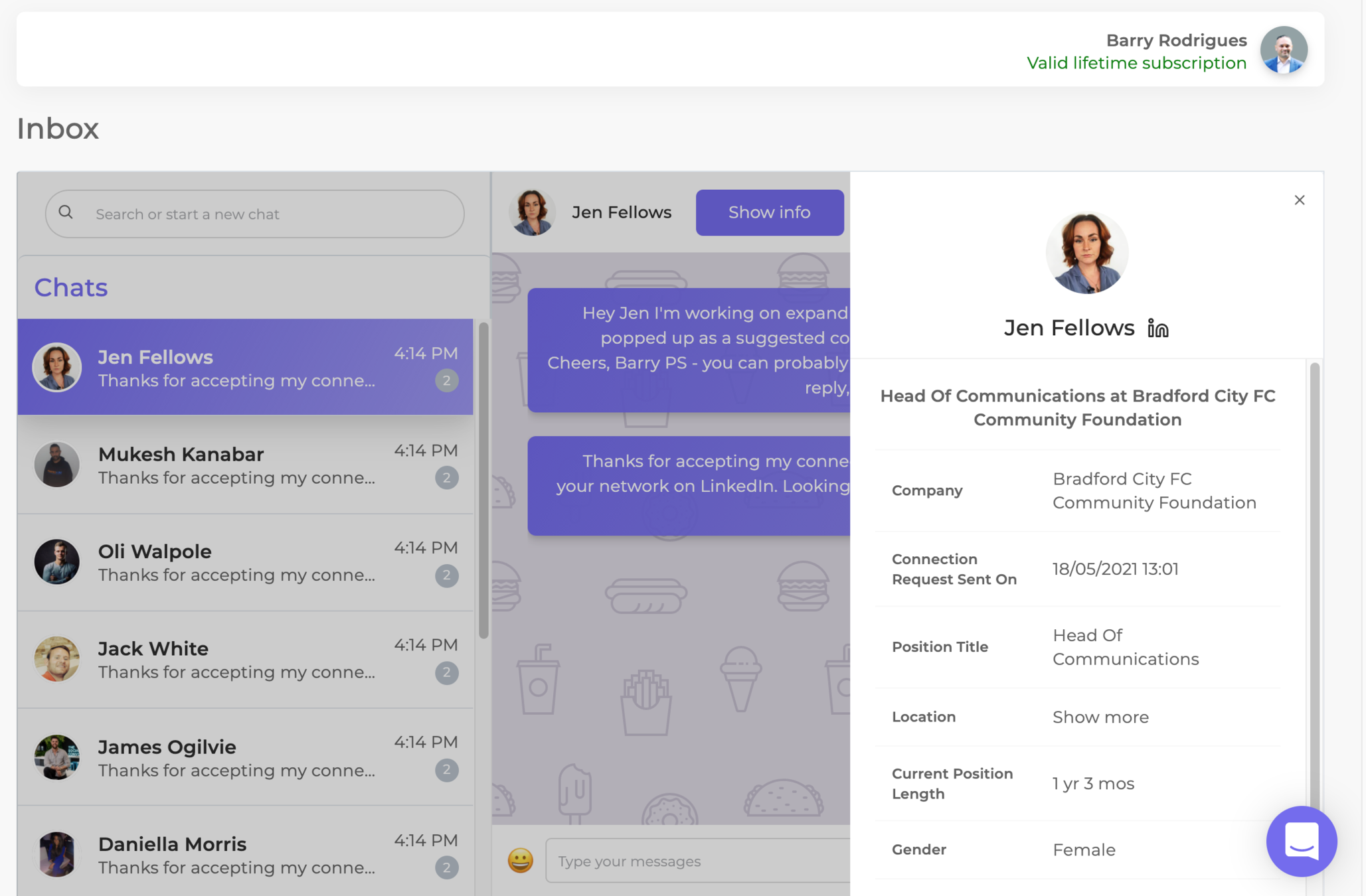
Clicking on picture should allow us to change profile - like gmail
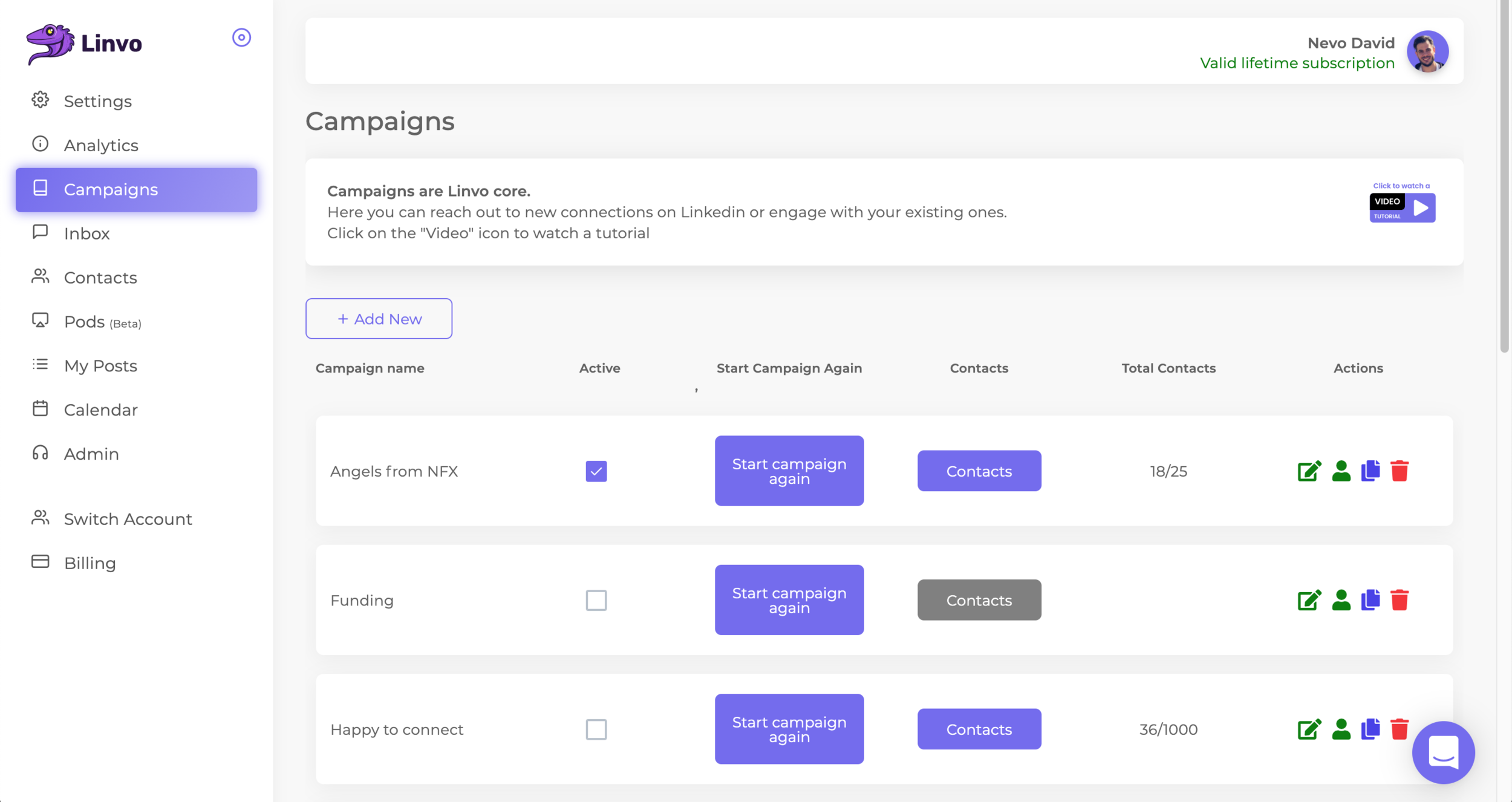
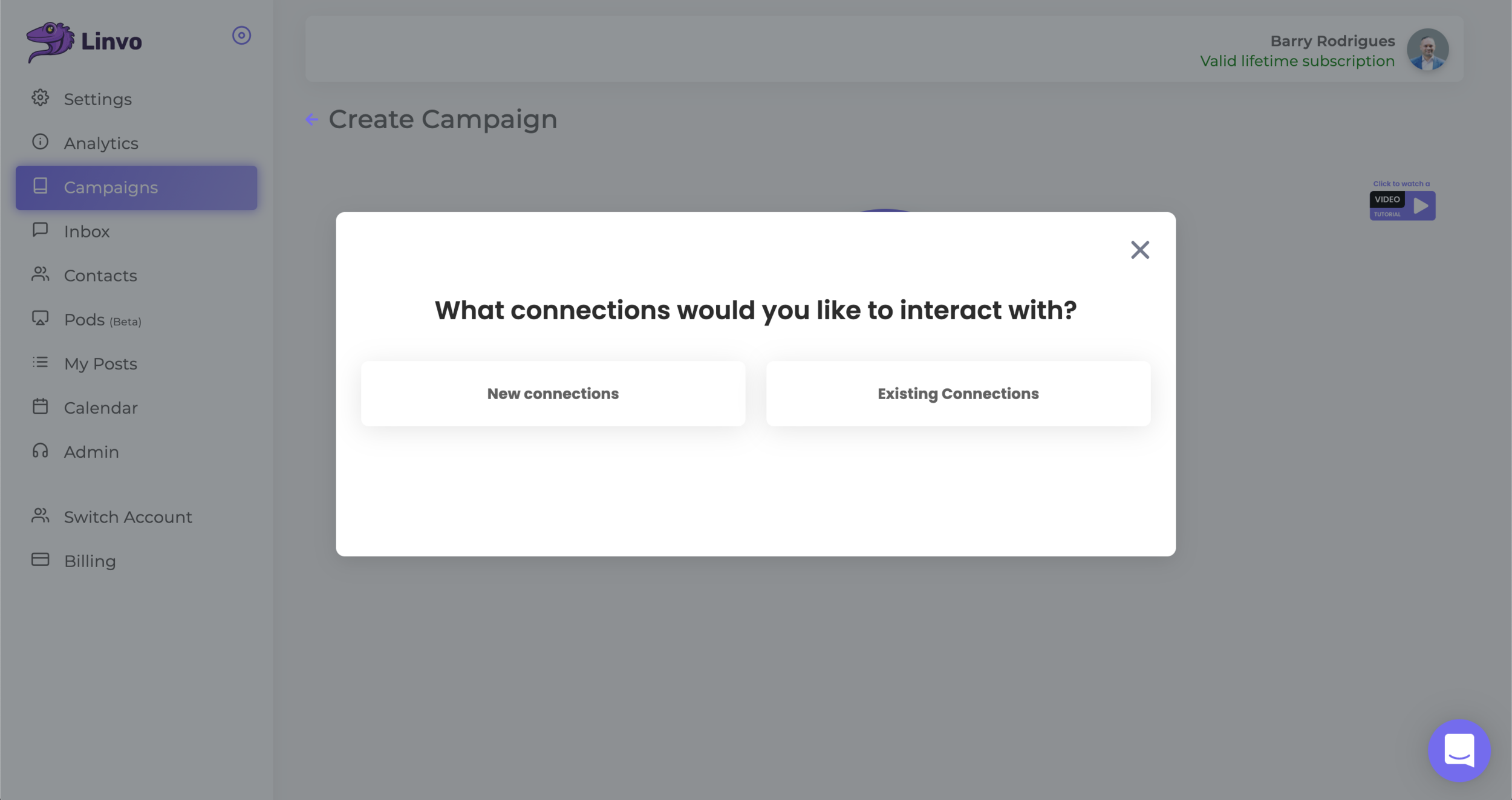
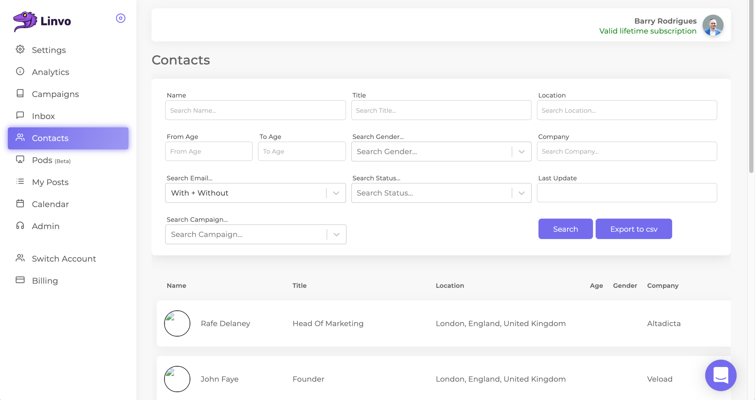
Campaigns
Should contain an illustration
edit
duplicate
delete
Icons are not understandable today, should be something else :)
Move it to be first and change to slider, every row should have an active and inactive state
Today the white box is huge, try to see if you can shrink it
Missing filters of age, gender, sentiment analysis
Next Page
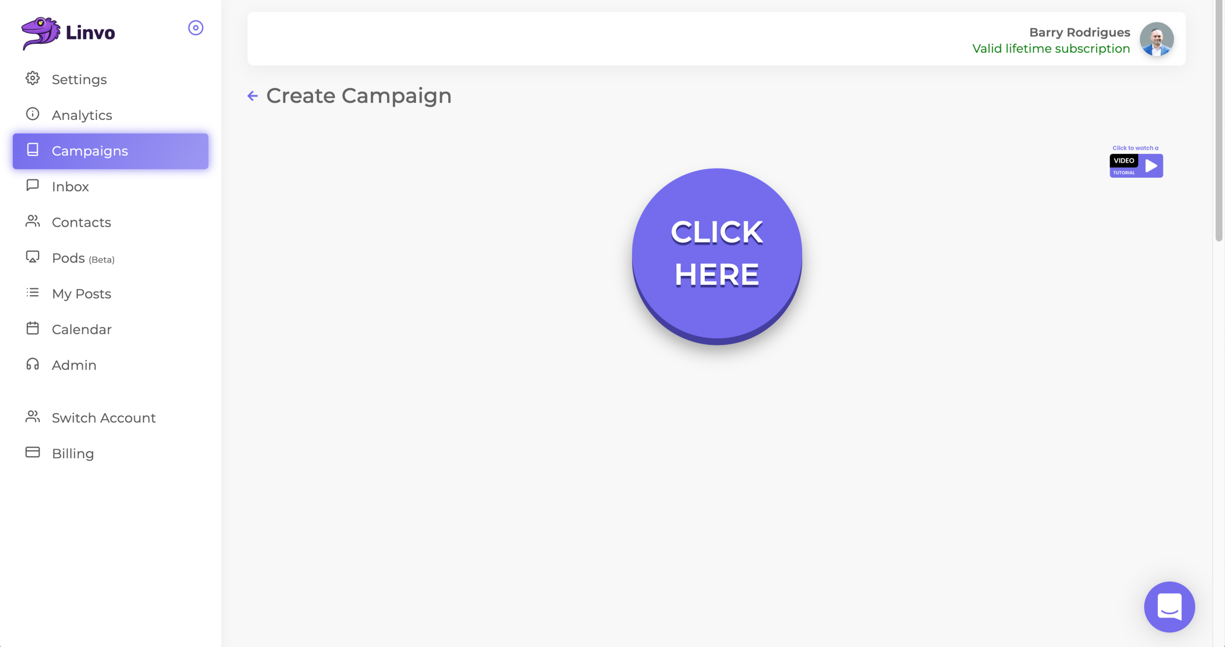
Try to shrink it, it's too big.
Pagination is also required (maybe should be on top also)
This should have right scrolling, scrolling should be fixed, and move with the screen
Make it a lot smaller