Basic UX Principles
or
"Don't make them think"
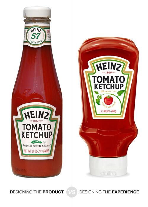
1. WRITE GOOD MESSAGES
"The 4 H's of error writing"
- Human
- Helpful
- Humorous
- Humble
Ben Rowe
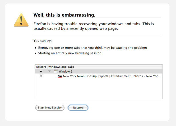
Good
Human, Humorous
Humble
Helpful
Bad
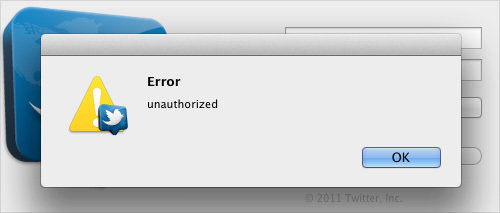
???
Label your buttons!
Place Order
or
Learn More
is always better than
OK
Next
or
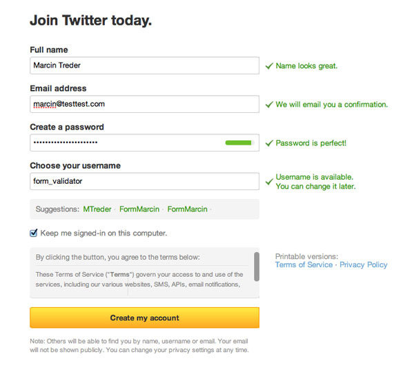
It applies to form validations!
2. THE UPPER LEFT IS KEY
Scanning Patterns
Heat maps of where the eye looks when presented with a page (with eye-tracking magic)
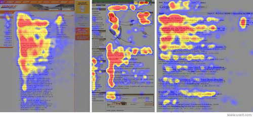
"F"
Use headings like this
It keeps the user from getting visually disoriented and the flow of your page nice and neat
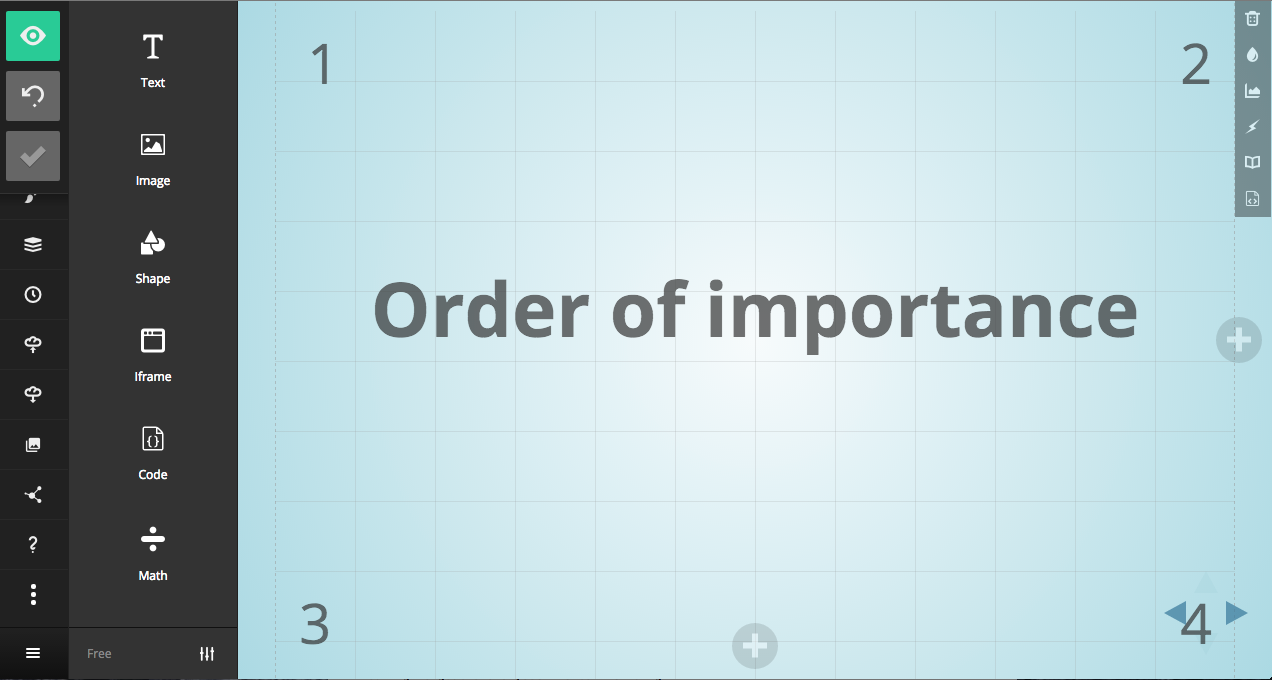
People scan from left to right, then down
You can organize your content to facilitate that.


Order of importance
1
2
3
4
3. GIVE FEWER CHOICES
"Menus are like dating. if you need more than 7 or 8 choices, it's time to break somebody's heart. Maybe your own."
Joel Marsh
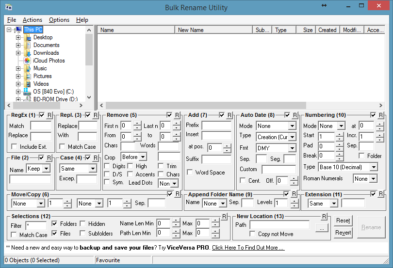
COUNT YOUR CLICKS

The Nick Ellsworth Approximation of
User Frustration vs Number of Clicks Required to Complete a Task
(NEAoUFvNoCRtCaT)
Clicks
Frustration
"Three Click Rule"
(controversial)
"Dropdowns Should be the UI of Last Resort"
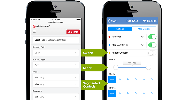
(CLARITY!)
The user should understand immediately
what a button or feature should do
THE GREAT DEBATE
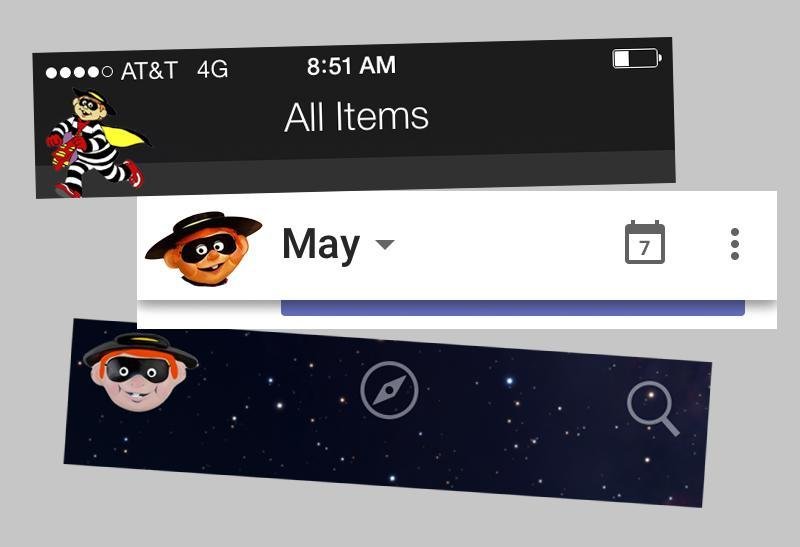
The burger menu:
An excuse to hold junk?
Unclear symbolism?
Too many clicks?
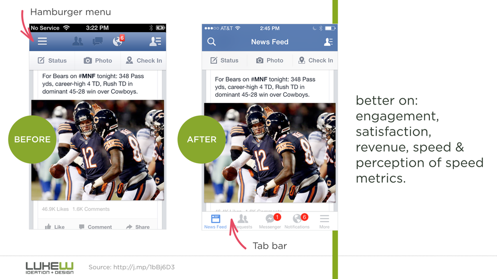
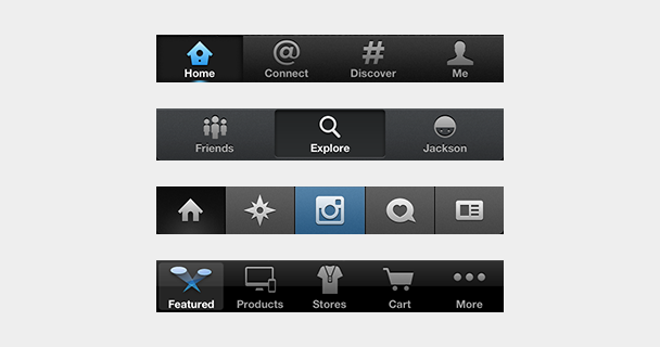
Proposed Solution: the Tab Bar!

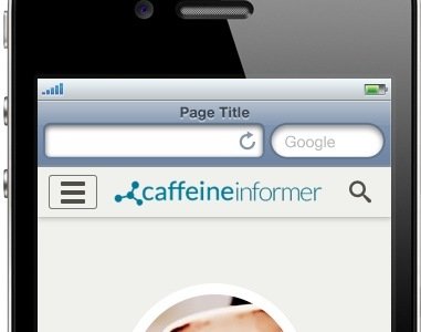
Proposed Solution #2: Just don't make it look like a burger
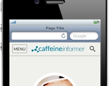

"
"
( http://exisweb.net/mobile-menu-abtest )
MAKE PEOPLE HAPPY

Further reading:
- http://littlebigdetails.com/
- http://thehipperelement.com/post/75476711614/ux-crash-course-31-fundamentals
- http://webdesign.tutsplus.com/series/ux-foundations--webdesign-8418
- http://m.repositori.upf.edu/bitstream/handle/10230/20943/CHI_mcmarcos.pdf?sequence=1