UI/UX + Frontend World
Nirajan Basnet
Frontend Developer
WEBO
/nirazanbasnet
Table of Contents
-
Introduction-
UI/UX and Frontend Development
-
-
Basic Usage of HTML and CSS-
Syntax, implementation and demo
-
-
Most Unseen mistakes-
Where UI meets actual real scenario
-
-
Solutions-
How we can be on both sides
-
-
Resources-
Let's get inspired
-
-
Summary-
Happy US !!
-
UI
-
Design of user interfaces for machines and software with the focus on maximizing the user experience.
-
The goal is to make the user's interaction as simple and user-centred design.
UX
-
Process design to provide meaningful and relevant experiences to users.
-
It involves the entire process of acquiring and integrating the product, including aspects of branding, design, usability and function
Frontend Development
-
Client-Side Development (HTML, CSS & JavaScript) for a website.
HTML
-
Hyper Text Markup Language -
Modification of the appearance of web pages, as well as making adjustments to their appearance. -
Structure and present content for the web.
-
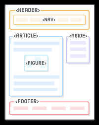
Use of proper semantic tags
HTML
<!doctype html>
<html class="no-js" lang="">

<head>
  <meta charset="utf-8">
  <title></title>
  <meta name="description" content="">
  <meta name="viewport" content="width=device-width, initial-scale=1">

  <link rel="manifest" href="site.webmanifest">
  <link rel="apple-touch-icon" href="icon.png">
  <!-- Place favicon.ico in the root directory -->

  <link rel="stylesheet" href="css/normalize.css">
  <link rel="stylesheet" href="css/main.css">

  <meta name="theme-color" content="#fafafa">
</head>

<body>
  <!--[if IE]>
    <p class="browserupgrade">You are using an <strong>outdated</strong> browser. Please <a href="https://browsehappy.com/">upgrade your browser</a> to improve your experience and security.</p>
  <![endif]-->

  <!-- Add your site or application content here -->
  <p>Hello world! This is HTML5 Boilerplate.</p>

  <header>This is header</header>

  <main>
  	This is main container
  </main>

  <footer>This is header</footer>
  <script src="js/main.js"></script>
</body>

</html>-
Semantic HTML elements clearly describe it's meaning in a human and machine-readable way. -
Such as <header>, <footer>, <article>
-
They describe the purpose on the element and the type of content that is inside them
HTML
CSS
CSS
-
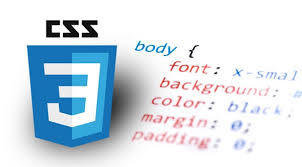
Cascading Style Sheets -
Describes how HTML elements are to be displayed on the screen, paper, or in other media
-
Controls the layout of multiple web pages all at once
CSS
-
It defines styles for your web pages, including the design, layout in display for different devices and screen sizes.
Syntax

CSS
.card {
	display: inline-block;
	width: 480px;
	margin: 16px auto;
	font-size: 16px;
	text-decoration: none;
	overflow: hidden;
	box-shadow: 0 0 3rem -1rem rgba(0,0,0,0.5);
	transition: transform 0.1s ease-in-out, box-shadow 0.1s;
}

.card:hover {
	transform: translateY(-0.5rem) scale(1.0125);
	box-shadow: 0 0.5em 3rem -1rem rgba(0,0,0,0.5);
}

.card-description {
	display: block;
	padding: 10px 16px;
	color: #515151;
	text-decoration: none;
}
Simple Card UI component

Most commonly unseen mistakes
1. Don't Design Too much
1. Don't Design Too much
-
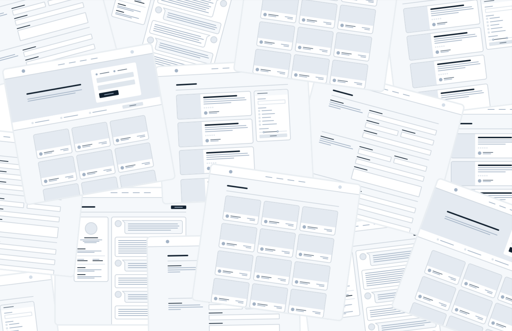
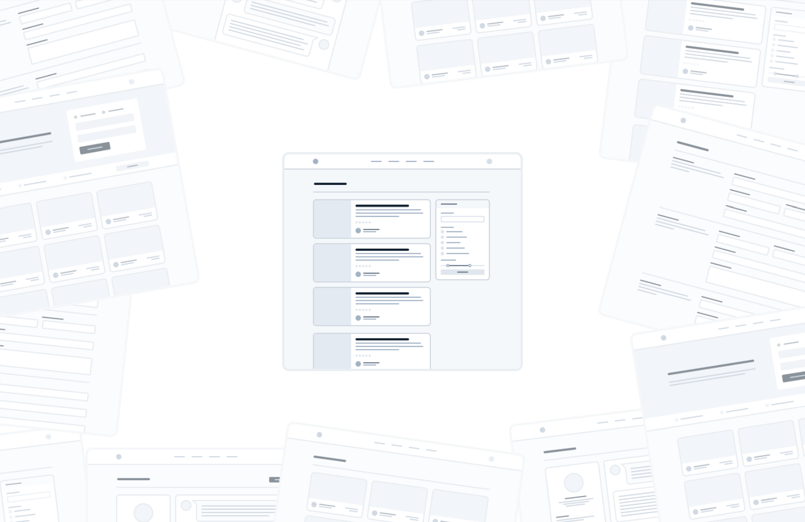
You don’t need to design every single feature in an app before you move on to implementation; in fact, it’s better if you don’t.
-
Figuring out how every feature in a product should interact and how every edge case should look is really hard, especially in the abstract.
-
You’re setting yourself up for frustration by trying to figure this stuff out using only a design tool and your imagination.
Work in Cycles
1. Don't Design Too much
1. Don't Design Too much
-
Instead of designing everything up front, work in short cycles.
-
Start by designing a simple version of the next feature you want to build.
-
You’ll probably run into some unexpected complexity, but that’s the point — it’s a lot easier to fix design problems in an interface you can actually use than it is to imagine every edge case in advance.
2. Be a Pessimist
-
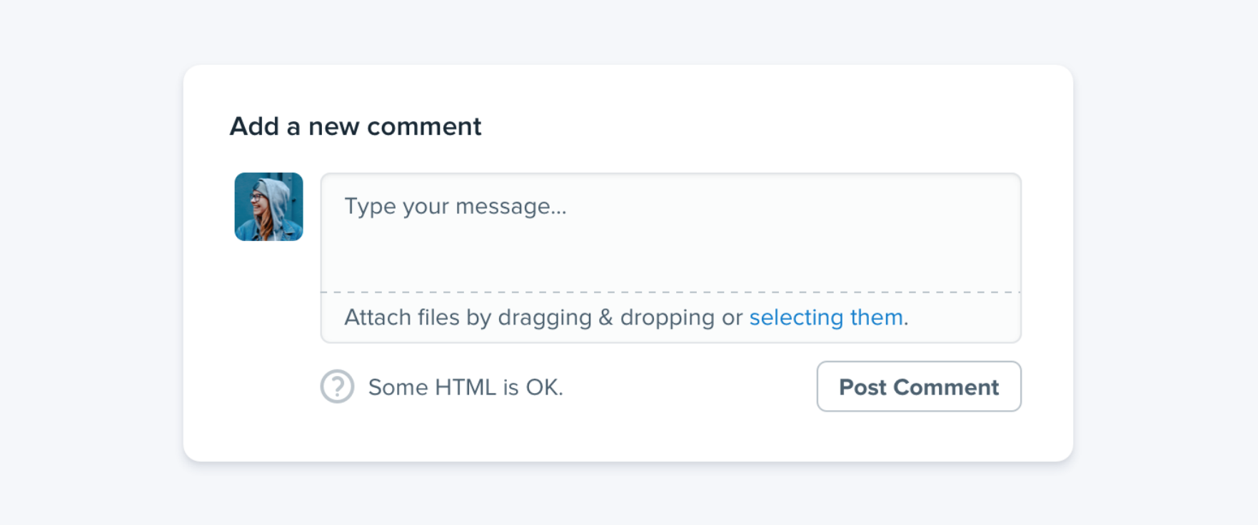
Don’t imply functionality in your designs that you aren’t ready to build.
2. Be a Pessimist
-
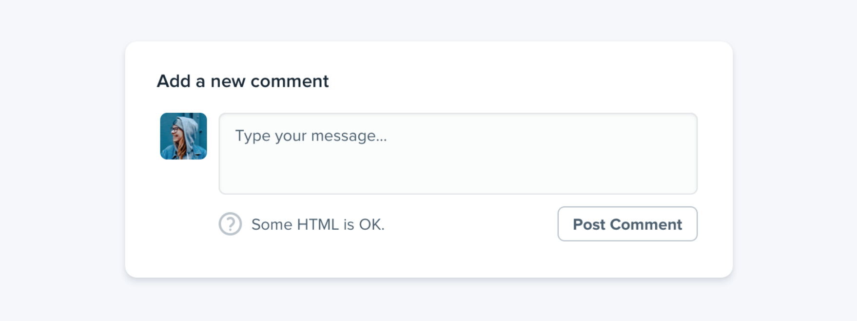
For example, say you’re working on a comment system for a project management tool. -
The thing is, a comment system with no attachments would still have been better than no comment system at all, but because you planned to include it from day one you’ve got nothing you can ship.
-
Designing the smallest useful version you can ship reduces that risk considerably
-
If part of a feature is a “nice-to-have”, design it later.
2. Be a Pessimist
3. Limit your Choices
-
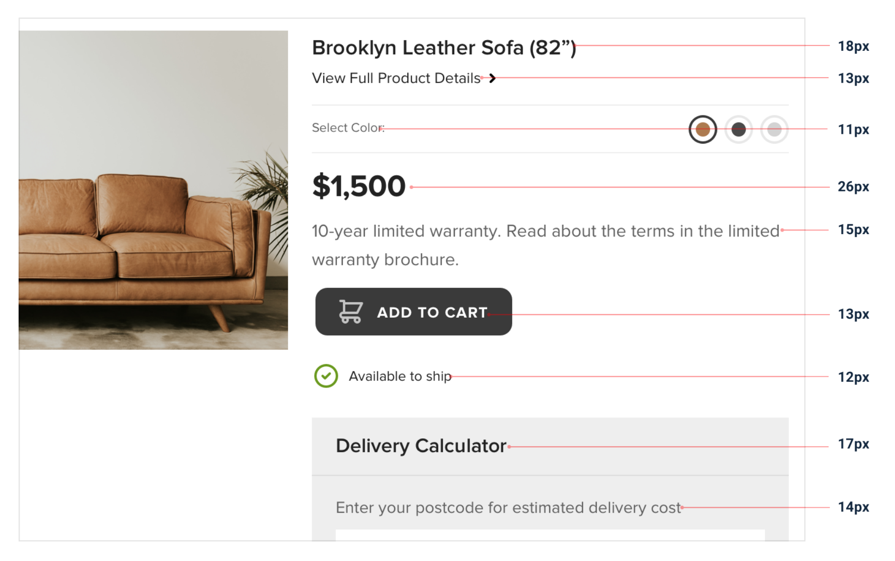
Should this text be 12px or 13px? -
Should this box shadow have a 10% opacity or a 15% opacity? -
Should this avatar be 24px or 25px tall? -
Should I use a medium font weight for this button or semibold? -
Should this headline have a bottom margin of 18px or 20px?-
When you’re designing without constraints, decision-making is torture because there’s always going to be more than one right choice.
-
-
Define systems in advance-
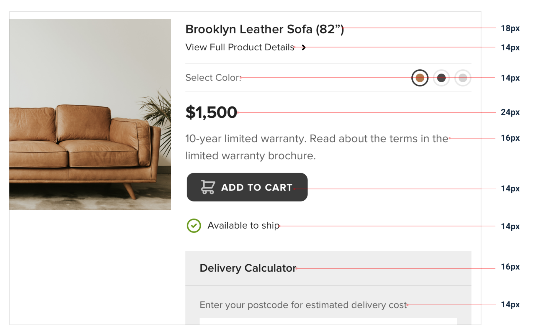
Instead of hand-picking values from a limitless pool any time you need to make a decision, start with a smaller set of options
-
3. Limit your Choices
-
You’ll want systems for things like:-
• Font size • Font weight • Line height • Color • Margin • Padding • Width • Height • Box shadows • Border radius • Border width • Opacity
-
-
When you build systems like this, you only have to do the hard work of picking the initial values once instead of every time you’re designing a new piece of UI.
4. Size isn't everything
-
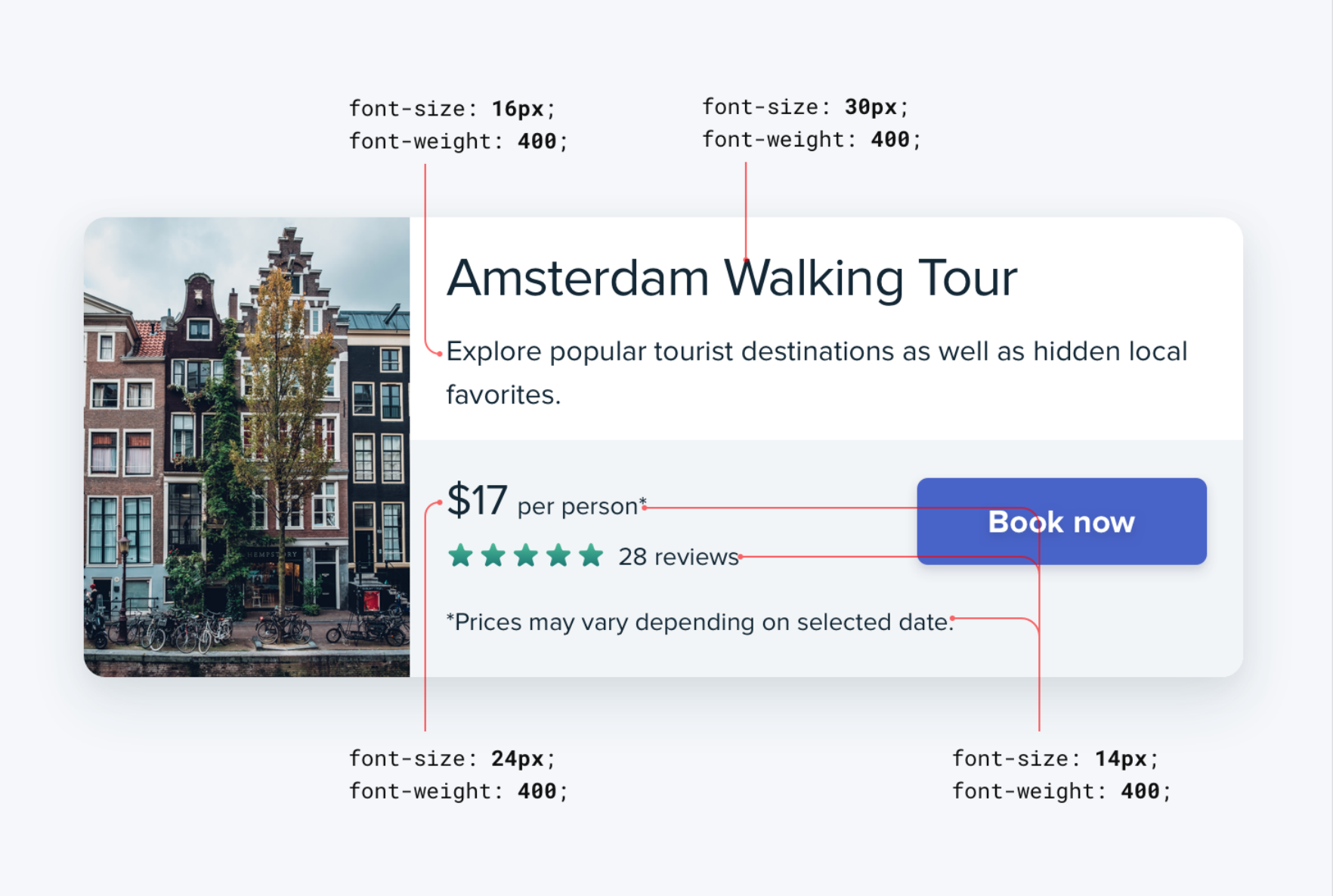
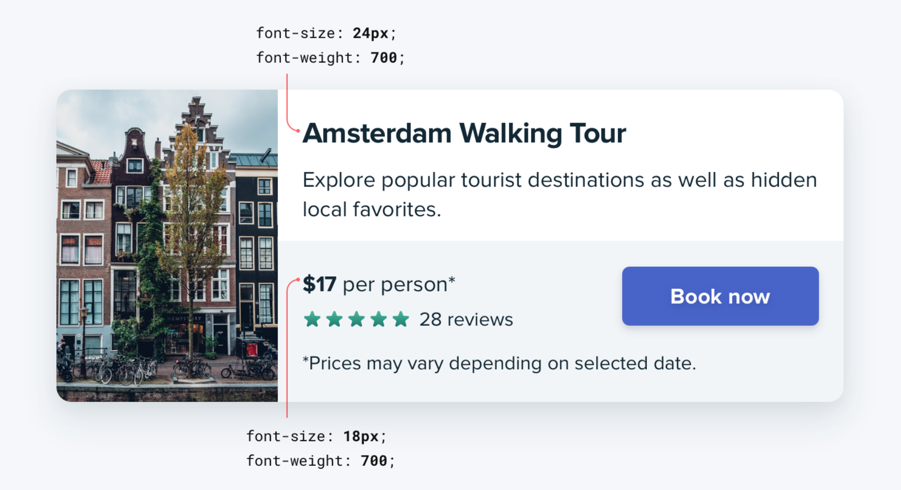
Relying too much on font size to control your hierarchy is a mistake
4. Size isn't everything
4. Size isn't everything
4. Size isn't everything
5. Layout and Spacing
-
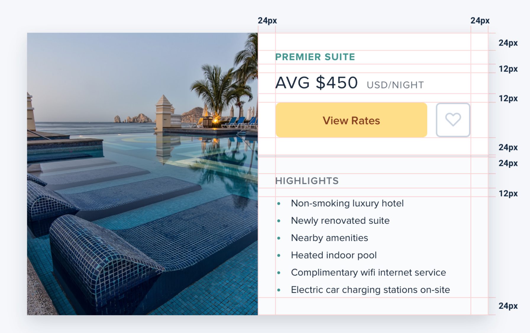
You shouldn’t be nitpicking between 120px and 125px when trying to decide on the perfect size for an element in your UI. Painfully trialing arbitrary values one pixel at a time will drastically slow you down at best, and create ugly, inconsistent designs at worst
5. Layout and Spacing

5. Layout and Spacing
-
Instead, limit yourself to a constrained set of values, defined in advance.
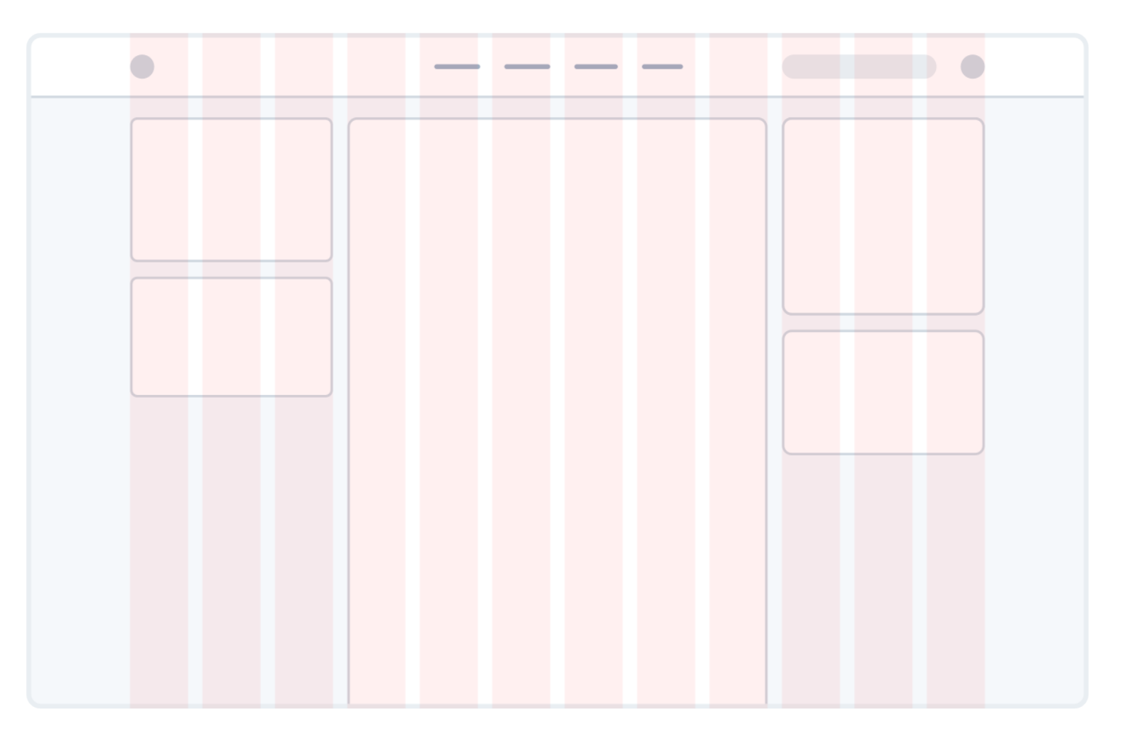
6. Set up proper Grids
-
Using a system like a 12-column grid is a great way to simplify layout decisions, and can bring a satisfying sense of order to your designs.
6. Set up proper Grids
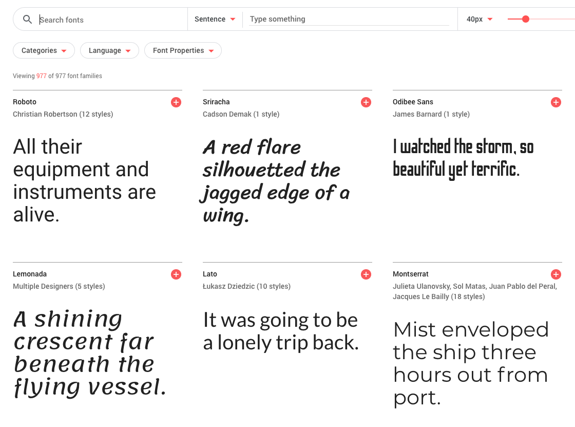
7. Choose Good fonts (google fonts - Besafe)
8. Proper Assets of icons and Images
9. COLOR Palette
(Hold the color)
10. Communication
11. Tips & Tricks
-
Explore UI on Dribbble -
Follow Design channels on YOUTUBE -
Explore the frontend Design on Themeforest -
Play the design on Codepen
-
Participate on the meetups and communitites -
Follow design magazines
-
Take screenshots of the live websites and make categorisation to that
12. Summary
-
Communication is key -
Front-end can help you to design more realistic UIs and smooth the process between conceptualization and implementation. -
An advantages of having frontend world, they can speak the same language as the developers, design in the browser, and prototype their ideas. -
Can make more intelligent design decisions, better understanding of the possibilities, limitations, and the tradeoffs.
-
It’s important to have a developer’s perspective on design: understand what’s possible/impossible to create, and evaluate the effort required for the development.
Thankyou!!
Nirajan Basnet
Frontend Developer
WEBO
/nirazanbasnet