Pure CSS Drawings
林罡北
Eric Lin
ㄍ
ㄤ
with Stylus
Hello everyone
- NTOU 資工系
- 除了前後端,也開發android app
- 立志成為優秀的全端工程師
- 目前的肝還算新鮮...
Agenda
- Stylus introduction
- 主角介紹
- 常用CSS屬性
- 基本幾何
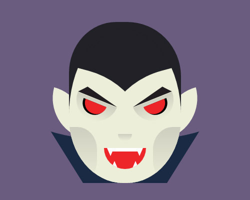
- Demo - Vampire
Stylus introduction

Stylus Basic Sytanx
body {
  font: 12px Helvetica, Arial, sans-serif;
}

a.button {
  -webkit-border-radius: 5px;
  -moz-border-radius: 5px;
  border-radius: 5px;
}
body
font: 12px Helvetica, Arial, sans-serif;
a.button
-webkit-border-radius: 5px;
-moz-border-radius: 5px;
border-radius: 5px;body
font: 12px Helvetica, Arial, sans-serif
a.button
-webkit-border-radius: 5px
-moz-border-radius: 5px
border-radius: 5pxbody
font 12px Helvetica, Arial, sans-serif
a.button
-webkit-border-radius 5px
-moz-border-radius 5px
border-radius 5px首先省略大括號
接著省略分號
最後冒號也一起省略
現在是CSS的語法
使用 mixins
border-radius()
  -webkit-border-radius arguments
  -moz-border-radius arguments
  border-radius arguments

body
  font 12px Helvetica, Arial, sans-serif

a.button
  border-radius(5px)
今天的主角
usually used CSS property
div{
      transform: rotate()  or  translate() or skew();
      border-radius: 10% 20% 20% 10% / 40% 50% 50% 40%;
      border-top/left/right/bottom: 2px solid #444;

      box-shadow:8px -8px 0 10px #f19b2c;

      background: linear-gradient();
      background-image: linear-gradient();

      overflow:hidden;

      position:relative or absolute;
      z-index: 1;
}
CSS基本幾何
Rectangle
Circle
Rectangular Triangle
Triangle
Trapezoid
Oval
2步驟畫出圖形
1. 先找出基本幾何圖形
2. 剩下的想辦法用基本幾何拼出來啊!!!!!!
- 形狀
- 顏色
Vampire
=
+
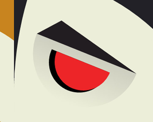
半圓形眼袋&眼睛
半圓形
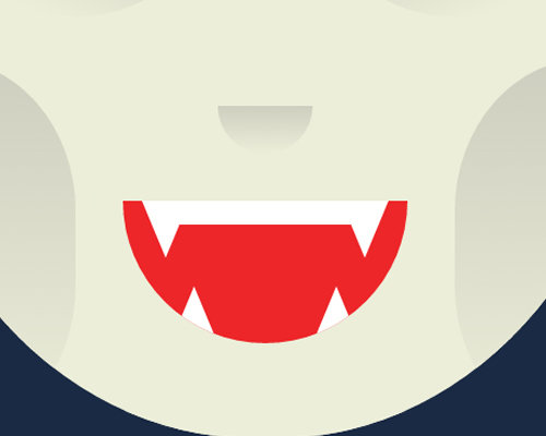
三角形眉毛
三角形牙齒
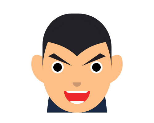
Vampire - cheek
CSS Animation
Reference
THE END
thanks for your attention