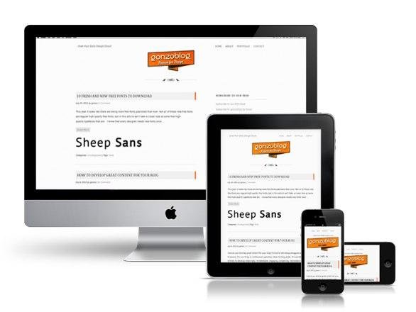
Media Queries in JS
Media Queries - What (Что)??
A media query consists of a media type and an expression/s
Media Queries - Why (Почему)??
Let the presentation of content be tailored to a specific range of output devices without having to change the content itself.
Examples:
Media Queries - How (Как)?
- All - for all devices
- Print - for print preview mode
- Screen
- Speech - Intended for speech synthesizers
- TV and more...
A media query consists of a media type
And one or more expressions of media features
@media tv and (min-width: 700px) and (orientation: landscape) { ... }

//This selects the style when the aspect ratio is either 16:9 or 16:10.
@media screen and (device-aspect-ratio: 16/9), screen and (device-aspect-ratio: 16/10) { ... }Media Queries In JS
Media Queries in JS - Why?
- When you can't use them solely in css
The Naive Way
- Hold a set of rules
- Listen on window.resize and check on change
A Better way
- Using JS native support for media queries
(window.matchMedia)
matchMedia
- Create a media query list object representing the media query
var mql = window.matchMedia("(orientation: portrait)");3. Invoke the handler for the first time
queryHandler(mql);2. Add Listeners
function queryHandler(mql) {
  if (mql.matches) {
      /* The device is currently in portrait orientation */
  } else {
      /* The device is currently in landscape orientation */
  }
}

mql.addListener(queryHandler);
Angular Lib
We use matchmedia-ng - https://github.com/AnalogJ/matchmedia-ng
1. Define your app's breakpoints
2. Test your rules / Register your callbacks
var isTablet = matchmedia.isTablet();

var unregister = matchmedia.onTablet( function(mediaQueryList){
  var isTablet = mediaQueryList.matches;
});

// to unregister -  unregister();
