Recap: List of Topics
Descriptive Statistics
Probability Theory
Inferential Statistics
Different types of data
Different types of plots
Measures of centrality and spread
Sample spaces, events, axioms
Discrete and continuous RVs
Bernoulli, Uniform, Normal dist.
Sampling strategies
Interval Estimators
Hypothesis testing (z-test, t-test)
ANOVA, Chi-square test
Linear Regression
What are the different types of data?
How do we describe qualitative data?
Learning Objectives
How do we describe quantitative data?
How do we describe relationships between attributes?
What are the different types of data?
Nominal
Ordinal
Discrete
Continuous
Qualitative
Quantitative
Data
Types of Data
Color
Pattern
Size
Rating
Price
Discount
R
B
G


385
315.99
525.50
7.5%
30.5%
20%
Types of Data (example from e-commerce)


Color:
Pattern:
Size:
Rating:
R
B
G


Qualitative or categorical attributes are those which describe the object under consideration using a finite set of discrete classes

Qualitative Data

Color:
Pattern:
R
B
G


Nominal attributes are those qualitative attributes in which there is no natural ordering in the values that an attribute can take.

There is no natural ordering in these attributes

Qualitative Data: Nominal

Size:
Rating:
Ordinal attributes are those qualitative attributes in which there is a natural ordering in the values that an attribute can take

There is a natural ordering in these attributes

<
<


<
<


Qualitative Data: Ordinal

Nominal
Employee
Ordinal


Healthcare

Agriculture

Government
Gender
(M, F, Other)
Income Range
(Low, Med, High)
Disease
(Non-)Communicable
Health Risk
(Low, Med, High)
Crop Type
(Kharif, Rabi)
Farm Type
(Small, Med, Large)
Nationality
(Indian, Chinese, etc)
Opinion
(Agree, Neutral, Disagree)
Ordinal and Nominal Data: examples
Price:
No. of Buttons:
385
525.50
12
15
17
Days for Delivery:
Discount:
2
4
5
7.5%
30.5%
20%
All of the above attributes have numerical values

Quantitative Data
315.99

Whole Numbers:
0, 1, 2, 3 ...
(No Fractions, No negatives)
Integers:
Rational Numbers:
Irrational Numbers:
Real Numbers:
-5, -4, -3...0...3, 4, 5 (No Fractions)
Ratio of 2 integers (1/2, 1/3, 2/1, 3/1)
Cannot be expressed as ratio of 2 integers (π, √2)
Quick Recap of types of numbers
Rational + Irrational
Whole Numbers
0, 1, 2, 3
-4, -3...0...3, 4
(1/2, 1/3, 3/1)
Integers
Rational Numbers
Real Numbers
Irrational Numbers
Real Numbers
Quick Recap of types of numbers
(\pi, \sqrt2)
\subset
\subset
\subset
\subset
Quantitative attributes are those which have numerical values and which are used to count or measure certain properties of a population

Quantitative Data

Price:
No. of Buttons:
385
525.50
12
15
17
Days for Delivery:
Discount:
2
4
5
7.5%
30.5%
20%
315.99
Discrete attributes are those quantitative attributes which can take on only a finite number of numerical values (Integers)

Quantitative Data: Discrete

No. of Buttons:
12
15
17
Days for Delivery:
2
4
5
Continuous attributes refer to quantitative attributes which can take on fractional values (Real Numbers)

Quantitative Data: Continuous

Price:
385
525.50
Discount:
7.5%
30.5%
20%
315.99
Continuous
Discrete
income tax, gross salary
# projects, # family members
cholesterol level, sugar level
days of treatment,
weeks of pregnancy
Total yield, acres
# of Farmers,
# of crops farmed
GDP, GST, CGST
# of Citizens,
# of Villages
Discrete & Continuous Data:examples
Employee


Healthcare

Agriculture

Government
Ratings
Very
Poor
Poor
Okay
Good
Very Good
1
2
3
4
5
Why is this not discrete (quantitative)?
Although expressed as numbers the notion of distance here is not well-defined

VP
P
OK
G
VG
The distance b/w G & VG may not be the same as the distance between G & OK although the difference in the numeric rating may be the same

Ordinal (qualitative) v/s Discrete (quantitative)
The type of statistical analysis depends on the type of variable

Qualitative Attributes
What is the average color of all shirts in my catalogue?
What is the average nationality of students in this course?
What is the frequency of the color red?
Why bother about data types?
Qualitative Attributes
Regression Analysis
ANalysis Of VAriance (ANOVA)
Chi-square test
Why bother about data types?
The type of statistical analysis depends on the type of variable

Quantitative (Discrete) Attributes
What is the average value in the dataset?
What is the frequency of a given value?
What is the spread of the data?
Regression Analysis
Why bother about data types?
The type of statistical analysis depends on the type of variable

52.35, 54.85, 62.10, 73. 25, 58.72, 56.15, 62.45, 68.75, 69.35, 73.50, 74.45, 75.30, 53.45, 57.75
Why bother about data types?
The type of statistical analysis depends on the type of variable

Quantitative (Continuous) Attributes
What is the average value in the dataset?
What is the frequency of a given value?
What is the spread of the data?
Regression Analysis
Nominal
Ordinal
Discrete
Continuous
Qualitative
Quantitative
Data
Summary: Types of Data
Exercise: Find examples of each type data of in the following domains: banking, insurance, education, healthcare, government, retail, sports, agriculture, automobile
How to describe qualitative data?
The values of categorial data types keep repeating in the data


bowled, lbw, caught, lbw, bowled, lbw, caught, caught
Repeating values

kharif, rabi, rabi, kharif, all-season, kharif, all-season
red, green, green, yellow, blue, red, blue, yellow, green, blue
How many times does the color red appear?
How many times does lbw appear ?
The count of the total number of times a value appear in the data is called its frequency

Frequency of a value
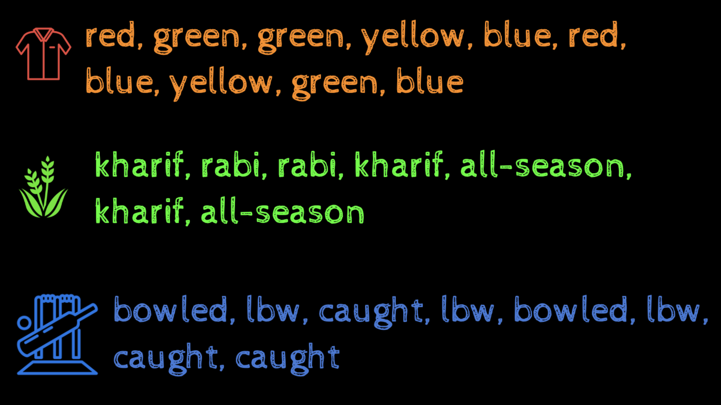
How many kharif crops are there in our data ?
| Match # | Runs | Mins | Strike Rate | Pos | Dismissal | Oppn | Ground | Date |
|---|---|---|---|---|---|---|---|---|
| 0 | 0 | 0 | 0.00 | 5 | caught | Pakistan | Gujranwala | 18 Dec 1989 |
| 1 | 0 | 2 | 0.00 | 5 | caught | New Zealand | Dunedin | 1 Mar 1990 |
| 2 | 36 | 51 | 92.3 | 6 | caught | New Zealand | Wellington | 6 Mar 1990 |
| 3 | 10 | 15 | 63.33 | 5 | run out | Sri Lanka | Sharjah | 25 Apr 1990 |
| 4 | 20 | 31 | 60.00 | 7 | caught | Pakistan | Sharjah | 27 Apr 1990 |
| 5 | 19 | 38 | 54.28 | 4 | bowled | England | Leeds | 18 Jul 1990 |
| ... ... | ... ... | ... ... | ... ... | ... ... | ... ... | ... ... | ... ... | ... ... |
| ... ... | ... ... | ... ... | ... ... | ... ... | ... ... | ... ... | ... ... | ... ... |
Dismissal and Opposition are Categorical attributes
Example: Sachin Tendulkar ODIs
| Match # | Runs | Mins | Strike Rate | Pos | Dismissal | Oppn | Ground | Date |
|---|---|---|---|---|---|---|---|---|
| 0 | 0 | 0 | 0.00 | 5 | caught | Pakistan | Gujranwala | 18 Dec 1989 |
| 1 | 0 | 2 | 0.00 | 5 | caught | New Zealand | Dunedin | 1 Mar 1990 |
| 2 | 36 | 51 | 92.3 | 6 | caught | New Zealand | Wellington | 6 Mar 1990 |
| 3 | 10 | 15 | 63.33 | 5 | run out | Sri Lanka | Sharjah | 25 Apr 1990 |
| 4 | 20 | 31 | 60.00 | 7 | caught | Pakistan | Sharjah | 27 Apr 1990 |
| 5 | 19 | 38 | 54.28 | 4 | bowled | England | Leeds | 18 Jul 1990 |
| ... ... | ... ... | ... ... | ... ... | ... ... | ... ... | ... ... | ... ... | ... ... |
| ... ... | ... ... | ... ... | ... ... | ... ... | ... ... | ... ... | ... ... | ... ... |
Example: Sachin Tendulkar ODIs
How often did Sachin get bowled?
Against which team did he score centuries?
Type of dismissal
Frequency
Caught
... (258)
Bowled
... (68)
Not Out
... (40)
lbw
... (39)
Frequency Tables
... ...
... ...
Opposition
Centuries
Australia
(9)
Sri Lanka
(8)
New Zealand
(5)
Pakistan
(5)
Frequency Tables
#centuries v/s opposition
type of dismissal
Horizontal Axis: values of the categorical attribute
Vertical Axis: Counts of these values
Height of bar proportional to count
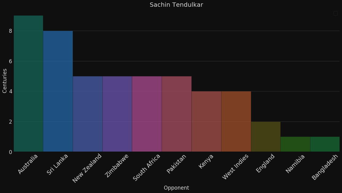
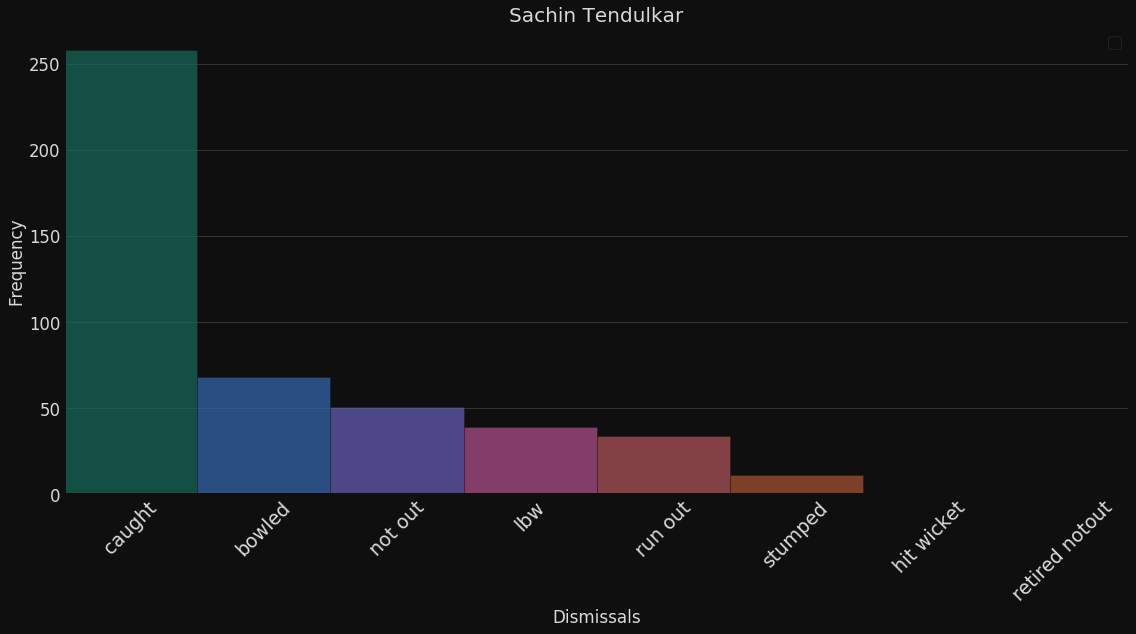
Frequency Plots
How many farms have planted rice?
How many crops grow during the Kharif season?
| State_Name | Crop_Year | Season | Crop | Area | Production |
|---|---|---|---|---|---|
| Andaman & Nicobar | 2000 | Kharif | Arecanut | 1254.0 | 2000 |
| Andaman & Nicobar | 2000 | Kharif | Other Kharif Pulses | 2.0 | 1 |
| Andaman & Nicobar | 2000 | Kharif | Rice | 102.0 | 321 |
| Andaman & Nicobar | 2000 | Whole Year | Banana | 176.0 | 641 |
| Assam ... | |||||
| .... | |||||
| Maharashtra | |||||
| Tamil Nadu | |||||
| Tamil Nadu |
Example: Agriculture
Categorical
Which is the 7th most grown crop in the country?
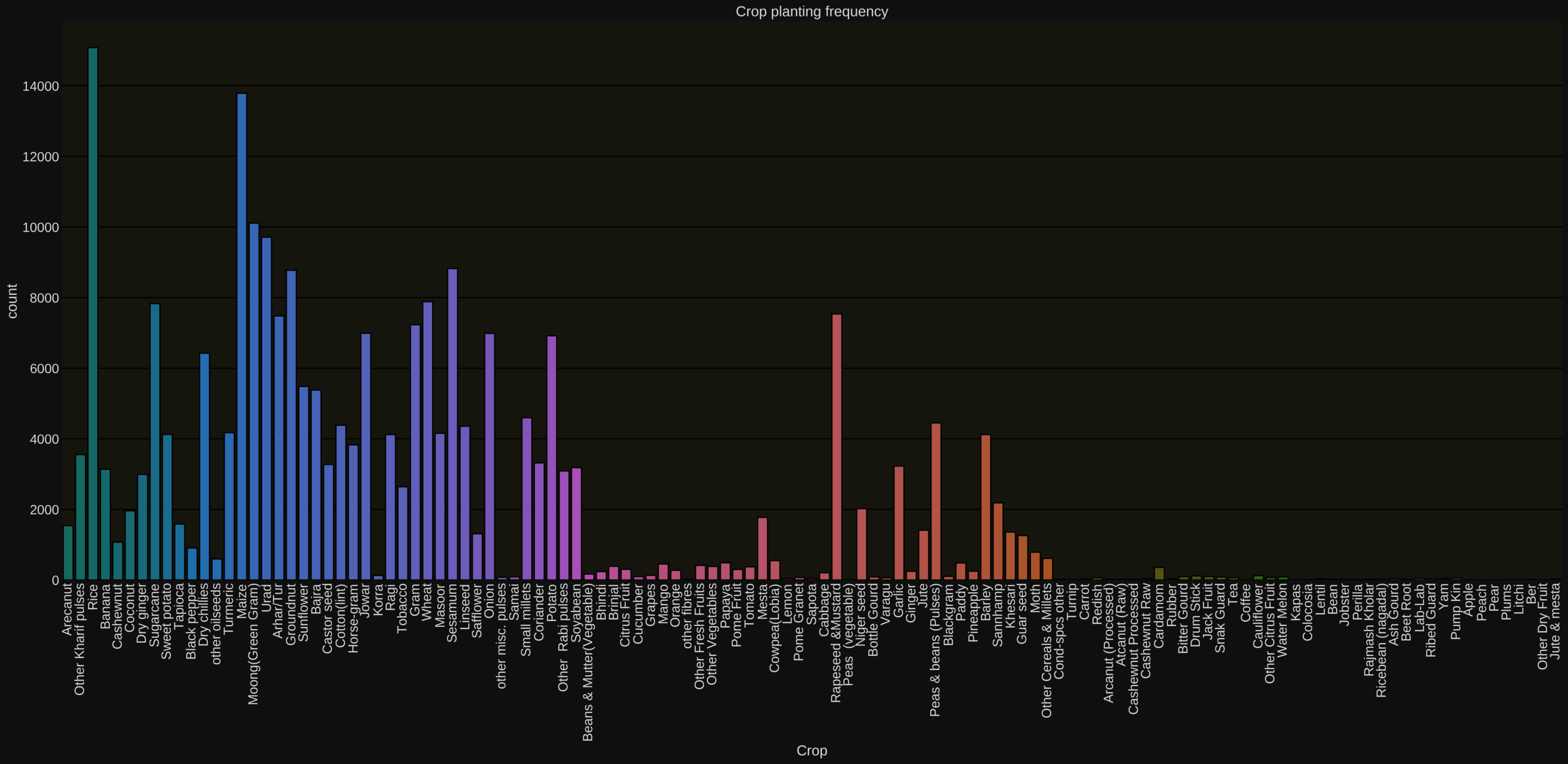
Example: Agriculture (Frequency Plots)
Hard to answer
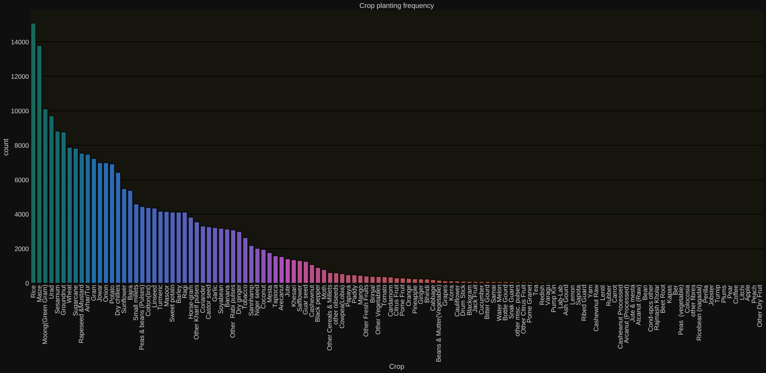
Sort the values by their counts for better visualisation

Example: Agriculture (Frequency Plots)

Long Tailed Distribution
- A large number of tall bars at the beginning
- A large number of short bars at the end
- Very common in many real world scenarios
Frequency Plots (Long-Tailed Distributions)
\overbrace{~~~~~~~~~~~~~~~~~~~~~~~~~~~~~~~~~~~~}
Frequency v/s crop type
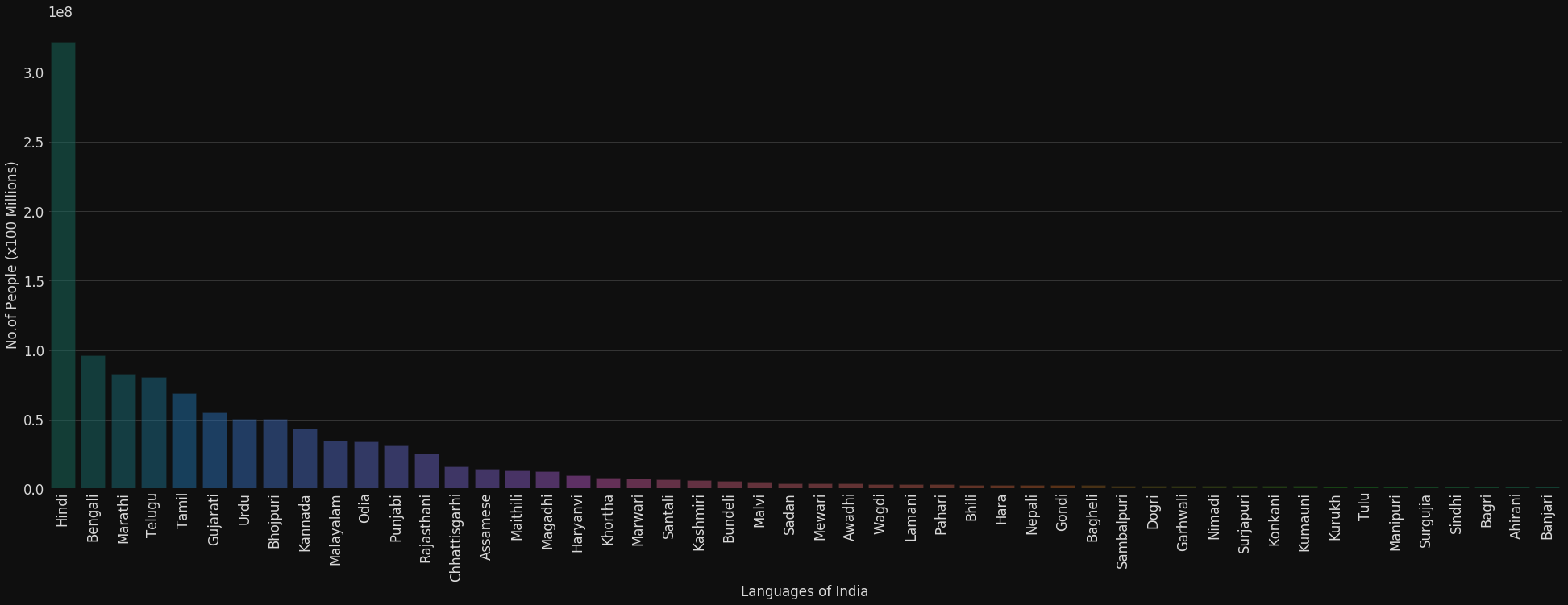
Long Tailed Distribution
\overbrace{~~~~~~~~~~~~~~~~~~~~~~~~~~~~~~~~~~~~}
Frequency Plots (Long-Tailed Distributions)
- Very common in many real world scenarios
Languages spoken in India
#People (x 100 million)
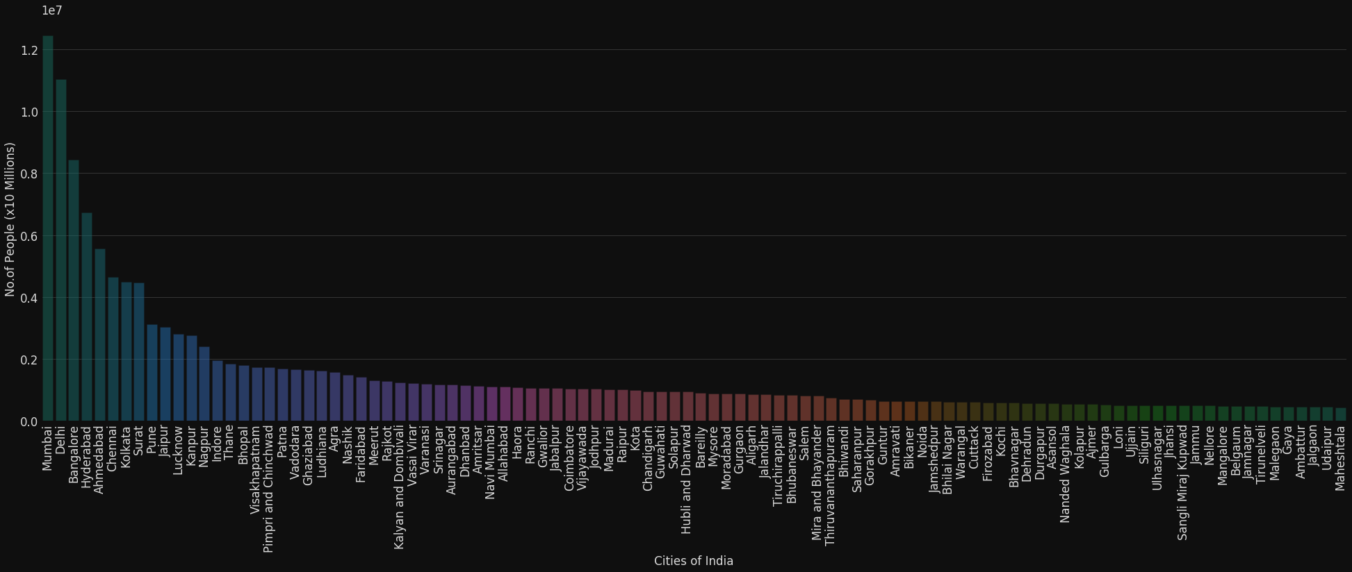
Long Tailed Distribution
\overbrace{~~~~~~~~~~~~~~~~~~~~~~~~~~~~~~~~~~~~}
Frequency Plots (Long-Tailed Distributions)
- Very common in many real world scenarios
Cities in India
#People (x 10 million)
Frequency Plots (Uniform Distributions)
All bars have equal height
\overbrace{~~~~~~~~~~~~~~~~~~~~~~~~~~~}
Die Faces
Frequency
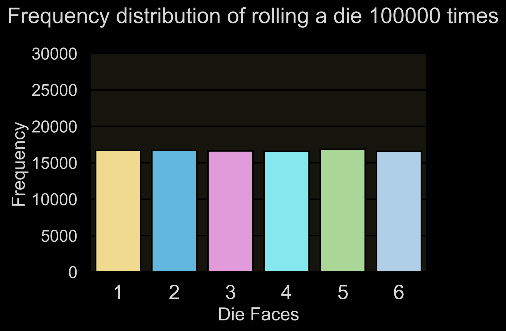
Frequency Plots
Exercise: Think of examples of categorical data which have long-tailed or uniform distributions in each of the following domains: banking, insurance, education, healthcare, government, retail, sports, agriculture, automobile
Frequency Plots (some inadequacies)

Frequency v/s crop type
What percentage of farms grow groundnut?
Hard to answer
Solution: Use relative frequency plots
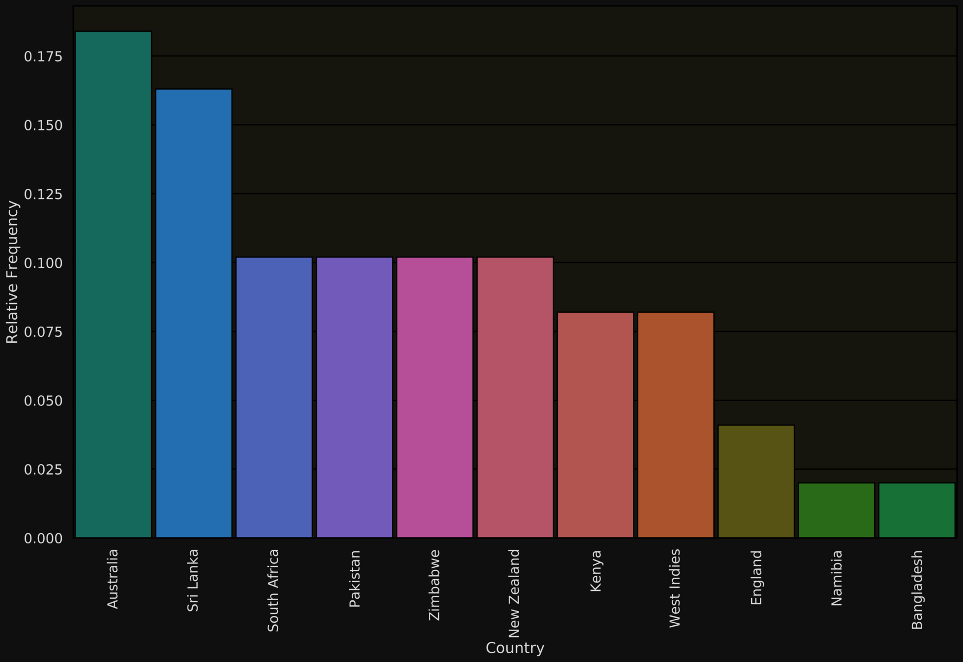
| Opposition | Frequency | Relative Frequency |
|---|---|---|
| Austraila | 9 | |
| Sri Lanka | 8 | |
| South Africa | 5 | |
| Pakistan | 5 | |
| Zimbabwe | 5 | |
| New Zealand | 5 | |
| Kenya | 4 | |
| West Indies | 4 | |
| England | 2 | |
| Namibia | 1 | |
| Bangladesh | 1 | |
| Total | 49 |
(9/49) = 0.184
Relative Frequencies are easier to interpret than absolute frequencies

Relative Frequency Tables
(8/49) = 0.163
(5/49) = 0.102
(5/49) = 0.102
(5/49) = 0.102
(5/49) = 0.102
(4/49) = 0.081
(4/49) = 0.081
(2/49) = 0.041
(1/49) = 0.020
(1/49) = 0.020
Relative Frequencies are easier to interpret than absolute frequencies

Relative Frequency Plots
Country
% of centuries
Relative Frequencies are easier to interpret than absolute frequencies

Relative Frequency Plots
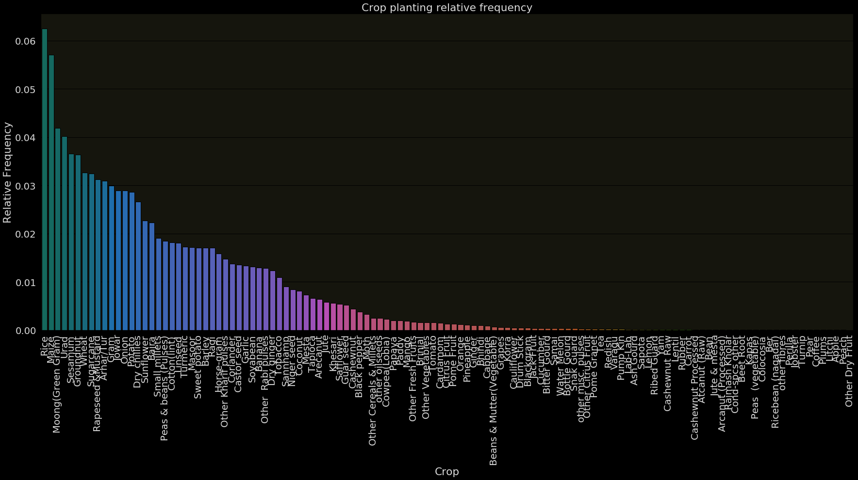
What percentage of farms grow groundnut?
Easy to answer!
Crop
Relative Frequency
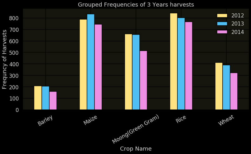
Compare different sets of data
Each bar corresponds to one set
Grouped Frequency Bar Charts
Has the farming pattern changed across years?
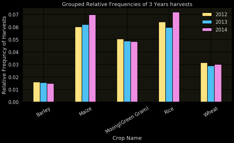
Grouped (Rel.) Frequency Charts
Has the farming pattern changed across years?
Earlier plot suggested that rice is no longer popular but this plot reveals the true picture

Feed 100 images of horses and giraffes
Count number of errors of each type
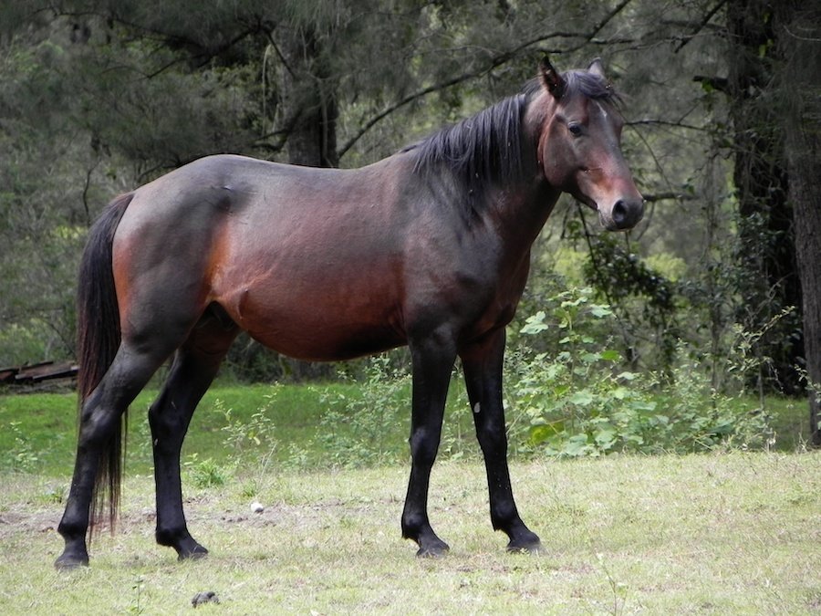
ML Algorithm
Horse
or
Giraffe


Image
Classification System
Frequency Plots in ML
1. Analysing errors in ML systems
Evaluation
Need more giraffe images for training ?

ML Algorithm
Horse
or
Giraffe


Image
Classification System
G
H
5
25
G
H
15
Need more horse images for training ?
G
H
5
25
Frequency Plots in ML
1. Analysing errors in ML systems
ML System
or
Sample Review
Typically we feed words from the review to the ML system
Which words to give as input?

Frequency Plots in ML
2. Designing features for a ML system
Frequency charts can help us identify discriminatory words

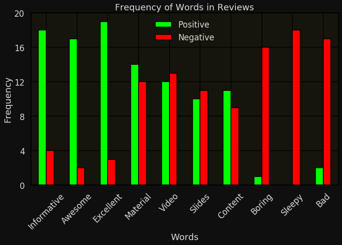
Frequency Plots in ML
2. Designing features for a ML system
How to describe quantitative data?
Primary Question:
What is the frequency of different categories?
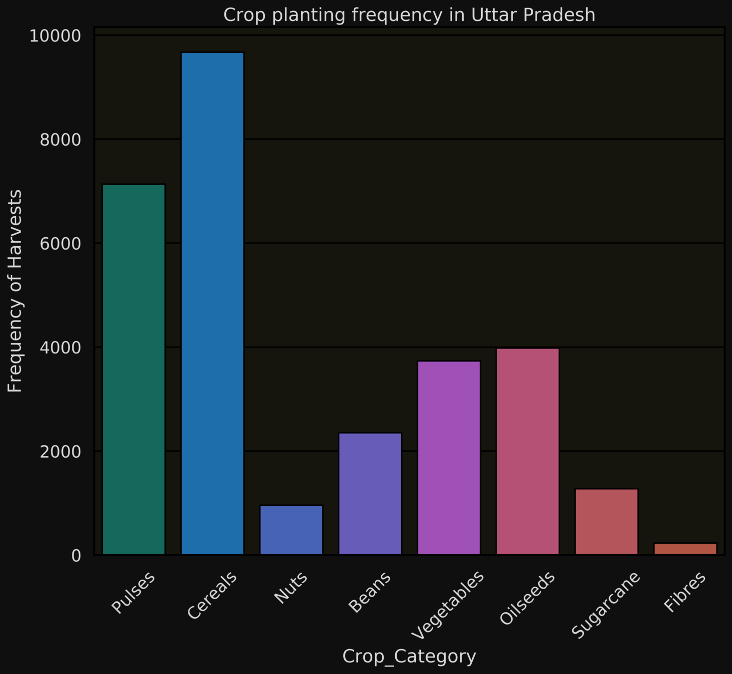
Does the same question make sense for quantitative data?

Recap: Describing qualitative data
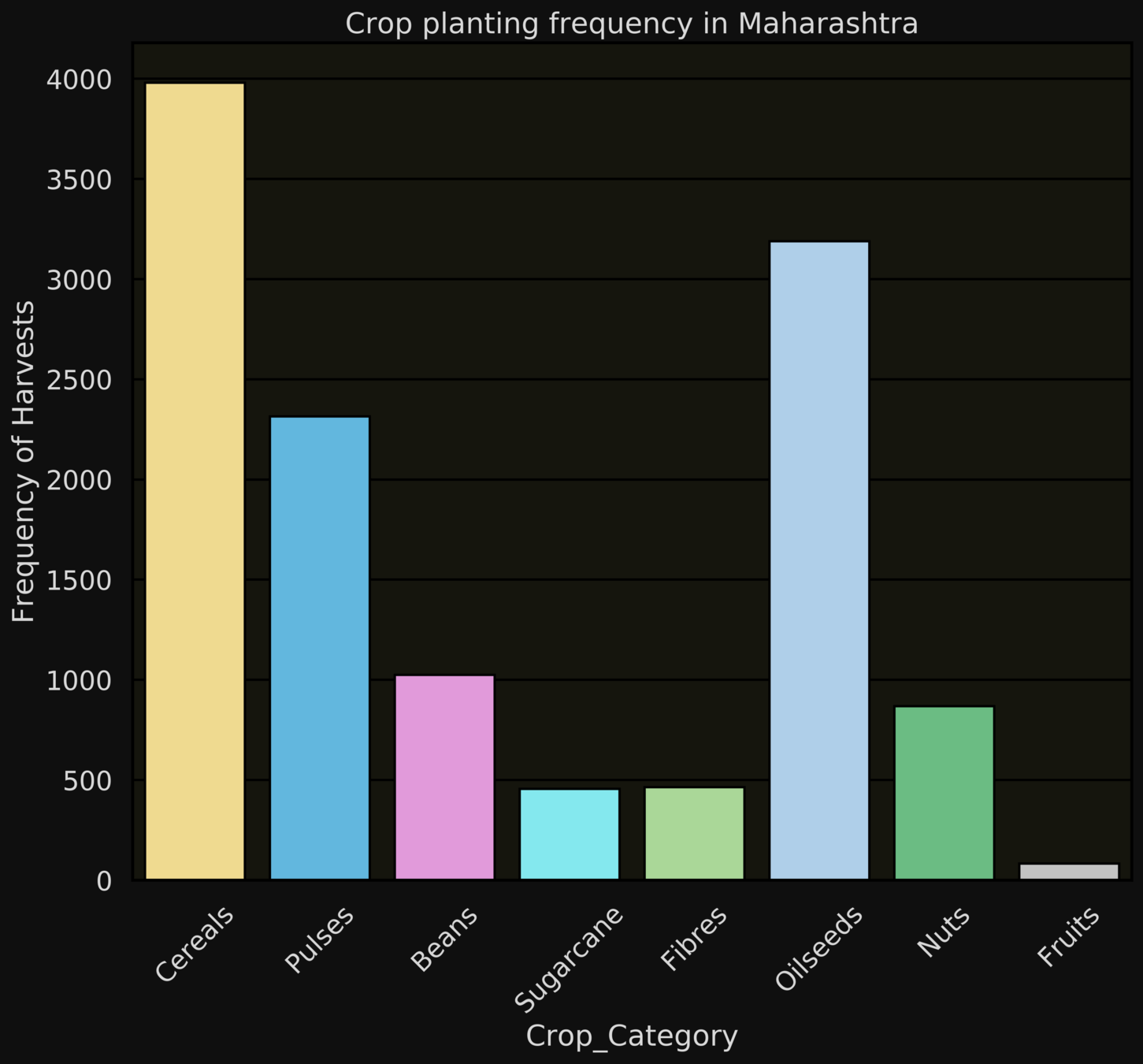
How many times did he get out on 0 or 49 or 99?

What are the frequencies of the values 0, 49, 99 ?
Example: Sachin Tendulkar ODIs
or
Primary Question:
What is the frequency of different values?
Values on the x-axis are now numbers instead of categories
There is a natural ordering of the values on the x-axis
Sort by value instead of frequency
Histograms
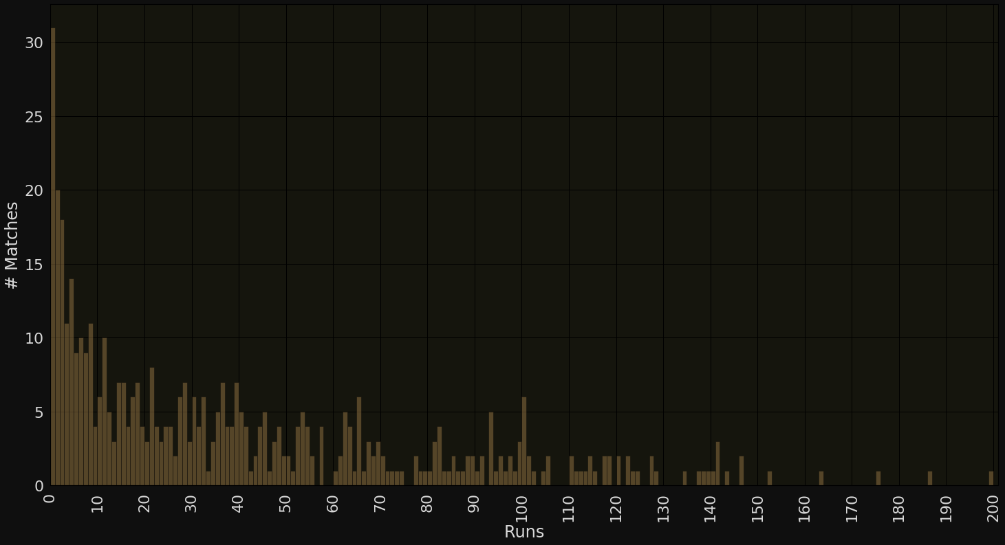
Runs
# Matches
What would the histogram of Sachin's scores look like?
Where would the tallest bar be?
Would there be some regions on the x-axis which would have a bar height of 0?
Histograms


Runs
# Matches
Looks like between 1 to 100, the only lucky numbers for Sachin were 56, 58, 59, 75, 76 and 92!!!

Histograms

Runs
# Matches
Too many unique values on the x-axis
Difficult to answer: How many times was he dismissed in 90s or single-digit scores?
Issues
Histograms


Runs
# Matches

Group values into bins: 0-9, 10-19...
Each bin will now show the sum of the frequencies of all values in it
Solution
Histograms
Runs
# Matches
The plot is now much easier to visualise although it hides some details (such as how many times did he score exactly 0 ?)

Histograms
Runs
# Matches
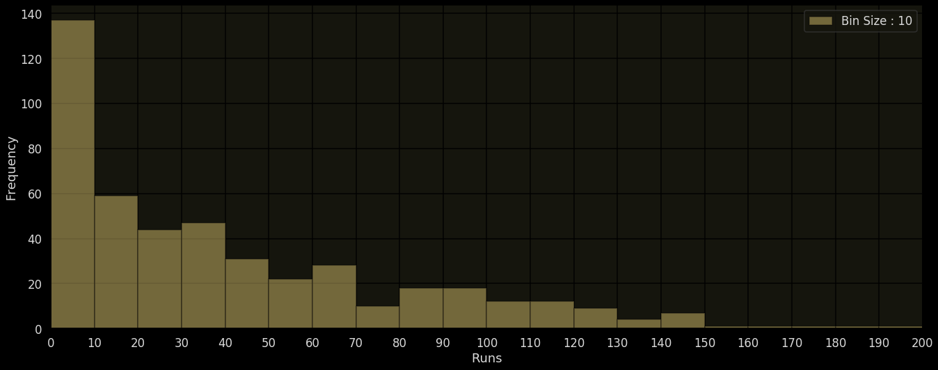
Bin Size: 10
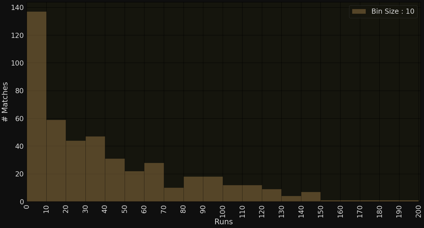
What about a bin size or class interval of 5?
1
10


Bin size (class interval)
Histograms (what is the right bin size?)
Bin Size: 10
Runs
# Matches

What about a bin size of 5? (too many bins?)
So should we just use a larger bin-size? 20, 40?
Histograms (what is the right bin size?)
Runs
# Matches
Bin Size: 5
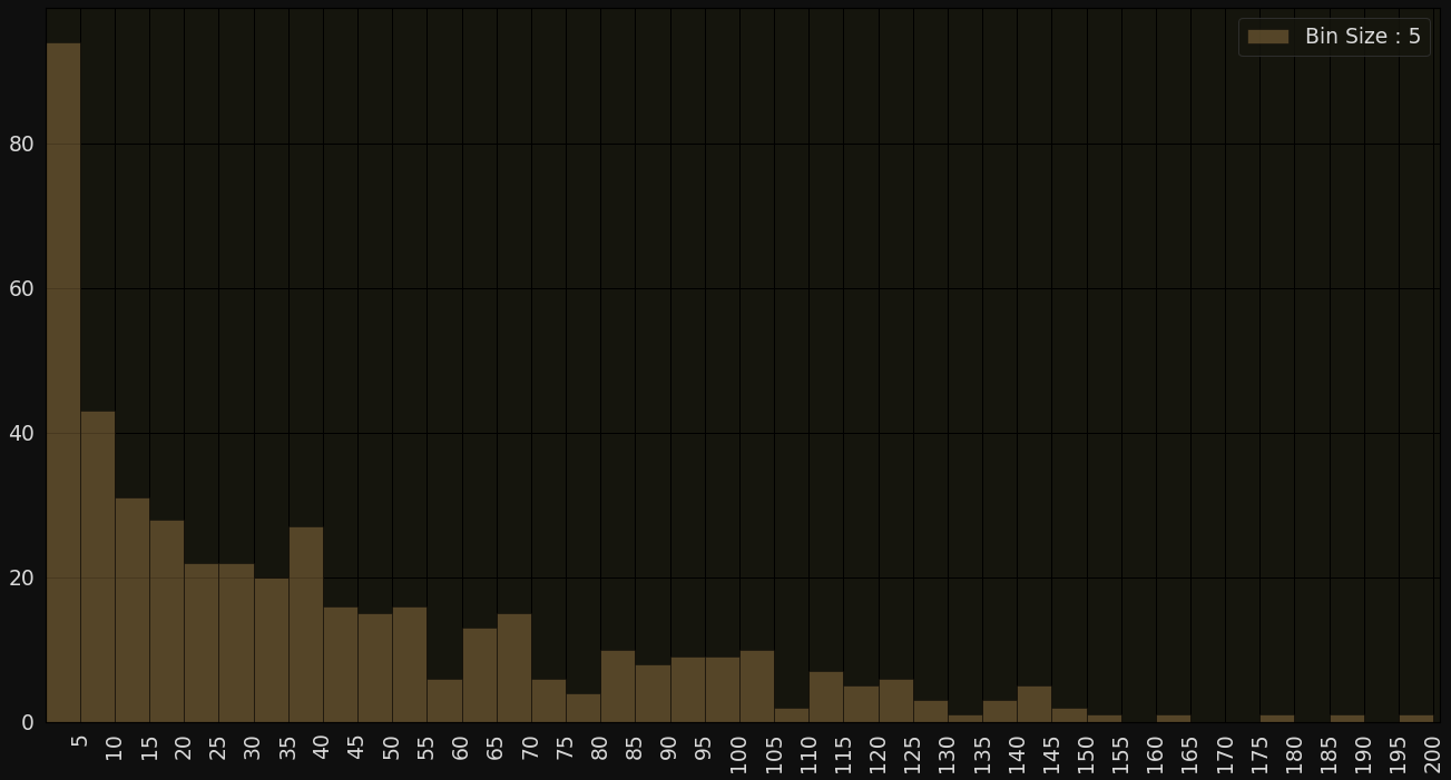


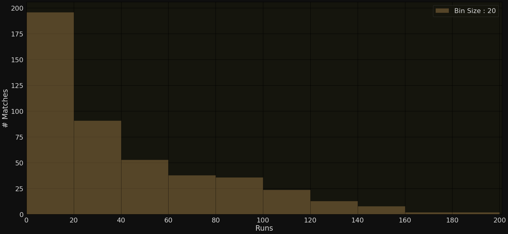
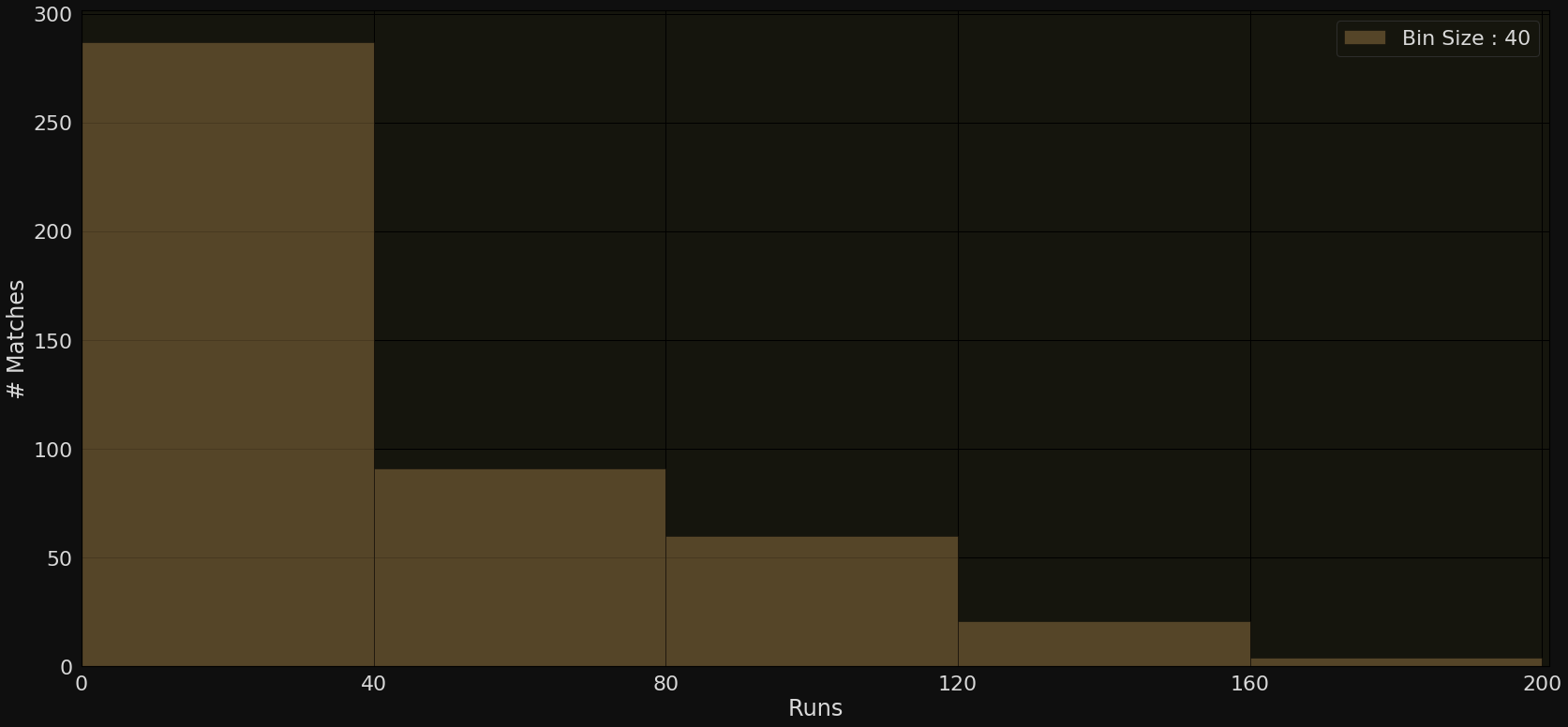
As we increase the bin size the granularity is compromised with very few details
Bin Size: 20
Bin Size: 40
Histograms (what is the right bin size?)
Runs
# Matches
Both extremes are bad

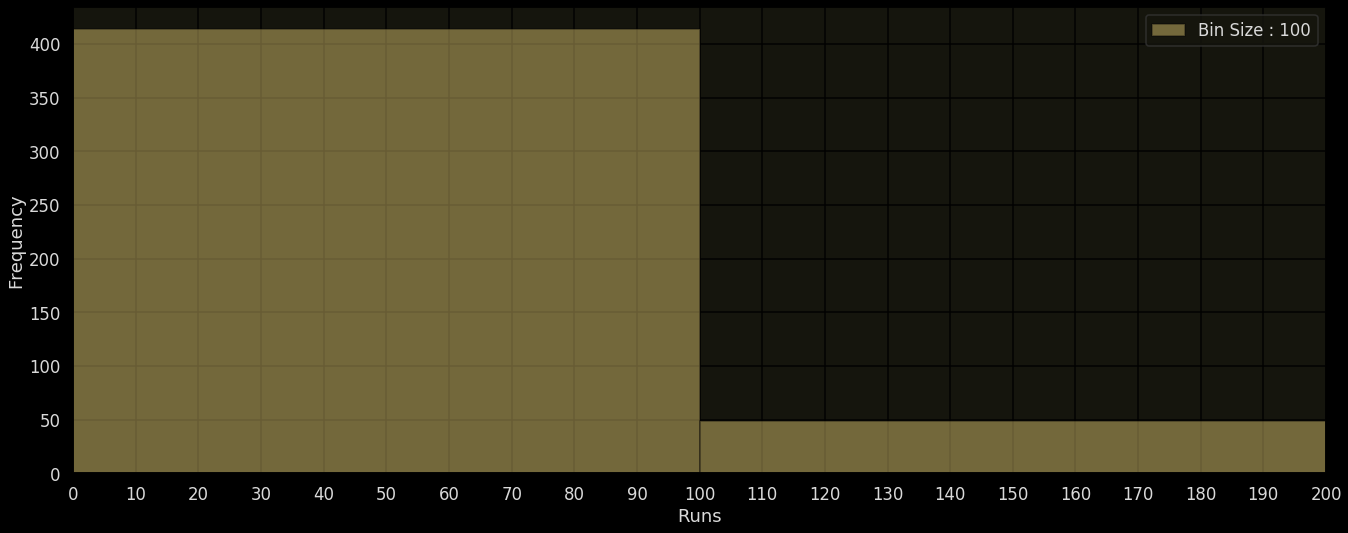
Histograms (what is the right bin size?)
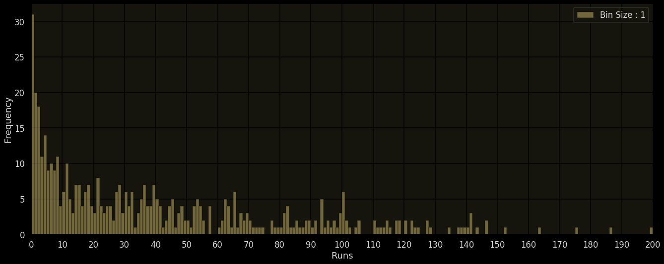
Bin Size: 1
Bin Size: 100
Bin size 1, 10, 100 or even 1000
Bin size: 10000
Total yield: 0 to 579441
Class interval or bin size also depends on the range of the data

Example: Agriculture (right bin size?)
Bin Size: 10000
Total yield
# Farms
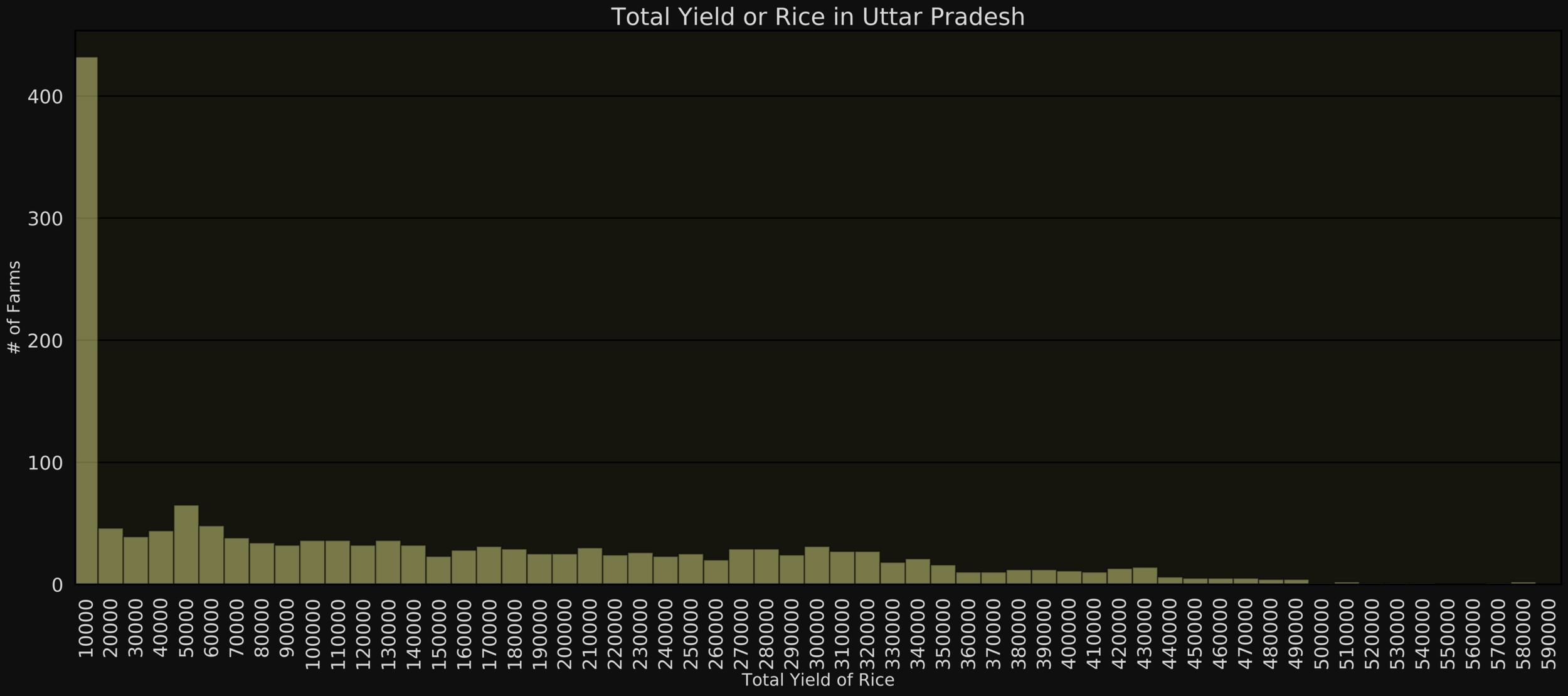
Total Yield of Rice in Uttar Pradesh


Bin Size: 1
Bin Size: 10
Histograms (what is the right bin size?)
Ideal bin size reveals meaningful patterns (neither hides not reveals too many details)

Bin Size: 100
Strike rate: Continuous attribute with fractional values
Histograms (for continuous data)


No interesting patterns since most of the values repeat only once
How about showing all unique values on the x-axis? (just as we did for bin size 1 for discrete data)
Histograms (for continuous data)
Strike Rate
# Matches
Use bins or class intervals instead
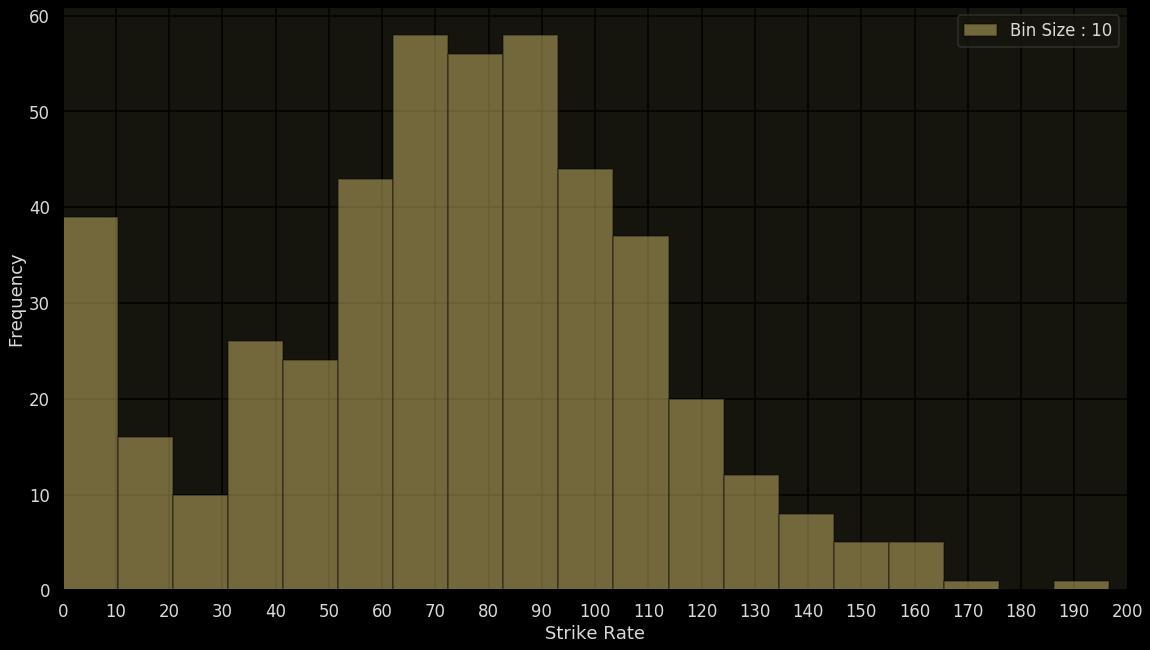
Choosing the right bin size can reveal interesting patterns

Bin Size: 10
Histograms (for continuous data)
Better approach
Strike Rate
# Matches
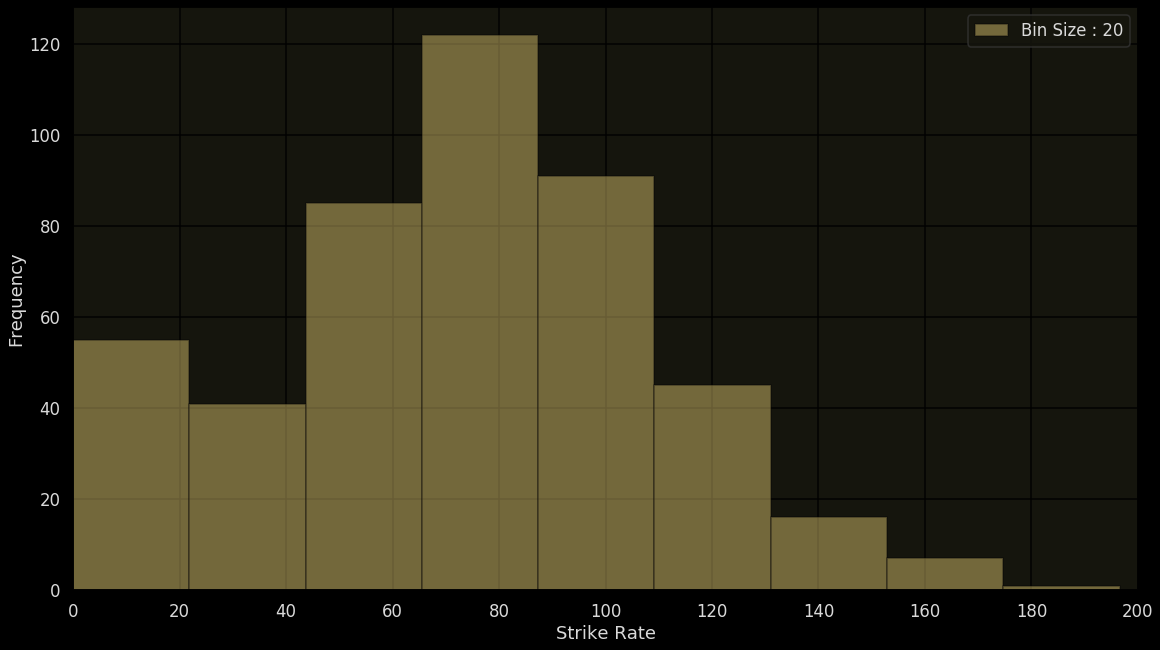
Choosing the right bin size can reveal interesting patterns

Histograms (for continuous data)
Bin Size: 20
Use bins or class intervals instead
Strike Rate
# Matches

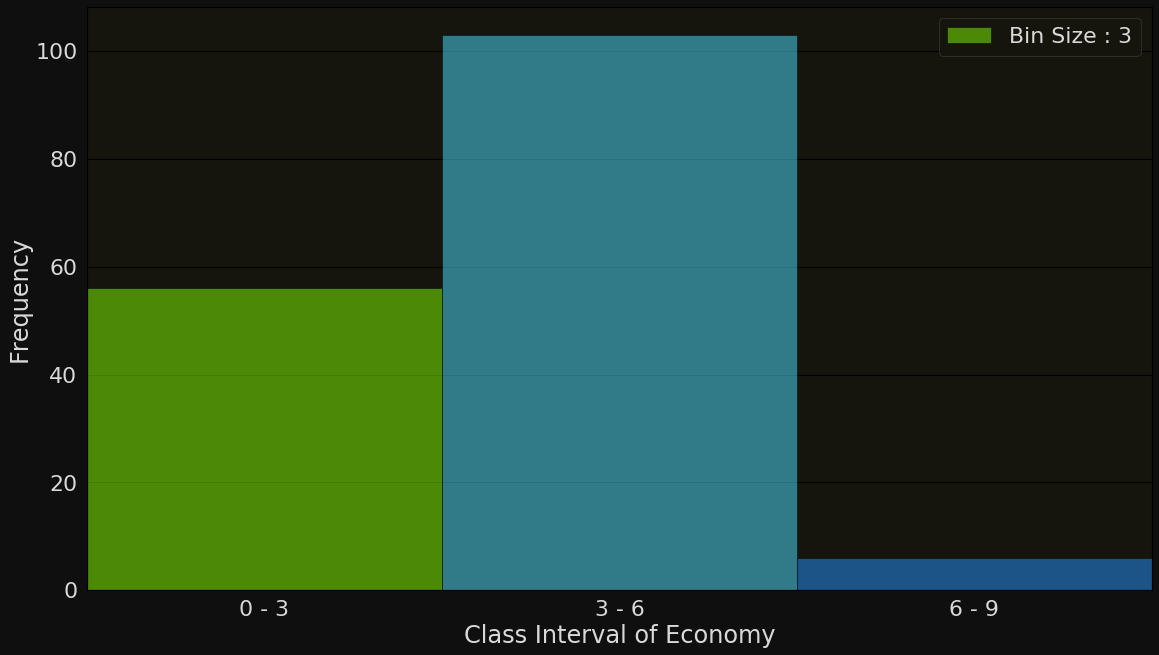
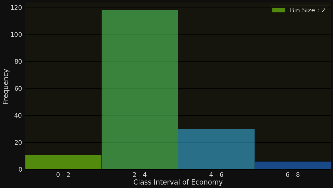
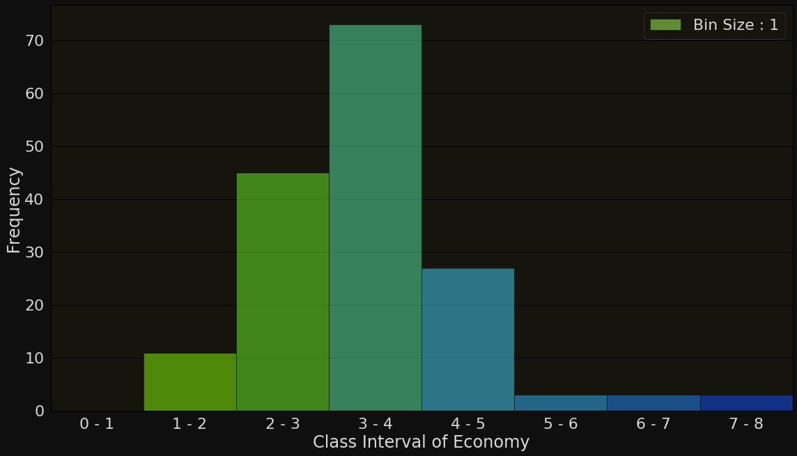
Bowler economy rate: Continuous attribute with fractional values
What is the right bin (class interval) size?
Example: Zaheer Khan bowler economy rate (right bin size?)


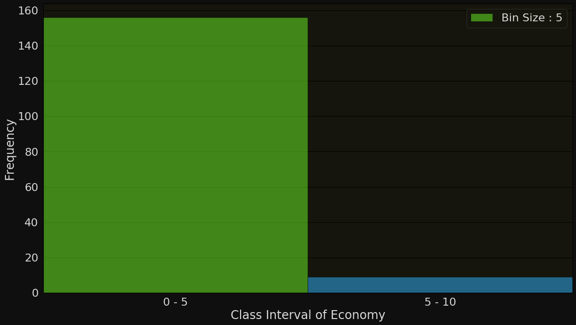
Bin Size 5: 0-5, 5-10, 10-15,...
Bin Size 3: 0-3, 3-6, 6-9,..
Bin Size 2: 0-2, 2-4, 4-6,...
Bin size 1: 0-1, 1-2, 2-3,....
Example: Zaheer Khan economy
Economy Rate
# Matches

0-2, 2-4, 4-6,...
Where does the value of 4.0 go? (4-6)
What about class boundaries?
Economy Rate
# Matches
Bin Size: 2
Left-end-inclusion convention: A class interval contains its left end boundary but not its right end boundary

Bin Size: 2

What about class boundaries?
Economy Rate
# Matches
Sort the values in increasing order
Choose the class intervals such that all values are covered (in particular, the minimum and maximum values should be covered, it's okay if there are some intervals without values)
Compute frequency of each interval
Draw bars for each interval (such that the height of the bars are proportional to the frequencies computed in the previous step)
Histograms (summary of procedure)

In what percentage of matches did Sachin score less than 10 runs?
Bin Size: 10
Histograms (what about percentages?)
Runs
# Matches
A bit difficult to answer
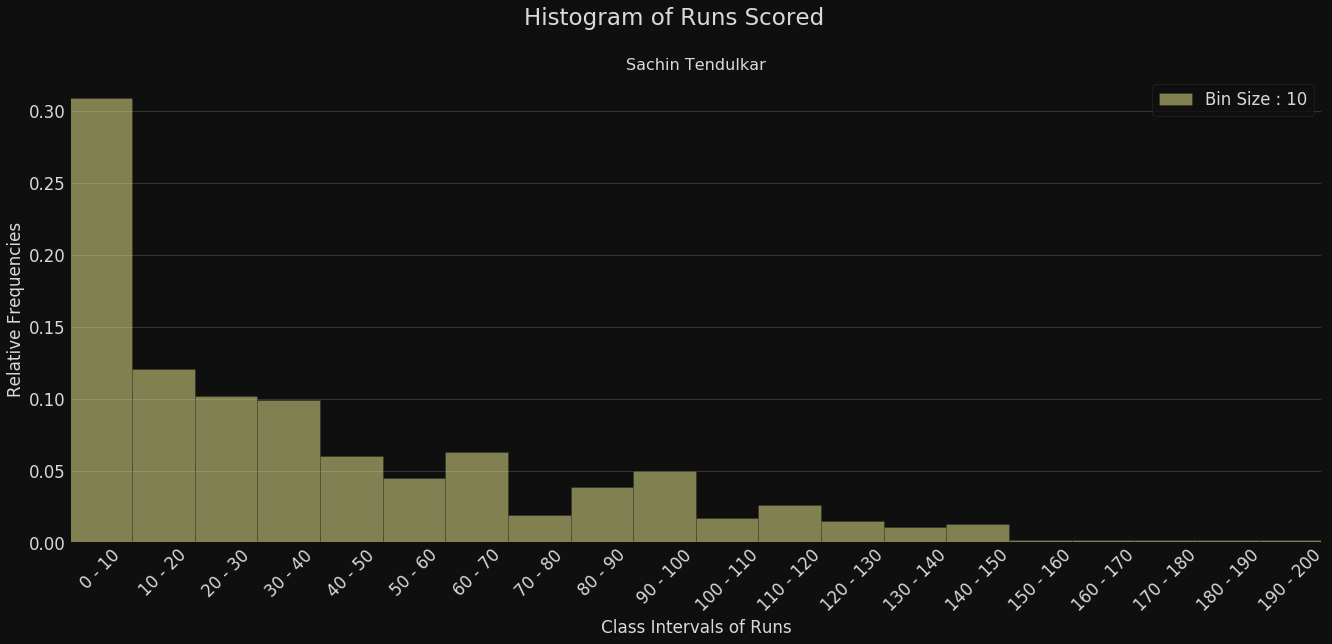
In what percentage of matches did Sachin score less than 10 runs?
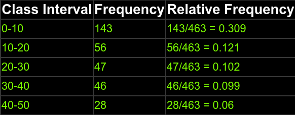
Relative Frequency Histograms
Runs
% of Matches
~31%
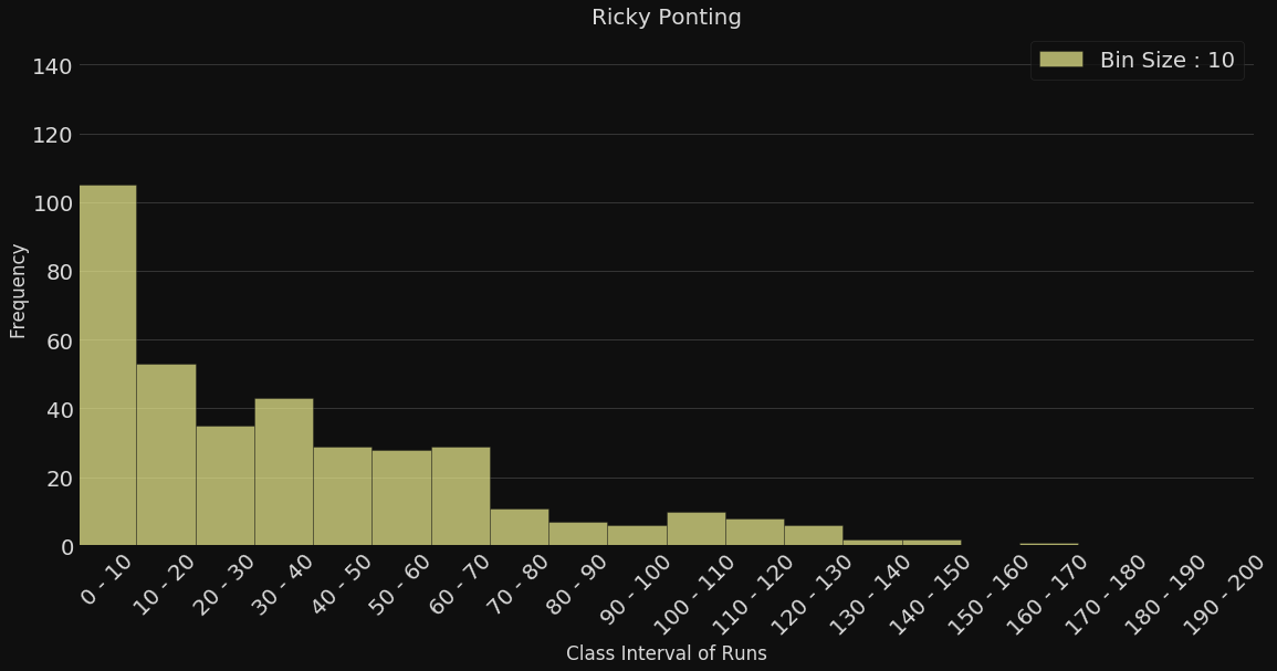
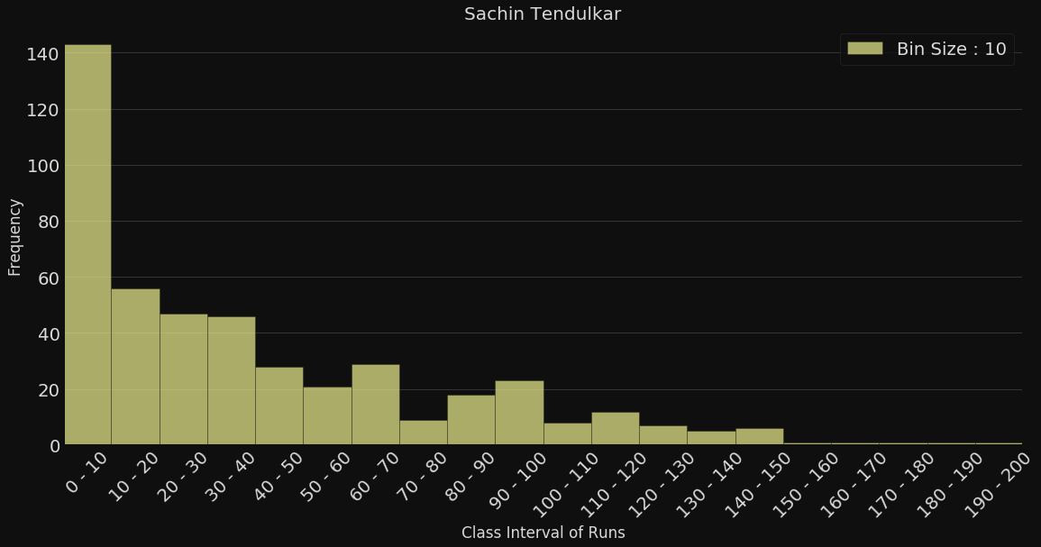
Sachin Tendulkar
Relative Histograms are useful when one wants to compare different sets of data

Ricky Ponting
Relative Frequency Histograms
Runs
# of Matches
Looks like Sachin has more low-scores (0-20) than Ponting (~200 v/s ~160)
But hey, Sachin also played more ODIs! (463 v/s 370)


Sachin Tendulkar
Ricky Ponting
Relative Frequency Histograms
Runs


# of Matches
Almost no difference in the % of low scores (0-20)

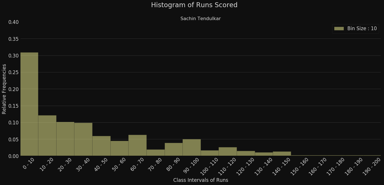
Sachin Tendulkar
Ricky Ponting
Relative Frequency Histograms
Runs
% of Matches
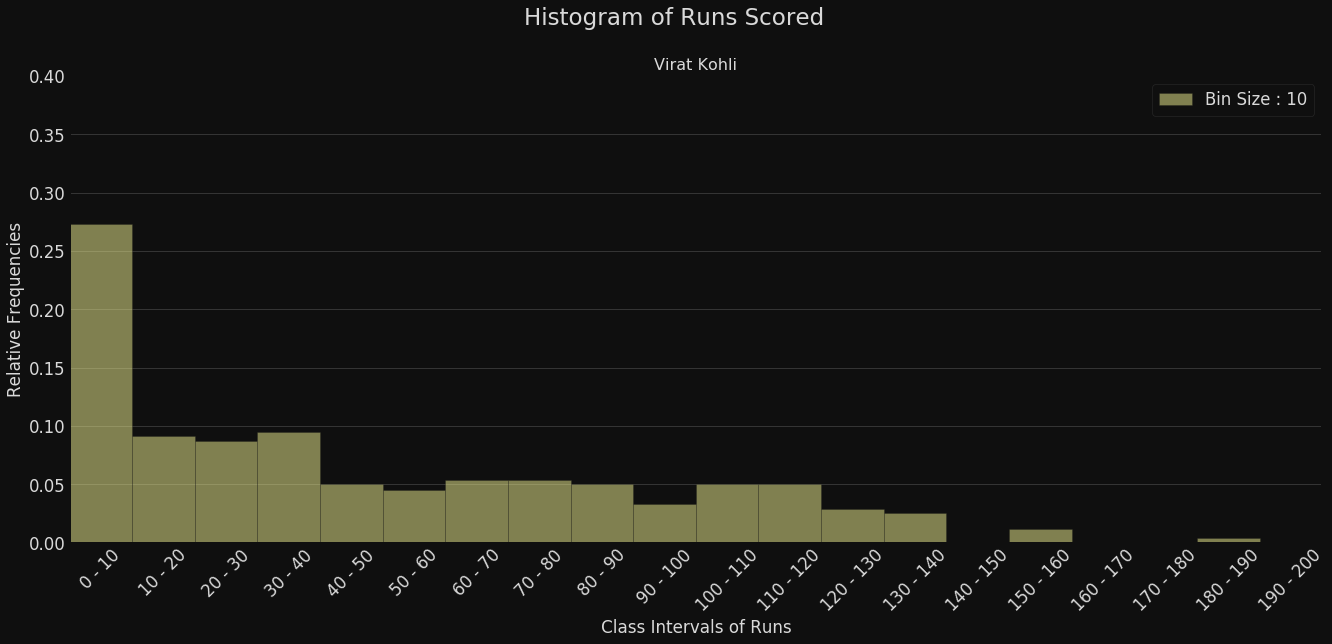

What about Virat Kohli?
Runs
% of Matches
Relative Frequency Histograms
Better (43% v/s 37%)
Sachin Tendulkar
Virat Kholi
Rel. Freq. Histograms (procedure)
Sort the values in increasing order
Choose the class intervals such that all values are covered (in particular, the minimum and maximum values should be covered, it's okay if there are some intervals without values)
Compute relative frequency of each interval
Draw bars for each interval (such that the height of the bars are proportional to the relative frequencies computed in the previous step)

How to compare histograms of mult. players?
Comparing Multiple Histograms

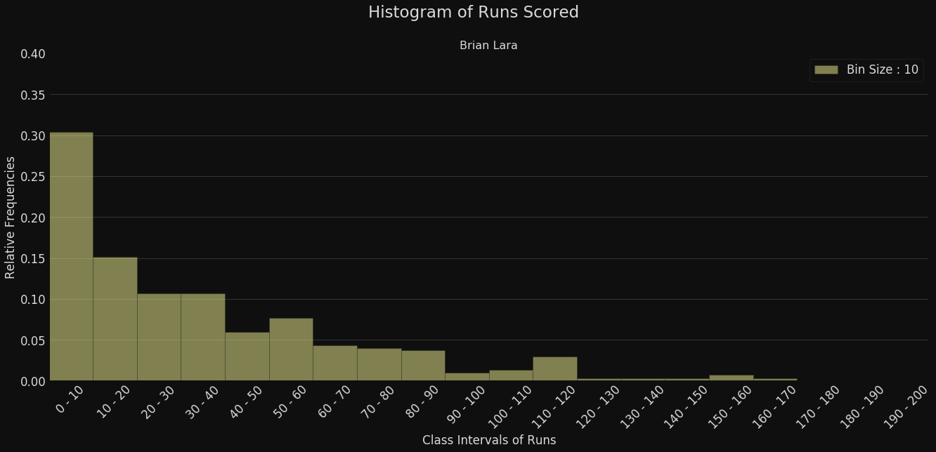

Option1: Draw indiv. histograms and compare!
A bit hard to visualise and compare
Runs
# of Matches
Sachin Tendulkar
Ricky Ponting
Brian Lara
Virat Kohli
How to compare histograms of mult. players?
Comparing Multiple Histograms
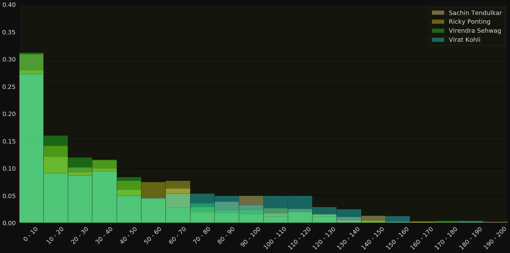
Option2: Draw all histograms in one plot
Hard to distinguish between indiv. histograms
Runs
# of Matches
How to compare histograms of mult. players?
Comparing Multiple Histograms
Option3: Draw grouped bar charts
Hard to see the overall trend for each player
Runs
# of Matches

How to compare histograms of mult. players?
Comparing Multiple Histograms
Option4: Use frequency polygons
Runs
# of Matches
Sachin Tendulkar
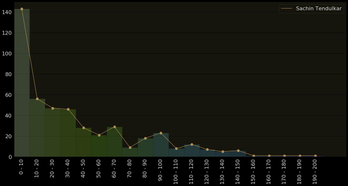
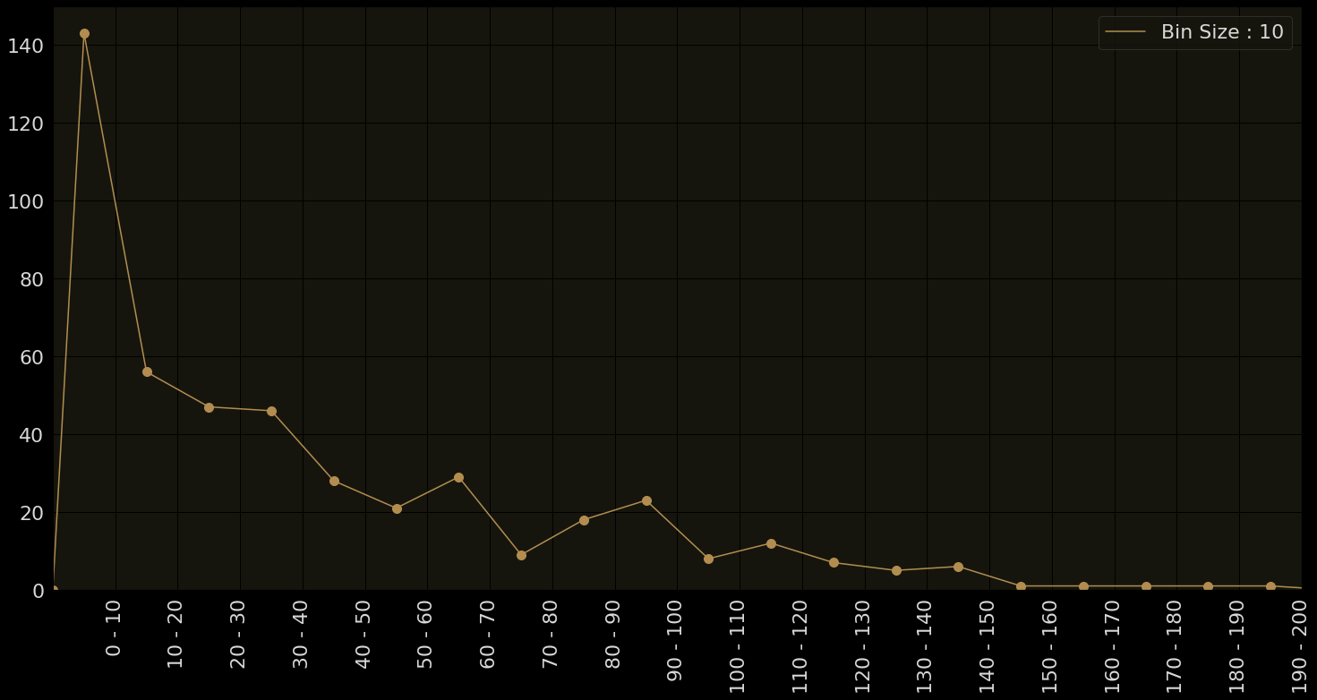
- Sort the values
- Choose the class intervals
- Compute frequency of each interval
- Compute mid-point of each interval
- Plot the frequency above the midpoint
Frequency Polygons
Runs
# of Matches
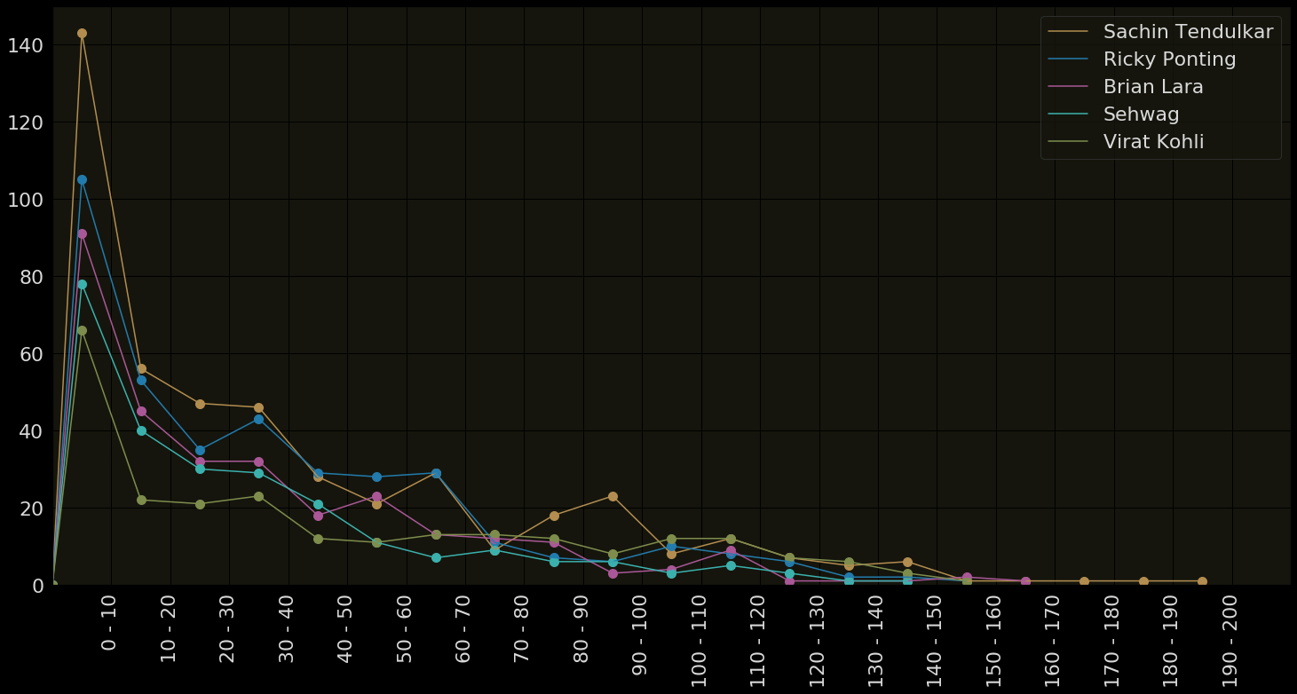
Can distinguish between players
Can see and compare overall trends for different players
Frequency Polygons
Runs
# of Matches
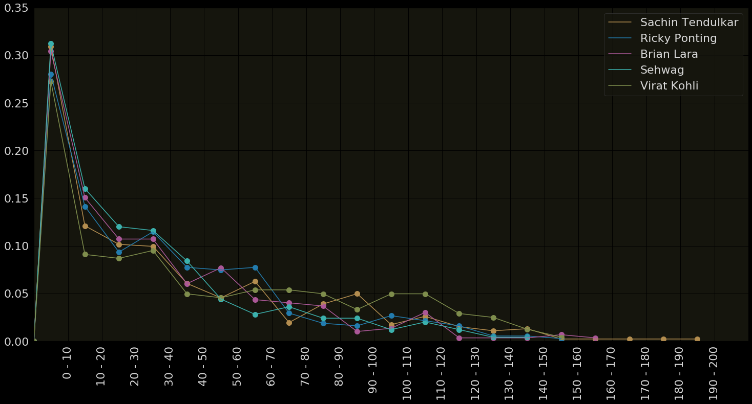
Relative Frequency Polygons
Runs
% of Matches
Relative frequency polygons are easier to compare

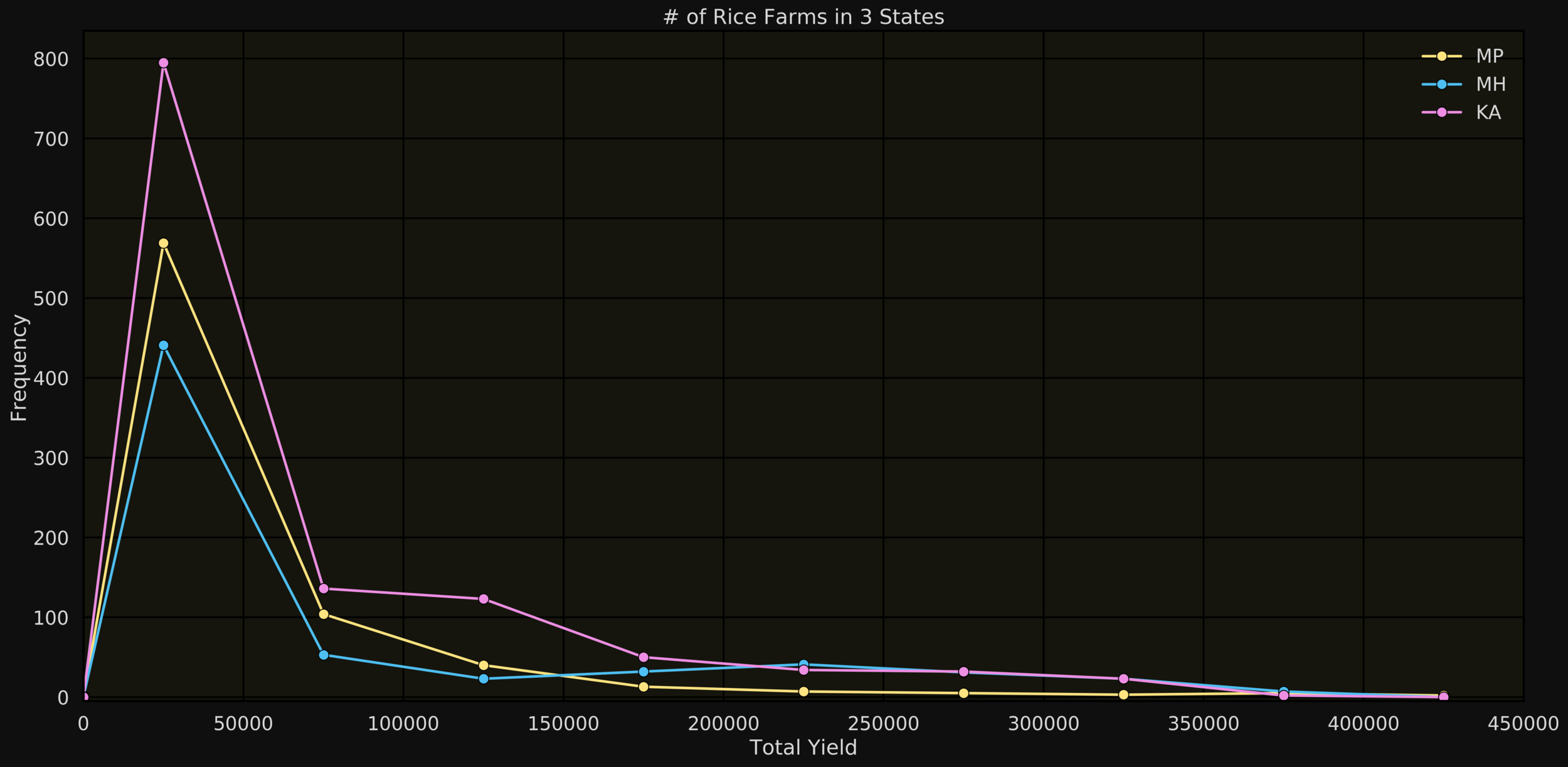
Comparing the histograms of "Total yield" of farms in 3 different states
Frequency Polygons (for continuous data)
total yield
# of farms
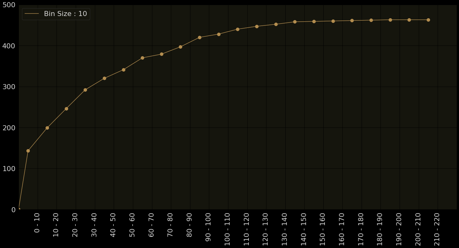
Cumulative Frequency Polygons
Runs
# of Matches
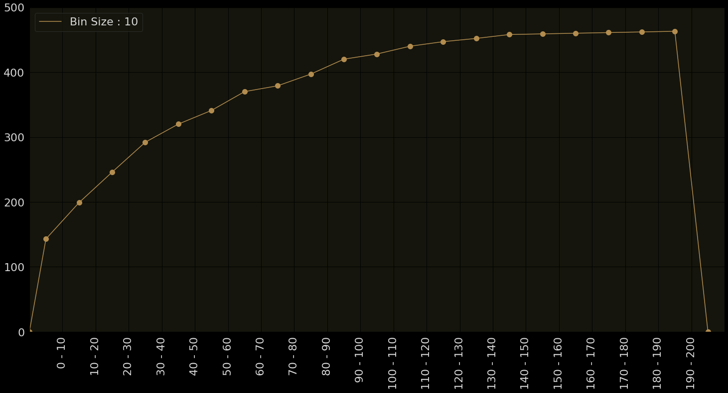
In how many matches did Sachin score less that 30?
Easy to answer with a cumulative frequency polygon
For each class interval also add the sum of the frequencies of all class intervals before it
Cumulative Relative Freq. Polygons
Runs
% of Matches
In what percentage of matches did Sachin score less than 30?
Easy to answer with a cumulative relative frequency polygon
Same as before except that we now use relative frequencies as opposed to absolute frequencies
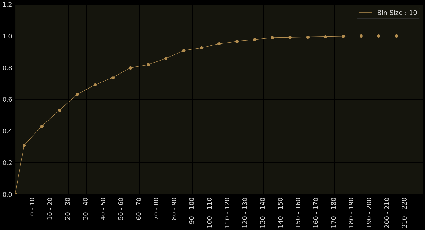
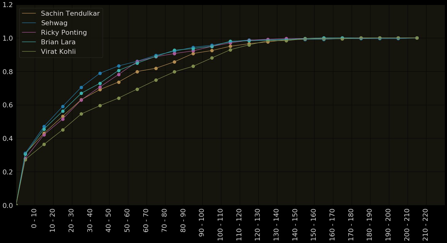
Multiple Cumul. Rel. Frq. Polygons
Runs
% of Matches
Easier to compare multiple sets of data (payers in this case)
How far are the values in the data spread out?
Is the data density high in certain intervals?
Are there gaps in the data? (i.e., are there certain intervals that do not contain any data)
Are there outliers in the data? (i.e., values which are very far from the typical values)
Typical trends in histograms
The data spreads out from 0-200
Data is concentrated in the intervals 0 to 40
No data values in regions between 150- 200
The highest score of 200 is an outlier (very far from the typical values in the data)

Typical trends in histograms
Sachin Tendulkar
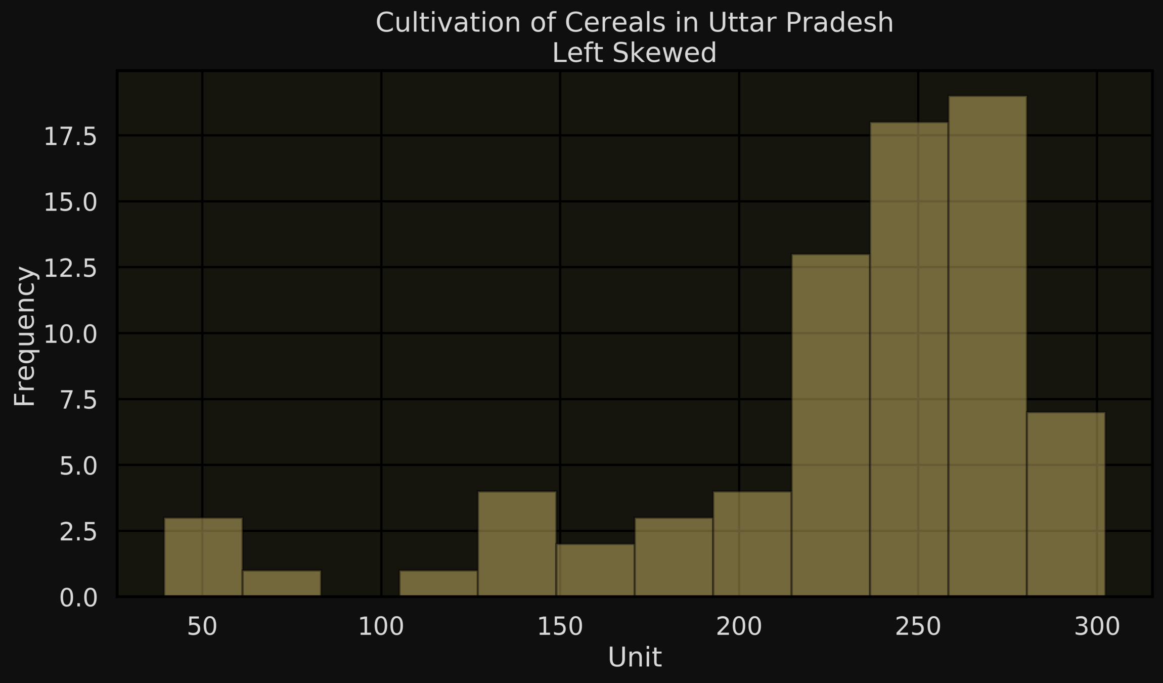
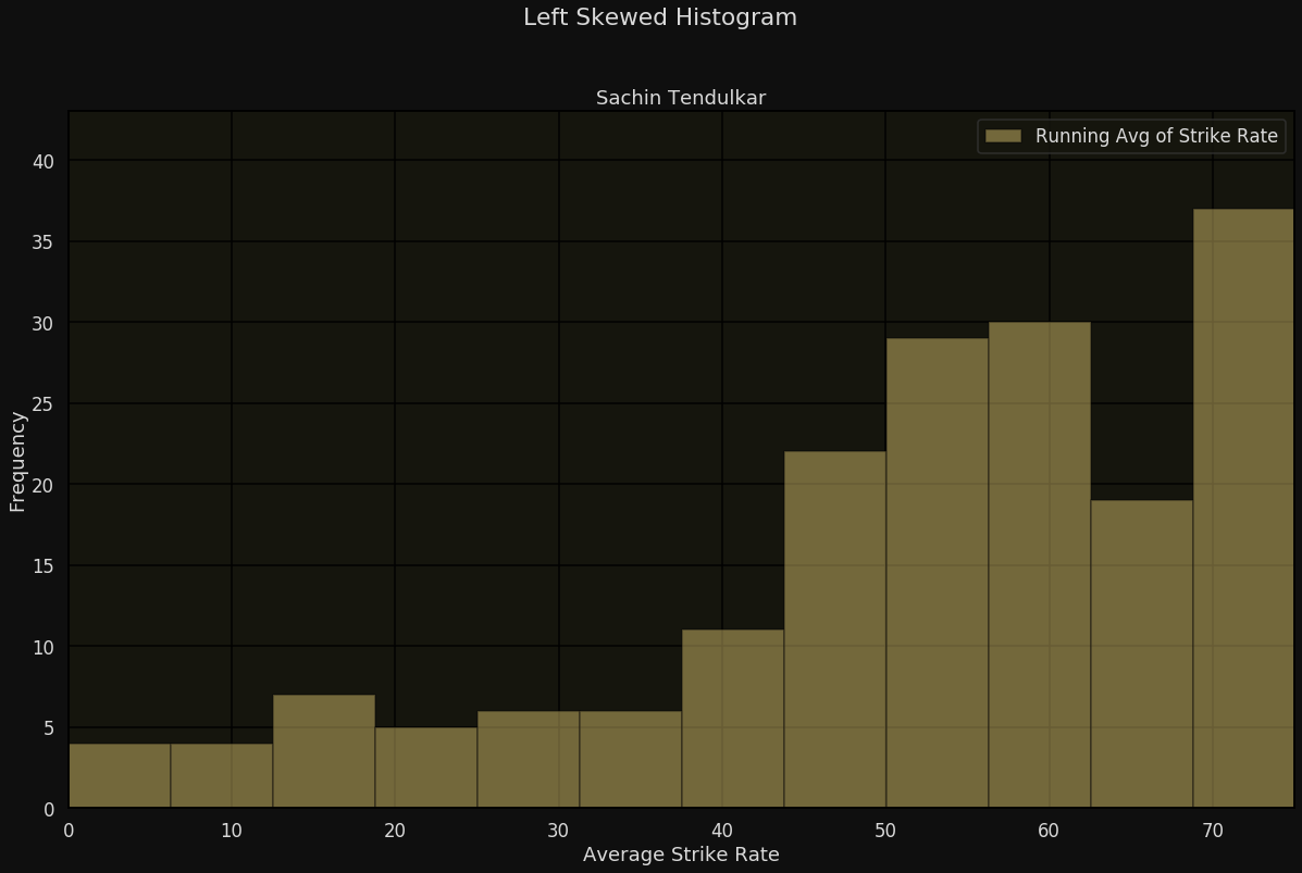
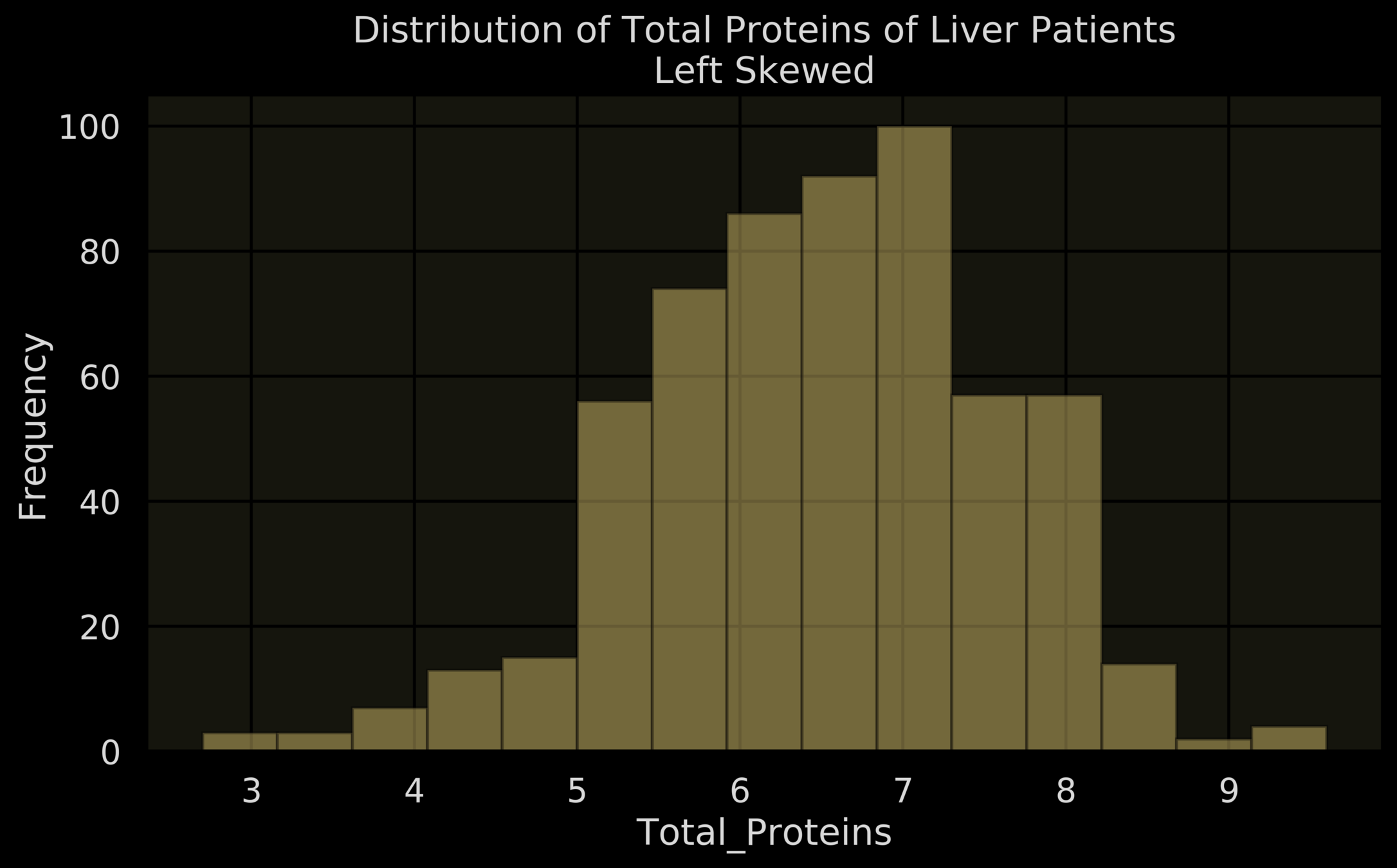
Left-skewed-histogram: Most of the short bars are towards the left of the histogram
Typical trends in histograms
Units
Frequency
Average Strike Rate
Frequency
Units
Frequency

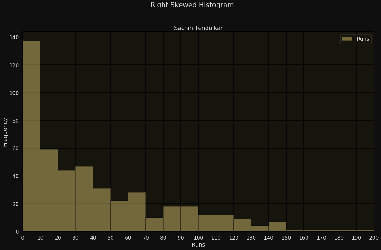
Runs
Frequency
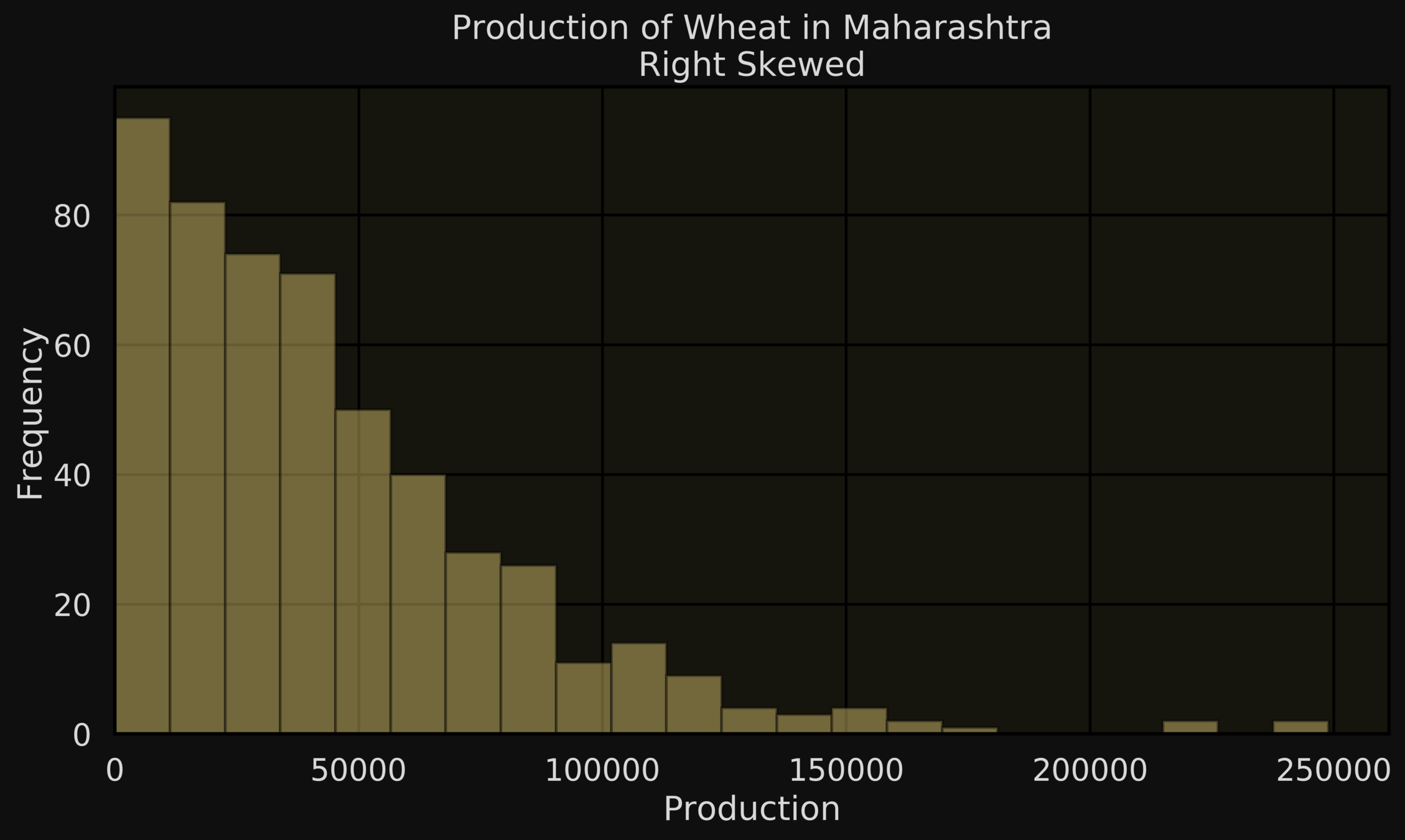
Right-skewed-histogram: Most of the short bars are towards the right of the histogram

Class Intervals of runs
Rel. Frequency
Production
Frequency

Typical trends in histograms
Uniform-histogram: Most of the bars are of a similar height

Die faces
Frequency

Typical trends in histograms
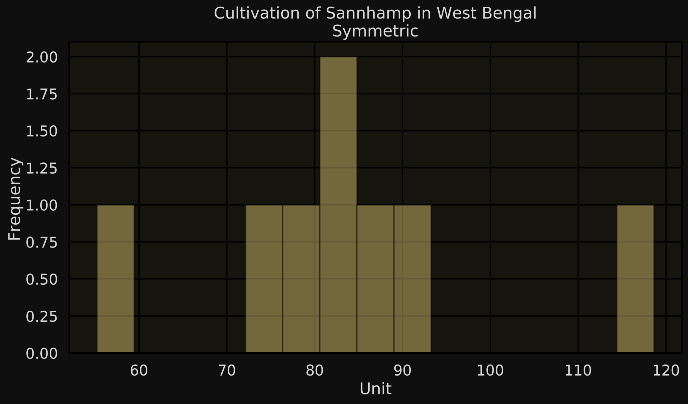
Units
Frequency
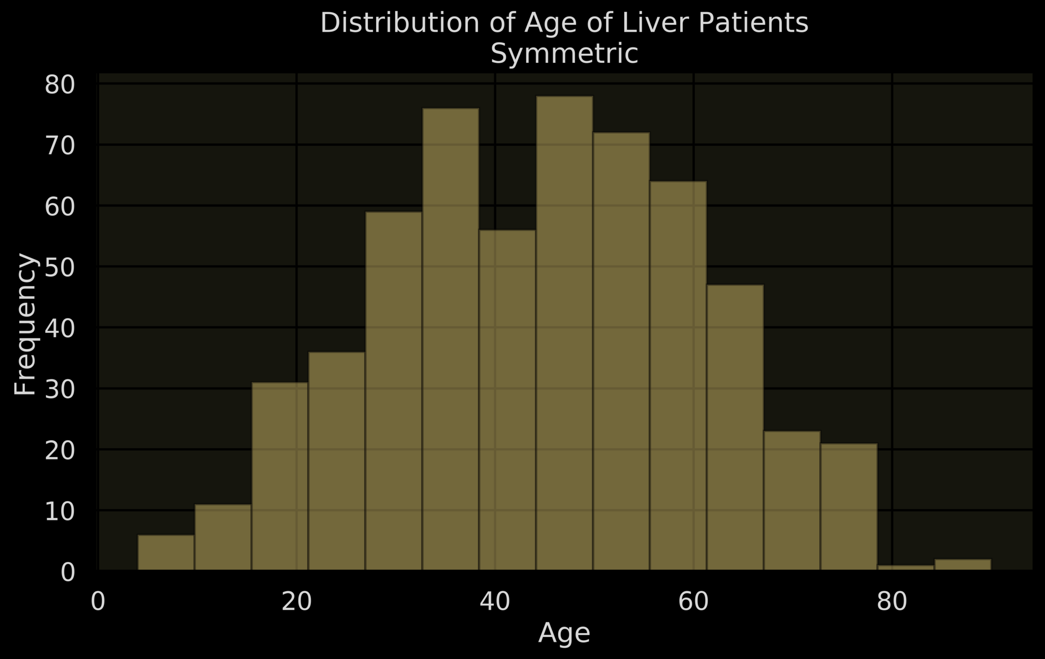
Age
Frequency
Symmetric-histogram: Bars are almost mirrored images of each other about the vertical median line

Symmetric
Almost Symmetric
Typical trends in histograms
1. Identifying discriminatory features
Use of histograms in ML
ML System
Age
Height Weight
Cholesterol
Sugar
Health Risk
No Health Risk
| Age | Height | .... | Risk |
|---|
| ... |
... | ... |
|---|
Risk
No Risk
Max Heart Rate
Suppose the trends for "max heart rate" are very different for "risk" and "no risk patients" a good discriminatory feature
1. Identifying discriminatory features
Use of histograms in ML
Plot the histograms of freq. polygons for "max heart rate" for "risk and "no risk" patients
Then "max heart rate" is a good discriminatory feature
Risk
No Risk
Height
2. Analysing output scores
Chatbot
"What's the temperature outside"
It is very hot. 38°C
I am not a temp variable

Current chatbots are nowhere close to satisfactory

Use of histograms in ML
Chatbot
"What's the temperature outside"
Good
Bad

(Let a human take over)
"I am not a temp variable"
ML
SYSTEM
Solution: Let a human take over when the output is bad
2. Analysing output scores
Use of histograms in ML
Chatbot
"What's the temperature outside"
Good
Bad

(Let a human take over)
"I am not a temp variable"
ML
SYSTEM
Question: Suppose someone develops such a system, how would you check if it is good?
2. Analysing output scores
Use of histograms in ML
Answer: Take 50 good and 50 bad responses and see the histogram of the system's scores
2. Analysing output scores
Use of histograms in ML
Question: Suppose someone develops such a system, how would you check if it is good?
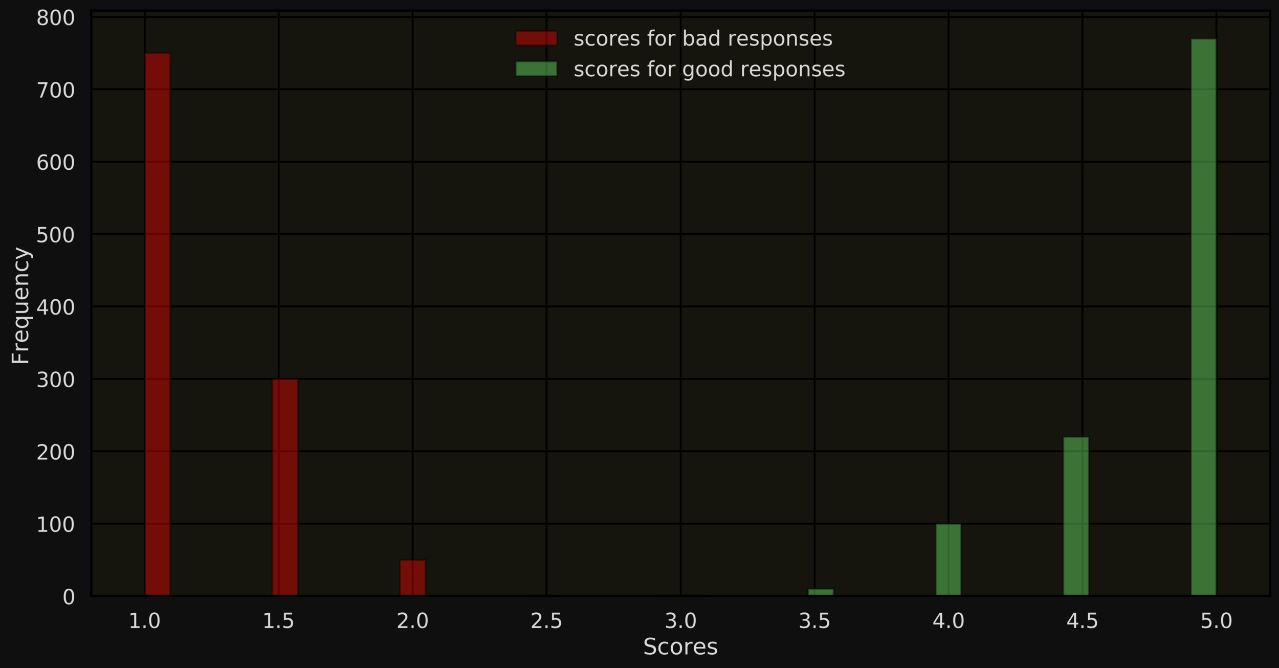
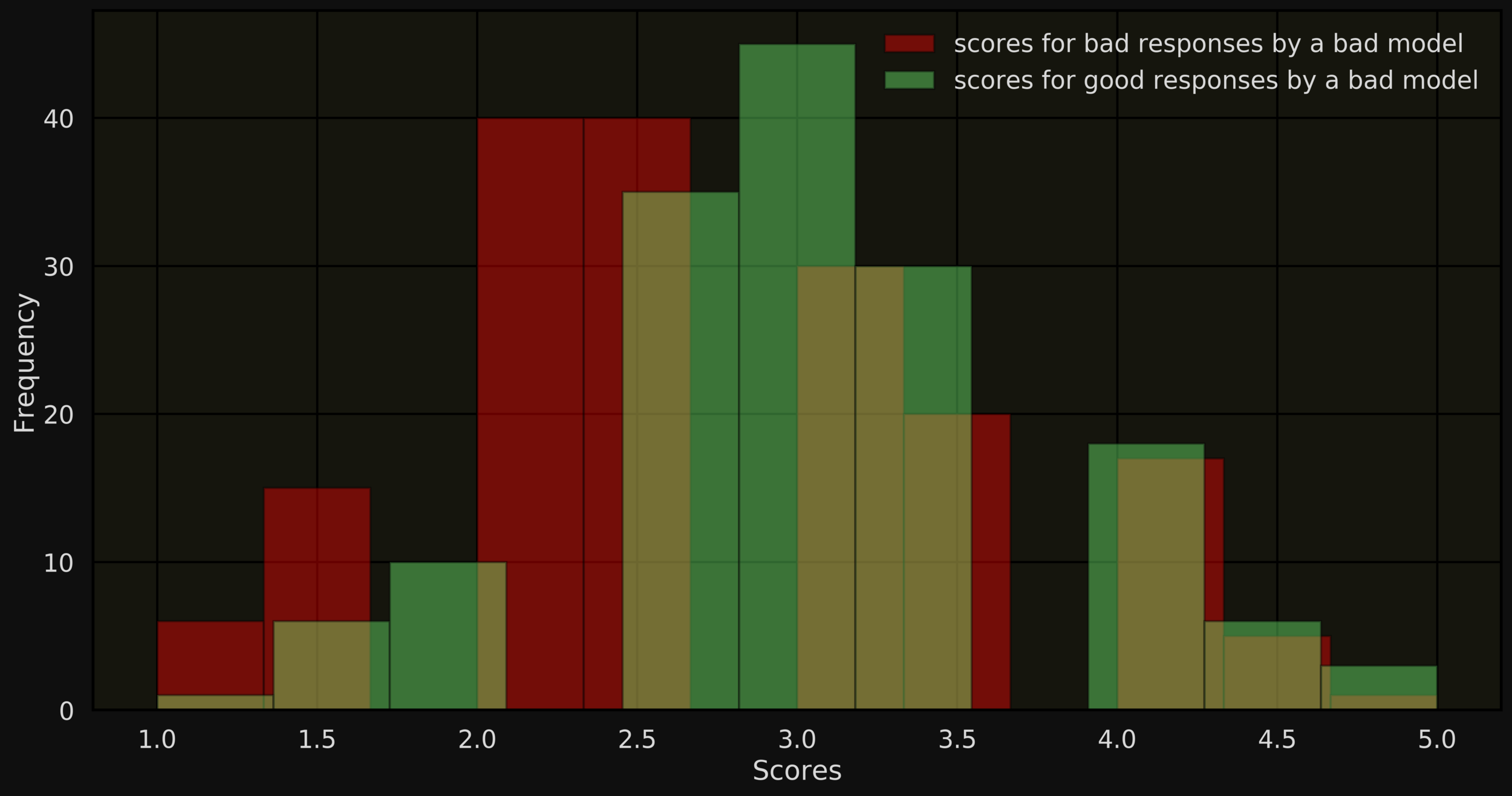
In our research, we analysed one such system and found that it did a pretty bad job

2. Analysing output scores
Use of histograms in ML
[40, 175, 10, 69, 43, 96, 8, 4, 200, 7, 24, 28, 120, 38, 27, 111, 2, 53, 85, 18, 2, 48, 15, 3, 22, 14, 39, 6, 114, 52]
Sachin's scores in his last 30 ODIs
69
85
Stem
Leaf
6
9
8
5
Efficient way of describing small to medium data

96
111
9
6
11
1
Stem and leaf plots
[2, 2, 3, 4, 6, 7, 8, 10, 14, 15, 18, 22, 24, 27, 28, 38, 39, 40, 43, 48, 52, 53, 69, 85, 96, 111, 114, 120, 175, 200]
Sachin's scores in his last 30 ODIs
Stem and leaf plots
0
1
2
3
4
5
6
7
8
9
10
11
Stem
Leaf
12
2234678
0458
2478
89
038
23
9
5
6
14
0
Efficient way of describing small to medium data

[58.82, 124.11, 58.82, 109.52, 82.69, 92.3 , 100. , 80. , 136.05, 63.63, 54.54, 96.55, 104.34, 67.85, 122.72, 109.9 , 50. , 77.94, 73.91, 128.57, 33.33, 76.19, 62.5 , 25. , 95.65, 93.33, 130. , 31.57, 77.55, 108.33]
Sachin's strike rate in his last 30 ODIs
Stem and leaf plots(for continuous data)
2
3
4
5
6
7
8
9
10
11
Stem
Leaf
12
5
23
0599
248
03
2367
00
349
13
06
048
4688
58.82
63.63
Stem
Leaf
5
9
6
4
82.69
92.3
8
3
9
2
What if the data contains bigger values?
Stem and leaf plots(for larger values)
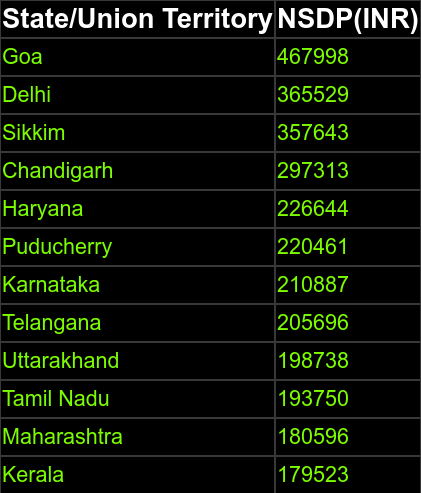
What if the data contains bigger values?
1 leaf digit

Stem and leaf plots(for larger values)
17952
18059
19375
19873
20569
21088
22046
22664
29731
35764
Stem
Leaf
36552
3
6
8
6
1
4
3
9
46799
8
3
7
0
Stem and leaf plots(for larger values)
What if the data contains bigger values?
4 leaf digit
17
18
19
20
21
22
29
35
Stem
Leaf
36
9523
0596
5696
0887
7313
7643
7798
46
5529
0461 6644
3750 8738

What if the a row has many values?
012, 019, 038, 123, 156, 198, 222, 234, 297, 312, 333, 367, 425, 445, 472
537, 551, 577, 621, 637,, 691, 711, 768, 821, 844, 956, 988, 991
(Leaves starting with digits 0-4)
(Leaves starting with digits 5-9)
Stem and leaf plots(splitting rows)
43|
43|
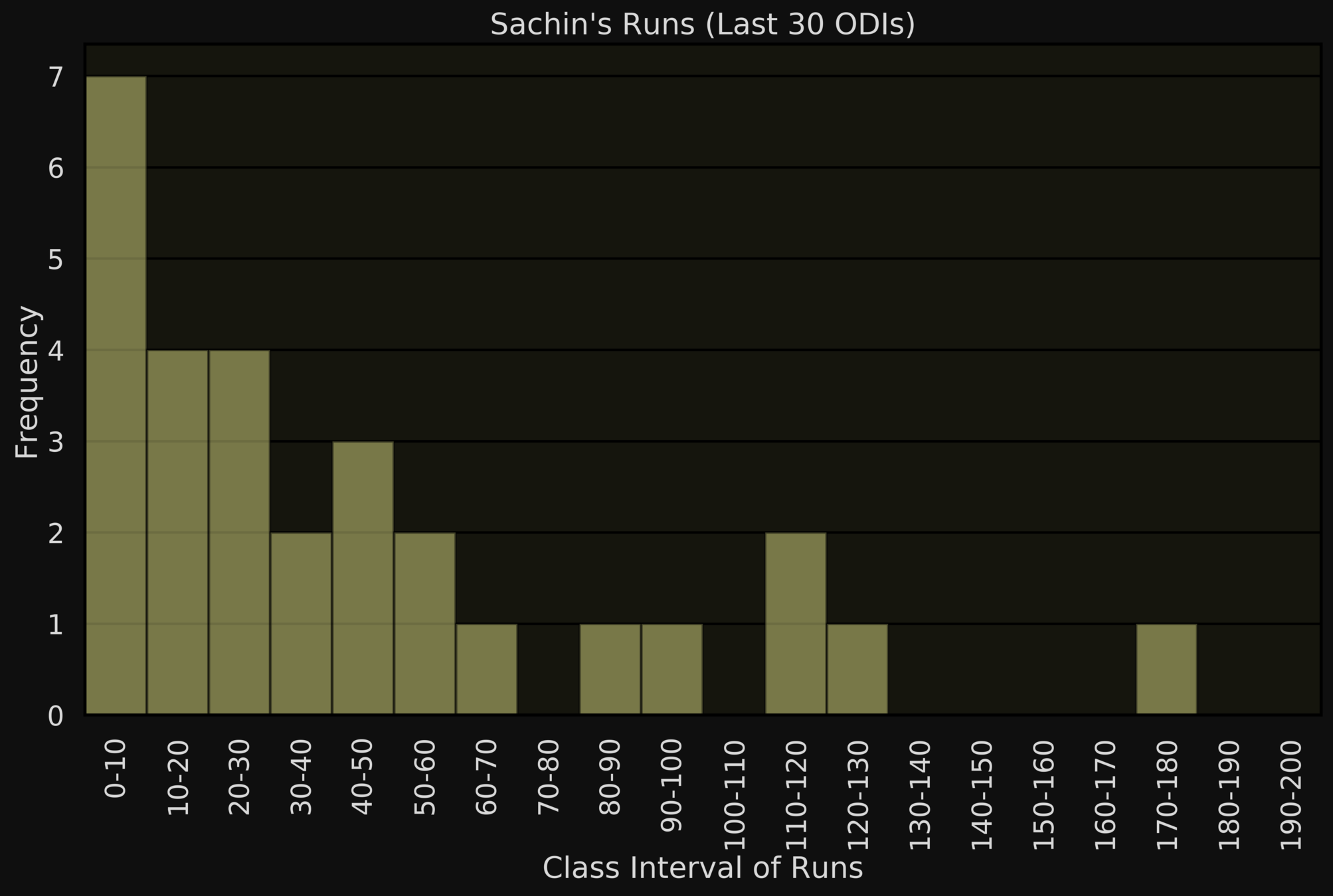
S&L plot looks like a histogram rotated on its side
More informative: displays within group values
Stem and leaf plot v/s Histogram
0
1
2
3
4
5
6
7
8
9
10
11
Stem
Leaf
12
2234678
0458
2478
89
038
23
9
5
6
14
0
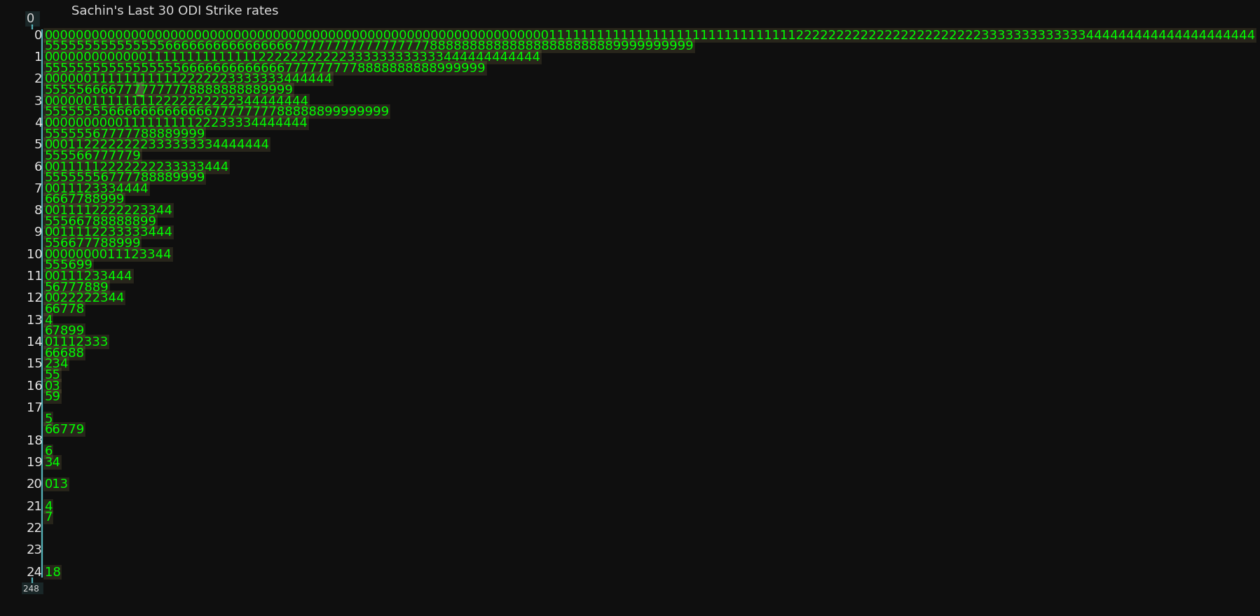
S&L plot not preferred for large datasets (Histogram is better)
Stem and leaf plot v/s Histogram
Displaying individual values makes it easy to spot patterns
Stem
Leaf
1
2
222 5555 888
3
111 4444 777
4
5
6
11 44444 5 7 9
7
8
000 22 444 66 888

Difference of 3
Multiples of 2
Stem and leaf plot v/s Histogram
Used to compare two different sets of data
Stem
Leaf

ODI Scores
Test Scores
Leaf
8875210
30
1
72
1
76
Back to back stem and leaf plots
0
1
2
3
4
5
6
7
8
9
10
11
12
2234678
0458
2478
89
038
23
9
5
6
14
How to describe relationships between variables?
Multiple attributes in datasets

Runs scored

Balls faced
Minutes played
Strike rate
Type of dismissal
State
District
Crop
Area
Yield
Agriculture
Cricket

Color
Pattern
Size
Price
Discount
E-Commerce
Most datasets contain several attributes for a given object

We often expect certain relationships b/w attributes

runs-scored = f(balls-faced)
total-yield = g(total-area)
Multiple attributes in datasets

Runs scored

Balls faced
Minutes played
Strike rate
Type of dismissal
State
District
Crop
Area
Yield
Agriculture
Cricket

Color
Pattern
Size
Price
Discount
price = h(size)
E-Commerce
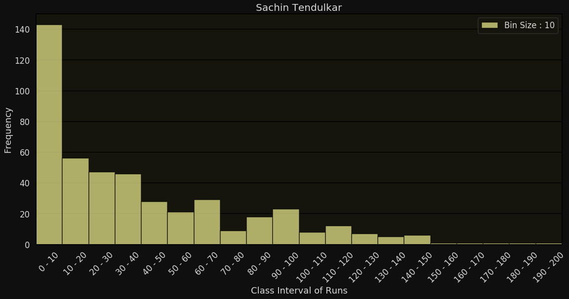
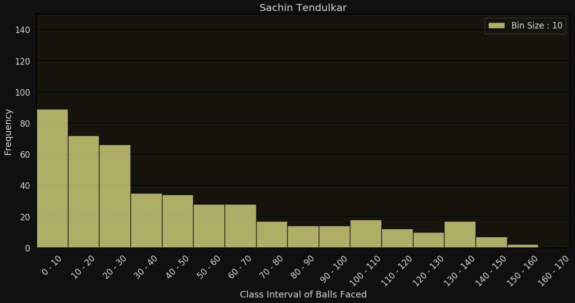
Individual histograms do not reveal such relationships

Can individual plots reveal relations?
Runs
Frequency
Balls Faced
How does the score of Sachin Tendulkar change as the number of balls faced increases?


Can individual plots reveal relations?
Runs
Frequency
Balls Faced
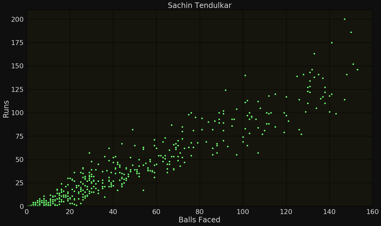
x-coordinate = balls faced
y-coordinate = runs scored
Scatter plots (for revealing relations b/w variables)
Balls faced
Runs
Not for qualitative variables
2 discrete variables
2 continuous variables
1 continuous 1 discrete variable
Scatter plots (for revealing relations b/w variables)
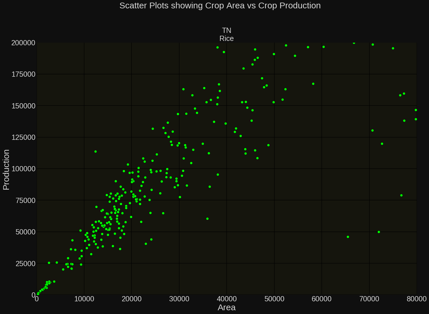
Area
Production

Balls faced
Runs
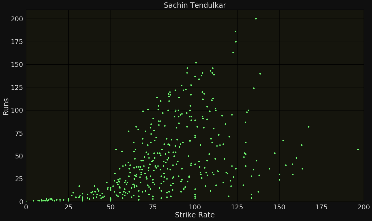
Runs
Strike Rate
y = mx + c
y = ax^2
y = e^x
Quick recap of functions
y = mx + c
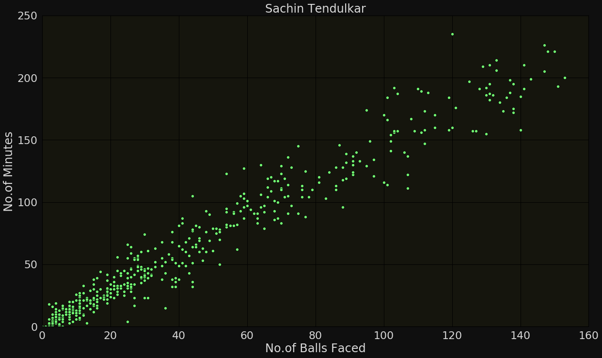
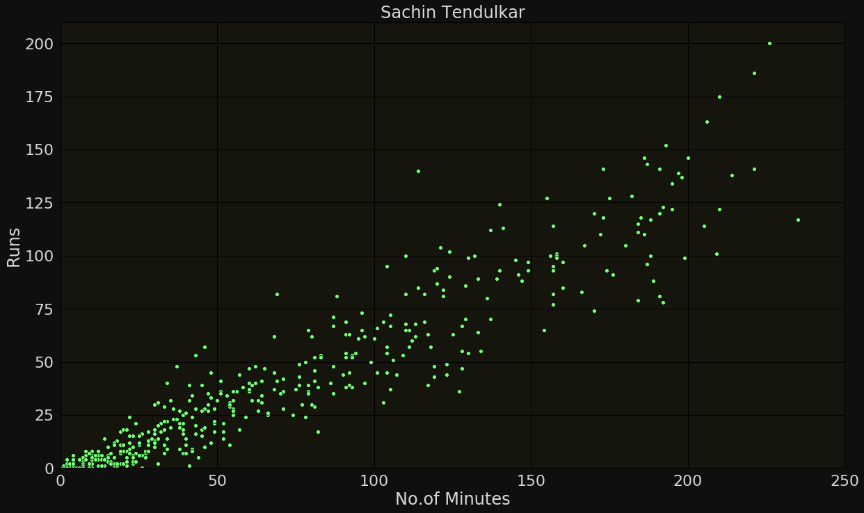
Linear relationship:

Typical trends in scatter plots
Balls faced
Minutes
Minutes
Runs
y = ax^2
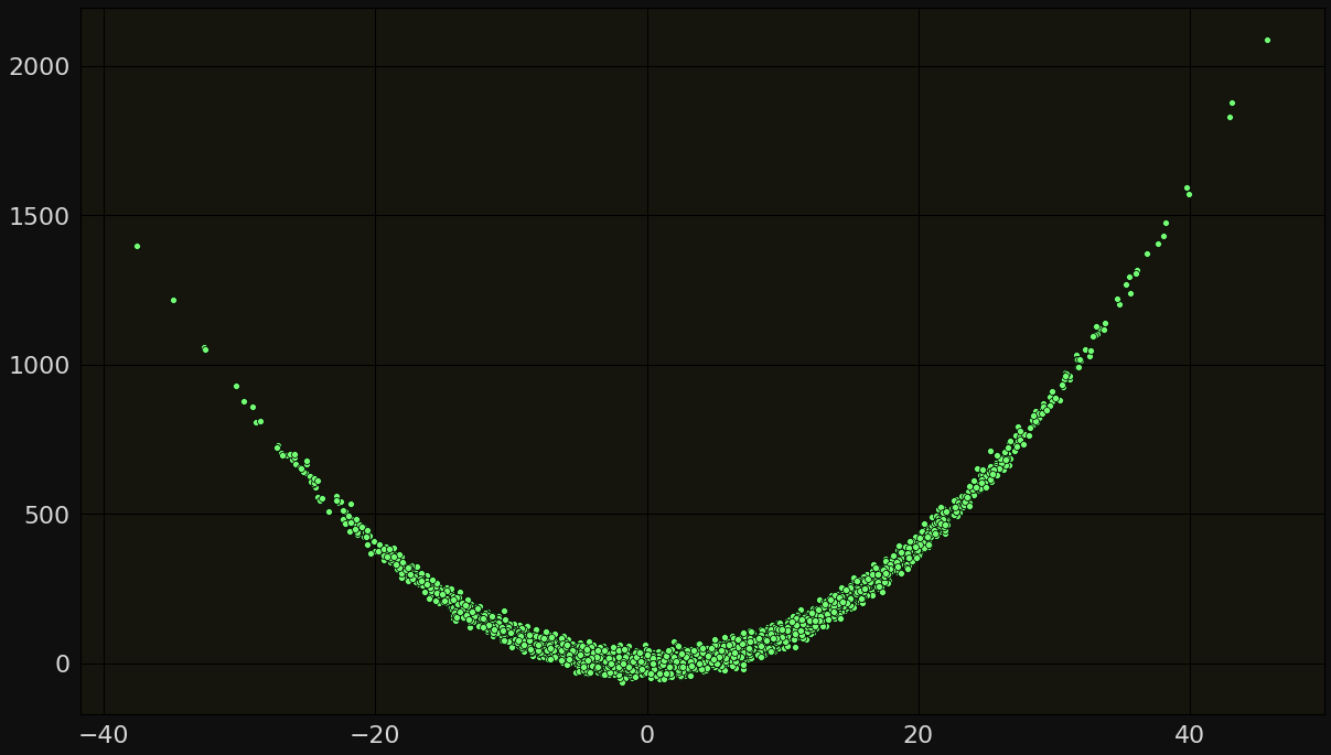
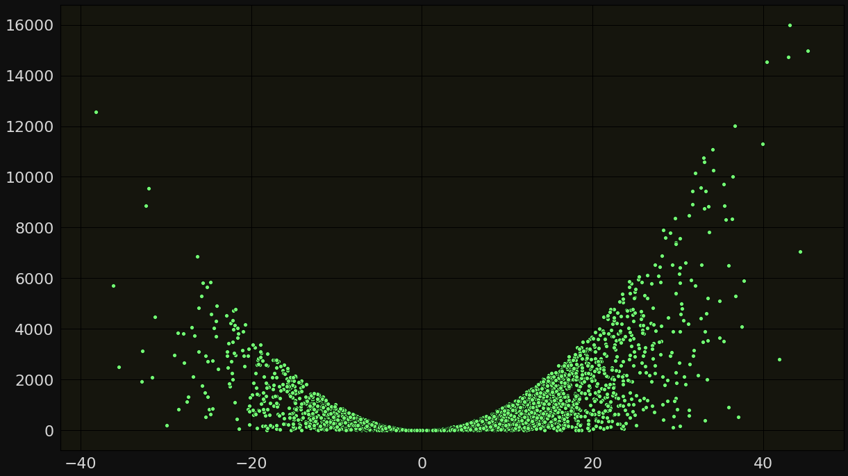
Quadratic relationship:

Typical trends in scatter plots
y = e^x
exponential relationship:

Typical trends in scatter plots


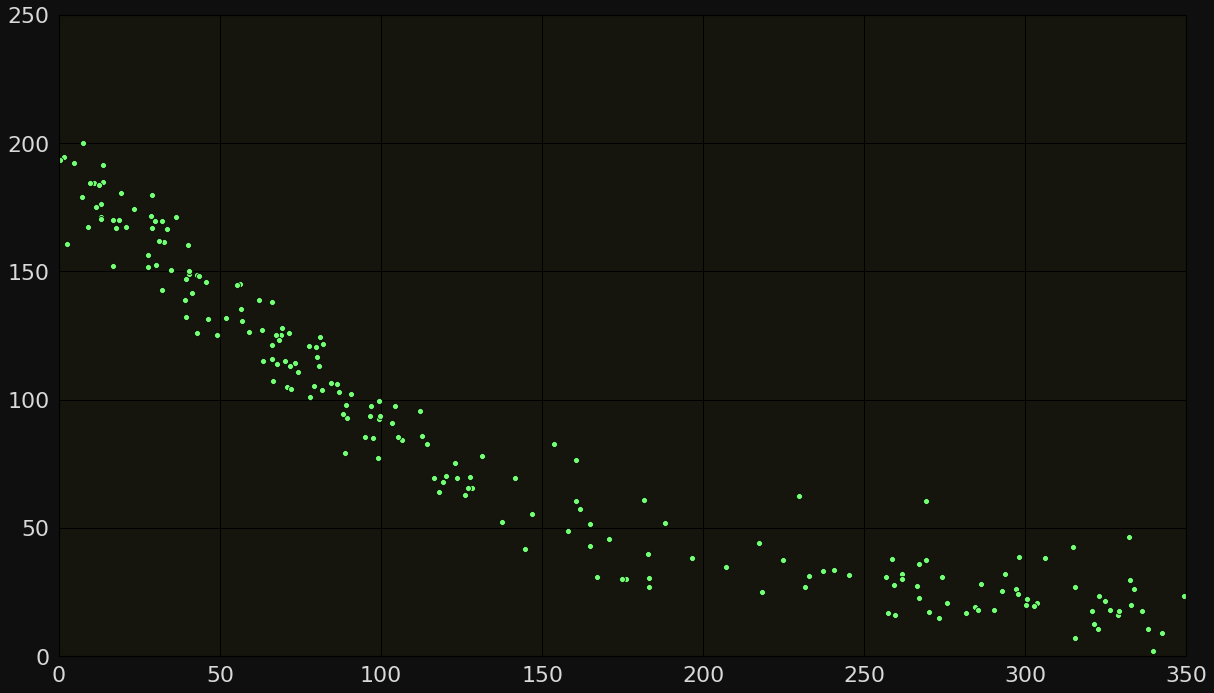
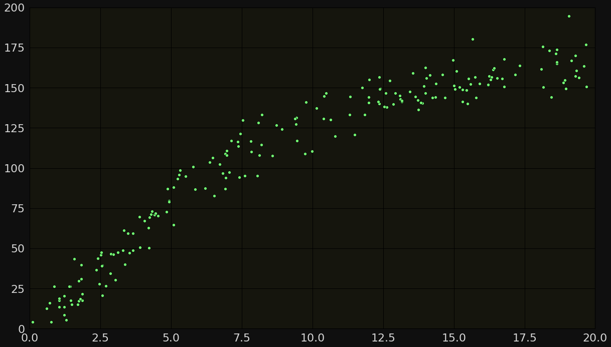
mixed (Linear + exp) relationship

Typical trends in scatter plots
No clear relation

Typical trends in scatter plots
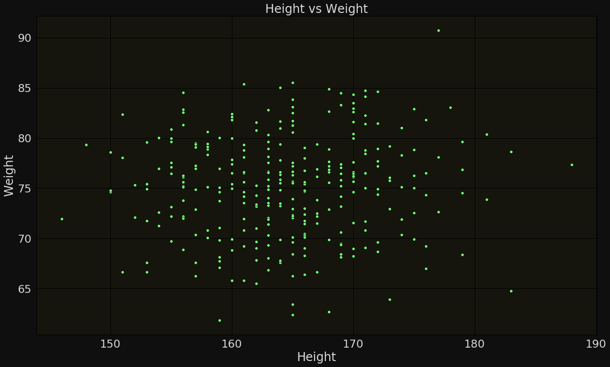
Height
Weight
1. Identify correlated features
ML System
Age
Height Weight
Cholesterol
Sugar
Health Risk
No Health Risk
| Age | Height | .... | Risk |
|---|
| ... |
... | ... |
|---|
Use of scatter plots in ML
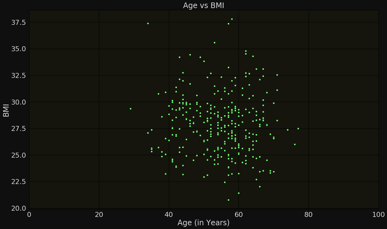
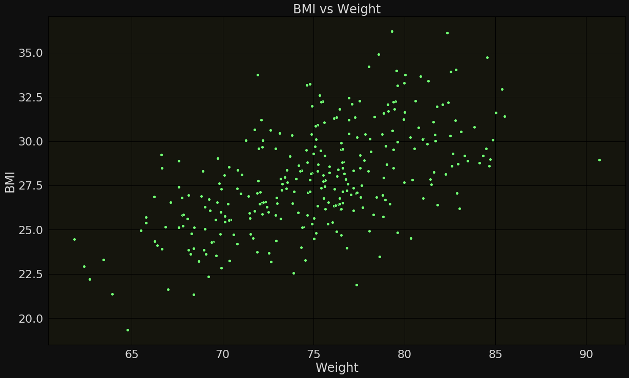
Use uncorrelated or non-redundant features for classification
