The How (and why) of Houdini
What problems does houdini solve?
1. Slow Feature is Slow
Release
The Situation...
PrioriTIsation
Specification
Implementation
Refinement
Release
The Situation...
PrioriTIsation
Specification
Implementation
Refinement
Release
The Situation...
PrioriTIsation
Specification
Implementation
Refinement
Release
The Situation...
PrioriTIsation
Specification
Implementation
Refinement
Release
The Situation...
PrioriTIsation
Specification
Implementation
Refinement
We'Re stuck

How does Houdini help?
Return to The
extensible web manifesto
CSS Houdini is a W3C effort to define lower-level CSS DOM APIs for authors to understand, recreate, and extend high-level CSS authoring features.
definition: wiki.mozilla.org/CSS/Houdini
An official definition...
Allow web developers and browser-initiated libraries to take the lead in costly explorations.
A new (old) Approach...
Make it possible to polyfill more of the platform's new features.
A new (old) Approach...
Low-level APIs
+
Feedback
⇒
Adoption

A new (old) Approach...
Low-level APIs
+
Feedback
⇒
Adoption

A new (old) Approach...
Low-level APIs
+
Feedback
⇒
Adoption

A new (old) Approach...
Low-level APIs
+
Feedback
⇒
Adoption

A new (old) Approach...
Involving web developers in the process, and iterating, avoids the platform getting stuck with bad APIs
A new (old) Approach...
Houdini is
a Toolbox
that
future-proofs
styling
a Toolbox
future-proofs


What problems does houdini solve?
2. Interoperability
or
"WHAT GRADIENTS CAN TEACH US ABOUT HOW CSS WORKS"

TDD: Twitter-Driven Development 👍
- Gradients are static images
- No individual access to colour stops
.app__header {
  background-image: linear-gradient(#e66465, #9198e5);
}
Having individual access to the variables means
we can update the gradient dynamically!
:root {
  --gradientStart: #e66465;
  --gradientEnd: #9198e5;
}

.app__header {
  background-image: linear-gradient(
    var(--gradientStart),
    var(--gradientEnd)
  );
}
document.addEventListener('mousemove', (e) => {
// Translate mouseX into degrees for HSL
const xDegree = getXDegree(e.clientX) // 0 - 360
// Update custom properties
setRootStyle('--grad-start', xDegree) // => 180
setRootStyle('--grad-end', xDegree + 120) // => 300
})Magic Animated Gradient
<html style="--grad-start: 180; --grad-end: 300">body {
// The H in HSL is a value in the range 0...360
background: linear-gradient(
hsl(var(--grad-start), 100%, 75%),
hsl(var(--grad-end), 100%, 50%)
)
}CSS
JS
HTML
Codepen: Magic Gradient
p {
  &::before {
    content: 'hsl(' var(--grad-start) ', 100%, 75%)';
  }

  &::after {
    content: 'hsl(' var(--grad-end) ', 100%, 50%)';
  }
}
Magic Gradient: Pseudo-content & Custom Props
Didn't work
😭

p {
  // Map custom-idents hueStart & hueEnd to Custom Props
  counter-reset:
    hueStart var(--grad-start)
    hueEnd var(--grad-end);

  // Use the value returned by counter(custom-ident)
  &::before {
    content: 'hsl(' counter(hueStart) ', 100%, 75%)';
  }
  &::after {
    content: 'hsl(' counter(hueEnd) ', 100%, 50%)';
  }
}
Magic Gradient: Pseudo-content & Custom Props
Type-juggling in CSS…
🤪
CSS IS A Turing Complete programming language
CSS IS A
TYPED LANGUAGE
🤯

IMPERATIVE
vs
Declarative
IMPERATIVE
vs
Declarative
telling machines what to do, letting them figure out to how to do it
This won't work
😭
:root {
  --gradientStart: #61BFD9;
  --gradientEnd: #0551B4;
}

@keyframes interpolate {
  from {
    --gradientStart: #61BFD9;
    --gradientEnd: #0551B4;
  }
  to {
    --gradientStart: #15AF88;
    --gradientEnd: #6C429A;
  }
}

.app__header {
  animation: interpolate 3s ease-in-out;
}
The browser knows how to turn one number into another

But if the variable type isn't understood as a number…
¯\_(ツ)_/¯
"God help us, we're in the hands of engineers"

Custom Props are just spicy strings
The browser only speaks
3 languages...
How come they don't understand each
other better?
How does Houdini Help?
What's in the Toolset?
-
Paint API
-
Animation API
-
Layout API
-
Typed OM
-
Properties & VALUES
visit: houdini.glitch.me
-
Paint API
-
Animation API
-
Layout API
-
Typed OM
-
Properties & VALUES
visit: houdini.glitch.me
Worklets
-
Paint API
-
Animation API
-
Layout API
-
Typed OM
-
Properties & VALUES
visit: houdini.glitch.me
Worklets
Houdini Ingredients
Typed Om
- Types are preserved between CSS & JS
el.attributeStyleMap.set('opacity', CSS.number(.5));
el.attributeStyleMap.get('opacity');
// CSSUnitValue {
  value: 0.5,
  unit: 'number'
};attributeStyleMap
el.style.opacity = 0.3;
typeof el.style.opacity === 'string'
Current CSSOM
Typed OM
Typed Om
const cs = document.querySelector('.content').computedStyleMap();

cs.get('background-position').x;
// CSSUnitValue {
//   value: 50,
//   unit: 'percent',
// }

cs.get('background-position').y;
// CSSMathSum {
//   operator: 'sum',
//   values: CSSNumericArray {
//     0: CSSUnitValue { value: -10, unit: 'px' },
//     1: CSSUnitValue { value: 100, unit: 'percent' },
//   },
// }
.content {
background-position: center bottom 10px;
}sample.css
sample.js
computedStyleMap
Properties and values
CSS.registerProperty({
  name: "--gradientStart",
  syntax: "<color>",
  initialValue: "#61BFD9",
  inherits: true
});
@property --gradientStart {
syntax: "<color>";
initialValue: "#61BFD9";
inherits: true;
};Proposed CSS syntax
Current JS syntax
Polyfill: PostCSS Register Property
Worklets
- Isolated JavaScript contexts
- Must be parallelised (at least 2 instances)
- Invoked by the rendering engine
- Almost no access to global scope

"The foundation on which
Houdini is built"
@snugug
Worklets: Paint API
- Canvas-like drawing context
- Can "paint" anywhere images are supported

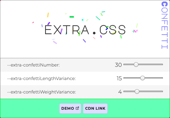
visit: extra.css
h1 {
  --extra-confettiNumber: 30;
  --extra-confettiLengthVariance: 15;
  --extra-confettiWeightVariance: 4;

  background: paint(extra-confetti);
}
Worklets: Animation API
- Allows animations based on user input
- Unlocks performant parallax (please use sparingly!)
Worklets: Layout API
- Complete control over the display property
- Able to polyfill layout specs like Container Queries
watch: Custom Layout Walkthrough

Part 4:
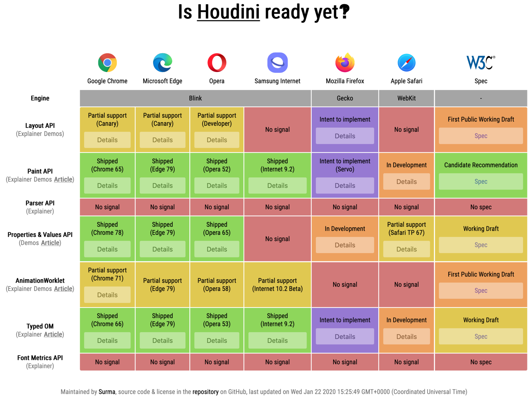
Where Are we now?


visit: ishoudinireadyyet.com
visit: ishoudinireadyyet.com

Part 5:
How do I get started?
Explainer: Houdini Spellbook


Aggregator: Awesome-CSS-Houdini
Examples: css-houdini.rocks

examples: Google Chrome Labs

in-depth articles: developers.google.com
Part 6:
Closing thoughts

Shareable, reusable, drop-in code: extra.css
Houdini is going to change
the way we write CSS
Houdini is great for
performance

- To device: 3Kb JS
- On device: 60FPS
Houdini is a
progressive enhancement

Houdini helps us write
more robust code
<header class="app__header">
  <figure class="header__jeffs">
    <img
      src="/img/jeff1.jpg"
      alt="Jeff YEAH"
      data-grad-start="#61bfd9"
      data-grad-end="#0551b4"
    />
    <img
      src="/img/jeff2.jpg"
      alt="Jeff again"
      data-grad-start="#15AF88"
      data-grad-end="#6C429A"
    />
    <img
      src="/img/jeff3.jpg"
      alt="It's all Jeff"
      data-grad-start="#EEA031"
      data-grad-end="#930560"
    />
  </figure>
</header>- Consistent types
- Clamped values
- No more string-based arithmetic bugs
CSS
♥
JS
vs
2014-2019
CSS
♥
JS
What Houdini really means

Thank you
@oliverturner