When Houdini met goldblum
Part 1:
What even is "Houdini"?!
CSS Houdini is a W3C effort to define lower-level CSS DOM APIs for authors to understand, recreate, and extend high-level CSS authoring features.
HOUDINI
definition: wiki.mozilla.org/CSS/Houdini
What is Houdini?
"God help us, we're in the hands of engineers"

Houdini is
a Toolbox
that
future-proofs
styling
a Toolbox
future-proofs
HOUDINI
What is Houdini?

Low-level APIs
+
Feedback
⇒
Adoption

Why is Houdini being developed like this?
-
Paint API
-
Animation API
-
Layout API
-
Typed OM
-
Properties & VALUES
HOUDINI
visit: houdini.glitch.me
Worklets
Houdini Ingredients
Worklets
- Isolated JavaScript contexts
- Must be parallelised (at least 2 instances)
- Invoked by the rendering engine
- Almost no access to global scope

"The foundation on which
Houdini is built"
@snugug
Worklets: Paint API
- Canvas-like drawing context
- Can "paint" anywhere images are supported
- Already shipped in Blink-based browsers! 🥳
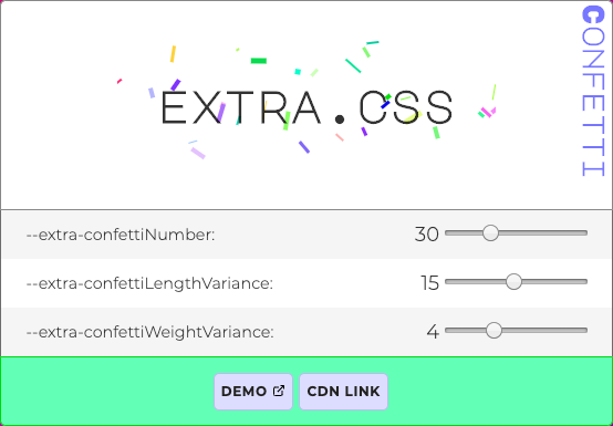
visit: extra.css
h1 {
  --extra-confettiNumber: 30;
  --extra-confettiLengthVariance: 15;
  --extra-confettiWeightVariance: 4;

  background: paint(extra-confetti);
}
Worklets: Animation API
- Allows animations based on user input
- Unlocks performant parallax (please use sparingly!)
Worklets: Layout API
- Complete control over the display property
- Able to polyfill layout specs like Container Queries
watch: Custom Layout Walkthrough

Typed Om
- Types are preserved between CSS & JS
- Already shipped in Blink-based browsers! 🥳
el.attributeStyleMap.set('opacity', CSS.number(.5));
el.attributeStyleMap.get('opacity');
// CSSUnitValue {
  value: 0.5,
  unit: 'number'
};attributeStyleMap
el.style.opacity = 0.3;
typeof el.style.opacity === 'string'
Current CSSOM
Typed OM
Typed Om
const cs = document.querySelector('.content').computedStyleMap();

cs.get('background-position').x;
// CSSUnitValue {
//   value: 50,
//   unit: 'percent',
// }

cs.get('background-position').y;
// CSSMathSum {
//   operator: 'sum',
//   values: CSSNumericArray {
//     0: CSSUnitValue { value: -10, unit: 'px' },
//     1: CSSUnitValue { value: 100, unit: 'percent' },
//   },
// }
.content {
background-position: center bottom 10px;
}sample.css
sample.js
computedStyleMap
Properties and values
CSS.registerProperty({
  name: "--gradientStart",
  syntax: "<color>",
  initialValue: "#61BFD9",
  inherits: true
});
@property --gradientStart {
syntax: "<color>";
initialValue: "#61BFD9";
inherits: true;
};Proposed CSS syntax
Current JS syntax
Polyfill: PostCSS Register Property

"Houdini" is a reference to CSS being able to free itself
from the constraints of big bang releases
What's in a name?
Part 2:
The one where Jeff
Goes Viral

TDD: Twitter-Driven Development 👍
- Gradients are static images
- No individual access to colour stops
.app__header {
  background-image: linear-gradient(#e66465, #9198e5);
}
But Wait!
what if we use Custom Properties?

Having individual access to the variables means
we can update the gradient dynamically!
:root {
  --gradientStart: #e66465;
  --gradientEnd: #9198e5;
}

.app__header {
  background-image: linear-gradient(
    var(--gradientStart),
    var(--gradientEnd)
  );
}
Codepen: Magic Gradient
document.addEventListener('mousemove', (e) => {
  // Translate mouseX into degrees for HSL
  const xDegree  = getXDegree(e.clientX) // 0 - 360

  // Update custom properties
  setStyle('--grad-start', xDegree)       // => 180
  setStyle('--grad-end', xDegree + 120)   // => 300
})
Magic Gradient: Animated Gradient
<html style="--grad-start: 180; --grad-end: 300">:root {
--grad-start: 180;
--grad-end: 300;
}
body {
background: linear-gradient(
hsl(var(--grad-start), 100%, 75%),
hsl(var(--grad-end), 100%, 50%)
)
}CSS
JS
HTML
Codepen: Magic Gradient
p {
  &::before {
    content: 'hsl(' var(--grad-start) ', 100%, 75%)';
  }

  &::after {
    content: 'hsl(' var(--grad-end) ', 100%, 50%)';
  }
}
Magic Gradient: Pseudo-content & Custom Props
Didn't work 😭
CSS IS A TYPED LANGUAGE
🤯
p {
  // Map custom-idents hueStart & hueEnd to Custom Props
  counter-reset:
    hueStart var(--grad-start)
    hueEnd var(--grad-end);

  // Use the value returned by counter(custom-ident)
  &::before {
    content: 'hsl(' counter(hueStart) ', 100%, 75%)';
  }
  &::after {
    content: 'hsl(' counter(hueEnd) ', 100%, 50%)';
  }
}
Magic Gradient: Pseudo-content & Custom Props
Type-juggling in CSS… 🤪

One month Later...

Mind. Blown.


Let's take a deeper look

Technique: stacked divs, animated opacity & z-index
<header class="app__header">
  <!-- Backgrounds -->
  <div class="jeff1-bg"></div>
  <div class="jeff2-bg"></div>
  <div class="jeff3-bg"></div>

  <!-- Portraits -->
  <figure class="header__jeffs">
    <img src="/img/jeff1.jpg" alt="Jeff YEAH" />
    <img src="/img/jeff2.jpg" alt="Jeff again" />
    <img src="/img/jeff3.jpg" alt="It's all Jeff" />
  </figure>
</header>
IMPERATIVE
vs
Declarative
IMPERATIVE
vs
Declarative
telling machines what to do, letting them figure out to how to do it
<header class="app__header">
  <!-- Backgrounds -->
  <div class="jeff1-bg"></div>
  <div class="jeff2-bg"></div>
  <div class="jeff3-bg"></div>

  <!-- Portraits -->
  <figure class="header__jeffs">
    <img src="/img/jeff1.jpg" alt="Jeff YEAH" />
    <img src="/img/jeff2.jpg" alt="Jeff again" />
    <img src="/img/jeff3.jpg" alt="It's all Jeff" />
  </figure>
</header>
Current structure
- Gradient information disconnected from images
- Adding content means editing multiple files
- Implicitly imperative
<header class="app__header">
  <figure class="header__jeffs">
    <img
      src="/img/jeff1.jpg"
      alt="Jeff YEAH"
      data-grad-start="#61bfd9"
      data-grad-end="#0551b4"
    />
    <img
      src="/img/jeff2.jpg"
      alt="Jeff again"
      data-grad-start="#15AF88"
      data-grad-end="#6C429A"
    />
    <img
      src="/img/jeff3.jpg"
      alt="It's all Jeff"
      data-grad-start="#EEA031"
      data-grad-end="#930560"
    />
  </figure>
</header>
Desired structure: declarative

<img src="jeff1.jpg" data-grad-start="#61bfd9" data-grad-end="#0551b4" />

<img src="jeff2.jpg" data-grad-start="#15AF88" data-grad-end="#6C429A" />

<img src="jeff3.jpg" data-grad-start="#EEA031" data-grad-end="#930560" />
This won't work
😭
:root {
  --gradientStart: #61BFD9;
  --gradientEnd: #0551B4;
}

@keyframes interpolate {
  from {
    --gradientStart: #61BFD9;
    --gradientEnd: #0551B4;
  }
  to {
    --gradientStart: #15AF88;
    --gradientEnd: #6C429A;
  }
}

.app__header {
  animation: interpolate 3s ease-in-out;
}
The browser knows how to turn one number into another

But if the variable type isn't a number…
¯\_(ツ)_/¯
"God help us, we're in the hands of engineers"

Custom Props are just spicy strings
Part 3:
How I learned to stop worrying and love Houdini
CSS.registerProperty lets us fix the type of the Custom Property
Properties & Variables API
CSS.registerProperty({
  name: "--gradientStart",
  syntax: "<color>",
  initialValue: "#61BFD9",
  inherits: true
});

CSS.registerProperty({
  name: "--gradientEnd",
  syntax: "<color>",
  initialValue: "#0551b4",
  inherits: true
});
const jeffs = [...hero.querySelectorAll("img")];
const jeffNum = jeffs.length;
export const showJeff = (currentIndex = 0) => {
// Extract gradient start/end from data attribute
const jeff = jeffs[currentIndex];
const { gradientStart, gradientEnd } = jeff.dataset;
// Update the Custom Props
root.style.setProperty("--gradientStart", gradientStart);
root.style.setProperty("--gradientEnd", gradientEnd);
// Slide next <img/> in (and get the next pair of gradients)
jeff.style.zIndex = 2;
jeff
.animate([
{ opacity: 0, transform: "scale(1.2, 1.2)" },
{ opacity: 1, transform: "scale(1, 1)" }
], {duration: 3000})
.onfinish = () => {
const nextIdx = currentIndex + 1;
setTimeout(switchJeff, 3000, jeff, nextIdx % jeffNum);
};
};
Updating --gradientStart/End triggers a smooth transition
.app__header {
  transition: --gradientStart 3s, --gradientEnd 3s;

  background-image: linear-gradient(
    var(--gradientStart),
    var(--gradientEnd)
  );
}CSS.layoutWorklet.addModule("/js/worklets/masonry.js");.main__gallery {
--padding: 20;
--columns: 5;
display: layout(masonry);
}main.js
main.css
display: familiar property, new value

[emotions not to scale]
Part 3:
How soon is now?


visit: ishoudinireadyyet.com

Download: Microsoft Edge Insider
Part 4:
How do I get started?
Explainer: Houdini Spellbook


Aggregator: Awesome-CSS-Houdini
Examples: css-houdini.rocks

examples: Google Chrome Labs

in-depth articles: developers.google.com
Part 5:
Closing thoughts

Shareable, reusable, drop-in code: extra.css
Houdini is going to change
the way we write CSS
Houdini is great for
performance

- To device: 3Kb JS
- On device: 60FPS
Houdini is a
progressive enhancement

Houdini helps us write
more robust code
<header class="app__header">
  <figure class="header__jeffs">
    <img
      src="/img/jeff1.jpg"
      alt="Jeff YEAH"
      data-grad-start="#61bfd9"
      data-grad-end="#0551b4"
    />
    <img
      src="/img/jeff2.jpg"
      alt="Jeff again"
      data-grad-start="#15AF88"
      data-grad-end="#6C429A"
    />
    <img
      src="/img/jeff3.jpg"
      alt="It's all Jeff"
      data-grad-start="#EEA031"
      data-grad-end="#930560"
    />
  </figure>
</header>- Consistent types
- Clamped values
- No more string-based arithmetic bugs
CSS
♥
JS
vs
2014-2019
CSS
♥
JS
What Houdini really means
Thank you FOR COMING TO
MY TED JEFF TALK
@oliverturner

Bonus slide: have an easter egg!