Web Design 3: Week # 6
Quiz time!
Please take Quiz # 5 on D2L!
Learning Time
So far, we've gone through creating a responsive page using manual techniques. That is, we used responsive grid layouts, media queries, and other techniques to give us a responsive web application. However, there is another approach to developing responsive layouts: the use of existing frameworks.
Frameworks give us the ability to create responsive pages using simple classes and structures so that our pages automagically become responsive. Now, this might seem a lot easier than what we just learned and it can be, but there are creative and technical limits:
1) If using a framework, you must understand the language of the framework and what it can and can't do. It might be great for creating a certain kind of style, but adjusting the CSS might be more difficult since you now have two layers of CSS to deal with.
Frameworks
Learning Time
2) The framework is going to take some time to understand and learn. This is tied into number 1, but it's vital to understand that there is going to be a learning curve to each framework.
Frameworks
Learning Time
Speaking of frameworks, we're going to be using the responsive framework developed by Twitter called "Bootstrap". Again, since this is an online course, I'm going to mainly be using online tutorials for your convenience.
Please follow along the notes by watching the Introduction, Section 1, and Section 2 of BootStrap 3 Essential Training on Lynda.com by Ray Villalobos.
You can use Lynda.com for free if you have a County of Los Angeles County library card (which is also free). There is a county library right next to the school, Duarte library.
Again, just like our last 5 classes, you will have weekly project updates that will cumulate into a final project. That means if you finished your work every week, you should have a final project ready at the end. We will be using a new project for the next 5 weeks. You can use your existing materials from the last project, but not what we've included for responsiveness over the last 5 weeks as it may interfere with Bootstrap.
Frameworks
Learning Time
Loggin In
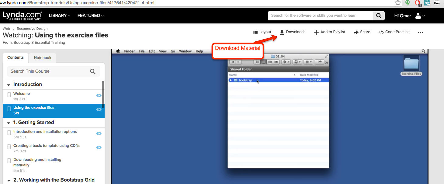
The first thing we need to do is log into Lynda.com via the County of Los Angeles Public Library (COLAPL) portal and then find the Bootstrap 3 Essential Training Course by Ray Villalobos. Here is a link for COLAPL log in: lynda.com/portal/sip?org=colapublib.org
Learning Time
Materials
Once you've logged in, please be sure to download the relevant materials from the Downloads section of the course:
Learning Time
What is Bootstrap?
- Bootstrap is a framework, like we mentioned earlier
- Goes for a mobile-first approach. This is the same mobile-first approach that we worked with in our first 5 weeks.
- It is a responsive design, using a 12 column grid frame work. This is similar to what we did when creating our layouts.
- Battle-tested: Bootstrap has been used extensively throughout many sites, making it well tested.
- Uses modern technologies: If using Bootstrap, you are usually using the latest technologies.
Learning Time
What is a Framework
- A framework is very similar to our layouts that we went over, except that they're coded into actual programs for us to use.
- It is a way to organize our code
- You follow a structure that makes you write code a certain way.
- Gives you many abilities, including classes that can automatically style your contents and features like carousels, nav menus, etc.
When to use Framework?
- Used for quick, small projects. This is because Bootstrap allows developers to create projects quickly and without the need for a designer. However, this has changed as there are templates for Bootstrap that look great. For example, http://startbootstrap.com/
Learning Time
installation
- You can get a basic or advanced version of Bootstrap at http://getbootstrap.com/
- You can install Bootstrap by downloading it or by using a CDN. A CDN is a content delivery network. That's just a fancy term for "we'll host the stuff for you, just link to us and we'll give you what you need". So, if you choose the CDN route, you're going to have a smaller project size and possibly shorter load time. However, there are advantages of downloading Bootstrap rather than using the CDN:
- You can download only what you need
- You can work on Bootstrap without a connection to the internet.
So, the choice is up to you.
Learning Time
installation Options (Choose one or the other)
- CDN
- To implement the CDN option, follow along the video and copy the code from https://goo.gl/NI6rLS and paste it into your index.html file of the project (you downloaded the project earlier).
- Here is the completed project: https://goo.gl/OYNW4x
- Downloading Bootstrap
- Download Bootstrap from http://getbootstrap.com/
- Decide on whether or not you're going to be changing values in the css file in Boostrap. If so, choose the non minified version to put in your project. If not, choose the minified version.
Learning Time
installation Options (Choose one or the other)
- Downloading Bootstrap (continued)
- Copy the fonts folder to your project folder and make sure it's in the same level.
- Copy either the minified or the regular version of Bootstrap to your project, depending on whether or not you're going to modify the file.
- Be sure to have the jQuery file included in your project and call the jQuery file before you call the bootstrap file.
- Here is a link to how the project can look like: https://goo.gl/JCKiYG
Learning Time
Grid System
- Bootstrap is built on a grid-like system, similar to how we used our layouts and the flex box, but with stricter standards.
- More specifically, Bootstrap uses a 12 column layout and also utilizes containers and rows. This gives the grid its table-like structure (rows and columns make up a table).
-
Bootstrap containers have two types, but both add padding to the sides.
- Fluid: adjusts to size of device. Can be used by adding a class of "container-fluid" to an element (usually a div element).
- Fixed-width: adjusts based on media queries. Can be used by adding a class of "container" to an element (usually a div element).
- Here is a link to the project with containers: https://goo.gl/jpiK9F
Learning Time
Rows
- Rows are used to set up containers for columns
- Adding a row to a container also removes any padding the container has. The default padding is 15 px.
To add a row to a container, simply add the "row" class to a div element within the container.
Learning Time
Columns
- Columns are what create the grid system by giving the layout the amount of columns you want.
- The classes are named as "col-SIZE-NUMBER OF COLUMNS". That is, you start off with using "col" and then set the size of the columns and then you set how many columns (up to 12) the column is going to take up.
- So, let's say you wanted 3 columns in a row and you wanted them evenly spaced. You could use "col-md-4" and give that class to 3 different containers.
- The size just gives you how much space you want until the breakpoint hits (as seen in the video), while the number of columns gives you the width of the columns, in relative terms.
- Here's a good site that has you build it in examples:
http://www.w3schools.com/bootstrap/bootstrap_grid_examples.asp - Check out Chapter 3 - Section 2 of the exercise files for the code to this part.
Learning Time
Multiple Breakpoints
You can also use multiple columns simultaneously. Why would you want to do this? Well, the size determines the breakpoints, so if you want different column arrangements depending on the viewports, this would be one way to do it.
Check out Exercise Files in Chapter 2 Section 4 for the code.
Learning Time
Resetting Columns
If you're having issues with the columns having weird float issues, then you might want to use responsive utility classes to fix the issue. Now, all the responsive utility classes do is fix issues with formatting and either make elements hidden or visible.
For example, let's say you have 3 divs with multiple classes. One of the classes has a float issue only in your col-sm breakpoint. You can add a div with a class of "clearfix" to clear out the float and then add the class of "visible-sm-block" in order to make the clearfix only on the "sm" breakpoint.
Check out Exercise Files in Chapter 2 Section 5 for the code.
Learning Time
Offset
You can also move the columns from their position from the left in units of columns by using the "offset" in the class.
For example, if you wanted space the size of 3 columns on the left hand side that have a size of xs, you could just add the "col-xs-offset-3" to the div. This would add 3 columns of space to the left, so you probably want 3 columns to the right as well. In order to do that, be sure to set "col-xs-6". That way, you have 3 columns of space on your left, your div takes up 6 columns of space, and your right hand side has 3 columns of space.
This might also affect other classes you have, so in order to clear the next class of any offset, be sure to set the next breakpoint to "offset-0".
Check out Exercise Files in Chapter 2 Section 6 for the code.
Learning Time
Nested Columns
Nested Columns are just columns within another column. You may want to do this when you want to have something a bit more complex.
To implement this, simply add another div with a class of "row" underneath the column you want to nest it under. You now have another 12 columns to use, albeit much smaller in size than the full size of the screen. The size of your nested columns is limited by the size of the parent column.
Add the div with the column classes like you did before and watch the magic happen.
Check out Exercise Files in Chapter 2 Section 7 for the code.
Learning Time
Pushing and Pulling Columns
Pushing and Pulling columns allows you to move columns based on their size from either the left or right. If you want to move a column to the right, you push it and if you want to move a column to the left, you pull it. This can be done, again, through the use of classes (hope you're seeing the pattern by now).
So, if you wanted to push the column with a breakpoint of xs by 1 column, you could add the class "col-xs-push-1
Check out Exercise Files in Chapter 2 Section 8 for the code.
Learning Time
That was a lot!
I know that was a lot of information to take in, so please take it slow and go through the notes and the videos.
Also, don't forget that you have me as a resource. Contact me if you're confused and I can set up a Skype session to help explain things.
Discussion
Don't forget to answer the discussion question for the week!
"What are the pros of using a grid-based system?"
Assignment 5
Once you're done with the reading and the lecture, I'd like you to continue working on your web application.
This week, your project requirements will be:
1) Create a 4-page website or use an existing 4-page website. You can duplicate the one used for the first 5 weeks, just be sure to remove any responsiveness.
2) Create a 12 column layout using at least 1 container, 1 row, and 3 columns.
Remember, the assignment for each week will result in a completed project. The next 6 weeks will be based on completing a final project, so see the project guidelines to see what the minimum requirements will be for your projects.