Vera & John Casino Case Study
In this deck we will reveal how to:
1. Skip __________________ _________ to improve registration conversion rate
2. Use ___________ _____________________ to make registration smoother
3. Simple ______________________ can go a long way
4. Don't forget about _________________
5. Use _________________ _________ to reduce churn
...and 3 more lessons from Vera & John


Just like 65M other visitors this month I've landed on Vera & John casino homepage.

By investing in digital advertising Vera & John is acquiring big numbers of monthly visitors.
Let's see where exactly is this traffic coming from.
Wow! It looks like Vera & John is getting about 62M monthly visitors from Japan only.
Wonder which publishers can provide that amount of gambling friendly traffic?

Gotcha Vera & John, if you know how to deal with adult & streaming traffic I see no reason why you should not invest in it.
Let's proceed to the registration!


Psst! Just keep on clicking right!
You can use your keyboard


The amount of text, input fields and tick boxes is a bit overwhelming at a first glance.
Hopefully the whole registration process will not be too complicated..
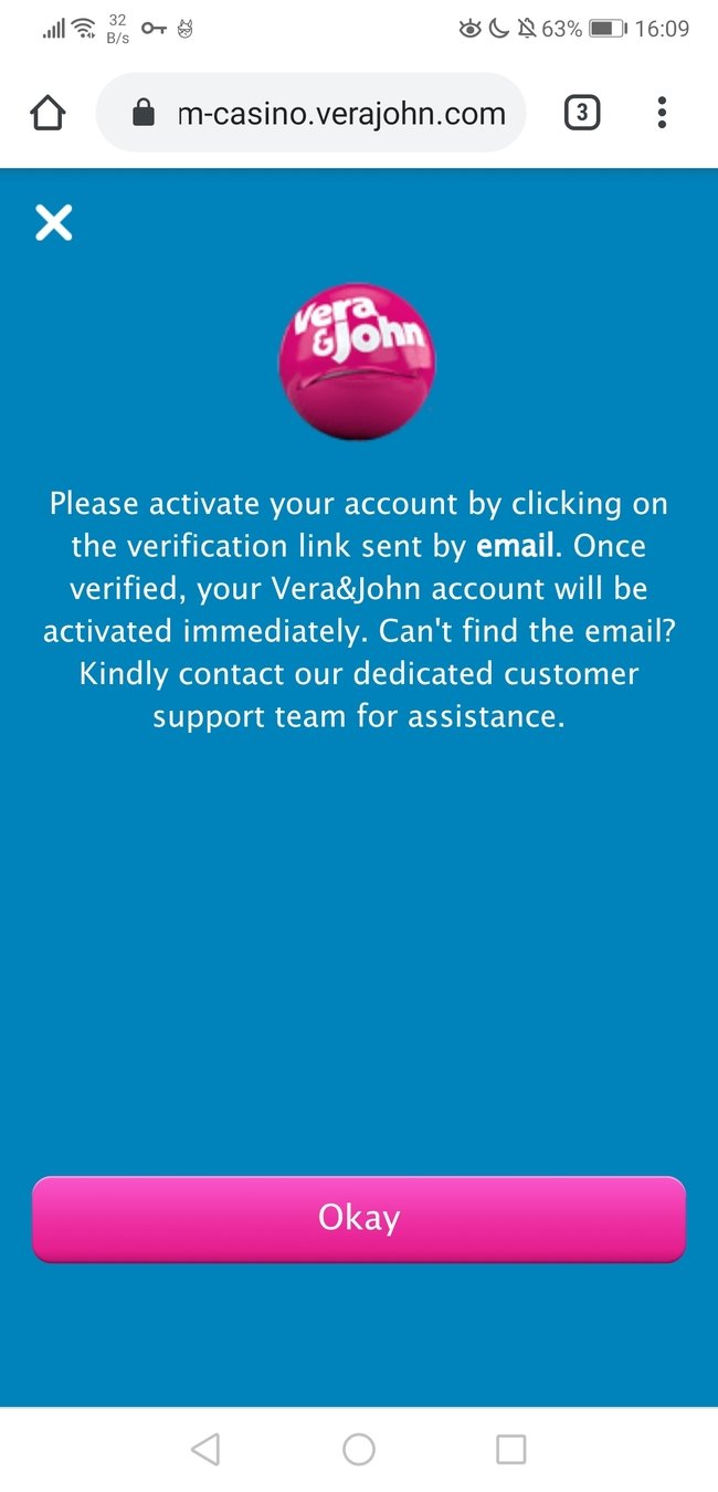
I decide to continue with the registration process regardless..
Despite initial objections now I see that registration should be quick and easy.
I can also see a clear benefit of completing the registration.
Not only I'll be a 'step closer to winning big bucks' but I'll also get a 200% bonus.
#1 Value Proposition
Always give your users a clear explanation of benefits associated with choosing your brand to make sure they keep their eyes on the prize.
It's time to start filling in that registration form.
Email - then email again.
Password and password again.
Seems like a lot of repetition for me..
#2 Skip the confirmation field
Show/hide toggle is more than enough to make sure the correct password is entered. Multiple studies prove that removing double confirmation field increases conversion without sacrificing accuracy of the the input data.
Three more tick boxes and I'm ready to move on to step 2.
Processing of the form takes a couple seconds, at least I can see that something is happening thanks to the loader icon.


I would like to amend my previous statement.
15 fields of personal information in one screen - this is quite a lot to process 😓
At least Vera&John is trying to make this process easier for me.
They automatically detect the country I'm currently in and fill in the appropriate fields for me.
By taking this approach a step further Vera&John could eliminate 4 fields from it's registration form.
How?

#3 Auto-suggestion
When implemented correctly address autosuggestion will improve conversion rate by reducing number of fields and improve accuracy of your data.
One of the most popular solutions for address auto-suggestion is Google Autocomplete used by thousands of business.
Two last steps in the registration form revolve around player protection.
Keep in mind that CRO is not always about short-term wins. Stay compliant, protect your players and your brand will yield higher returns in the long run.
OK, one last step and I can finally play some games!

After my first login I'm being greeted like an old friend.
The use of my first name makes it feel genuine and personal.
I want to play some real money games now.
Let's click that shiny deposit button and place some bets!
#4 Personalization
Personalization doesn't have to be based on complicated machine learning algorithms.
Little things like addressing your customer by name can go a long way in increasing your conversion.


Deposit page is straight to the point. I already had a payment method in mind so I quickly click the logo I recognize.
If I didn't though that inconspicuous 'compare' button would come in useful.
Step 2 contains only necessary fields and is easy to understand.
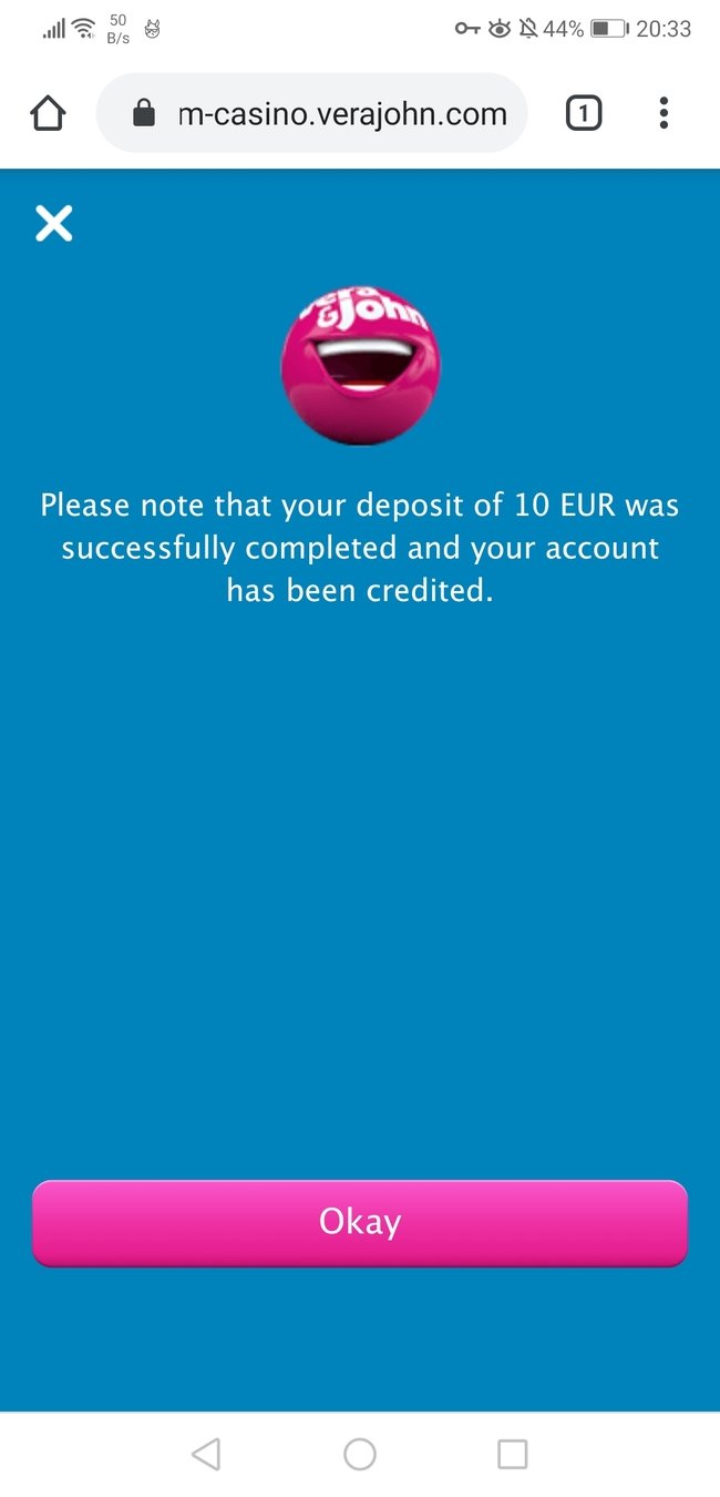
I just put in the desired amount and click continue.
Great! I get a clear notification that my actions were successful.
On top of that the little round mascot seem to be happy about my first deposit as well. Nice touch!
Have you noticed how different colors represent different priority of buttons along the funnel?
Gold buttons are clearly the ones I have to click to complete necessary actions.
Pink buttons while important won't impact crucial elements of my journey.
#5 Primary & Secondary Actions
By keeping the color of highest priority buttons the same and differentiating it from secondary buttons color you will make your desired funnel easy to follow and remove any confusion from decision making process.
Ugh..
Is anyone getting a headache too?
Lets quickly check the contrast ratio of the site.
I have a hunch that it might be the thing causing my headache.

source: https://webaim.org/resources/contrastchecker/
While white text on blue background definitely makes the site stand out it's also hard to read.
Web Content Accessibility Guidelines (WCAG) recommend for the contrast between foreground and text to be at least 4.5:1.
You can check your contrast ratios at https://webaim.org/resources/contrastchecker/
or do a full accessibility audit at
#6 Check Your Accessibility


It's time to plays some slots!
After heading to the games page I'm greeted by an array of clean game thumbnails. I choose one of my favorites and start playing.
It was a good session!
I played for a while and had a couple small wins.
Back in the lobby I notice some new notifications.
Wow! I've set a new record.
I have to beat it next time!
Read more about challenge and reward in our previous article
Gamifying your platform with challenges is an excellent way to increase user engagement and provide a USP that will make the players want to come back.
#7 Challenge & reward


I've decided to play some more and earned more badges.
Let's have a look what happened.

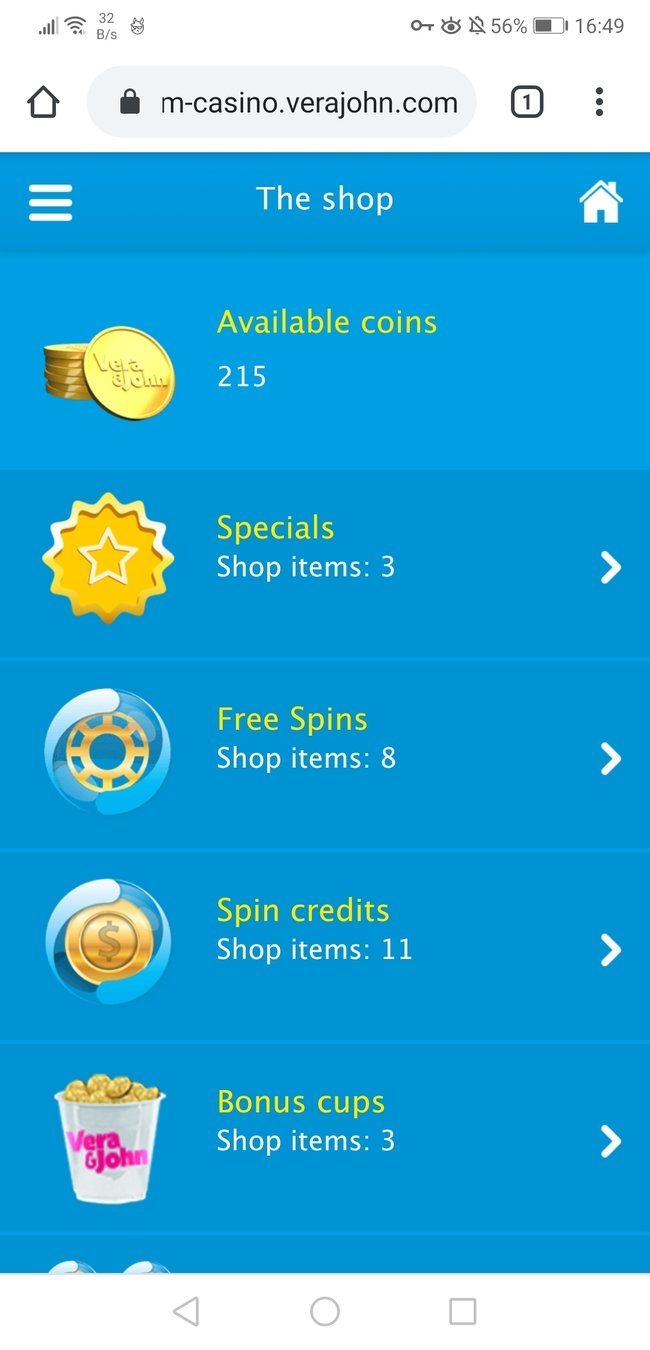
Vera & John loyalty program is based on badges, achievements and coins.
You can later use those coins to 'buy' bonuses.
It's a pity I can't use my coins to customize my avatar rather than just buy bonuses.
This would result in triggering stronger endowment effect if I were to ever to leave the platform.
#8 Endowment effect
Subconsciously we attribute more quality and value to something we've built ourselves. By taking time to create customized avatar you create a strong bond which will prevent you from leaving the platform.
By locking some of the prizes to players of certain levels VJ is encouraging players to actively participate in their loyalty program to be able to get more perks.

Looks like I'm running out of money..
It's time to wrap this case study up!
Registration page had a lot of fields, text and checkboxes.
I feel the whole process could be simplified.
After dealing with initial overload though I noticed the registration page highlighted the value proposition and player protection.
On the first login I'm greeted by name. That's a nice touch of personalization.
Thanks to smart color choices the deposit page is straightforward to navigate.
After browsing the site for a while I got a headache because of the contrast ratio being way too low.
Challenging me to beat my record wins and collect badges definitely increased my motivation to play.
What have we learned?
1. Highlight your ________ ________________ to get buy-in from more users
2. Skip __________________ _________ to improve registration conversion rate
3. Use ___________ _____________________ to make registration smoother
4. Simple ______________________ can go a long way
5. Differentiate between __________ and ______________ __________
6. Don't forget about _________________
7. Turn desired actions into _______________ and __________ ________ for completing them
8. Use _________________ _________ to reduce churn
value proposition
confirmation fields
address autosuggestion
personalization
primary
secondary actions
accessibility
challenges
reward users
endowment effect
Want to learn more?
Join our newsletter to receive bite-sized CRO & UX tips tailored to igaming industry.
In our newsletter group we regularly share:
- actionable CRO insights
- private case studies
- industry research
High Five - You Made it!