Summary of Research into Similar Products.
Conventions of Form: Film Poster
Film posters, regardless of genre, all have attributes that identify them as a poster. These are the convention of form. A main image is always present on a poster. The composition and shot type of this image is never the same, however they always aim to catch the attention of the audience. Conventionally the image will fill the entire poster and act as the background. The image in the poster will feature the main characters. Knowing who the leads are in the film can be a huge factor as to whether the audience decide to view the film. It is very rare for there to multiple images on a film poster, conventionally only one is used.
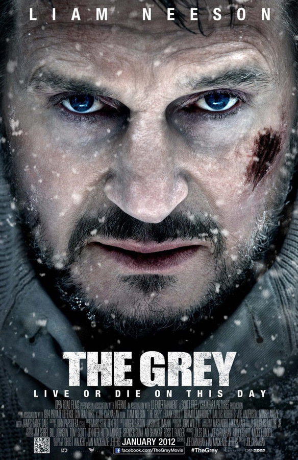
Main Image
Conventions of Form: Film Poster
The film title is the next basic convention that all film posters have and usually it will be the largest font on the page. This is because it is the most important piece of text on the poster. The tag-line conventionally follows the title, being placed underneath it in a small font size. The tag-line entices the audience through being a short phrase that sounds ominous or gives hints about the narrative. The leading role's name will accompany the image, this is
once again to give more information about the film and encourage the
audience to watch it.
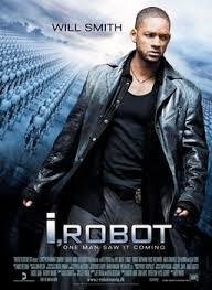
Tag-line.
Film Title
Actor Name
Conventions of Form: Film Poster
Film posters will have vital information that furthers the audiences knowledge about other aspects of the film like the release date and the director. The latter is another feature that may persuade the audience to watch the film, this is particularly effective if they are a famous director like Steven Spielberg or Martin Scorsese. A positive review of the poster is common on a movie poster. A billing block is nearly always present on a film poster, highlighting the actors, directors and producers as well as other key roles in the film's production. Where the film is being shown is also usually advertised. Film poster will also usually follow a root of the eye that follows a "Z" shape across the poster.The primary optical area is the top left corner; this is where the eyes first look. The "Z" continues across the top of the page and cuts diagonally to the bottom left corner. Lastly the route finishes in the bottom right hand corner; the terminal optical area.
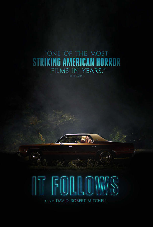
Film Review
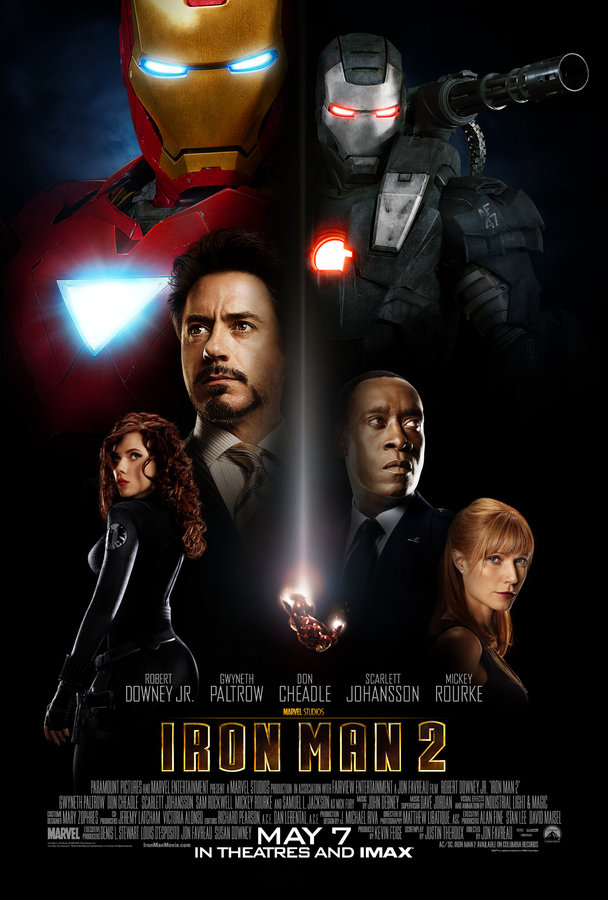
Billing Block
Release Date
Director
Conventions of Form Film Trailer
Film trailers follows a criteria of conventions. The trailer begins with the various production logos on screen. This obviously lets the audience know who is responsible for the production of the film. Furthermore it also gives an indication to the audience about aspects like the budget. For example the audience is likely to know that a film produced by Film 4 will be a small British production and have a much smaller budget that a film made by DreamWorks; a huge American film production company. The trailer is also given an age rating this is usually indicated through a red or green card at the very beginning of the trailer.


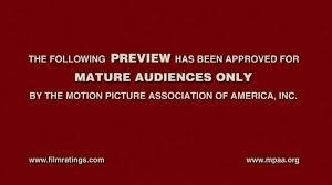
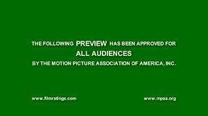
Conventions of Form: Film Trailers
Conventions of Form:Film Trailers
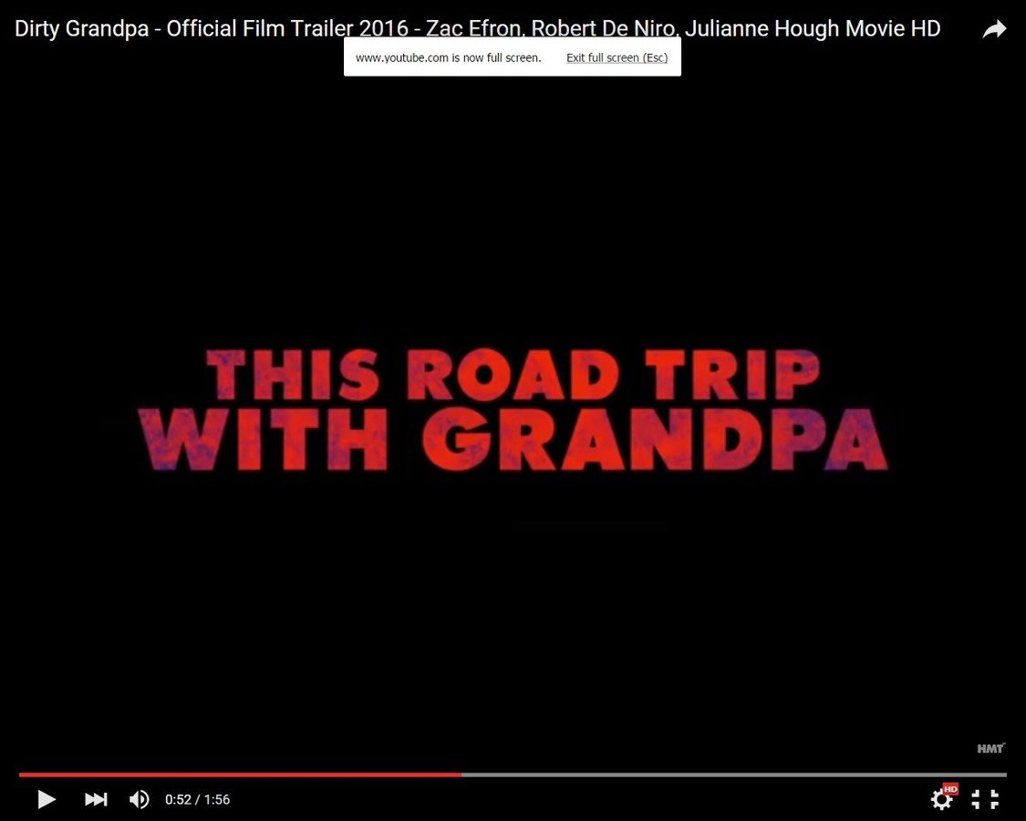
A film trailer has several key aims. It needs to entice the audience and peak their interest, this is can be done through suspense and mystery. Furthermore it needs to hint at the plot whilst not giving key narrative aspects away. A trailer will begin with a slow paced shot to build suspense. As the trailer progresses, title screens will be introduced to increase audience anticipation and hint at the plot. This screenshot is an example of a title slide from the "Bad Grampa" trailer. Generally in the latter half of the trailer the shots become faster to build excitement. However this aspect is amplified depending on the genre. The horror genre employs this feature regularly. This technique is used to create a sense of energy and thrill the audience. A film trailer length is conventionally anywhere between one and a half minutes to two and a half minutes.
Conventions of Form: Film Trailers
A trailer conventionally concludes with the title of the film, once again this is to gives a sense of hype as the trailer progresses. After this title comes a social media link that promotes the film. through viral marketing this is then followed by a billing block.

Conventions of Form: Magazine Front Cover
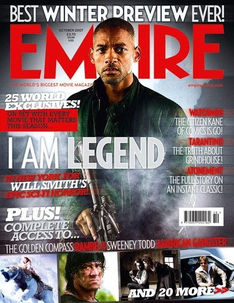
The masthead is unique to every cover, this is how the audience distinguish one cover from the next.They will conventionally be the largest font on the page. They will also be in the top third.
This is a strap line, its purpose is to promote the magazine and tell the audience how popular the magazine is.
This is the date and price, and issue number. Every magazine will have this, however this magazine has them placed unconventionally, usually they will be directly underneath the masthead.
A top line is another convention, its purpose is to promote the main cover story.
This is the magazine website, all modern and established magazine companies will have this to further promote the magazine
Cover lines are a vital component of every magazine cover they show to the audience the type of articles inside. These cover lines will conventionally be smaller than the main cover line to show they are less important. Underneath these are the tag lines in a smaller font in a different style.
More coverlines
This is the main cover line its larger font size indicates its importance. The different font style also helps to set it apart from the other cover lines. All magazine front covers will have a main cover article.
Cover lines will usually be accompanied by a tag-line that describes the article.
Barcode
Additional Cover lines.
Conventions of Form: Magazine Front Cover

The main image is conventionally placed down the middle third and in front of the masthead. This makes the cover more aesthetically pleasing.
Most magazines will follow a "root of the eye" This is the visual path the audience will take when they first see the cover.
Right third
Left third
Middle third
Middle third
Top third
Bottom third
Conventions of Genre
Setting: In the horror genre the setting is nearly always isolated, it is this sense of isolation that helps to build tension. Horror locations are often rural, this ties in well with the isolation theme. One of the key idea associated with rurality is the unknown. This use of setting is prominent in films like "The Woman in Black" and "The Boy". However successful films that have broken this convention include the "Scream franchise"with its suburban location.
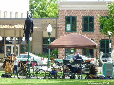
Scream location
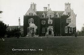
Woman in Black setting
Lighting: The lighting used in the horror genre is conventionally low-key. This helps to convey tension. Darkness is associated with fear this is always a key theme in horror. As a result of this convention the ambient light in these films will rarely be broad daylight. They are more likely to be associated with dusk and nightfall. Below is an example of this from "The Exorcist." Having said this, high-key lighting is also used to make a character seem more intimidating by casting shadow over their face.
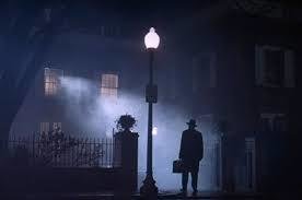
Conventions of Genre
Props: Props in horror films often relate back to violence. The protagonist often needs to protect themselves from the antagonist using weaponry. Adding to this an antagonist can become more recognisable to the audience through a signature weapon. Like Freddy Kruger's signature weapon an bladed glove from the "A Nightmare on Elm Street" franchise. or the kitchen knife from "Halloween"


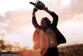
Costume: Like props, costume also helps the audience identify characters. The genre typically uses dark costuming, this fits in well with the aesthetic of the genre. Furthermore the audience can also identify who the antagonist is through their costume. A horror antagonist will usually wear worn, dark clothing that is often heavy, cloaked and hides their face. Examples of this can be seen in "Friday the 13th" and "Texas Chainsaw Massacre".
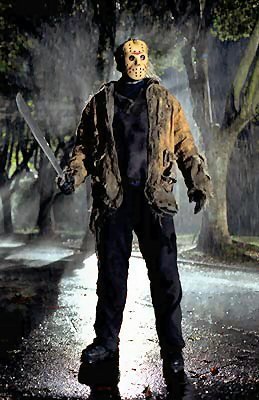
Conventions of Genre
Typography: Across all mediums font can help convey the horror genre. Both serif and san-serif are common in trailers, posters and magazines; however the genre seems to lean towards bulky serif font, this is perhaps because they help convey the horror genre to a better degree than san-serif.
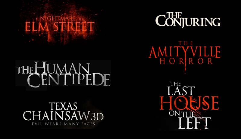
Colour: The conventional colours for the horror genre are red, white and black. Red has connotations of blood and anger. White has the opposite, this colour denotes purity, and heroism. Black signifies the unknown and fear. These are all key themes in the horror genre.
Camerawork and Editing: Typically the editing is fast-paced to create a tense atmosphere. The antagonist is portrayed as powerful through low-angle shots whilst the protagonist is conventionally shown as the underdog through high-angle shots.