Ancillary Analysis 1

Typography
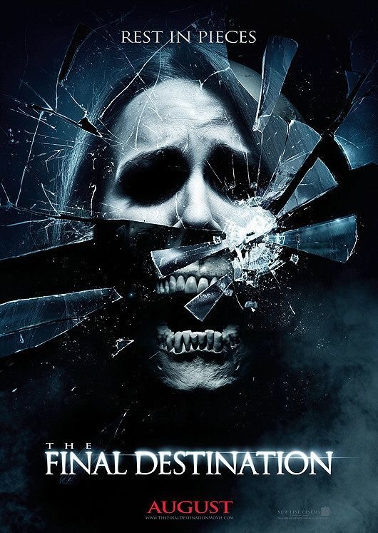
The tag-line "Rest in Pieces" is a sadistic line that suites the horror genre very well. This phrase is a play-on-words. The original "Rest in Piece" has been modified with "Pieces" this implies the the gruesome nature of the casualty involved. The tag-line ties in with the clean and broken pieces of glass. The serif font is in a sharp and formal style that adds to the posters sinister and dark theme. Adding to this, the tag-line is conventionally smaller compared to the rest of the typography on the poster. The main title "The Final Destination" is sized so the audience can focus on the key words "Final" and "Destination". The font style of the film title is the same, this helps to keep continuity to the poster.
The clean yet sharp font style has Gothic connotations. The date of the poster once again has the same style of typography. However this text is more compressed and is positioned at the very bottom of the poster.
Images
There is one main image on this poster, it is a close-up of a woman who is a protagonist in the film. The close up is split in two; the first half being a face of a woman. The image is literally broken in half by the shattered mirror. The bottom section of this face, specifically the jaw,teeth and part of the nose is bone and in skeletal form. In using a skull in the image it instantly has further connotations of death and fear.
The shattered mirror effect creates an interesting poster that will draw the attention of the audience. The pieces of glass work together with the tag line. A hard high-key lighting is effective in exposing most of the face if this character, while at the same time it hides other features, like the eyes which are in complete darkness. The fact that we can't see the eyes of this woman makes her seem frightening and lifeless. The line of light that is stretched across the main title give the film a sense of spectacle, the mist that is placed around the bottom corner of the poster has the same effect. The pitch black background helps the main image stand out and highlights the fact that the woman's head is only visible in the poster.

Colour
The main colours in this poster are black and grey. Black has been used in the background of this poster, this is very conventional for the horror genre, it also has connotations of darkness. Once again grey is used. Adding to this the grey is conventional for the horror genre. A grey tinge also evident on the main protagonist. This gives her a corpse-like complexion. This fits in well with the death theme that is so imminent in the Final Destination films. The dark colours also co-ordinate with the image of the skull. Once more reiterating the theme of decay and death. Having said this the date is in a bright red. This adds variation to the poster and has connotations of blood.

Layout
The layout of this poster is very symmetrical. Each piece of text is central throughout the poster, this formulaic layout helps it to be appealing and easy to read. The main image is placed between the tag-line and film name. Adding to this, the image takes up the vast majority of the poster. This layout choice helps it catch the eye of the audience.

Conventions of Genre and Form

This poster is very conventional for the horror genre, each technical element helps to convey the theme of death and violence. Dark colours are used throughout. Adding to this the imagery is both violent and disturbing, all of these elements are conventional for the horror genre.
This poster also conforms to the conventions of form. To begin with the tag-line is at the top of the page this is typical. The main image covers the majority of the poster and is placed in the center. The title of the film is placed towards the bottom half of the poster followed by the date of release at the very bottom.
Poster Analysis 2

Typography

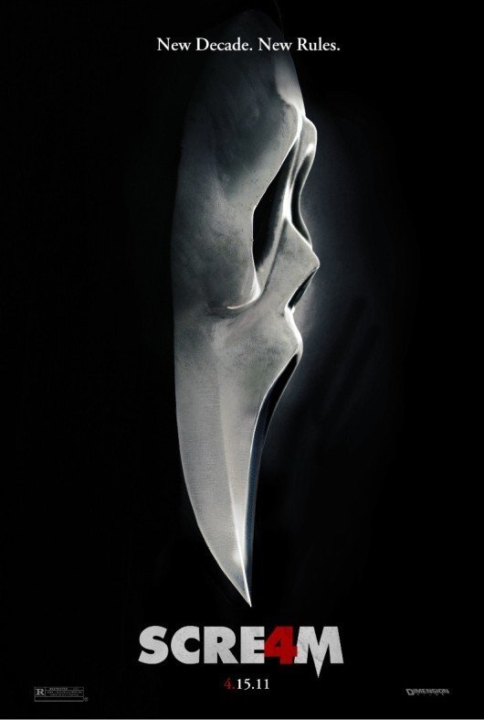
The tag-line is in a small serif font, this can be contrasted with the large san-serif font that is used for the film name. This variation will make for a more interesting poster to the audience. The tag-line font has a clean and sharp edge to it, this helps it to stand out from the black background. However, the tag-line itself is effective because it reads; New Decade. New Rules. These short sentences will appeal to an audience who enjoy the "Scream" franchise because they imply a fresh start or change from the usual film plot. "New Decade" is very effective because it connotes that scream is a long running franchise and therefore, that they are successful films.
The thick block capital film title is a font style that is in keeping with the typical Scream title seen in the other three movies. Having said this the title is effectively related back to the film, with the fact that it is fourth in the series and four has taken the place of the "A" in scream. The film release date is situated in the middle at the very bottom of the poster, the date has been given an identical font to the tag-line, this consistency with the font helps create a style for the poster. The date has been written in short hand. This is most suited to a poster because it is a brief form of media designed to draw attention and be taken in very quickly, so a short-hand date contributes to this idea.
Images

There is a single image on this poster and it is the scream antagonist "Ghostface" that has had a variety of identities behind the mask. The mask itself has become iconic to the scream films. Therefore it is a great choice of image for the poster. The image is a close-up view looking side on at this mask. The side on view is unusual it would be more common to have a direct view of the entire front of the face. Having said this the side-on view is effective for a number of reasons.
Firstly the black background that shrouds this character creates a sense of mystery only to entice the viewer further. The black colour makes it difficult to see whether Ghostface is wearing his iconic hooded robes, or in fact, if its just an empty mask waiting to be filled. This uncertainty makes a successful poster because it sparks curiosity in the audience. The use of this view is also effective because it helps the edge of the mask look like the blade of a knife. This use imagery is very effective because it is a reference to the film its self. Ghoastface's signature weapon is a hunting knife with a blade that looks similar to the edge of the mask. Members of the target audience who are fans of the Scream films will have picked up on this visual reference. This connotation of a knife blade is helped because the mask has been given a glint and shine, that makes it seem metallic. This effect reinforces the idea of the mask looking like a blade edge. The background of the mask has white glow, this makes for a more frightening image. Furthermore this white glow has connotations of ghosts, this ties the images in further with the antagonist Ghostface. These continual references to the film help the poster appeal to the audience.
Layout

Each piece of text is placed in the centre of the poster, progressively working down the page. The tag-line is a the top and the date is a the bottom. The information on this poster is set out like this because this way, it is very easy for the audience to digest and take in the information. Each piece of the poster is positioned consecutively one after the other in exactly the same place.
This style of layout is most effective when a large image takes up most of the poster. This is because the large image can be placed between the two most important lines of text, they are the tag-line and the film title. This layout also ensures everything is viewed in the correct order; the tag-line, the image, the title and the date. The root of the eye is a Z starting in the top left hand corner running directly across to the the right hand corner and then slanting directly across to the opposite bottom corner, this path finishes in the bottom right hand corner.
Colour

There are three main colours in this poster they are black, white and red. Black is used in the entire background, this has connotations of darkness. This theme is very common in horror because it creates as sense of the unknown and of threat. The black contrasts heavily with the other colours particularly the white. The black helps the white of the mask and the font to become more prominent in the poster, in turn this means that the audience will notice the poster easily. As this is a key aspect to any poster, the choice of a black background is very effective.
White is commonly used is horror. This is because it has connotations of fear, the complexion of an individual who is terrified, is often said to turn white. Having said this it can also be associated with illness. This colour is perfectly suited to the film Scream, this is because a scream is the sound someone makes when they are terrified.
Red is the most iconic colour in horror because it has connotations of gore and blood. These themes are very evident in this "slasher" sub-genre. Each "4" in both the date and the title are red, this singles them out and emphasises to the audience that this film is the fourth instalment in the franchise.
Conventions of Genre and Form
As already stated the colours in this poster are very conventional for the genre, in fact they are the three most conventional colours in the horror genre. The three colours connote fear, blood and gore and mystery or a feeling of the unknown.
The poster also conforms to the conventions a film poster usually follows. To begin with the image on this poster follows convention because it is of a main character form the film, this helps the poster become easily recognisable. A film poster's layout can be dependant on the size and type of the image, with a large image the text will usually be placed in a formulaic manner down the centre of the image. this poster follows this convention very closely. With the tag-line at the top and the date at the bottom. The typography also follows the conventions of form. To begin with, the tag-line is serif this is a conventional. Adding to this the title is san-serif because is needs to stand out. The sizing of the font is typical for a poster, the date being the smallest and the title being the largest.
