CSS Grid Layout
Olea Ovidiu
- What is CSS grid Layout?
- How we use it?
- Grid Tools
- Demo
- Four Reasons to use Grid
- Interactive learning links
- Q&A
Agenda:
What is CSS grid Layout?
CSS grid layout is a technique in CSS that allows you to create complex responsive web design layouts more easily and consistently.
- the very first CSS module created specifically to solve the layout problems
- It is a two-dimensional system (Rows and Columns)
Html Table
Box model
FlexBox
CSS Grid
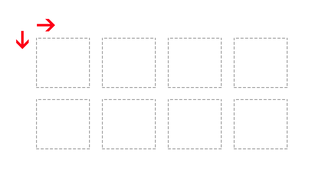
Two dimensional
What is CSS gird Layout?
"Css Grid" - Google Trends
Source:http://bit.ly/2p5xI9X

Browser support

- As of October 2017, Chrome, Firefox, Safari, and Edge all support CSS grid without vendor prefixes
- IE 10 and 11 support CSS grid but with an outdated specification
- On mobile, all modern browsers support CSS grid except for Opera mini
How we use it?
Grid Line
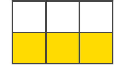
The dividing lines that make up the structure of the grid. They can be either vertical ("column grid lines") or horizontal ("row grid lines") and reside on either side of a row or column. Here the yellow line is an example of a column grid line.

Grid Track
The space between two adjacent grid lines. You can think of them like the columns or rows of the grid. Here's the grid track between the second and third row grid lines.
How we use it?
Grid Cell
The space between two adjacent row and two adjacent column grid lines. It's a single "unit" of the grid. Here's the grid cell between row grid lines 1 and 2, and column grid lines 2 and 3.

How we use it?
How we use it?
grid-template
grid-template-columns
grid-template-rows
grid-gap
grid-column-gap
grid-row-gap
justify-items
align-items
grid-column-start
grid-column-end
grid-column
grid-row
justify-self
align-self
Properties for the Parent
(Grid Container)
Properties for the Children
(Grid Items)
How we use it?
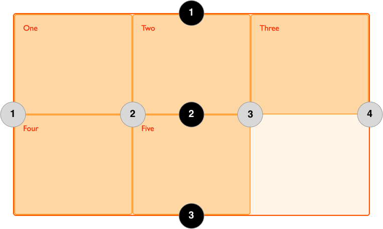
Grid lines
How we use it?
Grid lines properties
Implicit Number:
Explicit Name:
grid-template-rows: 10% 40% auto;
                        1   2   3
grid-template-rows: [sidebar] 10% [content] 40% [sidebar] auto [last-line];
How we use it?
Content Align properties
Align Rows:
Align Columns:
justify-items - align all the rows
align-items - align all the columns
justify-self - align single row
align-self - align single column
Grid Container
How we use it?
The element on which display: grid is applied. It's the direct parent of all the grid items. In this example container is the grid container.
<div class="container">
  <div class="item-1"></div>
  <div class="item-2"></div>
  <div class="item-3"></div>
</div>
.container {
    display:grid;
}
Shorthand properties
Grid Container
Grid Items
.container {
    grid-template: grid-template-rows / gird-template- columns;
}
.item-a {
grid-column: <start-line> / <end-line> | <start-line> / span <value>;
grid-row: <start-line> / <end-line> | <start-line> / span <value>;
}Shorthand for gird-templates-columns & grid-templates-row
Shorthand for grid-column-start / end & grid-row-start / end
How we use it?
CSS functions
The repeat() CSS function represents a repeated fragment of the track list, allowing a large number of columns or rows that exhibit a recurring pattern to be written in a more compact form.
.container {
    grid-template: repeat(2, 50%) / repeat(2, 50%);
}
How we use it?
.container {
    grid-template-column: repeat(2, 50%);
    grid-template-row: repeat(2, 50%);
}
Grid Tools
Grid Inspector
Inspect the Design
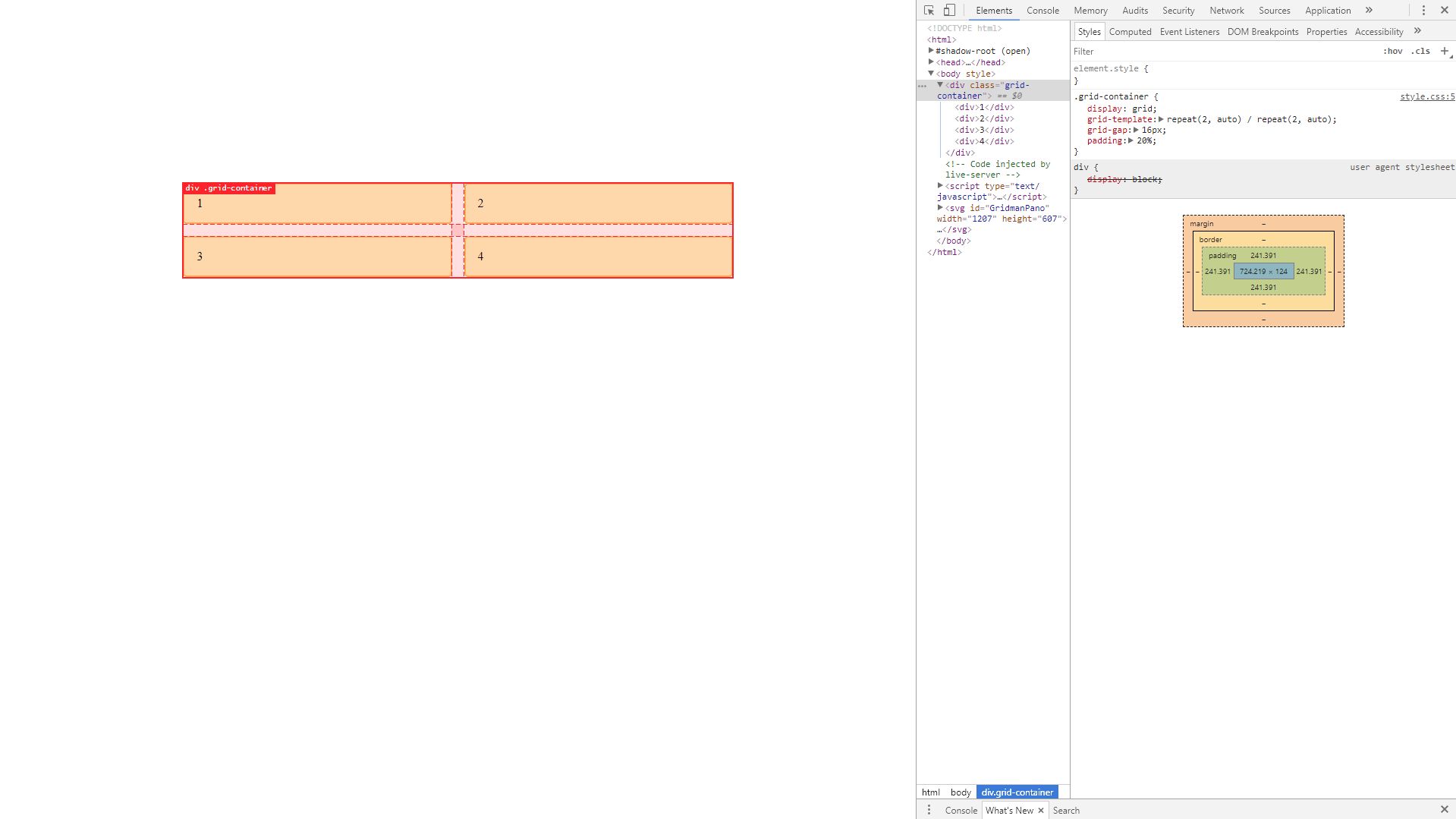
Grid inspector tool lets you see the grid lines in the browser while you’re creating a layout or studying other examples of CSS Grid in action. In fact, this entire page was laid out using CSS Grid.
Firefox:
Chrome: (Gridman Extension)
Grid Inspector
(DEMO)
Grid System
(DEMO)
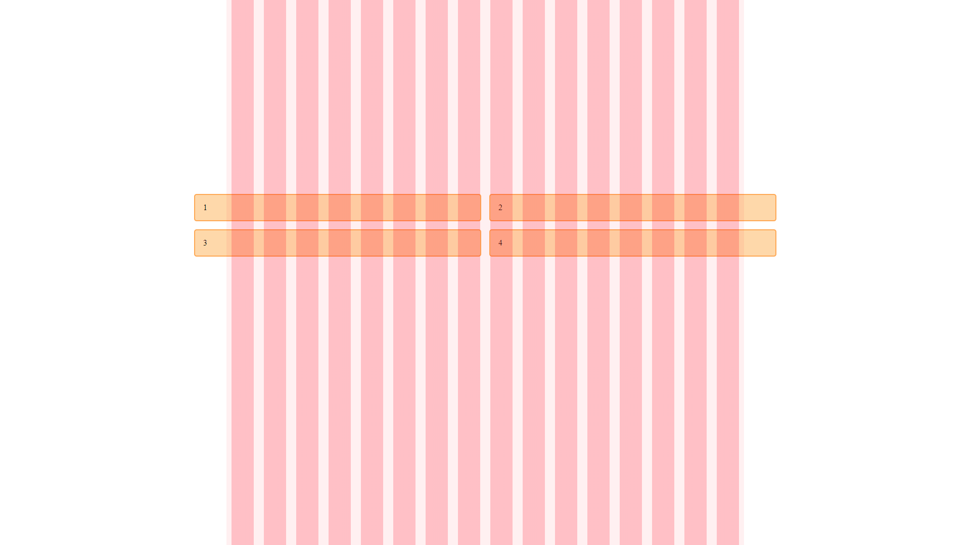
DEMO
Clarity/Order - Grids bring order to a layout making it easier for visitors to find and navigate through information.
Four Reasons to use Grid
Efficiency - Grids allow designers to quickly add elements to a layout because many layout decisions are addressed while building the grid structure.
Economy -Grids make it easier for other designers to work and collaborate on the design as they provide a plan for where to place elements.
Consistency/Harmony — Grids lead to consistency in the layout of pages across a single site or even several sites creating a structural harmony in the design.
Interactive learning links
Grid Garden:
Learn CSS Grid: