元件庫開發心得
Design System、UML、開發流程
大綱
1. 前言
2. Design System
3. UI 元件分類
4. 元件庫 UML
5. 一個元件的誕生
6. 小談測試
前言
-
前公司接很多後台 ERP 的案子
每次都花很多時間從頭造輪子很浪費時間 -
兩種策略 — 「自幹」或「用現成的」
採用自幹的理由:
- 強調設計、風格明確
- 資源充足(資金、規模、人力)
市面上有哪些選擇
- Design System(純設計、品牌端)
- Polaris - Shopify
- Material Design
- Ant Design
- CSS Framework(純樣式)
- Bootstrap
- Tailwind → Utility CSS
Integrate w/ component logic → Headless UI
- UI Framework(樣式+邏輯,開箱即用包)
- Material-UI
- Ant Design
- Chakra UI
大推
Design System
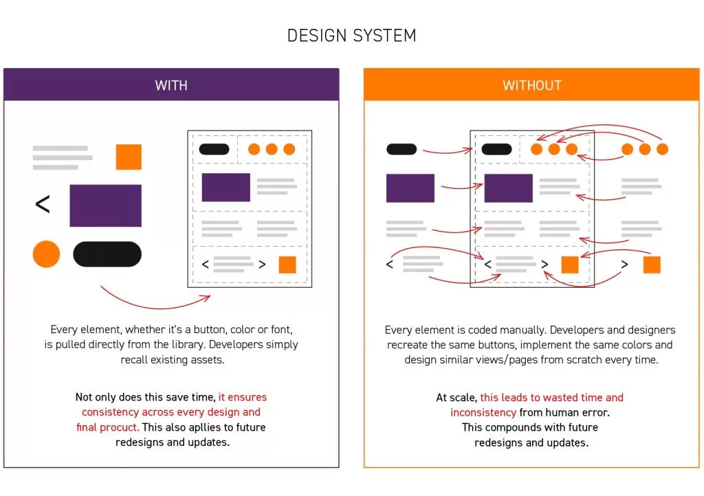
Why Design System?
- 為系統提供一致的介面體驗
- 避免重複造輪子
- 加速開發流程
- 專注在商業邏輯
從 Design System 出發理解
網頁設計跟頁面架構背後的概念
能讓我們更快地知道 Framework 都在幹嘛
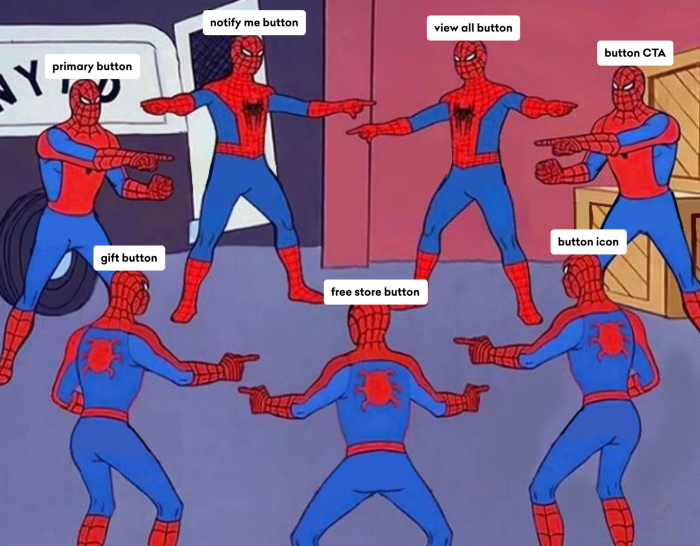
What if we don't have Design System?
What is Design System?
由一組共享、整合的元素及原則來定義產品整體的設計
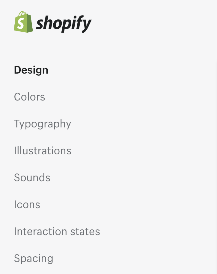
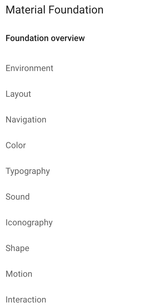
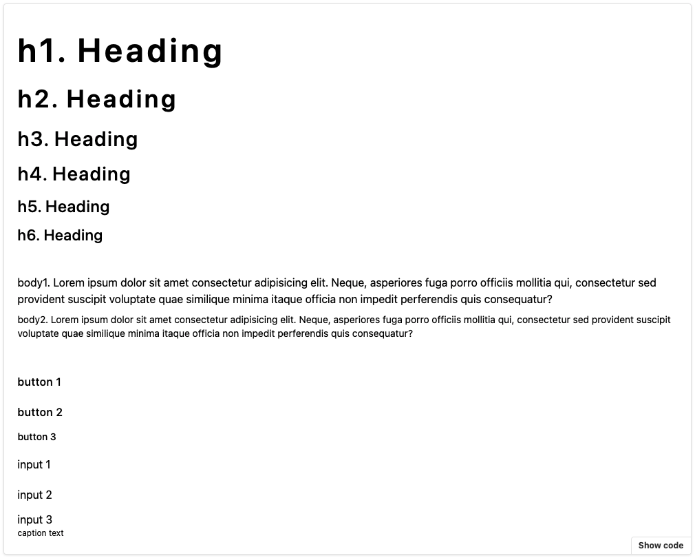
Design System in Project
Design System in Project
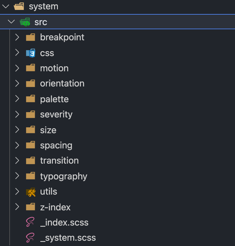
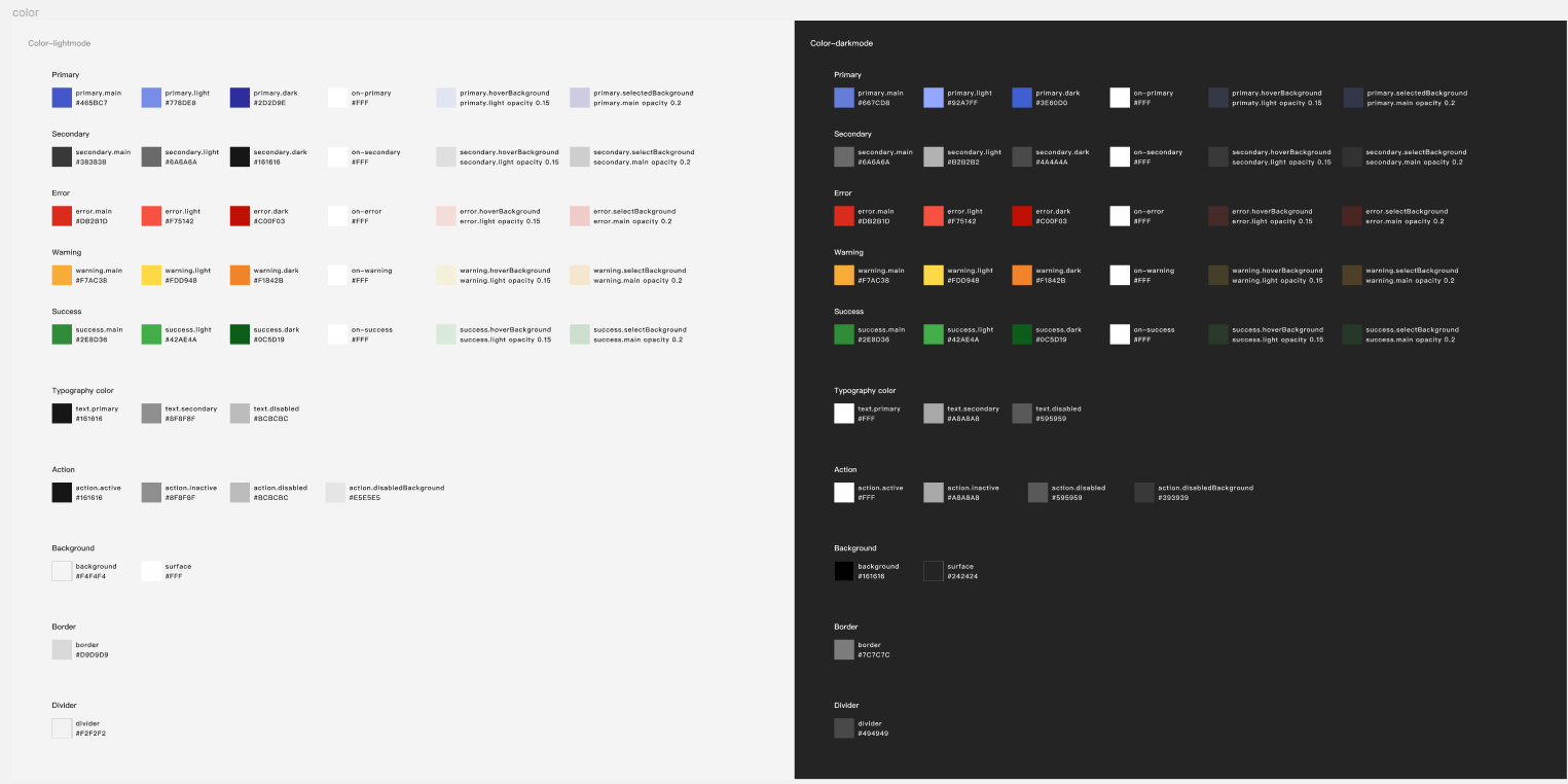
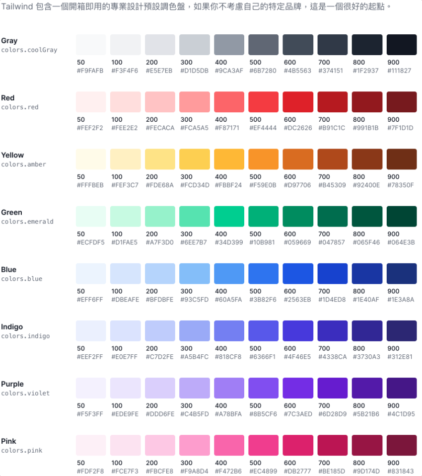
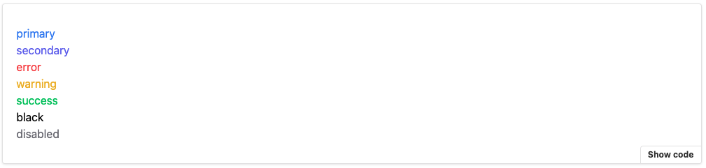
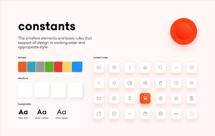
Color System (Palette)
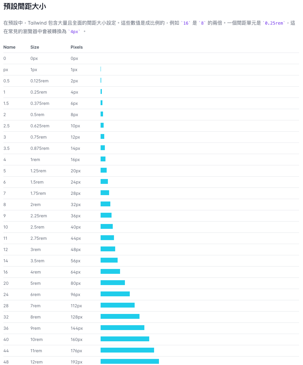
Spacing
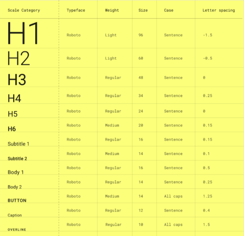
Typography
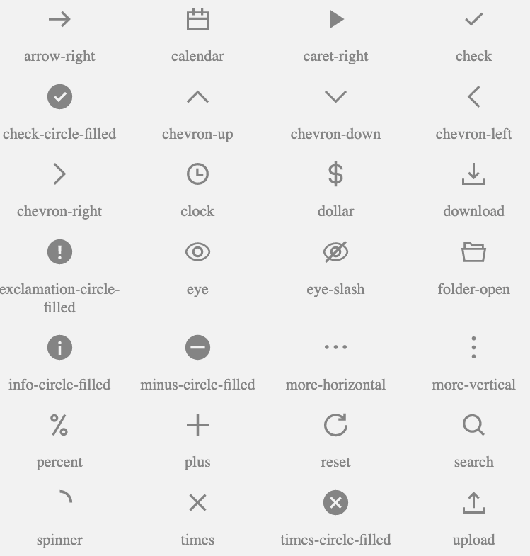
Icons
import { IconDefinition } from './typings';

export const ArrowRightIcon: IconDefinition = {
  name: 'arrow-right',
  definition: {
    svg: {
      viewBox: '0 0 24 24',
    },
    path: {
      fill: 'currentColor',
      fillRule: 'evenodd',
      stroke: 'none',
      strokeWidth: 1,
      d: 'M13.8 6.8l5.198 5.198-5.198 5.198-1.06-1.06 3.384-3.386H5v-1.5h11.131L12.74 7.86 13.8 6.8z',
    },
  },
};
export interface IconDefinition {
name: string;
definition: {
svg?: {
viewBox?: string;
};
path?: {
d?: string;
fill?: string;
fillRule?: 'nonzero' | 'evenodd' | 'inherit';
stroke?: string;
strokeWidth?: string | number;
transform?: string;
};
};
}
const Icon: React.FC<IconProps> = (props) => {
  const { className, color = "black", icon, spin = false, style, ...rest } = props;
  const { definition } = icon;

  return (
    <i
      {...rest}
      aria-hidden
      className={`
        inline-block flex-shrink-0 select-none w-em h-em
        ${spin ? "animate-spin" : ""}
        ${color ? Color[color] : ""}
        ${className ? className : ""}
      `}
      data-icon-name={icon.name}
      style={style}
    >
      <svg {...definition.svg} focusable={false}>
        <path {...definition.path} />
      </svg>
    </i>
  );
};Atomic Design
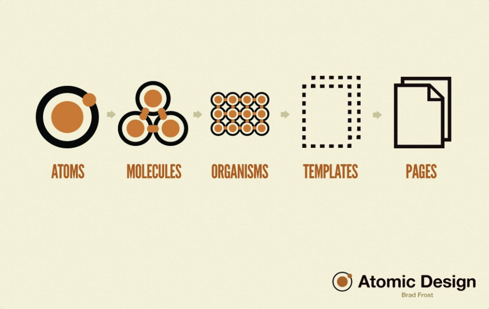
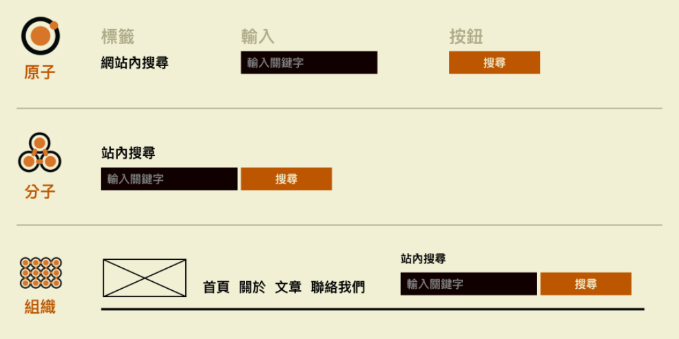
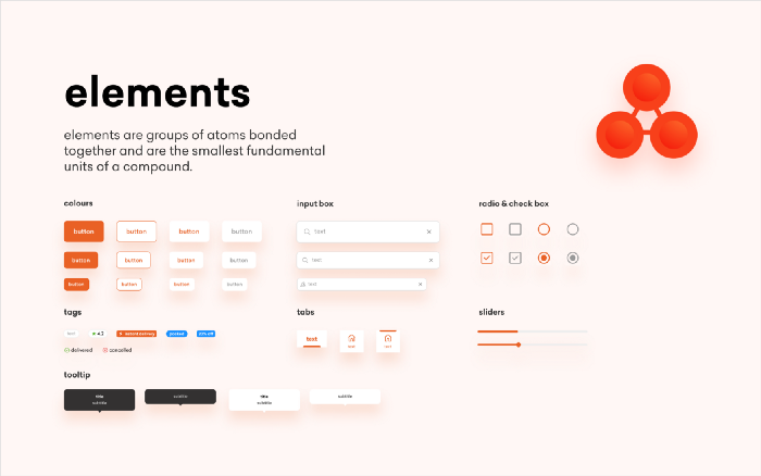
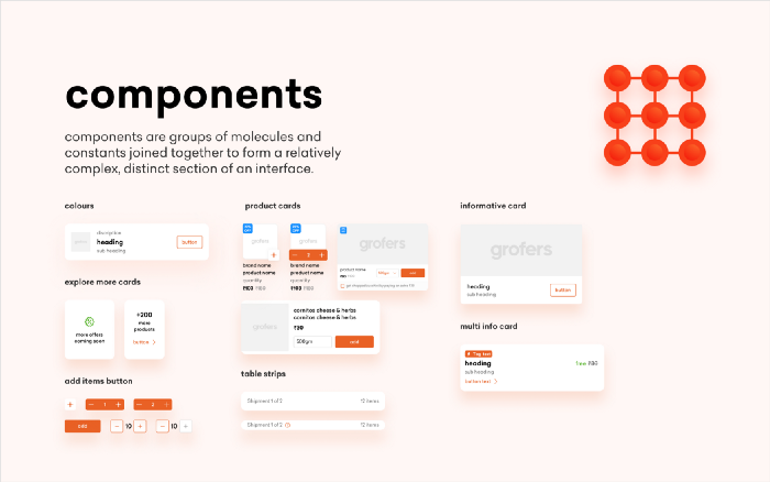
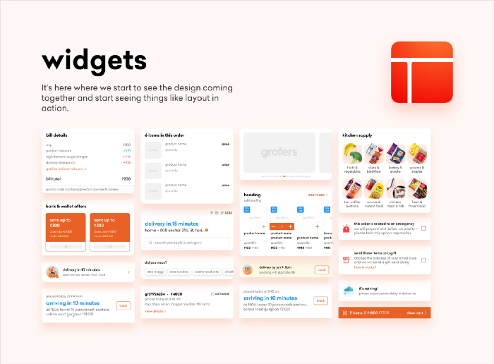
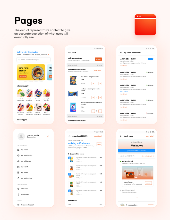
Design System
UI Component Library
Composed Component
(通常是在專案各自實作)
Layout / Template / Scaffold
Overview
因系統而異,在前公司大多是參考 Ant Design
- Layout
- Inputs
- Navigation
- Surfaces
- Feedback
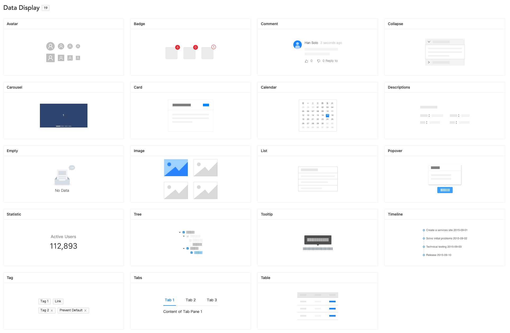
- Data Display
- Utils
- Lab
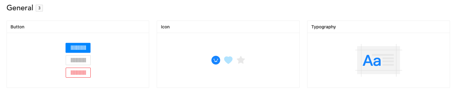
- General
- Layout
- Navigation
- Data Entry
- Data Display
- Feedback
- Other
- Layout
- Forms
- Data Display
- Feedback
- Typography
- Overlay
- Disclosure
- Navigation
- Media and Icons
- Others
- Hooks
General
Layout
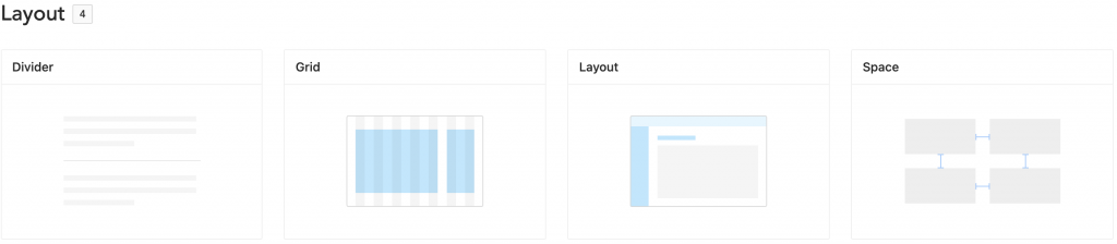
與網站的排版佈局有關係的元件
常見的還有 Box、Container、Flex 和 Wrap 等等。
Navigation
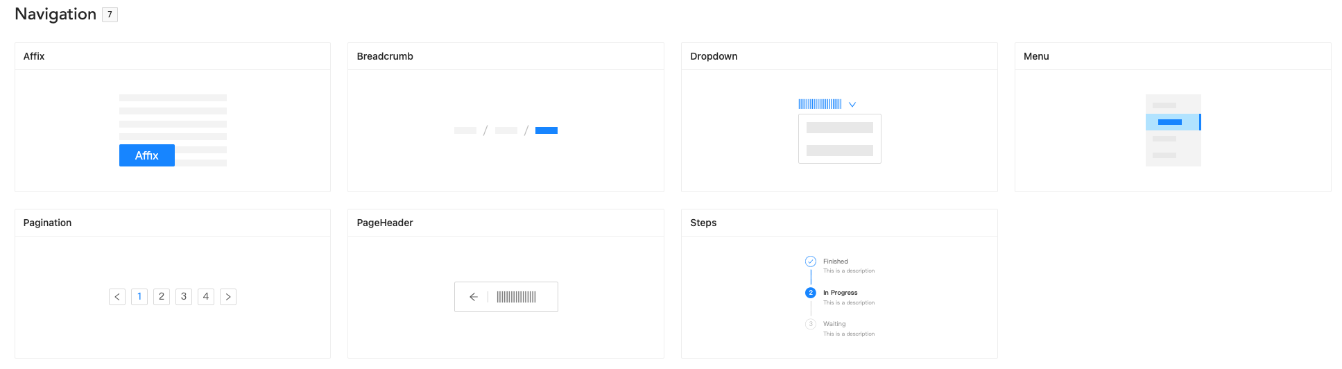
導覽相關的元件
提示使用者處於網站中的哪一個階段
與這些元件的互動通常會切換頁面。
常見的還有 Drawer、Links 等等。
Data Entry
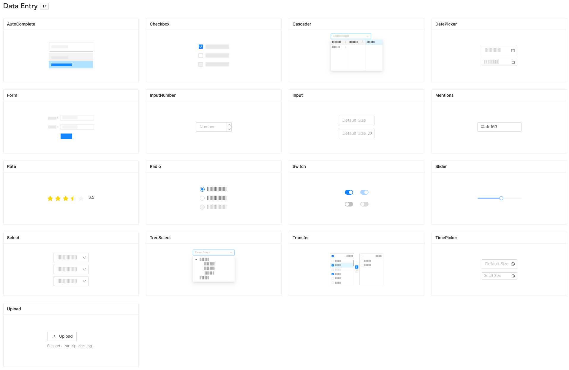
Inputs, Forms or Data Display
Feedback
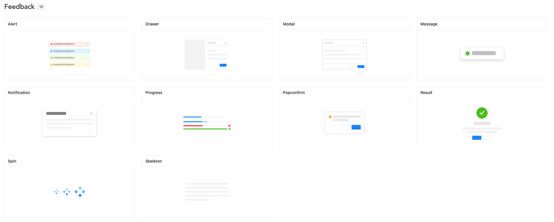
使用者互動過後網頁給使用者的反應
讓使用者感受到網頁還有在運作
Utility
- Portal 系列
- Overlay
- Transition
UML
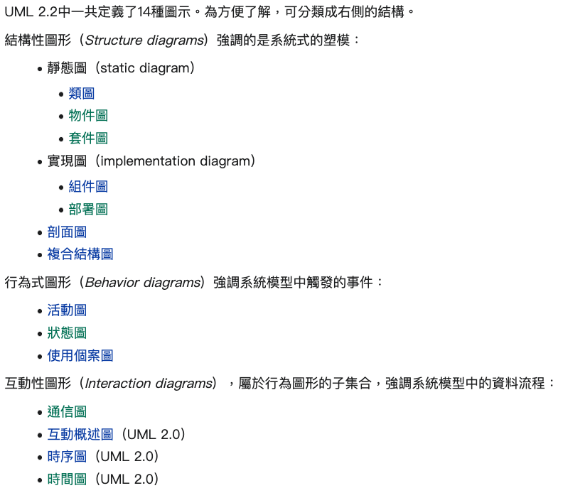
What is UML (Unified Modeling Language)?
以圖像化的方式,將系統的功能與結構畫成「模型」與藍圖
一種開放的方法,用於說明、視覺化、構建和編寫一個正在開發的、物件導向的、軟體密集系統的製品的開放方法
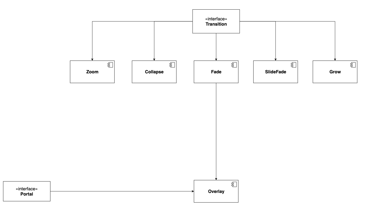
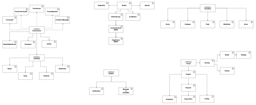
Component Diagram
反映出元件之間的依賴關係
Interface
Component
共用功能的抽象化
- TextField
- FormControl
- Portal
- Notifier
- Transition
就是一個個的 UI Component
- Input
- Button
- Popper
- Notification
- Fade
一個元件的誕生
WorkFlow
規格 Spec
介面 Interface
實作 Implement
Design System、UML 到 Spec 都是前期規劃
元件庫要好用很大程度決定於這些前期準備夠不夠完善
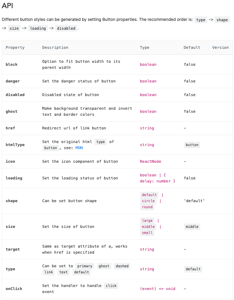
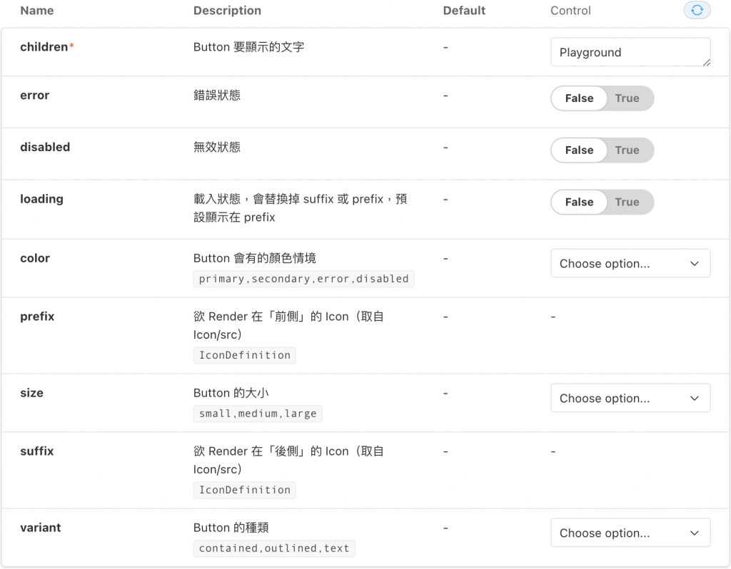
// 概念:先繼承原生的 Button Props 再來擴充需要的 Props
export interface ButtonProps extends Omit<React.ComponentPropsWithRef<'button'>, 'prefix'> {
  color?: ButtonColorType;
  error?: boolean;
  disabled?: boolean;
  loading?: boolean;
  prefix?: ReactNode;
  size?: Size;
  suffix?: ReactNode;
  variant?: ButtonVariantType;
}
Button Implement
const Button = forwardRef<HTMLButtonElement, ButtonProps>(function Button(props, ref) {
  const {
    children,
    color = 'primary',
    error = false,
    disabled = false,
    loading = false,
    onClick,
    prefix: prefixProp,
    size = 'medium',
    suffix: suffixProp,
    variant = 'text',
    style,
    ...rest
  } = props;

  let prefix: ReactNode = prefixProp;
  let suffix: ReactNode = suffixProp;

  // 處理情境
  if (loading) {
    const loadingIcon = <Icon icon={SpinnerIcon} spin />;

    if (suffix && !prefix) {
      suffix = loadingIcon;
    } else {
      prefix = loadingIcon;
    }
  }

  const asIconBtn = children == null && !!(prefix || suffix);


  // 處理樣式 (CSS)
  const buttonColorClass = useMemo(() => {
    if (disabled) return Color['disabled'];
    if (error) return Color['error'];
    if (color) return Color[color];
  }, [color, disabled, error]);

  const padding = useMemo(() => {
    if (asIconBtn) return 'px-0';

    if (size === 'small') return 'px-3';

    return 'px-4';
  }, [asIconBtn, size]);

  const iconClass = useMemo(() => size === 'small' ? "text-lg" : "text-2xl", [size]);

  const variantClass = useMemo(() => {
    if (variant === 'contained') return `text-white ${ButtonVariant[variant]}-${buttonColorClass}`;

    if (variant === 'outlined') return `border-2 text-${buttonColorClass} ${ButtonVariant[variant]}-${buttonColorClass}`;

    return `${ButtonVariant[variant]}-${buttonColorClass}`;
  }, [buttonColorClass, variant]);

  const disabledClass = useMemo(() => disabled ? "opacity-40 cursor-not-allowed" : "hover:opacity-60", [disabled]);
  const loadingClass = useMemo(() => loading ? "cursor-default pointer-events-none" : "", [loading]);

  // HTML Structure
  return (
    <button
      {...rest}
      ref={ref}
      aria-disabled={disabled}
      className={`relative box-border flex-center flex-shrink-0 gap-1 m-0 rounded cursor-pointer select-none whitespace-nowrap uppercase focus:outline-none ${padding} ${iconClass} ${variantClass} ${disabledClass} ${loadingClass}`}
      style={style}
      disabled={disabled}
      onClick={(event: MouseEvent<HTMLButtonElement>) => {
        if (!disabled && !loading && onClick) {
          onClick(event);
        }
      }}
    >
      {prefix}
      {children && <span className={`${size ? ButtonSize[size] : ""}`}>{children}</span>}
      {suffix}
    </button>
  );
});

export default Button;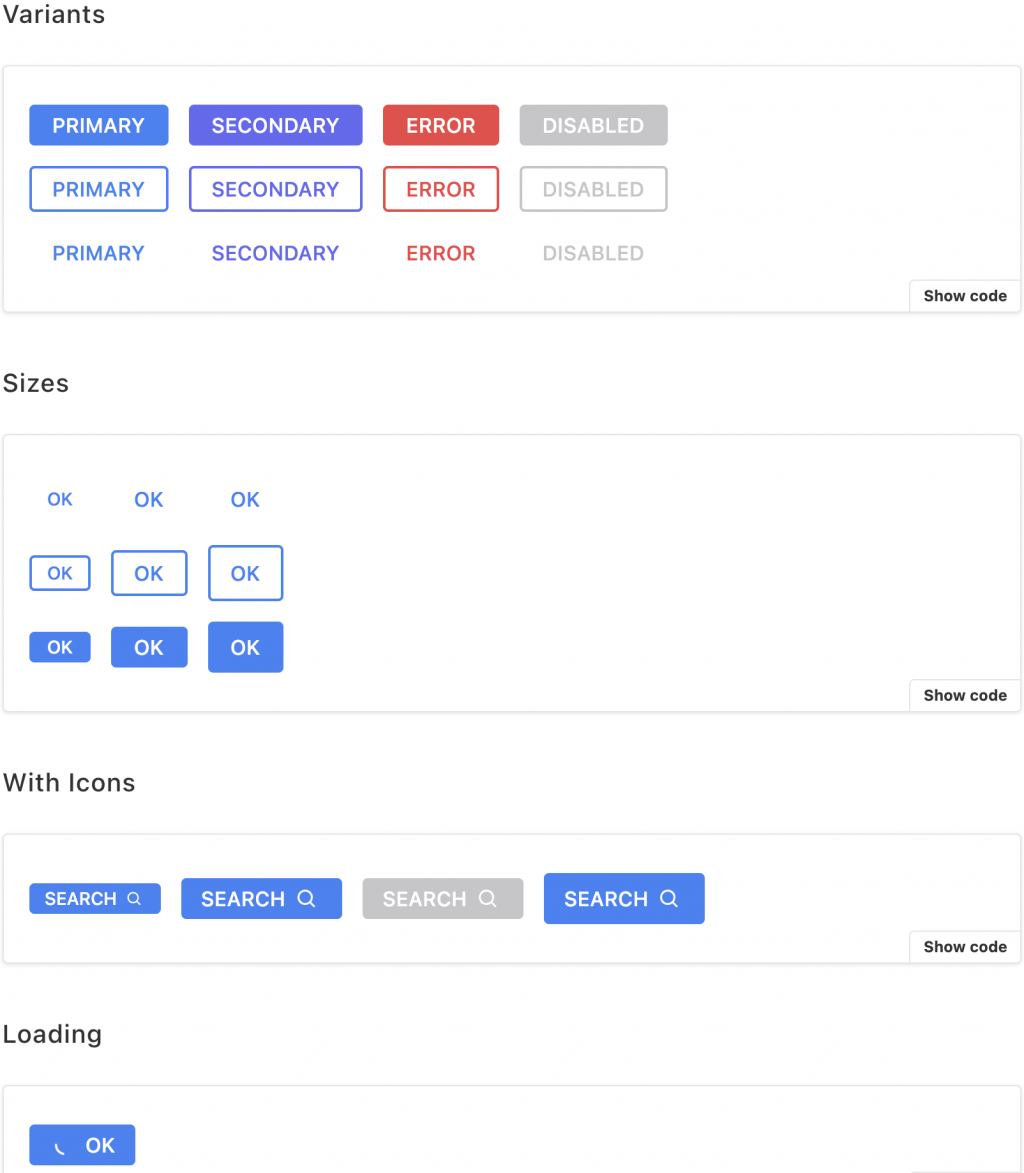
測試
各種測試
單元測試 Unit Test
整合測試 Integration Test
端對端測試 E2E Test
Unit Testing
-
測 最基本的情況 Component 該有的要有
-
測 各種 props 有沒有正常顯示?
-
style, element, attribute
-
-
測 coverage
-
每一行每一個 if-else branch 都跑
-
describe('<Switch />', () => {
  // 1.
  describeForwardRefToHTMLElement(
    HTMLSpanElement,
    (ref) => render(<Switch ref={ref} />),
  );

 // 2.
  describeHostElementClassNameAppendable(
    'foo',
    (className) => render(<Switch className={className} />),
  );

  describe('prop: checked', () => {
   	 // 3.
	 [false, true].forEach((checked) => {
        const message = checked
          ? 'should be checked if checked=true'
          : 'should be unchecked if checked=false';

        it(message, () => {
          const { getHostHTMLElement } = render(<Switch checked={checked} />);
          const element = getHostHTMLElement();
          const [inputElement] = element.getElementsByTagName('input');

          testChecked(element, inputElement, checked);
        });
      });
   };
 };
個人想法
公司規模不大的情況下
若能以市面上的方案出發來架構跟設計的話應該是可以避掉很多問題
畢竟錢跟資源真的挺有差的
條件不到位的情況下,也只會開發出半吊子
又浪費很多時間跟資金
Thanks For Listening
Q & A Time