Conceptual Models
CMPT 363
“Genius is the ability to reduce the complicated to the simple.”
– C.W. Ceram
Where Are We?
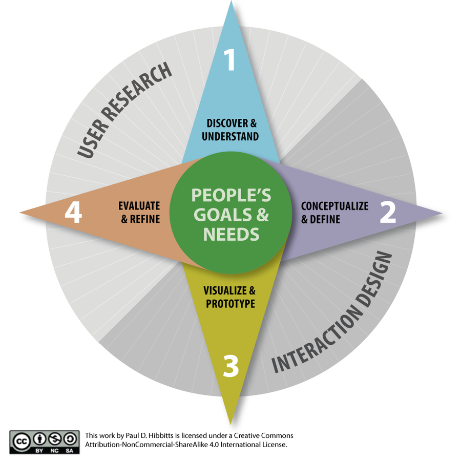
Let’s begin exploring
conceptual models…
with a case study
Apple iOS 6
Apple iOS 7
(and iOS 8... and now iOS9!)
Now, let’s get into the details of…
Conceptual Models
Mental Model
Mental Model
user’s conceptual model
Mental Model
- How to use an object
- What can be done with it
- How to recover from errors
Mental Model
Mental Model
Mental Model
Mental Model
- Two compartments: the freezer (frozen food, top) and fridge (fresh food, bottom)
- Two controls in bottom compartment
- Task is to make the freezer warmer and keep the fresh food the same temperature
Fridge Freezer Instructions
Copyright by respective copyright owners. Used without permission under the Fair Use Doctrine. Source: The Design of Everyday Things by Donald Norman
Presented Conceptual Model
Copyright by respective copyright owners. Used without permission under the Fair Use Doctrine. Source: The Design of Everyday Things by Donald Norman
Correct Conceptual Model
Copyright by respective copyright owners. Used without permission under the Fair Use Doctrine. Source: The Design of Everyday Things by Donald Norman
Revealing Mental Models
- Card sorts
- Interviews
- Contextual inquiries
- Visualizations
- Participatory design
- Usability tests (esp. "think aloud")
Mental Model
Activity:
Mental Model Case Study
Metaphors
Problems with Metaphors
- Breaks existing rules/conventions
- Too constraining for designers
- Conflicts with design principles
- Actions beyond metaphor causes confusion
- Translation of bad existing designs
Idioms
- Idioms are figures of speech that are understood not to be
taken literally - While an idiom must be learnt, it is learnt quickly, and once learned is essentially never forgotten
- For example, “He’s no rocket scientist” really means he’s not especially bright
Design Model
Levels of Design
- Idea, intent, goals
- Usability and user experience objectives
- Function and content (system services)
- Function and content structure (design model)
- Interaction structure (navigation model)
- Interaction techniques
- Presentation techniques (layout and graphical design)
- Physical form (artifact design)
Design Model
Design Model
General Guidelines for
Defining Design Models
- Based on the user’s point of view
- Centered around the user’s goals and tasks
- Easy to understand and remember
- Predictable in behaviour (consistent)
Key Design Model Questions
- What will the visual representation be?
- What objects/concepts are needed?
- How various objects/concepts relate to each other?
- How will needed tasks be supported?
Activity:
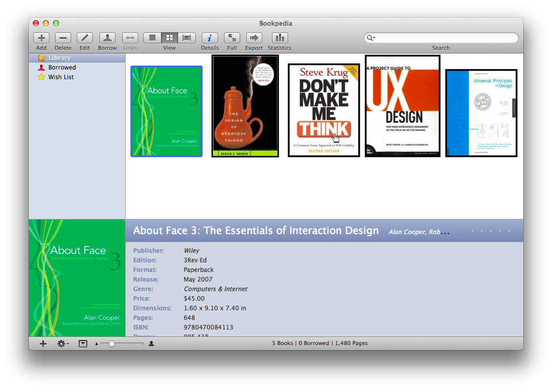
Design Model Case Study

Design Model
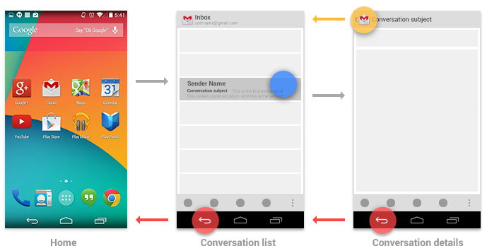
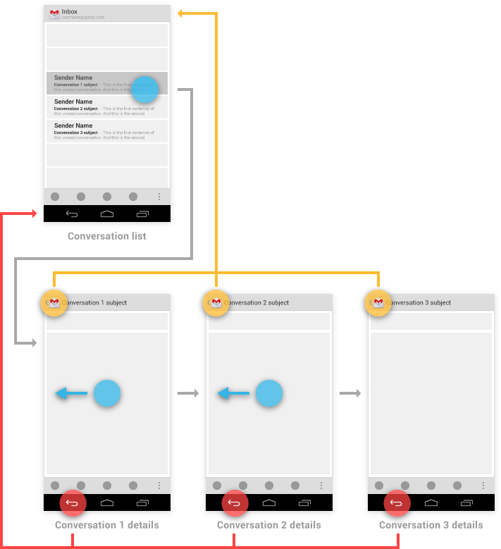
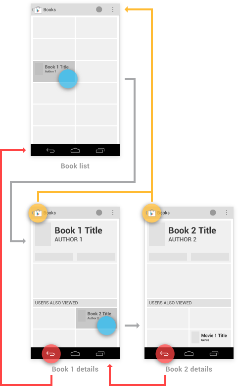
Android Back (vs. Up) Behavior
“The Up button is used to navigate within an app based on the hierarchical relationships between screens. For instance, if screen A displays a list of items, and selecting an item leads to screen B (which presents that item in more detail), then screen B should offer an Up button that returns to screen A. If a screen is the topmost one in an app (that is, the app's home), it should not present an Up button.
The system Back button is used to navigate, in reverse chronological order, through the history of screens the user has recently worked with. It is generally based on the temporal relationships between screens, rather than the app's hierarchy.”
– Android Developer Docs


System Image
Conceptual Model

Conceptual Models
Conceptual Models
- What we’ve covered so far
- Mental model
- Design model
- System image
- Coming up
-
Principles to communicate
conceptual models
Time for Questions & Discussion
Conceptual Models
-
Design principles that effectively communicate the conceptual model, as originally identified by Donald Norman:
- Visibility
- Affordances
- Mapping
- Feedback
- Constraints
Visibility
Visibility
Visibility
Copyright by respective copyright owners. Used without permission under the Fair Use Doctrine. Source: Amazon Design Team
Copyright by respective copyright owners. Used without permission under the Fair Use Doctrine. Source: Amazon Design Team
Visibility
Affordances
Copyright by respective copyright owners. Used without permission under the Fair Use Doctrine. Source: http://www.joelonsoftware.com
Perceived Affordances
Pictured: Windows Phone 8
- What we’ve covered so far
- Principles to communicate conceptual models
- Visibility
- Affordances (visual cues)
- Coming up
- More principles to communicate conceptual models
Time for More Questions
and Discussion
Mapping
Mapping
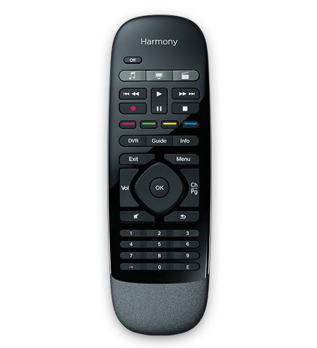
Copyright by respective copyright owners. Used without permission under the Fair Use Doctrine. Pictured: Logitech Harmony Smart Control
“On our 900's the replay function jumped back just enough to compensate for our reaction time when the commercial is over and we want to go back to watching the recording. It worked great! Now, on the Smart Control those functions are on dual function keys. When holding the rewind button long enough to trigger the replay function the fast forward keeps going, effectively increasing the effective reaction time so that I need at least 3 replays to get back to the portion of the program I missed. This design "feature" was a really dumb idea for keys that depend on reaction time. A remote big enough for the extra 2 keys would have been much better. ”
– Logitech Harmony Smart Control Reviewer
Natural Mapping
Natural Mapping
Copyright by respective copyright owners. Used without permission under the Fair Use Doctrine. Source: The Design of Everyday Things by Donald Norman
Copyright by respective copyright owners. Used without permission under the Fair Use Doctrine. Source: The Design of Everyday Things by Donald Norman
Copyright by respective copyright owners. Used without permission under the Fair Use Doctrine. Source: http://www.appolicious.com
Copyright by respective copyright owners. Used without permission under the Fair Use Doctrine. Source: http://cyrilmottier.com
Multi-touch Gestures


Copyright by respective copyright owners. Used without permission under the Fair Use Doctrine. Source: http://developer.android.com/
Feedback
Feedback
Constraints
Constraints
- Physical
- Cultural
- Logical
Constraints
Constraints
Constraints
determine alternatives
Activity:
Conceptual Model Analysis
Bonus Feature!
a conceptual model but thay can also be used as a method to quickly evaluate interfaces
Good Design
- Provides a good conceptual model
- Makes things visible
- Provides (perceived) affordances
- Gets the mappings right
- Supports interaction through feedback
- Exploits the power of constraints
Summary
- Mental model
- Design model
- System image
-
Principles to communicate conceptual models
- Visibility
- Affordances (visual cues)
- Feedback
- Mapping
- Constraints
References and Suggested Books
- The Design of Everyday Things by Donald Norman
- The Usability Engineering Lifecycle by Deborah Mayhew
