Visual Design Basics
CMPT 363
“To design is much more than simply to assemble, to order, or even to edit; it is to add value and meaning, to illuminate, to simplify, to clarify, to modify, to dignify, to dramatize, to persuade, and perhaps even to amuse.”
– Paul Rand
Copyright by respective copyright owners. Used without permission under the Fair Use Doctrine. Source: http://www.logodesignlove.com/next-logo-paul-rand
Activity: Visual Design Examples
What is an example website with poor visual design? Why?
How about an example website with excellent visual design? Why?
Visual Design Basics
-
Typography
-
Visual hierarchy
-
Visual design principles
Typography
typefaces for communication.
Typeface Classes

Copyright by respective copyright owners. Used without permission under the Fair Use Doctrine. Source: http://dwarfplanetpress.wordpress.com/
What About Fonts?
Typeface Selection

Copyright by respective copyright owners. Used without permission under the Fair Use Doctrine. Source: http://bonfx.com/23-really-bad-font-choices/
Typeface Selection

Copyright by respective copyright owners. Used without permission under the Fair Use Doctrine. Source: http://webdesignledger.com/inspiration/
Typeface Selection

Copyright by respective copyright owners. Used without permission under the Fair Use Doctrine. Source: http://bonfx.com/23-really-bad-font-choices/
Typeface Selection

Copyright by respective copyright owners. Used without permission under the Fair Use Doctrine. Source: http://webdesignledger.com/inspiration/
Selecting Typefaces
- Context (i.e. environment)
- Legibility (i.e. for individual characters)
- Readability (i.e. for blocks of text)
Tips about Selecting Typefaces
-
Stick with classic combinations (check out
fontsinuse.com)
- Limited palette (i.e. often only 2 different typefaces)
- Consider your planned visual hierarchy
Type Anatomy

Copyright by respective copyright owners. Used without permission under the Fair Use Doctrine. Source: http://blog.rockymountaintraining.com/basic-typography-terms/
Type Measurement
-
72 points = 1 inch
-
6 picas = 1 inch
-
12 points = 1 pica
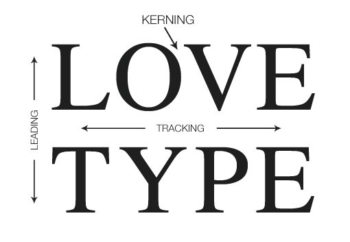
Kerning, Tracking, and Leading

Copyright by respective copyright owners. Used without permission under the Fair Use Doctrine. Source: http://designshack.net/articles/typography/
Leading: Before and After

Copyright by respective copyright owners. Used without permission under the Fair Use Doctrine. Source: http://martinsilvertant.deviantart.com/journal/
-
What we’ve covered so far
-
Typography
- Typeface classifications
- Typeface fonts
- Typeface selection
- Type anatomy
- Type measurement
- Kerning, tracking, and leading
-
Typography
-
Coming up
- Typography activity
Time for Questions & Discussion
Activity: Typography Analysis
Analyze the use of typography of
(the responsively designed)
microsoft.com
Consider the factors of typeface selections with regards to
context, legibility, and readability (i.e. 'CLR')
Visual Hierarchy
Aspects of Visual Hierarchy
-
Size
-
Color
- Alignment
- Whitespace
Typographic Hierarchy: Before

Copyright by respective copyright owners. Used without permission under the Fair Use Doctrine. Source: http://webdesign.tutsplus.com/articles/
Typographic Hierarchy: After

Copyright by respective copyright owners. Used without permission under the Fair Use Doctrine. Source: http://webdesign.tutsplus.com/articles/
Activity: Visual Hierarchy
Analyze the visual hierarchy of your in-progress mockups
for assignment #4
- What we’ve covered in this section
- Visual hierarchy
- Coming up
- Visual design principles
Time for More Questions
and Discussion
Visual Design Principles
- Alignment
- Proximity
- Repetition
- Contrast
Alignment
Effective Alignment
Effective Alignment
Effective Alignment
Proximity
Effective Proximity
Effective Proximity
- What we’ve covered so far
- Alignment
- Proximity
- Coming up
- Repetition
Time for More Questions
and Discussion
Repetition
Effective Repetition
Contrast
Effective Contrast
Effective Contrast
Effective Contrast
Visual Design Basics
-
Check alignment
-
Group similar items together
-
Create repetitive elements
-
Use contrast appropriately (esp. visual hierarchy)
Activity: Visual Design Principles
Review your assignment #4 sketches with the following principles:
- Alignment
- Proximity
- Repetition
- Contrast
References and Suggested Books
- The Non-Designers Web Book by Robin Williams
- Visual Usability: Principles and Practices for Designing Digital Applications by Tania Schlatter
