Designing a
Multi-device Moodle Course Site
A case study, presented for Moodle Moot NZ14
Paul D Hibbitts

Are you currently delivering
multi-device friendly Moodle courses?
Moodle 2.5 was a
true milestone release… why?
The Bootstrap Framework(!)
-
Grid-based layout
-
Support for responsive design
-
Interface components (e.g. tabs)
-
Javascript snippets (e.g. dialog boxes)
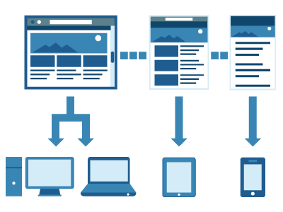
Responsive Web Design (RWD)

Multi-device delivery is now easy.
Creating great multi-device
learning experiences? Not so much...
Creating a (Multi-device)
Learning Strategy Foundation
-
Why? (i.e. problem, opportunity, etc.)
- Who? (i.e. audience, setting, etc.)
-
Where? (i.e. context of use, devices to be supported, etc.)
-
When? (i.e. learner intent, off-line access, etc.)
- What? (i.e. learner goals, organization goals, etc.)?
-
How? (i.e. organizational support and capabilities,
existing or new content, etc.)
Example RWD Design Process

RWD Sketching

Content Inventories
- A standard IA technique - even more essential for RWD
- Inventory a first step, but prioritization is the key
- Plays a key role when deciding upon RWD breakpoints
Redefining “Mobile Learning”
in a Multi-device World
-
Ubiquitous
-
Situational
-
Connected
- Personal
Multi-device Experience Goals
-
Conceptual and visual consistency
- Content and functionality parity
- Seamless task transferability
- Think ecosystem, not isolated devices
- Optimize physical interactions on every device
Multi-device
Learning Experience Goals
-
Learner-driven
-
Valuable
-
Streamlined
-
Collaborative
- Open
-
Integrated
-
Available
- Multi-device (goes without saying...)
So, What's the Real Story
About Multi-device Learning?
-
The unparalleled opportunity to enhance,
or replace, formal learning with elements of:
-
Performance support
-
Informal learning
-
Social networking
-
Real-time coaching/mentoring
Time for Questions or Comments
- What we’ve covered so far
- Why version 2.5 was a true milestone release
- Multi-device support is now easy, but doing it well is not
- Creating a multi-device learning strategy foundation
- Responsive Web Design as a process
- “Mobile Learning” in a multi-device world
- Multi-device experience goals
- Moodle course site learner experience goals
-
The real story about multi-device learning
- Coming up
- A guided tour of a multi-device Moodle course site
A guided tour of a
multi-device Moodle course site...
University of British Columbia (UBC) Continuing Studies,
part of the largest university in Western Canada.
part of the largest university in Western Canada.
http://iy103-w14.hibbittsdesign.com/ (built with Moodle 2.6.1)
Bootstrap (2.x) HTML Snippet
Media Thumbnail with Descriptive Text
<div class="media">
   <a class="pull-left" href="#">
   Media thumbnail object
   </a>
   <div class="main-body">
      Descriptive text for media
   </div>
</div>
Bootstrap (2.x) HTML Snippet
Two Column Grid
<div class="row-fluid">
   <div class="span6">
      Column one content
   </div>
   <div class="span6">
      Column two content
   </div>
</div>
Multi-device Moodle Resources
- Try out the included Bootstrap theme Clean (v2.5+)
-
Learn more about the Bootstrap Framework
- getbootstrap.com/2.3.2/ (version 2.x)
- getbootstrap.com/ (version 3.x)
-
Download and install a Moodle Bootstrap add-on Theme
Thank you! Any Questions?
-
Contact Info
- Web: paulhibbitts.com
- Email: paul@paulhibbitts.com
- Twitter: @hibbittsdesign
- LinkedIn: linkedin.com/in/paulhibbitts
-
Additional multi-device design resources
- OneNote notebook: 1drv.ms/1qYSWke
- Worksheets: 1drv.ms/1yvdNSP
-
IY103-W14 Course Companion
- iy103-w14.hibbittsdesign.com
- Google Chrome web app: bit.ly/1fPTBvw
Chrome App Launcher
