| Feedback from target audience | Improvements that we made |
|---|---|
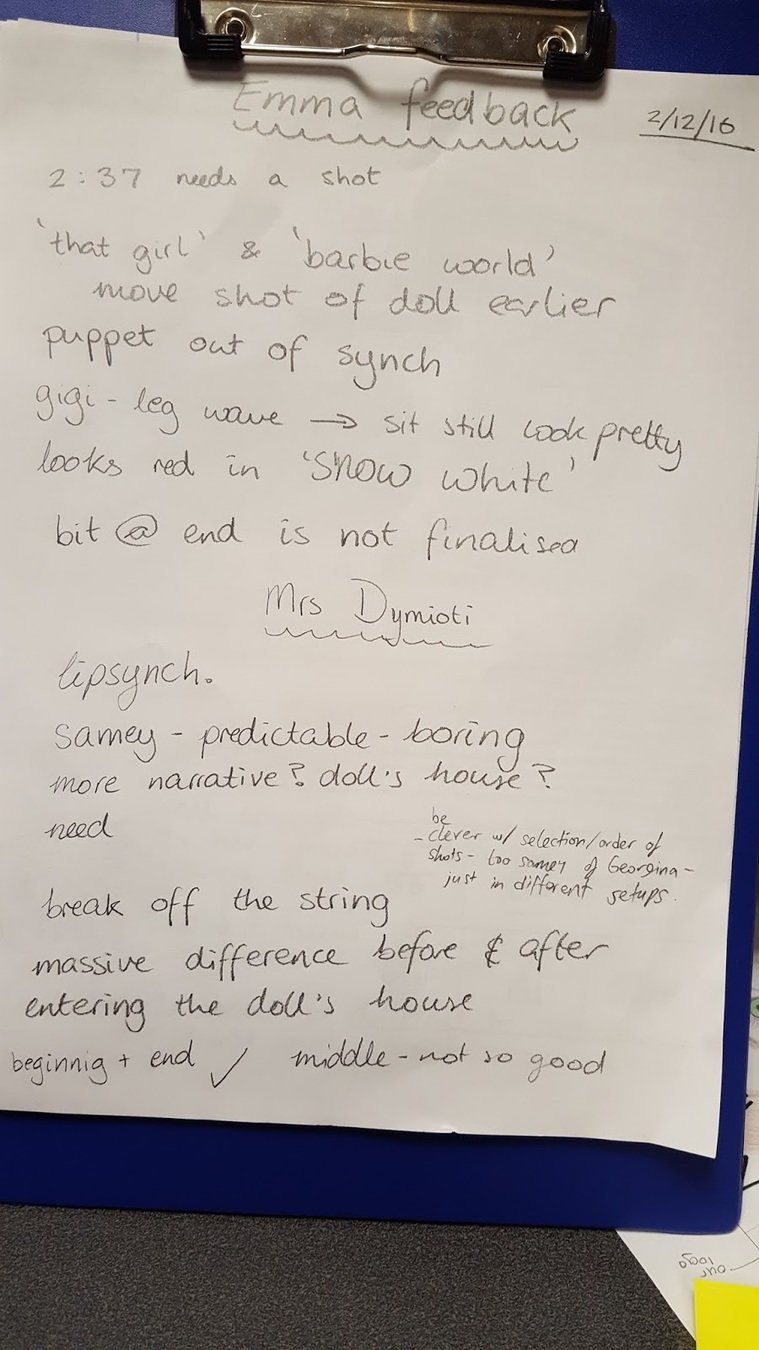
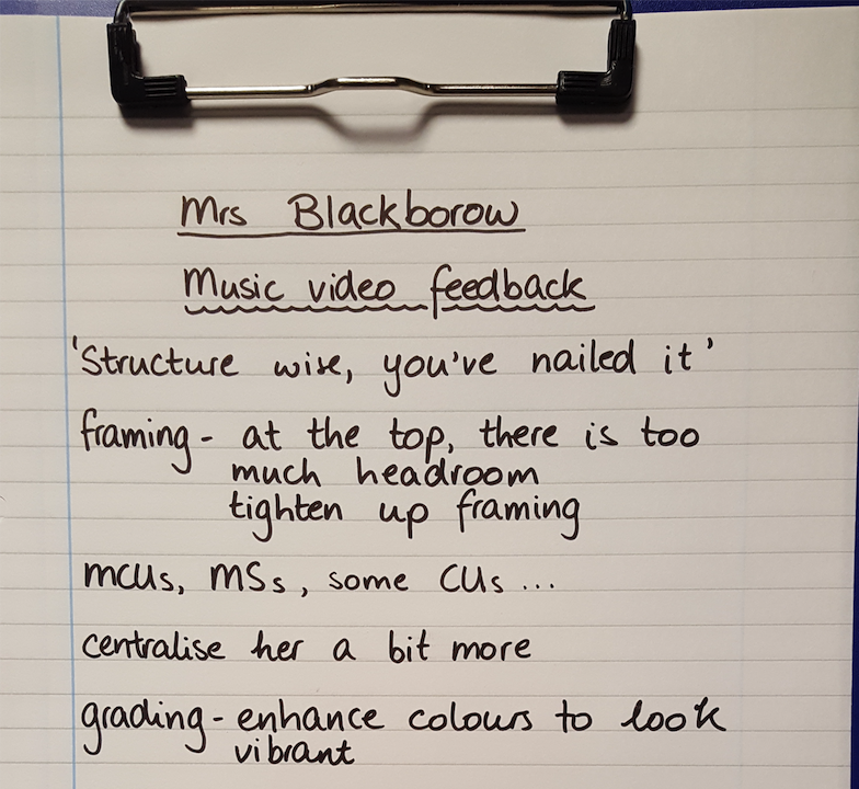
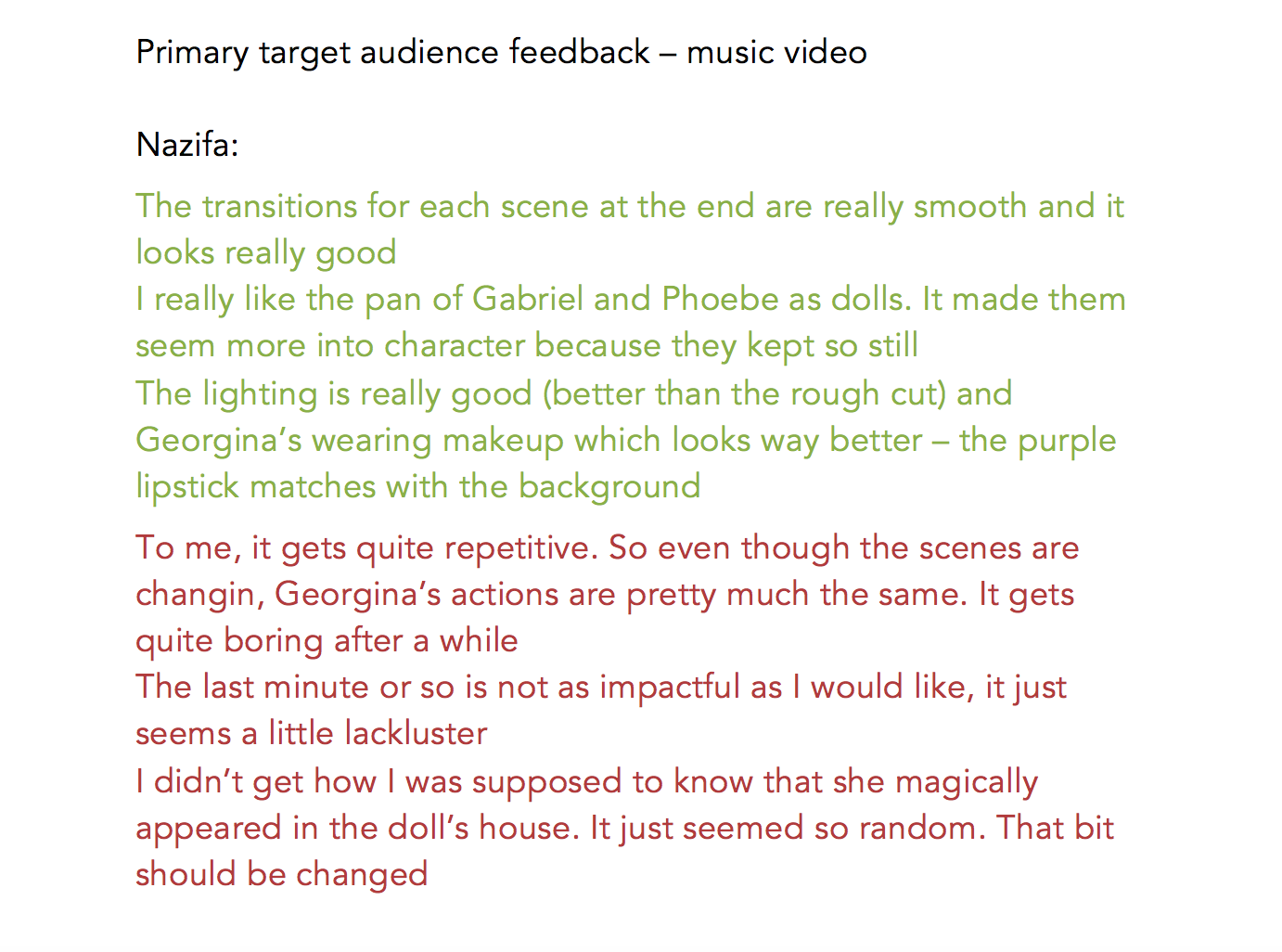
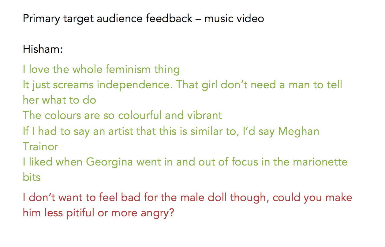
| Footage is too red in Snow White scenes and too yellow in Housewife setups | We graded the footage using RGB curves, three way colour corrector and Procamp |
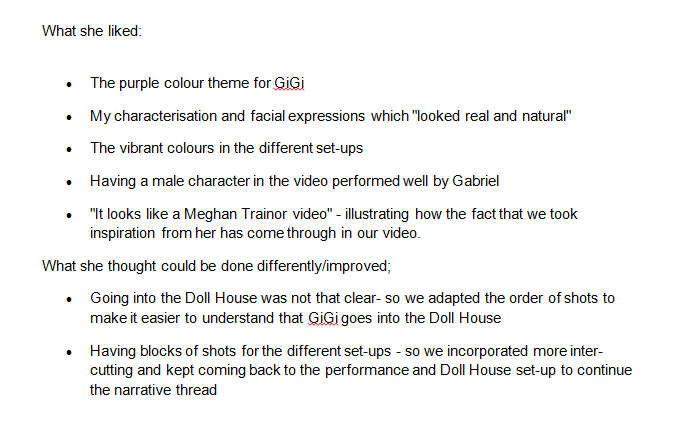
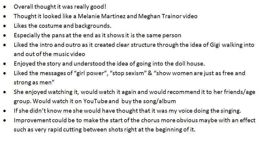
| Repetitive and predictable because of the blocks of setups | We intercut between setups and performance shots |
| Doesn't understand how GiGi got into the doll's house | We changed the order of events to make sequence clear |
| Too much headroom | Tightened up the framing |
| Lighting is too weak and dim | Use levels to enhance colours and make more vibrant |
| Feedback from target audience | Improvements that we made |
|---|---|
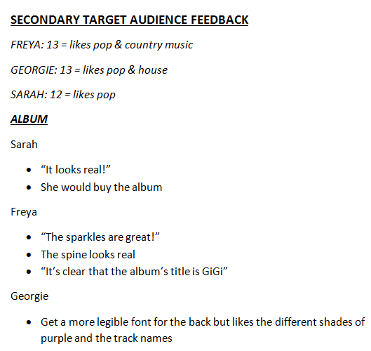
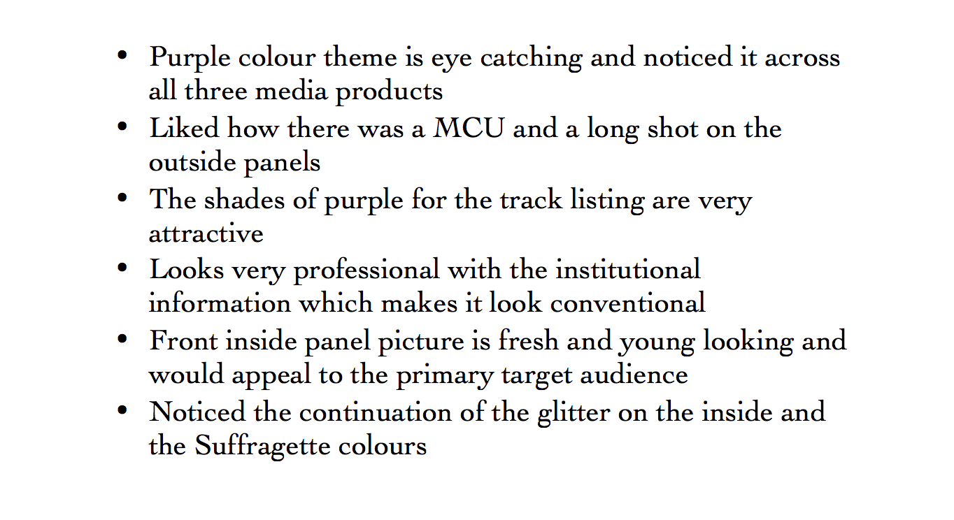
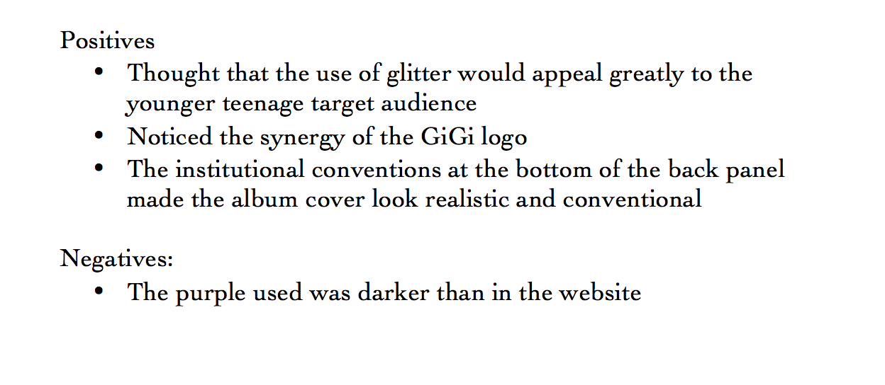
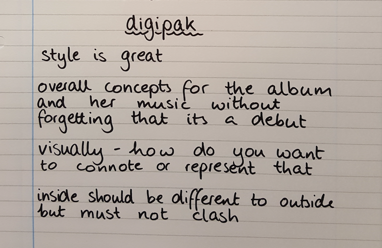
| Black background is boring and unconventional | Added the glitter gradient across front panels |
| Tracklist colours are too vibrant. Rainbow does not fit with the colour scheme | Toned down the colours to more purple, blue and pink based to adhere to the colour scheme |
| Focal image is oversaturated, looks too orange | Used a cooling filter and blue tones to counteract |
| Purple colour was not consistent over the digipak and website | We made the purple colour on the website darker to match |
| Inside panels must link to the outside but must offer something different | Continued the glitter theme across inside panels. Went with a different colour theme |
| Feedback from target audience | Improvements that we made |
|---|---|
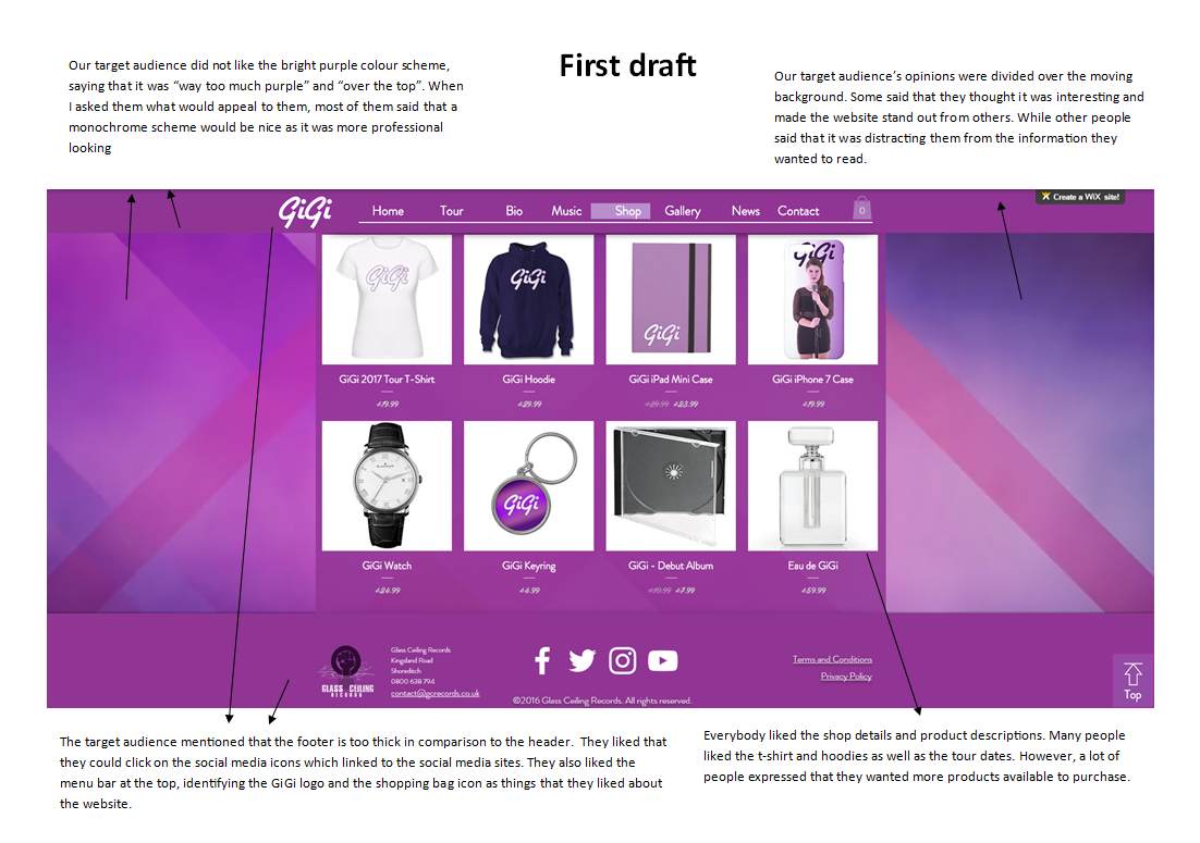
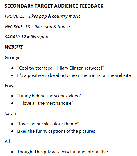
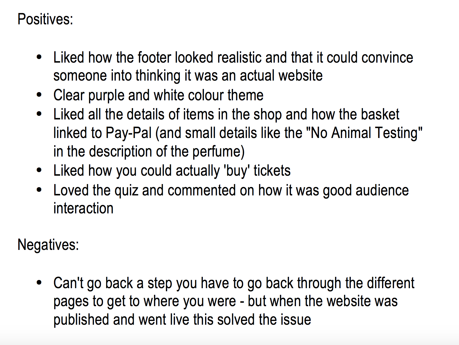
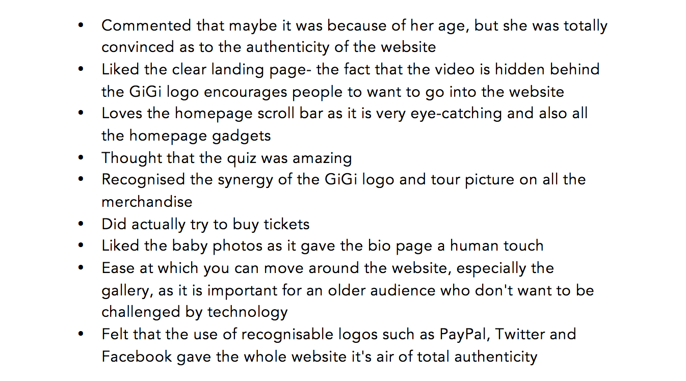
| Too much purple. The shade of purple is also very off putting | We changed the colour scheme to black, purple and grey |
| Live background is distracting from the actual information | We changed the background to a still image |
| Needs a visual hook - an icon that is evident on every page | We made the GiGi logo larger and integrated photos of GiGi into the background |
| Links to buy tickets did not function properly | Fixed the hyperlinks and set all of them to the same Paypal account |
| Information at edges of the page were cut off | Discovered the cause of the problem (using wider monitors than normal screens) moved vital text and images inside the |
| Cannot access news page from article | We put links back to the news page on every article |