Question 1:
In what ways does your media product use, develop or challenge forms and conventions of real media products?
Production Ident
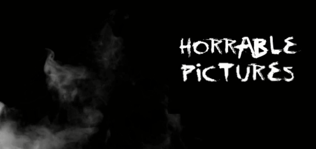
A key convention I conformed to was production idents, they appear at the beginning of all trailers which is why I decided to create my own ident and put it in my media product.
Title Cards

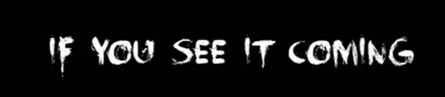
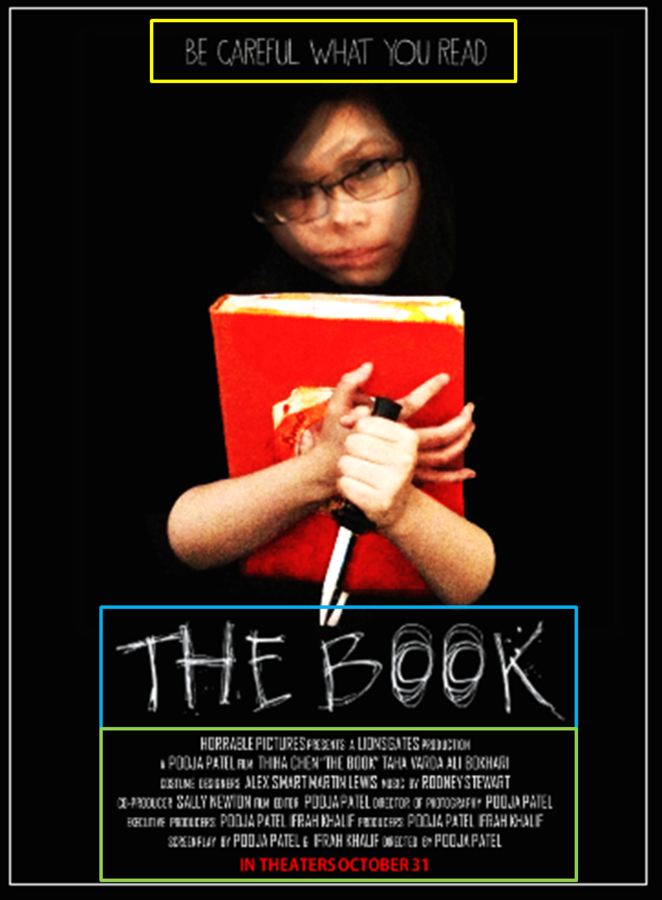
Title cards are an important aspect of trailers, especially in horror trailers because they emphasise the tension built in the trailer as well as enticing the viewer because even though they can watch the exciting and thrilling shots, the words solidify the intensity because it is adding extra to it. This is why I used title cards because it adds to the mystery of Ash as well as what is going on.
Attacking of Victims

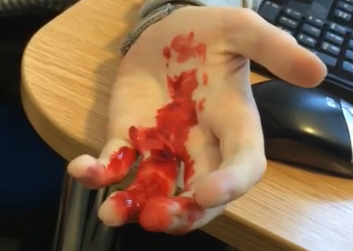
From my research of trailers, I found that shots of the victims are a key because it highlights the threat of the villain and in my trailer, Ash is the threat to the friends so I conformed to this convention because even though it may appear as Ash is harmless in the beginning on the trailer, the attacks show that the possession is strong and that in fact she is very threatening for everyone.
Different Shot Types
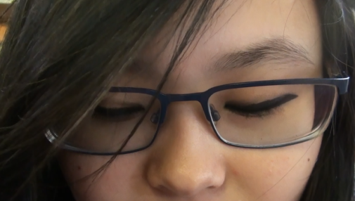
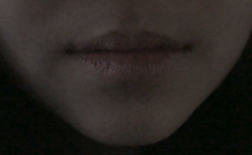
Another convention I conformed to was the use of different shot types. I found in my research that trailers featured various types of shots such as extreme close ups and wide shots. This is why I included shots such as extreme close ups of Tia's eyes and mouth to present her possession as well as point of view shots of Ifrah running and of Tia herself. Although we filmed one scene in different shot types, I did not use all of them in the final edit but it was useful to know that I had more options so I was not restricted to one shot.
Poster Conventions
Every poster has a tagline that is placed on the poster which is why I conformed to this convention. Although in many horror posters, the tagline is usually above the title so I challenged the placement of it.
Secondly, inevitably every film needs a title so it will appear on the poster as well, the convention I conformed to was the font. Many posters have distinctive fonts which is why I had to choose my carefully.
Also, institutional information and the release date always appears on the bottom on every poster so I conformed to this convention.