Introduction to Polymers
What is Polymer?
- Framework for creating custom elements
- Takes advantage of polyfills for emerging web standards
- Web Component Model
- Debuted at Google I/O 2013
- Currently in pre-alpha
Buzz - Words
- Web-Components
- Polyfill
- Shadow-DOM
Web Components
Web Components Web Components consist of four pieces that let web application developers define widgets with a level of visual richness not possible with CSS alone, and ease of composition and reuse not possible with script libraries today.
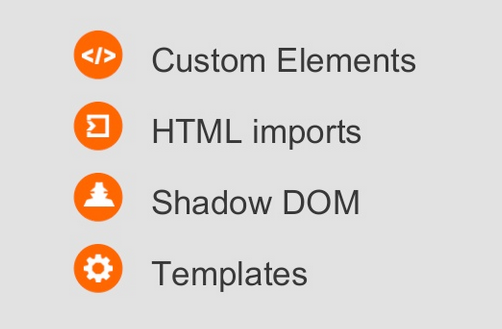
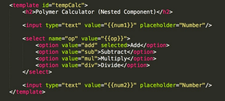
Templates
blocks of markup that are inert but can be activated for use later
Decorators
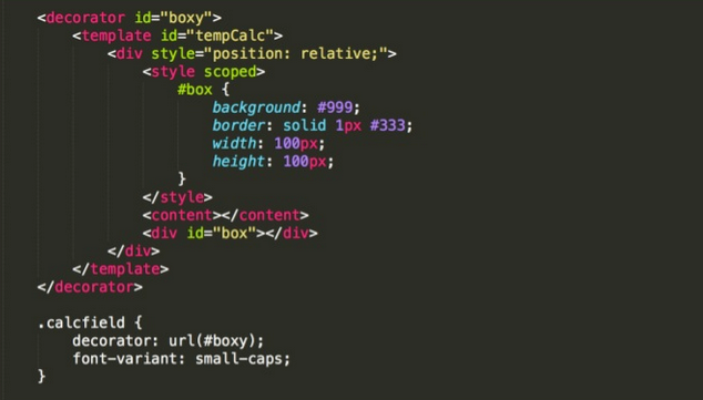
which apply templates to let CSS affect visual and behavioral changes
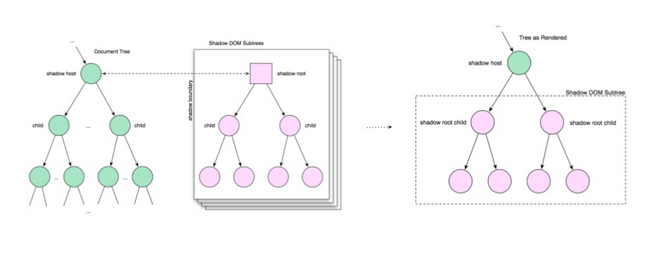
Shadow DOM
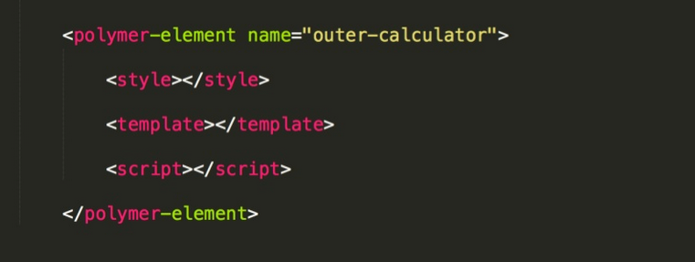
Custom Elements
Let developers define their own reusable custom elements Decorators and custom elements are called components.
Polymers
Polymer is a library for building modular web applications. It is built on new web platform primitives called Web Components.
Web Components are easier to develop, compose, connect and use on the web. The result is an increase in developer productivity.
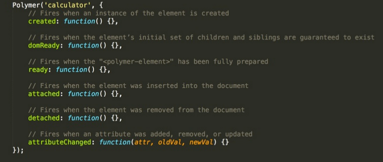
LifeCycle Methods
Data Binding
Polymer supports two-way data binding. Data binding extends HTML and the DOM APIs to support a sensible separation between the UI (DOM) of an application and its underlying data (model). Updates to the model are reflected in the DOM and user input into the DOM is immediately assigned to the model.
Polyfills
Custom JavaScript methods inside webcomponents.js designed to make non-native browsers (Everything other than Chrome) support web components.
webcomponents.js is a set of polyfills built on top of the web components specifications. It makes it possible for developers to use these standards today across all modern browsers.
Scoped Styles
Routing
By combining data-binding, core-scaffold, core- pages/core-animated-pages, and <flatiron-director> (an element for routing), it is possible to create a responsive SPA with deep linking.
The Stack
Build & Packaging
Build Tools:
- Gulp
- Grunt
Packaging Tools:
- Bower
- Wcpack
Wrapping session...
