hi, I am hannahpun
擔任 Front-End Developer 4年 現任 AFT Senior Front-End Developer
先更新到Sass3.3(以上)
看現在版本
# sass -v
# sudo gem update sass
更新
Control Directives
@if @else, for, @each,
原來Sass也可以用這些控制(工程師很懶惰的)
@if @else
@if 判斷式{
    ...
}@else{
    ...
}
$animal: duck;

p{
    @if $animal==duck{
	color: yellow;
    }@else{
	color: black;
    }
}
p {
color: yellow;
}
Scss
Css
基本範例
呃,感覺平常不太會用到說...
@mixin btn($bgColor){
    @if $bgColor==yellow{
	color: black
    }@else{
	color: white;
    }
    background-color: $bgColor;
}

.btnMain{
    @include btn(yellow);
}
.btnSub{
    @include btn(black);
}
.btnMain {
color: black;
background-color: yellow;
}
.btnSub {
color: white;
background-color: black;
}
Scss
Css
應用
if(判斷式, 對的話做, 錯的話做)
if(你會害羞?, 是少女, 是媽媽)
@mixin btn($bgColor){
    color: if($bgColor==yellow, black, white);
    background-color: $bgColor;
}

.btnMain{ @include btn(yellow);}
.btnSub{ @include btn(black); }
.btnMain {
color: black;
background-color: yellow;
}
.btnSub {
color: white;
background-color: black;
}
Scss
Css
@if a==b
@if a!=b
@if a or b
@if a and b
其實我只用過==,其他就拿來補充
@for
第一種
@for $var from <start> through <end>{
    ...
}
第二種
@for $var from <start> to <end>{
    ...
}
@for $i from 1 through 3{
    .through-#{$i}{
	color: red;
    }
}

@for $i from 1 to 3{
    .to-#{$i}{
	color: yellow;
    }
}
.through-1 {
color: red;
}
.through-2 {
color: red;
}
.through-3 {
color: red;
}
.to-1 {
color: yellow;
}
.to-2 {
color: yellow;
}Scss
Css
請寫一個loop, 輸出之後符合右圖
.btn-3 {
  width: 750px;
}
.btn-4 {
  width: 800px;
}
.btn-5 {
  width: 850px;
}
Practice
.col-1 { width: 8.33333%; }

.col-2 { width: 16.66667%; }

.col-3 { width: 25%; }

.col-4 { width: 33.33333%; }

.col-5 { width: 41.66667%; }

.col-6 { width: 50%; }

.col-7 { width: 58.33333%; }

.col-8 { width: 66.66667%; }

.col-9 { width: 75%; }

.col-10 { width: 83.33333%; }

.col-11 { width: 91.66667%; }

.col-12 { width: 100%; }
Practice
自己寫一個簡單的grid system
@each
@each $i in $list{
    ...
}
$color: red yellow blue;

@each $i in $color{
    .btn-#{$i}{
	color: $i;
    }
}
.btn-red { color: red; }
.btn-yellow { color: yellow; }
.btn-blue { color: blue; }
Scss
Css
基本範例
$color: red yellow blue;

length($color) //長度
nth($color, 2) // 找東西
index($color, red) // 找順序
$color: red yellow blue;

@for $i from 1 through length($color){
  .btn-#{nth($color,$i)}{
      color: nth($color,$i);
  }
}
.btn-red {
color: red;
}
.btn-yellow {
color: yellow;
}
.btn-blue {
color: blue;
}
Scss
Css
同樣範例換成@for
@each 有更強大的用法!!
List-map
變數延伸運用(sass3.3新功能)
宣告
$map: (
    key: value,
    key2: value2,
    key3: (v1, v2)
);
使用
1. map-get($map, key)
2. @each $key, $value in $map{
    ...
}
key不能重覆/value可以是數字,字串,布林/記得加;
Normal
Map
$blue: #2980b9;
$green: #27ae60;

.btn-default{
    color: $blue;
}
.btn-success{
    color: $green;
}
$blue: #2980b9;
$green: #27ae60;
$color: (
default: $blue,
success: $green
);
.btn-default{
color: map-get($color, default);
}
.btn-success{
color: map-get($color, success);
}基本用法
但是,怎麼比本來更長了?
$blue: #2980b9;
$green: #27ae60;
$colors: (
    default: $blue,
    success: $green
);

@each $theme, $color in $colors{
    .btn-#{$theme}{
	color: $color;
    }
}
搭配@each
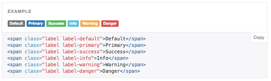
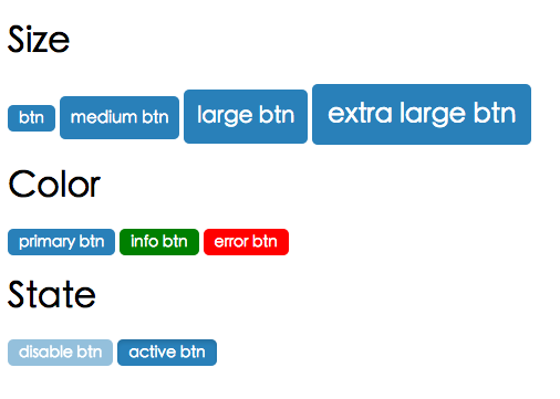
如何用@each到達右邊結果
.btn-default {
  color: #2980b9; }

.btn-success {
  color: #27ae60; }

.btn-error {
  color: #d35400; }

.btn-info {
  color: #8e44ad; }
Practice
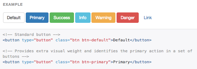
在挑戰看看,用@mixin跟@each
做出符合右圖
.btn-light {
  color: #2980b9;
}
.btn-success {
  color: #27ae60;
}
.btn-error {
  color: #d35400;
}
.btn-info {
  color: #8e44ad;
}

.bg-light {
  color: #fff;
}
.bg-dark {
  color: #000;
}
Practice
Advance
@extend,@mixin進階用法與@function介紹
Variable
揭秘變數進階使用 !default
$baseBorder: 5px;
$baseBorder: 3px;

@debug "$baseBorder is #{$baseBorder}";
$baseBorder: 5px;
$baseBorder: 3px !default;
@debug "$baseBorder is #{$baseBorder}";Scss
Css
//我現在在_mixin.scss裡
$baseBorder: 3px;

@mixin border($border:$baseBorder){
    -webkit-border-radius: $border;
    -moz-border-radius: $border;
    border-radius: $border;
}

.border{
    @include border;
}

//我現在在_main.scss裡
.border{
    @include border(5px);
}
.border {
-webkit-border-radius: 3px;
-moz-border-radius: 3px;
border-radius: 3px;
}
.border {
-webkit-border-radius: 5px;
-moz-border-radius: 5px;
border-radius: 5px;
}
實例
Scss
Css
//我現在在_main.scss裡
$baseBorder: 5px;

//我現在在_mixin.scss裡
$baseBorder: 3px !default;

@mixin border($border:$baseBorder){
    -webkit-border-radius: $border;
    -moz-border-radius: $border;
    border-radius: $border;
}

.border{
    @include border;
}
.border {
  -webkit-border-radius: 5px;
  -moz-border-radius: 5px;
  border-radius: 5px;
}
!default
@extend
除了%單純繼承外,還可以?
Scss
Css
%posidion{
    &_absolute{
	position: absolute;
    }
    &_relative{
	position: relative;
    }
}

.a{
    @extend %posidion_absolute;
}
.a {
position: absolute;
}@mixin
塞多變數
@mixin foo($height, $color){
    height: $height;
    color: $color;
}
.block{
    @include foo(200px, red);
}
@mixin foo($width:100px, $height:200px, $color:null){
width: $width;
height: $height;
color: $color;
}
.block{
@include foo(50px, 100px);
}Normal
延續上一頁範例,mixin不變
只想要換顏色
.block {
  width: 100px;
  height: 200px;
  color: yellow;
}
Practice
延續範例,mixin不變
想輸出如右
.block {
  color: yellow;
}
Practice
@mixin transition($transition...) {
    -moz-transition:    $transition;
    -o-transition:      $transition;
    -webkit-transition: $transition;
    transition:         $transition;
}
.box{
    color: blue;
    background-color: orange;
    @include transition(background-color 1s .5s, color 2s);
}
...
多個變數+多個屬性值
@content自定內容樣式
$mobile: 768px;
@mixin rwd($device){
    @media screen and (max-width: $device){
	@content;
    }
}
.box{
    width: 100px;
    @include rwd($mobile){
	width: 30px;
    }
}
.box {
width: 100px;
}
@media screen and (max-width: 768px) {
.box {
width: 30px;
}
}
Scss
Css
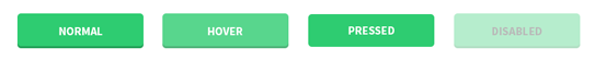
用@mixin + @if做出右圖
Practice

@function
處理複雜運算,輸出的是一個值不是樣式
-
darken($color,$amount)/lighten($color,$amount)
-
percentage($value)
-
length($list)
-
nth($list, $n)
-
if($condition, $if-true, $if-false)
-
自定
//define function
$font-size: 12px;

@function em($target, $context: $font-size){
     @return ($target / $context) * 1em;
}
.font-test{
	font-size: em(18px);
}
.font-test {
font-size: 1.5em;
}Scss
Css
@自定function
Css Architecture
簡介OOCSS & SMACSS
Css is simple..., It's simple to understand. But CSS is not simple to use or maintain.
寫到後面忘了前面,命名常常看不懂,很難修改或新增樣式,要維護別人的code寧願自己重寫,無法共同開發...
- Chris Eppstein
//???

.text-red{
    color: yellow;
}
.box1{
    width: 200px;
    border: 1px solid red;
    color: red;
}
.box2 div{
    width: 100px;
    border: 1px solid red;
    color: red;
}

a.link{
    text-decoration: none;
}
h2.link{
    text-decoration: none;
}
不好的範例1
不好的範例2
//html
<div id="news">
<h2>News</h2>
<ul>
    <li><a href="…">…</a></li>
    <li><a href="…">…</a></li>
    …
</ul>
</div>

//CSS
div#news ul {
    margin: 0;
    padding: 0;
    list-style-type: none;
}

div#news li {
    float: left;
    height: 100px;
    margin-left: 10px;
}
Predictable
Reusable
Maintainable
Scalable
當更新或增加樣式時
不能影響已存在的css
樣式可以一直重複使用
容易維護
有彈性,可多人共同開發
CSS Should be...
OOCSS
Object Oriented CSS,最有名的例子就是Bootstrap了
-
Separate Structure and Skin
-
Separate Container and Content
結構與外觀分離
容器與內容分離
OOCSS
.button{
    width:250px;
    height:100px;
    border: solid 2px #ccc;
    background: red;
}

.box{
    width:400x;
    height:200px;
    border: solid 2px #ccc;
    background: red;
}
.button{
width:250px;
height:100px;
}
.box{
width:400x;
height:200px;
}
.skin{
border: solid 2px #ccc;
background: red;
}結構與外觀分離就是把不同樣式獨立出來
OOCSS
//html
<div class="head">
    <p>
        內容內容內容
    </p>
</div>
<div class="foot">
    <p>
        內容內容內容
    </p>
</div>

//css
.head p {css code}
.foot p {css code}
//html
<div class="head">
<p class="mydata">
內容內容內容
</p>
</div>
<div class="foot">
<p class="mydata">
內容內容內容
</p>
</div>
//css
.head {css code}
.foot {css code}
.mydata {css code}
容器與內容分離
class不要綁在html tag上
用OOCSS做出各式各樣button吧
Practice
SMACSS
Scalable and Modular Architecture for CSS
假如OOCSS是憲法,SMACSS就是法律了
Base
Layout
Module
State
Theme
5 Category
Base
初始化html tag的樣式,ex p, a
/* Base */

html, body {
  height: 100%;
}
p{
    line-height: 1.6;
}
a{
    color: red;
    text-decoration: none;
}
h1,h2,h3{
    padding: 10px;
}
Base
Layout
每頁上都一定會出 現的元素,通常是HTML架構的前兩層 ex. header, footer
/* layout */

.sidebar{
    padding: $pad-section $pad-txt;
}
#header{
    width: 960px;
    margin: 0 auto;
}
#footer{
    padding: $pad;
    color: $white;
    background-color: #262626;
    text-align: center;
}
Layout
大架構例如header, footer, sidebar
Module
能被套用在所有頁面的元件 ex button,tab
/* Module */

.tab{
    padding: $pad;
    background-color: $white;
}

.list{
    margin-bottom: $pad-txt;
    &-name{
        left: calc(50% - #{$title-border-w}/2);
    }
}
Module
-
用class,不要用id -
不綁在html tag或父元素上,要單獨存在且可移到任何地方 -
子模組用-分開
//Original
<div class="list">
    <span>Hello</span>
    <span>Hello</span>
</div>


//SMACSS
<div class="list">
    <span class="list-name">Hello</span>
    <span class="list-items">Hello</span>
</div>-
用class,不要用id
-
不綁在html tag或父元素上,要單獨存在且可移到任何地方
-
子模組class用-分開
-
class儘量用抽象式命名
Practice
//html
<form class="form">
  <input type="text">
</form>
<div class="box">
  <input type="text">
</div>
<div class="nav">
  <input type="text">
</div>
改善以下寫法
//css
.form { width: 100%; }
.form input { width: 50%; }

.box { width: 80%; }
.box input { width: 30%; }

.nav { width: 80%; }
.nav input { width: 30%; }
State
表示Layout或Module的狀態變化

/* State */

.is-hidden{
    display: none;
}
.is-error{
    color: red;
}
.is-disabled{
    background-color: grey;
}
State
-
由class定義 -
命名規則.is-*開頭
Theme
-
定義整個網站主視覺 -
命名規則.theme-*開頭
-
字的顏色,連結顏色,背景顏色,按鈕顏色 -
主視覺顏色,輔色
-
字型,字型大小(不要超過六種)
-
位置(側邊欄選單,上方選單)
-
其他...
_theme.scss
$font-size-base: 14px !default;
$font-size-h1: floor(($font-size-base * 2.6)) !default; // ~36px
$font-size-h2: floor(($font-size-base * 2.15)) !default; // ~30px
$main-color: red !default;

html{ color: $main-color; }
.btn{ border: 1px solid $main-color; }
$font-size-base: 16px;
$main-color: orange;
_main.scss
_theme.scss
範例
改善這不好的範例
Practice
//html
<div id="news">
<h2>News</h2>
<ul>
    <li><a href="…">…</a></li>
    <li><a href="…">…</a></li>
    …
</ul>
</div>

//CSS
div#news ul {
    margin: 0;
    padding: 0;
    list-style-type: none;
}

div#news li {
    float: left;
    height: 100px;
    margin-left: 10px;
}
CSS檔案結構與管理
運用SMACSS做檔案分類
-
utilities/_variable, _color , _typography ,_mixins -
_base;
-
_plugins
-
_layout
-
modules/_module, _form, _button, _table -
_states
-
pages/ (個別頁面)
-
main
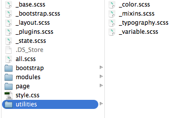
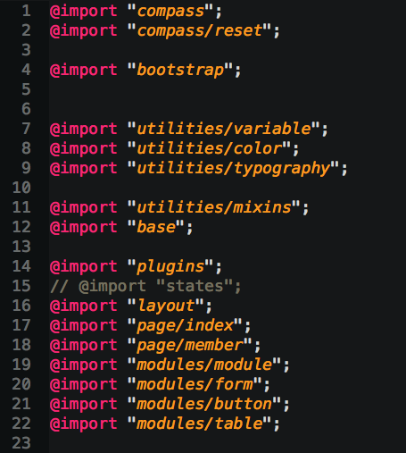
Practice
來練習一下吧,把檔案變結構化
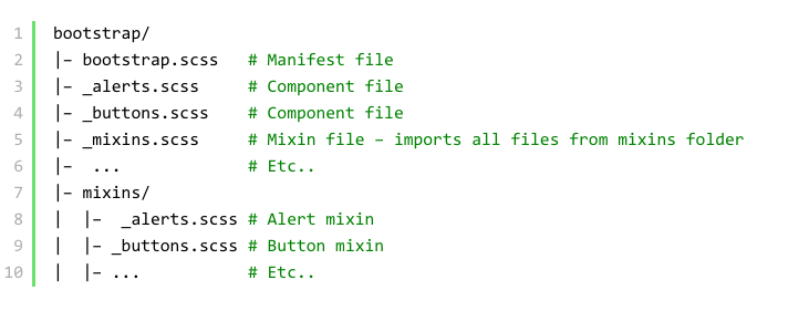
Structure-Bootstrap
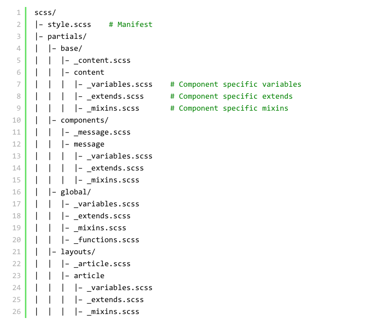
Structure-Other
Debug SASS
到哪裡除錯呢?
Source map
在瀏覽器就可看自己的SASS寫在哪個檔案
在commend line
sass --watch --sourcemap sass:csssourcemap = trueconfig.rb
@debug
@debug "$bgColor is #{$bgColor}";Final Example
Practice
CSS Guideline
精進你的css
多看多學習