先來裝編輯器吧
hi, I am hannahpun
擔任 Front-End Developer 4年 現任 AFT Senior Front-End Developer
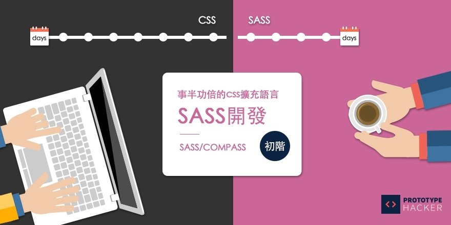
Why Use Sass?
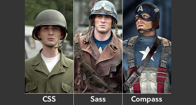
Sass v.s Css?
Sass/Scss?
什麼是Sass, 阿Scss又是什麼鬼
為什麼我要用
他跟css到底有什麼不一樣
"Sass(Syntactically Awesome Stylesheets) is the most mature, stable, and powerful professional grade CSS extension language in the world."
翻成中文就是Sass真的很厲害,很厲害,真的很厲害!趕快來用讓我們模擬一下平常用css做專案的情況...
平常大家會遇到什麼問題呢?
你會發現非常很多問題...
Not Reusable
Not Predictable
Hard to Maintainable
Not Scalable
複製貼上複製貼上
當增加樣式時往往要重新寫style
沒有架構可言,自己以前再寫什麼都忘了
無法多個工程師一起合作,效率不佳
這些問題 Sass都可以幫你解決喔
Sass提供變數,巢狀結構function,數學運算式...等等讓你把css寫更好
而Compass就是Sass的Framework
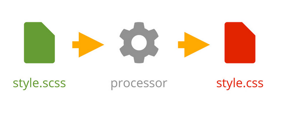
一個簡單的Sass範例
@import "compass";

$pink: #E80C7A;
$color-main: $pink;
$color-light: lighten($pink, 30%);
$font-base: 12px;

%text{
    color: $color-main;
    font-size: $font-base;
}
.box{
    @extend %text;
    @include border-radius(3px);
    a{ @include link-colors($color-main, $color-light); }
}
.box-side{
    @extend %text;
    width: 100px;
}
輸出的css
.box{
    color: #E80C7A;
    font-size: 12px;
    -moz-border-radius: 3px;
    -webkit-border-radius: 3px;
    border-radius: 3px;
}
.box a{
    color: #E80C7A'
}
.box a:hover{
    color: #xxxxx'
}
.box-side{
    color: #E80C7A;
    font-size: 12px;
    width: 100px;
}
有沒有頓時覺得
Sass很強大
Scss
Sass
$font-base: 12px;
@mixin font($font){
    font-size: $font;
}
.box{
    color: #fff;
    @include font($font-base);
}
$font-base: 12px
=font($font)
font-size: $font;
.box
color: #fff;
+font($font-base);
所以從今以後我們都會用Scss做範例
但因為Scss太難念,所以我還是念Sass好
那學了Sass還需要學Less/Sylus嗎?
其實是大同小異的,學一套就夠了
Install Sass
安裝篇
Mac
Windows
-
打開終端機
-
sudo gem install compass -
compass -v
創建Sass檔案
# compass create
Workflow
常用的指令
// 創建Sass檔案
# compass create

// sass 編譯成css
# compass compile

// 及時偵測編譯成css
# compass watch

//及時偵測編譯成沒有註解的css
# compass watch --no-line-comments

// 編譯成壓縮後的css
# compass watch --output-style compressed
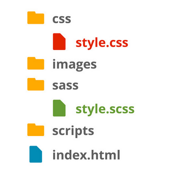
Config.rb
設定篇
http_path = "/"  //根目錄位置
css_dir = "stylesheets" //css位置
sass_dir = "sass" //sass位置
images_dir = "images" //圖片位置
javascripts_dir = "javascripts" //js 位置

// 使用compass helper時輸出的路徑
relative_assets = true

//設定你輸出的格式 一般/有縮進/簡潔格式/壓縮格式
output_style = :expanded or :nested or :compact or :compressed

//要不要行數註解
line_comments = true or false

//debug用 sass 2.0之後版本才有
sourcemap = true or false
link: configuration-reference
Sourcemap
Nesting
巢狀: 可以一目瞭然各個選擇器之間關係
父選擇器{
    子選擇器{
        子選擇器{
            樣式...
        }
    }
    子選擇器{
        樣式...
    }
}
Scss
Css
//我是註解
/*
    我也是註解喔
*/
ul{
    width: 300px;
    margin: 0 auto;
    background-color: #ccc;
    li{
        padding: 10px;
        a{
            color: red;
        }
    }

}
/*
我也是註解喔
*/
ul {
width: 300px;
margin: 0 auto;
background-color: #ccc;
}
ul li {
padding: 10px;
}
ul li a {
color: red;
}
基本巢狀.box{
a{
color: red;
&:hover{
color: blue;
}
&.active{
color: yellow;
}
.wrapper &{
color: orange;
}
}
}.box a {
color: red;
}
.box a:hover {
color: blue;
}
.box a.active {
color: yellow;
}
.wrapper .box a {
color: orange;
}
Scss
Css
&
.box{
    a{
        color: red;
        .ie6 &{
            color: blue;
        }
        .ie7 &{
            color: yellow;
        }
    }
}
.box a {
color: red;
}
.ie6 .box a {
color: blue;
}
.ie7 .box a {
color: yellow;
}
Scss
Css
運用在判斷不同瀏覽器
.main {
    font-size: 15px;
    @media screen and (max-width: 320px) {
        font-size: 35px;
    }
}
.main {
font-size: 15px;
}
@media screen and (max-width: 320px) {
.main {
font-size: 35px;
}
}
Scss
Css
RWD
Nesting
Bad part of
教你如何避免並寫出更乾淨且有效率的程式碼
Scss
Css
.nav{
    padding: 10px;
    ul{
	float: left;
	li{
	    display: inline-block;
	    a{
		color: red;
		span{
		    width: 10px;
		}
	    }
	}
    }
}
.nav {
padding: 10px;
}
.nav ul {
float: left;
}
.nav ul li {
display: inline-block;
}
.nav ul li a {
color: red;
}
.nav ul li a span {
width: 10px;
}
缺點:層級太多..效能變差
.nav{
    padding: 10px;
    ul{
        float: left;
	li{
	    display: inline-block;

	}
    }
    a{
	color: red;
	span{
	    width: 10px;
	}
    }

}
.nav {
padding: 10px;
}
.nav ul {
float: left;
}
.nav ul li {
display: inline-block;
}
.nav a {
color: red;
}
.nav a span {
width: 10px;
}
改善: 最多三層就好~~
Practice
來練習一下吧

1. 按鈕hover時:字變#c6538c,底色變白色(#fff)
2. 螢幕小於500px時:按鈕寬變200px,邊框變黃色,字的顏色也變黃色
3. 如果是ie的話(body class="ie"):字變黑色(#000)
Variable
變數: 節省許多搜尋取代的時間,可以讓客戶盡情改,你只要動動手指頭換變數的值就可以了
宣告
$var: val;
$list: val1 val2 val3;
使用
selector{
  屬性-#{$var}: $val;
  width: nth($list, number);
  z-index: index($list, val1);
}
Scss
Css
$grey: #333333;
$padding: 15px;

.box{
    color: $grey;
    padding: $padding;
    a{
        color: $grey;
    }
}
.sidebar{
    padding: $padding;
}
.box {
color: #333333;
padding: 15px;
}
.box a {
color: #333333;
}
.sidebar {
padding: 15px;
}
基本變數$var
$direction: top;

.box{
    border-#{$direction}: 1px solid #000;
}
.box {
  border-top: 1px solid #000;
}
Scss
Css
選擇器上的變數#{}
$direction: top right bottom left;

.box{
    border-#{nth($direction,2)}: 1px solid #000;
}
.box {
  border-right: 1px solid #000;
}
Scss
Css
多個變數$list
Scss
Css
多個變數$list2

1.banner
2.header
3.mask
$elements: banner header mask;

.header{ z-index: index($elements, header); }
.banner{ z-index: index($elements, banner); }
.mask{ z-index: index($elements, mask); }
.header { z-index: 2; }

.banner { z-index: 1; }

.mask { z-index: 3; }
Scss
Css
多個變數$list2
Operation
原來css也可以做數學運算式
Scss
Css
$padding: 15px;

.box{
    padding: $padding*2;
    margin: $padding+10px;
    width: $padding - 5px;
    height: $padding/3;
}
.box {
  padding: 30px;
  margin: 25px;
  width: 10px;
  height: 5px;
}
+-*/
Scss
請問以下的css是?
$padding: 15px;

.box{
    width: $padding-5px;
    padding: $padding - 5px;
    padding: -$padding - 5px;
    padding: -$padding - $padding*2;
    padding: (-$padding) (-$padding*2);
}
$padding: 15px;
$basic-width: 10%;
.box{
width: calc(#{$padding} + #{$basic-width});
height: $padding;
}.box {
width: calc(15px + 10%);
height: 15px;
}
Scss
Css
calc(很好用)
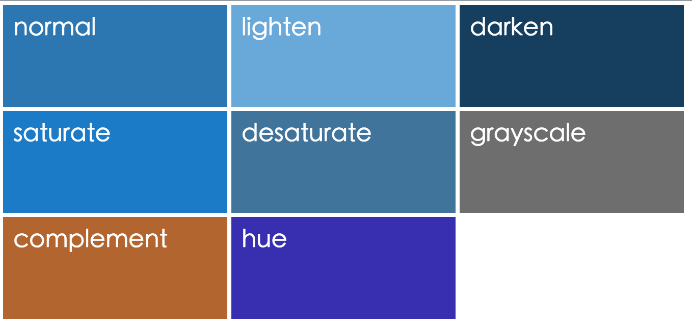
Color
跟顏色有關的變數
lighten($color,amount); //變亮
darken($color,amount); //變暗
saturate($color,amount); //飽和度
desaturate($color,amount);
grayscale($color);//灰階
complement($color);//互補
adjust_hue($color,0-360);//色相
Practice
來練習一下吧

1. 把所有顏色變變數
2. $mainColor: #c6538c
3. $subColor: 飽和度是$mainColor 30%
4. $subColor取代原本的yellow
Extend
繼承: 同一個樣式寫一次就好
宣告
%名稱{
    /*樣式*/
}
使用
selector {
    @extend 名稱;
}
以前我會這樣寫...
.header a, .nav a, .block h1{
    display: block
    color: red;
    font-size: 25px;
}
.header a{
    padding: 10px;
}
.nav a{
    border: 1px solid blue;
}
.footer a{
    display: block
    color: red;
    font-size: 25px;
    background: black;
}
寫到後面忘了前面,重覆樣式開始不斷出現
然後越來越亂..
.link{
    display: block;
    color: red;
    font-size: 25px;
}
.header a{
    padding: 10px;
    @extend .link;
}
.nav a{
    border: 1px solid blue;
    @extend .link;
}
.footer a{
    background: black;
    @extend .link;
}
.link, .header a, .nav a,
.footer a {
display: block;
color: red;
font-size: 25px;
}
.header a {
padding: 10px;
}
.nav a {
border: 1px solid blue;
}
.footer a {
background: black;
}
Scss
Css
來用@extend吧
Extend
Bad part of
教你如何避免並寫出更乾淨且有效率的程式碼
Scss
Css
.link{
    display: block;
    color: red;
    font-size: 25px;
}
.box .link{
    width: 100px;
    height: 200px;
    background-color: red;
}
.wrapper .link{
    margin: 0 auto;
    border-radius: 50%;
}
.footer a{
    background: black;
    @extend .link;
}
.link, .footer a {
display: block;
color: red;
font-size: 25px;
}
.box .link, .box .footer a,
.footer .box a {
width: 100px;
height: 200px;
background-color: red;
}
.wrapper .link, .wrapper .footer a,
.footer .wrapper a {
margin: 0 auto;
border-radius: 50%;
}
.footer a {
background: black;
}
缺點: 跑出好多多餘的程式碼
Scss
Css
%link{
    display: block;
    color: red;
    font-size: 25px;
}
.box .link{
    width: 100px;
    height: 200px;
    background-color: red;
}
.wrapper .link{
    margin: 0 auto;
    border-radius: 50%;
}
.footer a{
    background: black;
    @extend .link;
}
.footer a {
display: block;
color: red;
font-size: 25px;
}
.box .link {
width: 100px;
height: 200px;
background-color: red;
}
.wrapper .link {
margin: 0 auto;
border-radius: 50%;
}
.footer a {
background: black;
}
改善: %取代.
Scss
Css
%padding{
  padding: 10px;
}
%border{
  border: 1px solid #333;
}
.box{
  @extend %padding, %border;
}
.test{
  @extend %padding;
  @extend %border;
}
.box, .test {
padding: 10px;
}
.box, .test {
border: 1px solid #333;
}
@extend多個樣式
Mixin
方法:自定樣式功能,Sass的重頭戲
宣告
@mixin Mixins名稱(參數:參數值){
    /*公用樣式*/
}
使用
selector {
    @includ Mixins名稱(參數值);
}
@mixin border-radius($radius){
   -webkit-border-radius: $radius;
   -moz-border-radius: $radius;
   border-radius: $radius;
   padding: 5px;
}
.header a{
   @include border-radius(2px);
}
.nav a{
   @include border-radius(5px);
}
.header a {
  -webkit-border-radius: 2px;
  -moz-border-radius: 2px;
  border-radius: 2px;
  padding: 5px;
}

.nav a {
  -webkit-border-radius: 5px;
  -moz-border-radius: 5px;
  border-radius: 5px;
  padding: 5px;
}
Scss
Css
基本mixin範例
@mixin border-radius($radius:2px){
   -webkit-border-radius: $radius;
   -moz-border-radius: $radius;
   border-radius: $radius;
}
.header a{
   @include border-radius();
}
.nav a{
   @include border-radius(5px);
}
.header a {
  -webkit-border-radius: 2px;
  -moz-border-radius: 2px;
  border-radius: 2px;
}

.nav a {
  -webkit-border-radius: 5px;
  -moz-border-radius: 5px;
  border-radius: 5px;
}
Scss
Css
mixin參數帶預設值
@mixin border-radius($radius:2px, $color:red){
  border-radius: $radius;
  color: $color;
}
.header a{
  @include border-radius($color:blue);
}
.nav a{
  @include border-radius(5px);
}
.header a {
  border-radius: 2px;
  color: blue;
}

.nav a {
  border-radius: 5px;
  color: red;
}
Scss
Css
多個參數請把左下@mixin寫完,讓程式可以輸出右下css
.a {
  -webkit-border-radius: 3px;
  -moz-border-radius: 3px;
  border-radius: 3px;
}

.b {
  -webkit-box-shadow: 3px 3px 0 #000;
  -moz-box-shadow: 3px 3px 0 #000;
  box-shadow: 3px 3px 0 #000;
}
Practice
@mixin css3(  ){  }

.a{
  @include css3(  );
}
.b{
  @include css3(  );
}
Scss
Css
RWD
Media Query快速搞定
$mobile: 768px;
@mixin rwd($device){
    @media screen and (max-width: $device){
	@content;
    }
}
.box{
    width: 100px;
    @include rwd($mobile){
	width: 30px;
    }
}
.box {
width: 100px;
}
@media screen and (max-width: 768px) {
.box {
width: 30px;
}
}
Scss
Css
RWD
Mixin
Bad part of
教你如何避免並寫出更乾淨且有效率的程式碼
@mixin border-radius($radius){
   -webkit-border-radius: $radius;
   -moz-border-radius: $radius;
   border-radius: $radius;
}
.a{ @include border-radius(5px); }
.b{ @include border-radius(5px); }
.a {
-webkit-border-radius: 5px;
-moz-border-radius: 5px;
border-radius: 5px;
}
.b {
-webkit-border-radius: 5px;
-moz-border-radius: 5px;
border-radius: 5px;
}
Scss
Css
缺點:用法沒問題,但輸出的css卻重覆了
@mixin border-radius($radius){
   -webkit-border-radius: $radius;
   -moz-border-radius: $radius;
   border-radius: $radius;
}
%btn{ @include border-radius(5px); }
.a{ @extend %btn; }
.b{ @extend %btn; }
.a, .b {
-webkit-border-radius: 5px;
-moz-border-radius: 5px;
border-radius: 5px;
}
Scss
Css
改善: 把@mixin包在@extend裡
@extend
不能定義參數
會產生較簡潔程式碼
@mixin
可以設置變數、定義默認參數值
Conclusion
%名稱{ /*樣式*/ }
selector { @extend 名稱; }
@mixin Mixins名稱(參數:參數值){
    /*公用樣式*/
}
selector { @includ Mixins名稱(參數值); }
用@mixin還@extend?
//1
.button{
  width: 100px;
  height: 100px;
  color: red;
}
.nav .button{
  width: 100px;
  height: 100px;
  color: red;
  border: 1px solid #333;
}
Q&A
//2
.button{
  color: red;
  width: 100px;
  height: 50px;
}
.nav .button{
  color: blue;
  width: 120px;
  height: 30px;
}
Practice
先觀察下面兩頁,找出相同或相似元件,是可以寫成@mixin或@extend的

一桌為一組討論

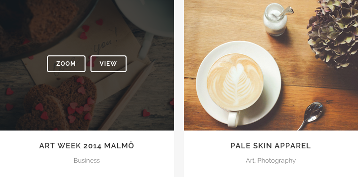


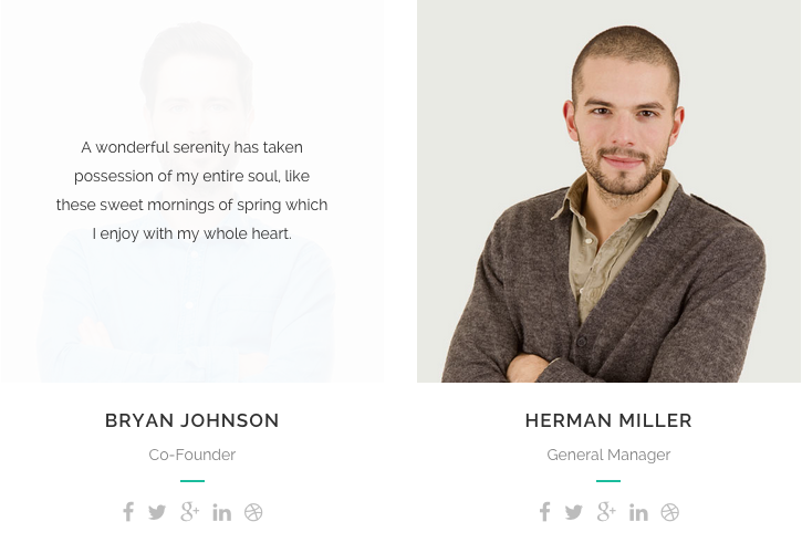
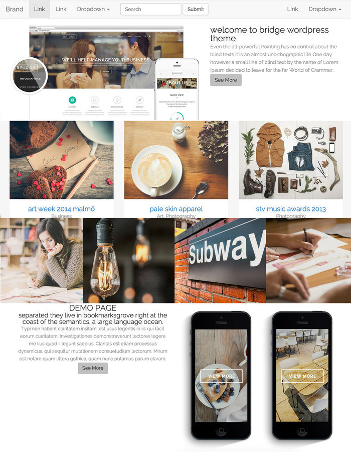
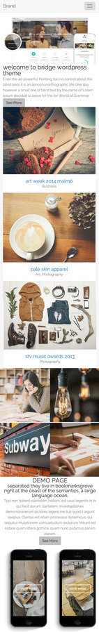
圖來自demo.qodeinteractive.com

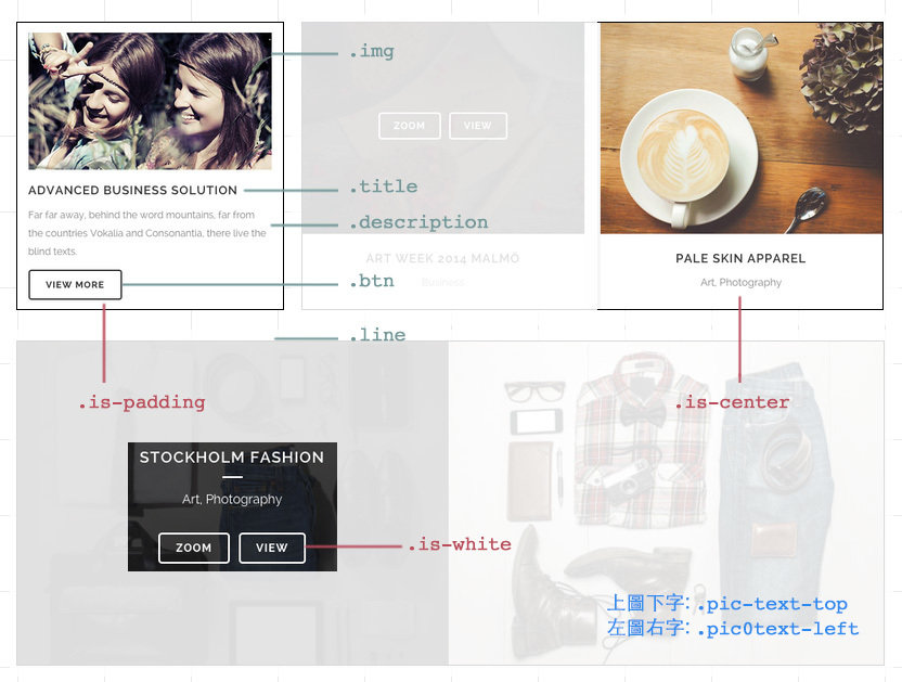
Practice
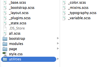
1. sass拆成兩支以上,_variable.scss, main.scss

2. 善用@mixin跟@extend(不是用越多越好),搭配css class, 讓css減少重覆並容易維護
Hint
extend
name "before"- position: absolute; width: 100%; height: 100%; left: 0; top: 0;
name "basic-box"
name "btn-basic" - border-radius: 4px; padding: 7px 15px; border: 1px solid; text-transform: uppercase; font-size: 12px; background-color: transparent;
mixin
name "css3($key, $value)"- #{$key}: $value;
name "bg-color($color)"- background-color: rgba($color, 0.8);
Import
載入:讓你css檔案結構化
sass檔案存為_檔名.scss
使用
@import "檔名";
_variable.scss
main.scss
//variable
$btn-pad: 7px 15px;
$pad-basic: 10px;

$white: #fff;

//mixin
@mixin bg-color($color){
    background-color: rgba($color, 0.8);
}

//extend
%before{
    position: absolute;
    width: 100%;
    height: 100%;
    left: 0;
    top: 0;
}
@import "variable";
.before-box{
display: none;
@extend %before;
background-color: $grey;
}
.title{
text-transform: uppercase;
+ .description{
margin-top: $pad-basic;
}
}基本範例
Compass
reset/ css3 / typography / utilities / Helperlayout
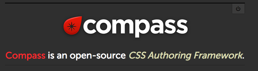
Compass is an open-source CSS Authoring Framework.
用別人寫好的東西自己就不用再寫一次了
@import "compass/函式庫";

selector{
  @include 函式名稱($value)
}
Reset
@import "compass/reset";
Css3
不用在自己寫Mixin了,它已幫你寫好所有瀏覽器的prefix
@import "compass/css3";
.radius{
    @include border-radius(3px);
}
.opacity{
    @include opacity(0.6);
}
.shadow{
    @include box-shadow(1px 1px 3px #333);
}
.radius {
-webkit-border-radius: 3px;
-moz-border-radius: 3px;
-ms-border-radius: 3px;
-o-border-radius: 3px;
border-radius: 3px;
}
.opacity {
filter: progid:DXImageTransform.Microsoft.Alpha(Opacity=60);
opacity: 0.6;
}
.shadow {
-webkit-box-shadow: 1px 1px 3px #333333;
-moz-box-shadow: 1px 1px 3px #333333;
box-shadow: 1px 1px 3px #333333;
}
Scss
Css
Typography
link-colors($normal, $hover, $active, $visited, $focus)
unstyled-link
ellipsis() //...
replace-text('img') //圖片取代文字
replace-text-with-dimensions('img')
sticky-footer($footer-height)
Sticky Footer
<body>
  <div id="root">

    content here

    <div id="root_footer"></div>
  </div>

  <div id="footer">
    Footer content goes here.
  </div>
</body>
@include sticky-footer($footer-height)
Utilities/Helper
contrasted($background-color) //深底就白字,淺底就黑色
image-url //偵測圖片路徑
image-width/ image-height //偵測圖片寬/高
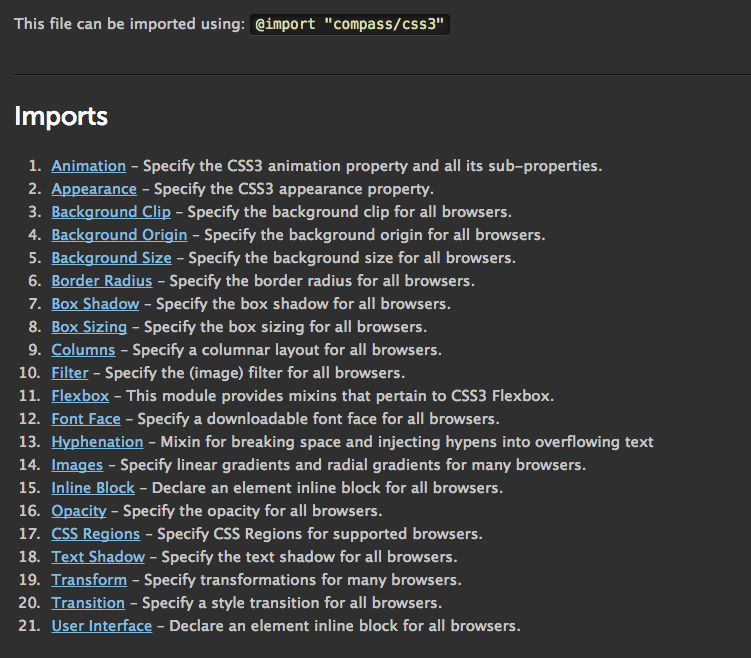
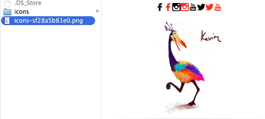
Sprite
/**** optional ****/

// 圖片的間距
$icons-spacing:20px;

// 圖片排列方法 smart, diagonal, horizontal
$icons-layout: smart;

// 要不要自己去算圖片尺寸
$icons-sprite-dimensions: true;


/**** necessary ****/

@import "icons/*.png";
@include all-icons-sprites;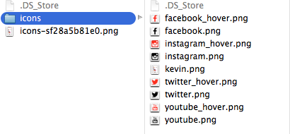
Bootstrap
補充
1.做出navbar
2.加.row
3.做出col-md-
col-xs- 的grid
Practice
7
5
4
4
4
1/4
1/4
1/4
1/4
1/2
1/2
應用
bootstrap sass / tools
bootstrap sass
客製化『有用的功能到再匯入就好
@import "bootstrap";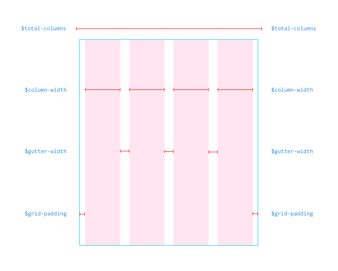
圖出自Even Wu
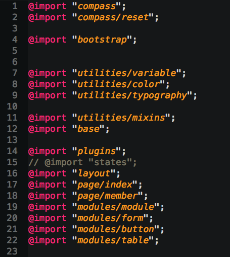
Grid
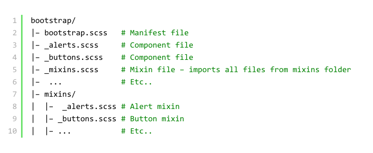
SASS結構
Practice
是驗收成果的時候了,每組分享Sass真好用的地方(至少2個)
1.logo圖用replace-text-with-dimensions 2.需要sticky-footer 3.按鈕會用到contrasted 4.連結會用到link-colors 5.banner圖會用到image-url偵測圖片位置 6.icons會用到sprite 7.注意螢幕縮小時會不會壞(寫些RWD吧)
Tools
實用工具介紹
Q&A
拜託幫我填滿意度問券,
讓我可以有更多改進空間