Question 1
In what ways does your media product use, develop or challenge forms and conventions of school magazines?
What Are Conventions?
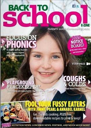
Convention defines the way in something is usually done (http://www.oxforddictionaries.com/definition/english/convention), therefore meaning there are certain rules which are followed when agreeing to meet the conditions of the conventions of something. In terms of what type of genre a magazine is, the genre type usually sticks to the conventions of that category. For example there are different conventions that a rock magazine has to carry out, just as there are different conventions which a fashion magazine has to carry out.

Why Is It Good To Use Conventions?
Using conventions is a good way of sticking to the rules which are placed on the magazine category. Which means, if you use the conventions which are placed on a magazine, it is more likely recognised as being in that category therefore it will appeal to the audience in that category more because of the conventions that have been used. It is good to stick to conventions as they are guidelines of how something should be.
Why Is It Good To Develop Conventions?
Developing conventions is the idea of using the conventions which are set on a particular category and then changing or adapting them in your own way, but still loosely following the guidelines. As a result of this the person creating the product will still be able to appeal directly to the audience which they want but be able to have a different way of presenting this. An example of this could be that a hip-hop magazine has the convention of using big bold letters for the masthead, by developing this convention a person could still use bold lettering in their masthead but for all the letters to be lowercase; therefore it stands out to the audience as a convention but one that has been developed.
Why Is It Good To Challenge Conventions?
When creating a product it is also good to have your own ideas which you plan to implement into the product. Challenging conventions means that you are going against the conventions and guidelines which are set in that category. By doing this it creates something else which is added to the mix. By not sticking to the house colours of a magazine and adding an extra colour in can help enhance the magazine and possibly also reach out to other people who might not have been interested in the magazine with the set guidelines. Challenging conventions is a good way of placing something new into the magazine.
What are the main conventions of a school magazine?
- A short masthead which draws the reader in and relates to the school therefore making an audience want to buy the magazine as it links to the pupils
- Main Image has to be attracting and relating to the school and the main article which the magazine promotes
- Coverlines to help the reader realise in a few words what the articles are about before reading and delving deeper in to the magazine.
- Anchorage Text
- House Style which connects to the school main colours.
My School Magazine Front Cover

What Conventions Have I Used In My School Magazine? (1/3)
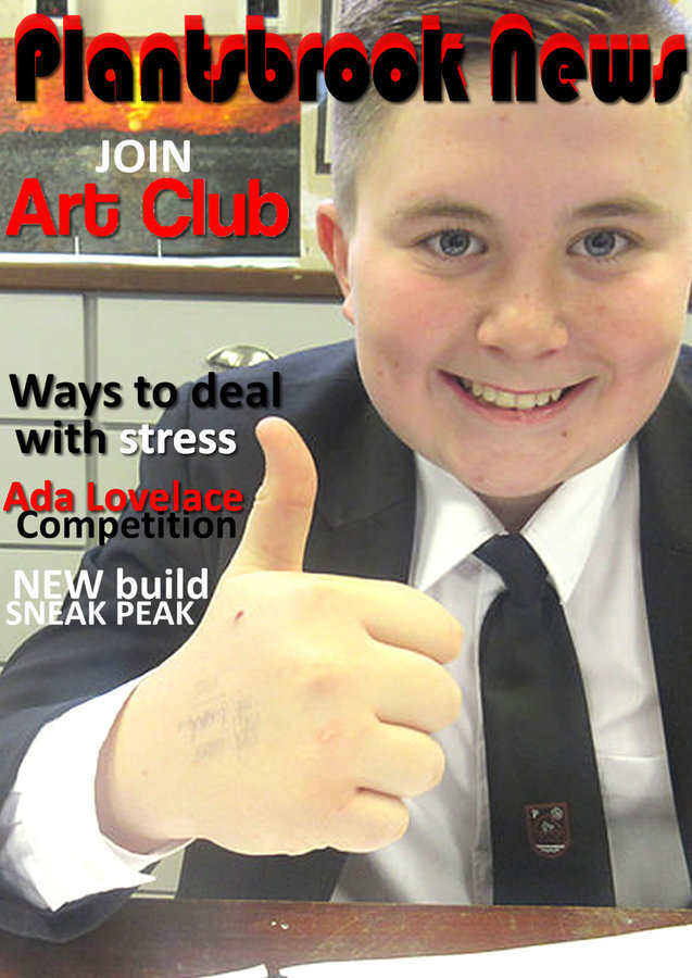
My school magazine has used a variety of conventions as I wanted my magazine to be able to relate and be known as a school magazine very easily from just a glance at the front cover. The first convention which I have used is the masthead of the magazine, the masthead is called “Brookers News”, this is because “Brookers” is a shorter version of “Plantsbrook” which is the name of the school. By shortening the name of the school and creating it in to a masthead I am able to appeal to the audience of the pupils at Plantsbrook as a shorter version of the school name can connote to slang which interests a younger audience.
What Conventions Have I Used In My School Magazine? (2/3)
The second convention which I have used in my magazine is the main image. A main image on the front of a school magazine should be able to relate to the school and in most cases uses the pupils in the main image as a way to do so. My main image uses conventions of a school magazine, as it is of a Plantsbrook pupil. It then further uses the conventions of a school magazine by using a pupil which is looking happily into the camera, breaking the fourth wall, and this will interest the pupils of Plantsbrook because they will see a smiling pupil which could mean that the magazine is interesting.
What Conventions Have I Used In My School Magazine? (3/3)
The next convention which I have included in my school magazine is the use of the coverlines being all in one column to the side of the main image. Many school magazines will use this technique as a way of not covering the image too much and being able to sow the coverlines clearly in one place and not muddling them around the page; this is a way for the audience to not be confused and overloaded with text by aligning it on one side of the page.
What Conventions Have I Developed In My School Magazine?
I decided to develop the masthead as I wanted the focus to be heavily on the masthead. In this respect it is more to do with the look of the masthead. Instead of having the masthead one colour with a black border I was innovative and played around with different ways I could have the masthead. I finally found one way which impressed me a lot. I used the technique of grouping and layering the words to establish a thickness to make the masthead stand out a bit more and look more unique. After this I used a drop shadow to have a tiny bit of a background to the masthead, therefore making it stand off the page a bit and not blend in.
What Conventions Have I Challenged In My School Magazine?
I chose not to challenge too many conventions, for this my reasoning is that I wanted my school magazine to look like a proper school magazine which pupils would read. Consequently, I decided to challenge the conventions of a headline. I decided to not have a proper headline which links to a main article or what the main image is. First of all the main image is of a smiling pupil at Plantsbrook school, there is not a main article which connects to the main image therefore there is not headline which can come from this. I also did not want the main focus to be on the headline but for the main focus to be on the masthead and the main image which concentrates heavily on the concept of a magazine made for Plantsbrook school.