Design Trends
2017
Every Design Trend will be followed with few creative references.
** Creative reference credits are available in the Last slide
1. Semi Flat Design
Flat design ruled the web design market but now, influenced by Material Design, it is becoming more dimensional.
2. Cinemagraphs
Cinemagraphs aren't the regular gifs
we see all around the web.
Cinemagraphs are still images with minor elements moving in them. This technique makes a simple photo more realistic by bringing it to life.
3D is definitely heading our way and we are going to see its influence in all design fields.
3. More 3D
With the VR/AR revolution rapidly building momentum, this domain is evolving pretty fast.
4. Animations
Animations are more and more present in web design and they can be gifs, SVG, WebGL CSS or videos.
Animations were definitely one of the biggest things in the last year’s web design trends, so don't hesitate to use them.
5.Geometric Shapes, Patterns, Lines and Circles
This trend started in 2016 and will definitely continue in 2017.
You can personalise a website simply by adding some modern shapes, either flat or with a soft shadow.
6.Courageous Colors
Use bold colors to make a statement.
Material design and flat design go perfectly with bold colors.
You can use the color palette provided by Google to choose and pair the colors you want.
7.Innovative Scrolling & Parallax
This visual idea is great to add a unique element
to any website.
From a multi layered parallax to a video parallax, anything is possible.
Color transitions are one of the biggest trends right now.
8. Color Transitions
Beginning in 2016 and growing quickly after, big names like Instagram decided to change their logos and images from a flat color to a multi-colored transitions. From logos to buttons or picture overlays, this trend is everywhere.
9.Mobile First -
Responsive Design
2015 and 2016 brought a considerable increase in mobile browsing.
Tablets and smartphones are now the first choice when it comes to browsing websites surpassing desktops, laptops and tablets - and this trend will continue.
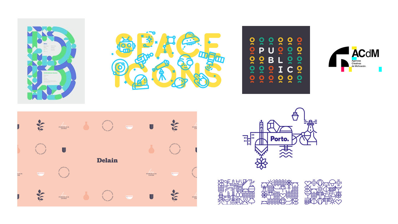
10. Custom Graphics
& illustrations
Stock photos are still pretty popular, but there has been a new trend growing significantly in 2016 that will increase in 2017.
use of custom made graphics and illustrations.
less stock and more original, unique images.
11. Creative Use of Neutral Space & Grid
In previous years web design had been adapted to organized columns and grids, but in 2016 we saw a considerable shift towards irregular layers and ultra-modern design.
12. Split Content
Split content is becoming popular in responsive web design and it splits the screen in two or more parts.
A split-screen website will show the viewer several equally important messages on a single page. This trend is rising since late 2015, but in 2017 it will grow further and is likely to be encountered on many websites.
13. Video Every where
Video content has increased in the last year and people are demanding high quality videos that tell a story.
showing a product or a large scale cinematographic project that will keep the viewer interested in the story.
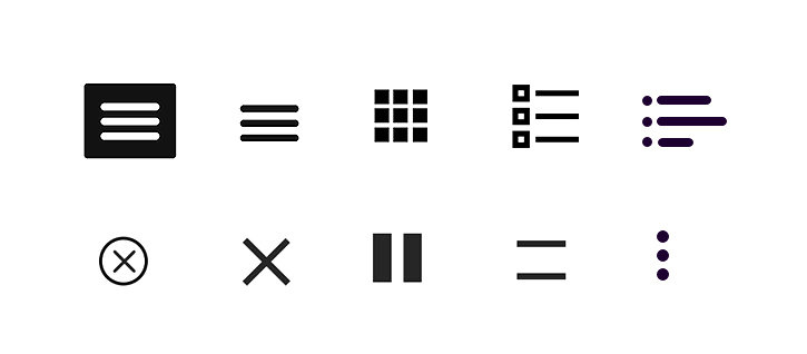
14. Hidden Navigation
The hamburger menu creates many pro and con arguments over how difficult it is for tusers to find the menu, but one thing is for sure - this trend is here to stay and people will eventually get used to them.
15. Logo Design trends
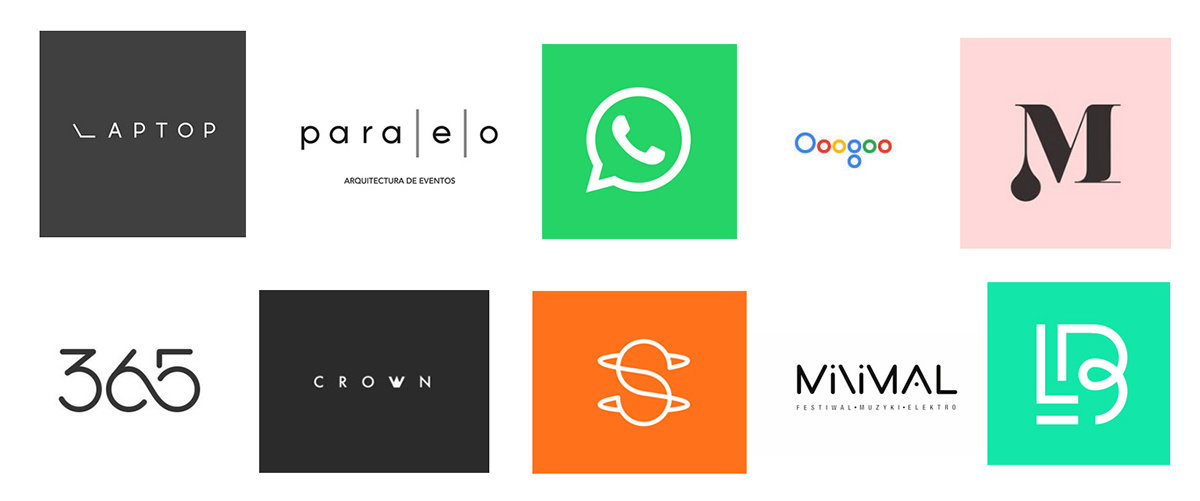
Minimalist
15.1 Logo Design Trends
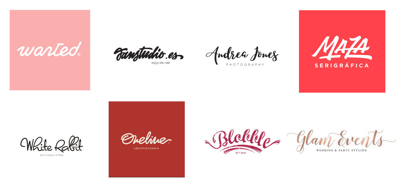
Hand drawn
15.2 Logo Design Trends
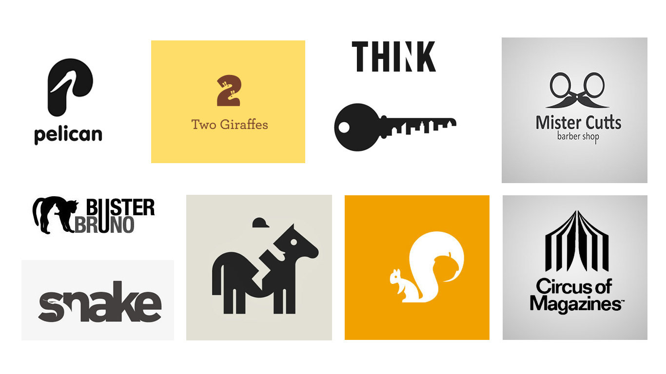
Negative Space
15.3 Logo Design Trends
Line art
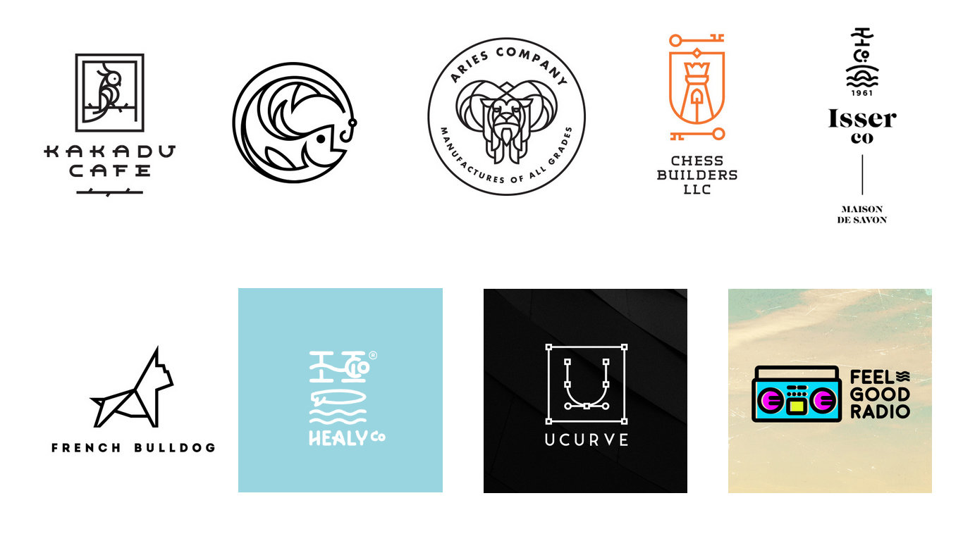
15.4 Logo Design Trends
Pattern
15.5 Logo Design Trends
Animated
15.6 Logo Design Trends
Animated
16. Typography Trends
Big, bold & beautiful typography
16.1
Visual Hirearchy
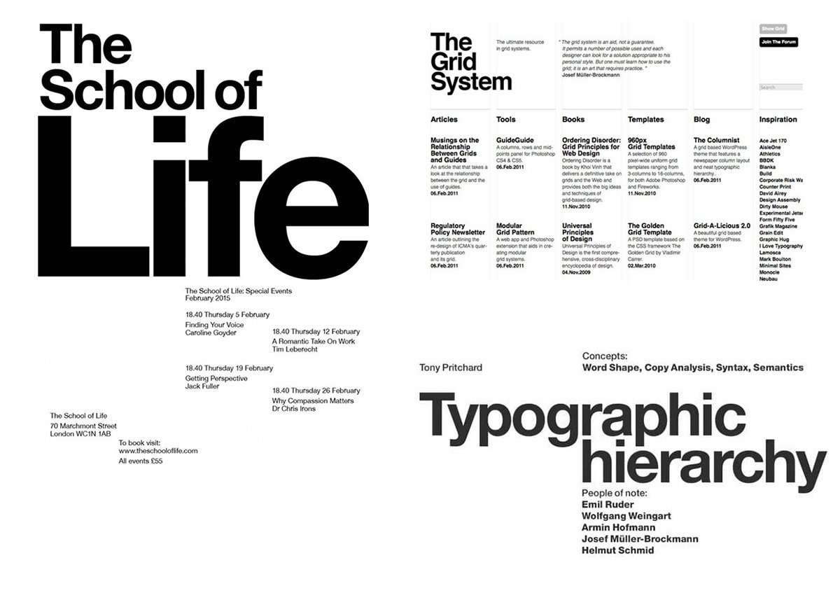
16.2
Tiny typography
16.3
Animated typography
Creative Credits
Thank you for your interest and
if you like the presentation
share it with your friends &
co-workers.
in case you have a question / project or an idea to discuss ,connect me @ nishant.pandey@leoburnett.co.in