
The Big Issue cover analysis
This cover features Johnny Depp as the main image drawn in a computerised style with words surrounding him connoting his traits and famous roles, expressing how much he has accomplished at the age of 50. Words such as 'Mad Hatter' 'Pirate' and 'Scissorhands' show the many contrasting roles he has performed in his lifetime.
The colour scheme is teal, light magenta and black. The two vibrant colours against the black project the words and highlight the main points. The only text in light magenta is 'Depp at 50' which shows that that is the main focus and lead story of the paper.
The typography is alternative, sketchy and twisted, with most of the words squeezed around the main image in an unconventional form. The boldness of some of the typography shows the importance of some words over others, for example the crude phrase 'sex god' is bigger and bolder than 'Romeo' which shows the importance of the sexual reference as it is being largely broadcasted. This may be because he is a well known celebrity and more women read the magazine than men so the audience may appeal to that statement more (assuming they are heterosexual)
As the image is drawn on a computer it is hard to establish lighting and inferences from it. The image is well drawn and captures the features of the celebrity. There is a slight shadow on the right side of his face and he is looking directly at the reader of the magazine, with the eyes slightly following you from each direction.
The masthead is in the top centre of the page, conventional to the magazine. The price and issue date features underneath this.
The Big Issue cover analysis
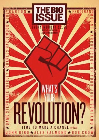
This issue does not feature a celebrity etc. instead connotes communist propaganda posters with a red fist as the main image. The main and only headline is bold and expressive, 'What's your revolution?', here this question is used to emphasise a wanted change or difference.
The colour scheme follows the similar propaganda theme with the bold red and biege background. The main image is red as it is associated with energy, war, danger, strength, power, determination as well as passion, desire, and love. Red is a very emotionally intense color. It enhances human metabolism, increases respiration rate, and raises blood pressure.
Surrounding the poster there are names listed in a square format. These names link to the issue and the 'revolution' as it says 'time to make a change with'. Separating the names are small red stars perhaps portraying their status.
The typography is all capitalised and thin all in the same font. The word revolution is the biggest which highlights what the paper wants to emphasise.
The masthead is in the top centre of the page, conventional to the magazine. The price and issue date features underneath this.
The main image of the fist is gripping and empowering, which emphasises the revolution the magazine wants to portray.
The Big Issue cover analysis

This issue features Madonna as the main image. This is an American issue from 2016. The image is quite sexual yet casual with hands on her face and biting her finger. Her expression is happy and slightly lusty. The lighting highlights her features and makes her standout against the purple background. Her cleavage is evidently shown which is used to sell the magazine (Male Gaze).
The main colours are light purple, red and a slight amount of white. These colours contrast against each other making the issue vibrant and stand out. Similar to the previous image the red connotes passion, desire, and love. Red is a very emotionally intense color. It enhances human metabolism, increases respiration rate, and raises blood pressure.
The typography for 'madonna' is italicised and in the bright red colour which highlights it against the purple tone. The font is quite gothic and formal with a thinner side on the left hand side of the letter.
Madonna is situated on the right hand side of the page. Her makeup is professional and classy with red lipstick and eyeliner. Her nails clash with her pale face.
Unlike the other two issues, the masthead is on the left hand side. this is because of the main image madonna being on the right hand side. The price and release date is on the right hand corner.