Responsive Web Bloopers at Viki
Mobile Era 2017
@renettarenula
Aysha Anggraini


@renettarenula
aysha.me
codepen.io/rrenula
-
Working Together
-
Writing Code
-
Testing Site
Blooper #1: Working Together
Lack of collaboration between designers & developers


Designer
Engineer


Designer
Engineer


Designer
Engineer
Time loss

Problems Found!


Designer
Engineer


Designer
Engineer


Designer
Engineer


Designer
Engineer

Problems Found!


Designer
Engineer

-
Fancy Animations
-
Big Images
-
Intricate Layouts
1. Limitations of design
Episode
Clips
Trailers
Episode
Clips
Trailers
Episode
Clips
Trailers
Episode
Clips
Trailers
2. Weakness of mockups
-
Performance?
-
Interaction types?

“The correlation between screen size and input type is quickly blurring. There is no longer any guarantee that small screens equal touch and large screens equal mouse.”
- Tom Maslan
-
Discovered problems late
-
Hacks & Shortcuts
-
Last minute feature
3. Shortcomings

Design
Mocks
Develop &
Test
Beta Testers
Bug fixes, etc.
Rollout!
Previous Workflow

Time loss

No time for feature request


Collaborative Workflow!


Low-fidelity mockups
Designer
Engineer


Low-fidelity mockups
Feedback
Designer
Engineer

Prototype!


Low-fidelity mockups
High-fidelity mockups
Feedback
Designer
Engineer
Prototype
-
Don't prototype everything
-
Build fast, build ugly

Design
Mocks
Develop &
Test
Beta Testers
Bug fixes, etc.
Rollout!

Prototype!

Less time loss

Feature Request
Blooper #2: Writing Code
Lack of planning on development
// nested media queries
.modal-submit-channel {
    width: 580px;

    @media #{$respond-media} {
        width: 780px;
    }
}
// un-nested media queries
.slides-vertical {
position: relative;
.slides-wrapper {
height: 298px;
overflow: hidden;
}
}
@media #{$respond-wide} {
.slides-vertical {
.slides-wrapper {
height: 386px;
}
}
}Inconsistent ways of writing media queries
// mobile first CSS
.modal-submit-channel {
    width: 580px;

    @media #{$group-large} {
        width: 780px;
    }
}
// non-mobile first CSS
@media #{$group-small} {
.pagination {
width: 100%;
li.prev,
li.next {
width: 100%;
}
li.pages {
width: 80%;
}
}
}Inconsistent paradigm in writing CSS
Planning: Browsers & Devices
Decide on supported browsers & devices early
Browsers & Devices
-
Design within constraints
-
Device specific issues

Device Bugs
by Scott Jehl
https://github.com/scottjehl/Device-Bugs
Planning: Coding Styleguides
Decide on conventions early
Coding conventions
-
Naming conventions
-
Nesting levels
-
Media Queries

SCSS Lint
https://github.com/brigade/scss-lint
Planning: Beware of CSS Frameworks
CSS Frameworks
-
CSS Bloats
-
Rigid Styling
-
Unsuitable


Maintenance: Create Styleguide
Maintain standards that you have set previously

https://www.viki.com/styleguide
Styleguide
-
Promote re-use
-
Faster development
-
Better on-boarding for new engineers
Caution!
Requires Discipline

Hologram
https://github.com/trulia/hologram
Maintenance: Get with the times
Use new features to maintain components
CSS Grid
-
Better layout system
-
Simpler than current grid-based frameworks
-
Not affected by source order of HTML
<div class="row">
    <div class="col s12">
        <div class="header"></div>
    </div>
</div>

<div class="row">
    <div class="col s12 l8">
        <div class="about"></div>
    </div>
    <div class="col s12 l4">
        <div class="episodes"></div>
    </div>
</div>
Current grid system
-
Row wrappers
-
Floats clearing
-
Complicated Markup
<!-- HTML -->
<div class="wrapper">
    <div class="header"></div>
    <div class="about"></div>
    <div class="episodes"></div>
</div>
CSS Grid
-
No row wrappers
-
CSS instead of HTML
-
Simpler Markup
.wrapper {
    grid-template-columns: repeat(2, 1fr);
    grid-gap: 20px;
    display: grid;
}

.header {
    grid-column: 1fr;
}
1
2
3
1
2
3
What about browser support?
Think of layout as an enhancement
@supports
Feature Queries
// fallback code for older browsers

@supports (display: grid) {
    // code for newer browsers
    // including overrides of the code above
}
Using Feature Queries in CSS
by Jen Simmons
https://hacks.mozilla.org/2016/08/using-feature-queries-in-css/
Grid by Example
by Rachel Andrew
https://gridbyexample.com/
Blooper #3: Testing Site
Testing late on devices and relying too much on emulators
Device Testing
-
Testing Interactions
-
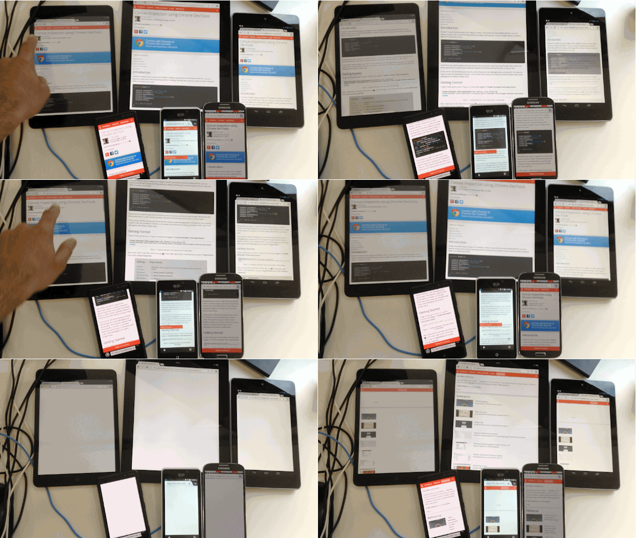
Bugs & Quirks on mobile


Build UI Components
Deploy to Staging
QA Test

Trivial Bugs!
Build UI Components
Connect to device
Repeat
Staging & QA Test
Reference: http://stackoverflow.com/questions/11005540/localhost-running-on-mac-can-i-view-it-on-my-android-phone

Trivial Bugs!
Localtunnel
Proxylocal

Ghostlab

GIF Credit: Addy Osmani


Drawbacks
-
Lazy loaded item
-
False Positive
-
Slow

Workaround
-
Lazy loaded items
- Increase Timeouts
-
False Positive
- Testing env with consistent data
-
Slow
- Limit Testing

Current Project: Optimizing Site
Did not focus on performance earlier
Prior Performance
Start Render
2.8s
Desktop
Start Render
13.8s
Mobile
Performance on both desktop and mobile before improvements are made
Fully Loaded
23.4s
Fully Loaded
48.2s
Content Sizes
5881KB
Content Sizes
6229KB
Deferring Scripts: Load resource lazily
Improves the start render time on mobile device
Define Fallback & Web Fonts in CSS (@font-face)
Load fonts dynamically & use it
Leverage browser cache to prevent FOUT
Deferring Scripts: Loading Fonts
Web Font Loading Patterns
by Bram Stein
https://www.bramstein.com/writing/web-font-loading-patterns.html
Comprehensive Guide to Font Loading Strategy
by Zach Leatherman
https://www.zachleat.com/web/comprehensive-webfonts/
CSS Font-Display
https://developer.mozilla.org/en-US/docs/Web/CSS/@font-face/font-display
Deferring Scripts: Async or Defer Scripts
Async — Scripts with no dependencies
Defer — Scripts with dependencies; Execution order matters

Video Page: Deferring Scripts
Start Render
13.8s
Start Render
4.9s
64% Faster
Speed improvement on mobile devices
Serve images correctly: Responsive image tag
Serve image according to user's screen size
// CSS
.responsive-img {
    max-width: 100%;
    height: auto;
    width: 100%;
}
<!-- HTML -->
<img src="image.png" class="responsive-img" />VS.
<img srcset="image-480.jpg 480w,
             image-640.jpg 640w,
     sizes="(max-width: 400px) 100vw,
            (max-width: 960px) 75vw,
            640px"
     src="image-640.jpg" alt="Image">
The anatomy of responsive images
by Jake Archibald
https://jakearchibald.com/2015/anatomy-of-responsive-images/
Lazy loading: Images
Load images only when users needs it
Lazysizes
https://github.com/aFarkas/lazysizes
Homepage: Lazy load images
Content Sizes
6229KB
Content Sizes
2181KB
65% Lower
Content Request on mobile devices
Homepage: Lazy load images
Fully loaded
48.2s
Fully loaded
28.9s
40% Faster
Speed improvement on mobile devices
Essential Image Optimization
by Addy Osmani
https://images.guide/

Google Lighthouse
-
Network level optimizations
-
PWAs
-
...many more
Performance: An ongoing process

@renettarenula
aysha.me
codepen.io/rrenula
Thank You!
http://slides.com/renaysha/responsive-web-bloopers-at-viki/