A FRONT-END WORKSHOP
Learning the fundamentals of CSS and applying them in your very own CSS Zen Garden project
Women Coders · 2026
Becoming Zen with CSS

Rhiana Heppenstall - Accessibility Lead

00 — RATIONALE
Why CSS Zen Garden?
The CSS Zen Garden invites you to relax and meditate on the important lessons of the masters. Begin to see with clarity. Learn to use the time-honored techniques in new and invigorating fashion. Become one with the web.
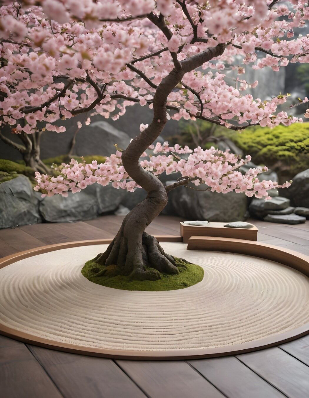
FIG. 1 — Public Domain Cherry Blossoms
INDEX
The outline
May jump around a bit
01
02
03
04
05
The Set-Up
Getting the Zen Garden showing in your browser
The Text and Color
How and where to add colour
The Box Model
How the browser sees it
The Layout
How to position elements
The Demo
Example garden you can follow or make your own!
CHAPTER
ONE
01
01 - SET-UP
Getting set up
01 — SET-UP
What to do
STEP 01
STEP 02
STEP 03
STEP 04
Download HTML
Text Editor
Browser test
Set up CSS
<!DOCTYPE html>
<html lang="en">
<head>
	<meta charset="utf-8">
	<title>CSS Zen Garden: The Beauty of CSS Design</title>

	<link rel="stylesheet" media="screen" href="style.css?v=8may2013">
	<link rel="alternate" type="application/rss+xml" title="RSS" href="http://www.csszengarden.com/zengarden.xml">

	<meta name="viewport" content="width=device-width, initial-scale=1.0">
	<meta name="author" content="Dave Shea">
	<meta name="description" content="A demonstration of what can be accomplished visually through CSS-based design.">
	<meta name="robots" content="all">


	<!--[if lt IE 9]>
	<script src="script/html5shiv.js"></script>
	<![endif]-->
</head>

<body id="css-zen-garden">
  <div class="page-wrapper">

	<section class="intro" id="zen-intro">
		<header role="banner">
			<h1>CSS Zen Garden</h1>
			<h2>The Beauty of <abbr title="Cascading Style Sheets">CSS</abbr> Design</h2>
		</header>

		<div class="summary" id="zen-summary" role="article">
			<p>A demonstration of what can be accomplished through <abbr title="Cascading Style Sheets">CSS</abbr>-based design. Select any style sheet from the list to load it into this page.</p>
			<p>Download the example <a href="/examples/index" title="This page's source HTML code, not to be modified.">html file</a> and <a href="/examples/style.css" title="This page's sample CSS, the file you may modify.">css file</a></p>
		</div>

		<div class="preamble" id="zen-preamble" role="article">
			<h3>The Road to Enlightenment</h3>
			<p>Littering a dark and dreary road lay the past relics of browser-specific tags, incompatible <abbr title="Document Object Model">DOM</abbr>s, broken <abbr title="Cascading Style Sheets">CSS</abbr> support, and abandoned browsers.</p>
			<p>We must clear the mind of the past. Web enlightenment has been achieved thanks to the tireless efforts of folk like the <abbr title="World Wide Web Consortium">W3C</abbr>, <abbr title="Web Standards Project">WaSP</abbr>, and the major browser creators.</p>
			<p>The CSS Zen Garden invites you to relax and meditate on the important lessons of the masters. Begin to see with clarity. Learn to use the time-honored techniques in new and invigorating fashion. Become one with the web.</p>
		</div>
	</section>
 ...
Base:
- Add in style tags between html and body
- Basic reset CSS
Style tags
</head>

<style>
	body {
		margin: 0;
	}
</style>

<body>
Plus:
- Add in full CSS reset code
DEFINITION
CSS
Cascading
Style
Sheets
EXAMPLE
Inverted Triangle
RESET
ELEMENTS
CLASSES
COMPONENTS
!IMPORTANT
- blue
- pink
- something else
What colour will the text be?
p {
  color: blue;
}

p {
  color: pink;
}- blue
- pink
- something else
What colour will the text be?
p.text {
  color: blue;
}

p {
  color: pink;
}
Examples only!
Not best Practice
CHAPTER
TWO
02
02 - TEXT AND COLOUR
Text and Colours
02 - TEXT AND COLOUR
Main Rules for Text
I.
II.
III.
font-family
font-size
line-height
font-weight
font-style
text-decoration
Base:
- Add in two websafe font families
Font Families
html, body {
  font-family: Palatino, 'Book Antiqua', Georgia, serif;
}


h1, h2, h3, h4, h5, h6 {
  font-family: Verdana, Geneva, sans-serif;
}
Plus:
- Add in two custom imported font families
Font Size
html {
  font-size: 16px;
}

h1 {
  font-size: 3rem;
}

h2 {
  font-size: 2.25rem;
}

h3 {
  font-size: 1.5rem;
}
Base:
- Pick a base font size in pixels
- px
- Add some example sizes shown
- rem
Plus:
- Test out some different units
- em, %, vh, vw
- Generate your own font sizes
Line Height
h1, h2, h3, h4, h5, h6 {
  line-height: 1.1;
}

p, ul li, ol li {
  line-height: 1.5;
}
Base:
- Pick a base line height ratio
- Between 1 and 2
- Headings should be shorter than body
Plus:
- Use the calculator to find best heights
Font Weight
h1, h2, h3, h4, h5, h6 {
  font-weight: bold;
}

p, ul li, ol li {
  font-weight: 400;
}| Key word | Number |
|---|---|
| normal | 400 |
| bold | 700 |
| thin | 100 |
| black | 900 |
Base:
- Add in some base font-weights
- Keywords or numbers
Plus:
- Test out different font-weights to see what your font can render
- ditig.com/css-font-weight-cheat-sheet
- Hint: It can only render what has been loaded
02 - TEXT AND COLOUR
Main Rules for Colour
I.
II.
III.
color
background-color
border
Color
html, body {
  color: black;
}

h1, h2, h3, h4, h5, h6 {
  color: #5F1A37;
}

p {
  color: hsl(177, 39%, 32%);
}

a {
  color: rgb(72, 63, 80);
}
Base:
- Add in some example colours
- hex, rgb, hsl, keyword
Plus:
- Generate your own colour scheme
- Test out other text properties
- text-shadow, opacity (rgba)
Background Color
html, body {
  background-color: #F5F4F6;
}

header {
  background-color: #9BCFE8;
}

footer {
  background-color: #ACB2D8;
}

aside {
  background-color: #BFEDE2;
}
Base:
- Add in some example background
- hex, rgb, hsl, keyword
Plus:
- Test out other background properties
- box-shadow, gradients, background images
- cssgradient.io
Border Color
header {
  border: 1px solid #267EA6;
}

footer {
  border-width: 1px;
  border-style: dashed;
  border-color: #3B447D;
}

aside {
  border-width: 5px;
  border-style: dotted;
  border-color: #288F77;
}
Base:
- Add in some example borders
- Style and width first
- hex, rgb, hsl, keyword
Plus:
- Test out other border properties
- border-radius, single side
- Add an outline
CHAPTER
THREE
03
Box Model
03 - BOX MODEL
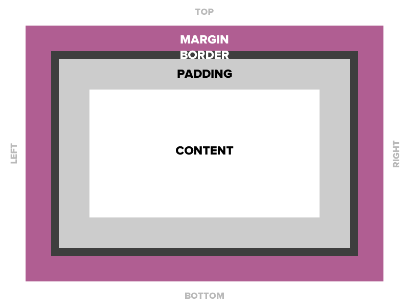

Content
Padding
Border
Margin
03 - BOX MODEL
Three boxes per element
I.
II.
III.
content
padding
margin
Content
header {
  height: 150px;
}

footer {
  height: 3rem;
  width: 80%;
}

.explanation,
.participation {
  display: inline-block;
  border: 1px solid black;
  width: 49%;
}
Base:
- Pick an element
- Add a height and width
- px, rem, %
- Hint: adding some colour will help you visualise
Plus:
- Test out with different display options
- block, inline-block and inline
Padding
aside {
  padding: 3%;
}

footer {
  padding: 15px;
}

.main {
  padding: 3rem;
  background-color: #EED2AA;
}

header {
  padding: 20px 0 1rem 0;
}
Base:
- Pick an element
- Add padding
- px, rem, %
Plus:
- Test out with different display options
- block, inline-block and inline
- Add padding to 1, 2 or 3 sides only
Margin
h1, h2, h3, p {
  margin-bottom: 0.5em;
}

.summary {
  margin: 100px;
}

ul {
  margin: 2rem;
  background-color: #E3E4F2;
  border: 1px solid black;
}
Base:
- Pick an element
- Add margin
- px, rem, %
- Hint: adding a border will help you visualise
Plus:
- Test out with different display options
- block, inline-block and inline
- Add margin to 1, 2 or 3 sides only
What did you discover?
Display Table
| Property | Size | Padding | Margin | Direction |
|---|---|---|---|---|
| inline | No | Left/Right only* | Left/Right only* | Left to right |
| block | Yes | Yes | Yes | Up to down |
| inline-block | Yes | Yes | Yes | Left to right |
* top and bottom are kind of applied but go outside the alignment of the parent
CHAPTER
FOUR
04
Layout
04 - LAYOUT
04 - LAYOUT
Three different layouts
I.
II.
III.
position
flex
grid
Position
header {
  position: sticky;
  top: 0;
  left: 0;
  right: 0;
}

footer {
  position: relative;
  bottom: 10rem;
  left: 50%;
}
Base:
- Pick an element
- Add a position type and co-ordinates
Plus:
- Test out with different position options
- absolute, block, relative, sticky
- add some z-index
Flex
.main {
  display: flex;
  flex-direction: column;
  align-items: center;
}

header {
  display: flex;
  flex-direction: row;
  align-items: flex-end;
}
Base:
- Pick an element
- Add flex to create a layout
Plus:
- Test out with different options
- flex-direction, flex-reverse,
justify-content, align-items
- flex-direction, flex-reverse,
- flexboxfroggy.com
Grid
aside .wrapper {
  display: grid;
  grid-template-columns: 1fr 20% 250px;
  gap: 1rem;
}
Base:
- Pick an element
- Add grid to create a layout
Plus:
- Test out with different options
- grid-template-area
- cssgridgarden.com
CHAPTER
FIVE
05
Demo
05 - DEMO
Thank
you.
Rhiana Heppenstall - Accessibility Lead 3P Learning
WEB
SOCIAL