ENGINEERING + DESIGN
design
systems
@RiaCarmin
🔥🔥🔥
VERY

By understanding recurrent design problems in our environment, readers can identify extant patterns in their own design projects and use these patterns to create a language of their own.
“
@RiaCarmin
trello.com/b/
pIVAuqKc
p - i - v - a - u - q - k - c
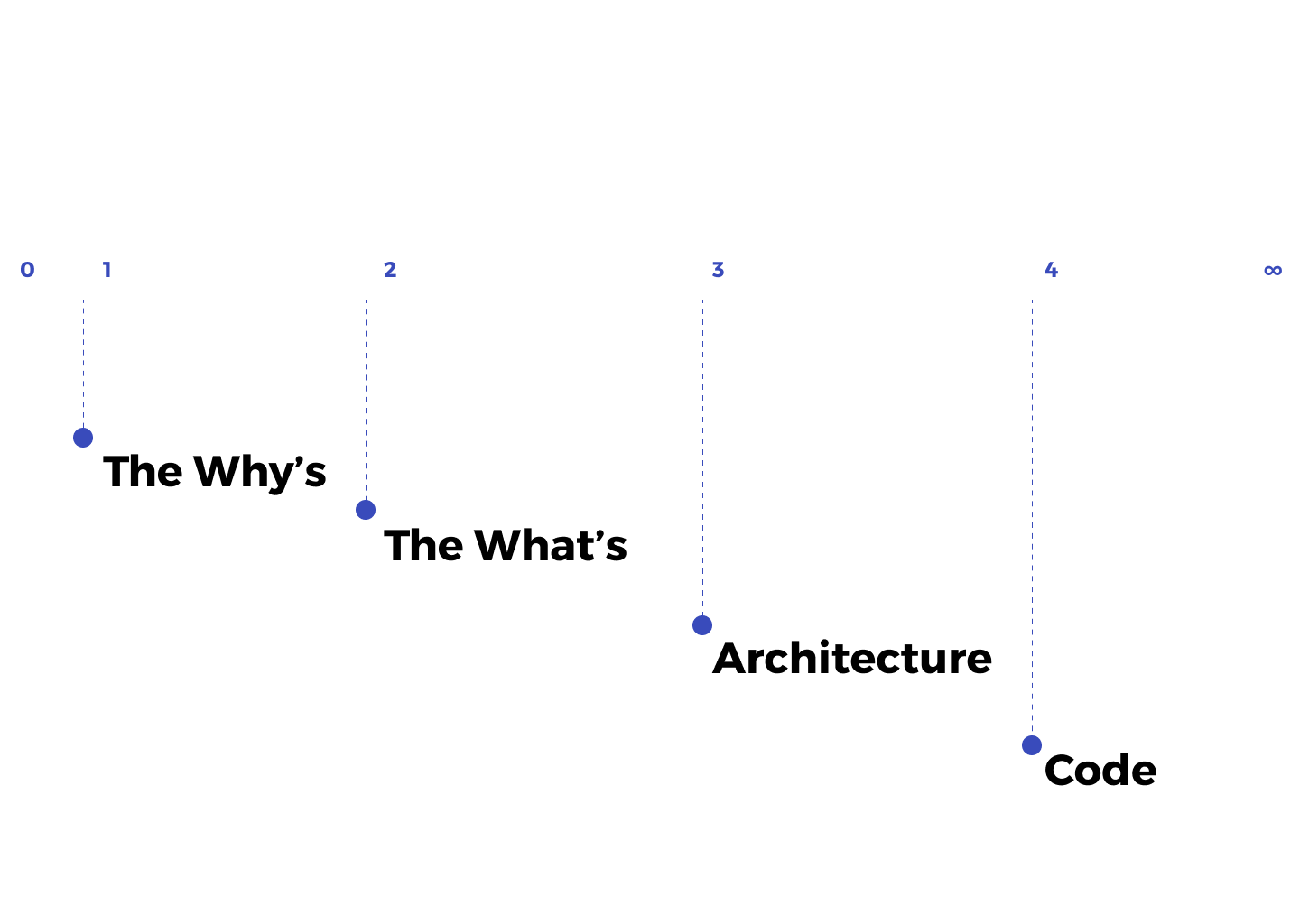
THE
why’s
🎨 + 💻


…
greater coherence between design and engineering
#1
livable code
— Sarah Mei @sarahmei
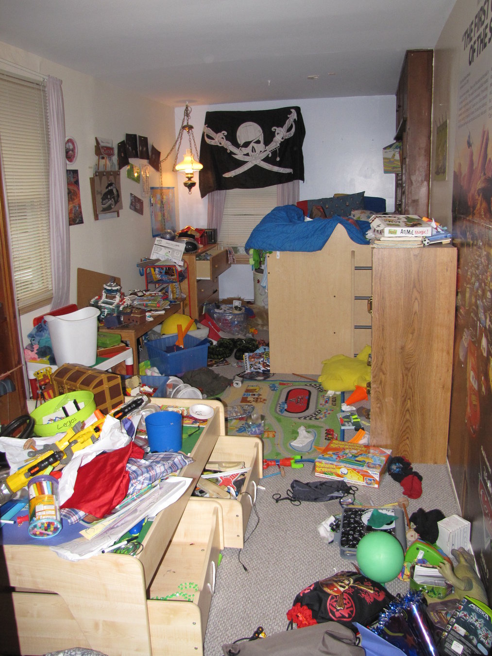
makes it easy to bring people on to your project, makes building your product fun
#2

💁
HAVE STANDARDS
consistent user interface
#3

THE
what's

THE
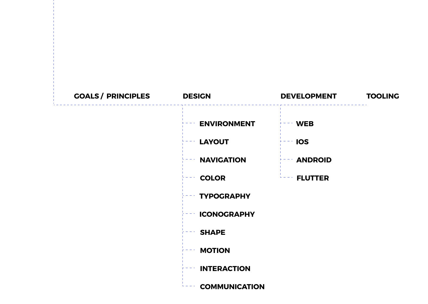
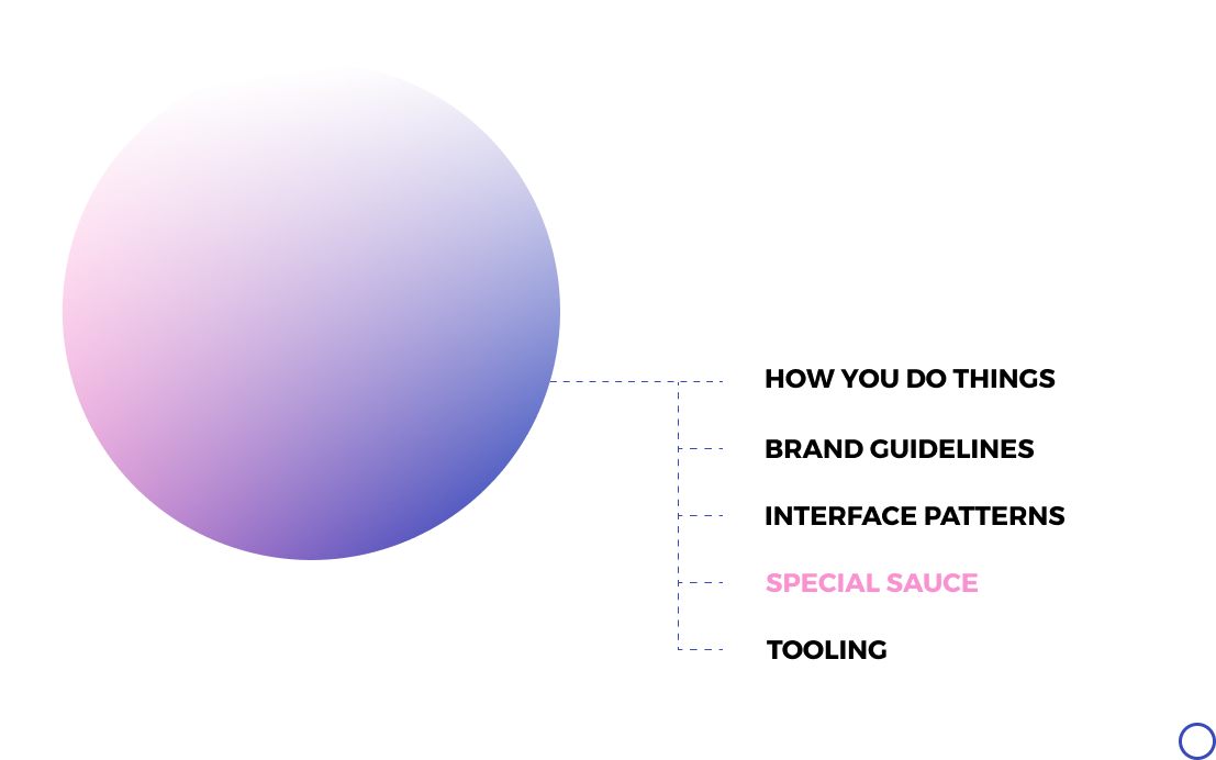
architecture


fluent / Microsoft


carbon / IBM


lightning / Salesforce

polaris / Shopify

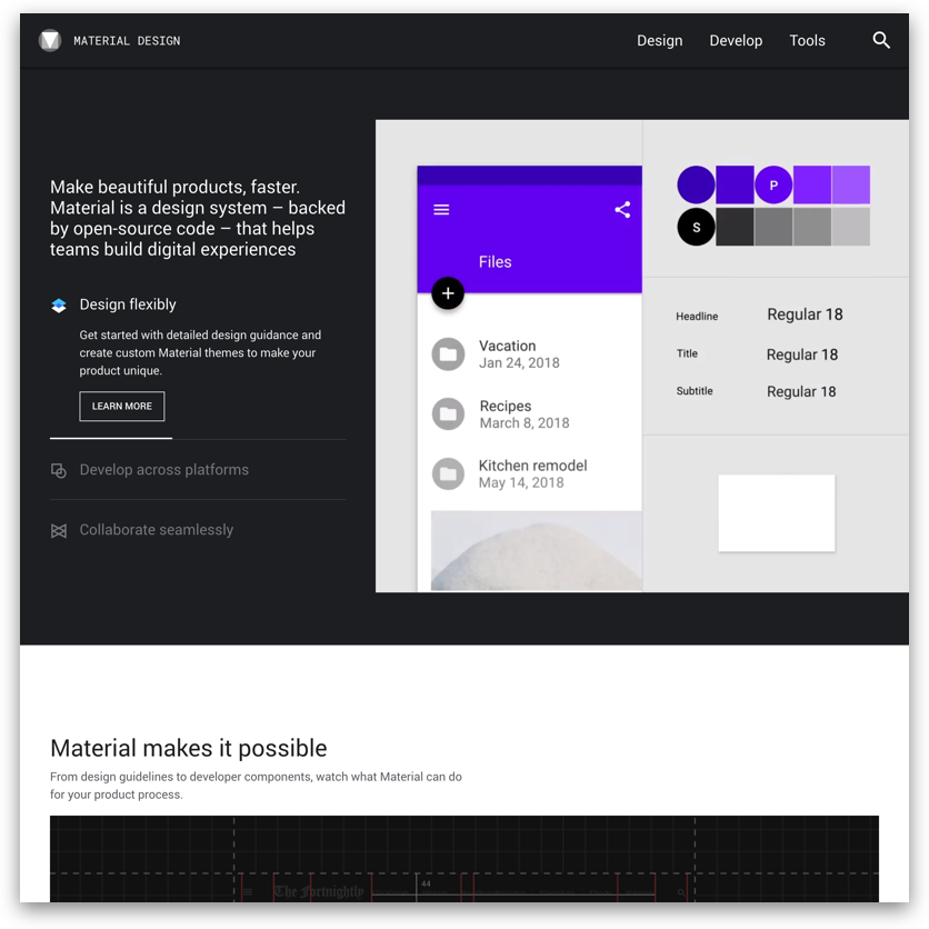
material / Google

THE
code
01
implement the brand guidelines in a way that ensures consistency
02
build in some of the rules of graphic design

.
.
.
.
└── styles
    ├── base // Constants
    │   ├── _base.scss
    │   ├── _colors.scss
    │   ├── _layout.scss
    │   ├── _line.scss
    │   ├── _motion.scss
    │   ├── _plane.scss
    │   ├── _spacing.scss
    │   └── _typography.scss
    ├── global // Global resets and styles
    │   ├── _global.scss
    │   ├── _links.scss
    │   ├── _lists.scss
    │   ├── _normalize.scss
    │   ├── …
    ├── index.scss // Manifest
    ├── modules // Style blocks
    │   ├── _buttons.scss
    │   ├── _errors.scss
    │   ├── _layout.scss
    │   └── _typography.scss
    └── utilities // Functions and Mixins
        ├── _font-size.scss
        ├── _plane-level.scss
        ├── _space.scss
        └── _utilities.scss
// In Sass import order matters
@import "base/base";
@import "utilities/utilities";
@import "global/global";
@import "modules/modules";styles/index.scss
// =============================================================================
// Colors
// =============================================================================

// Theme Colors
// …

// Grey Colors
// …

// UI Colors
$ui-colors: (
  action: $color-primary,
  success : #42f4a1,
  warning : #ffcc68,
  error : #f44141,
  info : #7caeff,
);

$color-action: map-get($ui-colors, action);
$color-success : map-get($ui-colors, success);
$color-warning : map-get($ui-colors, warning);
$color-error : map-get($ui-colors, error);
$color-info : map-get($ui-colors, info);

// Brand Colors
// …
styles/base/_colors.scss
// =============================================================================
// Typography
// =============================================================================

// Montserrat — Bold 700
// Inconsolata — Regular 400
// Inconsolata — Bold 700

$heading-font-family: "Montserrat", serif;
$base-font-family: "Inconsolata", monospace;

$font-weight-regular: 400;
$font-weight-bold: 700;

// Font Colors
$base-font-color: $color-x-dark-grey;
$action-color: $color-primary;
styles/base/_typography.scss
// =============================================================================
// BASE
// =============================================================================

@import 'colors';
@import 'layout';
@import 'line';
@import 'motion';
@import 'plane';
@import 'spacing';
@import 'typography';
styles/base/base.scss
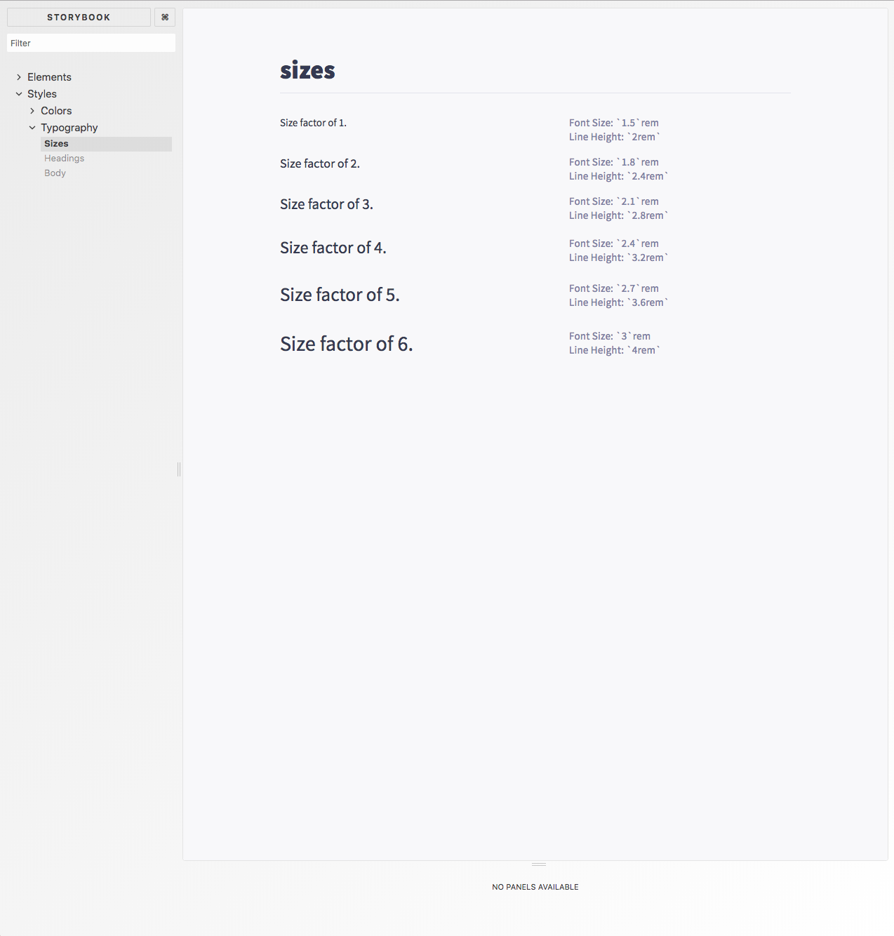
// Calculate font-size to line-height ratio (1) Typographic rules
 @mixin font-size($factor: 1) {
    $init: 4;
    $size: $factor + $init;
    $rhythm: $step / 2;
    $font-ratio: 0.75;

    font-size: $size * $rhythm * $font-ratio / 10rem;
    line-height: $size * $rhythm / 10rem;
}

// Add visual hierarchy level styles. (3) Visual hierarchy
@mixin plane-level($n: 1) {
    @if $n == 1 { box-shadow: $box-shadow-0; }
    @if $n == 2 { box-shadow: $box-shadow-2; }
    @if $n == 3 { box-shadow: $box-shadow-4; }
}

// Calculate step-based spacing in rem. (2) Layout grid and alignment
@function space($n) {
    @return $n * $step + 0rem; // 👈 Uses the Base step.
}

// Add truncate styles to an inline element. (4) Common style helpers
@mixin truncate($truncation-boundary) {
  max-width: $truncation-boundary;
  white-space: nowrap;
  overflow: hidden;
  text-overflow: ellipsis;
}
styles/utilities/[...].scss
// =============================================================================
// GLOBAL
// =============================================================================

@import 'normalize';

* {
  box-sizing: border-box;
}

html {
  height: 100%;
  width: 100%;
  font-size: 62.5%;
  background-color: $base-background-color;
}

body {
…
}

@import 'buttons';
@import 'code';
@import 'forms';
@import 'links';
@import 'lists';
@import 'spacing';
@import 'typography';
styles/global/global.scss
// =============================================================================
// Links
// =============================================================================

a {
    color: $color-action;
    transition: all $base-duration $base-timing;
}

a:hover {
    color: $color-action;
}

// =============================================================================
// Lists
// =============================================================================

ol, ul {
    margin: spacing(2) 0 spacing(2) spacing(3);
    font-size: font-size(1);
}
li {
    margin-bottom: spacing(2);
}
styles/global/_[…].scss
// =============================================================================
// Links
// =============================================================================

a {
    color: $color-action; // 👈 (1) Brand constant
    transition: all $base-duration $base-timing; // 👈 (1) Brand constant
}

a:hover {
    color: $color-action; // 👈 (1) Brand constant
}

// =============================================================================
// Lists
// =============================================================================

ol, ul {
    margin: spacing(2) 0 spacing(2) spacing(3); // 👈 (2) Gr. Design mixin
    font-size: font-size(1); // 👈 (2) Gr. Design mixin
}
li {
    margin-bottom: spacing(2); // 👈 (2) Gr. Design mixin
}
styles/global/_[…].scss
// =============================================================================
// Blocks: Buttons
// =============================================================================

%button {
    display: inline-block;
    height: spacing(4);
    padding: 0 30px;
    text-align: center;
    font-size: font-size(1);
    font-weight: $font-weight-bold;
    line-height: spacing(4);
    letter-spacing: 0.2rem;
    text-transform: uppercase;
    text-decoration: none;
    white-space: nowrap;
    background-color: transparent;
    border-radius: $base-border-radius;
    border: $base-border;
    cursor: pointer;
    box-sizing: border-box;
    transition: all $base-duration $base-timing;
}
styles/modules/_buttons.scss
// =============================================================================
// Blocks: Layout
// =============================================================================

%base-view {
    min-height: 100%;
    width: 100%;
    padding-top: $header-height; // 👈 (1) Brand constant
}

%base-padding {
    padding-left: spacing(2);
    padding-right: spacing(2);
}

%desktop-view {
    @media screen and (min-width: $breakpoint-mobile) { // 👈 (1) Brand constant
        @include plane-level(1); // 👈 (2) Gr. Design mixin
        max-width: $breakpoint-mobile; // 👈 (1) Brand constant
        border-radius: $base-border-radius; // 👈 (1) Brand constant
        background: $color-white; // 👈 (1) Brand constant
    }
}

%card {
    @include plane-level(2); // 👈 (2) Gr. Design mixin
    border-radius: $base-border-radius; // 👈 (1) Brand constant
}
styles/modules/_layout.scss
// =============================================================================
// Blocks: Typography
// =============================================================================

%sub-heading {
    font-weight: $font-weight-bold; // 👈 (1) Brand constant
    text-transform: uppercase;
    letter-spacing: 0.2rem;
    @include font-size(2); // 👈 (2) Gr. Design mixin
    @each $theme, $color in $grey-colors { // 👈 (3) Generating modifiers from maps
        &--#{$theme} {
            color: $color;
        }
    }
}

.example-heading {
    @extend %sub-heading;
    margin: space(2) 0;
}

// .example-heading .example-heading--white
// .example-heading .example-heading--light
// .example-heading .example-heading--medium
// …
styles/modules/_typography.scss
.
.
.
.
└── styles
    ├── base // Constants
    │   ├── _base.scss
    │   ├── _colors.scss
    │   ├── _layout.scss
    │   ├── _line.scss
    │   ├── _motion.scss
    │   ├── _plane.scss
    │   ├── _spacing.scss
    │   └── _typography.scss
    ├── global // Global resets and styles
    │   ├── _global.scss
    │   ├── _links.scss
    │   ├── _lists.scss
    │   ├── _normalize.scss
    │   ├── …
    ├── index.scss // Manifest
    ├── modules // Style blocks
    │   ├── _buttons.scss
    │   ├── _errors.scss
    │   ├── _layout.scss
    │   └── _typography.scss
    └── utilities // Functions and Mixins
        ├── _font-size.scss
        ├── _plane-level.scss
        ├── _space.scss
        └── _utilities.scss
.
.
.
.
├── components
│ ├── avatar
│ │ ├── index.js
│ │ └── style.scss
│ ├── button
│ │ ├── index.js
│ │ └── style.scss
│ └── message
│ ├── index.js
│ └── style.scss
@import 'Base'; // (1) Resolve style constants and placeholder classes
@import 'Utilities'; // (1) Resolve utilities

// (2) Block styles
.avatar {
  border-radius: 50%;
  height: spacing(5); // 👈 (2) Gr. Design mixin
  width: spacing(5); // 👈 (2) Gr. Design mixin
  vertical-align: -64%;

  // (3) Modifier styles
  // .avatar .isOnline
  & .isOnline { // https://smacss.com/book/type-state
    border: 0.2rem solid $color-success; // 👈 (1) Brand constant
  }
}
components/avatar/style.scss
import { h } from 'preact';
import PropTypes from 'prop-types';
import { CLOUDINARY } from '../../config';

import style from './style'; // (1) Import styles
import { block } from 'bem-cn'; // (2) BEM class names generator

function Avatar({online, size = 40, user}) {

  const avatarClassNames = block(style.avatar); // (3) Create block
  avatarClassNames.is({[style.isOnline]: online}) // (4) Add Modifier

  const imgSrc = `${CLOUDINARY}/image/fetch/w_${size},h_${size},c_fill/${ user.avatar}`;
  return <img src={imgSrc} class={avatarClassNames)} />;
}

Avatar.defaultProps = {
  online: false
};

Avatar.propTypes = {
  user: PropTypes.shape({
    username: PropTypes.string.isRequired,
    avatar: PropTypes.string,
    size: PropTypes.number
  })
};

export default Avatar;
components/avatar/index.js
@import 'Base'; // (1) Resolve style constants and placeholder classes

// (2) Block styles
.message {
  padding: 1rem;
  border-bottom: $base-border;
  width: 100%;
  text-decoration: none;
  display: block;
  figure {
    display: inline-block;
  }

  // (3) Modifier classes
  // .message .message--unread
  &--unread { // BEM
      background-color: $color-accent;
  }
}
components/message/style.scss
import { h } from 'preact';
import PropTypes from 'prop-types';
import Link from 'react-router-dom/Link';
import UserChip from '../userchip';
import style from './style'; // (1) Import styles
import { block } from 'bem-cn'; // (2) BEM class names generator
const block = setup({
mod: '--', // (optional) Traditional BEM syntax
});
function Message({ id, user, count, unread }) {
const messageClassNames = block(style.message); // (3) Create block
messageClassNames({ unread }) // (4) Add modifier
return (
<Link class={messageClassNames} to={`/messages/${id}`}>
<UserChip user={user} />
 | 
<span class="font__accent">{count}</span>
 messages
</Link>
);
}
Message.propTypes = {
…
};
export default Message;components/message/index.js
@import 'Base'; // (1) Resolve style constants
                // and placeholder classes

.button {
    // (2) Extend button styles
    @extend %button; // 👈

    // (3) Generate modifier styles
    @each $theme, $color in $ui-colors { // 👈
        &--#{$theme} {
            background-color: $color;
            color: transparentize($white, .2);
        }
        &--#{$theme}:hover,
        &--#{$theme}:focus {
            background-color: shade($color, 20%);
            color: $white;
        }
    }
}
styles/base/_colors.scss
// UI Colors
$ui-colors: (
  action: $color-primary,
  success : #42f4a1,
  warning : #ffcc68,
  error : #f44141,
  info : #7caeff,
);
components/button/style.scss
import { h } from 'preact';
import PropTypes from 'prop-types';

import style from './style'; // (1) Import styles
import { block } from 'bem-cn'; // (2) BEM class names generator
const block = setup({
    mod: '--', // (optional) Traditional BEM syntax
});

function Button({ children, ...rest }) {
    const buttonClassNames = block(style.message); // (3) Create block
    buttonClassNames(rest) // (4) Add modifiers

    return (
      <button className={buttonClassNames}>
        {children}
      </button>
    );
}

Button.propTypes = {
    action: PropTypes.bool,
    success: PropTypes.bool,
    warning: PropTypes.bool,
    error: PropTypes.bool,
    info: PropTypes.bool,
};

export default Button;
components/button/index.js
const MyComponent = () => (
    <div>
        <Button action>Action</Button>
        <Button success>Success</Button>
        <Button warning>Warning</Button>
        <Button error>Error</Button>
        <Button info>Info</Button>
    </div>
);
components/my-component/index.js
css({
  color: 'darkorchid',
  backgroundColor: 'lightgray'
})

styled.div({
  color: 'darkorchid',
  backgroundColor: 'lightgray'
})
css`
  color: 'darkorchid';
  background-color: 'hotpink';
`

styled(MyComponent)`
  color: 'darkorchid';
  background-color: 'hotpink';
`
.
.
├── src
│ ├── components
│ │ ├── …
│ ├── elements // (4) “Atoms”
│ │ ├── Box.js
│ │ ├── Box.md
│ │ ├── Box.story.js
│ │ ├── Button.js
│ │ ├── Button.md
│ │ ├── Button.story.js
│ │ ├── …
│ ├── global // (3) Global styles
│ │ └── index.js
│ ├── styles // (1) Constants, functions and style blocks
│ │ ├── Colors.js
│ │ ├── Colors.story.js
│ │ ├── Layout.js
│ │ ├── Line.js
│ │ ├── Motion.js
│ │ ├── Plane.js
│ │ ├── Scale.js
│ │ ├── Typography.js
│ │ └── Typography.story.js
│ └── utilities // (2) Helpers
│ └── styleguide.js
│ └── …styles/index.scss
// =============================================================================
// Colors
// =============================================================================
// 1. Functions // =============================================================
export const calcGrey = value => `hsl(230, 20%, ${value}%)`
// 2. Constants // =============================================================
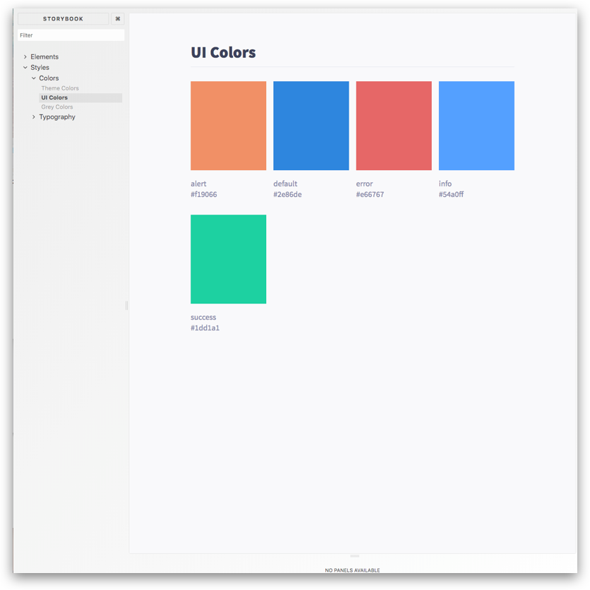
export const ui = {
alert: '#f19066',
default: '#2e86de',
error: '#e66767',
info: '#54a0ff',
success: '#1dd1a1'
}
export const grey = {
black: '#000000',
dark: calcGrey(30),
medium: calcGrey(60),
light: calcGrey(98),
white: '#FFFFFF'
}
// …
// 3. Style Blocks // ==========================================================
styles/Colors.js

import React from 'react'
import { storiesOf } from '@storybook/react'

import Colors from 'Styles/Colors'

storiesOf('Styles/Colors', module)
    .add('UI Colors', () => (
        <Styleguide>
            <Styleguide.Title>UI Colors</Styleguide.Title>
            <Styleguide.Grid>
                <Swatches scheme={Colors.ui} />
            </Styleguide.Grid>
        </Styleguide>
    ))
styles/Colors.story.js
// Typography
// =============================================================================

// Constants // ================================================================
…

// Functions // ================================================================
…

// Style Blocks // =============================================================
export const paragraph = css(
    {
        fontFamily: TEXT_FONT
    },
    calcFontSize(2)
)

export const title = css(
    {
        fontFamily: HEADING_FONT,
        fontWeight: FONT_WEIGHT_REGULAR
    },
    calcFontSize(8)
)

export const caption = css(
    {
        fontFamily: TEXT_FONT,
        letterSpacing: '0.025rem'
    },
    calcFontSize(1)
)
styles/Typography.js
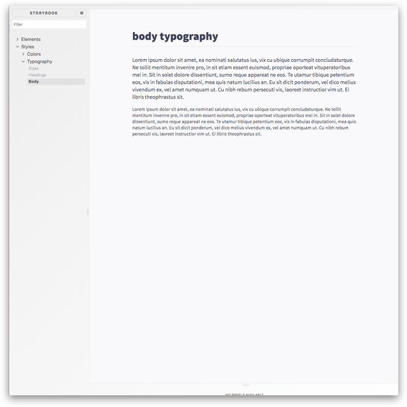
storiesOf('Styles/Typography', module)
    .add('Body', () => {
        const Paragraph = styled.p(Typography.paragraph) // 👈
        const Caption = styled.p(Typography.caption)  // 👈

        return (
            <Styleguide>
                <Styleguide.Title>body typography</Styleguide.Title>
                <Paragraph>
                    Lorem ipsum dolor sit amet, ea nominati salutatus ius, vix
                    …
                </Paragraph>
                <Caption>
                    Lorem ipsum dolor sit amet, ea nominati salutatus ius, vix
                    …
                </Caption>
            </Styleguide>
        )
    })
styles/Typography.story.js
        const Factor = styled(
            ({ className, factor }) => (
                <p className={className}>Size factor of {factor}.</p>
            ))
            ((props) => calcFontSize(props.factor), {
                margin: `0 0 ${calcSpace(2)} 0`
            })


        <Factor factor={factor} />
styles/Typography.story.js
import { injectGlobal } from 'emotion'
import Colors from 'Styles/Colors'
import { BASE_SCALE } from 'Styles/Scale'
import Typography, { TEXT_FONT, calcFontSize } from 'Styles/Typography'
import { calcSpace } from 'Styles/Layout'

// 👇
injectGlobal`
  * {
    box-sizing: border-box;
  }

  html {
    line-height: 1.15;
    -webkit-text-size-adjust: 100%;
    font-size: ${BASE_SCALE};
    font-family: ${TEXT_FONT};
    color: ${Colors.grey.dark};
  }

  html,
  body {
    height: 100%;
    position: relative;
    background-color: ${Colors.grey.light};
    margin: 0;
    padding: 0;
  }

…

`
styles/global/index.js
fin.
@RiaCarmin
@RiaCarmin
trello.com/b/
pIVAuqKc
p - i - v - a - u - q - k - c