@riacarmin
The Space in Between
UI Design & Engineering
The Space in Between
UX Engineer
User
Experience

Front-End Engineering
Systems
Thinking in
0. [intro]
1. Problem
2. Symbols
3. Blocks
4. … and beyond!
1
Problem

Keep your code DRY
— every good engineer
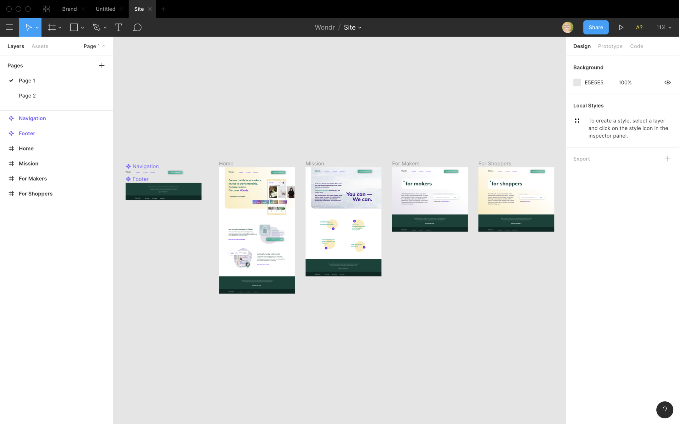
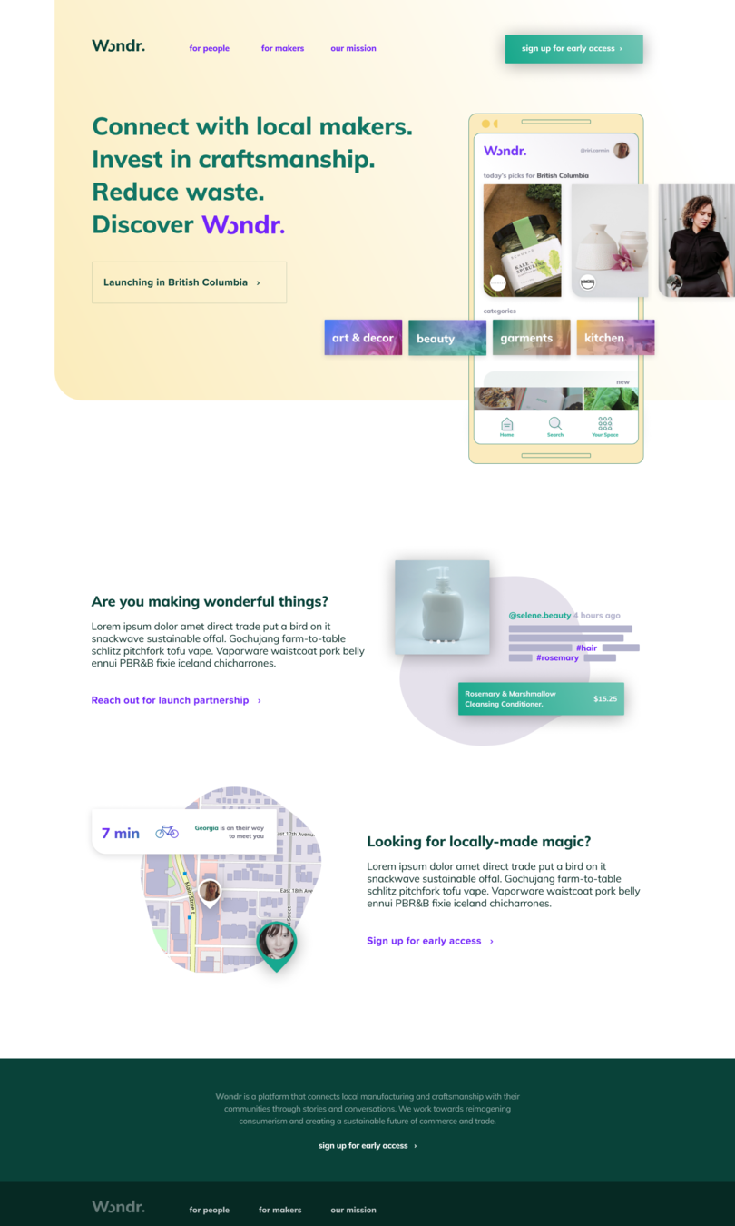
Plan how to modularize the interface design together
2
Symbols
tokens
constants
variables
…
aka
Plan out all the pieces that are required to recreate the look and feel of your product.
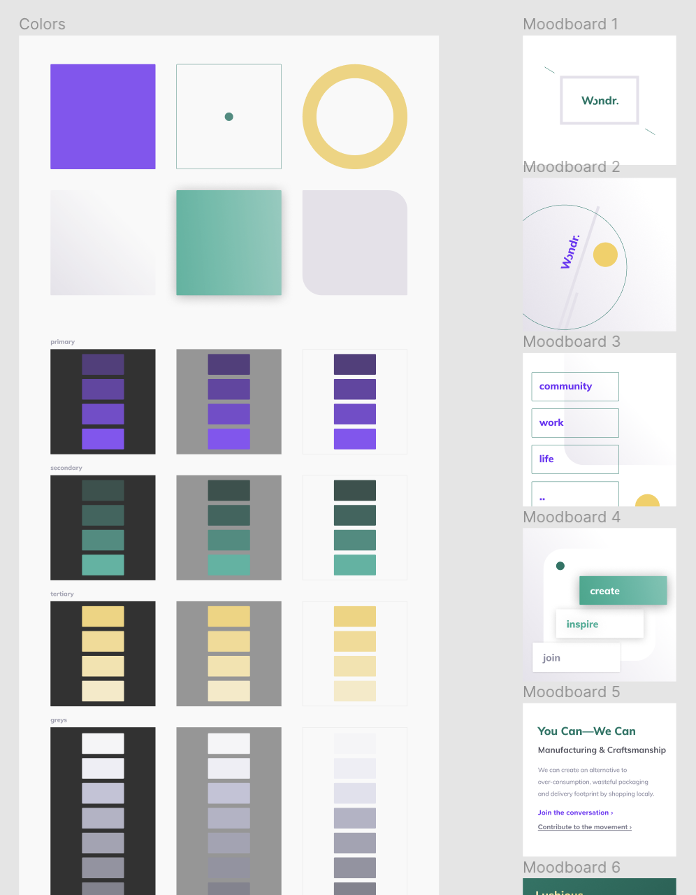
color
layout
line
motion
plane
typography
brand/theme, greyscale, utility
container, grids, breakpoints
radii, outlines, dividers
transitions, animations
shadows, z-index
fonts, weights, sizes, scale
export const LINE_BORDER_RADIUS = '0.2rem'
export const LINE_BORDER_RADIUS_ACCENT = '2.8rem'
export const LINE_WIDTH = '0.1rem'
export const TYPOGRAPHY_TEXT_FONT = `'Muli', sans-serif`
export const TYPOGRAPHY_FONT_WEIGHT_REGULAR = 400
export const TYPOGRAPHY_FONT_WEIGHT_BOLD = 800
3
Blocks
// INTERACTIVE BASE
// --------------------------------------

export const base = {
  cursor: 'pointer',
  transition: S.MOTION_DEFAULT_TRANSITION,

  '&:disabled': {
    cursor: 'not-allowed',
    opacity: 0.5
  }
}
// AREA
// --------------------------------------
export const area = {
...base,
backgroundColor: 'transparent',
borderRadius: S.LINE_BORDER_RADIUS,
borderStyle: 'solid',
borderWidth: '0',
boxShadow: S.PLANE_SHADOW_2
}// BUTTON
// --------------------------------------
export const button = {
// (1) Inherit the base styles
...base,
// (2) Use the Symbols
fontFamily: S.TYPOGRAPHY_TEXT_FONT,
fontWeight: S.TYPOGRAPHY_FONT_WEIGHT_BOLD,
color: S.COLOR_UTILITY.ACTION,
fontSize: S.TYPOGRAPHY_SCALE(2),
lineHeight: S.LAYOUT_RHYTHM(4),
// (3) Additional styles
textDecoration: 'none',
display: 'flex',
alignItems: 'center',
'&:hover': {
color: lighten(0.1, S.COLOR_UI.ACTION)
}
}4
… and beyond
Global
Elements
Components
Layouts
◢
◢
◢
◢
Q/A
@riacarmin