Pure CSS cross browser animations for fun and profit
Camp Digital
Thursday April 23rd
'Sup


Ben Holden
@BenHoldenPrime
Liam Richardson
@meevil
What you'll learn...
By the end of this presentation, you'll have learned how to...
- Create subtle transitions
- Create complex animations
- Animate SVG's
Let's begin our whistle stop tour!
A brief history of animation on the web



GIF's FTW

All hail Flash


... Oh
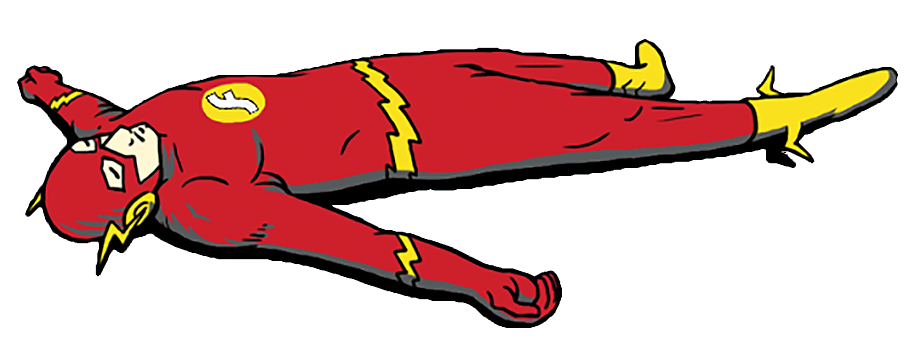
R.I.P in peace, Flash
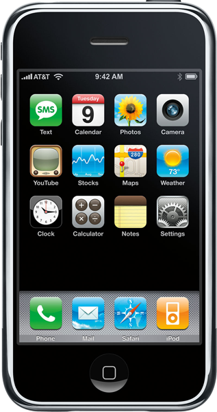
The open web

A note about code...

Onto the fun stuff...
6 essential lessons
Want to do animation? Pure CSS is the way forward
Lesson 1
Transitions
Transitions allow you to create smooth, subtle animations with ease
Lesson 2
.button {
    transition: background 1s ease;
}
The transition property can be triggered by any kind of "state" change
:hover
JavaScript prompted class change
The transition property allows you to smoothly affect an element when changing from one state to another
Hover me!
Hover me!
.button{
    transition: background 1s all;

    background: white;
}
.button:hover{
background: pink;
}Hover
That was easy! What's the code?

.button {
    transition: background 1s ease;

    background: white;
}
Animation made easy
.button {
    transition: background 1s ease;

    background: white;
}

.button:hover {
    background: pink;
}
transition-property: width;
transition-duration: 1s;
transition-timing-function: linear;
transition-delay: 2s;transition: width 1s linear 2s;
transition: width 2s, height 2s, transform 2s;transition: all 2s linear;Sass <3
@mixin transition($transition-property, $transition-time, $method) {
    transition: $transition-property $transition-time $method;
}
What can you use it on?

Supports 81 properties
Classed as "Animatable"
Ok, so what CAN'T you use it on?

http://oli.jp/2010/css-animatable-properties/
- background-image (sort of works, sometimes)
- float
- height or width using the value auto (currently both values must be a length or percentage)
- display between none and anything else
- position between static and absolute
When should you use it?
On the majority of projects?
- As little as possible
- As subtly as possible
Buttons and links
Image transitions
Smooth UI
What about "REAL" animation?
Keyframes
@keyframes mymove {
    from {top: 0px;}
    to {top: 200px;}
}
Keyframes allow you to create amazing animations that work
seamlessly across
modern browsers
Lesson 3
How do keyframes work?

Keyframes are essentially a list of what the animation should do over a defined period of time
Let's see them in action
How did that work?
.car {
  animation-name: drive;
  animation-duration: 2s;
}

@keyframes drive {
  from {margin-left: 0px;}
  to {margin-left: 400px;}
}
CSS @keyframes
@keyframes drive {
  from {margin-left: 0px;}
  to {margin-left: 400px;}
}
@keyframes %
@keyframes drive {
  0% {margin-left: 0px;}
  50%{margin-left: 400px;}
  100% {margin-left: -200px;}
}
Properties, properties, properties
- animation-delay
- animation-direction
- animation-duration
- animation-fill-mode
- animation-iteration-count
- animation-name
- animation-play-state
- animation-timing-function
animation-timing-function

linear

ease-in

ease-out
So many options
- linear
- ease
- ease-in
- ease-out
- ease-in-out
- cubic-bezier(n,n,n,n)

What can you change using @keyframes?
The same 81 properties that you can influence with transition can be changed with @keyframes as well

When should you use it?
On projects that require additional visual "flair" or engagement that traditional methods can't provide.
- As little as possible
- As subtly as possible
- Ensure the design doesn't rely on it
Adding fluidity to an otherwise static design
Creating visual flair
Enhancing dull UI's
Doing something crazy

http://codepen.io/Xpressive_Team/full/LeHGF/
Seriously, do something crazy
SVG + CSS animation = Awesomeness

SVG's are potentially the future of web graphics, and give CSS animation
super powers
Lesson 4
My god, it's full of code...

Code you can apply classes too!
  <rect class="background" fill="#D03E27" width="400" height="400" />

  <path class="letter" fill="#F4F4F4" d="M60.858,129...." />
  <path class="letter" fill="#F4F4F4" d="..." />
Allowing you to do cool stuff!

.path {
  stroke-dasharray: 1000;
  stroke-dashoffset: 1000;
  animation: dash 5s linear alternate infinite;
}

@keyframes dash {
  from {
    stroke-dashoffset: 1000;
  }
  to {
    stroke-dashoffset: 0;
  }
}
A larger playset - SVG
only properties
clip-rule, flood-color, flood-opacity, stop-opacity, kerning, tech-anchor, color-profile, color-rendering, fill, fill-opacity, fill-rule, marker, marker-end, marker-mid, marker-start, stroke, stroke-width, stop-color, lighting-color, enable-background, dominant-baseline, color-interpolation-filters, color-interpolation, glyph-orientation-horizontal, glyph-orientation-vertical, shape-rendering, baseline-shift, alignment-baseline, stroke-miterlimit, stroke-linejoin, stroke-linecap, stroke-dashoffset, stroke-dasharray, stroke-opacity

...but what about the profit?!
Lesson 5
Animation + UX = Conversion = Profit
"When used as more than just a subtle design detail, animation can provide cues, guide the eye, and soften the sometimes-hard edges of web interactions. It can improve the user experience."
http://alistapart.com/article/ui-animation-and-ux-a-not-so-secret-friendship
Val Head, A List Apart
Subtle cues...
Stop waiting around, get creating!
Lesson 6
Get experimenting
with transitions!

Get creating with @keyframes!

Webkit, you silly thing
/* Chrome, Safari, Opera */
@-webkit-keyframes myfirst {
    0%   {background: red;}
    25%  {background: yellow;}
    50%  {background: blue;}
    100% {background: green;}
}

/* Standard syntax */
@keyframes myfirst {
    0%   {background: red;}
    25%  {background: yellow;}
    50%  {background: blue;}
    100% {background: green;}
}
Additional reading
- http://valhead.com/book/
- http://slides.com/sarasoueidan/styling-animating-svgs-with-css#/
- http://www.smashingmagazine.com/2014/11/03/styling-and-animating-svgs-with-css/
- http://www.smashingmagazine.com/2014/04/15/understanding-css-timing-functions/
Thank you! Any questions?
@meevil
@BenHoldenPrime

