UX Design
& Gutenberg Blocks
Rich Tabor
richtabor.com - @richard_tabor
Slides
x.co/tabor
Twitter DM
@richard_tabor

Indirect
Manipulation
Settings and options are buried in multiple locations through indirect mechanisms.
Widgets
[shortcodes]
Admin Pages
Customizer
Third party apps
Gutenberg introduces a landmark shift in UX design for WordPress
Direct
Manipulation
Options for an element are controlled in the context of the block itself.

Flexibility
Design Patterns
Core Components
Complexity is not bad.
& it does not evoke difficulty
Blocks should aim to reduce cognitive load
Simple, seamless and cohesive
Complexity can be challenging and engaging

Gutenberg
Design Patterns

We must grasp the Gutenberg design patterns...

...to build remarkable blocks experiences.

Block Content
Block Settings Sidebar
Block Toolbar
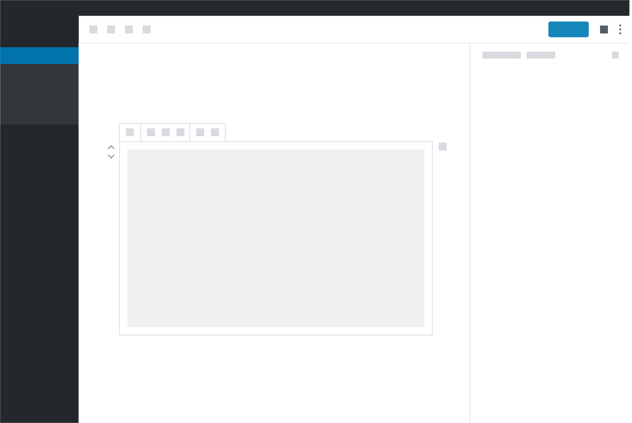
Primary interface for adding & manipulating content
Two main patterns: Placeholders & Contextual Controls
Most intuitive level of interaction
Block
Content Area:

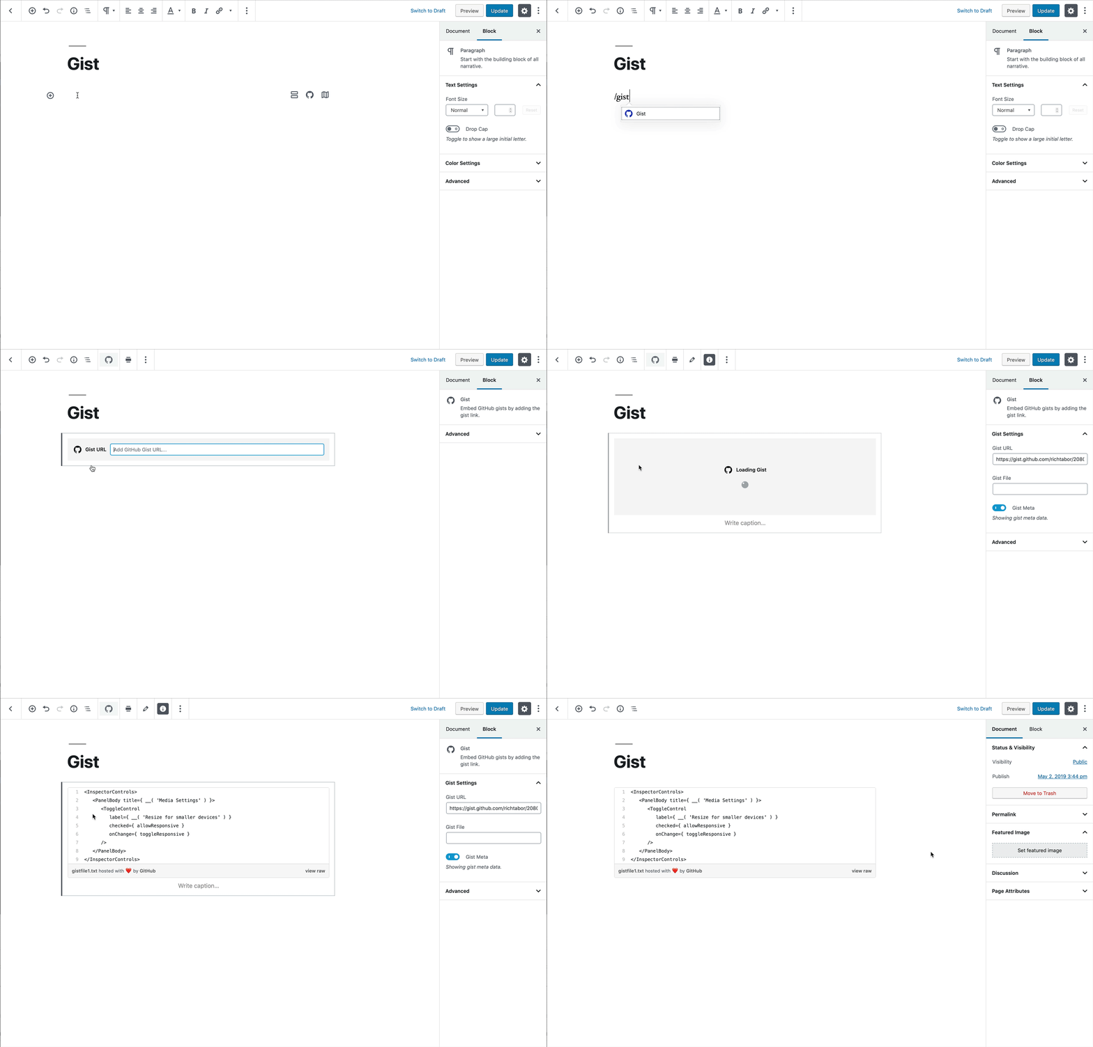
A guide or set of instructions in the content area of a block.
Placeholders
Must be:
1. Thoughtful
2. Relative
3. Concise
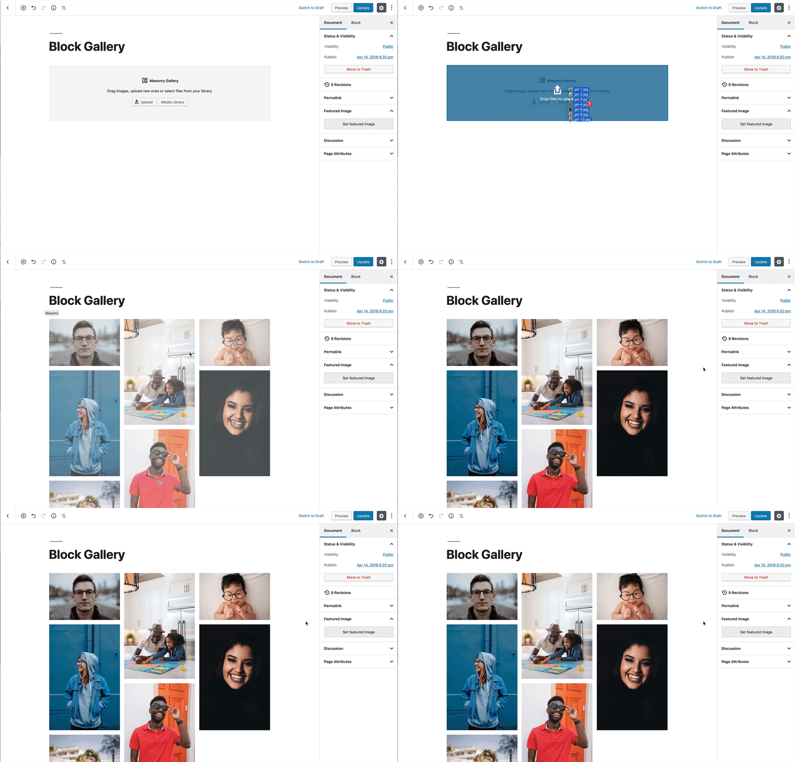
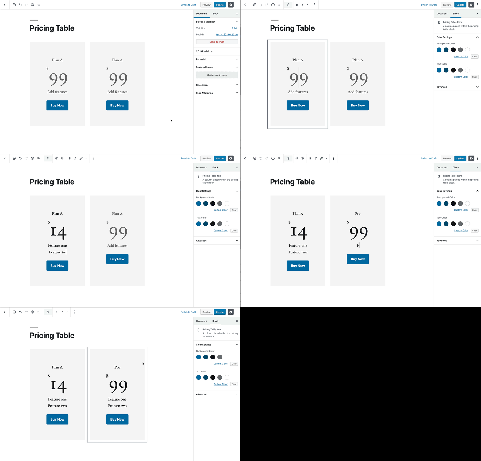
Logical controls based on other variables within a singular block.
Contextual
Controls
Must be:
1. Minimal
2. Not Disorienting

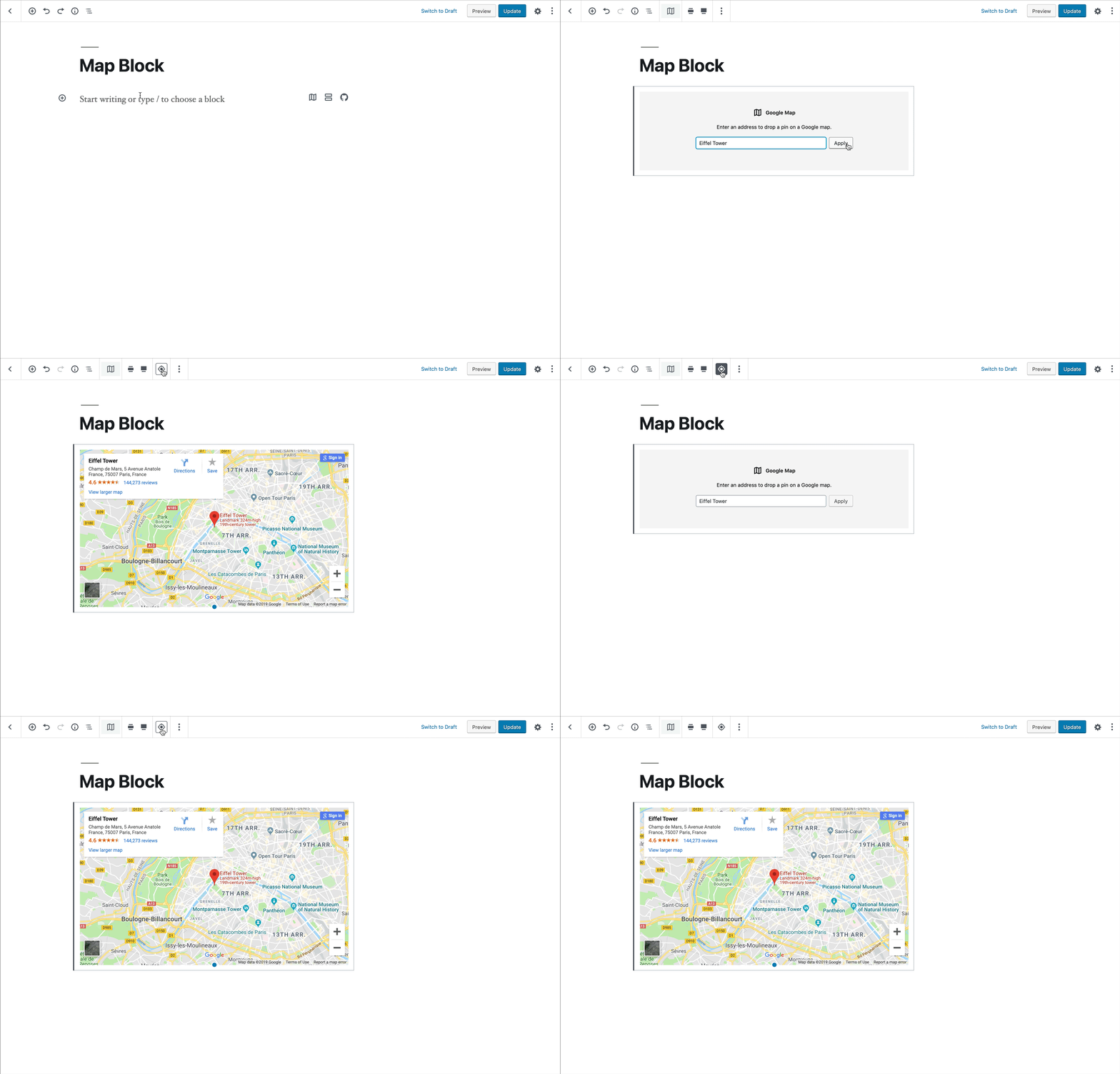
Block-level controls consisting of 100% necessary commonly-used actions
Block Toolbar
Must be:
1. Contextual
2. Fitting within the current UI
3. Necessary for managing a block
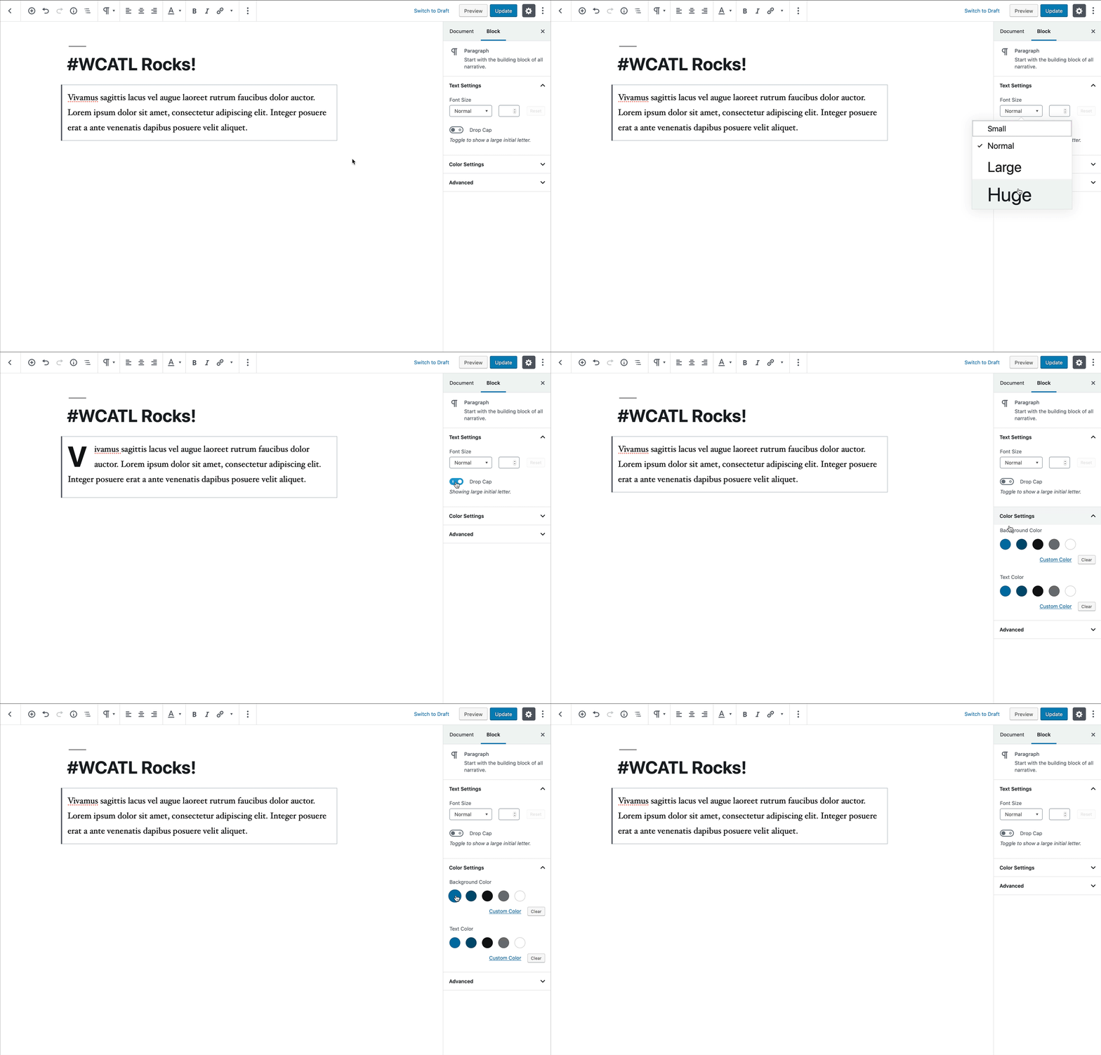
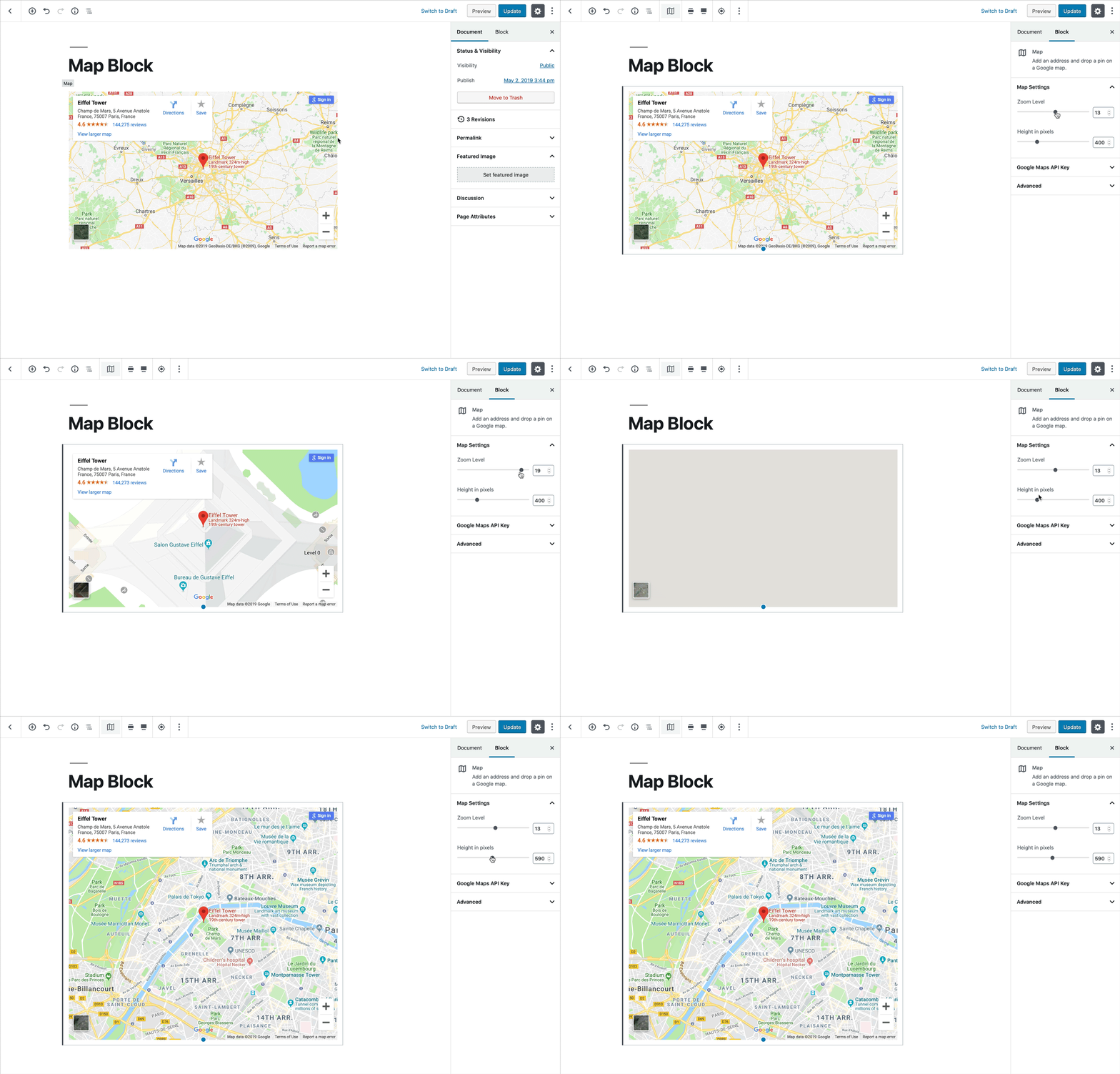
Shows advanced settings and controls for the currently selected block.
Sidebar Settings
Must be:
1. Contextual
2. Not necessary for the basic block operation
Core Components
A consistent experience is paramount.


