Extending the Block Editor with Tools & Styles
Rich Tabor – Twitter: @richard_tabor


Rich Tabor
Senior Product Manager, WordPress Experience at GoDaddy
Previously:
Founded ThemeBeans, CoBlocks & Block Gallery
WordPress Reviewer, Envato

Slides
https://richtabor/blocktalk-2020


Welcome to the block editor!

To leave here with a clear understanding of how to extend the block editor for a better WordPress experience.
Today's goal:

Learn Javascript


Learn UX


Widgets
[shortcodes]
Admin Pages
Customizer
Third party apps
User experience in WordPress has never been as important as it is today

Learn design & UX, the anatomy of the editor and core UX patterns

What is Design?

Experience
Design is...

Accessibility
Design is...


Internationalization
Design is...


Internationalization
Accessibility
Experience


The Anatomy of the Block Editor

We must grasp the block editor design patterns...

...to build remarkable blocks experiences.

Block Content
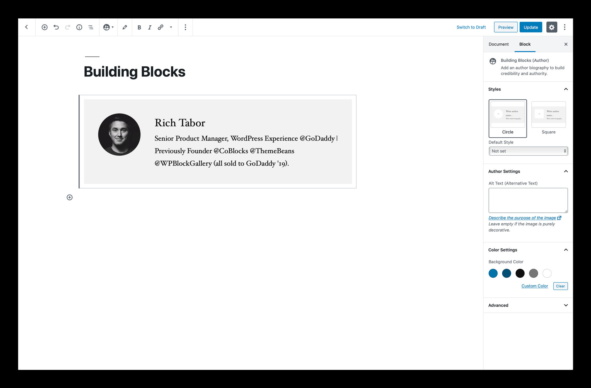
Block Settings Sidebar
Block Toolbar
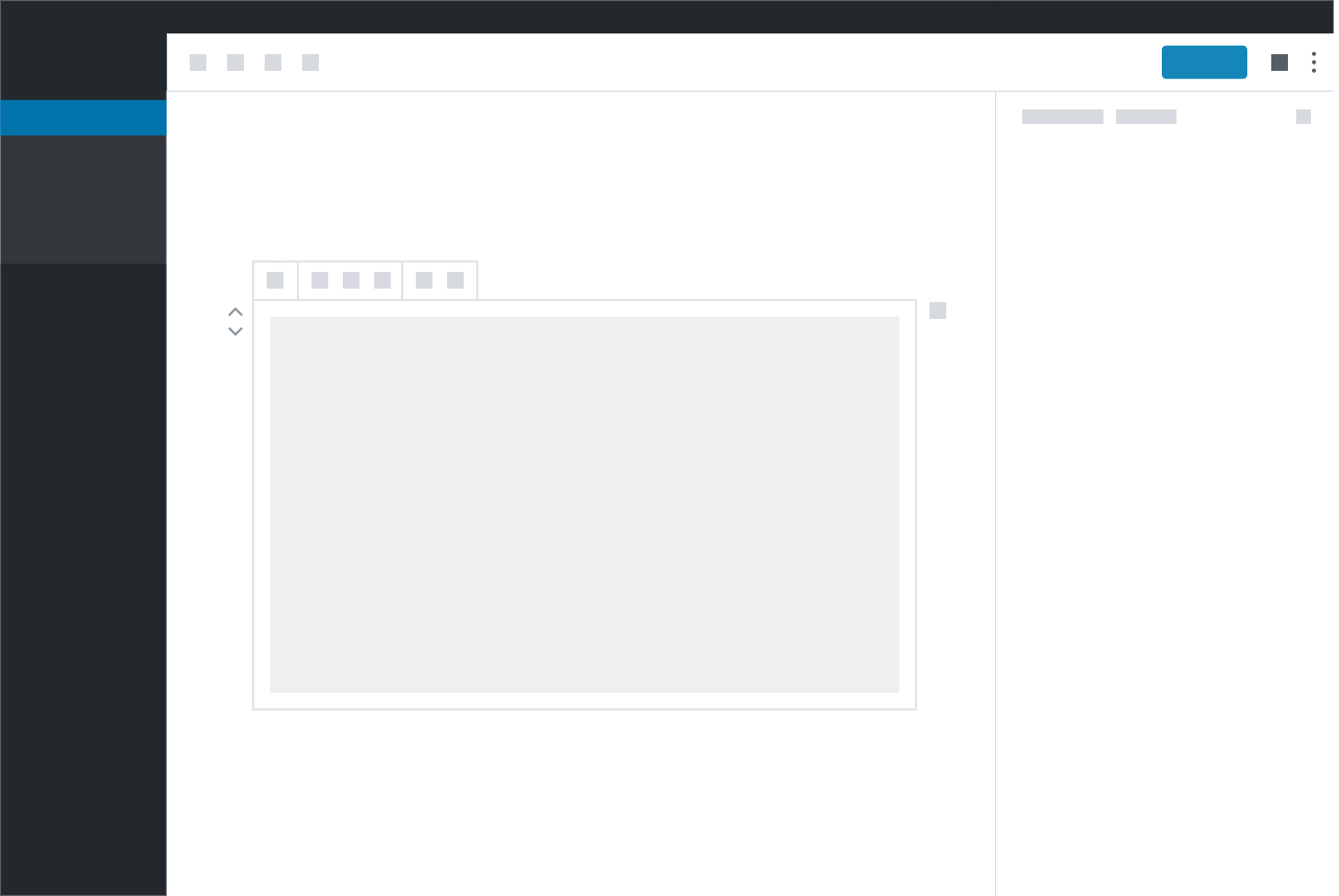
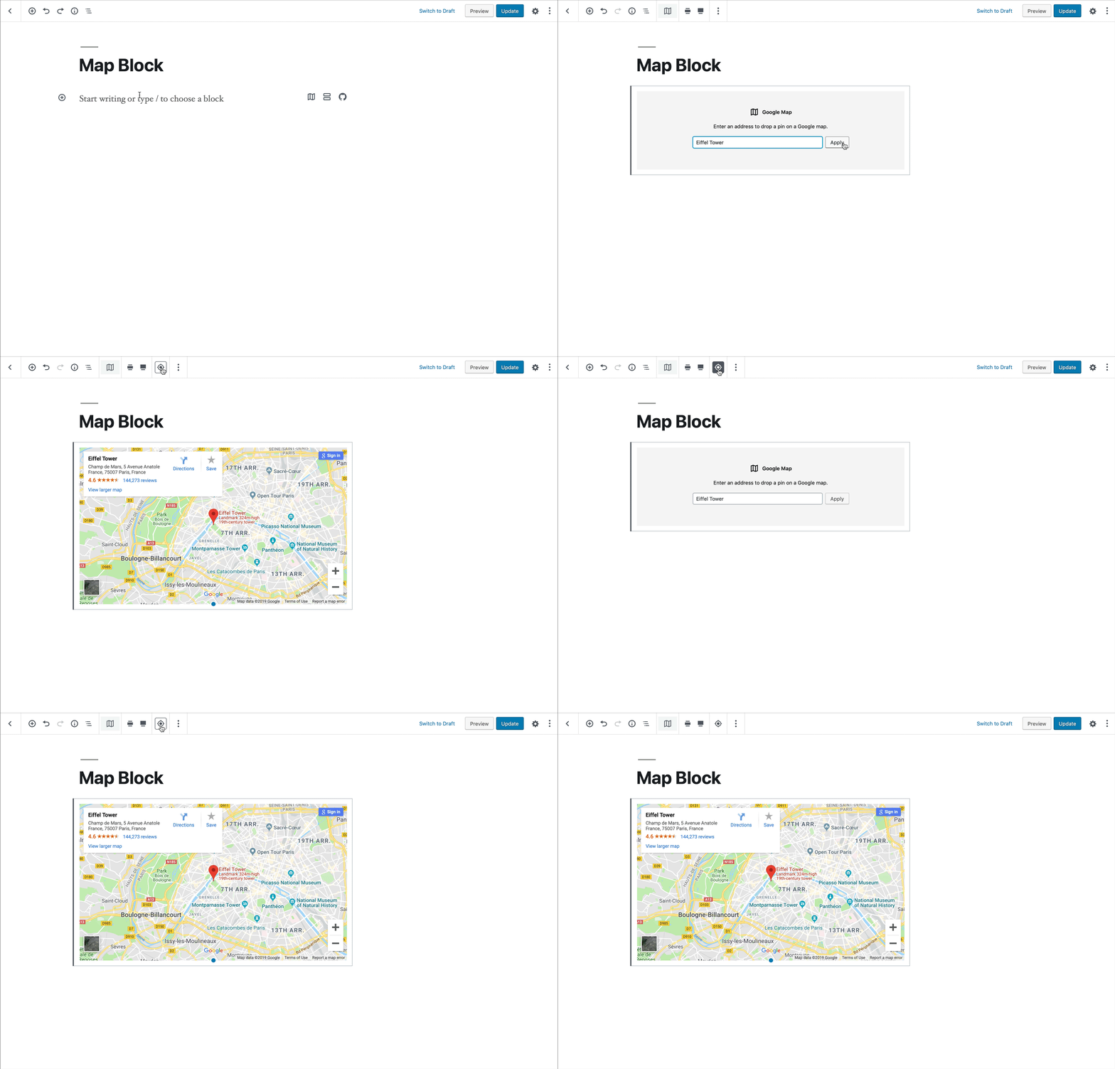
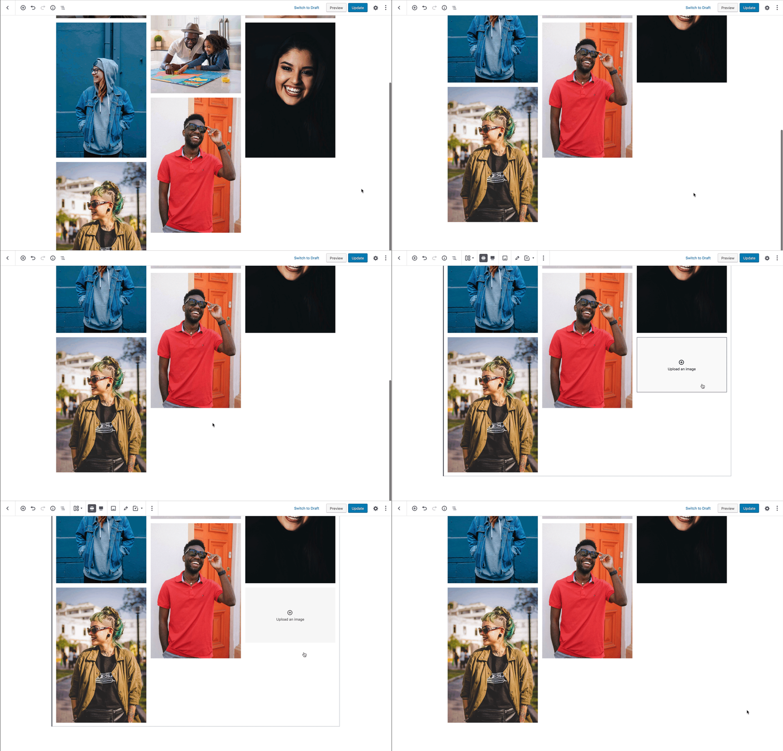
Primary interface for adding & manipulating content
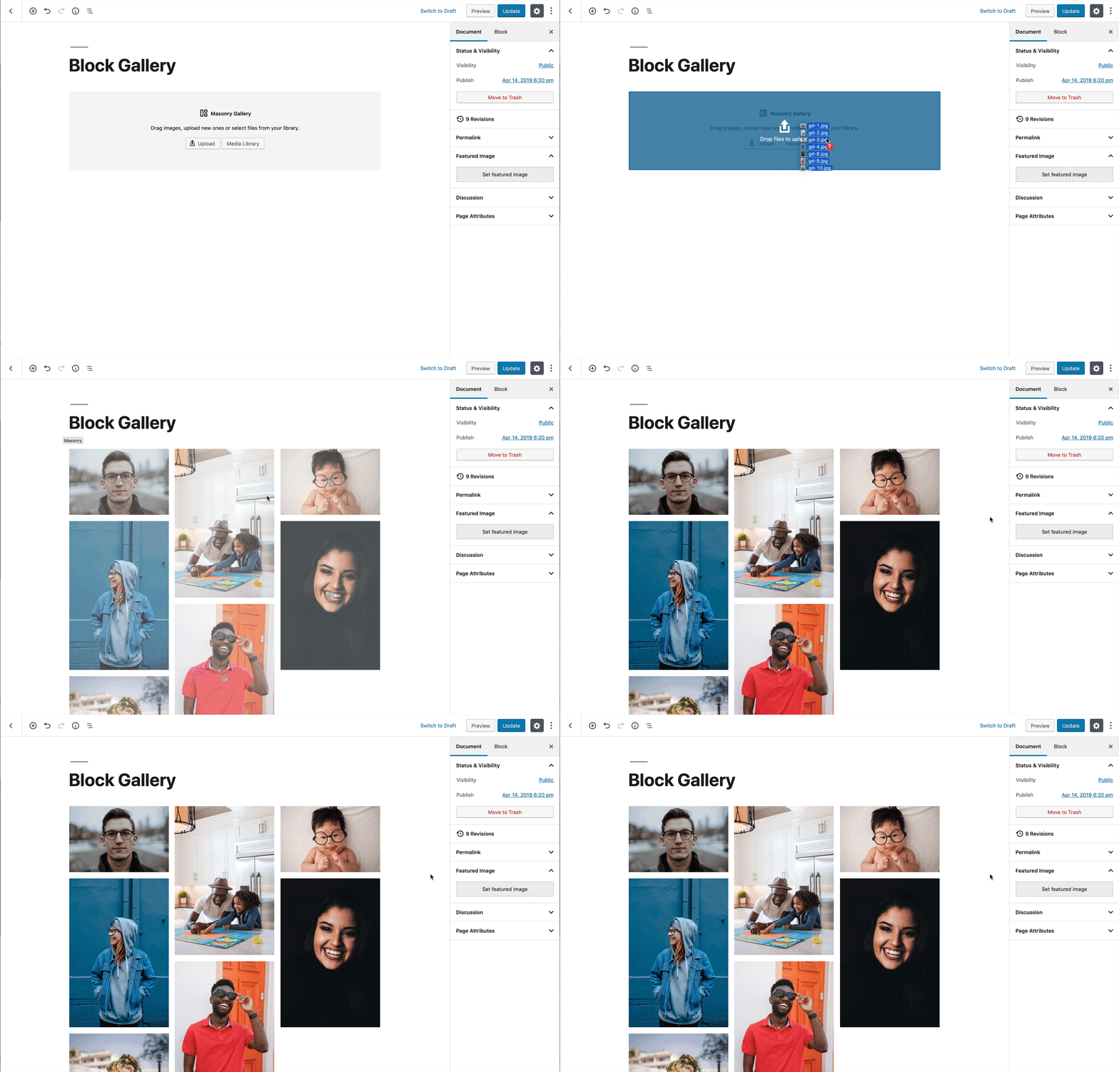
Two main patterns: Placeholders & Contextual Controls
Most intuitive
Block
Content Area:

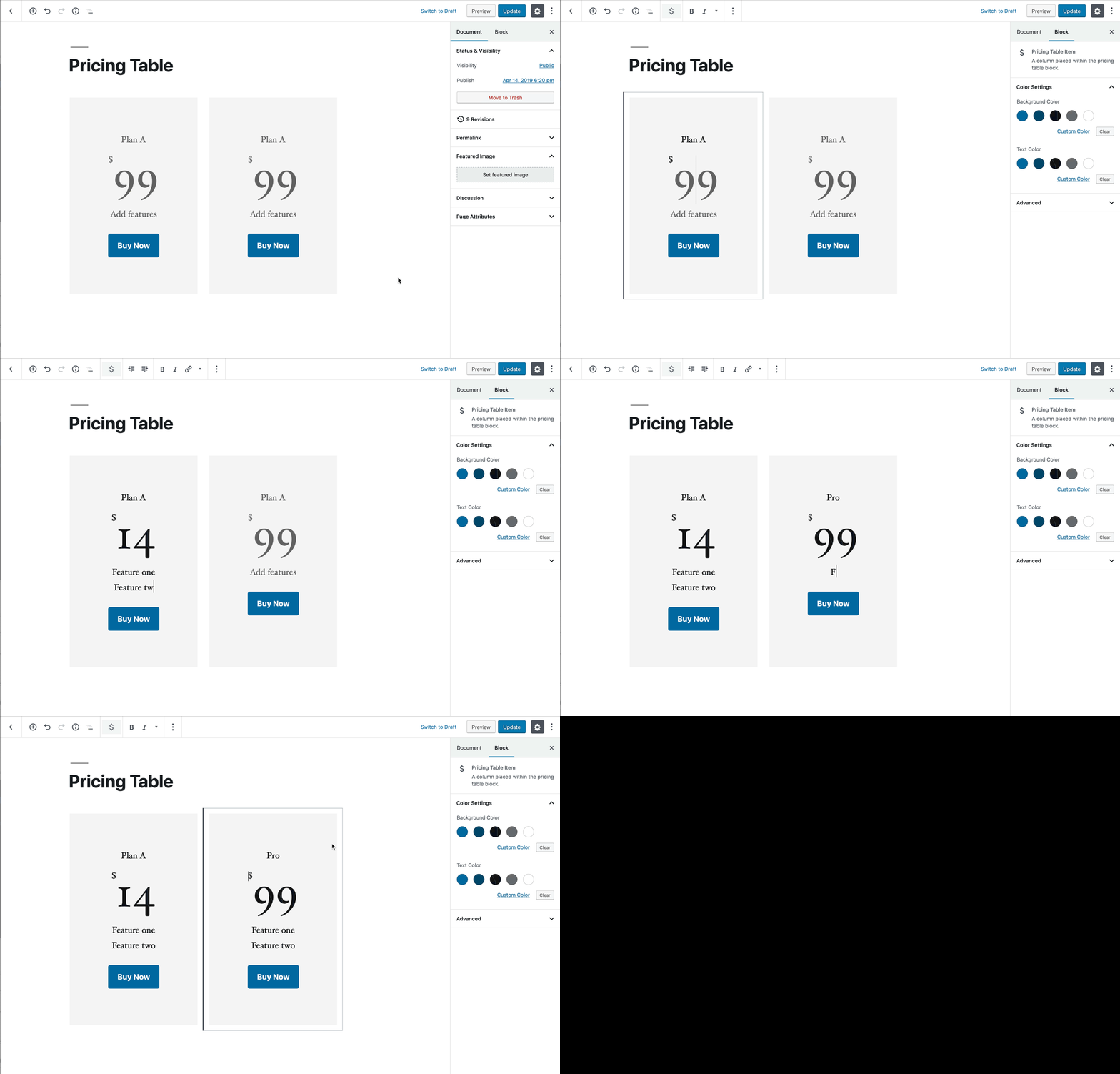








Block-level controls consisting of 100% necessary commonly-used actions
Block Toolbar
Must be:
1. Contextual
2. Fitting within the current UI
3. Necessary for managing a block

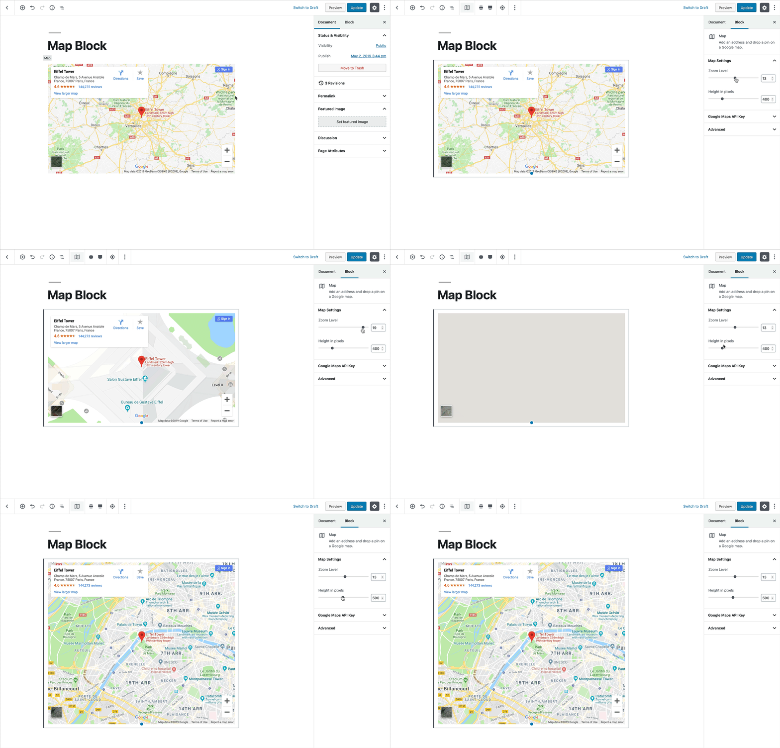
Shows advanced settings and controls for the currently selected block.
Settings Sidebar
Must be:
1. Contextual
2. Not necessary for the basic block operation



Extending blocks with Style Variations

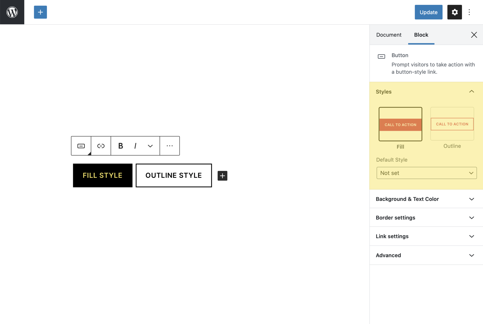


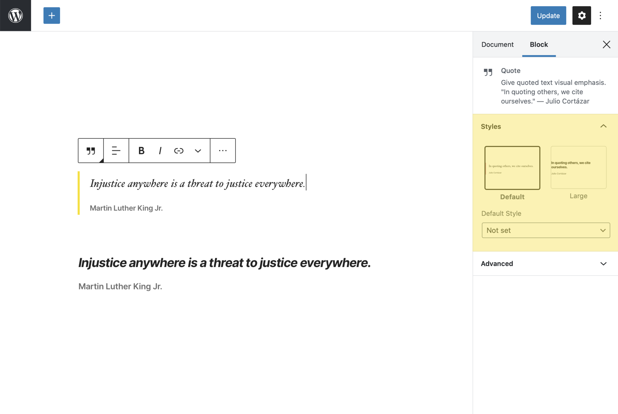


Register Block Styles (Server)
Function: register_block_style()
1. Receives the name of the block as the first argument and an array describing properties of the style as the second argument
2. Include inline_style or style_handle (inline styles or stylesheet of styles)

<?php

register_block_style(
    'core/button',
    array(
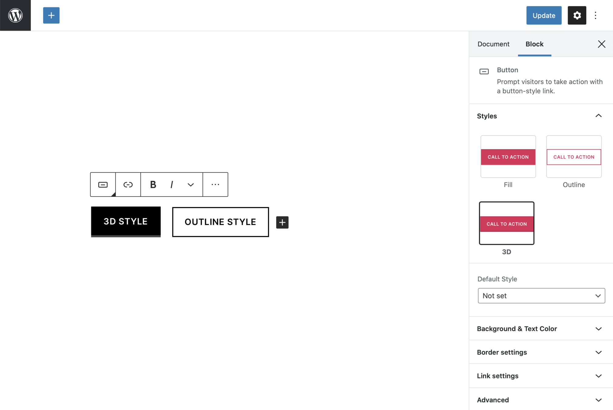
        'name'         => '3d',
        'label'        => __( '3D' ),
        'inline_style' => '.wp-block-button.is-style-3d .wp-block-button__link { box-shadow: inset 0 -3px 0 0 rgba(0,0,0,0.25); }',
    )
);
Adding block styles (PHP)

Yes, it's that simple

/**
 * WordPress dependencies
 */
import { __ } from '@wordpress/i18n';
import { registerBlockStyle } from '@wordpress/blocks';

wp.blocks.registerBlockStyle( 'core/button', {
    name: '3d',
    label: __( '3D', 'textdomain' ),
    isDefault: false,
} );
Adding block styles (ESNext)

Not too shabby :)

function blocktalk_enqueue() {
    wp_enqueue_script(
        'blocktalk-script',
        plugins_url( 'blocktalk.js', __FILE__ ),
        array( 'wp-blocks', 'wp-dom-ready', 'wp-edit-post' ),
        filemtime( plugin_dir_path( __FILE__ ) . '/blocktalk.js' )
    );
}
add_action( 'enqueue_block_editor_assets', 'blocktalk_enqueue' );
Adding block styles (JS)


wp.domReady( function() {
	wp.blocks.registerBlockStyle( 'core/button', [
		{
			name: '3d',
			label: '3D',
			isDefault: true,
		}
	]);
} );


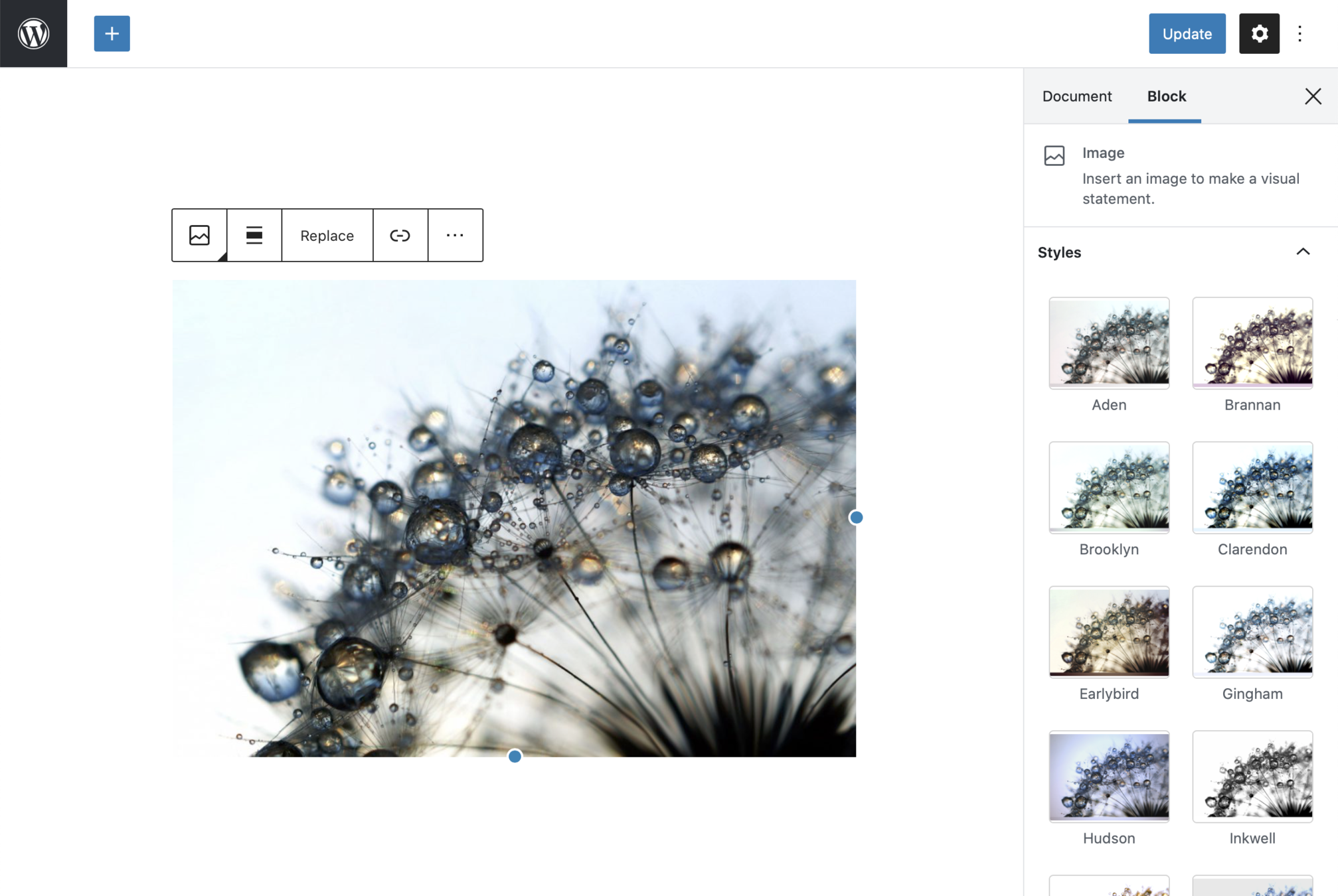


Altered Reality
20+ image filters for the Image block
WordPress Plugin
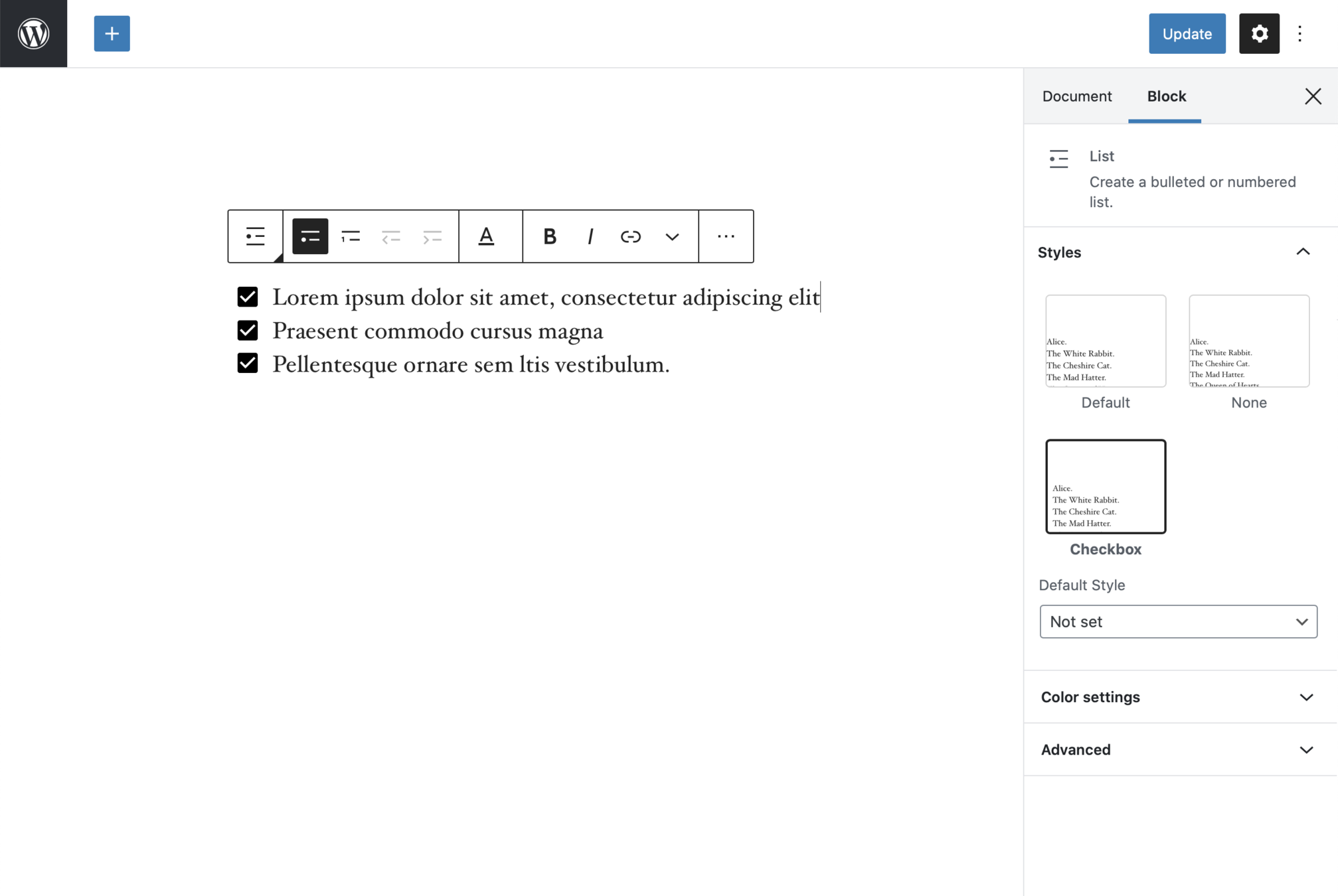


CoBlocks
Checkbox style applied to the core List block
WordPress Plugin
Function: unregister_block_style()
Unregister Block Styles
2. Registered name of the block, and the name of the style.
1. Allows unregistering a block style previously registered on the server using register_block_style()

3. Only works for styles registered server-side
function blocktalk_enqueue() {
    wp_enqueue_script(
        'blocktalk-script',
        plugins_url( 'blocktalk.js', __FILE__ ),
        array( 'wp-blocks', 'wp-dom-ready', 'wp-edit-post' ),
        filemtime( plugin_dir_path( __FILE__ ) . '/blocktalk.js' )
    );
}
add_action( 'enqueue_block_editor_assets', 'blocktalk_enqueue' );
Unregister block styles (JS)


wp.domReady( function() {
    wp.blocks.unregisterBlockStyle( 'core/quote', 'large' );
} );
Extending blocks with Block Variations

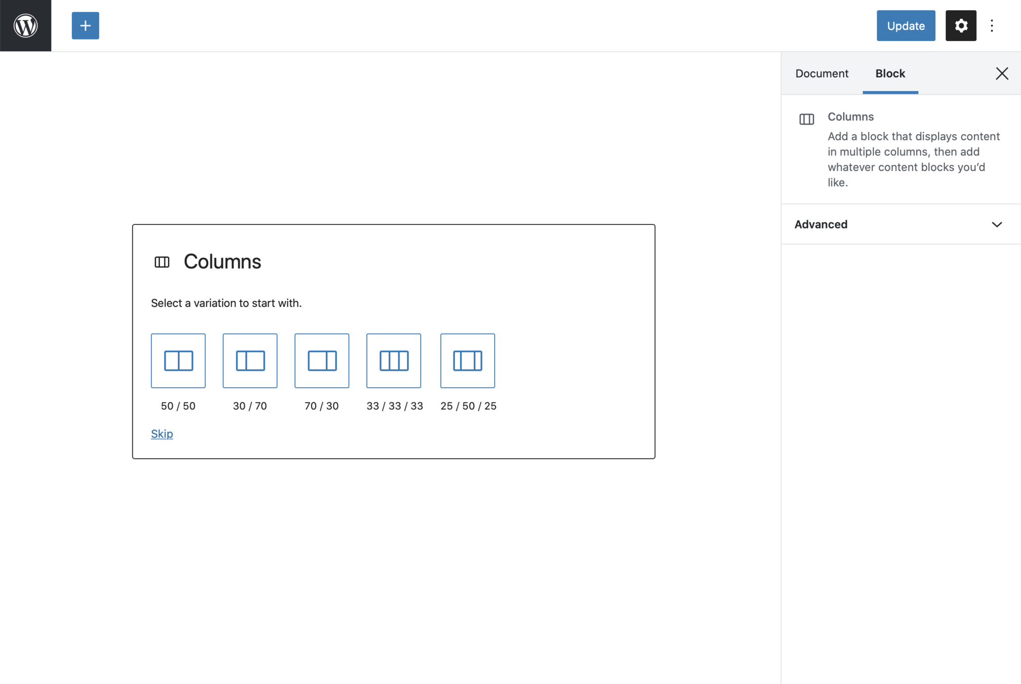


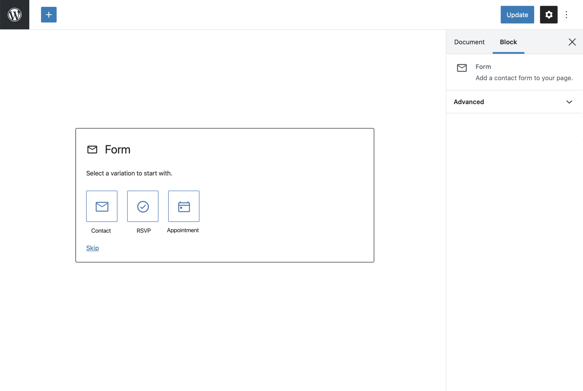


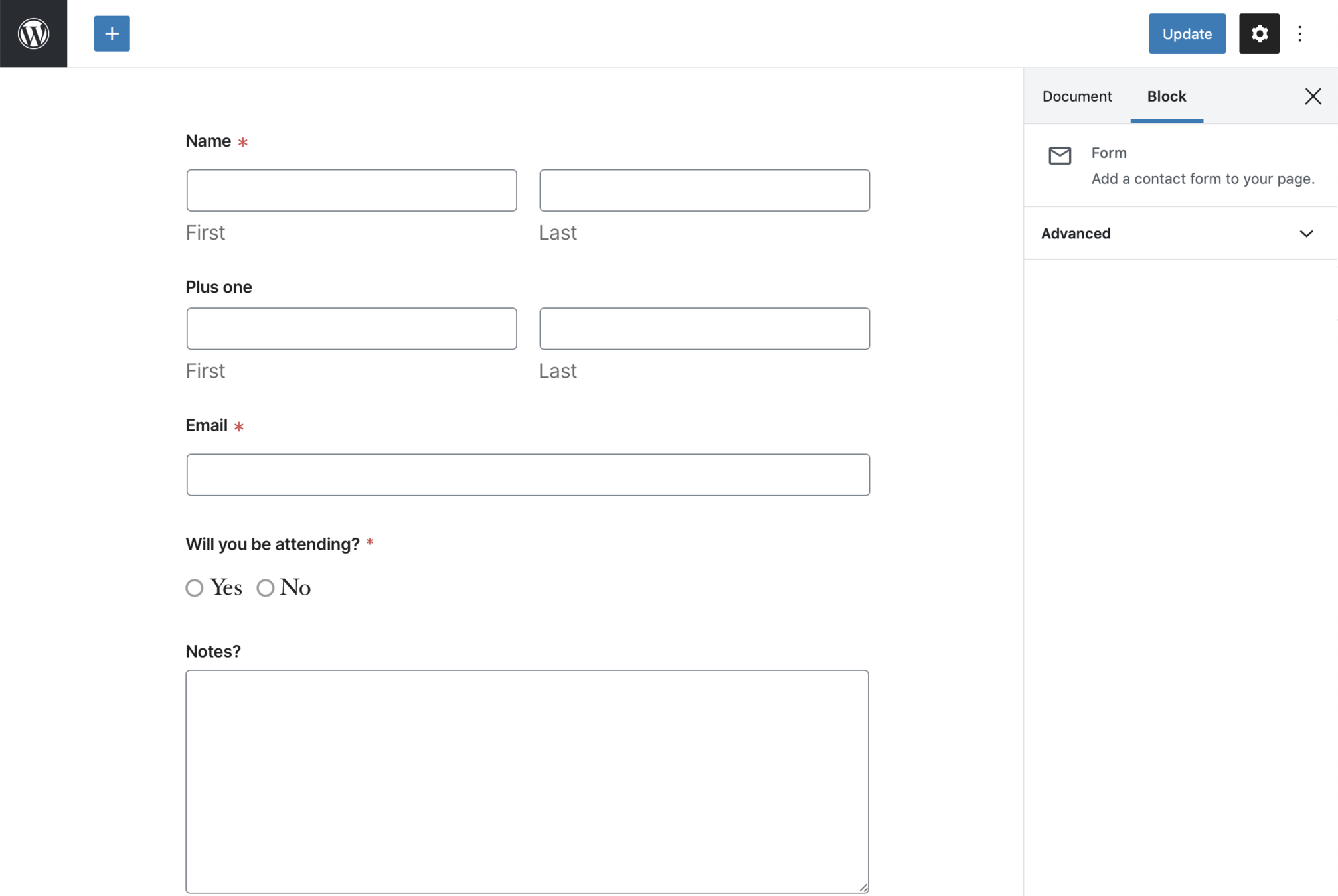


Register Block Variations
Javascript: registerBlockVariation()
Receives the name of the block, title of the variant, description, icon, attributes, innerBlocks and example (basically the same as registering a block)

import { Path, SVG } from '@wordpress/components';
import { __ } from '@wordpress/i18n';
import { registerBlockVariation } from '@wordpress/blocks';

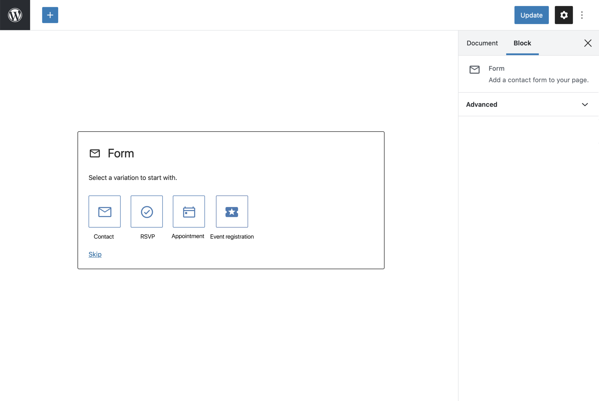
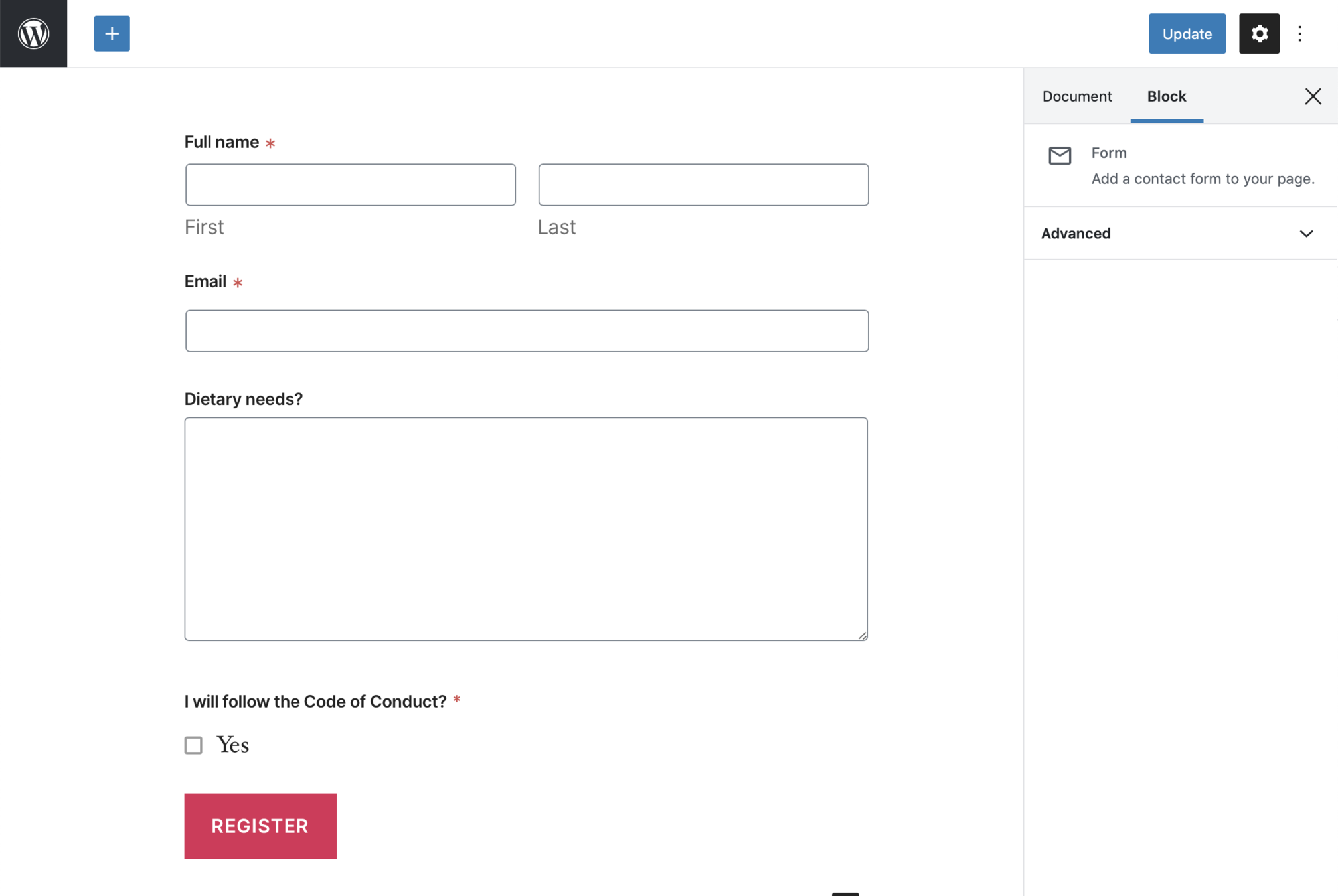
registerBlockVariation( 'coblocks/form', {
	name: 'event-registration',
	label: __( 'Event registration', 'coblocks' ),
	icon: '',
	innerBlocks: [
		[ 'coblocks/field-name', { label: __( 'Full name', 'textdomain' ), hasLastName: true } ],
		[ 'coblocks/field-email', { required: false } ],
		[ 'coblocks/field-textarea', { label: __( 'Dietary needs?', 'textdomain' ), required: true } ],
		[ 'coblocks/field-checkbox', { label: __( 'I will follow the Code of Conduct', 'textdomain' ), options: [ __( 'Yes', 'textdomain' ) ] } ],
	],
	submitButtonText: __( 'Register', 'textdomain' ),
	scope: [ 'block' ],
} );
Adding block variations (ESNext)

Similar to registering blocks

wp.domReady( function() {

	wp.blocks.registerBlockVariation( 'coblocks/form', {
		name: 'event-registration',
		label: 'Event registration',
		icon: '',
		innerBlocks: [
			[ 'coblocks/field-name', { label: 'Full name', hasLastName: true } ],
			[ 'coblocks/field-email', { required: false } ],
			[ 'coblocks/field-textarea', { label: 'Dietary needs?', required: true } ],
			[ 'coblocks/field-checkbox', { label: 'I will follow the Code of Conduct', options: [ 'Yes' ] } ],
		],
		submitButtonText: 'Register',
		scope: [ 'block' ],
	} );
} );
Adding block variations (JS)

Don't forget to enqueue the script





Extending blocks with Block Patterns

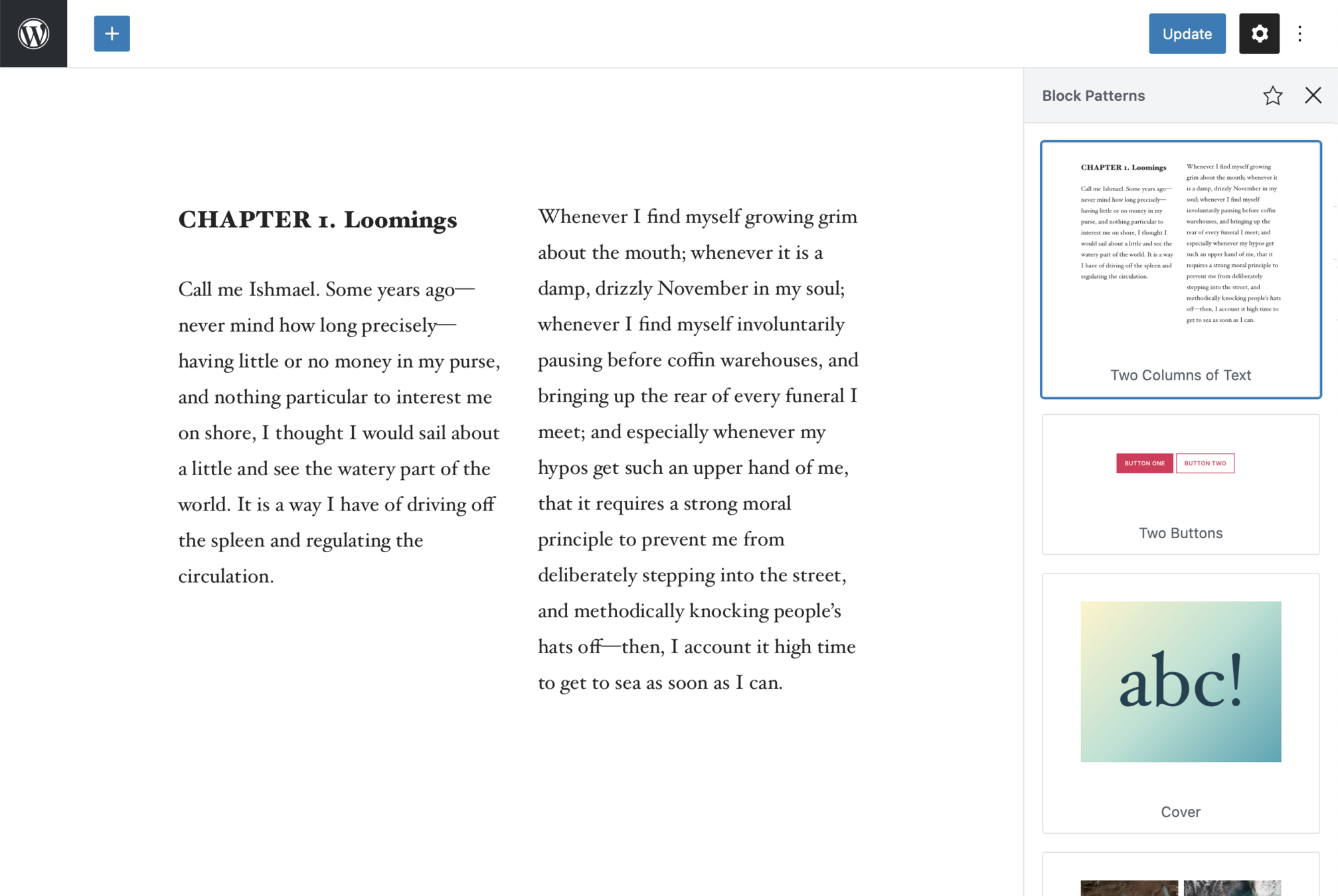
Block Patterns
Combinations of blocks you can create, and share, to help folks make rich, unique site layouts quicker






Registering Block Patterns
Receives two arguments: A title to name the pattern, and raw HTML content.
function blocktalk_register_block_patterns() {
	if ( function_exists( 'register_pattern' ) ) {
		register_pattern(
			'blocktalk/highlight-feature',
			array(
				'title'   => __( 'Highlight feature', 'textdomain' ),
				'content' => "<!-- wp:group {\"backgroundColor\":\"primary\",\"align\":\"full\"} -->\n<div class=\"wp-block-group alignfull has-primary-background-color has-background\"><div class=\"wp-block-group__inner-container\"><!-- wp:paragraph {\"customFontSize\":45,\"lineHeight\":1.56} -->\n<p style=\"font-size:45px;line-height:1.56\" class=\"has-custom-lineheight\">Curabitur blandit tempus port titor um sociis lorem.</p>\n<!-- /wp:paragraph -->\n\n<!-- wp:columns -->\n<div class=\"wp-block-columns\"><!-- wp:column -->\n<div class=\"wp-block-column\"><!-- wp:paragraph -->\n<p>Morbi leo risus, porta ac consectetur ac, vestibulum at eros. Lorem ipsum dolor sit amet, consectetur adipiscing elit. Nullam quis risus eget urna mollis ornare vel eu leo.</p>\n<!-- /wp:paragraph -->\n\n<!-- wp:buttons -->\n<div class=\"wp-block-buttons\"><!-- wp:button {\"backgroundColor\":\"background\",\"textColor\":\"primary\"} -->\n<div class=\"wp-block-button\"><a class=\"wp-block-button__link has-text-color has-primary-color has-background has-background-background-color\">Learn more</a></div>\n<!-- /wp:button --></div>\n<!-- /wp:buttons --></div>\n<!-- /wp:column -->\n\n<!-- wp:column -->\n<div class=\"wp-block-column\"><!-- wp:paragraph -->\n<p>Morbi leo risus, porta ac consectetur ac, vestibulum at eros. Lorem ipsum dolor sit amet, consectetur adipiscing elit. Nullam quis risus eget urna mollis ornare vel eu leo.</p>\n<!-- /wp:paragraph --></div>\n<!-- /wp:column --></div>\n<!-- /wp:columns --></div></div>\n<!-- /wp:group -->",
			)
		);
	}
}
add_action( 'init', 'blocktalk_register_block_patterns' );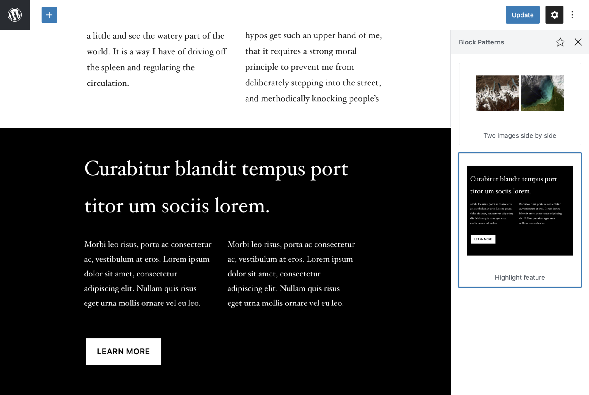


Extending the Editor via Theme Settings

Block Editor Theme Enhancements
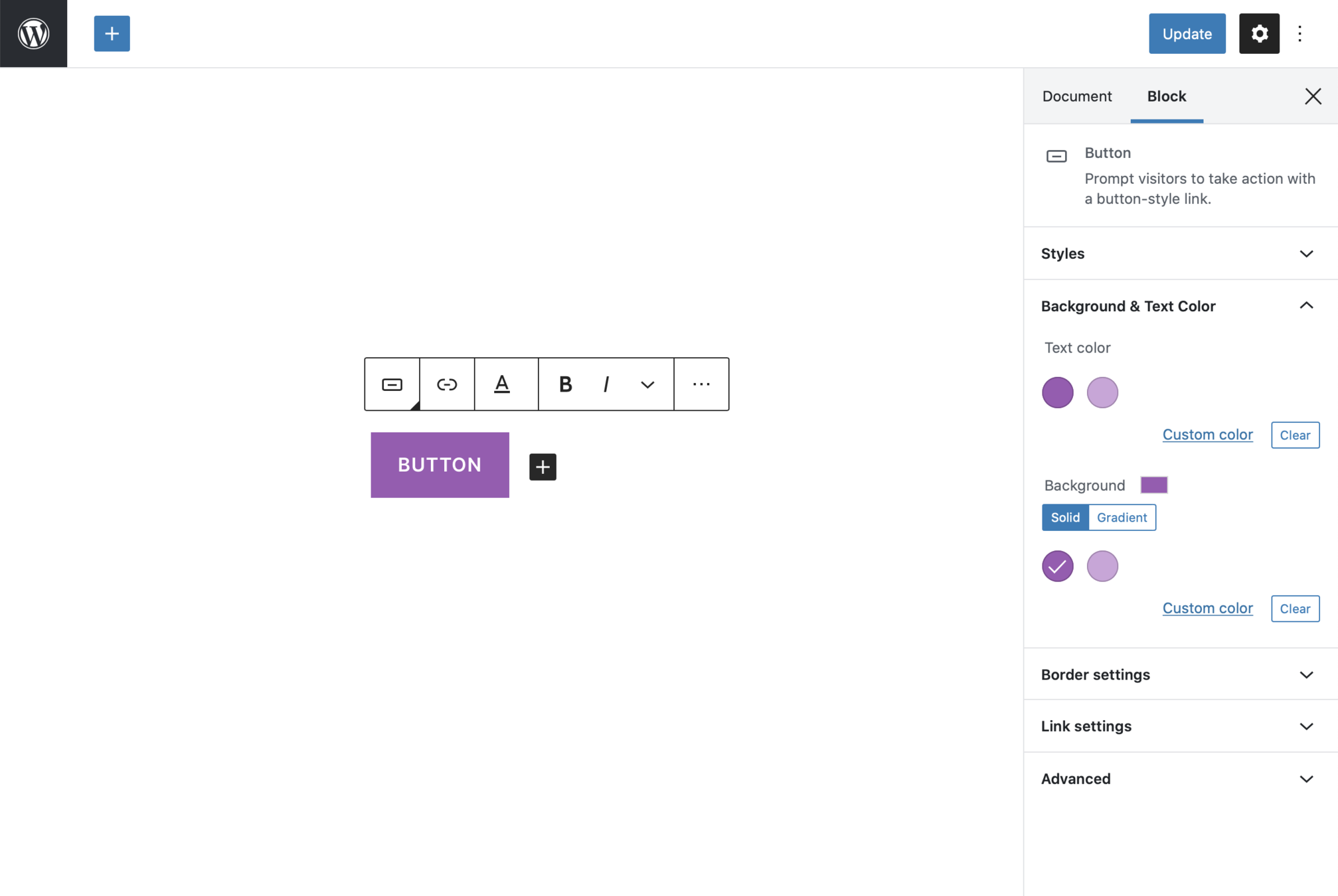
1. Editor Color Palette
2. Editor Text Sizes
3. Gradient Presets
4. Wide and Full Alignments

5. Dark Mode
Editor Color Palette
1. Themes can register their own colors to be used throughout the editor.
2. Themes must provide relevant color classes

<?php
function blocktalk_setup_theme() {
    add_theme_support( 'editor-color-palette', array(
        array(
            'name' => __( 'Primary', 'textdomain' ),
            'slug' => 'primary',
            'color' => '#a156b4',
        ),
        array(
            'name' => __( 'Secondary', 'textdomain' ),
            'slug' => 'secondary',
            'color' => '#d0a5db',
        ),
    ) );
}
add_action( 'after_setup_theme', 'blocktalk_setup_theme' );
Extending Theme Colors

In the theme's functions.php file

.has-primary-background-color {
	background-color: #a156b4;
}

.has-primary-color {
	color: #a156b4;
}

.has-secondary-background-color {
	background-color: #d0a5db;
}

.has-secondary-color {
	color: #d0a5db;
}
Adding Color Classes

In the theme's stylesheet



Editor Font Sizes
1. Themes can register their own font sizes to be used throughout the editor
2. Themes must provide relevant font-size classes

<?php
function blocktalk_setup_theme() {
    add_theme_support( 'editor-font-sizes', array(
        array(
            'name' => __( 'Small', 'textdomain' ),
            'slug' => 'small',
            'size' => 14,
        ),
        array(
            'name' => __( 'Large', 'textdomain' ),
            'slug' => 'large',
            'size' => 36,
        ),
    ) );
}
add_action( 'after_setup_theme', 'blocktalk_setup_theme' );
Extending Font Sizes

In the theme's functions.php file

.has-small-font-size {
	font-size: 14px;
}

.has-large-font-size {
	font-size: 36px;
}
Adding Font Size Classes

In the theme's stylesheet

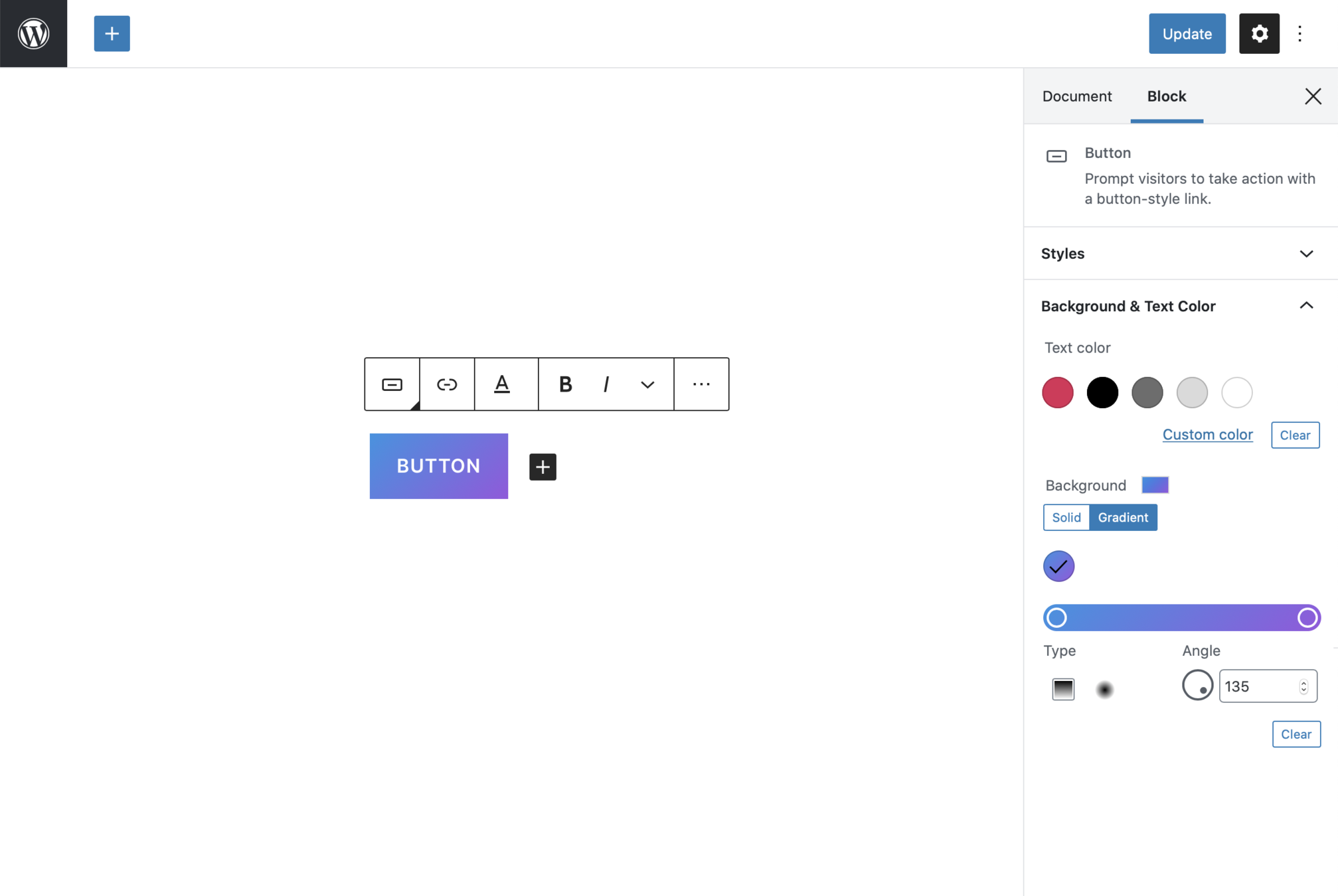
Editor Gradient Presets
1. Themes can register their own gradients to be used throughout the editor, for blocks that support gradeints
2. Themes must provide relevant gradient classes

<?php
function blocktalk_setup_theme() {
    add_theme_support( 'editor-gradient-presets',
    array(
        array(
            'name'     => __( 'Vivid cyan blue to vivid purple', 'textdomain' ),
            'gradient' => 'linear-gradient(135deg,rgba(6,147,227,1) 0%,rgb(155,81,224) 100%)',
            'slug'     => 'vivid-cyan-blue-to-vivid-purple'
        ),
    )
);
}
add_action( 'after_setup_theme', 'blocktalk_setup_theme' );
Extending Theme Gradients

In the theme's functions.php file

.has-vivid-cyan-blue-to-vivid-purple-gradient-background {
    background: linear-gradient(135deg,rgba(6,147,227,1) 0%,rgb(155,81,224) 100%);
}
Adding Gradient Classes

In the theme's stylesheet



Wide and Full Alignments
1. Themes can opt into supporting the editor's new wide and fullwidth alignment options
2. add_theme_support( 'align-wide' );

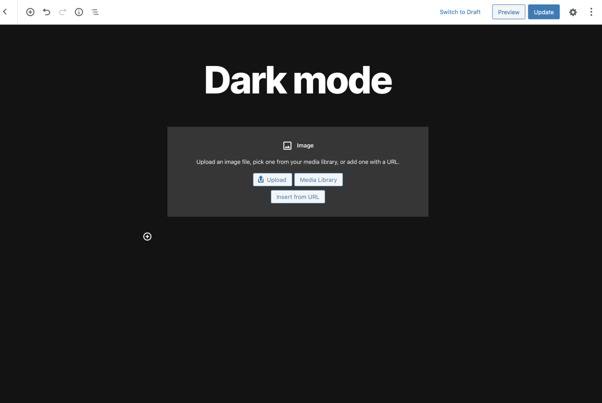
Dark mode
1. Themes can opt into a suite of dark-first editor styling
2. It's not a 100% catch all, so be prepared to tweak


3. add_theme_support( 'editor-styles' );
add_theme_support( 'dark-editor-style' );


Extending the editor with Editor Styles

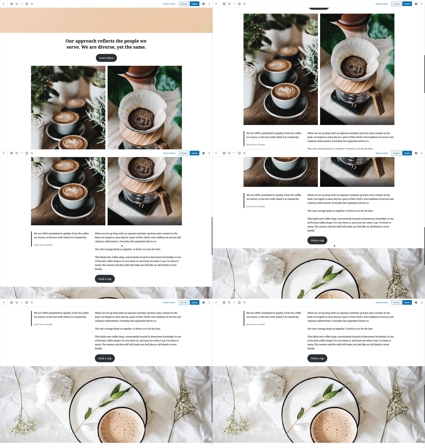
Registering Editor Styles
3. body {} is converted to .editor-styles-wrapper {}
2. add_theme_support('editor-styles');

1. Making the editor look like the front-end of the theme


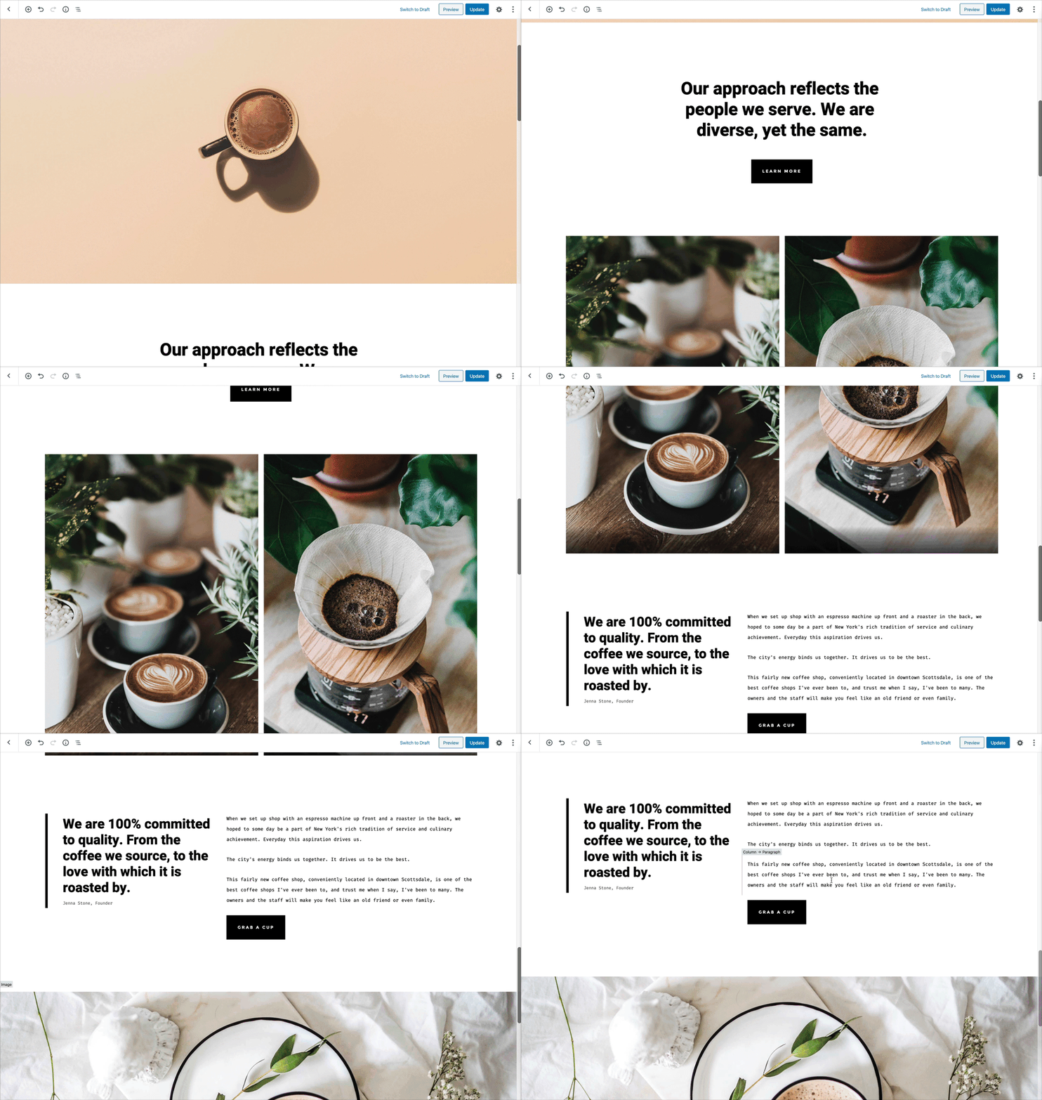


Tweaking Editor Styles
1. do_action( 'enqueue_block_editor_assets' )
2. Enqueue assets for further tailoring the editor styling

3. Setting fonts, background color, editor block widths, styling the page/post title, adding, additional typography tweaks and block-specific adjustments
Dark Mode
Color Palettes
Extending the Block Editor
Block Patterns
Editor Styles
User Experience
Core UX Patterns
Design is...
Block Style Variations
Editor Font Sizes
Gradients
Block Variations
Slides
https://richtabor/blocktalk-2020


My blog
https://richtabor.com
@richard_tabor


