Dhan - A new Trading and Investing experience
How Dhan uses product psychology
Onboarding and Exploration Flows
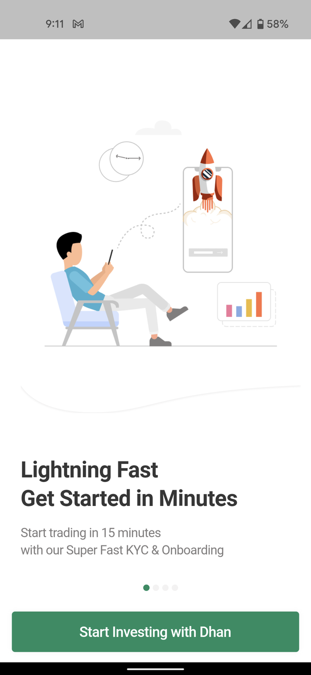
First up - Quick loading which leads the first onboarding screen
Great Visual Anchors - Grabbing the user's attention and showing how fast it is to trade on Dhan. Illustrations used also tell the user how they can relax in a chair and trade stocks easily


More cool illustrations and great copy! Showing empathy towards the user and giving reassurance with customer support options
Let's click of Start Investing and dive in
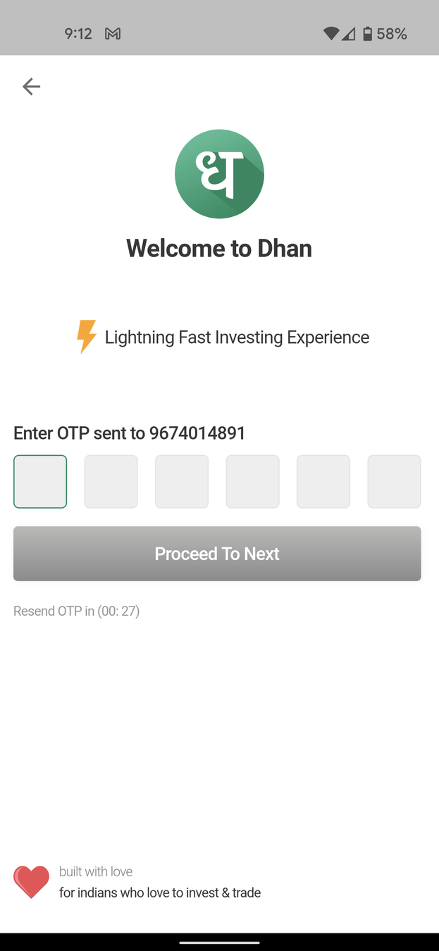
Delighter - Straightforward login with auto-detect of OTP and proceeding to next screen reducing cognitive load
Great copy again - Targetting the audience and telling them it's specially made for them and with love!
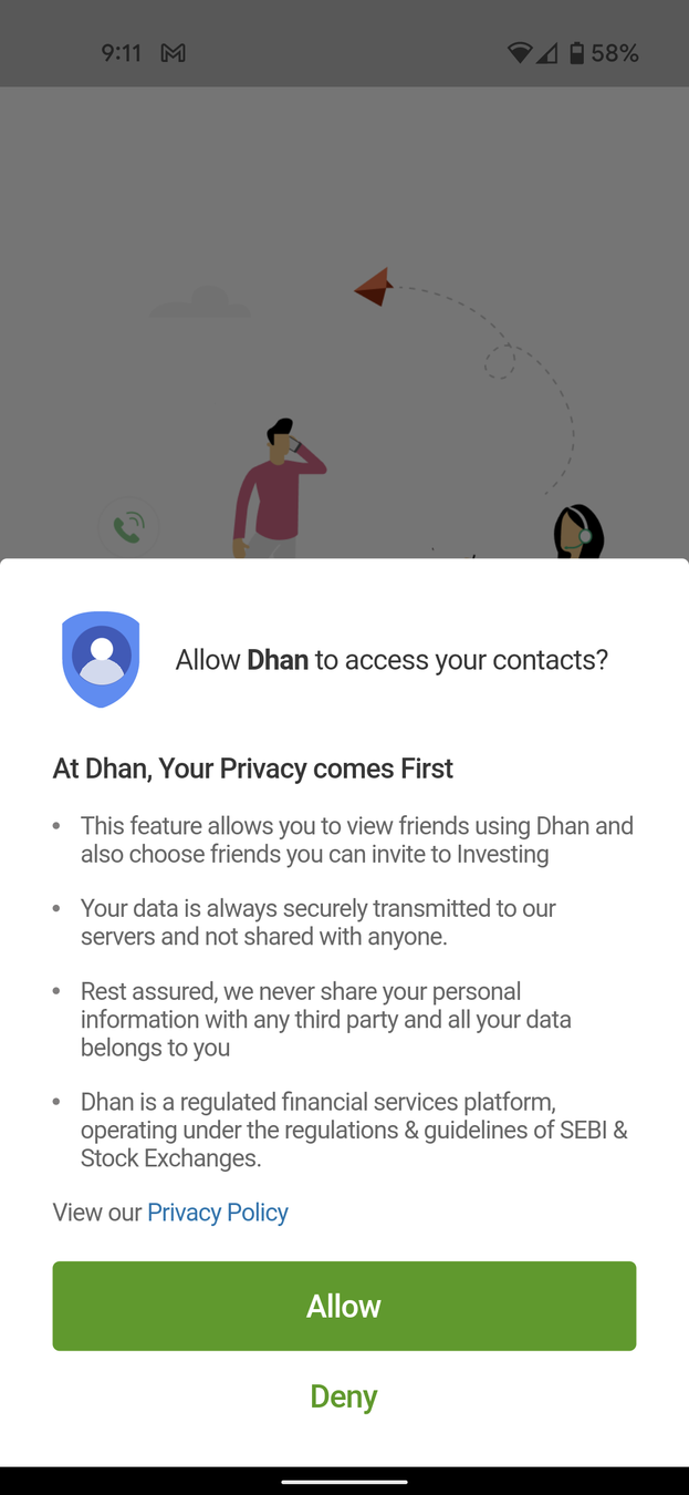
While the messaging is great, it's a bummer that an investment app is asking for my contacts. Why? That too before letting me do any investment related stuff? Let's deny and move on
A more appropriate place to ask for contact permissions would have been when a user tries to share/refer something from the app for the first time
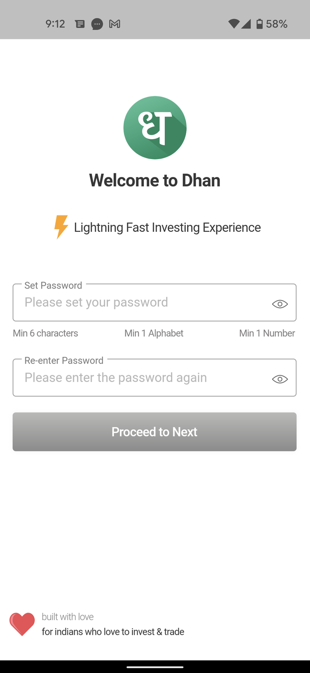
Straight forward password creation. Delighter is showing password criteria at first glance telling the user what is expected

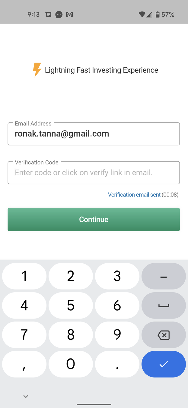
Focus is definitely on the 'Lighting Fast Experience' telling reinforcing how quick the process is

By giving the user a heads up on approximately how long it takes. Mentally preparing the user about the length of the process increases the likelihood of them going through with it - Anchoring Bias
The raging bull in green color is a good example of Visual Anchor. The message passed here is the user is a bull in the stock market, waiting to get started!
There is an option to skip the process as well but does a good job of not attracting user's attention as Dhan would ideally want you to complete onboarding
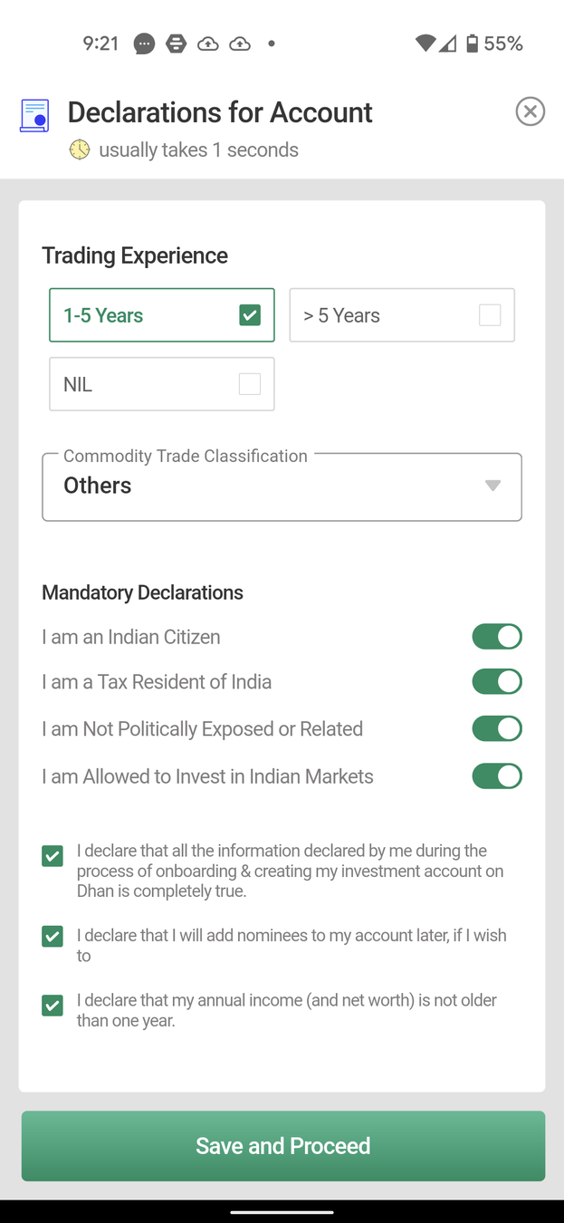
Nice Delighter feature by giving a counter of how long the process takes. Reducing the Curiosity Gap
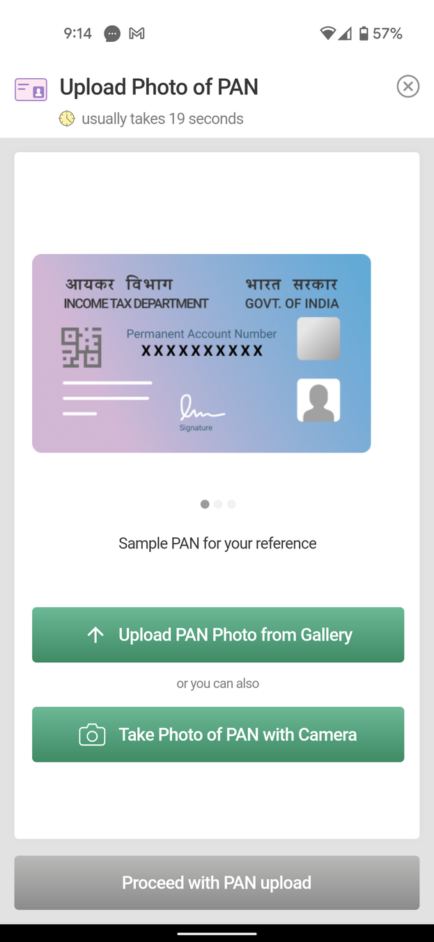
I like how a visual representation of the PAN card is given. Nice Visual Representation making it easy to recollect
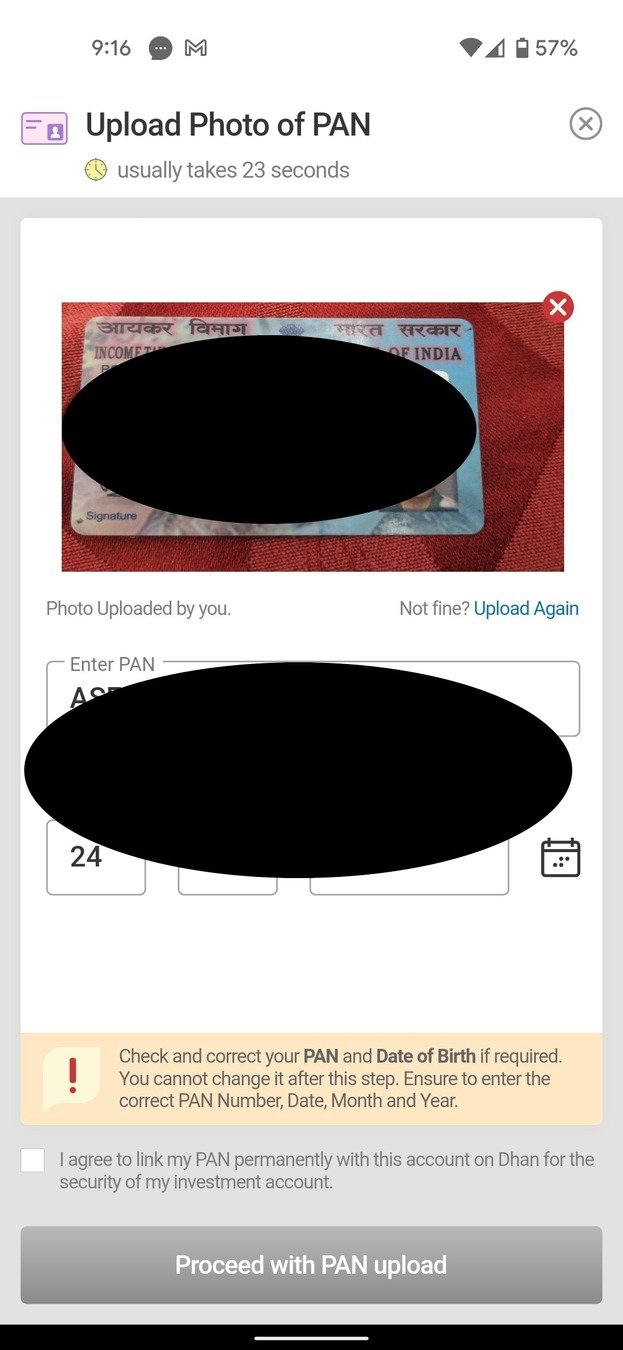
Loved how it auto-detected the details and filled it up correctly. Delighter that reduces Cognitive Load
Nice of the app to give appropriate messaging and draw the user's attention towards the message making sure the detection of details is correct
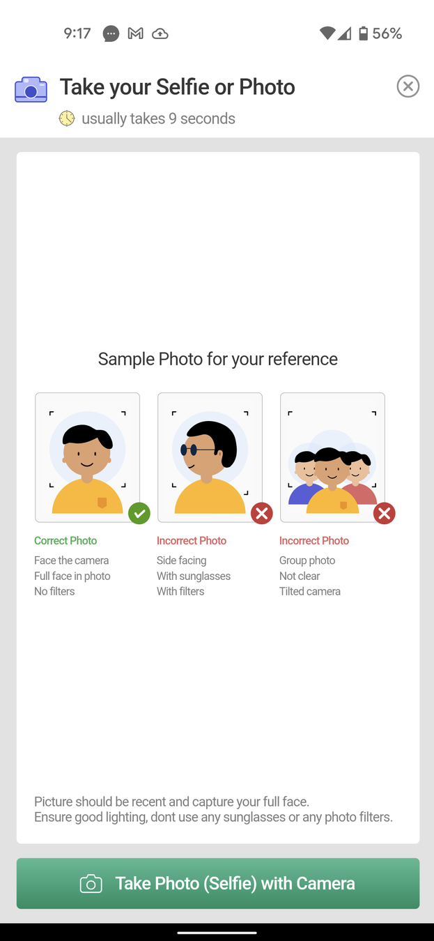
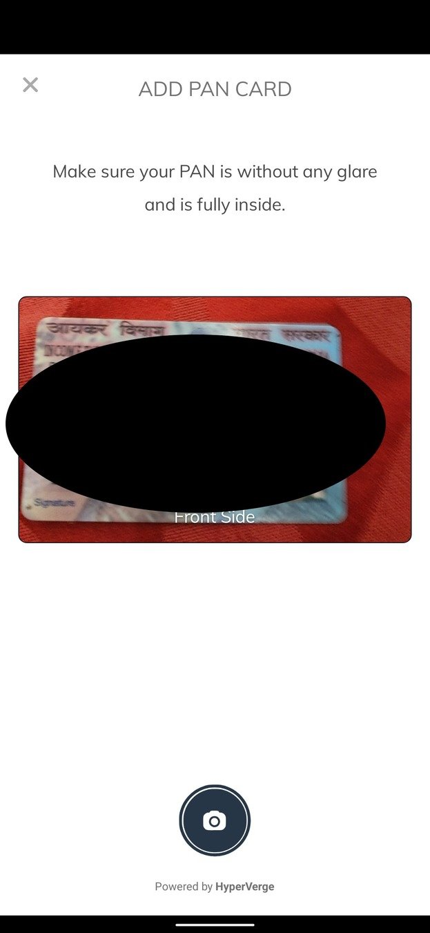
Good use of visuals to tell the user what the correct way of clicking the photo is, however this could have been better if the correct option would have been more prominent as it currently doesn't strike out as the obvious option
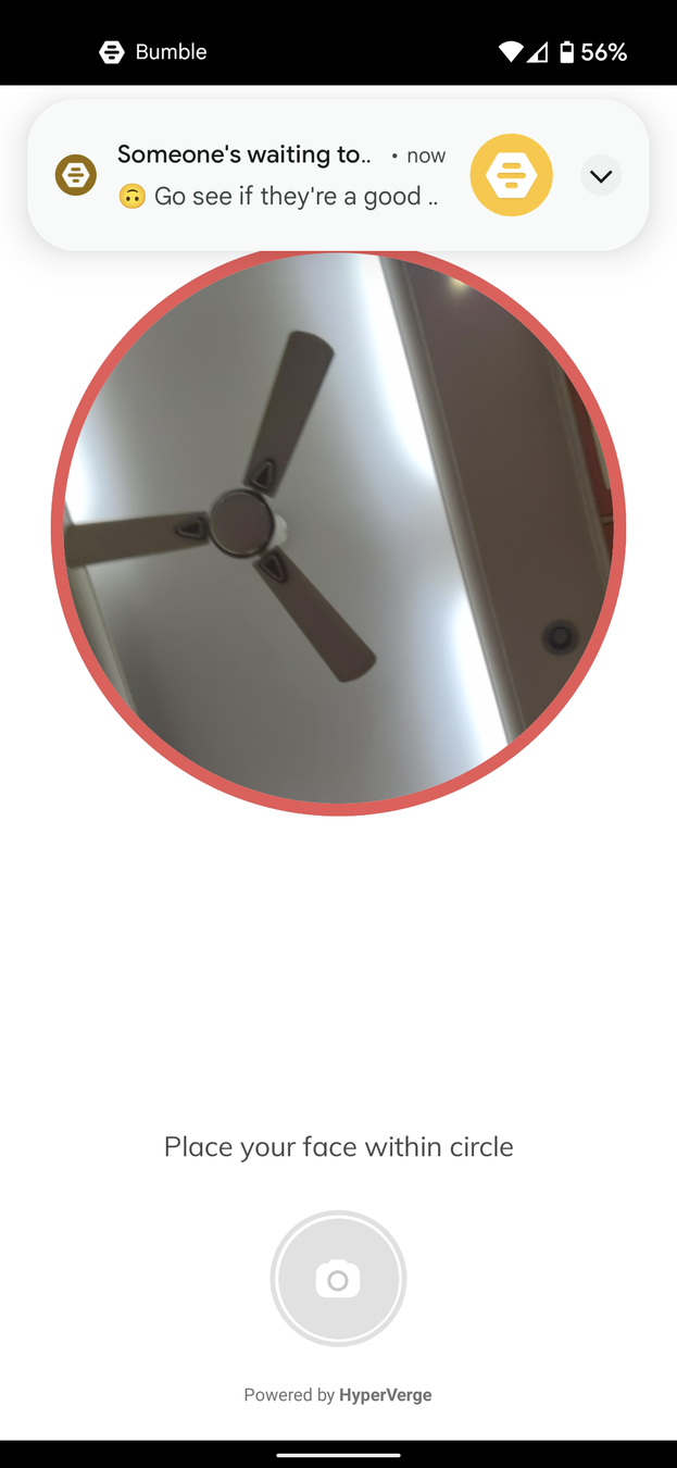

Another good to have feature of showing the red ring and disabling the capture button when the face is not in the camera - two levels of checks
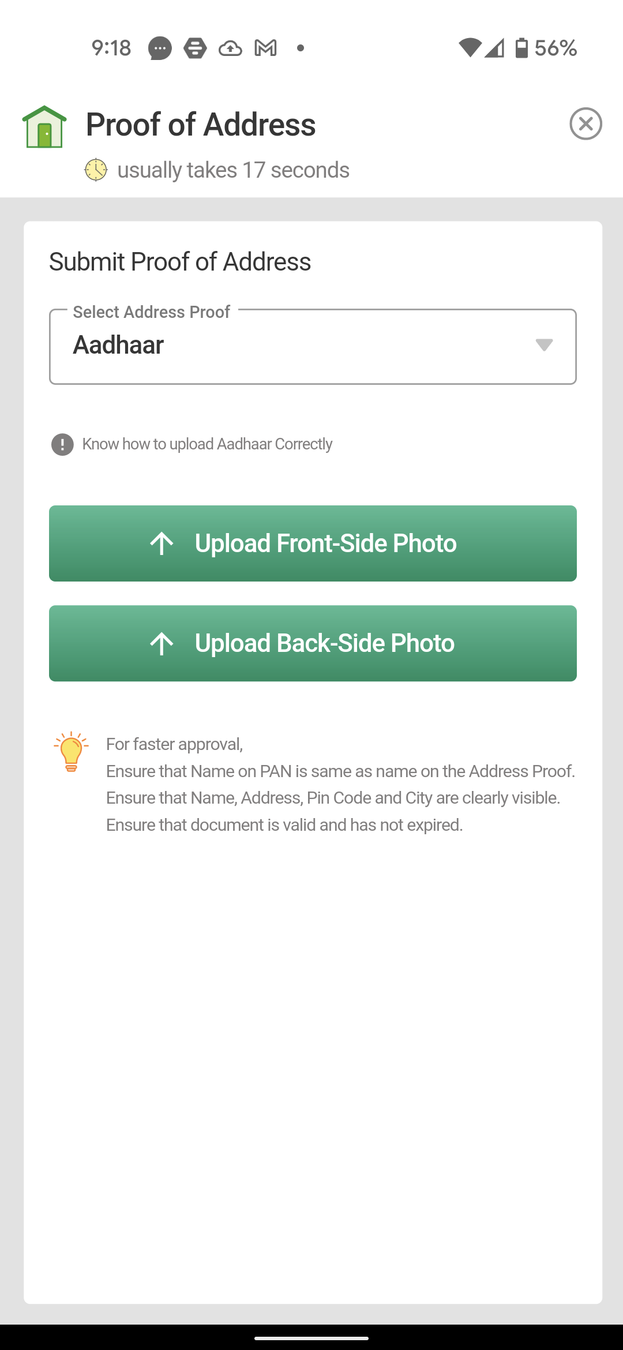
Pretty straight-forward and very similar to the PAN card flow creating a Familiarity Bias and making it easier for the user
There is some amount of inconsistency though as the app doesn't provide visual representation of the AADHAAR as it did for PAN card
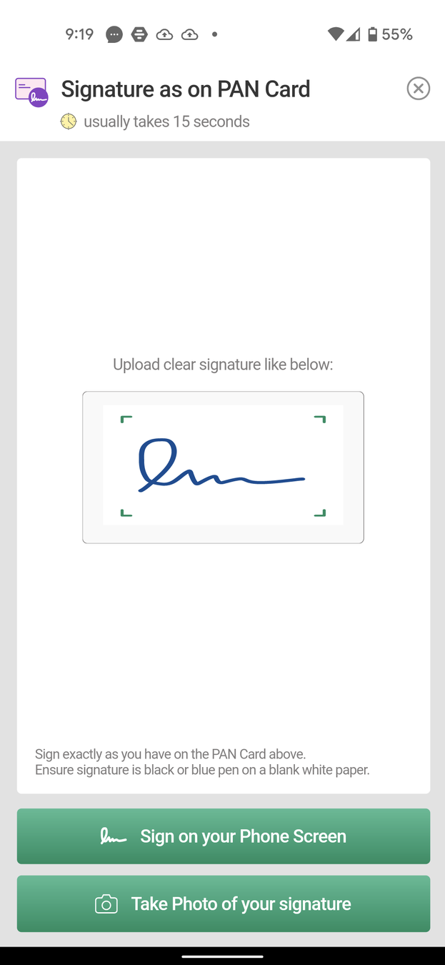
As we can see the visual representation is back and a nice one as well, reducing cognitive load
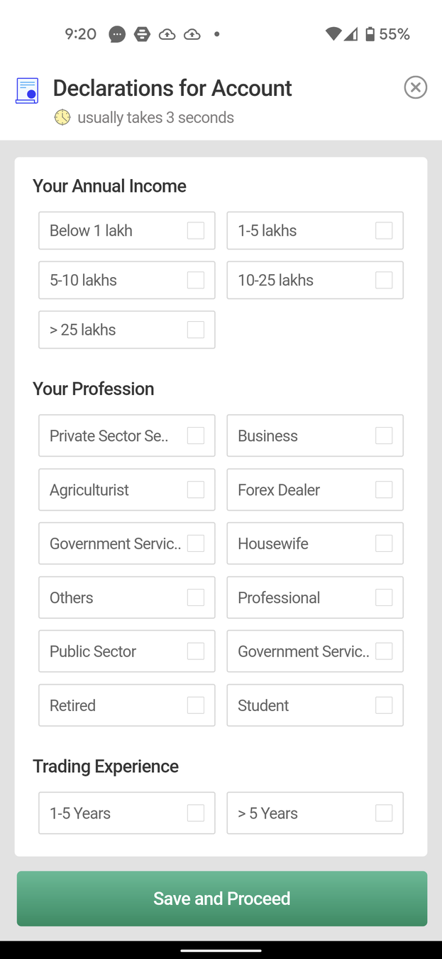
All of these could have been a drop-down menu but I like how Dhan choose to lay out all the information for you at first glance helping you make decisions faster
As an investor, I would have liked if this step was kept for later, as the onboarding process already feels like too many steps
So we do have an option to skip it, but the button is different colored and doesn't come to user's attention at first glance. Let's click and move on!
Since the onboarding process is so long, a progress bar of some sort would have been nice, giving the user some sort of an idea of how many more steps are left
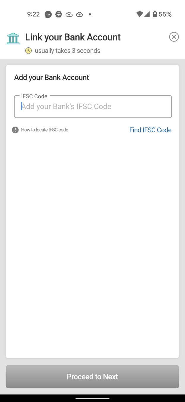
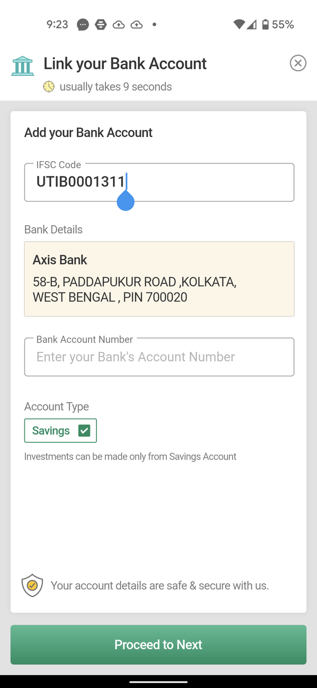
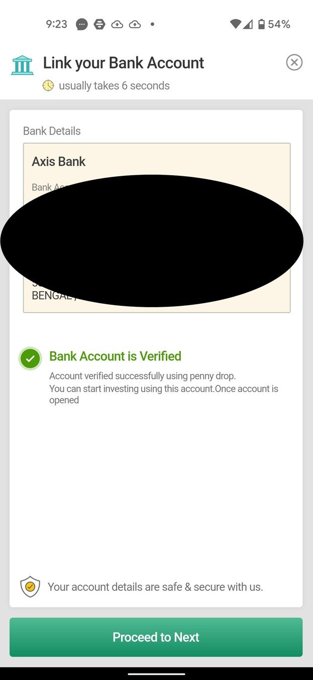
Again pretty straightforward. Entering Bank Account details
Nice touch to build the trust of the user assuring that the data is secure
The messaging on this CTA could have been better, Proceed to Next is not as intuitive as something like Proceed
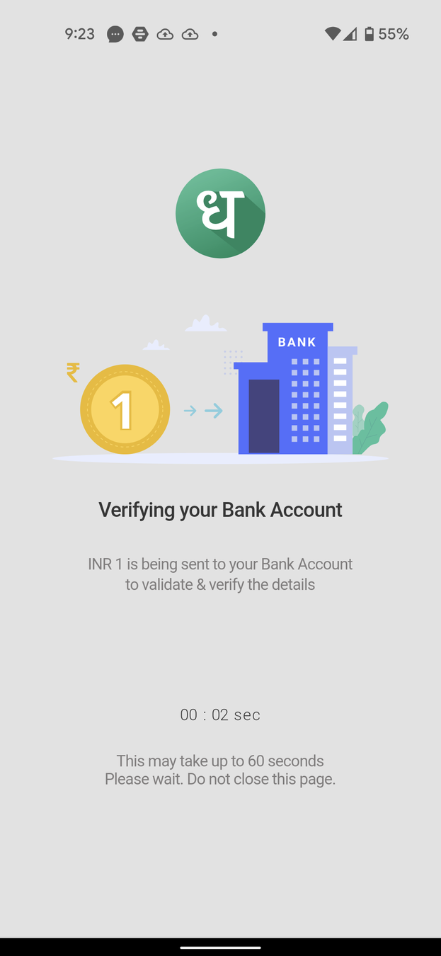
Another example of Visual Anchor showing a representation of the Bank when verification is in process

Messaging here again could have been made more rewarding after so many steps that the user has taken. A message like Hurray! would have been more encouraging than just In Progress
Now that we're kind of done with Onboarding let's explore the App and see what it has to offer!
Nice personal touch. Forming a connection with the user.
Consistent messaging of the fast experience but kind of feels redundant at this point. Referral bonus seems attractive though!
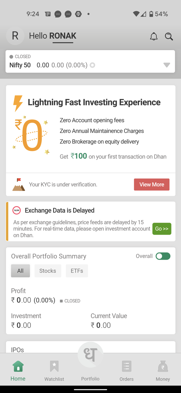
Not much to see here as KYC is still pending and no investment has been made. Let's explore a different screen
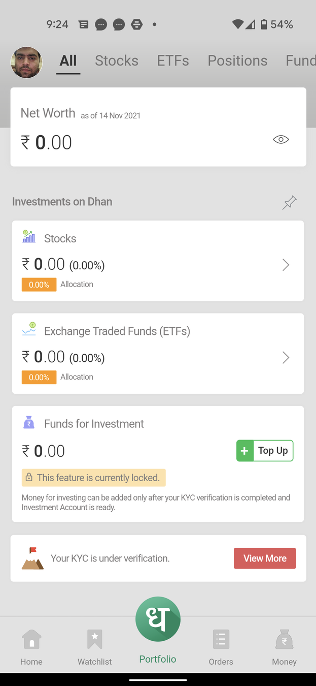
Ah! The all-important Portfolio Page. I like how we have different tabs to explore all our investments and trades
While the screen is well organized and doesn't feel overwhelming, the experience could have been even better with a better Fresh Start Effect and making the page more welcoming and having some other points of engagement or walkthrough
Nice ability to personalize this screen by having an option to Pin
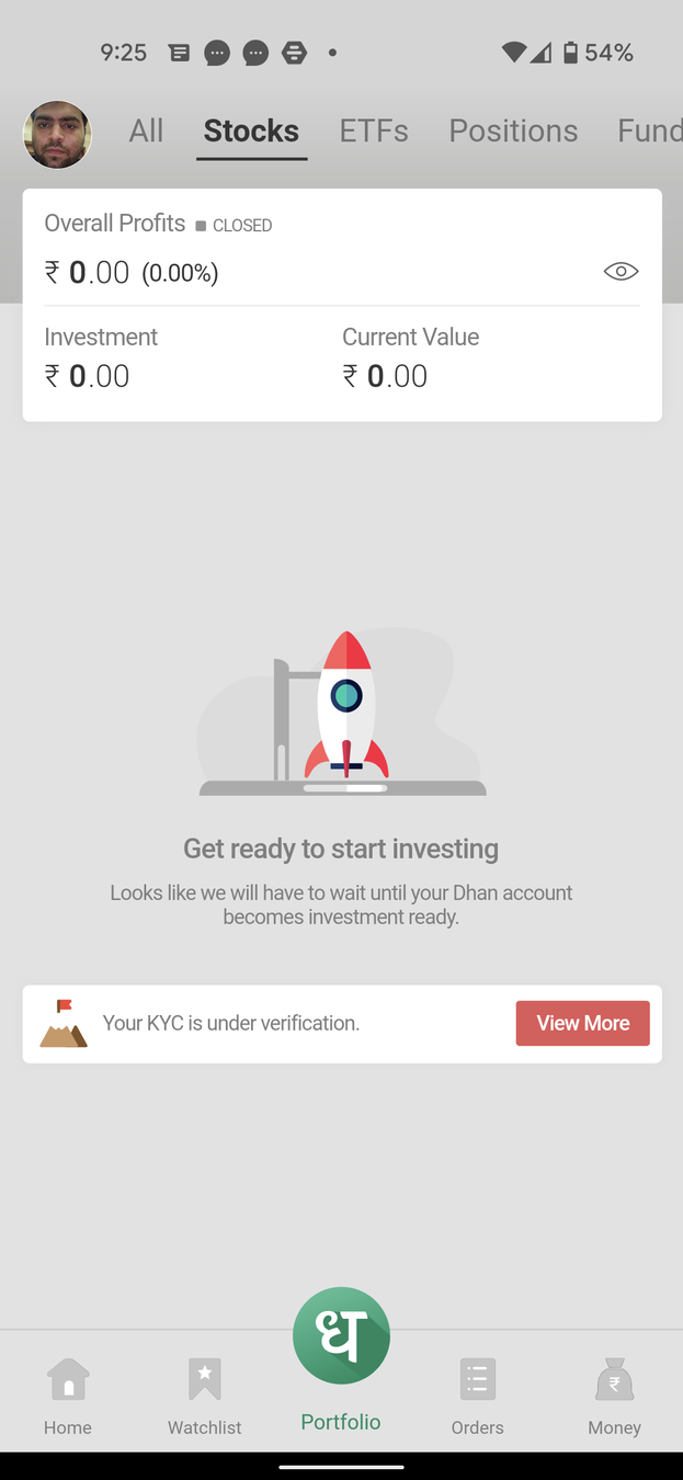
Okay, so the Fresh Start Effect is here with great Visual Anchor as well with rocket and copy telling the user to go to the moon!
Nice messaging with KYC process, not making the user feel lost as to why they cant trade at the moment
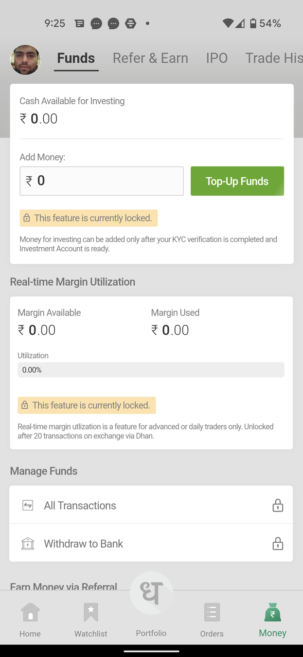
So there is a separate screen for Money. Wonder if this feels redundant and could have been part of the Portfolio page or the Home Page. Wonder what led to the decision of screen for this functionality?
However, it does have Familiarity Bias going for it, making the user feel at home

Lots of CTAs with Contrast, doing a good job of grabbing User's attetion
Creating Curiosity Gap, making the user want to click on this button and see what's in store
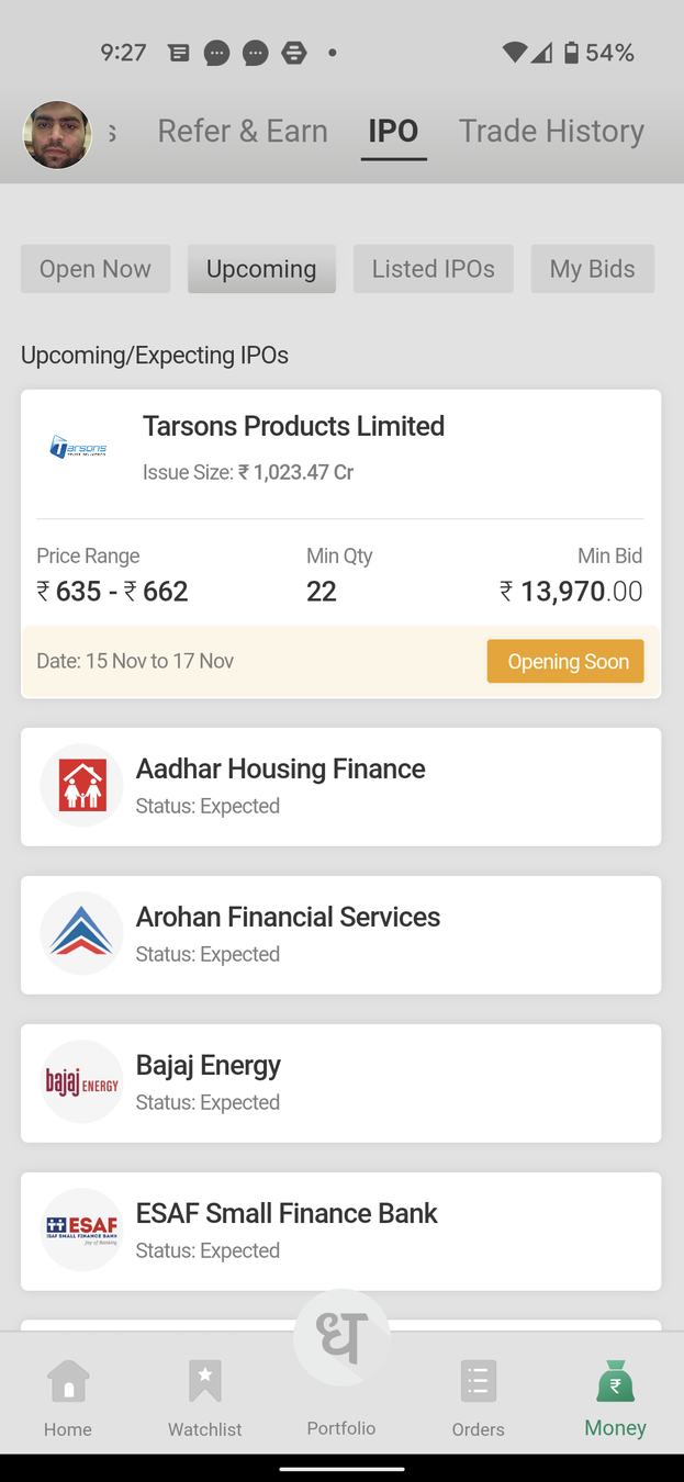
It's the bull market, and lots of IPOs happening. I like how Dhan has created a separate section for it withing the App
I also like the fact that Dhan shows all the necessary details of the IPOs without having to expand into a different screen
Filters in the form of tabs also exist to let you switch from Open Now, Upcoming, Listed, and Bids but they could have been made to look more clickable. Right now the distinction among the buttons is very little
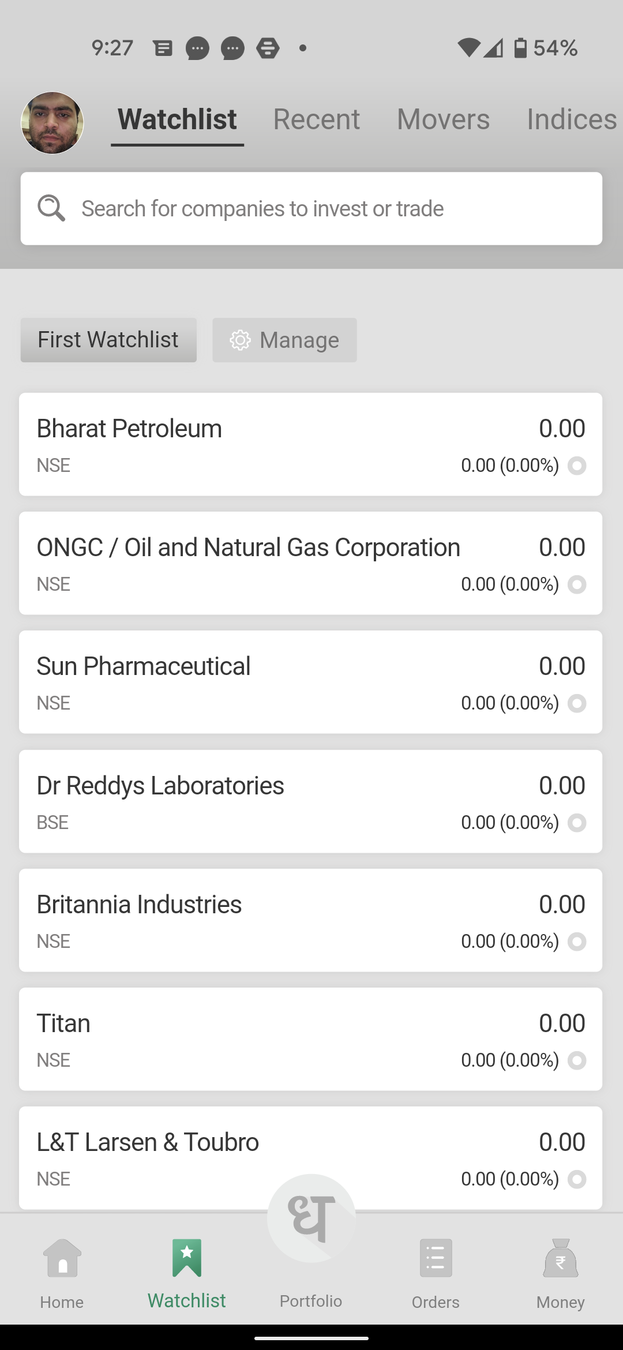
Like how in the Watchlist tab a watchlist is already created a sample watchlist for me - a great example of the Spark Effect
Without a 'Create a new Watchlist' or 'Add' button it's difficult to identify how to create a new watchlist. A tooltip of some sort would have been nice.
The template watchlists like Movers and Indices are a good touch since these are instruments that most traders/investors would want to keep a track of
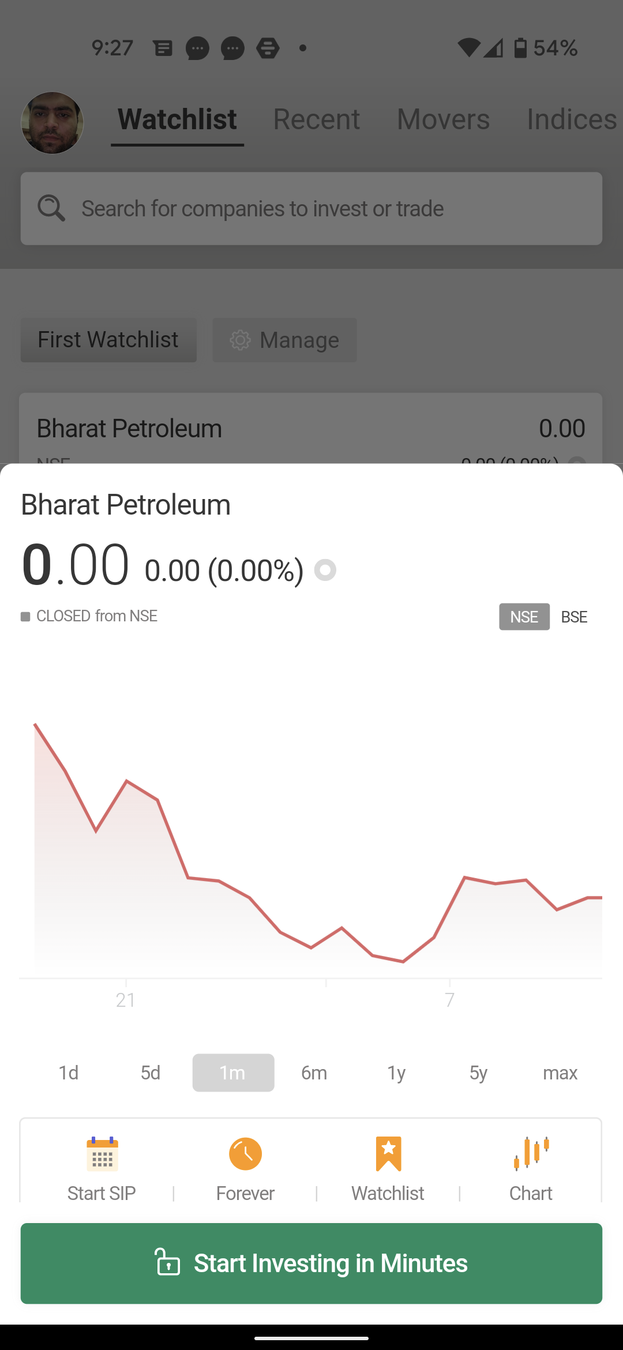
Is this a bug? Why am I seeing 0s for a stock price?
However, I like how they've put an External Trigger in the CTA, making the user want to click the button more!
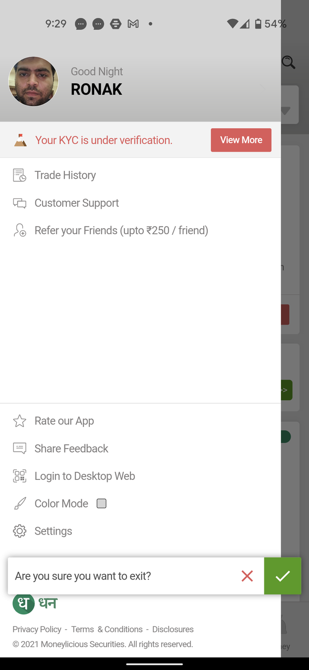
The side menu only has the necessary options, abstracting away other functionalities
Continuing with the personalization and maintaining context as well


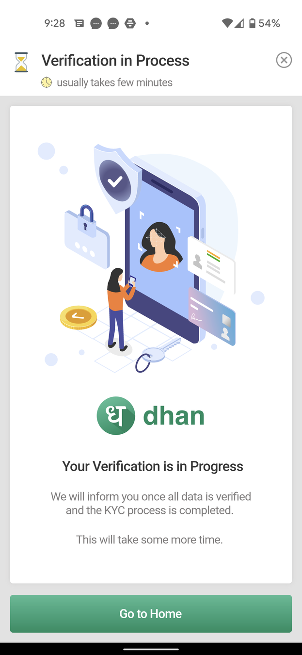
Two interesting tricks at play here:
Peak-End Rule - Users tend to remember peaks and the last part of their experience more than anything else. Dhan does a good job of ending the onboarding/KYC process on a high note!
Zeigarnik Effect - Users tend to remember incomplete tasks more than complete ones, and Dhan does a great job with messaging to tell the user they'll be notified when the process is complete
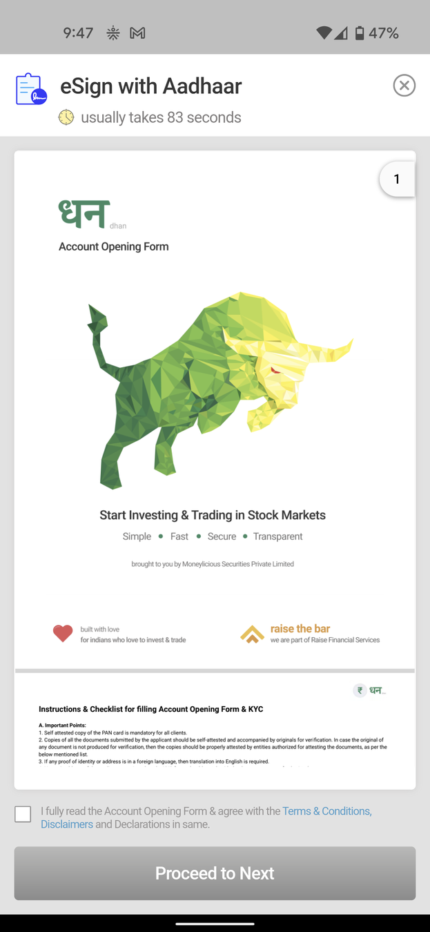
The Green Bull is back! Definitely acts as a positive Picture Superiority Effect

And we're back to the Home Screen!
Gotta wait till KYC is approved to a teardown on how Orders work in a separate case study.
Fin