CSS(Cascading style sheet)
- CSS stands for Cascading Style Sheets
- CSS describes how HTML elements are to be displayed on screen, paper, or in other media
- CSS saves a lot of work. It can control the layout of multiple web pages all at once
- External stylesheets are stored in CSS files
Why do we need CSS.?
CSS is used to define styles for your web pages,
including the design, layout and variations in display
for different devices and screen sizes.
CSS Syntax
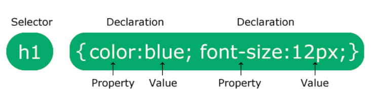
Text
p {
color: red;
text-align: center;
}
How To Add CSS
Three Ways to Insert CSS
There are three ways of inserting a style sheet:
- External CSS
- Internal CSS
- Inline CSS
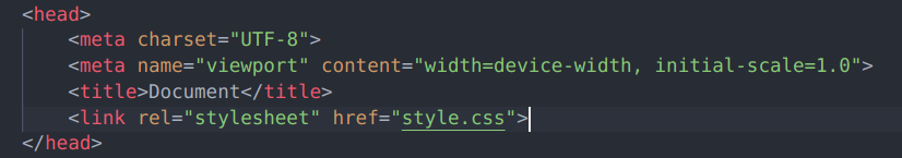
Linking External CSS File
CSS Selectors
We can select an HTML element in simple ways
Simple selectors (select elements based on name or Tag, id, class)
Ex : <p class="large">This paragraph refers one class.</p>
Ex : <p id="center">This paragraph refers to one id</p>
Ex : h1, p, ol, img these tags we can directly selects in css
The CSS Universal Selector
The universal selector (*) selects all HTML elements on the page.
* {
text-align: center;
color: blue;
}
Specificity of selectors in css
- Inline style css have the highest specificity.
- ID Selectors: Selectors that use the
#idsyntax have higher specificity than classes or tag selectors. - Class Selectors : Selectors with Classes have a moderate specificity.
- Element Type or tag Selectors: Selectors based solely on HTML elements (like
div,p,a, etc.) have the lowest specificity.
COLOR in CSS
We can apply colors in diffent ways.
- Predefined color name
- RGB(Red Green Blue)
- Hex values(Hexadecimal)
- HSL(Hue-Saturation-Lightness)
h1{
color: #000;
}
CSS values and units
CSS has several different units for expressing a length.
Many CSS properties take "length" values, such as width, margin, padding, font-size, etc.
We have 2 types of lengths
- Absolute length
- Relative length
Absolute length
| cm | => centimeters |
| mm | => millimeters |
| in | => inches (1in = 96px = 2.54cm) |
| px * | => pixels (1px = 1/96th of 1in) |
| pt | => points (1pt = 1/72 of 1in) |
| pc | => picas (1pc = 12 pt) |
Relative length
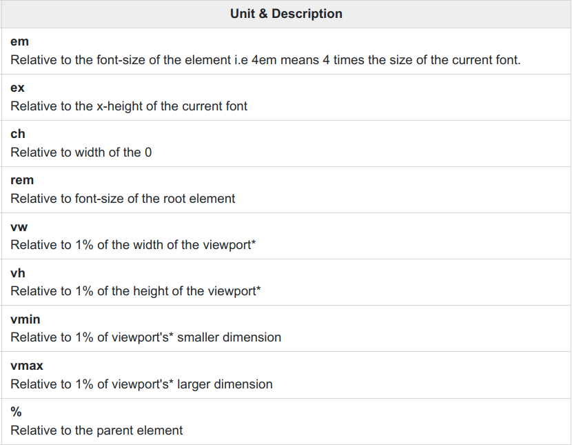
What are the units we use in real time apps
In real-time applications for CSS, the units that are commonly used include:
-
Pixels (px): This unit is the most common unit used in CSS, as it provides a fixed size of the element regardless of the device resolution.
-
Percentages (%): This unit is used to set the size of an element relative to the size of its parent element.
-
Viewport Units (vw, vh): These units are used to set the size of an element relative to the size of the viewport. 1vw is equal to 1% of the viewport width, and 1vh is equal to 1% of the viewport height.
-
EM and REM: These units are used to set the size of an element relative to the size of the parent or root element, respectively. EM is relative to the font size of the parent element, while REM is relative to the font size of the root element.
Backgrounds in CSS
The CSS background properties are used to add background effects for elements
CSS background properties:
background-colorbackground-imagebackground-repeatbackground-attachmentbackground-position-
background(shorthand property)
Adding images with CSS
The background-image property specifies an image to use as the background of an element.
body{
background-image: url('./pexels-andrei-tanase-1271619.jpg');
}
Background attachment
body {
background-image: url("img_tree.png");
background-repeat: no-repeat;
background-position: right top;
background-attachment: fixed;
}
SHORT HAND NOTATION
body {
background: #ffffff url("img_tree.png") no-repeat right top;
}
To shorten the code, it is also possible to specify all the background properties in one single property. This is called a shorthand property.
Content: The content of the box, where text and images appear
Padding
Border
Content
Margin
Border: A border that goes around the padding and content
Padding The space between the content (text, images, videos, etc.) and the border of an HTML element, such as a div, a paragraph, or an image.
Margin: The space outside the border and between neighboring elements.
Shadows
We can apply 2 types of shadows to HTML Elements
- Text-shadow
- Box-shadow
div{
    box-shadow: 2px 3px 5px black;
 }

 h1{
 	text-shadow: 2px 3px 5px black;
 }
Height and width
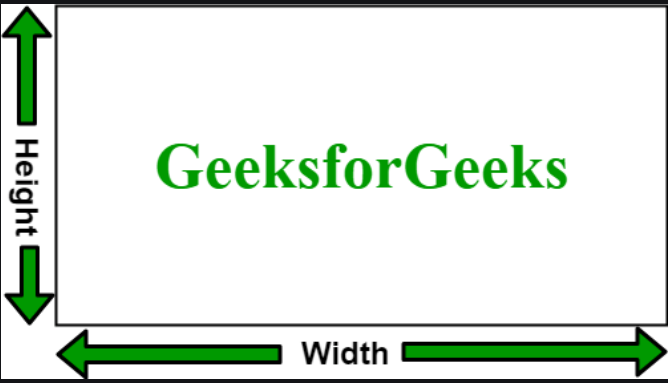
Height and Width in CSS are used to set the height and width of boxes. Its value can be set using length, percentage, or auto.
CSS Borders
The CSS border properties allow you to specify the style, width, and color of an element's border.
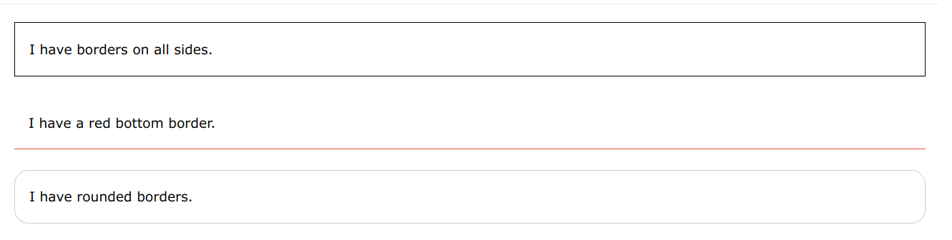
Border style
The border-style property specifies what kind of border to display.
The following values are allowed:
dotted- Defines a dotted borderdashed- Defines a dashed bordersolid- Defines a solid borderdouble- Defines a double bordergroove- Defines a 3D grooved border. The effect depends on the border-color valueridge- Defines a 3D ridged border. The effect depends on the border-color valueinset- Defines a 3D inset border. The effect depends on the border-color valueoutset- Defines a 3D outset border. The effect depends on the border-color valuenone- Defines no borderhidden- Defines a hidden border
Border properties
- 1.Border-width
- 2. Border-color
- 3.Rounded-borders
CSS MARGIN
Margins are used to create space around elements, outside of any defined borders.
With CSS, you have full control over the margins. There are properties for setting the margin for each side of an element (top, right, bottom, and left).
CSS PADDING
Padding is used to create space around an element's content, inside of any defined borders.
div {
padding-top: 50px;
padding-right: 30px;
padding-bottom: 50px;
padding-left: 80px;
}
Text formatting with CSS
p{
text-align: center ;
text-indent: 10px
text-decoration: none;
text-align-last: start;
text-transform: capitalize;
letter-spacing: 5px;
line-height: 1.8;
word-spacing: 10px;
white-space: nowrap;
text-shadow: 2px 2px;
}
CSS Fonts
Choosing the right font has a huge impact on how the readers experience a website.
The right font can create a strong identity for your brand.
Using a font that is easy to read is important. The font adds value to your text. It is also important to choose the correct color and text size for the font.
Font properties in CSS
- font-style
- font-weight
- font-size
- font-family
CSS LISTS
HTML Lists and CSS List Properties
In HTML, there are two main types of lists:
- unordered lists (<ul>) - the list items are marked with bullets
- ordered lists (<ol>) - the list items are marked with numbers or letters
Content overflow
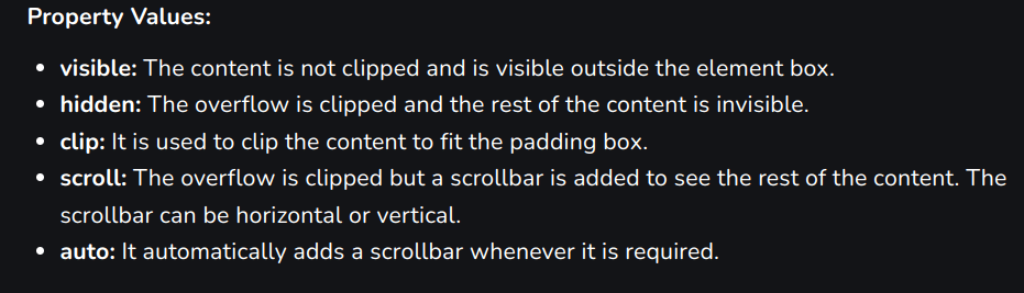
The CSS overflow property is used to set the overflow behavior of an element. It is the shorthand property of overflow-x and overflow-y properties. This property is used to control the large content.
Transformations
The transform property in CSS is used to change the coordinate space of the visual formatting model. This is used to add effects like skew, rotate, translate, etc on elements.
Note: The transformations can be of 2-D or 3-D type.
Animations in CSS
- An animation lets an element gradually change from one style to another.
- You can change as many CSS properties you want, as many times as you want.
- To use CSS animation, you must first specify some keyframes for the animation.
- Keyframes hold what styles the element will have at certain times.
The @keyframes Rule
- When you specify CSS styles inside the
@keyframesrule, the animation will gradually change from the current style to the new style at certain times. - To get an animation to work, you must bind the animation to an element.
Min-width, Max-width, Min-height, and Max-height are properties that can be used to define the minimum and maximum dimensions of an HTML element.
Min Width: This property sets the minimum width of an element, which means that the element cannot be narrower than the specified value.
div {
min-width: 200px;
}
Max Width: This property sets the maximum width of an element, which means that the element cannot be wider than the specified value
div {
max-width: 200px;
}
Min Height: This property sets the minimum height of an element, which means that the element cannot be shorter than the specified value.
div {
min-height: 200px;
}
Max Height: The max-height property sets the maximum height that an element can have, but it does not guarantee that the element will have that height. In below <div> element has a maximum height of 600 pixels, but it will only be as tall as its content requires by default. If the content is smaller than 600 pixels, the element will shrink to fit the content.
div {
max-height: 600px;
}
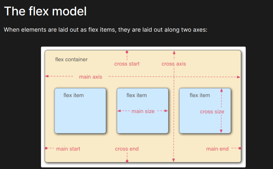
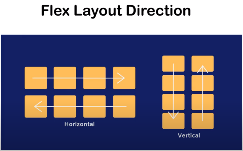
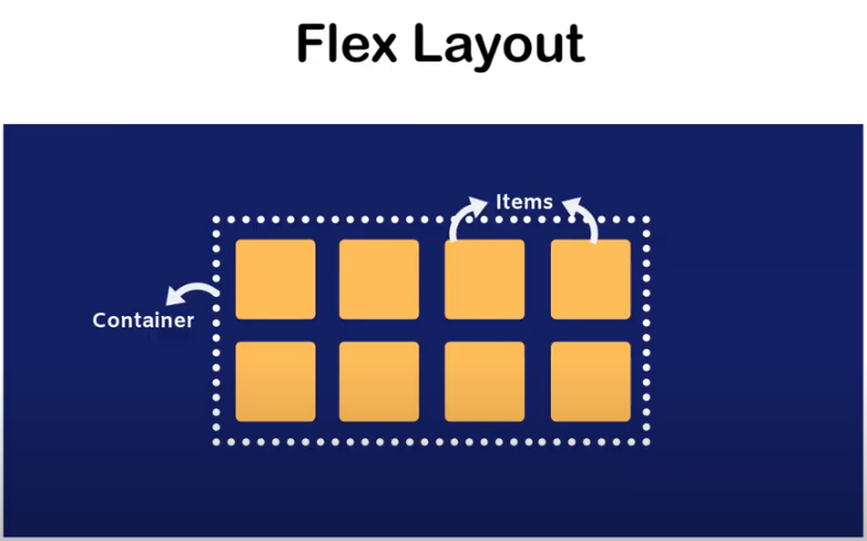
Flex Box
display : flex (to create a flex container)
Flexbox is a CSS layout module that allows you to create flexible and responsive layouts with ease.
flex-direction (to specify the direction of the main axis)
justify-content (to align items along the main axis)
Flex Wrap (It specifies whether flex items should be wrapped onto multiple lines or remain on a single line.)
align items (It defines how flex items are aligned along the cross-axis of the flex container.)
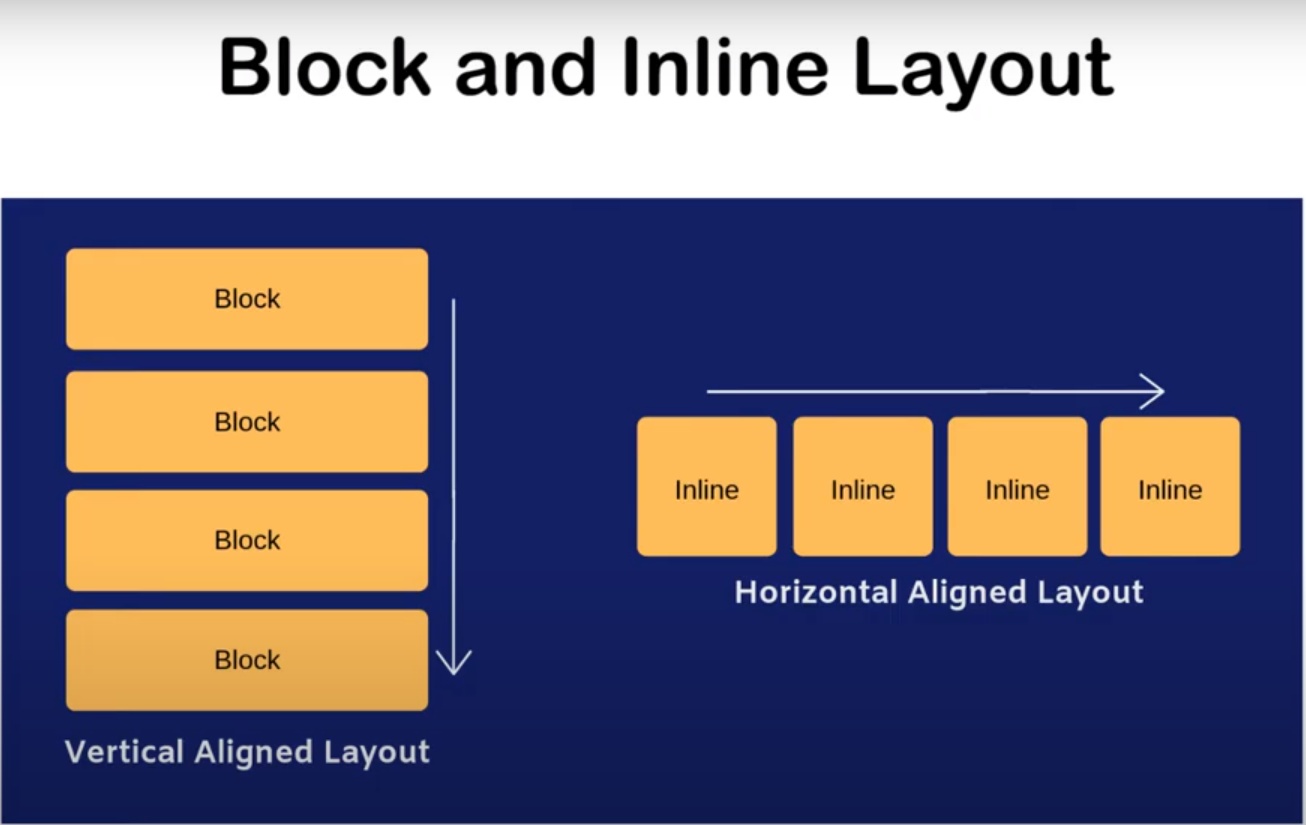
LAYOUT
FLEX-DIRECTION
FLEX-LAYOUT
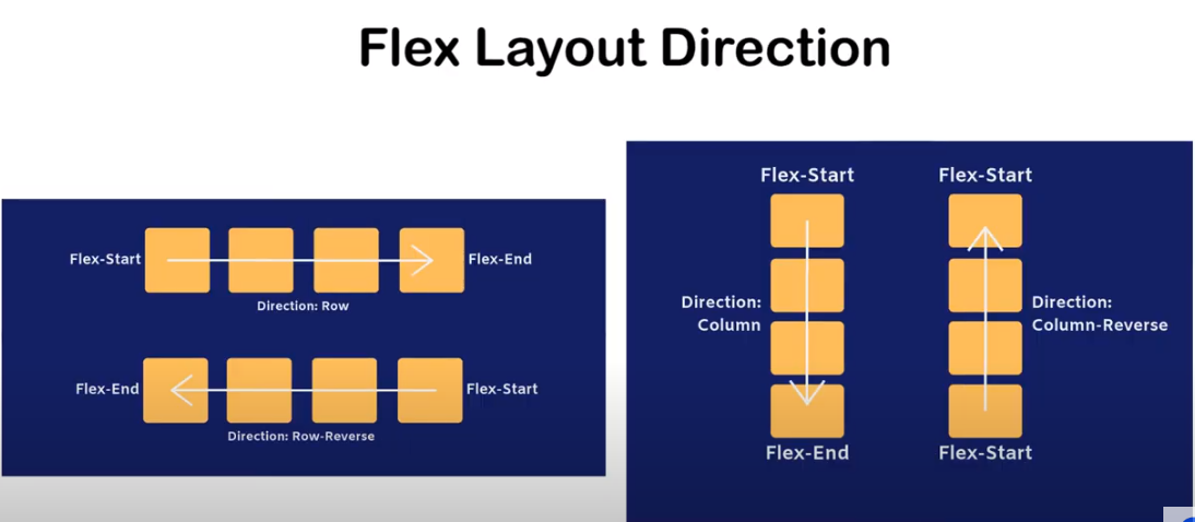
Reverse-direction
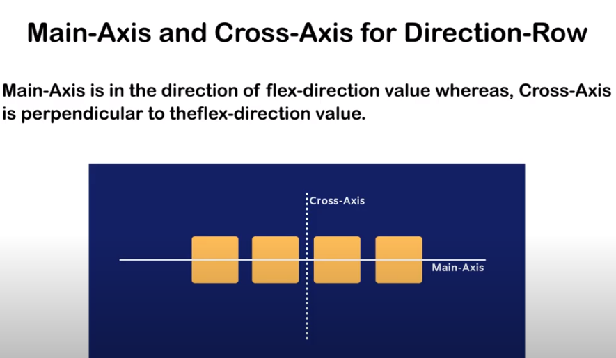
MAIN -AXIS
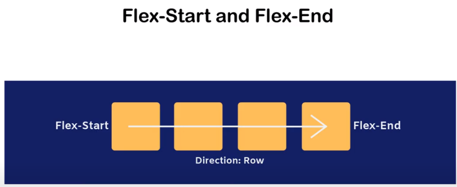
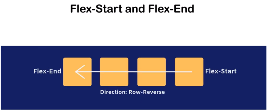
ROW-DIRECTION
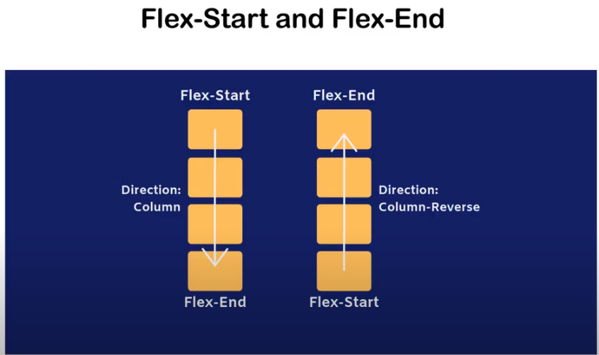
COLUMN-DIRECTIONS
MEDIA QUERIES
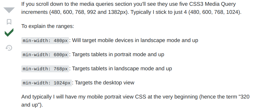
MEDIA QUERIES
@media only screen and (max-width: 600px) {
body {
background-color: lightblue;
}
}
CSS POSITION
position: static;
position: relative;
position: absolute;
position: fixed;
position: sticky;
position : static
relative
The element is positioned according to the normal flow of the document, and then offset relative to itself based on the values of top, right, bottom, and left. The offset does not affect the position of any other elements; thus, the space given for the element in the page layout is the same as if position were static.
This value creates a new stacking context when the value of z-index is not auto. Its effect on table-*-group, table-row, table-column, table-cell, and table-caption elements is undefined.
absolute
The element is removed from the normal document flow, and no space is created for the element in the page layout. It is positioned relative to its closest positioned ancestor, if any; otherwise, it is placed relative to the initial containing block. Its final position is determined by the values of top, right, bottom, and left.
This value creates a new stacking context when the value of z-index is not auto. The margins of absolutely positioned boxes do not collapse with other margins.
fixed
The element is removed from the normal document flow, and no space is created for the element in the page layout. It is positioned relative to the initial containing block established by the viewport, except when one of its ancestors has a transform, perspective, or filter property set to something other than none (see the CSS Transforms Spec), or the will-change property is set to transform, in which case that ancestor behaves as the containing block. (Note that there are browser inconsistencies with perspective and filter contributing to containing block formation.) Its final position is determined by the values of top, right, bottom, and left.
This value always creates a new stacking context. In printed documents, the element is placed in the same position on every page.
sticky
The element is positioned according to the normal flow of the document, and then offset relative to its nearest scrolling ancestor and containing block (nearest block-level ancestor), including table-related elements, based on the values of top, right, bottom, and left. The offset does not affect the position of any other elements.
This value always creates a new stacking context. Note that a sticky element "sticks" to its nearest ancestor that has a "scrolling mechanism" (created when overflow is hidden, scroll, auto, or overlay), even if that ancestor isn't the nearest actually scrolling ancestor.
Bootstrap
Bootstrap is a widely-used open-source front-end framework for web development, providing a collection of HTML, CSS, and JavaScript components and tools that enable developers to build responsive, mobile-first websites with ease.
By using this framework we can easily manipulate the styling of any web page, like font style, text color, background color, flex, grid system, etc. Bootstrap Vesrion 4 & Vesrion 5 are the most popular versions. There are lots of other CSS frameworks like Tailwind CSS, Bulma, and Foundation but among them, this framework is the most popular because of below mentioned features:
- It is Faster and Easier way for Web-Development.
- It creates Platform-independent web-pages.
- It creates Responsive Web-pages.
- It designs responsive web pages for mobile devices too.
- It is a free and open-source framework available on www.getbootstrap.com
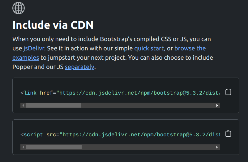
How to use Bootstrap on the webpage?
Include Bootstrap through CDN links:
- First head-over to bootstrap official website.
- Check the Include via CDN options
- Copy the links of script and css
- Paste those links in the head tag in the HTML file
Text Colors: Bootstrap provides many classes to set the text color of an element. All classes of text colors are listed below:
Bootstrap 4 | Colors
Example: This example uses text color class to set the color of text content.
We just have to add the class in the HTML Tags like this
- text-primary
- text-secondary
- text-success
- text-danger
- text-info
- text-warning...etc
Bootsrap 4 | Backgrounds
Background Colors: Bootstrap provides many classes to set the background color of an element. All classes of background colors are listed below:
Example: This example uses background-color class to set the background color of content.
- bg-primary
- bg-secondary
- bg-success
- bg-info
- bg-danger
- bg-light
Bootstrap provides different classes that can be used with different tags, such as <button>, <a>, <input>, and <label> to apply custom button styles. Bootstrap also provides classes that can be used for changing the state and size of buttons. Also, it provides classes for applying toggle, checkbox and radio buttons like effects.
Bootstrap contains many classes to set the style of the button element. The list of button classes are given below:
- .btn
- .btn-primary
- .btn-secondary
- .btn-success
- .btn-info
- .btn-warning
- .btn-danger
- .btn-dark
- .btn-light
- .btn-link
Bootstrap 4 | Buttons
Bootstrap 4 | Button outlines
Button Outlines: Bootstrap provides a series of classes that can be used when we need to use outline styled buttons in our project, i.e. button without background color. The outline button classes remove any background color or background image style applied to the buttons. These classes are listed below:
- .btn-outline-primary
- .btn-outline-secondary
- .btn-outline-success
- .btn-outline-info
- .btn-outline-warning
- .btn-outline-danger
- .btn-outline-dark
- .btn-outline-light
- .btn-outline-link
Bootstrap 4 | Modal
In simple words, the Modal component is a dialog box/popup window that is displayed on top of the current page, once the trigger button is clicked. However, clicking on the modal’s backdrop automatically closes the modal. Also, it must be kept in mind that Bootstrap doesn’t support nested modals as they create bad UI experience for the user. Therefore, only one modal window is supported at a time.
Bootstrap 4 | Carousel
A slideshow component for cycling through elements—images or slides of text—like a carousel.
The carousel is a slideshow for cycling through a series of content, built with CSS 3D transforms and a bit of JavaScript. It works with a series of images, text, or custom markup. It also includes support for previous/next controls and indicators.
Bootstrap 4 | Navbar
A navigation bar is used in every website to make it more user-friendly so that the navigation through the website becomes easy and the user can directly search for the topic of their interest.
Navbar: Bootstrap provide various types of navigation bar:
- Basic Navbar
- Inverted Navbar
- Coloured Navigation Bar
- Right-Aligned Navbar
- Fixed Navigation Bar
- Drop-Down menu Navbar
- Collapsible Navigation Bar
Bootstrap 4 | Alerts
Provide contextual feedback messages for typical user actions with the handful of available and flexible alert messages
Bootstrap 4 | Tables
Bootstrap provides a series of classes that can be used to apply various styling to the tables such as changing the heading appearance, making the rows stripped, adding or removing borders, making rows hoverable, etc. Bootstrap also provides classes for making tables responsive.
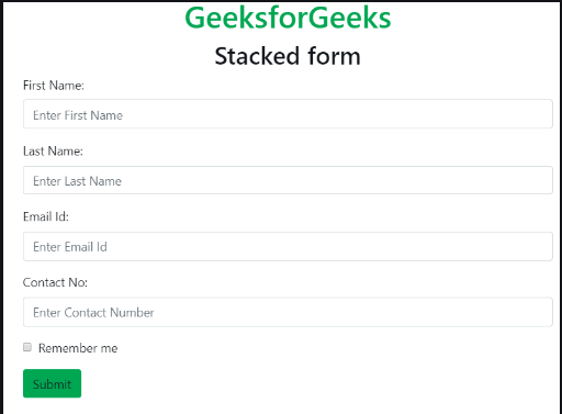
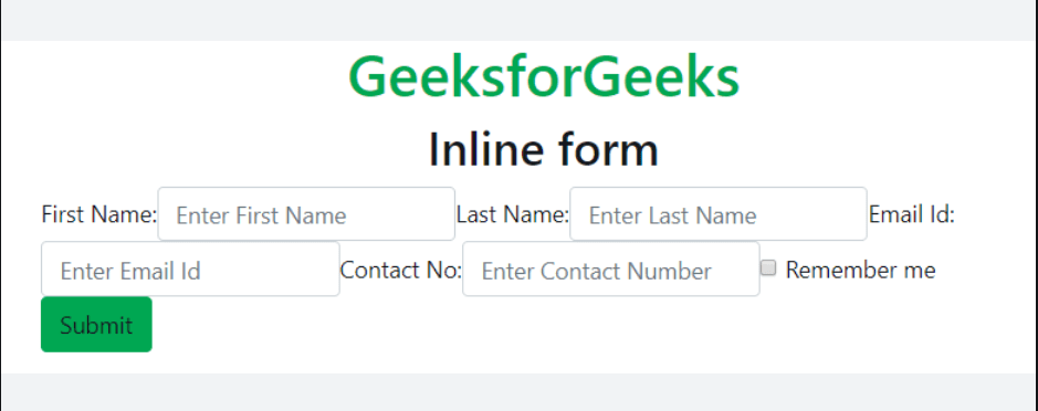
Bootstrap 4 | Forms
Form Layout: Bootstrap provides two types of form layout which are listed below:
- Stacked form
- Inline form
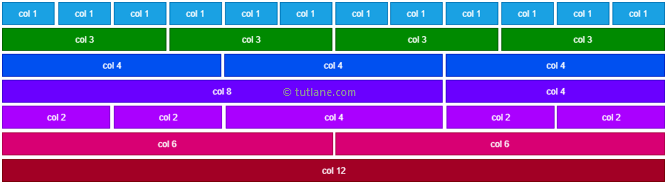
Bootstrap 4 | Containers
Containers are the most basic layout element in Bootstrap and are required when using our default grid system. Choose from a responsive, fixed-width container (meaning its max-width changes at each breakpoint) or fluid-width (meaning it’s 100% wide all the time).
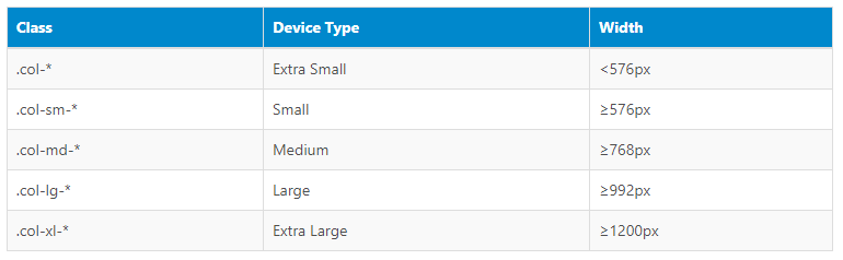
BREAK POINTS