Flex - Day4
CONTENT
- Data grid
- Drag and drop
- Skinning
- Creating an AIR app
1. Data grid
Cont.
The DataGrid control is like a List except that it can show more than one column of data making it suited for showing objects with multiple properties.
The DataGrid control provides the following features:
- Columns of different widths or identical fixed widths
- Columns that the user can resize at runtime
- Columns that the user can reorder at runtime
- Optional customizable column headers
- Ability to use a custom item renderer for any column to display data other than text
-
Cell editing
- Support for sorting the data by clicking on a column
Cont.
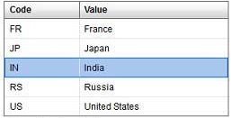
         [Bindable]
         public var data:ArrayCollection = new ArrayCollection(
         [
            {value:"France", code:"FR"},
            {value:"Japan", code:"JP"},
            {value:"India", code:"IN"},
            {value:"Russia", code:"RS"},
            {value:"United States", code:"US"}
         ]
         );


           <s:DataGrid dataProvider="{data}" id="dataGrid">
               <s:columns>
                  <s:ArrayList>
                     <s:GridColumn dataField="code" width="100"
                        headerText="Code" />
                     <s:GridColumn dataField="value" width="200"
                        headerText="Value" />
                  </s:ArrayList>
               </s:columns>
            </s:DataGrid>
Cont.
2. Drag and Drop
Cont.
- The drag-and-drop operation lets you move data from one place in an application to another.
- It is especially useful in a visual application where you can drag data between two lists.
- The list-based controls have built-in support for drag and drop, but you can use drag and drop with any Flex component. To support drag-and-drop operations with components other than list-based controls, or to explicitly control drag and drop with list-based controls, you must handle the drag and drop events.
- To make any list draggable we must set dragEnabled property of list to true and to make a list to accept(drop) the dragged data we must set dropEnabled property to true.
Cont.
<?xml version="1.0"?>
<!-- dragdrop\SimpleListToListMoveSparkDropIndicator.mxml -->
<s:Application xmlns:fx="http://ns.adobe.com/mxml/2009"
    xmlns:s="library://ns.adobe.com/flex/spark"
    xmlns:mx="library://ns.adobe.com/flex/mx"
    creationComplete="initApp();">
    <s:layout>
        <s:VerticalLayout/>
    </s:layout>

    <fx:Script>
        <![CDATA[
            import mx.collections.ArrayList;
            import myComponents.MyListSkin;

            private function initApp():void {
                srclist.dataProvider =
                    new ArrayList(['Reading', 'Television', 'Movies']);
                destlist.dataProvider = new ArrayList([]);
            }
        ]]>
    </fx:Script>

    <s:HGroup>
        <s:VGroup>
            <s:Label text="Available Activities"/>
            <s:List id="srclist"
                allowMultipleSelection="true"
                dragEnabled="true"
                dragMoveEnabled="true"/>
        </s:VGroup>

        <s:VGroup>
            <s:Label text="Activities I Like"/>
            <s:List id="destlist"
                dropEnabled="true"
                skinClass="myComponents.MyListSkin"/>
        </s:VGroup>
    </s:HGroup>

    <s:Button id="b1"
        label="Reset"
        click="initApp();"/>
</s:Application>
3. Skinning
Cont.
- The skin controls all visual elements of a component, including layout.
- Spark skins can contain multiple elements, such as graphic elements, text, images, and transitions.
- Skin states integrate well with transitions so that you can apply effects to one or more parts of the skins without adding much code.
Steps to create skin
- To have access to the host component from the skin, you must declare [HostComponent] metadata in the skin.
Cont.
<?xml version="1.0" encoding="utf-8"?>
<!-- skinning_components\SimpleButtonSkin.mxml -->
<s:Skin
    xmlns:fx="http://ns.adobe.com/mxml/2009"
    xmlns:mx="library://ns.adobe.com/flex/mx"
    xmlns:s="library://ns.adobe.com/flex/spark"
    minWidth="21" minHeight="21">

    <fx:Metadata>
        [HostComponent("spark.components.Button")]
    </fx:Metadata>

    <!-- Specify one state for each SkinState metadata in the host component's class -->
    <s:states>
        <s:State name="up"/>
        <s:State name="over"/>
        <s:State name="down"/>
        <s:State name="disabled"/>
    </s:states>

    <s:Rect left="0" right="0" top="0" bottom="0" width="69" height="20" radiusX="2" radiusY="2">
        <s:stroke>
            <s:SolidColorStroke color="0x000000" weight="1"/>
        </s:stroke>
    </s:Rect>

    <s:Label id="labelDisplay"
    	fontWeight="bold"
        horizontalCenter="0" verticalCenter="4"
        left="10" right="10" top="2" bottom="2">
    </s:Label>
</s:Skin>