DATAVISUALISATION
or
INFOGRAPHICS ?
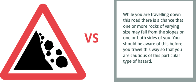
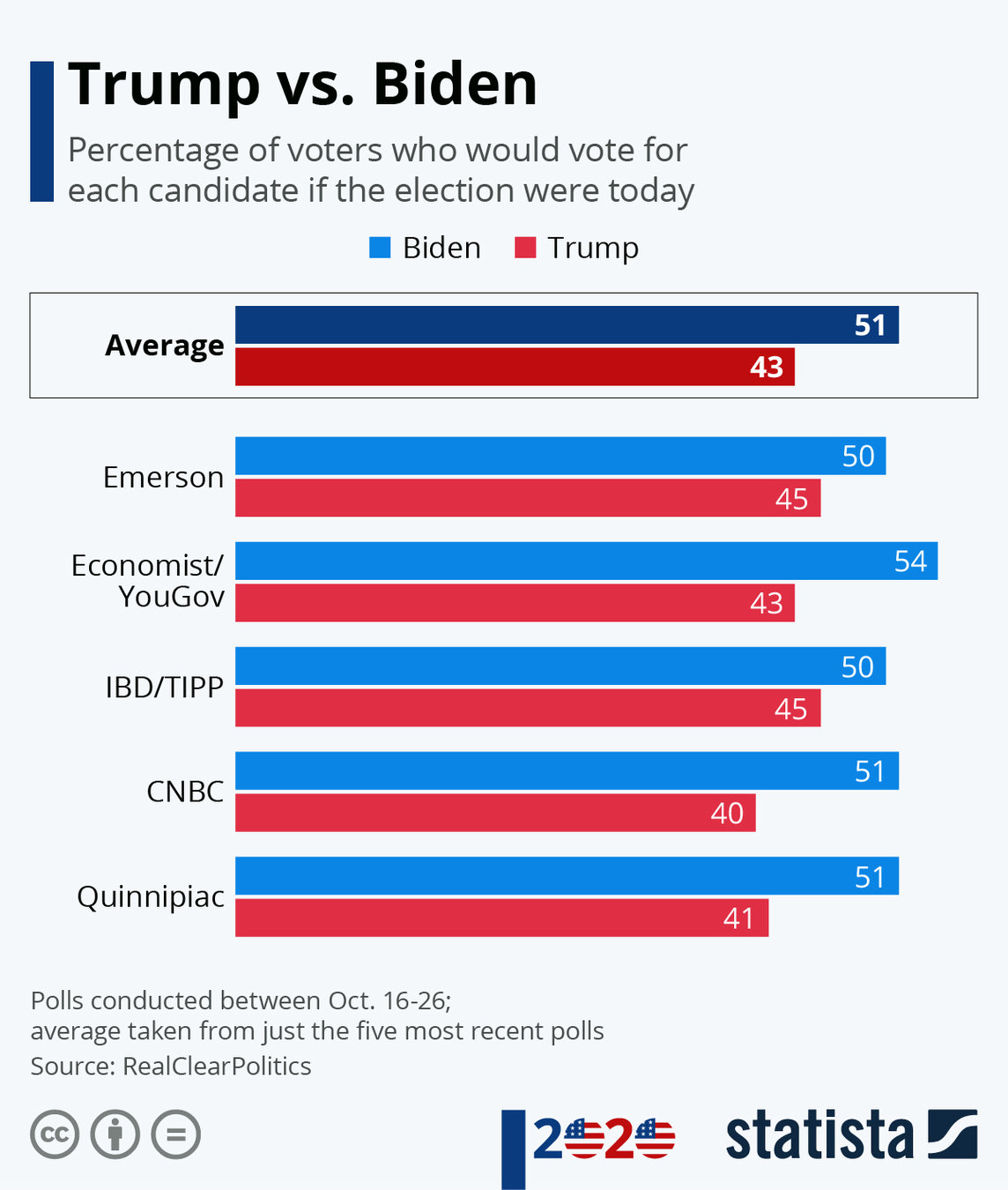
COLOUR
does matter
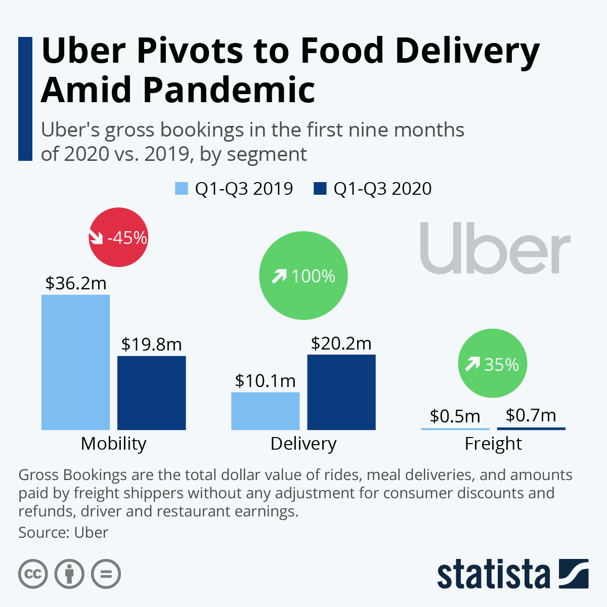
SIZE
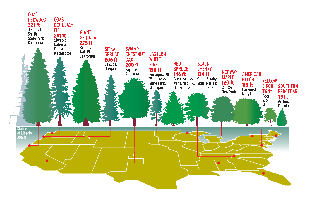
people don't like numbers
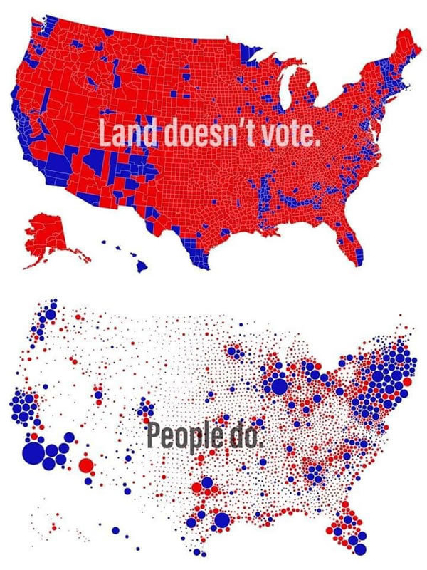
>> compare with something people can relate to
STORYTELLING
the logic of a headline OR think as a journalist
What's in it for me?
Validity of routine medical procedures (based on Meyer, Finn 2001)
OR
What employees and employers want to work on
OR
Top 5 health concerns
>> keep your text as tight as possible
>> people care about numbers people
MISTAKES
ending the infographic plague
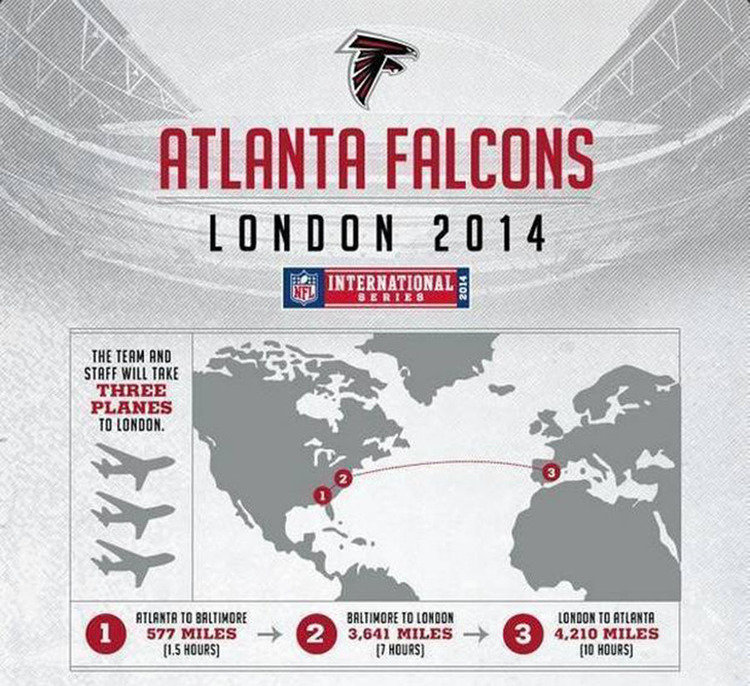
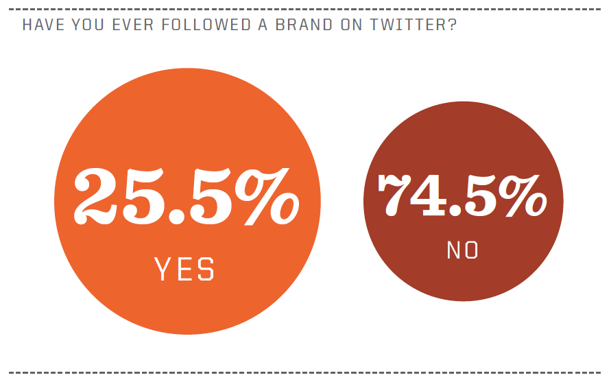
2. The wrong chart
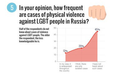
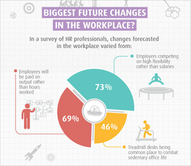
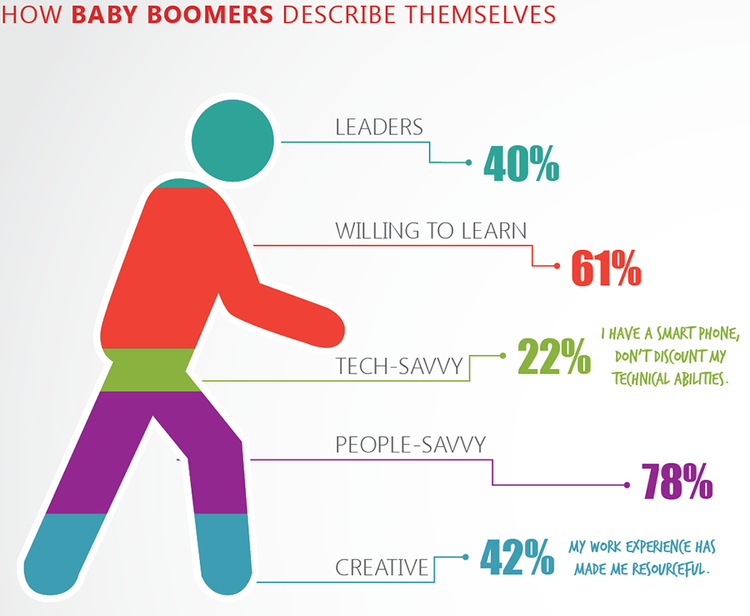
To choose the right type of chart,
just ask yourself if you want to:
-
Compare values:
- Bar chart
- Line chart
-
Show the individual parts that make up a whole:
- Pie chart
- Stacked bar
- Stacked column
-
Understand how the data is distributed:
- Scatter plot
- Line chart
- Bar chart
-
Analyze trends:
- Line chart
- Bar chart
-
Comprehend the relationship between data sets:
- Line chart
- Scatter plot
- Bubble chart
3. Too many data
copy paste data <> organize info

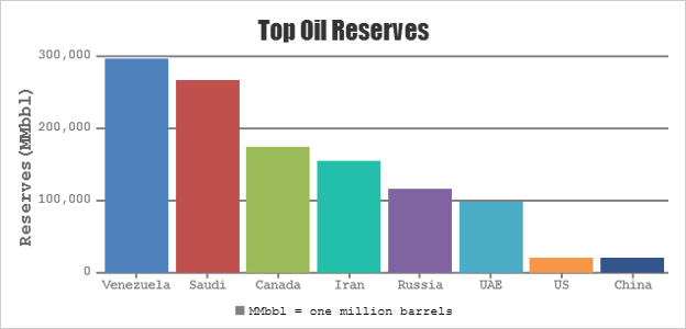
4. Lack of a consistent visual 'language'
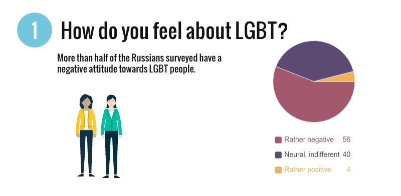
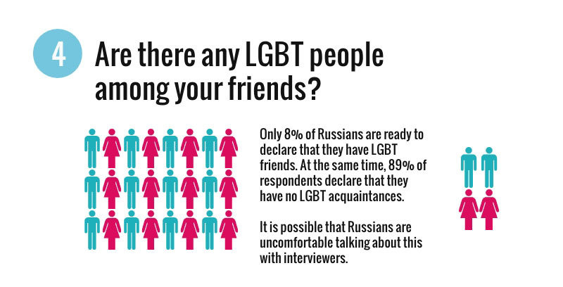
4. Context (use a clear legend)
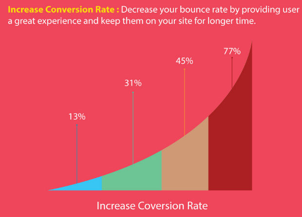
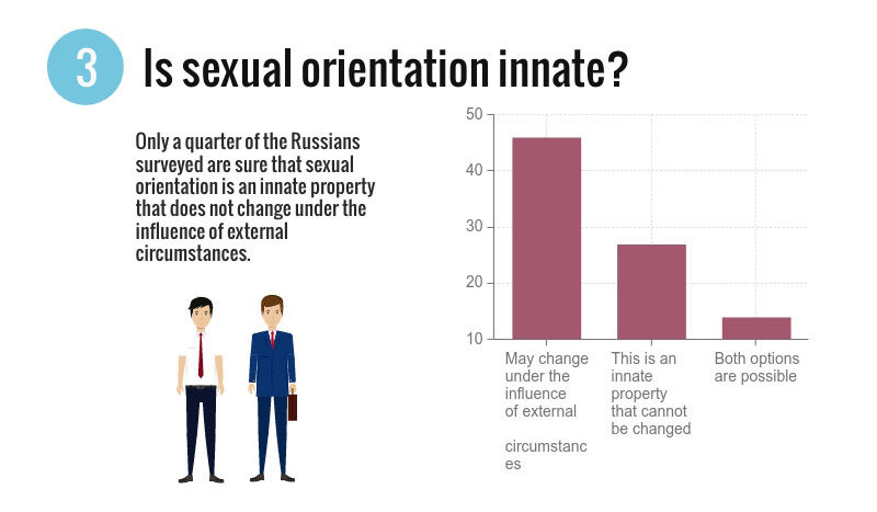
>> Make it granny proof
>> Do not forget to mention the source!
TOOLS

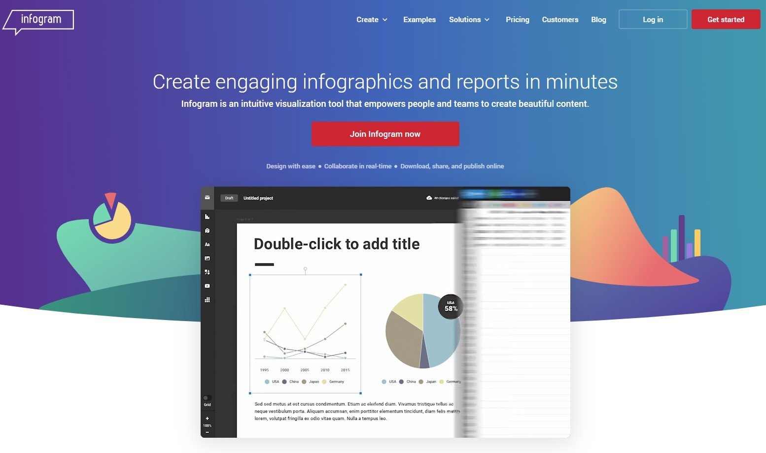


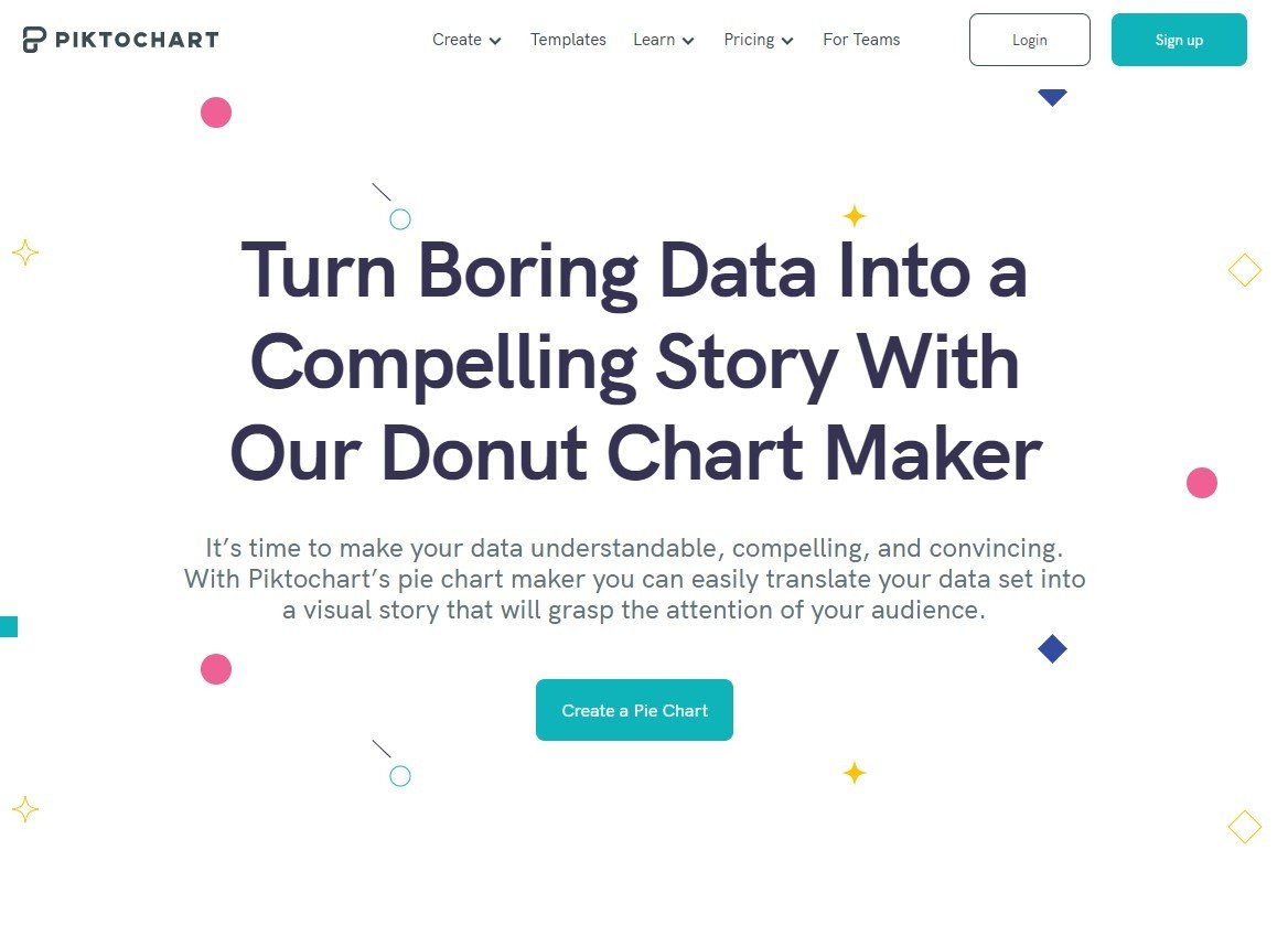
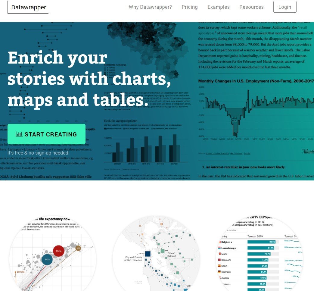
Interactive maps and infographics
datawrapper or Flourish

ASSIGNMENT
Inspiration lab 2022
Experiment with a plug & play tool
to visualise your research
* choose your own level of difficulty
* test the tool before you start
* make a screen print of the final result
or share the link (but test if it works!)
1 team
=
1 infographic*
* consumer + industry
Deadline
First draft = Tuesday 22/03 10:30 AM
FEEDBACK round on Thursday 24/03
Final version = Tuesday 29/03 10:30 AM
Canvas
