Sara Nayerian
Gr Des 75
Spring 2018
Place to go is an app to help you find the best places to go.Just say what you want and it will give you the best options
Problem:
not knowing where to go in different situations such as having fun with friends and family.
Solution:
Users can answer to the app's question by using the options on drop down menu. The app will analyses the answers and will give them all the available options which are sorted by the best rated to the least.
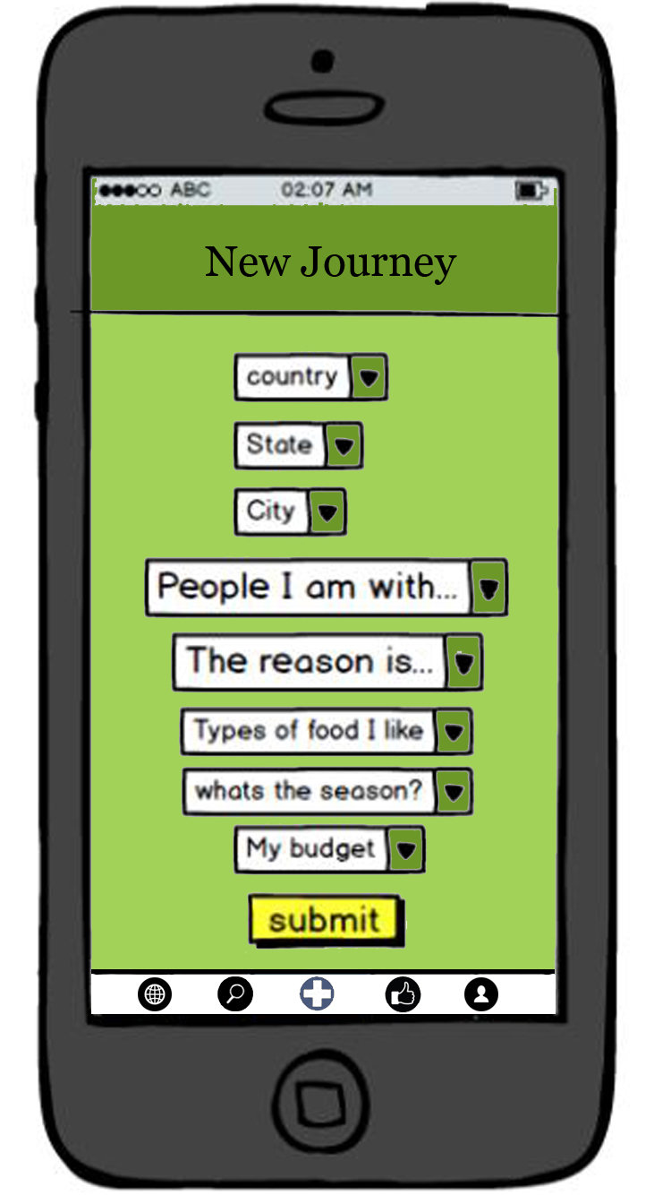


Questions
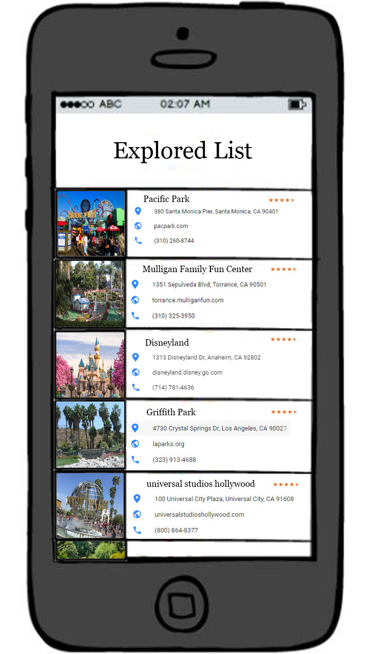
Options

choose and Read more information
Target Users:
anyone can use it especially young generation. this app can help the one who is seeking a fun place, romantic place, quiet place or a formal place.
Development Process:
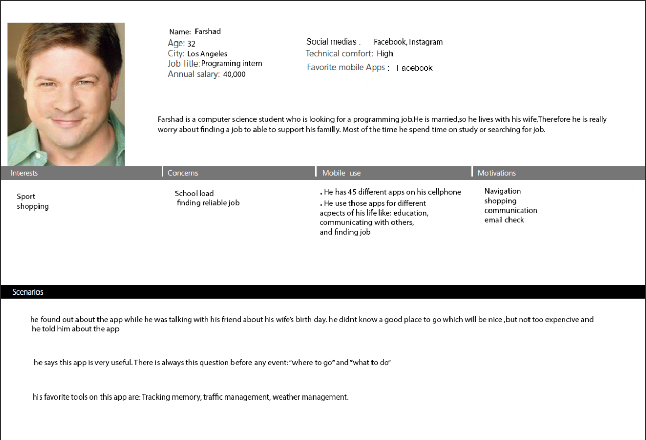
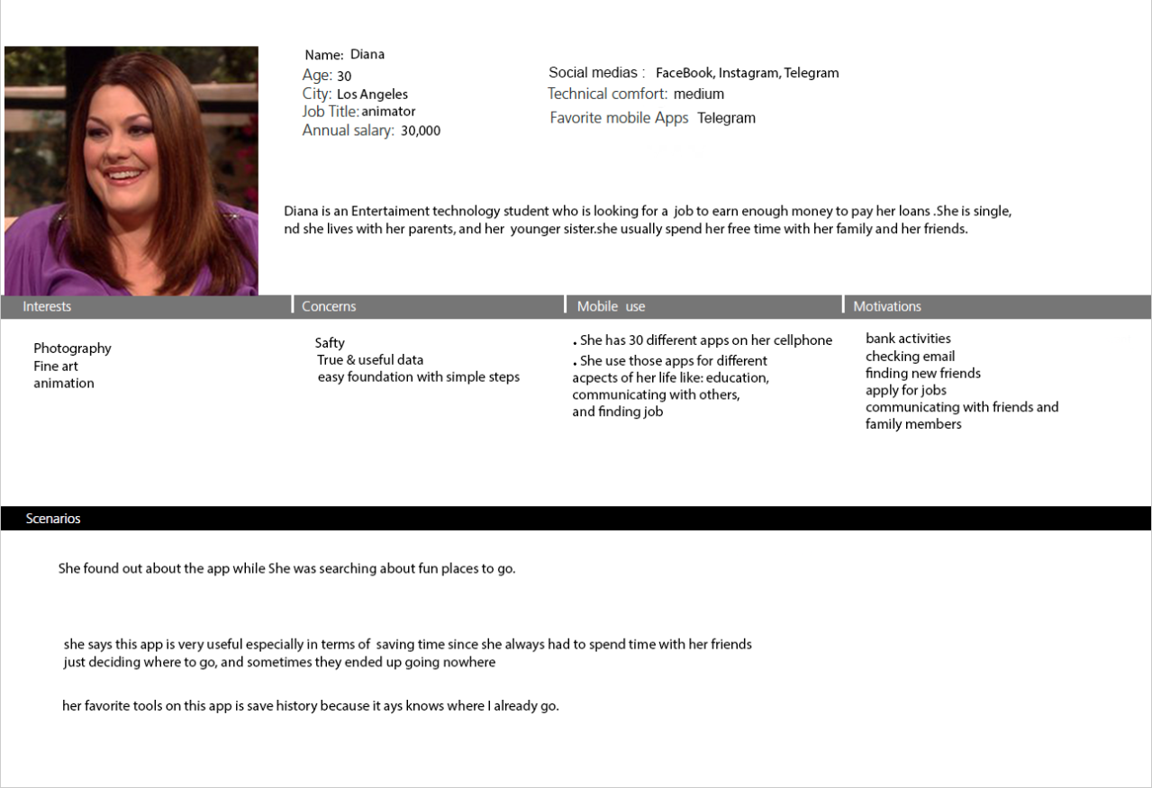
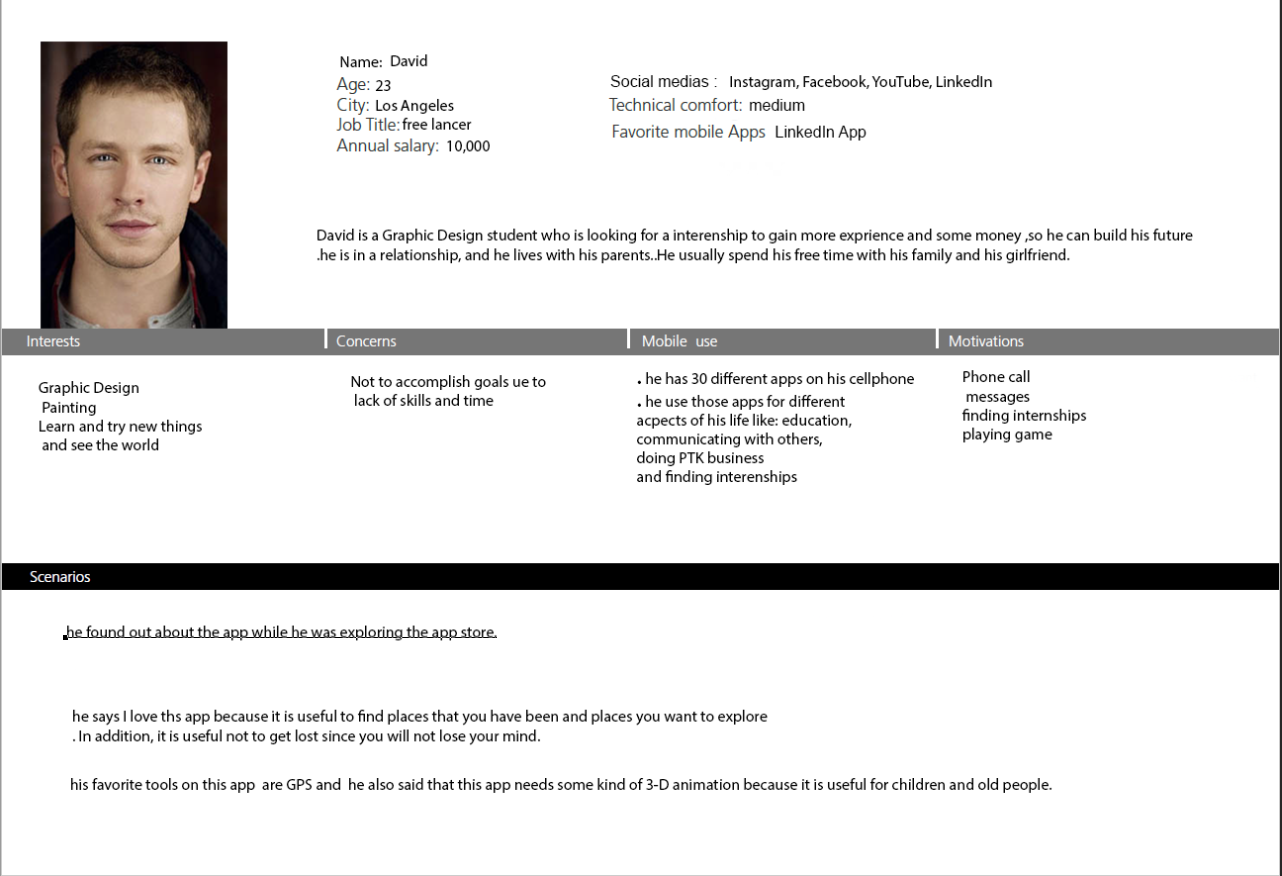
Personas:
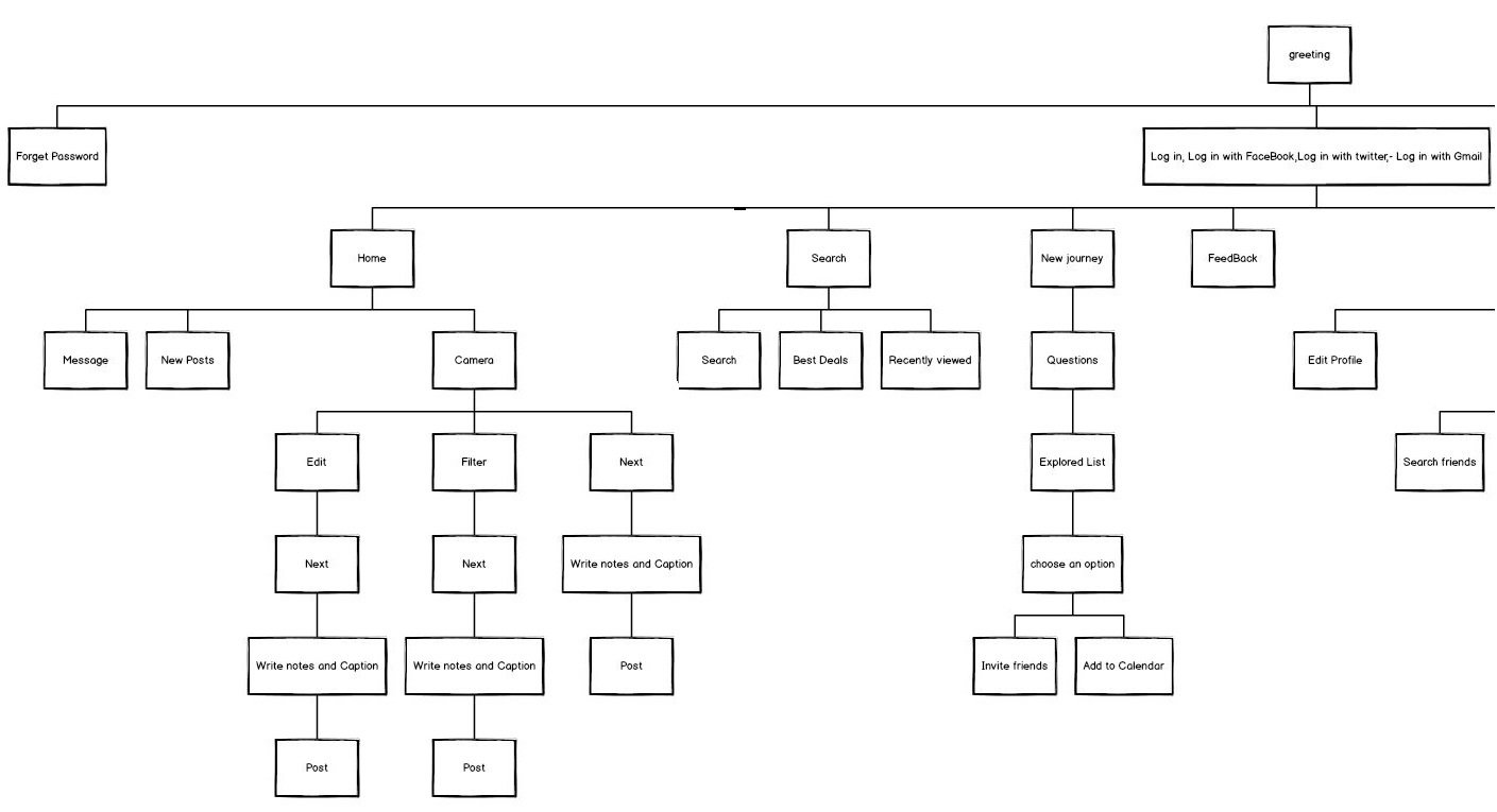
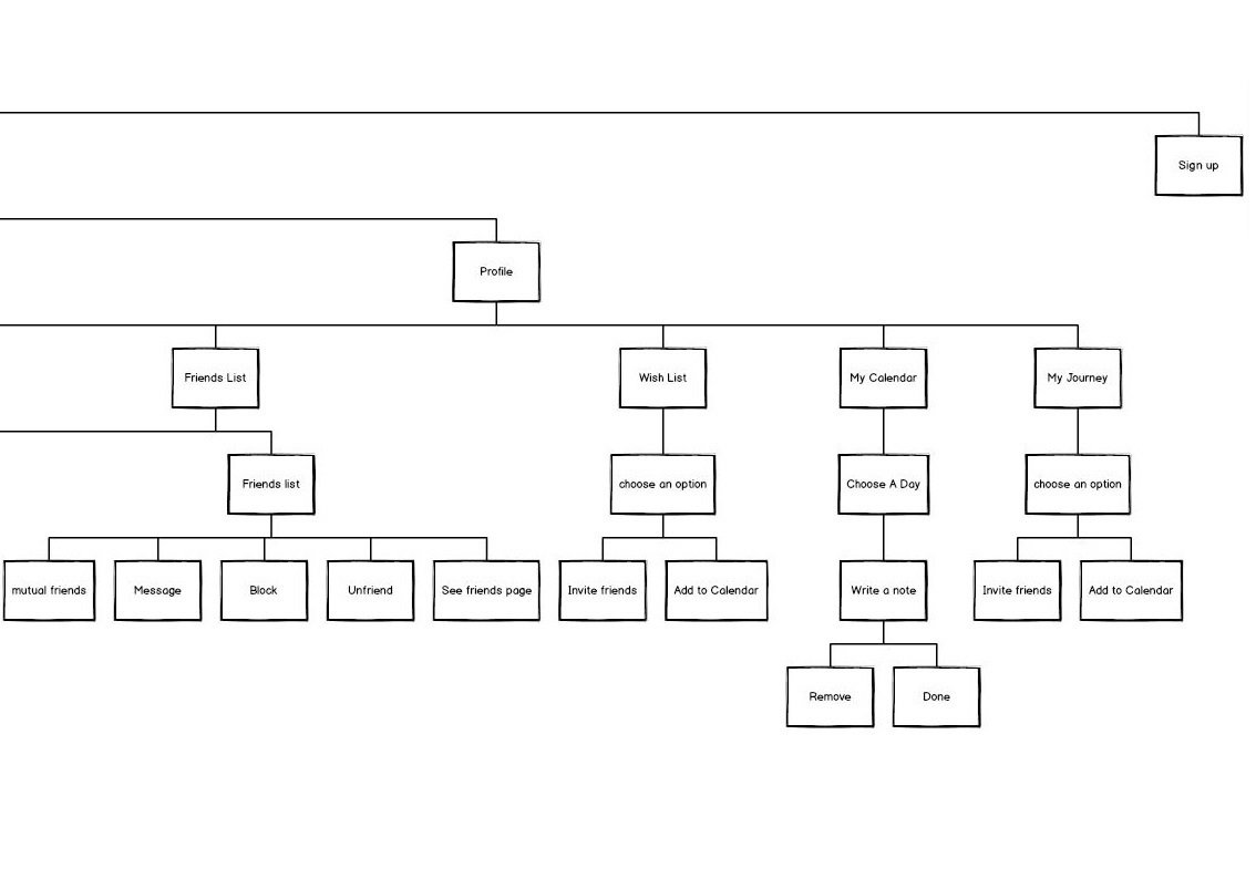
Flow chart:
=
clickable left and right:
Sketches & wire frames:
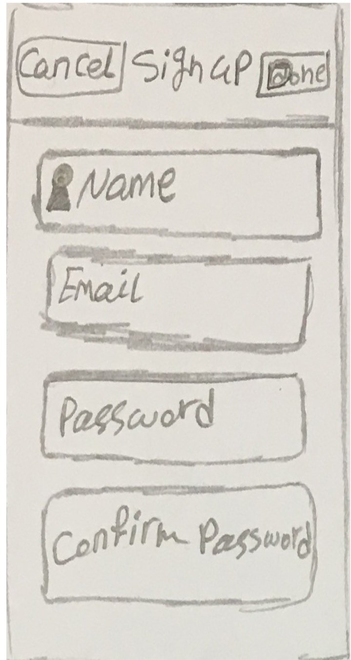

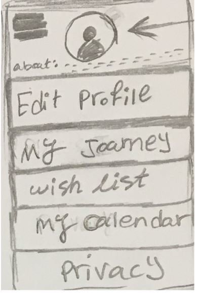

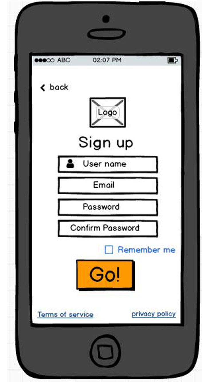
As I started thinking about the app I want to design, a lot of ideas came to my mind. Therefore I started doing some sketches. The sketches on this page were my final idea. However, when I looked at them again to make the wire-frame, I made some new changes
sign up: For the person who would change his/her mind about making a new account, I put cancel button.Then I realized that it doesn't look good, and it makes the top part so busy, so I put back button on top. I also put "Go" button instead of "Done" because it is more exciting, and its easier to see. Another change I made after doing researches on other applications was putting the terms of service and privacy policies buttons at the bottom of the page.
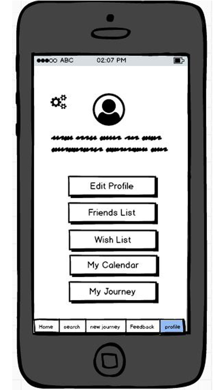
Profile: First I wanted to make a drop-down menu, but I realized that its hard to use, and It is much better if a user can see the options all the time, so I put the navigation bar at the bottom instead. I also changed the way that the buttons on the page look, so now they look more like buttons on the page that the way they were before. In addition, on the wire-frame, I put the setting button which I totally forgot to put it on my sketch.
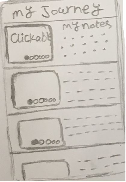


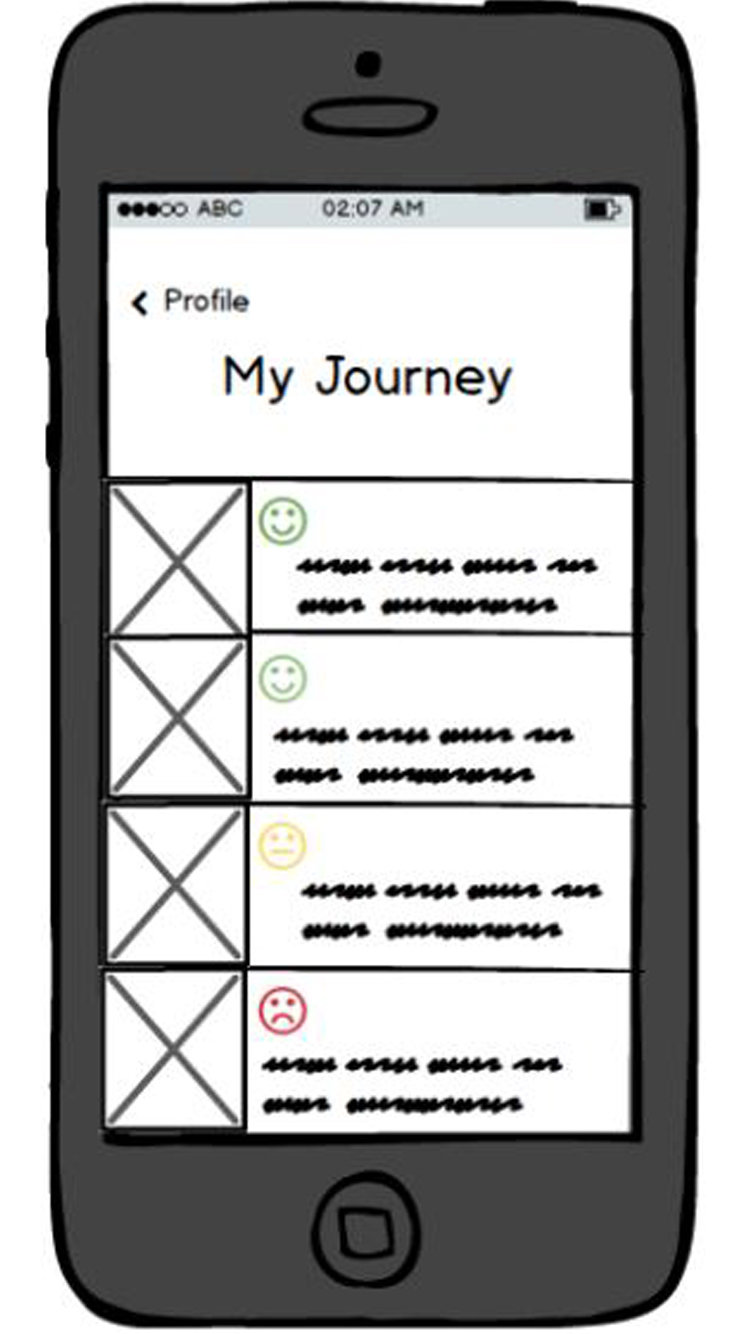
My Journey: This page is for saving the memory of the places that the user experience, so for the next trip she/he can decide if they want to go to that place again or not and why.on the sketch I put the note part plus pictures. on the wire-frame, I put just one picture because it is on the iPhone and it won't be big enough to have slides of photos. I also decided to put emojis on it as the overall impression, so they I can understand if it was good or bad without reading the text.
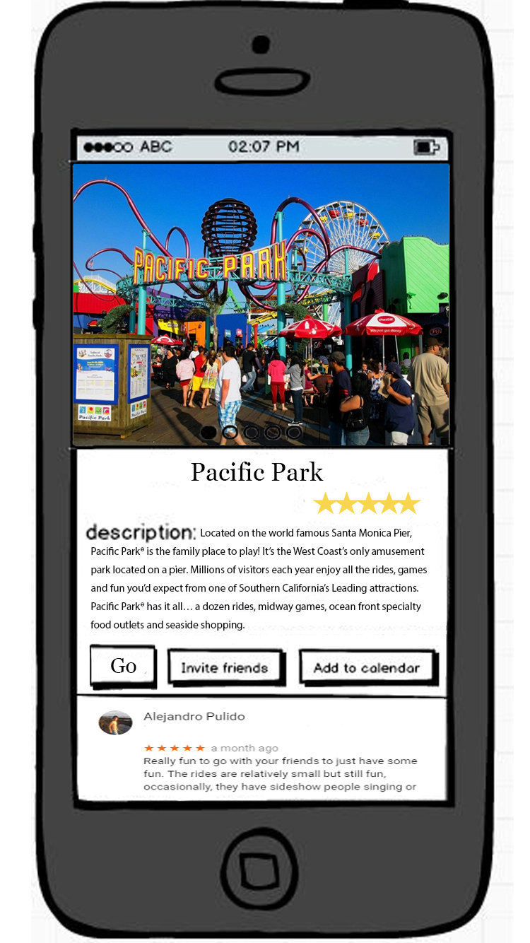
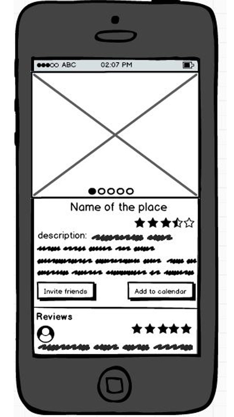
Details: this page has the general information of the place plus it shows the rate of it with stars and reviews.The only thing that I added to the wire-frame was the two buttons for "inviting friends" and "add to the calendar." However, on the final version, I also added a "go" button to directly go to the map and starting the trip.
Prototype:
https://invis.io/MWGQF5HD6XS
