Designing for Input
Beyond read-only interfaces

Table of Contents
The Humble Form
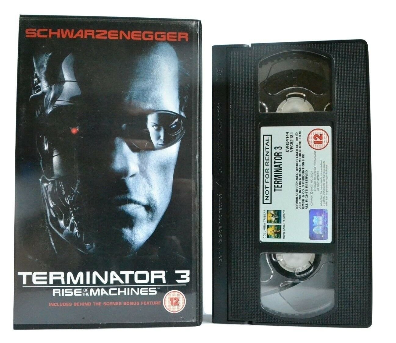
From typewriters to The Terminator
Web 2.0
The future that arrived yesterday
Forms are Scary
Textfields, radios, checkboxes, oh my!
The Post-form World
When forms are not forms
📋
👨🚀
👻
👽
📋 The Humble Form
From typewriters to The Terminator
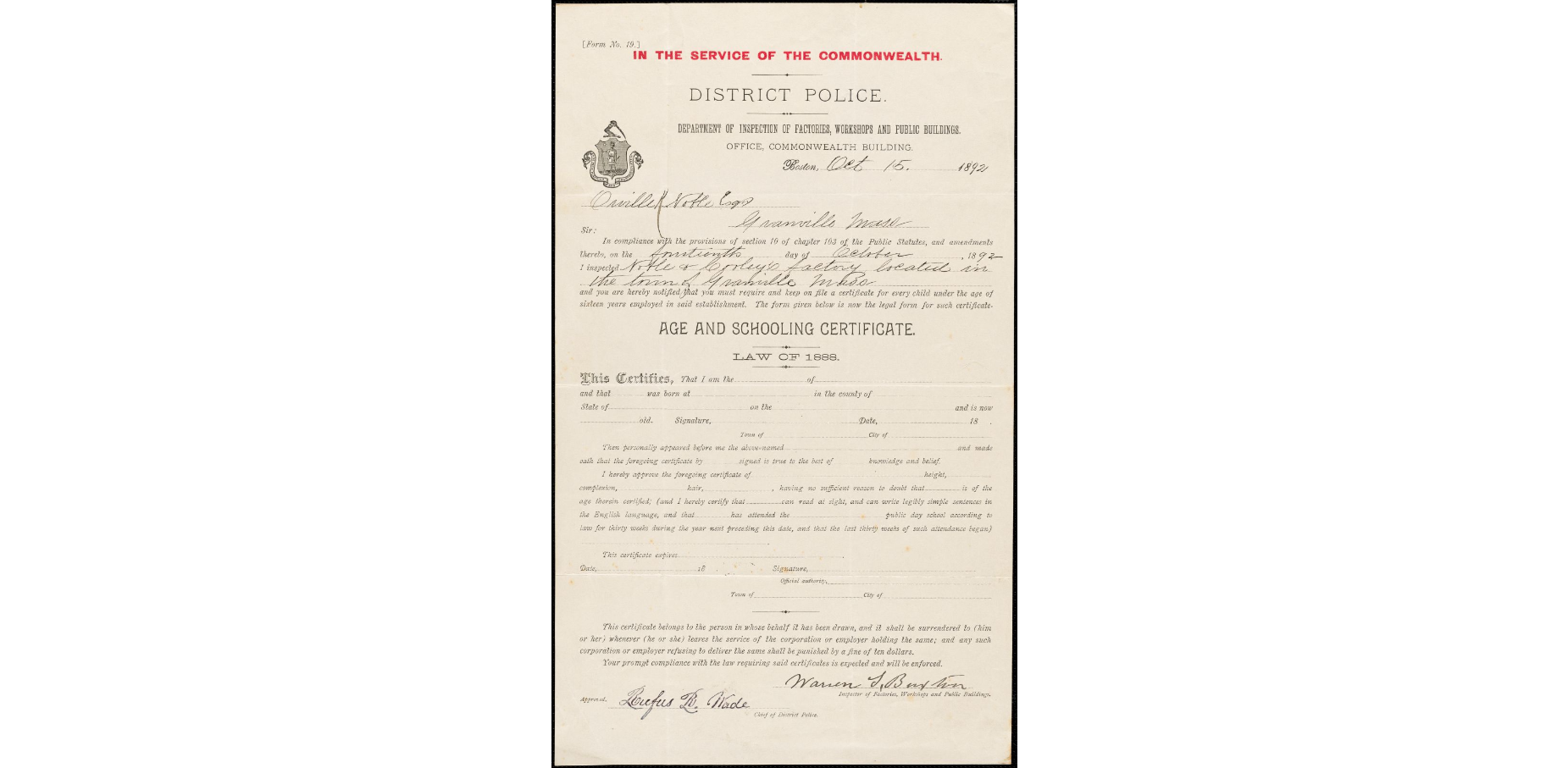


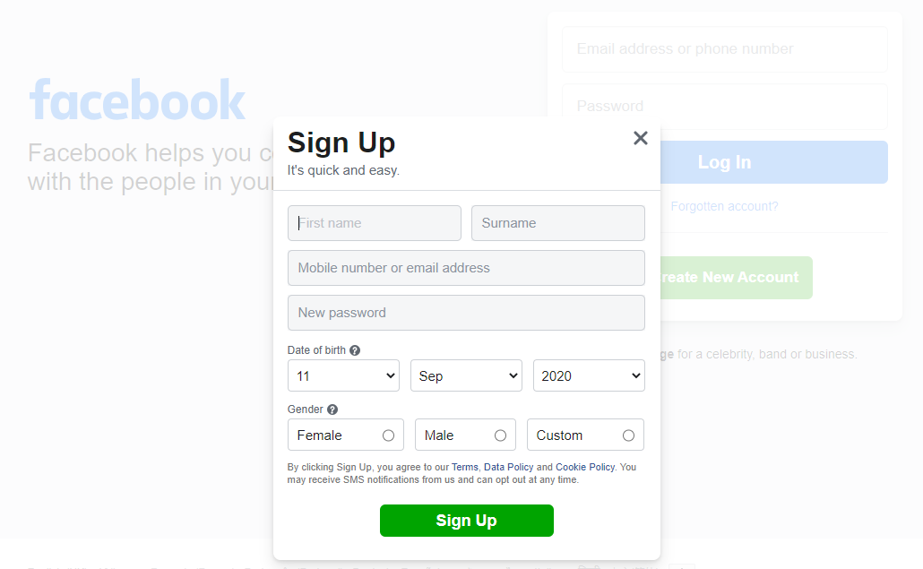
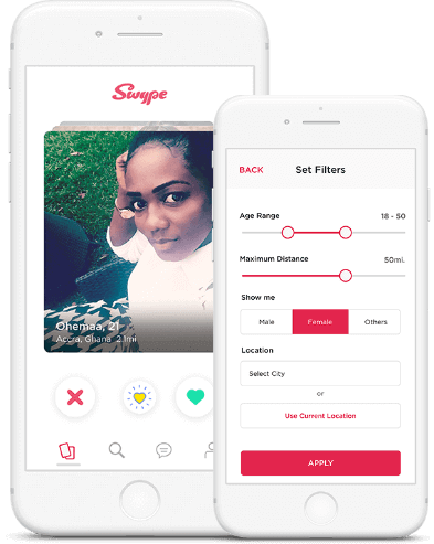

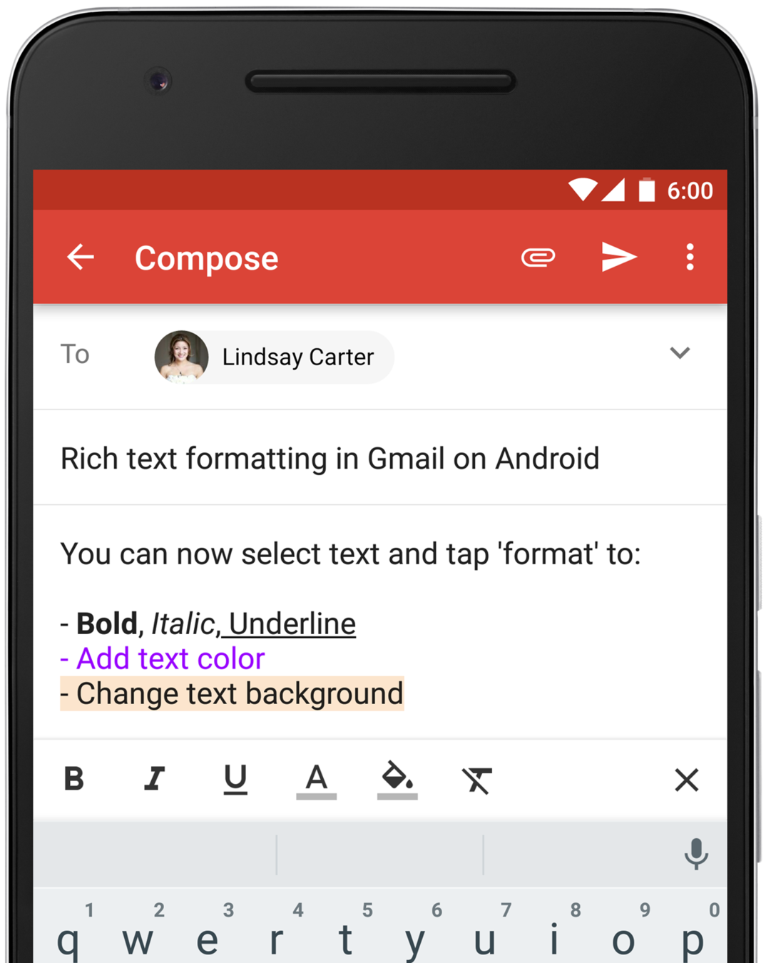
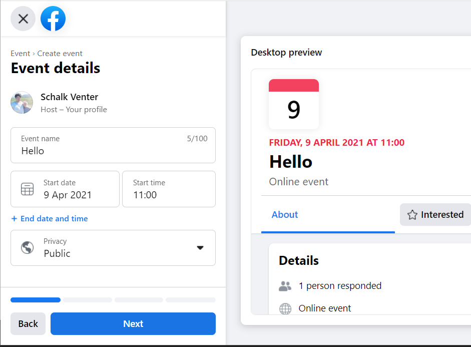

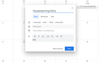

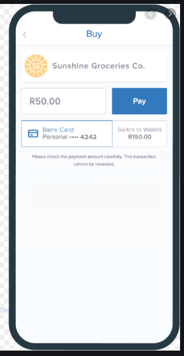


Commonality?


<form action="/authentication-url" method="post">
  <div>
    <label for="username-element">
      <span>Name:</span>
      <input type="text" id="username-element" name="username">
    </label>
  </div>

  <div>
    <label for="password-element">
      <span>Password</span>
      <input type="password" id="password-element" name="password">
    </label>
  </div>

  <button type="submit">Login</button>
</form>

Semiotic Inheritance
"The same applies to nonlinguistic signs. The small slit in the back of jackets, for instance, was once functional, serving to make it easier to mount a horse. Today most people are no longer aware of this. Yet it persists in the design of jackets."
Theo van Leeuwen
Introducing Social Semiotics (2005)


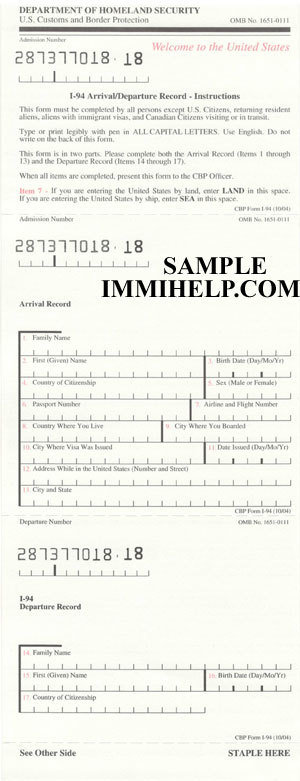
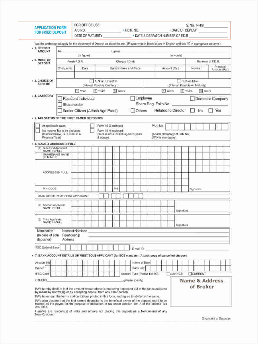
The OG Paper Form
"A form is a document with spaces (also named fields or placeholders) in which to write or select, for a series of documents with similar contents. [...] Forms have existed for a significant amount of time, with historians of law having discovered preprinted legal forms from the early 19th century that greatly simplified the task of drafting complaints and various other legal pleadings."
Wikipedia
Form (Document)

Typewriter Conventions
"Most forms ask questions. But to save words and therefore save space, the questions usually aren't written out. Instead of asking. "What is your age?" is is better simply to say "Age". [...] The visibility of captions in the upper corner of boxes permits the typist to read them without rolling the typewriter platen up and down as is required when the captions are below the line."
National Archives and Records Service
Record Management Handbook (1960)


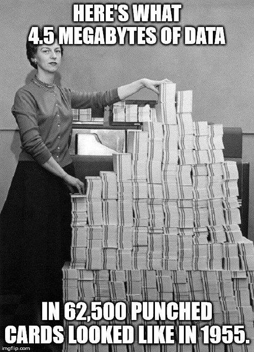
Punch Cards
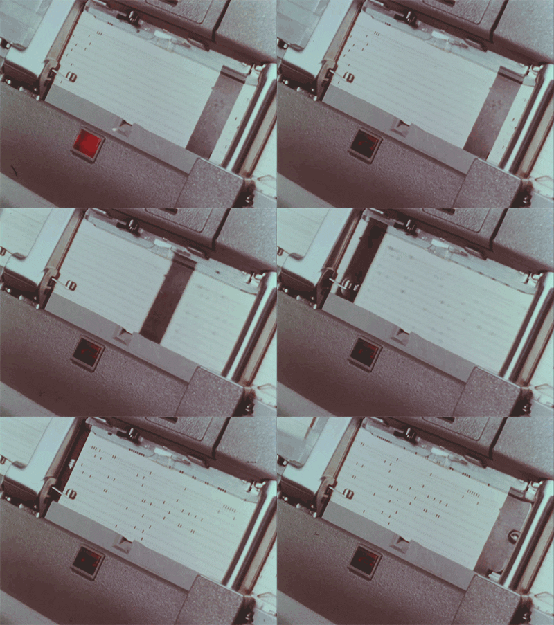
"At the end of the 1800s Herman Hollerith invented the recording of data on a medium that could then be read by a machine, developing punched card data processing technology for the 1890 U.S. census. [...] Printing could include having fields named and marked by vertical lines, logos, and more"
Wikipedia
Punched card

Input by Means of Paper
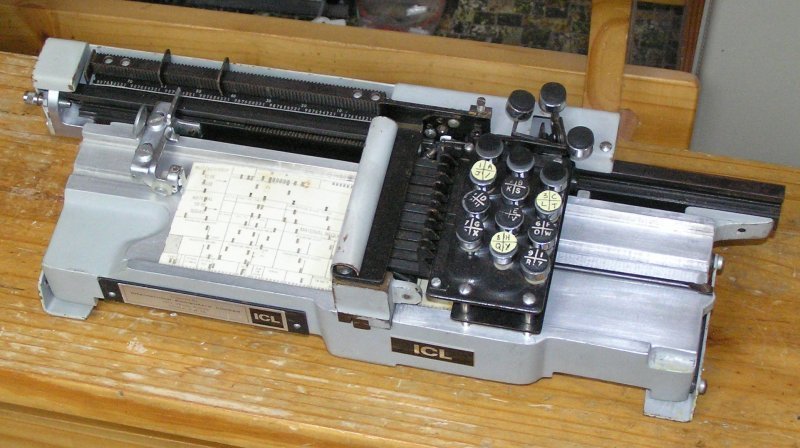
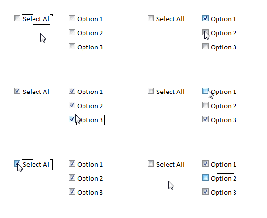

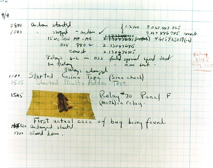
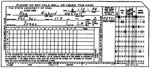


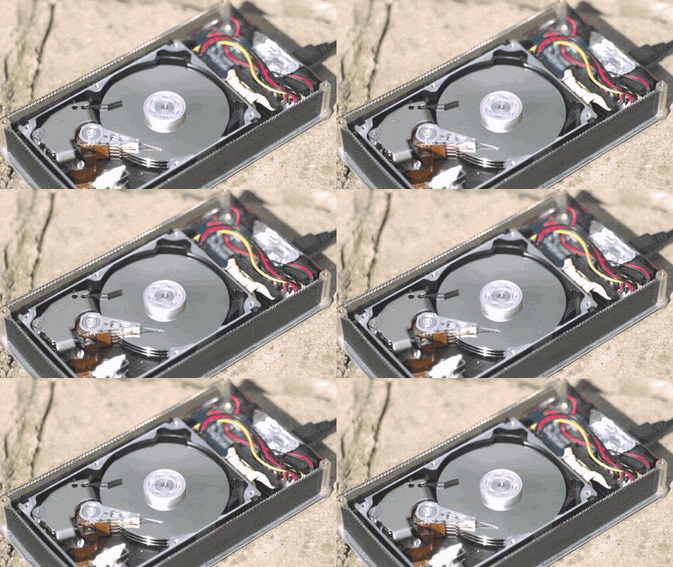
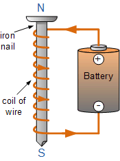
Input by Means of Magnets

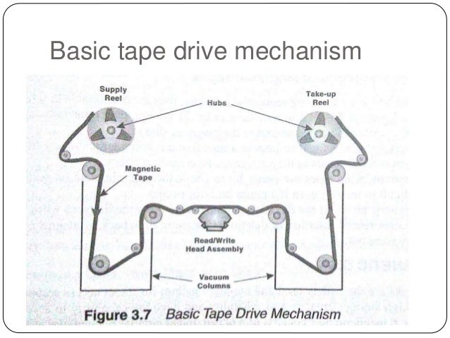
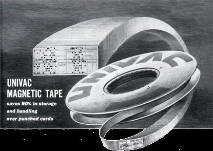
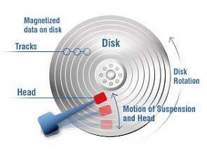

What Could Go Wrong?
Mental Model




The Humble Form
"Every meaningful interaction
that happens on the web is achieved by a form of some sort."
Adam Silver
Form Design Patterns (2018)

The Humble Form
"Every meaningful interaction
that happens on the web is achieved by a form of some sort."
Adam Silver
Form Design Patterns (2018)


The Humble Form
"Every meaningful interaction
that happens on the web is achieved by a form of some sort."
Adam Silver
Form Design Patterns (2018)


👨🚀 Web 2.0
The future that arrived yesterday
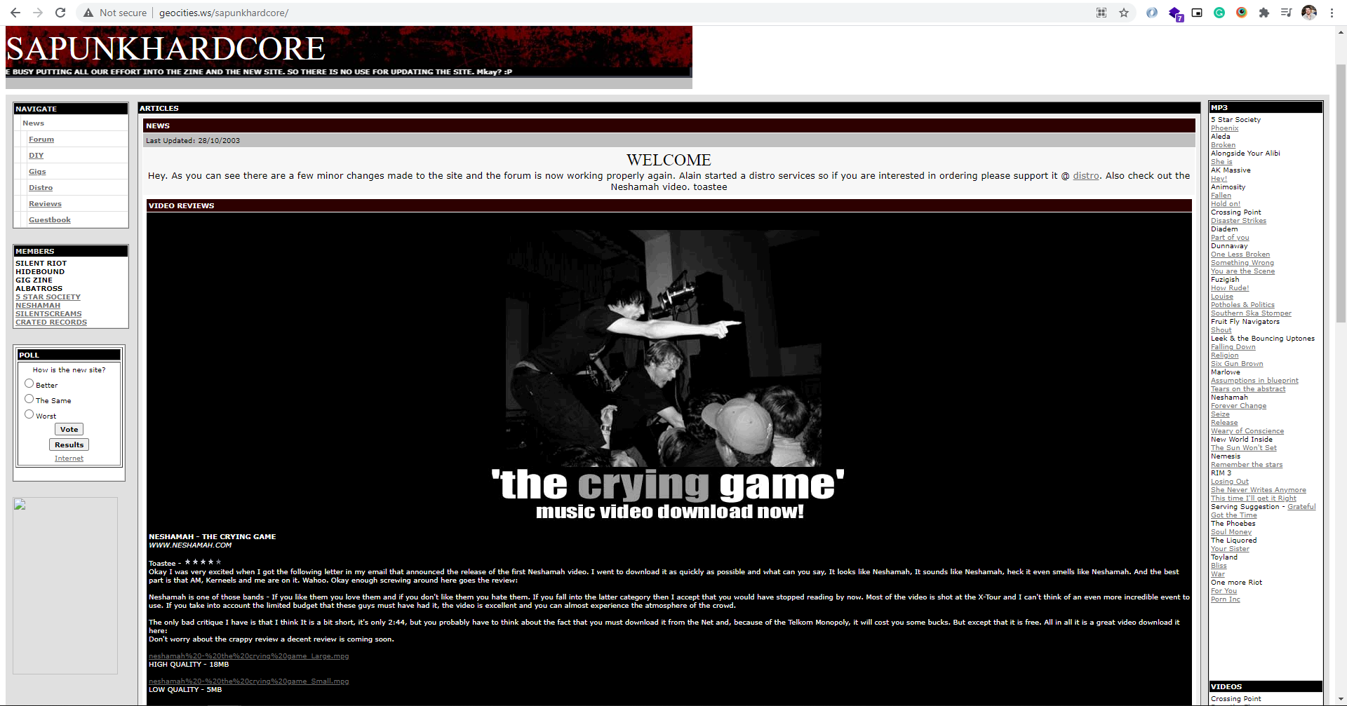
2003


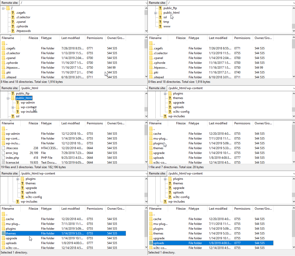
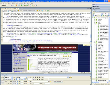
The End of User Input?
"Berners-Lee envisioned a read/write Web. But what had emerged in the 1990s was an essentially read-only Web on which you needed an account with an ISP (Internet service provider) to host your web site, special tools, and/or HTML expertise to create a decent site."

Dan Gillmor
We The Media (2006)

The End of User Input?
"Berners-Lee envisioned a read/write Web. But what had emerged in the 1990s was an essentially read-only Web on which you needed an account with an ISP (Internet service provider) to host your web site, special tools, and/or HTML expertise to create a decent site."

Dan Gillmor
We The Media (2006)

The End of User Input?
"Berners-Lee envisioned a read/write Web. But what had emerged in the 1990s was an essentially read-only Web on which you needed an account with an ISP (Internet service provider) to host your web site, special tools, and/or HTML expertise to create a decent site."

Dan Gillmor
We The Media (2006)

The End of User Input?
"Berners-Lee envisioned a read/write Web. But what had emerged in the 1990s was an essentially read-only Web on which you needed an account with an ISP (Internet service provider) to host your web site, special tools, and/or HTML expertise to create a decent site."

Dan Gillmor
We The Media (2006)

The End of User Input?
"Berners-Lee envisioned a read/write Web. But what had emerged in the 1990s was an essentially read-only Web on which you needed an account with an ISP (Internet service provider) to host your web site, special tools, and/or HTML expertise to create a decent site."

Dan Gillmor
We The Media (2006)

The End of User Input?
"Berners-Lee envisioned a read/write Web. But what had emerged in the 1990s was an essentially read-only Web on which you needed an account with an ISP (Internet service provider) to host your web site, special tools, and/or HTML expertise to create a decent site."

Dan Gillmor
We The Media (2006)

Web 2.0
"Even your grand-mother can recognize a Web page by its typical brochure-like displays of Times or Arial text, eye-grabbing graphics, and highlighted hyper-links. What we need to remember, though, is that the Web, as we know it now, is a fleeting thing. [...] The Web will be understood not as screenfuls of text and graphics but as a transport mechanism, the ether through which interactivity happens."
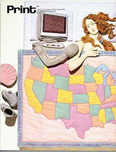
Darcy DiNucci
Print Magazine (1999)

Web 2.0
"Even your grand-mother can recognize a Web page by its typical brochure-like displays of Times or Arial text, eye-grabbing graphics, and highlighted hyper-links. What we need to remember, though, is that the Web, as we know it now, is a fleeting thing. [...] The Web will be understood not as screenfuls of text and graphics but as a transport mechanism, the ether through which interactivity happens."

Darcy DiNucci
Print Magazine (1999)

Web 2.0
"Even your grand-mother can recognize a Web page by its typical brochure-like displays of Times or Arial text, eye-grabbing graphics, and highlighted hyper-links. What we need to remember, though, is that the Web, as we know it now, is a fleeting thing. [...] The Web will be understood not as screenfuls of text and graphics but as a transport mechanism, the ether through which interactivity happens."

Darcy DiNucci
Print Magazine (1999)

Web 2.0
"Even your grand-mother can recognize a Web page by its typical brochure-like displays of Times or Arial text, eye-grabbing graphics, and highlighted hyper-links. What we need to remember, though, is that the Web, as we know it now, is a fleeting thing. [...] The Web will be understood not as screenfuls of text and graphics but as a transport mechanism, the ether through which interactivity happens."

Darcy DiNucci
Print Magazine (1999)

Web 2.0
"Even your grand-mother can recognize a Web page by its typical brochure-like displays of Times or Arial text, eye-grabbing graphics, and highlighted hyper-links. What we need to remember, though, is that the Web, as we know it now, is a fleeting thing. [...] The Web will be understood not as screenfuls of text and graphics but as a transport mechanism, the ether through which interactivity happens."

Darcy DiNucci
Print Magazine (1999)

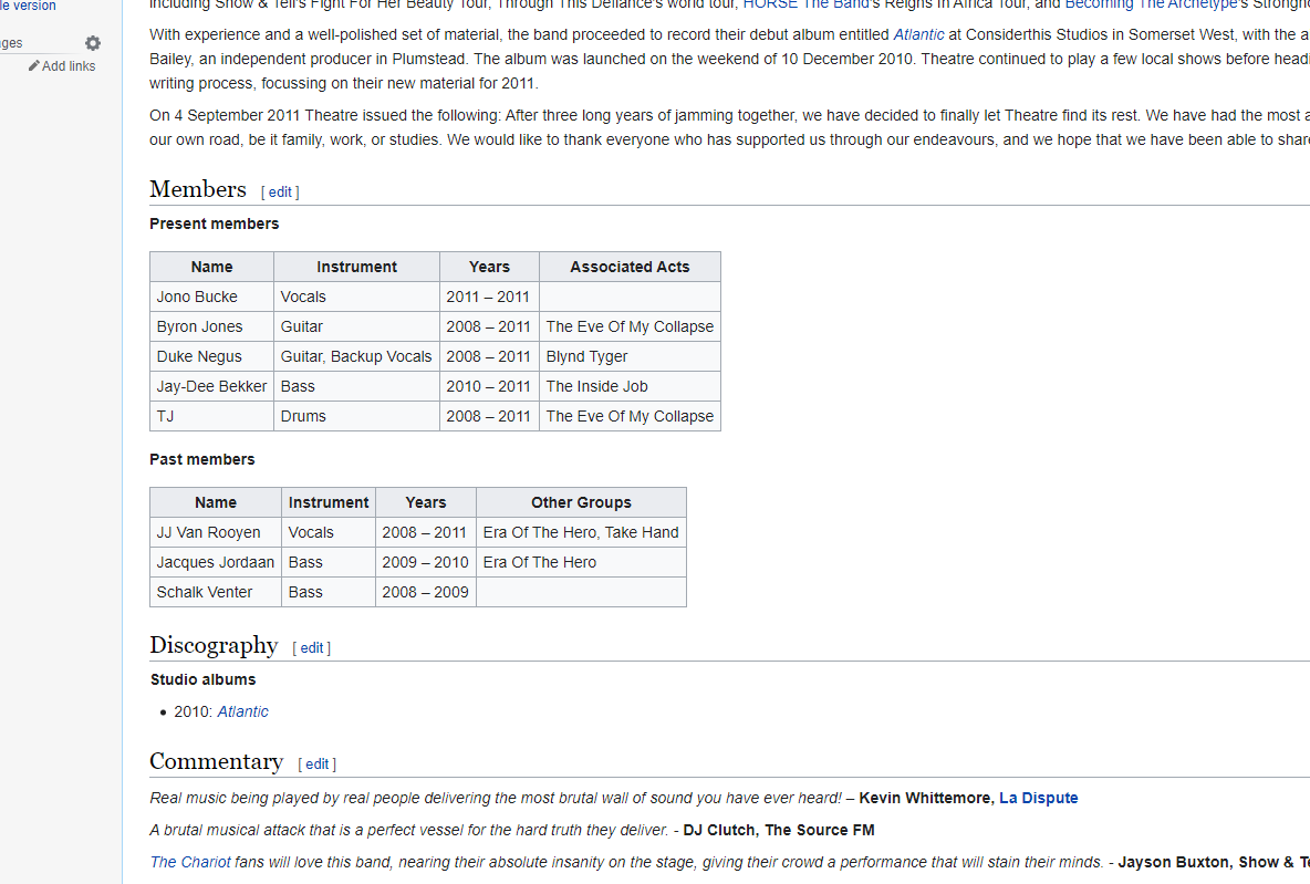
2009
Web 1.0
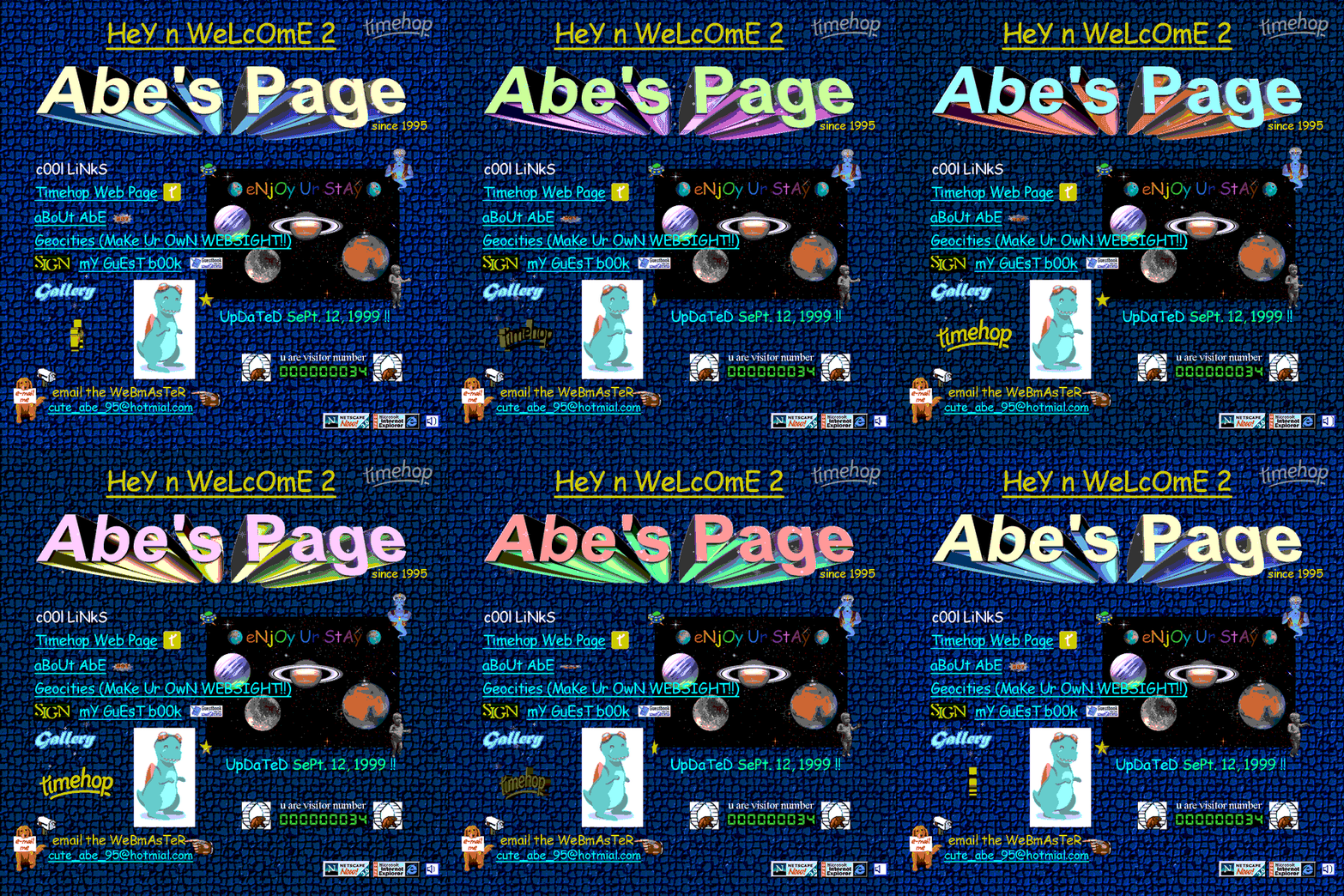
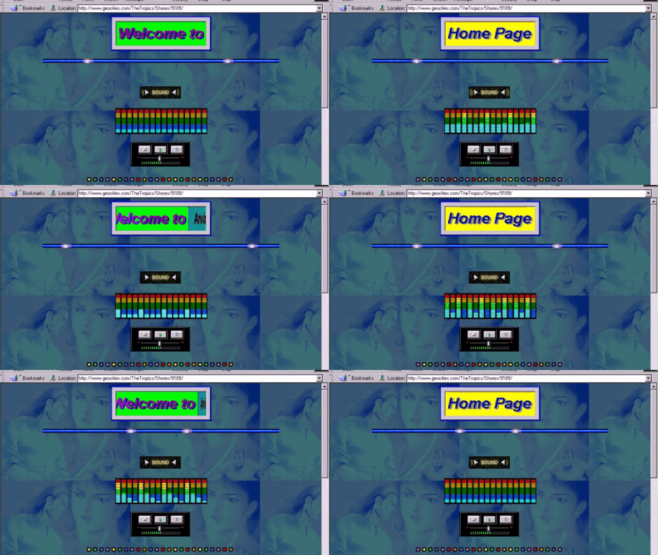
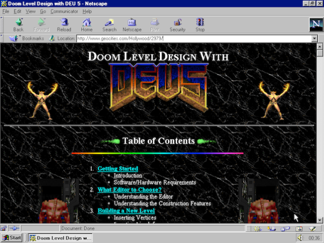
"Web 1.0 is a retronym referring to the first stage of the World Wide Web's evolution, from roughly 1991 to 2004. [...] Personal web pages were common, consisting mainly of static pages hosted on ISP-run web servers, or on free web hosting services such as Tripod and defunct GeoCities."
Wikipedia
Web 2.0
Web 1.0

Web 1.0

Wikipedia
Web 2.0
Web 1.0

"Web 1.0 is a retronym referring to the first stage of the World Wide Web's evolution, from roughly 1991 to 2004. [...] Personal web pages were common, consisting mainly of static pages hosted on ISP-run web servers, or on free web hosting services such as Tripod and defunct GeoCities."
Web 1.0

Wikipedia
Web 2.0
Web 1.0

"Web 1.0 is a retronym referring to the first stage of the World Wide Web's evolution, from roughly 1991 to 2004. [...] Personal web pages were common, consisting mainly of static pages hosted on ISP-run web servers, or on free web hosting services such as Tripod and defunct GeoCities."
Web 1.0

Wikipedia
Web 2.0
Web 1.0

"Web 1.0 is a retronym referring to the first stage of the World Wide Web's evolution, from roughly 1991 to 2004. [...] Personal web pages were common, consisting mainly of static pages hosted on ISP-run web servers, or on free web hosting services such as Tripod and defunct GeoCities."
Web 1.0

Wikipedia
Web 2.0
Web 1.0

"Web 1.0 is a retronym referring to the first stage of the World Wide Web's evolution, from roughly 1991 to 2004. [...] Personal web pages were common, consisting mainly of static pages hosted on ISP-run web servers, or on free web hosting services such as Tripod and defunct GeoCities."
Web 1.0

Wikipedia
Web 2.0
Web 1.0

"Web 1.0 is a retronym referring to the first stage of the World Wide Web's evolution, from roughly 1991 to 2004. [...] Personal web pages were common, consisting mainly of static pages hosted on ISP-run web servers, or on free web hosting services such as Tripod and defunct GeoCities."
Web 1.0

Wikipedia
Web 2.0
Web 1.0

"Web 1.0 is a retronym referring to the first stage of the World Wide Web's evolution, from roughly 1991 to 2004. [...] Personal web pages were common, consisting mainly of static pages hosted on ISP-run web servers, or on free web hosting services such as Tripod and defunct GeoCities."
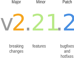
2.0 Etymology
"The minor version is incremented for releases which add new, but backward-compatible, API features, and the major version is incremented for API changes which are not backward-compatible. For example, software which relies on version 2.1.5 of an API is compatible with version 2.2.3, but not necessarily with 3.2.4."
Wikipedia
Software versioning

The Driving Engine
"Want to join a fun new social network? Just fill in this form. Care to share this great video with a close friend? Just fill in a form. Want to respond to an interesting author’s blog post? You guessed it—a form. Just about everywhere people want to participate in social interactions online, forms get in the way."
Luke Wroblewski
Web Form Design (2008)



👻 Form Input is Scary
Textfields, radios, checkboxes, oh my!
Forms are Deceptive
"At first glance, forms are rather easy to grasp. In less than an hour, you’ll have text boxes, radio buttons and select boxes on the page. But their low barrier to entry turns them into what Heydon Pickering refers to as a “10,000-volt electromagnet for attracting usability problems."
Adam Silver
Form Design Patterns (2018)


"It’s hard to imagine a form that could be simpler: two fields, two buttons, and one link. Yet, it turns out this form was preventing customers from purchasing products from a major e-commerce site, to the tune of $300,000,000 a year. What was even worse: the designers of the site had no clue there was even a problem."
Jared M. Spool
The $300 Million Button

$300000000 / year

"It’s hard to imagine a form that could be simpler: two fields, two buttons, and one link. Yet, it turns out this form was preventing customers from purchasing products from a major e-commerce site, to the tune of $300,000,000 a year. What was even worse: the designers of the site had no clue there was even a problem."
Jared M. Spool
The $300 Million Button

$300000000 / year

"It’s hard to imagine a form that could be simpler: two fields, two buttons, and one link. Yet, it turns out this form was preventing customers from purchasing products from a major e-commerce site, to the tune of $300,000,000 a year. What was even worse: the designers of the site had no clue there was even a problem."
Jared M. Spool
The $300 Million Button

$300000000 / year

"It’s hard to imagine a form that could be simpler: two fields, two buttons, and one link. Yet, it turns out this form was preventing customers from purchasing products from a major e-commerce site, to the tune of $300,000,000 a year. What was even worse: the designers of the site had no clue there was even a problem."
Jared M. Spool
The $300 Million Button

$300000000 / year

"It’s hard to imagine a form that could be simpler: two fields, two buttons, and one link. Yet, it turns out this form was preventing customers from purchasing products from a major e-commerce site, to the tune of $300,000,000 a year. What was even worse: the designers of the site had no clue there was even a problem."
Jared M. Spool
The $300 Million Button

$300000000 / year

"It’s hard to imagine a form that could be simpler: two fields, two buttons, and one link. Yet, it turns out this form was preventing customers from purchasing products from a major e-commerce site, to the tune of $300,000,000 a year. What was even worse: the designers of the site had no clue there was even a problem."
Jared M. Spool
The $300 Million Button

$300000000 / year

"It’s hard to imagine a form that could be simpler: two fields, two buttons, and one link. Yet, it turns out this form was preventing customers from purchasing products from a major e-commerce site, to the tune of $300,000,000 a year. What was even worse: the designers of the site had no clue there was even a problem."
Jared M. Spool
The $300 Million Button

$300000000 / year

"It’s hard to imagine a form that could be simpler: two fields, two buttons, and one link. Yet, it turns out this form was preventing customers from purchasing products from a major e-commerce site, to the tune of $300,000,000 a year. What was even worse: the designers of the site had no clue there was even a problem."
Jared M. Spool
The $300 Million Button

$300000000 / year

"It’s hard to imagine a form that could be simpler: two fields, two buttons, and one link. Yet, it turns out this form was preventing customers from purchasing products from a major e-commerce site, to the tune of $300,000,000 a year. What was even worse: the designers of the site had no clue there was even a problem."
Jared M. Spool
The $300 Million Button

$300000000 / year

Scary for Users Too
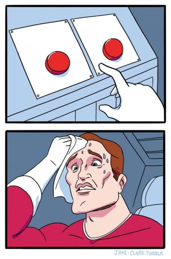
"a quick round of eyetracking tests and have analyzed the resulting data to better understand what makes Web forms usable—or unusable. [...] Rookies needed reassurance that their actions were correct, so while typing search strings, they continually checked whether the input field they were using was actually the search field."

Matteo Penzo
Evaluating The Usability of Search Forms (2006)
Scary for Users Too
"a quick round of eyetracking tests and have analyzed the resulting data to better understand what makes Web forms usable—or unusable. [...] Rookies needed reassurance that their actions were correct, so while typing search strings, they continually checked whether the input field they were using was actually the search field."

Matteo Penzo
Evaluating The Usability of Search Forms (2006)

Scary for Users Too
"a quick round of eyetracking tests and have analyzed the resulting data to better understand what makes Web forms usable—or unusable. [...] Rookies needed reassurance that their actions were correct, so while typing search strings, they continually checked whether the input field they were using was actually the search field."

Matteo Penzo
Evaluating The Usability of Search Forms (2006)

Scary for Users Too
"a quick round of eyetracking tests and have analyzed the resulting data to better understand what makes Web forms usable—or unusable. [...] Rookies needed reassurance that their actions were correct, so while typing search strings, they continually checked whether the input field they were using was actually the search field."

Matteo Penzo
Evaluating The Usability of Search Forms (2006)

Scary for Users Too
"a quick round of eyetracking tests and have analyzed the resulting data to better understand what makes Web forms usable—or unusable. [...] Rookies needed reassurance that their actions were correct, so while typing search strings, they continually checked whether the input field they were using was actually the search field."

Matteo Penzo
Evaluating The Usability of Search Forms (2006)

Scary for Users Too
"a quick round of eyetracking tests and have analyzed the resulting data to better understand what makes Web forms usable—or unusable. [...] Rookies needed reassurance that their actions were correct, so while typing search strings, they continually checked whether the input field they were using was actually the search field."

Matteo Penzo
Evaluating The Usability of Search Forms (2006)

Acceptance
"Forms suck.
We should design accordingly."
Luke Wroblewski
Web Form Design (2008)


Acceptance
"Forms suck.
We should design accordingly."
Luke Wroblewski
Web Form Design (2008)


Acceptance
"Forms suck.
We should design accordingly."
Luke Wroblewski
Web Form Design (2008)


👽 The Post-form World
When a forms are not forms
Commonality?


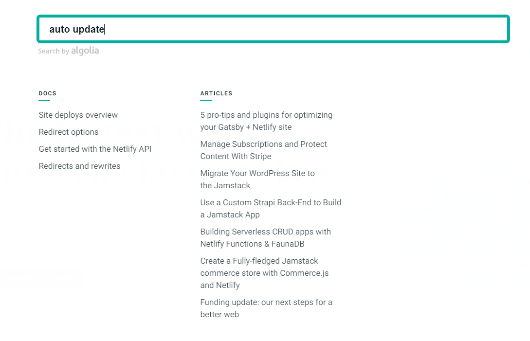
Commonality?


AJAX

Definition
"Ajax (also AJAX /ˈeɪdʒæks/; short for "Asynchronous JavaScript and XML") is a set of web development techniques using many web technologies on the client side to create asynchronous web applications. With Ajax, web applications can send and retrieve data from a server asynchronously (in the background) without interfering with the display and behaviour of the existing page."
Wikipedia
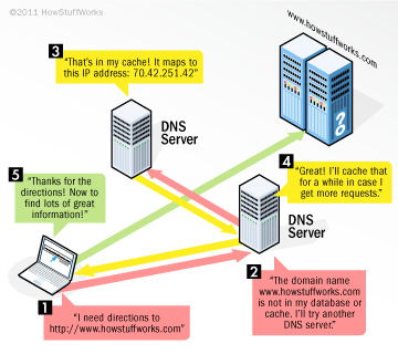
How does it work?
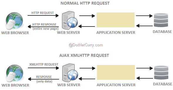

How does it work?
Forms that are not Forms
Mozilla Developer Network
A Form is Not Always a Form

"Standard HTML form submission, as described in the previous article, loads the URL where the data was sent, which means the browser window navigates with a full page load. Avoiding a full page load can provide a smoother experience by avoiding network lag, and possible visual issues like flickering. Many modern UIs only use HTML forms to collect input from the user, and not for data submission."
Ship of Theseus
"It is supposed that the famous ship sailed by the hero Theseus in a great battle was kept in a harbor as a museum piece, and as the years went by some of the wooden parts began to rot and were replaced by new ones; then, after a century or so, every part had been replaced. The question then is if the "restored" ship is still the same object as the original."
Wikipedia
Ship of Theseus

Ship of Theseus
"It is supposed that the famous ship sailed by the hero Theseus in a great battle was kept in a harbor as a museum piece, and as the years went by some of the wooden parts began to rot and were replaced by new ones; then, after a century or so, every part had been replaced. The question then is if the "restored" ship is still the same object as the original."
Wikipedia
Ship of Theseus

Ship of Theseus
"It is supposed that the famous ship sailed by the hero Theseus in a great battle was kept in a harbor as a museum piece, and as the years went by some of the wooden parts began to rot and were replaced by new ones; then, after a century or so, every part had been replaced. The question then is if the "restored" ship is still the same object as the original."
Wikipedia
Ship of Theseus

Ship of Theseus
"It is supposed that the famous ship sailed by the hero Theseus in a great battle was kept in a harbor as a museum piece, and as the years went by some of the wooden parts began to rot and were replaced by new ones; then, after a century or so, every part had been replaced. The question then is if the "restored" ship is still the same object as the original."
Wikipedia
Ship of Theseus

Ship of Theseus
"It is supposed that the famous ship sailed by the hero Theseus in a great battle was kept in a harbor as a museum piece, and as the years went by some of the wooden parts began to rot and were replaced by new ones; then, after a century or so, every part had been replaced. The question then is if the "restored" ship is still the same object as the original."
Wikipedia
Ship of Theseus

Ship of Theseus
Wikipedia
Ship of Theseus

"It is supposed that the famous ship sailed by the hero Theseus in a great battle was kept in a harbor as a museum piece, and as the years went by some of the wooden parts began to rot and were replaced by new ones; then, after a century or so, every part had been replaced. The question then is if the "restored" ship is still the same object as the original."
Ship of Theseus
Wikipedia
Ship of Theseus

"It is supposed that the famous ship sailed by the hero Theseus in a great battle was kept in a harbor as a museum piece, and as the years went by some of the wooden parts began to rot and were replaced by new ones; then, after a century or so, every part had been replaced. The question then is if the "restored" ship is still the same object as the original."
Portfolio Heaven
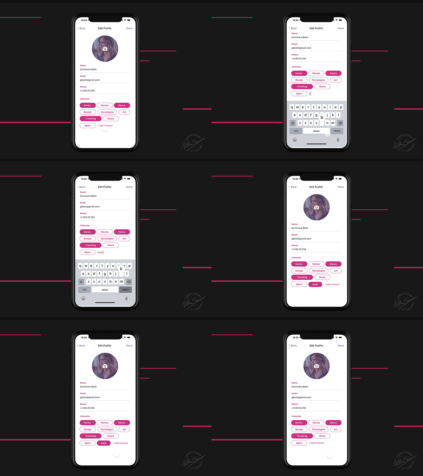

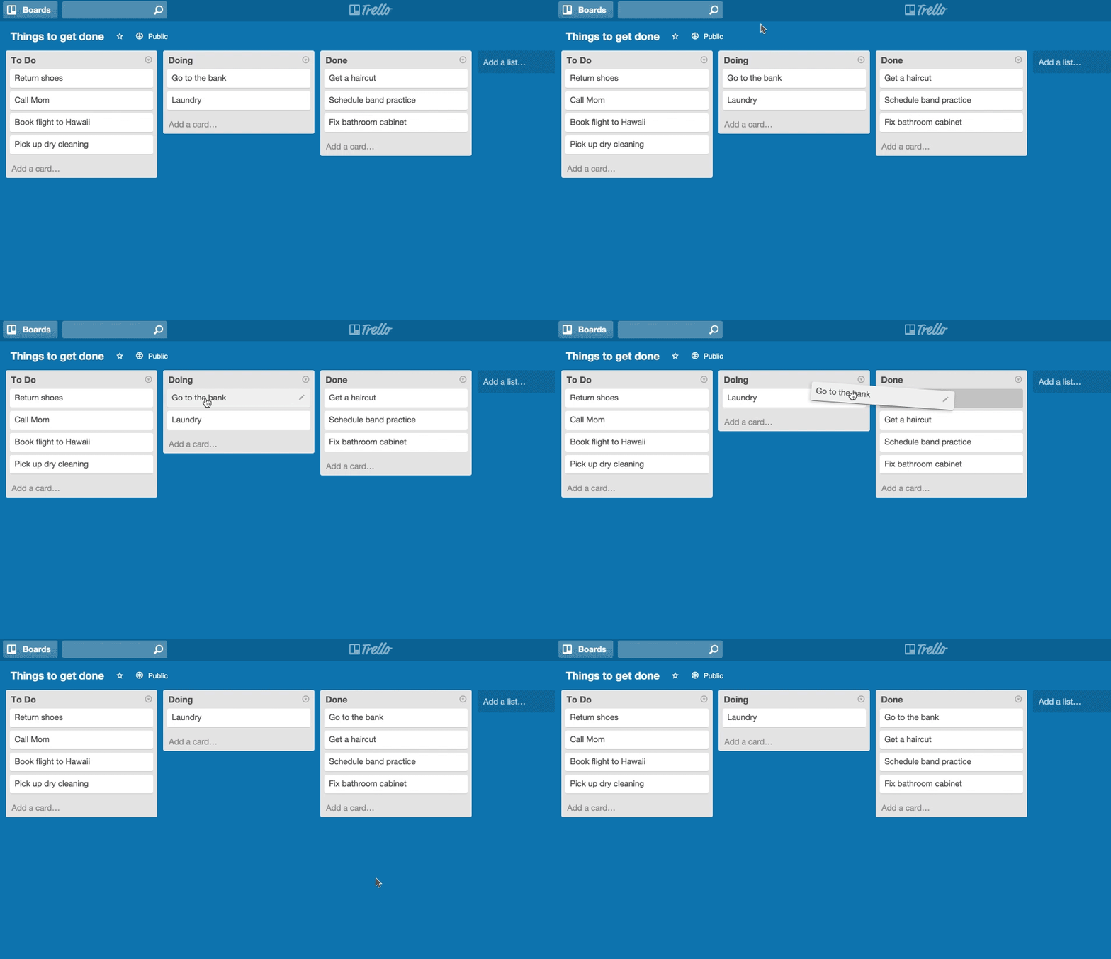
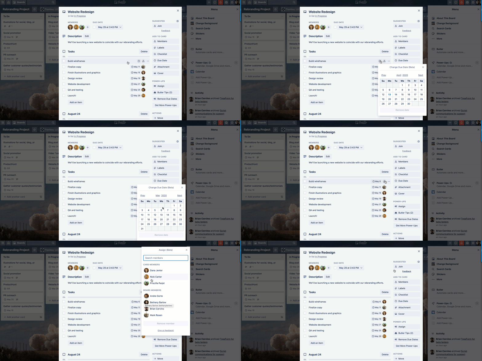
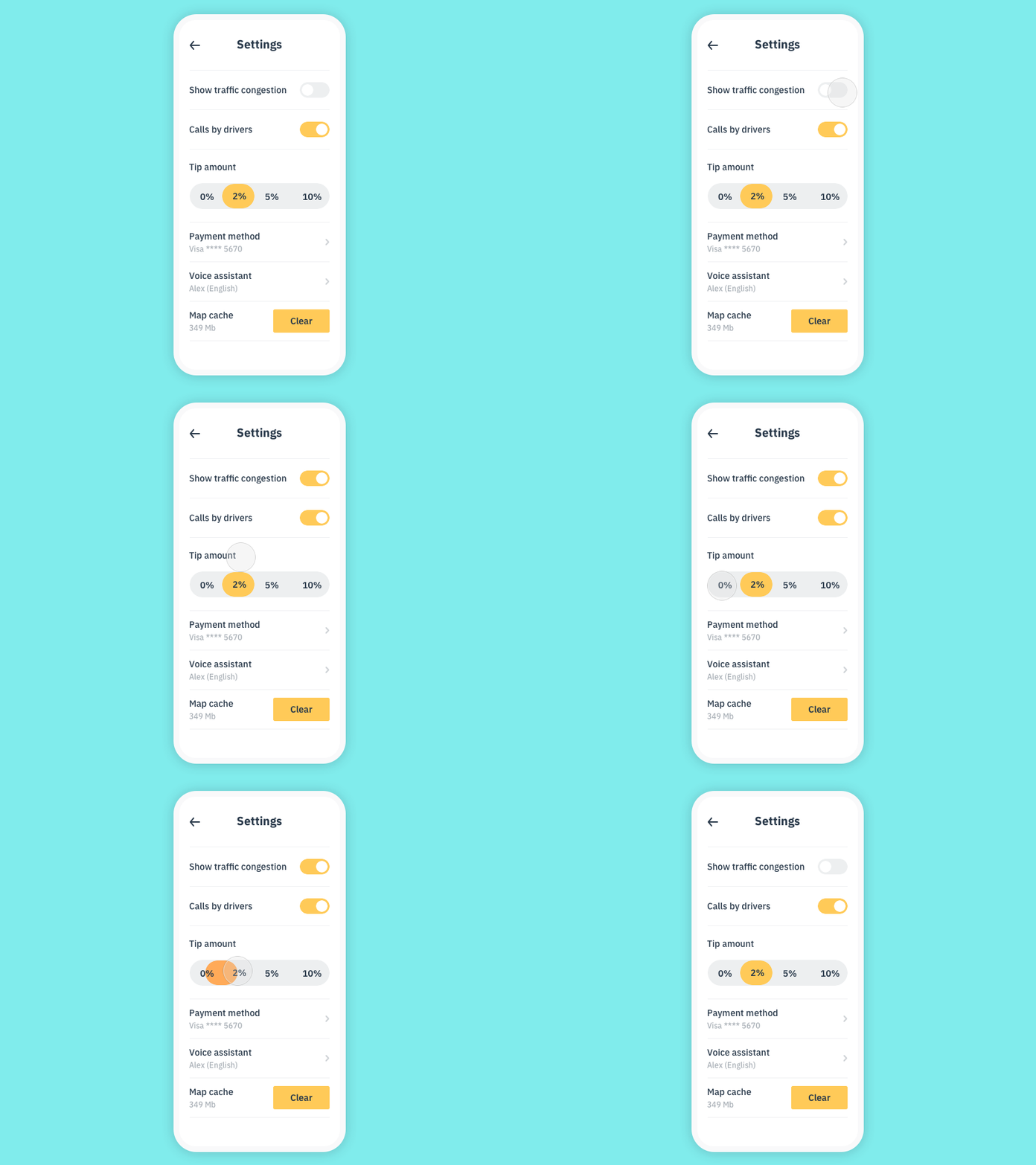

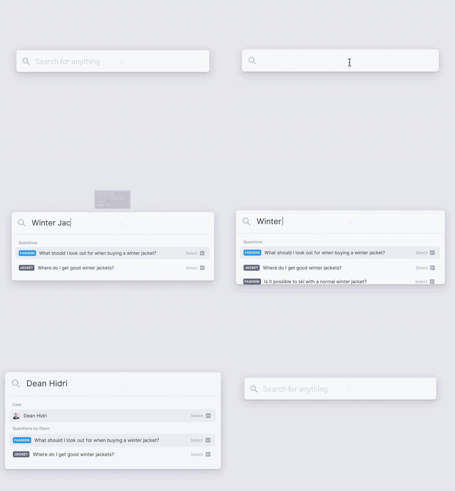
Implication Hell
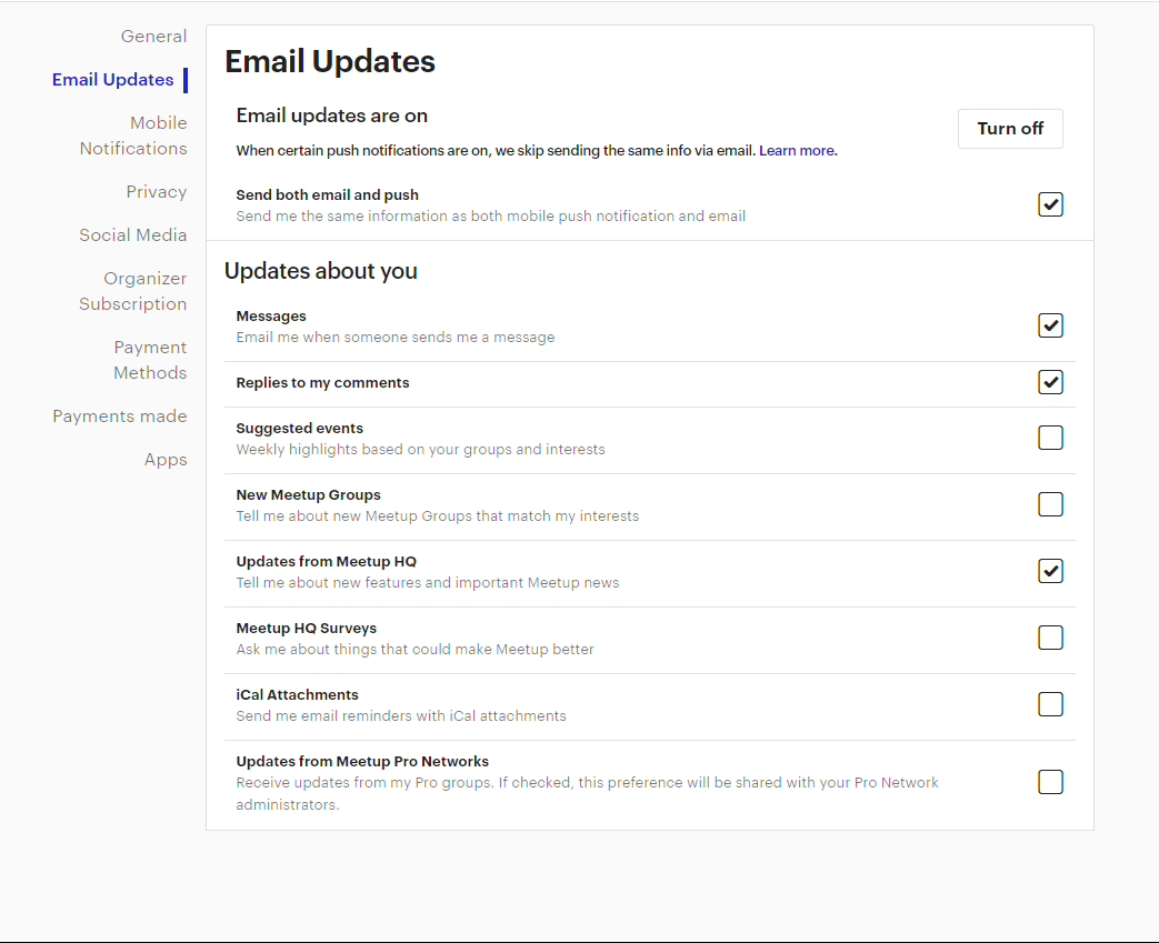
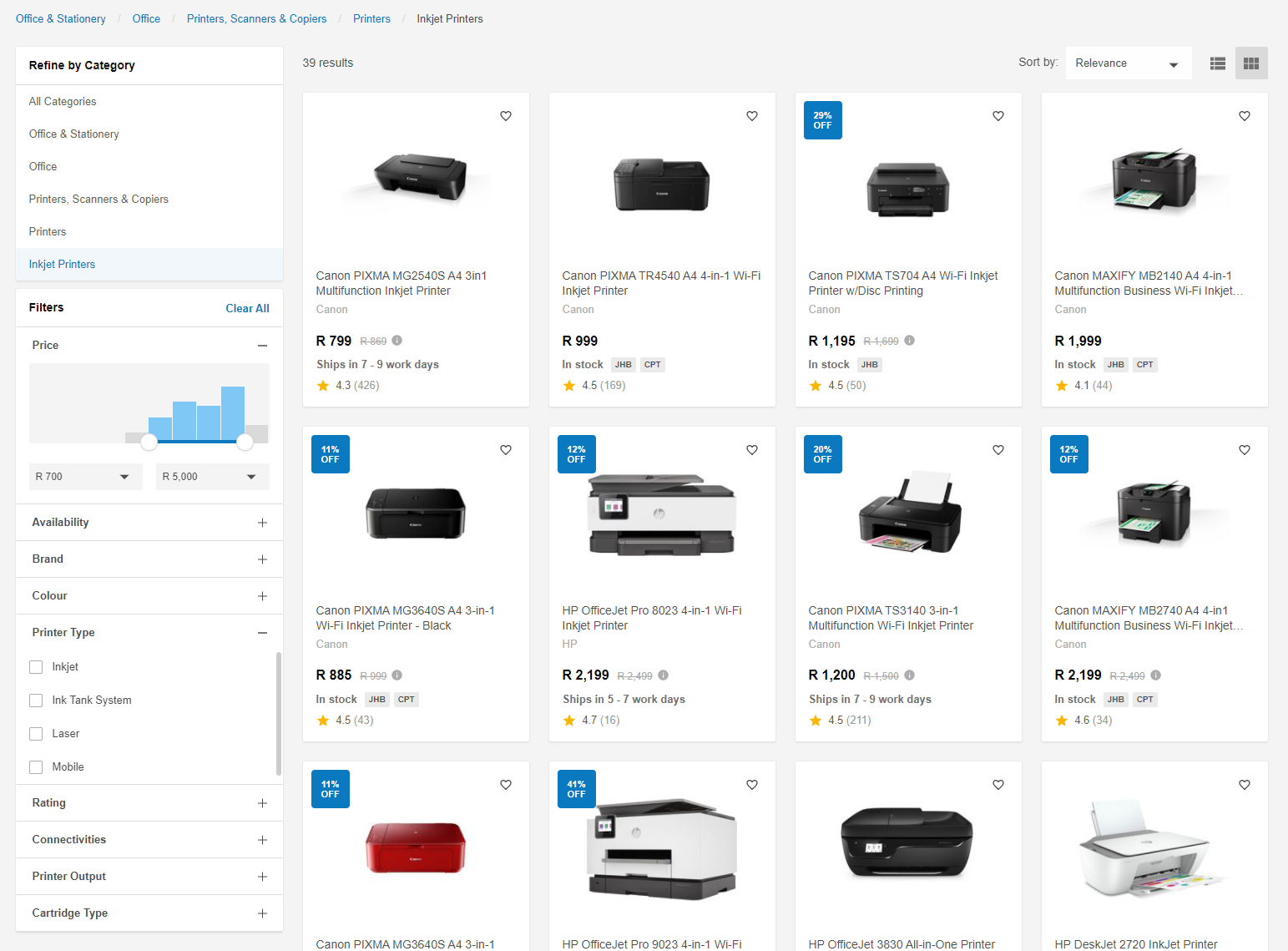
"And this may work for radio buttons and checkboxes, but what if there were text boxes that could be used to enter a price range? When would users expect the form to submit? Submitting while typing is out of the question. This leaves submitting the form on blur (tabbing or clicking out of the field), which is odd and unintuitive."
Adam Silver
Form Design Patterns (2018)


Caveat Emptor
Yikes

- When to send data to server?
- When to tell user data is wrong?
- When to show errors?
- When to remove errors?
- How to tell user data has been saved?
- How to cancel saving of data?
- Can user edit while saving?
- When to close input?
- When to load new data?
- Does save if input is closed?
Yikes

- When to send data to server?
- When to tell user data is wrong?
- When to show errors?
- When to remove errors?
- How to tell user data has been saved?
- How to cancel saving of data?
- Can user edit while saving?
- When to close input?
- When to load new data?
- Does save if input is closed?
Yikes

- When to send data to server?
- When to tell user data is wrong?
- When to show errors?
- When to remove errors?
- How to tell user data has been saved?
- How to cancel saving of data?
- Can user edit while saving?
- When to close input?
- When to load new data?
- Does save if input is closed?
Yikes

- When to send data to server?
- When to tell user data is wrong?
- When to show errors?
- When to remove errors?
- How to tell user data has been saved?
- How to cancel saving of data?
- Can user edit while saving?
- When to close input?
- When to load new data?
- Does save if input is closed?
Yikes

- When to send data to server?
- When to tell user data is wrong?
- When to show errors?
- When to remove errors?
- How to tell user data has been saved?
- How to cancel saving of data?
- Can user edit while saving?
- When to close input?
- When to load new data?
- Does save if input is closed?
Yikes

- When to send data to server?
- When to tell user data is wrong?
- When to show errors?
- When to remove errors?
- How to tell user data has been saved?
- How to cancel saving of data?
- Can user edit while saving?
- When to close input?
- When to load new data?
- Does save if input is closed?
Yikes

- When to send data to server?
- When to tell user data is wrong?
- When to show errors?
- When to remove errors?
- How to tell user data has been saved?
- How to cancel saving of data?
- Can user edit while saving?
- When to close input?
- When to load new data?
- Does save if input is closed?
Yikes

- When to send data to server?
- When to tell user data is wrong?
- When to show errors?
- When to remove errors?
- How to tell user data has been saved?
- How to cancel saving of data?
- Can user edit while saving?
- When to close input?
- When to load new data?
- Does save if input is closed?
Yikes

- When to send data to server?
- When to tell user data is wrong?
- When to show errors?
- When to remove errors?
- How to tell user data has been saved?
- How to cancel saving of data?
- Can user edit while saving?
- When to close input?
- When to load new data?
- Does save if input is closed?
Yikes

- When to send data to server?
- When to tell user data is wrong?
- When to show errors?
- When to remove errors?
- How to tell user data has been saved?
- How to cancel saving of data?
- Can user edit while saving?
- When to close input?
- When to load new data?
- Does save if input is closed?
Yikes

- When to send data to server?
- When to tell user data is wrong?
- When to show errors?
- When to remove errors?
- How to tell user data has been saved?
- How to cancel saving of data?
- Can user edit while saving?
- When to close input?
- When to load new data?
- Does save if input is closed?
- When to send data to server? Submit pressed
- When to tell user data is wrong? Submit pressed
- When to show errors? Submit pressed
- When to remove errors? Submit pressed
- How to tell user data has been saved? Submit pressed
- How to cancel saving of data? Submit not pressed
- Can user edit while saving? Submit pressed
- When to close input? Submit pressed
- When to load new data? Submit pressed
- Does save if input is closed? If Submit pressed
Yikes
INTERACTION DESIGNER:
Let me add a simple form

INTERACTION DESIGNER:
Let me add a simple form
SIMPLE FORM:
