Perceptual Patterns
Let's talk about feelings
Table of Contents
Look and Feel
Beauty in the eye of the beholder
Maneuvers in the Dark
How to agree on stylistic consideration?
Creativity and Originality
Everything is a remix
Tools
...
🎨
🦇
👩🎨
🔧
🎨 Look and Feel
Beauty in the eye of the beholder
Functionality First
"For a user’s needs to be met, an interface must be functional. If the user can’t complete a task, they certainly won’t spend much time with an application. Remember when Apple released Ping? It was their attempt at building a social network around your iTunes music library. It was a pretty big flop, in part because you couldn’t share a song with friends on Twitter or Facebook. After users learned that the new system lacked basic features, most didn’t return. The interface must be reliable”
Aarron Walter
Designing for Emotion (2011)

Visual Frosting
"Design is too often wrongly taken for the indulgent frosting on a functional interface.”

Visual Manifestation
"Examples of perceptual patterns in digital products include tone of voice, typography, color palette, layouts, illustrations and iconography styles, shapes and textures, spacing, imagery, interactions or animations, and all the specific ways in which those elements are combined and used in an interface. Perceptual patterns are always present, even if they’re not purposefully designed. Even a purely functional tool has an aesthetic."
Alla Kholmatova
Design Systems (2017)



Personality in Abstract
"As we gaze at the world, we discover ourselves looking back. When we stare at the clouds, or inspect the grain of a gnarled piece of wood, inevitably we’ll construct the image of a face in our mind’s eye. We are accidental narcissists seeking that which we know best—ourselves. [...] Sometimes we perceive human presence through abstract things such as proportion.”
Aarron Walter
Designing for Emotion (2011)

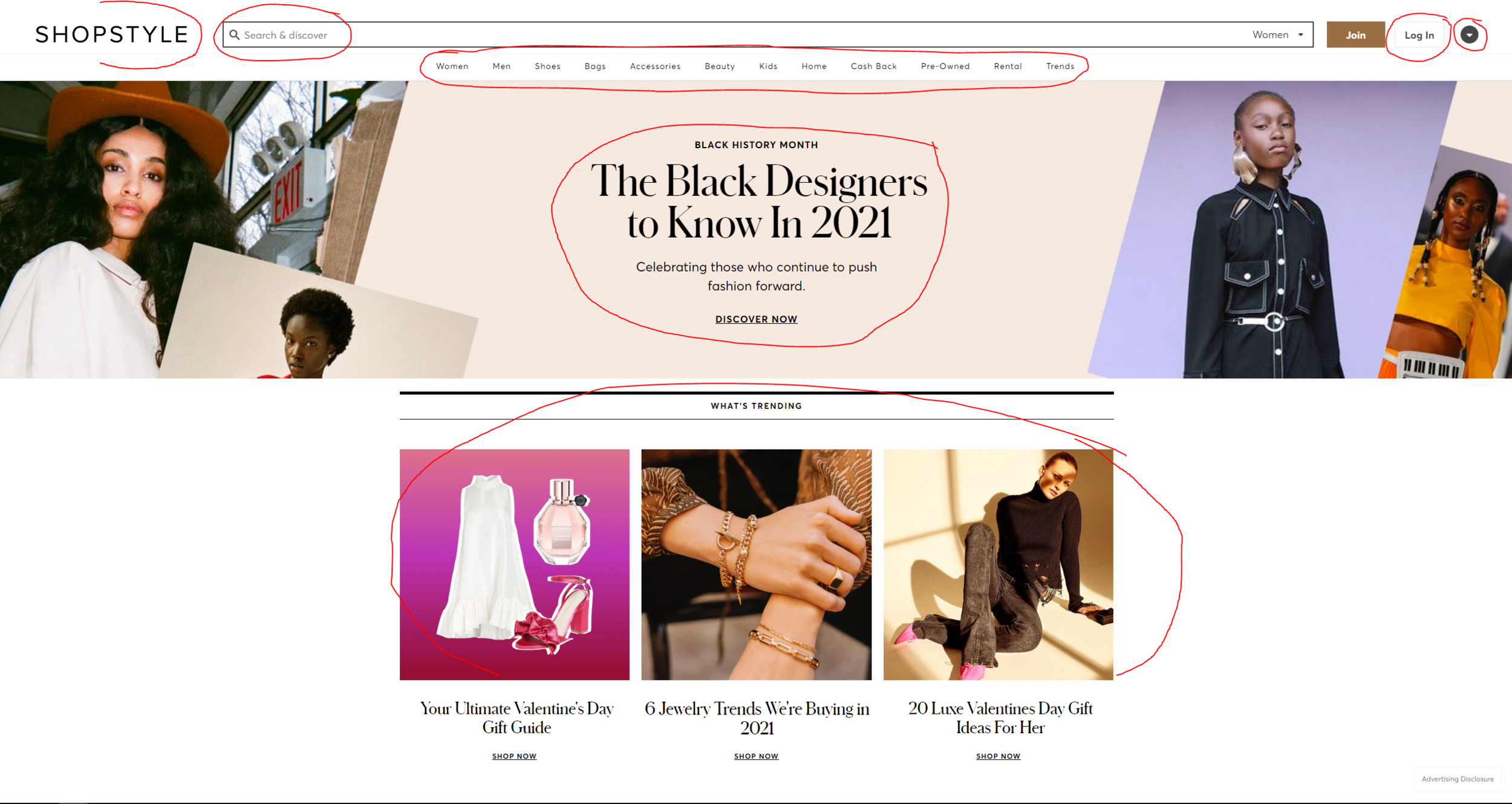
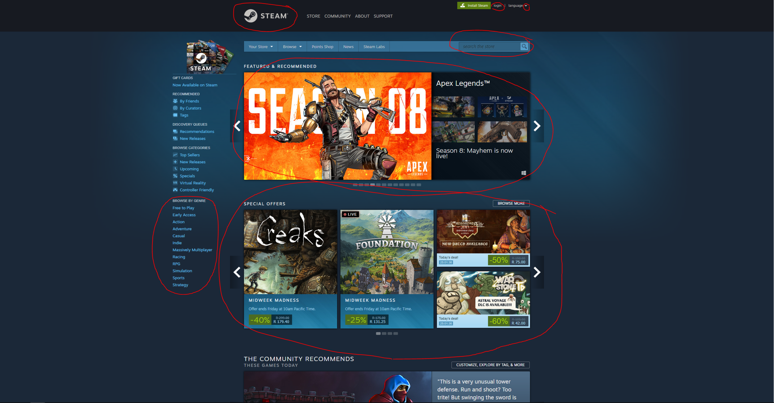
Expression of Form
"Imagine we both have a house, with the same set of furniture: a table, a few chairs, a bed, and a wardrobe. Even though the furniture is the same, our houses can feel distinctly different: it could be because of the style of the furniture, the materials, colors, textures, the fabric on the bed covers, the style of the ornaments, how we lay out the room, the lighting, or even the music we play inside. I refer to such attributes as perceptual patterns. Because of them, your house might feel like a bohemian lair, and mine like a warehouse."
Alla Kholmatova
Design Systems (2017)

Microinteractions
The intertwined history of interaction design and human–computer interaction is really the history of microinteractions. The tiny things we unthinkingly interact with every day on desktops, laptops, and mobile devices were once novel microinteractions: everything from saving a document to organizing files into folders to connecting to a WiFi network were all microinteractions that needed to be designed. Even “basics” like scrolling and opening multiple windows needed to be designed and engineered.
Dan Saffer
Microinteractions: Designing with Details (2013)

Aesthetic of the Times
"As business pioneers discovered new watering holes, the web quickly became a breeding ground of dot-com bubble thinking. I remember writing copy for my personal website in the late 1990s using the royal “we,” trying to create the perception that I was a big company when the guy behind those words was in his bedroom in smelly pajamas trying to figure out HTML. I wasn’t trying to be me—I was trying to be like the other big players out there. But something happened to that trend in the middle of the naughts.”
Aarron Walter
Designing for Emotion (2011)

Alegria


Aesthetic is not Accidental
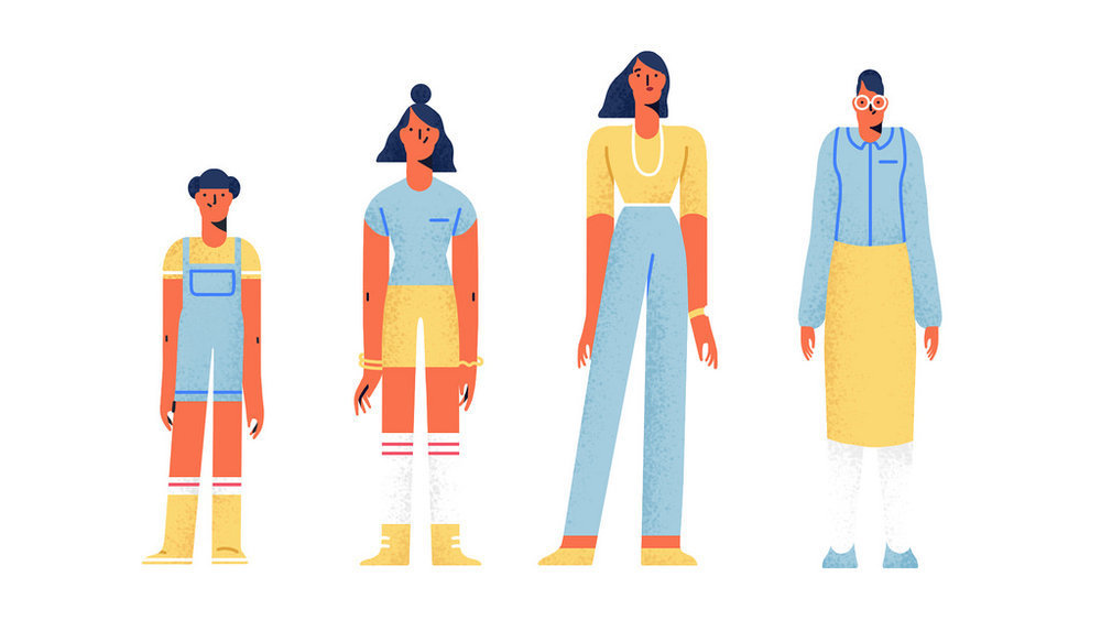
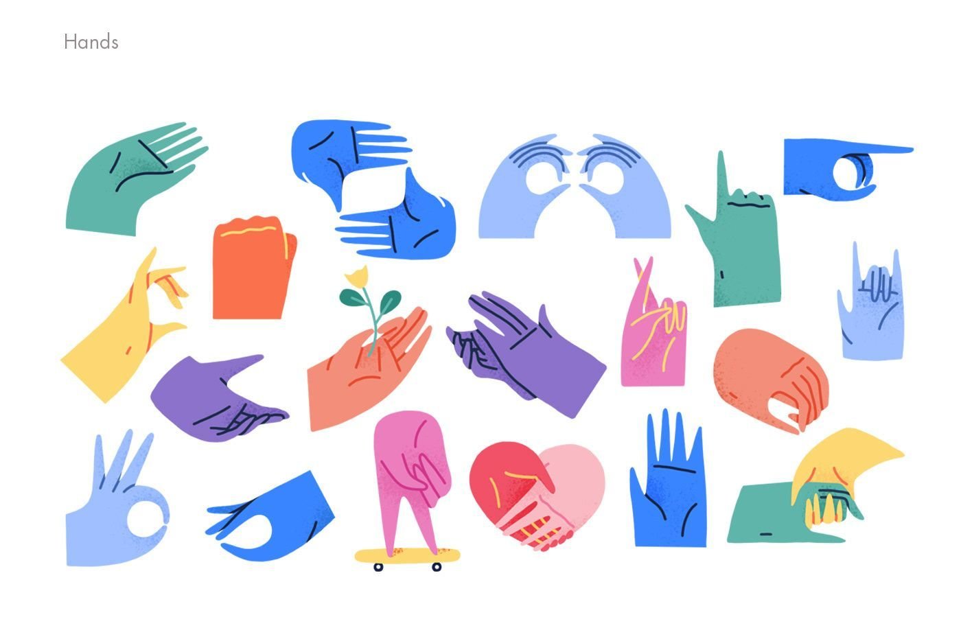
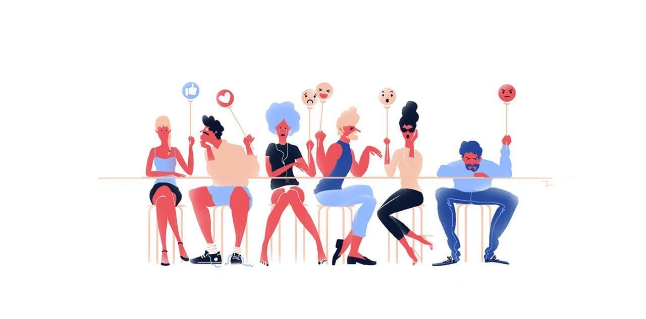
"Airbnb, Hinge, Lyft, Airtable, Google, and YouTube are all in on the craze, along with seemingly every other new app or startup in existence. Outside of the cash-flush tech sphere, in the world of editorial illustration, shrinking budgets and condensed production timelines may have something to do with the turn towards flat minimalism—more ornate artwork means more hours putting pen to paper, and fewer dollars per hour to show for it. [...] Like many Alegria-style illustrations systems, it’s hard to scroll through the cheerful, cooperative figures in Airbnb’s case study and not be filled with a sort of utopian optimism. Human connection!”
Rachel Hawley
Don’t Worry, These Gangly-armed Cartoons Are Here to Protect You From Big Tech (2019)

Emotional Events
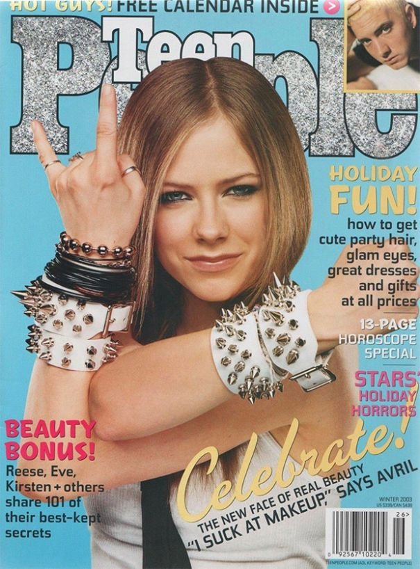
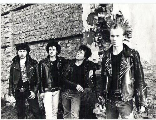
"Emotionally charged events persist much longer in our memories and are recalled with greater accuracy than neutral memories. [...] When the brain detects an emotionally charged event, the amygdala releases dopamine into the system. Because dopamine greatly aids memory and information processing, you could say the Post-It note reads “Remember this!” Getting the brain to put a chemical Post-It note on a given piece of information means that information is going to be more robustly processed. It is what every teacher, parent, and ad executive wants.”
Aarron Walter
Designing for Emotion (2011)

Emotional Association
"When Johannes Gutenberg—goldsmith and father of the printing press—experimented with movable type in the mid-fifteenth century, the human hand inspired him. Before the printing press, scribes—usually monks—painstakingly penned each page of religious manuscripts by hand with quill and ink. Transcribing a bible was a sacred duty, as the scribe was thought to be channeling a divine message. [...] So when Gutenberg designed and cast the original typefaces he used to print hundreds of bibles, the letterforms mimicked the calligraphic style of scribes.”
Aarron Walter
Designing for Emotion (2011)

Emotional Association
"When Johannes Gutenberg—goldsmith and father of the printing press—experimented with movable type in the mid-fifteenth century, the human hand inspired him. Before the printing press, scribes—usually monks—painstakingly penned each page of religious manuscripts by hand with quill and ink. Transcribing a bible was a sacred duty, as the scribe was thought to be channeling a divine message. [...] So when Gutenberg designed and cast the original typefaces he used to print hundreds of bibles, the letterforms mimicked the calligraphic style of scribes.”
Aarron Walter
Designing for Emotion (2011)

Emotional Association
"When Johannes Gutenberg—goldsmith and father of the printing press—experimented with movable type in the mid-fifteenth century, the human hand inspired him. Before the printing press, scribes—usually monks—painstakingly penned each page of religious manuscripts by hand with quill and ink. Transcribing a bible was a sacred duty, as the scribe was thought to be channeling a divine message. [...] So when Gutenberg designed and cast the original typefaces he used to print hundreds of bibles, the letterforms mimicked the calligraphic style of scribes.”
Aarron Walter
Designing for Emotion (2011)

🦇 Maneuvers in the Dark
How to agree on stylistic consideration?
Aesthetic is Slippery
"Unless a microinteraction is terrible or wonderful, determining the statistical effectiveness of its nuances is nigh impossible through qualitative testing. Quantitative is the only real option."
Dan Saffer
Microinteractions: Designing with Details (2013)

Aesthetic is Slippery
"Unless a microinteraction is terrible or wonderful, determining the statistical effectiveness of its nuances is nigh impossible through qualitative testing. Quantitative is the only real option."
Dan Saffer
Microinteractions: Designing with Details (2013)

Aesthetic is Slippery
"Unless a microinteraction is terrible or wonderful, determining the statistical effectiveness of its nuances is nigh impossible through qualitative testing. Quantitative is the only real option."
Dan Saffer
Microinteractions: Designing with Details (2013)

A Sum of the Parts
"Perception is influenced not only by the building blocks such as color palette and typeface, but the relationships between them. It’s not enough to use headings and colors across the modules consistently. We should also be aware of the unique proportions and combinations that make the product feel a certain way. How do the colors relate to one another? How does the imagery relate to the typography? How does the typography relate to the spacing?"
Alla Kholmatova
Design Systems (2017)

Humans
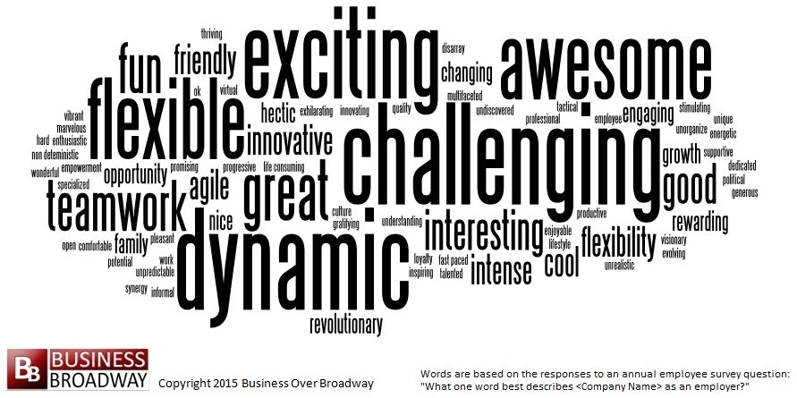
"We humans are complex beings, and can be difficult to design for. We all have distinct personalities, emotional baggage, and unique dispositions, so how can we design something that can appeal to such wide-ranging perspectives?”
Aarron Walter
Designing for Emotion (2011)

Humans
"We humans are complex beings, and can be difficult to design for. We all have distinct personalities, emotional baggage, and unique dispositions, so how can we design something that can appeal to such wide-ranging perspectives?”
Aarron Walter
Designing for Emotion (2011)

Humans
"We humans are complex beings, and can be difficult to design for. We all have distinct personalities, emotional baggage, and unique dispositions, so how can we design something that can appeal to such wide-ranging perspectives?”
Aarron Walter
Designing for Emotion (2011)

Humans
"We humans are complex beings, and can be difficult to design for. We all have distinct personalities, emotional baggage, and unique dispositions, so how can we design something that can appeal to such wide-ranging perspectives?”
Aarron Walter
Designing for Emotion (2011)

Designer as Facilitator
"What individuals and organizations that fall into this trap fail to realize is that when a project is tasked with making something, no matter what it is, every single team member is a part of the design process. Design doesn’t just happen in the design department. It happens with every decision about what will or won’t be part of the final product, whether that’s a feature, a paragraph of content, a color pallet, a user interface pattern — anything."

Adam Connor & Aaron Irizarry
Discussing Design (2015)

Designer as Facilitator
"What individuals and organizations that fall into this trap fail to realize is that when a project is tasked with making something, no matter what it is, every single team member is a part of the design process. Design doesn’t just happen in the design department. It happens with every decision about what will or won’t be part of the final product, whether that’s a feature, a paragraph of content, a color pallet, a user interface pattern — anything."

Adam Connor & Aaron Irizarry
Discussing Design (2015)

Designer as Facilitator
"What individuals and organizations that fall into this trap fail to realize is that when a project is tasked with making something, no matter what it is, every single team member is a part of the design process. Design doesn’t just happen in the design department. It happens with every decision about what will or won’t be part of the final product, whether that’s a feature, a paragraph of content, a color pallet, a user interface pattern — anything."

Adam Connor & Aaron Irizarry
Discussing Design (2015)

Designer as Facilitator
"What individuals and organizations that fall into this trap fail to realize is that when a project is tasked with making something, no matter what it is, every single team member is a part of the design process. Design doesn’t just happen in the design department. It happens with every decision about what will or won’t be part of the final product, whether that’s a feature, a paragraph of content, a color pallet, a user interface pattern — anything."

Adam Connor & Aaron Irizarry
Discussing Design (2015)

Design is not an Island
"Collaboration and coordination are critical elements in the success of projects in most (if not all) modern organizations. There isn’t a single individual who is responsible for coming up with an idea, designing it, building it, selling it, and supporting it. [...] So, we need to work together, combining our skills and know-how. And to work together, we need to talk with one another. We need to discuss what it is we’re designing, why we’re creating it, and how it will all come together."

Adam Connor & Aaron Irizarry
Discussing Design (2015)

Design is not an Island
"Collaboration and coordination are critical elements in the success of projects in most (if not all) modern organizations. There isn’t a single individual who is responsible for coming up with an idea, designing it, building it, selling it, and supporting it. [...] So, we need to work together, combining our skills and know-how. And to work together, we need to talk with one another. We need to discuss what it is we’re designing, why we’re creating it, and how it will all come together."

Adam Connor & Aaron Irizarry
Discussing Design (2015)

Design is not an Island
"Collaboration and coordination are critical elements in the success of projects in most (if not all) modern organizations. There isn’t a single individual who is responsible for coming up with an idea, designing it, building it, selling it, and supporting it. [...] So, we need to work together, combining our skills and know-how. And to work together, we need to talk with one another. We need to discuss what it is we’re designing, why we’re creating it, and how it will all come together."

Adam Connor & Aaron Irizarry
Discussing Design (2015)

Design is not an Island
"Collaboration and coordination are critical elements in the success of projects in most (if not all) modern organizations. There isn’t a single individual who is responsible for coming up with an idea, designing it, building it, selling it, and supporting it. [...] So, we need to work together, combining our skills and know-how. And to work together, we need to talk with one another. We need to discuss what it is we’re designing, why we’re creating it, and how it will all come together."

Adam Connor & Aaron Irizarry
Discussing Design (2015)

Design is not an Island
"Collaboration and coordination are critical elements in the success of projects in most (if not all) modern organizations. There isn’t a single individual who is responsible for coming up with an idea, designing it, building it, selling it, and supporting it. [...] So, we need to work together, combining our skills and know-how. And to work together, we need to talk with one another. We need to discuss what it is we’re designing, why we’re creating it, and how it will all come together."

Adam Connor & Aaron Irizarry
Discussing Design (2015)

Design is not an Island
"Collaboration and coordination are critical elements in the success of projects in most (if not all) modern organizations. There isn’t a single individual who is responsible for coming up with an idea, designing it, building it, selling it, and supporting it. [...] So, we need to work together, combining our skills and know-how. And to work together, we need to talk with one another. We need to discuss what it is we’re designing, why we’re creating it, and how it will all come together."

Adam Connor & Aaron Irizarry
Discussing Design (2015)

Industry Icebergs
"When you engage in a new client project how do you get started? A solid process plays a critical role in the project’s overall success, yet this process is one of the deepest darkest secrets of our industry."
Samantha Warren
Director of Design at Adobe

Industry Icebergs
"When you engage in a new client project how do you get started? A solid process plays a critical role in the project’s overall success, yet this process is one of the deepest darkest secrets of our industry."
Samantha Warren
Director of Design at Adobe

Industry Icebergs
"When you engage in a new client project how do you get started? A solid process plays a critical role in the project’s overall success, yet this process is one of the deepest darkest secrets of our industry."
Samantha Warren
Director of Design at Adobe

Industry Icebergs
"When you engage in a new client project how do you get started? A solid process plays a critical role in the project’s overall success, yet this process is one of the deepest darkest secrets of our industry."
Samantha Warren
Director of Design at Adobe

👩🎨 Creativity & Originality
Everything is a remix

Design is also Negation
"I believe a successful digital design process is quite similar to subtractive stone sculpture. At the beginning of the sculpting process, the artist and their patron have a general idea of what’s being created, but that vision won’t be fully realized until the sculpture is complete. The sculptor starts with a giant slab of rock and starts chipping away. A crude shape begins to form after the first pass, and the shape becomes more pronounced with every subsequent pass. After a few rounds of whacking away at the rock, it becomes clear that the sculptor’s subject is a human form."
Brad Frost
Atomic Design (2016)

Everything is a Knockoff
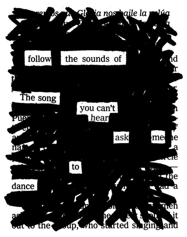
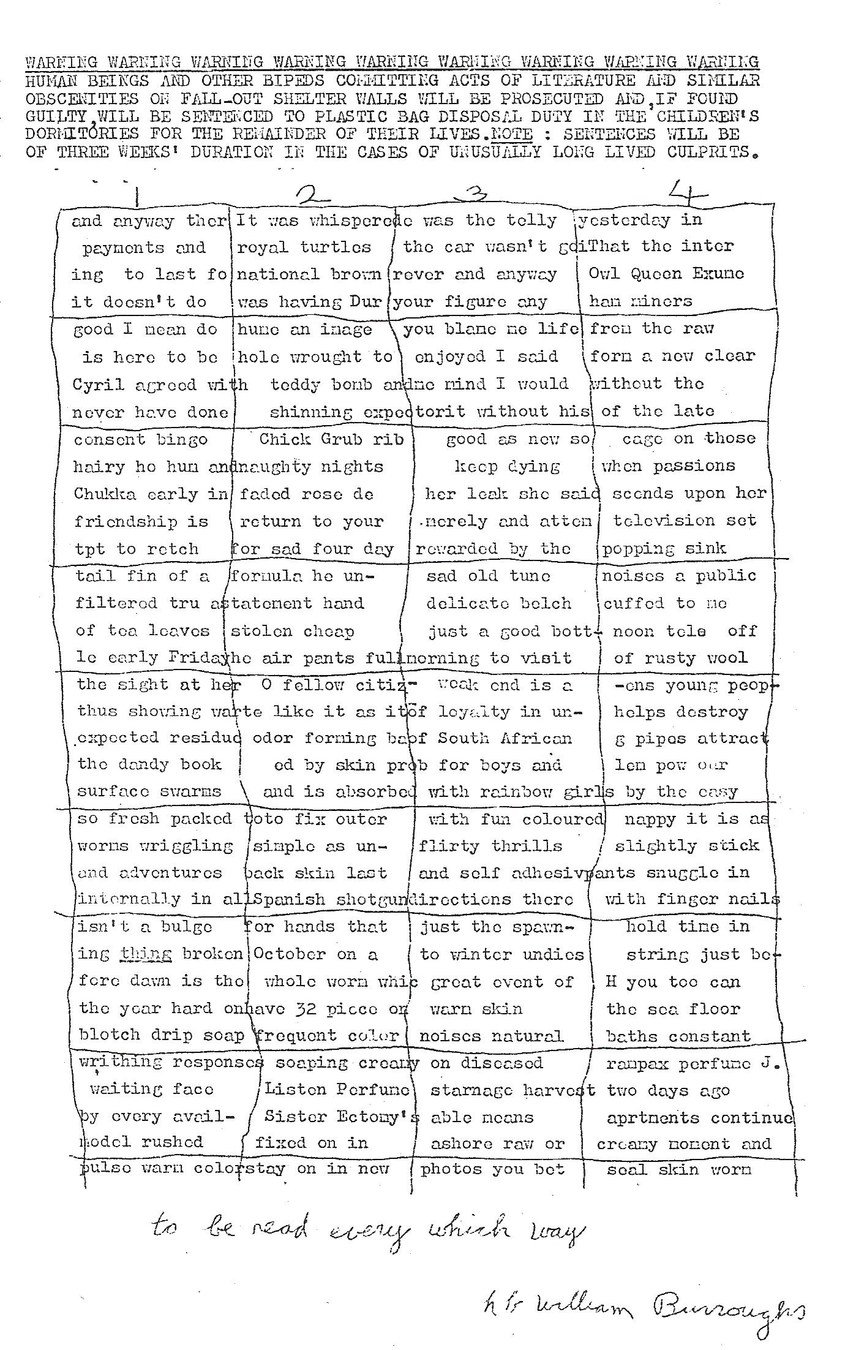
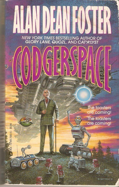
"The writer Jonathan Lethem has said that when people call something “original,” nine out of ten times they just don’t know the references or the original sources involved. What a good artist understands is that nothing comes from nowhere. All creative work builds on what came before. Nothing is completely original. [...] If we’re free from the burden of trying to be completely original, we can stop trying to make something out of nothing, and we can embrace influence instead of running away from it."
Austin Kleon
Steal Like an Artist (2012)



Or More Simply...
"If you wish to make an apple pie from scratch
you must first invent the universe"
Carl Sagan
Astrophysicist
Bricolage
"This is what is commonly called ‘bricolage’ in French. In its old sense the verb ‘bricoler’ applied to ball games and billiards, to hunting, shooting and riding. It was however always used with reference to some extraneous movement: a ball rebounding, a dog straying or a horse swerving from its direct course to avoid an obstacle. And in our own time the 'bricoleur' is still someone who works with his hands and uses devious means compared to those of a craftsman."
Claude Lévi-Strauss
The Savage Mind (1962)

Designer as a DJ
"His universe of instruments is closed and the rules of his game are always to make do with ‘whatever is at hand’, that is to say with a set of tools and materials which is always finite and is also heterogeneous because what it contains bears no relation to the current project, or indeed to any particular project, but is the contingent result of all the occasions there have been to renew or enrich the stock or to maintain it with the remains of previous constructions or destructions."
Claude Lévi-Strauss
The Savage Mind (1962)

Designer as a DJ
"His universe of instruments is closed and the rules of his game are always to make do with ‘whatever is at hand’, that is to say with a set of tools and materials which is always finite and is also heterogeneous because what it contains bears no relation to the current project, or indeed to any particular project, but is the contingent result of all the occasions there have been to renew or enrich the stock or to maintain it with the remains of previous constructions or destructions."
Claude Lévi-Strauss
The Savage Mind (1962)

Designer as a DJ
"His universe of instruments is closed and the rules of his game are always to make do with ‘whatever is at hand’, that is to say with a set of tools and materials which is always finite and is also heterogeneous because what it contains bears no relation to the current project, or indeed to any particular project, but is the contingent result of all the occasions there have been to renew or enrich the stock or to maintain it with the remains of previous constructions or destructions."
Claude Lévi-Strauss
The Savage Mind (1962)

Designer as a DJ
"His universe of instruments is closed and the rules of his game are always to make do with ‘whatever is at hand’, that is to say with a set of tools and materials which is always finite and is also heterogeneous because what it contains bears no relation to the current project, or indeed to any particular project, but is the contingent result of all the occasions there have been to renew or enrich the stock or to maintain it with the remains of previous constructions or destructions."
Claude Lévi-Strauss
The Savage Mind (1962)

Designer as a DJ
"His universe of instruments is closed and the rules of his game are always to make do with ‘whatever is at hand’, that is to say with a set of tools and materials which is always finite and is also heterogeneous because what it contains bears no relation to the current project, or indeed to any particular project, but is the contingent result of all the occasions there have been to renew or enrich the stock or to maintain it with the remains of previous constructions or destructions."
Claude Lévi-Strauss
The Savage Mind (1962)

Designer as a DJ
"His universe of instruments is closed and the rules of his game are always to make do with ‘whatever is at hand’, that is to say with a set of tools and materials which is always finite and is also heterogeneous because what it contains bears no relation to the current project, or indeed to any particular project, but is the contingent result of all the occasions there have been to renew or enrich the stock or to maintain it with the remains of previous constructions or destructions."
Claude Lévi-Strauss
The Savage Mind (1962)

🔧 Tools
Systematic way of navigating aesthetic
Here Be Dragons


- Adjectives
- Mockups
Ready, Player 2
Budget and Timeline

Gradual Precision
Fidelity Range
"The differences between these techniques aren’t always obvious, and people use them interchangeably. For me, the distinction lies in their relative fidelity. Mood boards are looser and more open; they combine existing materials from various sources to create a certain visual feel. Style tiles and element collages are more focused on a specific product and the practical application of patterns in the interface. Element collages provide the highest level of fidelity and can be used as a starting point to transition into full comps.”
Alla Kholmatova
Design Systems (2017)

Placing Your Pins
- Adjectives
- 20 Second Gut-Test
- Moodboards
- Style Tiles
- Element Collages
- Mockups


20 Second Gut Test
"The 20 Second Gut Test is a workshop which can help you discover an initial visual design direction. It helps you identify general design aesthetics and is a good technique to help you get started. [...] Display each screenshot for 20 seconds and ask each stakeholder to rate it out of 5. At the end of test collate the numbers and discuss the results."
Michael Allan
Senior Product Designer at Pfizer
Moodboards
"A tool typically used by interior designers, mood boards can be a great way of exploring different thematic approaches and stylistic treatments. These can be put together really quickly, as much of their content is sourced from existing work. [...] Any process needs to acknowledge the relative design literacy of project stakeholders, ensuring the correct expectations are set early and that everyone is comfortable with the messy process of designing a website"
Paul Lloyd
Former Designer at Clearleft

Mood Boards
"Mood boards are a great tool for exploring different visual themes. They can be created digitally (Pinterest is a popular tool for creating digital mood boards) or assembled physically on a large board, using cut outs from magazines and other printed material. Some people use mood boards to research current trends or gather ideas, while others generate them to work out what their brand might feel like. Mood boards can be broad, or they can focus on exploring specific parts of the brand, like color or typography."
Alla Kholmatova
Design Systems (2017)

Style Tiles
"Once a general brand direction is defined, style tiles can be useful for exploring several variations in more detail. The concept of style tiles was introduced by Samantha Warren, who describes them as “a design deliverable consisting of fonts, colors and interface elements that communicate the essence of a visual brand for the web. [...] Like mood boards, style tiles can provide valuable discussion points with users and stakeholders, and gauge their initial reactions towards specific design directions. Comparing and contrasting style tiles against each other can help you make a choice of one direction over the other.”
Alla Kholmatova
Design Systems (2017)

Style Tiles
"Once a general brand direction is defined, style tiles can be useful for exploring several variations in more detail. The concept of style tiles was introduced by Samantha Warren, who describes them as “a design deliverable consisting of fonts, colors and interface elements that communicate the essence of a visual brand for the web. [...] Like mood boards, style tiles can provide valuable discussion points with users and stakeholders, and gauge their initial reactions towards specific design directions. Comparing and contrasting style tiles against each other can help you make a choice of one direction over the other.”
Alla Kholmatova
Design Systems (2017)

Style Tiles
"Once a general brand direction is defined, style tiles can be useful for exploring several variations in more detail. The concept of style tiles was introduced by Samantha Warren, who describes them as “a design deliverable consisting of fonts, colors and interface elements that communicate the essence of a visual brand for the web. [...] Like mood boards, style tiles can provide valuable discussion points with users and stakeholders, and gauge their initial reactions towards specific design directions. Comparing and contrasting style tiles against each other can help you make a choice of one direction over the other.”
Alla Kholmatova
Design Systems (2017)

Style Tiles
"Once a general brand direction is defined, style tiles can be useful for exploring several variations in more detail. The concept of style tiles was introduced by Samantha Warren, who describes them as “a design deliverable consisting of fonts, colors and interface elements that communicate the essence of a visual brand for the web. [...] Like mood boards, style tiles can provide valuable discussion points with users and stakeholders, and gauge their initial reactions towards specific design directions. Comparing and contrasting style tiles against each other can help you make a choice of one direction over the other.”
Alla Kholmatova
Design Systems (2017)

Style Tiles
"Once a general brand direction is defined, style tiles can be useful for exploring several variations in more detail. The concept of style tiles was introduced by Samantha Warren, who describes them as “a design deliverable consisting of fonts, colors and interface elements that communicate the essence of a visual brand for the web. [...] Like mood boards, style tiles can provide valuable discussion points with users and stakeholders, and gauge their initial reactions towards specific design directions. Comparing and contrasting style tiles against each other can help you make a choice of one direction over the other.”
Alla Kholmatova
Design Systems (2017)

Enter Element Collages
"There’s a huge chasm in being able to visualize the final product from such a vague starting point. [...] That particular phrase [(element collage)] creates an expectation that what we’re looking at isn’t a final design but rather an assembly of disparate pieces without specific logic or order."
Daniel Mall
CEO at SuperFriendly

Element Collages
"Riffing on style tiles, Dan Mall suggested the idea of an element collage: an assembly of interface pieces that explore how branding works in the interface. As a design deliverable, they can feel more concrete and tangible than style tiles; yet element collages don’t come with quite as many expectations as complete visual mock-ups. Element collages explore not only a general brand direction but how brand is expressed through the interface.”
Alla Kholmatova
Design Systems (2017)


