
Authentication
Registration and sign-in userflows.
Table of Contents
👻 The first rule of authentication is avoid it
🚪 The importance of where authentication is placed
☂️ Creating inclusive registration
🦴 The anatomy of a sign-in flow
🤹 Types of authentication flows
Authentication
"In computer security, logging in (or logging on, signing in, or signing on) is the process by which an individual gains access to a computer system by identifying and authenticating themselves. The user credentials are typically some form of "username" and a matching "password", and these credentials themselves are sometimes referred to as a login (or a logon or a sign-in or a sign-on).
Wikipedia
The Solution
"The designers fixed the problem simply. They took away the Register button. In its place, they put a Continue button with a simple message: “You do not need to create an account to make purchases on our site. Simply click Continue to proceed to checkout. To make your future purchases even faster, you can create an account during checkout.”
Jared M. Spool
The $300 Million Button

The Result
"The number of customers purchasing went up by 45%. The extra purchases resulted in an extra $15 million the first month. For the first year, the site saw an additional $300,000,000."
Jared M. Spool
The $300 Million Button

Best Input is No Input
"People need to parse every question you ask them, formulate their response to that question, and then enter their response into the space you have provided. The best way to speed up that process is not to ask the question at all. That means if you want to be vigilant about optimizing your forms, put every question you are asking people to the test. Do you really need to ask this question? Is it information that you can get automatically? Is there a better time or place to get an answer from people?"
Luke Wroblewski
Web Form Design (2008)

Everyone has KPI's
"Agreeing as to which questions should remain on a form may also be a discussion among several departments in your company or organization. The marketing team may have specific questions to understand customers better. The engineering team may require specific information to identify unique individuals. The legal team might mandate certain terms and conditions that have to be accepted by new customers. And the list goes on."
Luke Wroblewski
Web Form Design (2008)

K.C.P.E.
"Though all these teams may have questions they want to pose to your customers, your forms need to speak with one voice. To achieve that goal, teams will need to come together and work out which questions make it into each form. Take a look at Caroline Jarrett’s “Keep, cut, postpone, and explain” framework (outlined in the sidebar) for a way to decide what makes the cut."
Luke Wroblewski
Web Form Design (2008)

"Keep"
"But if you’ve decided on buying something that needs to be shipped, then it would be distinctly strange if the site did not ask you for a street address. And you’ll probably take care to enter a real address accurately. [...] Maybe, as with my “shipping” example, you and your users are in harmony: you’re asking for answers that they are eager to give you. Well done—keep those questions and move to thinking about the details of design."
Luke Wroblewski
Web Form Design (2008)

"Cut"
"But perhaps you’re asking a question that you don’t really need right now. Cut: get rid of the question and help everyone. That translates to less work for you in design, less work for your users, and no long-term storage."
Luke Wroblewski
Web Form Design (2008)

"Postpone"
"Or maybe it’s the ”right now” part: postpone asking that question until later, until the point where it moves from unnecessary or intrusive to harmonious."
Luke Wroblewski
Web Form Design (2008)

"Explain"
"[...] personal data, such as a phone number, or something that requires research or extra thought. But you’ve investigated your form, you know that there is a real value to your organization in asking these questions, and there is some important reason why you have to ask them ahead of time. Your strategy is to explain: write a very short but clear reason why you’re asking. Make sure it offers a benefit to the user— for example, “Asking you this now helps us to process your order more quickly."
Luke Wroblewski
Web Form Design (2008)

There is No Escape
"Registration forms are the gatekeepers to community membership—they allow people to define their identity within social applications. All of MySpace’s 150+ million users joined through a Web form. [...] Data input forms allow users to contribute or share information, and they allow companies to grow their content. Most of YouTube’s huge video collection comes from its Upload Your Video form."
Luke Wroblewski
Web Form Design (2008)

A Word on Words
"The noun login comes from the verb (to) log in and by analogy with the verb to clock in. Computer systems keep a log of users' access to the system. The term "log" comes from the chip log historically used to record distance travelled at sea and was recorded in a ship's log or log book. To sign in connotes the same idea, but it's based on the analogy of manually signing a log book or visitors book."
Wikipedia
Which one?
"Sign in is perhaps more human than Log in. When you visit a spa or office building, signing in grants you entry. And you sign out as you leave. It’s usually sensible to use the same language for digital experiences too. It can, however, depend on the industry. Banks, for example, tend to use Log in. [...] Whichever you choose, be consistent. Make URLs, links, headings, and buttons match. And if users click “Log in” to log in, then they should click “Log out” to log out."
Adam Silver
Form Design Patterns (2018)

Accessibility
"If there are timing aspects of the product, allow the user to turn them off, adjust them, or extend them. For example, if the product imposes a timeout for security or performance reasons, allow the end-user to extend it without losing any work."
Luke Wroblewski
Web Form Design (2008)

Let's Talk Politics
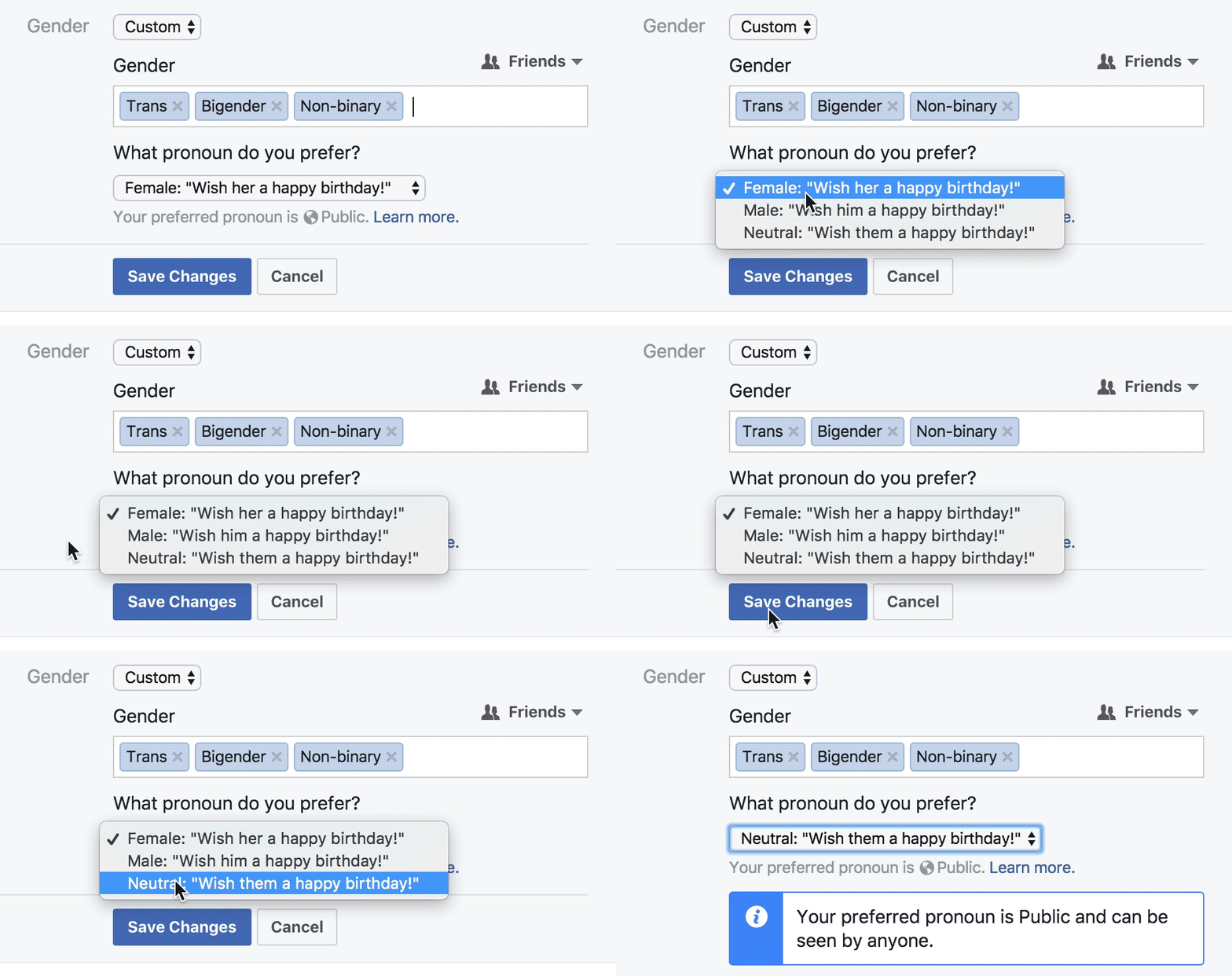
"Are you monitoring diversity? Creating policies that will benefit them and other trans and GNC folks? Figuring out if they are eligible for benefits? Or is it for marketing and communication purposes? Is it for their doctor, or for their health insurance? Be transparent, explain what exactly you are asking about, and how it will benefit them. [...] As with any form field, if there isn’t a clear benefit to the user, you probably shouldn’t ask about it."
Sabrina Fonseca
Designing forms for gender diversity and inclusion

Gender vs. Sex
"a person's sex (the anatomy of an individual's reproductive system, and secondary sex characteristics) from that person's gender, which can refer to either social roles based on the sex of the person (gender role) or personal identification of one's own gender based on an internal awareness (gender identity). In some circumstances, an individual's assigned sex and gender do not align, and the person may be transgender. In other cases, an individual may have biological sex characteristics that complicate sex assignment, and the person may be intersex."
Wikipedia
Allow Skipping
"Make that field optional as much as you can. This is part of the previous recommendation — the user may know better than you if it’s safe or appropriate to disclose the information based on the context. It may even warm them up to answer the question accurately rather than skipping it."
Sabrina Fonseca
Designing forms for gender diversity and inclusion


Coursera

Scratch
Ethnicity
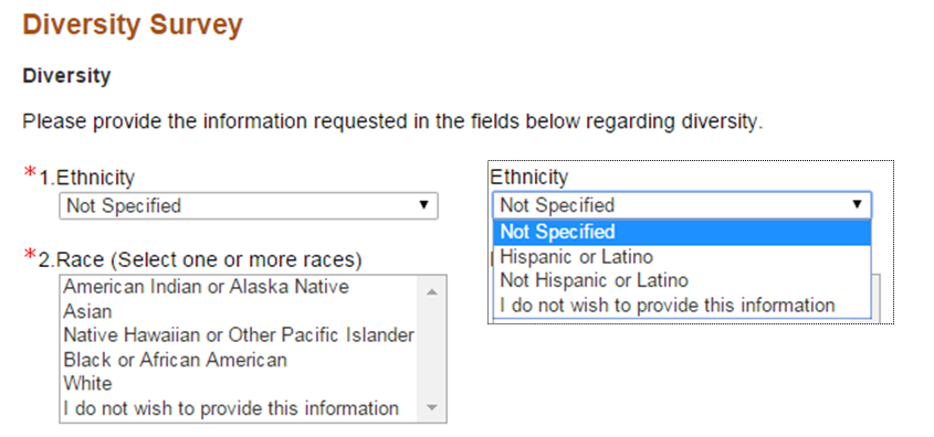
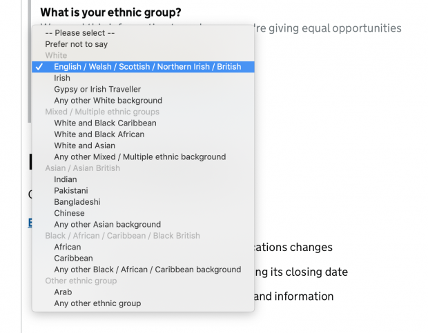
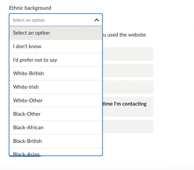
"Second, the form doesn’t give me option to NOT pick one of the labels provided. I am forced to select something before I proceed. There’s no “Other” button either. [...] We live in a world where there are too many stories like mine. I’m sure a lot of readers here can relate to it. Most of these stories are incredibly complex — and the amalgamation of people’s nationalities, biological traits, cultural references and languages spoken creates a wildly nuanced range of options that is hard to capture with a single form input field."
Fabricio Teixeira
The (frustrating) UX of defining your own ethnicity

Race vs. Ethnicity vs. etc.
"Many countries and national censuses currently enumerate or have previously enumerated their populations by race, ethnicity, nationality, or a combination of these characteristics. Different countries have different classifications and census options for race and ethnicity/nationality which are not comparable with data from other countries."
Wikipedia
USA Government
- American Indian or Alaska Native
- Asian
- Black or African American
- Hispanic or Latino
- Native Hawaiian or Other Pacific Islander
- White
US National Institute of Health
RSA Government

Security by Obscurity
"Many login forms make the same mistake of showing users an error message that says “The username and password don’t match. [...] We know which one doesn’t match, we’re just not going to tell you, because our security people think that if we told you that it was the password, they would know they had a legal username and they would try every possible password in history. As noted earlier, hackers don’t actually do this. But even if they did, it’s easy to check username availability by trying to register an account with that username."
Adam Silver
Form Design Patterns (2018)

Minimizing Distraction
"Removing interface elements not directly related to completing a form helps keep people on task and removes paths to abandonment. [...] For mission-critical forms like checkout or registration, remove distractions and any links or content that may lead to form abandonment."
Luke Wroblewski
Web Form Design (2008)

Common Pattern
"Usually, checkout pages are given a special and more streamlined layout that helps reduce noise and keep users on-task. For example, the header usually contains a logo, security note, and accepted cards. [...] By omitting navigation and search, users can focus on checking out, which speaks to inclusive design principle 6, “Prioritize content.” [...] Many sites design the login page with a unique, minimalist layout. For example, when users try to add a product to their basket on Tesco’s website, they’re taken to a login page with a very different layout."
Adam Silver
Form Design Patterns (2018)

Primary Key
"Some niche sites, such as airlines, ask users to enter their booking reference number. In this case, use the hint pattern to tell users where they can find it."
Adam Silver
Form Design Patterns (2018)

Confirm Password?
"Owing to the increased risk of typos, some registration forms include an additional “Confirm password” field. This is a precautionary measure that requires the user to type the same password twice, doubling the effort and degrading the user experience. [...] Instead, it’s better to let users reveal their password [...] This way users can choose to reveal their password when they know nobody is looking, reducing the risk of typos."
Adam Silver
Form Design Patterns (2018)

Forgot Password
"Most sites give users a way to reset their password if they forget it. The feature itself isn’t especially problematic. It’s the placement of the link within the login form that can cause usability issues. If the link is just above the password field, when users tab from the email field, it’s the link that will receive focus, not the password field. Some users will tab and start typing, not realizing what’s happened."
Adam Silver
Form Design Patterns (2018)

Terms & Conditions
"Depending on the legal requirements of a site, the terms of service can be governed by a primary call to action that explicitly includes a legal agreement, for example, a button labeled "I agree and move forward" or one that infers it through text preceding the primary action "by clicking register below, I agree." [...] Consider opportunities to streamline legal requirements by combining terms of service agreements with primary actions."
Luke Wroblewski
Web Form Design (2008)

Progress Indicators
"Despite the sound reasoning, there isn’t much evidence to show that progress bars are all that useful or even noticed. [...] Progress bars pose some practical design challenges too. First, they take up a lot of space at the top of the page, which is particularly important on mobile where they can push the main content down. Second, fitting an accessible progress bar with clear labeling into a small viewport is nigh on impossible. [...] If that weren’t enough, they’re even trickier to design when the journey consists of conditional steps"
Adam Silver
Form Design Patterns (2018)

Cookies
"Perhaps most importantly, authentication cookies are the most common method used by web servers to know whether the user is logged in or not, and which account they are logged in with. Without such a mechanism, the site would not know whether to send a page containing sensitive information, or require the user to authenticate themselves by logging in. The security of an authentication cookie generally depends on the security of the issuing website and the user's web browser, and on whether the cookie data is encrypted."
Wikipedia
Session vs. Persistence
"A session cookie, also known as an in-memory cookie, transient cookie or non-persistent cookie, exists only in temporary memory while the user navigates the website. Web browsers normally delete session cookies when the user closes the browser. [...] Instead of expiring when the web browser is closed as session cookies do, a persistent cookie expires at a specific date or after a specific length of time."
Wikipedia
Turing Test
"“Can machines think?"... The new form of the problem can be described in terms of a game which we call the 'imitation game." It is played with three people, a man (A), a woman (B), and an interrogator (C) who may be of either sex. The interrogator stays in a room apart front the other two. The object of the game for the interrogator is to determine which of the other two is the man and which is the woman."
Alan Turing
Computing Machinery and Intelligence (1950)

CAPTCHA
"A CAPTCHA, a contrived acronym for Completely Automated Public Turing test to tell Computers and Humans Apart", is a type of challenge–response test used in computing to determine whether or not the user is human. [...] This user identification procedure has received many criticisms, especially from people with disabilities, but also from other people who feel that their everyday work is slowed down by distorted words that are difficult to read."
Wikipedia
Why CAPTCHA?
"CAPTCHA prevents spam in website comment sections and on blogs. [...] Many companies offer free email services but a while ago bots would sign up for hundreds of free accounts and then use these accounts to cause havoc on the Internet. [...] It offers protection from scrapers who want to copy the email addresses of users. Spammers would crawl the Internet for email addresses that are posted in clear text."
Maxxor
Alternatives to CAPTCHA
❔ Non-traditional sign-in (next section)
Types of Sign In
- Traditional Sign In
- Social Sign In
- OTP
- Confirmation-based Sign In
- Multi-factor Auth/2FA
Not Yet Another Account!
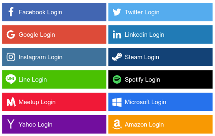
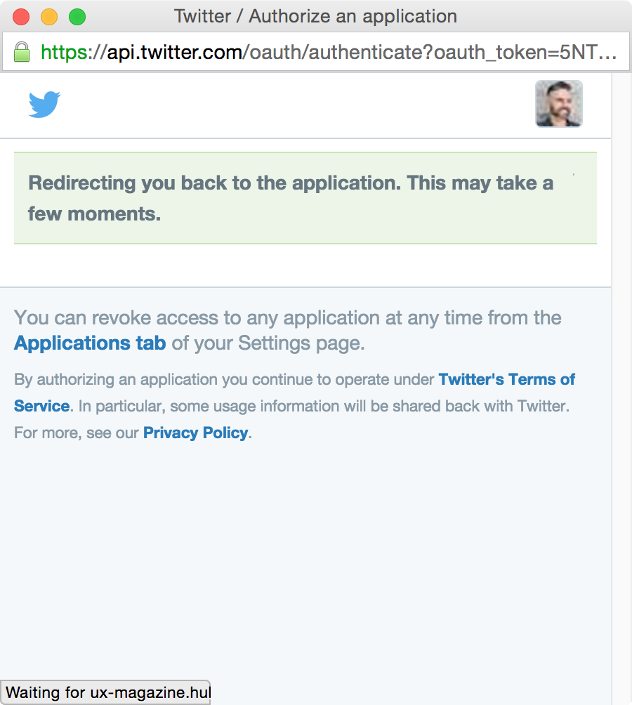
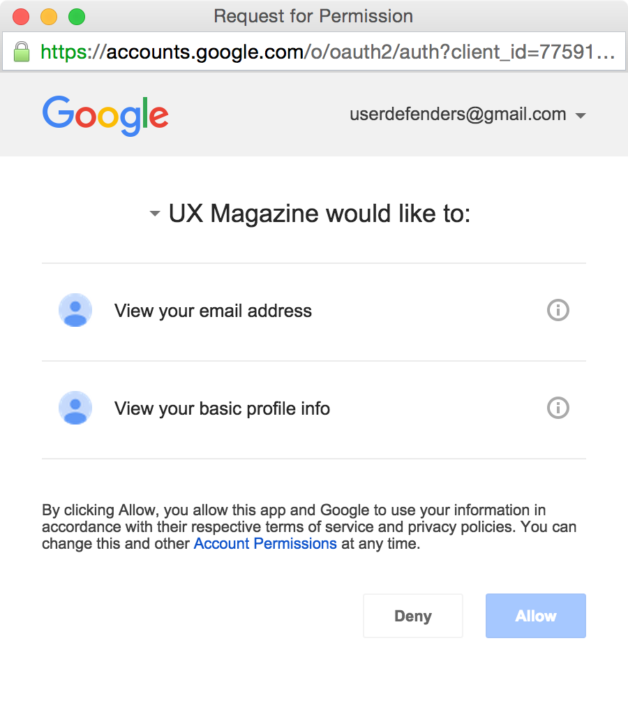
"Sites have recently started to offer users the ability to log in with social networks, such as Facebook, Twitter, and Google. This saves users having to type credentials they may not remember."
Adam Silver
Form Design Patterns (2018)

Social Sign In
"Social login is a form of single sign-on using existing information from a social networking service such as Facebook, Twitter or Google, to sign into a third party website instead of creating a new login account specifically for that website. It is designed to simplify logins for end users as well as provide more and more reliable demographic information to web developers."
Wikipedia
- Established pattern
- Be mindful in terms of which you include since developers need to integrate/maintain these
- Social media be blocked by schools/workplaces or might not have so
- Least effort
- No CAPTCHA required

Confirmation-based Auth
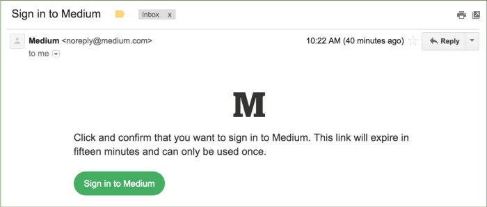
"That’s right, no passwords. When you want to sign in to Medium, we’ll send you an email that contains a special sign in link. Clicking on that link will sign you in. That’s all there is to it. If you’ve ever used a “forgot password” feature, it works a lot like that, except you don’t have to forget a password to use it."
Medium.com
Email Confirmation
"One way to avoid asking users for a password is to use the no password sign-in pattern. It works by making use of the security of email (which already needs a password). Users enter only their email address, and the service sends a special link to their inbox. Following it logs the user into the service immediately. [...] Not only does this reduce the size of the form to just one field, but it also saves users having to remember another password. [...] First, users might be less familiar with this approach, and many people are worried about online security."
Adam Silver
Form Design Patterns (2018)

Keep Users In Mind
"First, users might be less familiar with this approach, and many people are worried about online security. [...] Whether it’s the no password sign-in pattern or passphrases, we should only move away from convention once we’ve conducted thorough and diverse user research. You don’t want to exchange one set of problems for another unknowingly."
Adam Silver
Form Design Patterns (2018)

- More secure than password
- Still relatively new, so might confuse users
- Might not have access to device/platform during sign in


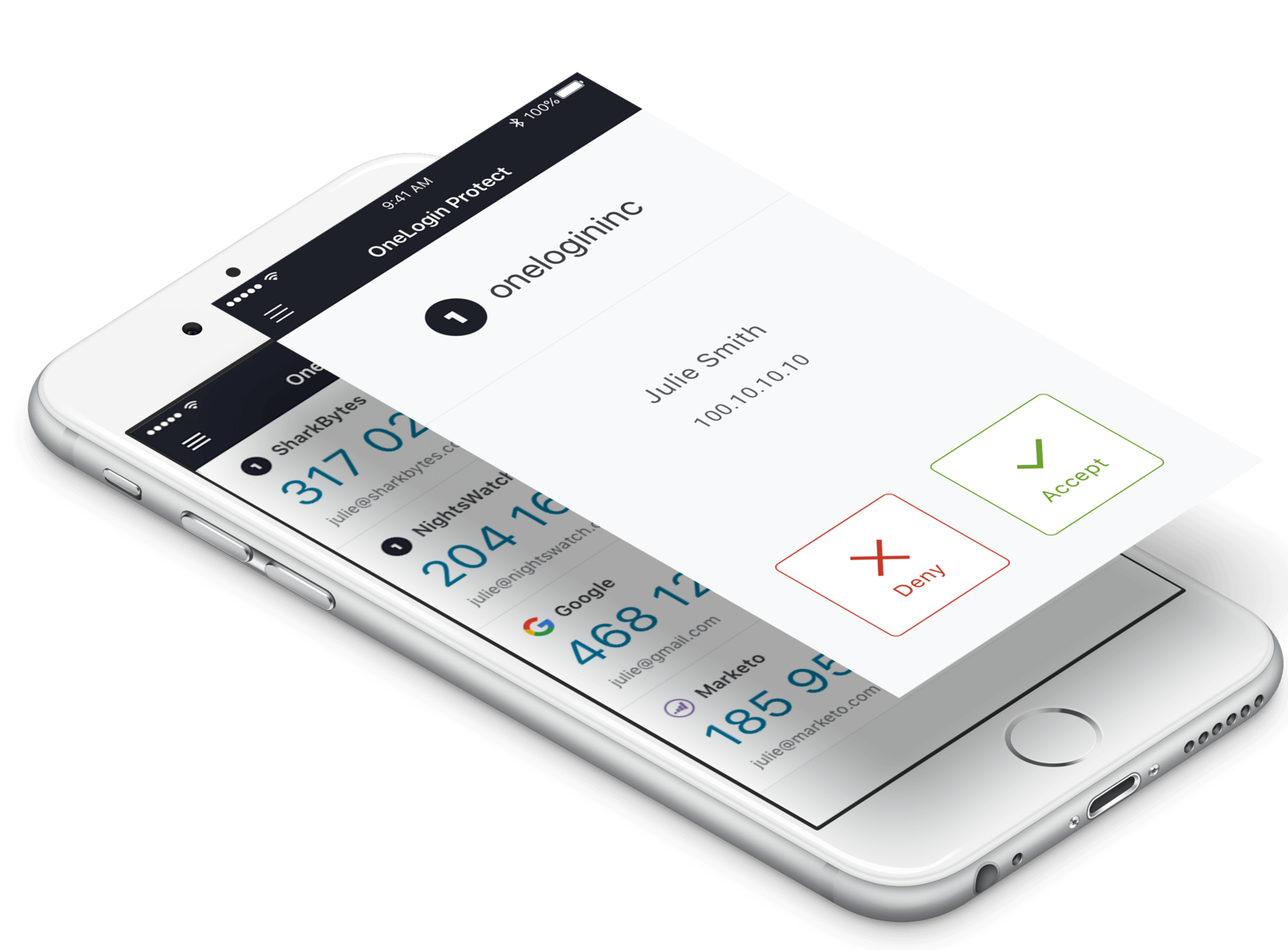
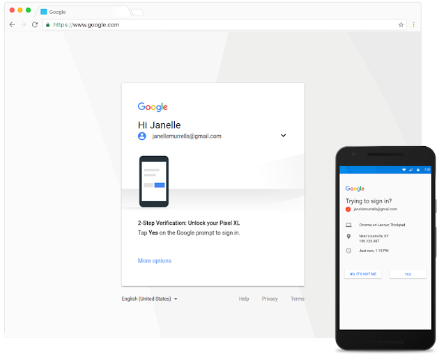
One Time Password (OTP)
"A one-time password (OTP), also known as one-time PIN or dynamic password, is a password that is valid for only one login session or transaction, on a computer system or other digital device. [...] A common technology used for the delivery of OTPs is text messaging."
Wikipedia
- Most secure option
- Might be overkill for a basic site/platform
- Might even require a specific device if used internally

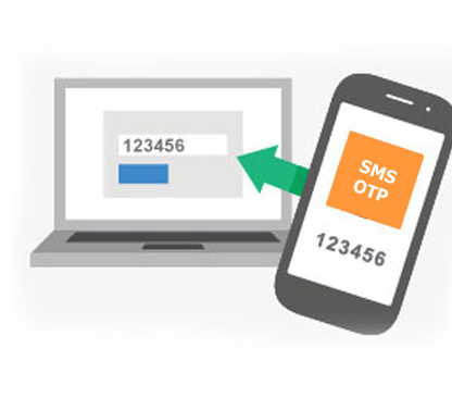
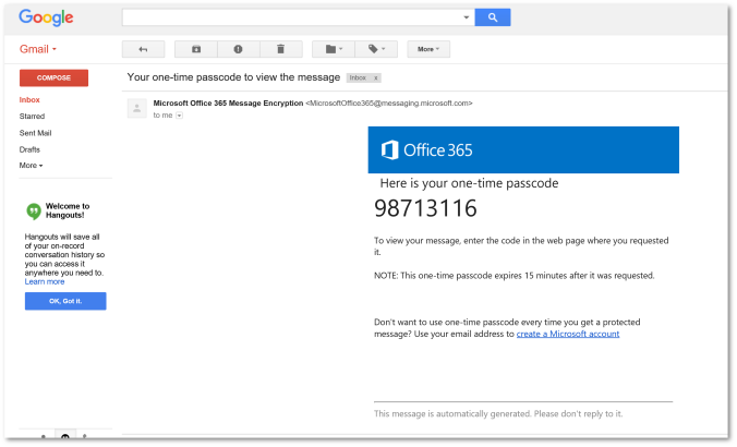
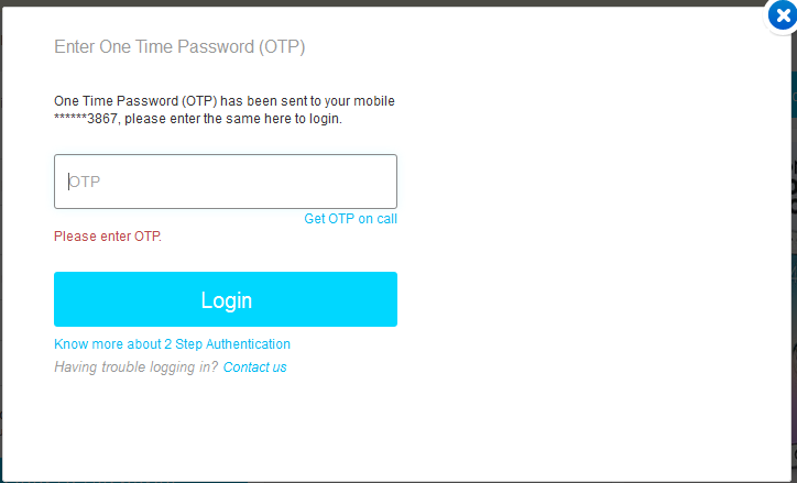
2 Factor Auth
"Multi-factor authentication is an electronic authentication method in which a computer user is granted access to a website or application only after successfully presenting two or more pieces of evidence (or factors) to an authentication mechanism: knowledge (something the user and only the user knows), possession (something the user and only the user has), and inherence (something the user and only the user is)."
Wikipedia