Website and Web Application Accessibility
Kora Lajoie
Scott Blinch


Why?
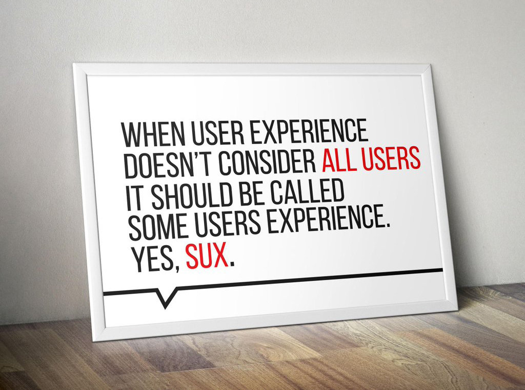
- It's the law
- Better UX
- Accessibility IS Usability
- Everyone deserves it


Is this your website?
How do I start?
- It can be less difficult than you think
- But can also be very complicated
- Being wrong
- Prepare to be wrong
- Prepare for others to be wrong
- Prepare for us to be wrong
- It's a process
- You will never be finished
- It's okay to start small

A
- Define language
- Text alternatives for all media
- Logical structure in a meaningful order
- Go beyond
colour - Keyboard navigable, controllable
- Limit flashes
- Skip links
- Link purpose
- Accessible forms
AA
- Live video captions
- Audio description of video
- Contrast (4.5:1)
- Zoom/resizing
- No images of text
- Navigation alternatives
- Clear headings/labels
- Consistent menus, icons, buttons
- Error suggestion, prevention
Web Content Accessibility Guidelines (WCAG)
Semantics

Semantics
- JS can be used to make anything do anything
- You probably shouldn't if you can be semantic instead
- Use elements for their intended purpose
- Buttons for buttons, lists for lists, tables, etc
- E.g. a div is not a button
- Usually means less CSS/JS/extra attributes
- Use headings (correctly)
- Use the title tag
- Make sure your markup is valid!
- e.g. No duplicate IDs, correct nesting
- Validator
Lists
- Markup all visual lists
- Unordered list
- Ordered list
- Definition list
- 2-column tables could be dl instead
- Group related links into lists
<ul>
    <li>Apples</li>
    <li>Oranges</li>
</ul>

<ol>
    <li>Peel the banana</li>
    <li>Eat the banana</li>
    <li>Throw the peel at Luigi</li>
</ol>

<dl>
    <dt>Name</dt>
    <dd>Godzilla</dd>
    <dt>Born</dt>
    <dd>1952</dd>
    <dt>Birthplace</dt>
    <dd>Japan</dd>
    <dt>Color</dt>
    <dd>Green</dd>
</dl>
Headings
- Use a logical structure (h1-h6)
- Know when to use them
- Also know when not to use them
- Not just for making text bigger or emphasizing
- h1-h6 should be an appropriate title for following content
- Only 1 h1 - it should accurately describe the purpose of the page and come before (most) other content
- Not just for accessibility - helps SEO too
- HTML5 muddies it a bit
Links
- All links should make sense out of context
- "Click here" = bad
- "Learn more" = bad
- Describe where the link is going between the tags
- Or use title or aria-label
- Empty hash links = bad
- Don't use anchor if it should be a button/input

Anchor vs button vs input
- Anchor
- Navigate to another page
- Navigate to another part of the same page
- Download something
- Button
- Submit or reset forms
- Activate custom functionality
- Input
- Receive and store data
The final showdown
Tables
- Don't use tables
- Except when you should
- e.g. tabular data
- thead, tbody, tfoot
- col, colgroup
- th (don't forget scope)
- td (don't forget headers if multiple th's)
- Descriptions for complex tables
Why did the web developer leave the restaurant?
Because of the table layout.
Images
- All images require the alt attribute
- Empty alt means the image is decorative
- Be descriptive
- An empty alt is usually better than a bad alt
- Having trouble writing alt?
- Why are you using this image?
- If you had to describe it over the phone what would you say?
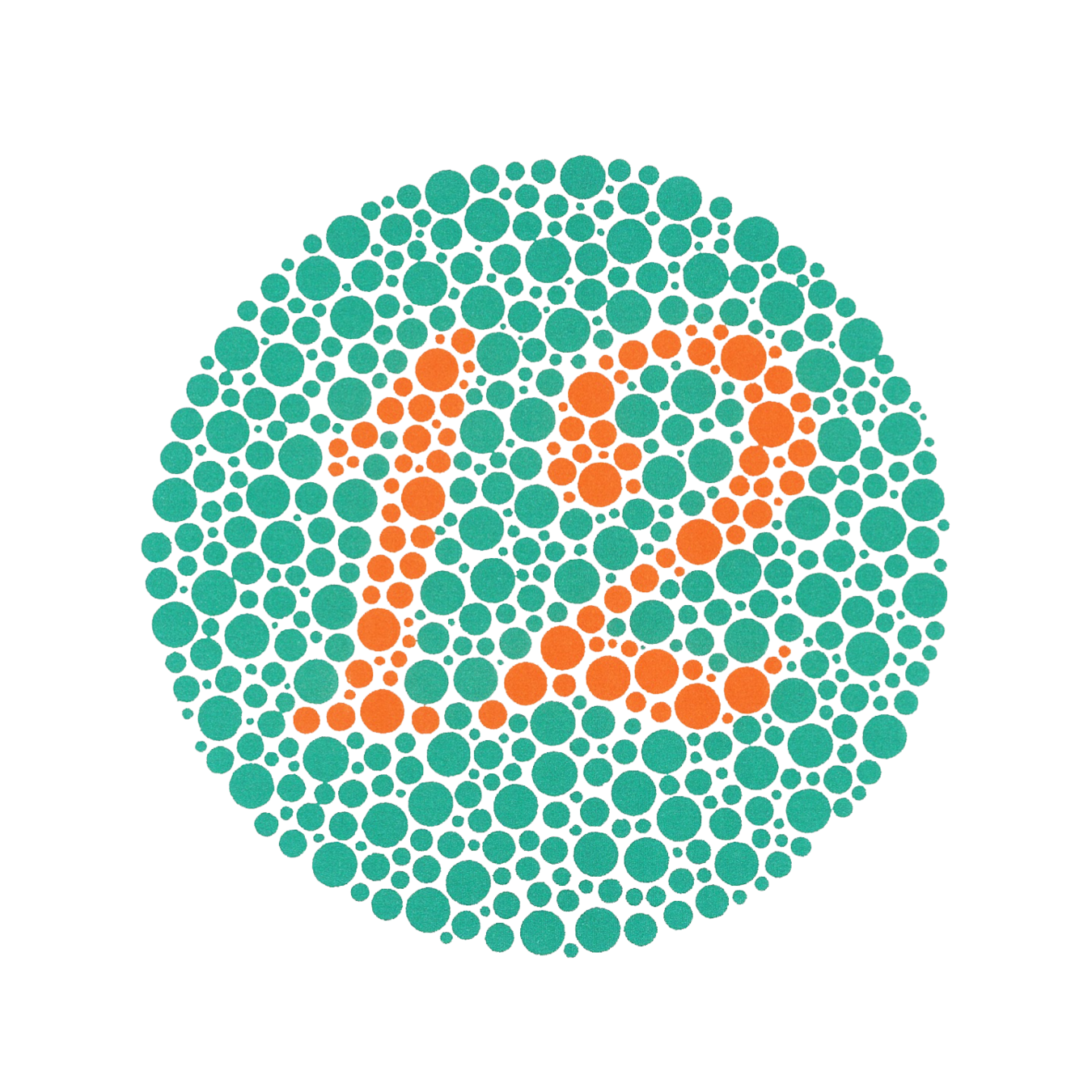
- Don't use reference to colour or position alone
-
Avoid infographics and images with text
- Or provide a detailed textual summary
- Avoid flashing
Audio and Video
- Audio
- Don't autoplay (unless it's expected)
- Provide controls
- Provide text alternative
- Video
- Don't autoplay if it has audio
- Provide controls
- Provide text alternative
- Avoid flashing
Forms
- Provide instructions for form before the form tag
- All fields need label (use for/id)
- Mark required fields (programmatically and visually)
- If using *, define it
- Use fieldsets with legends for related fields
- Sets of multiple radio/checkboxes
- Don't nest fieldsets
<p>All fields marked with an asterisk (*) are required</p>
<form>
    <label for="email">
        Email
        <span title="Required">*</span>
    </label>
    <input type="email" id="email" required>
    <button type="submit">Submit</button>
</form>
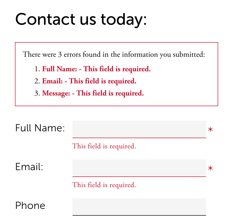
Form Errors

Form Errors
- Provide summary at top in unorder list, each item linking to the associated field (don't forget to move focus)
- Add error to each field
- Provide hints for valid input

Keyboard
- Provide keyboard alternatives
- Skip links
- Provide more than one way to navigate the site (e.g. sitemaps)
- All interactive elements should be accessible
- Tab/focus management
- Don't let user get lost or stuck (e.g. pop-ups, modals, off-canvas)
- Don't be unpredictable
- Focus order matters
- If you apply :hover styles, consider :focus too
- Don't use colour alone
Visual
- Entire site should be readable and usable up to 200% zoom
- Contrast
- 4.5:1 contrast between the non-link text color
and background. - 4.5:1 contrast between the link text color
and background. - A 3:1 contrast between the link text color
and the surrounding non-link text color.
- 4.5:1 contrast between the non-link text color
-
Screen readers hide elements from their users when they are styled using display none and visibility hidden
- sr-only css

WAI-ARIA
- First rule of using aria is not to use aria
- Roles
- main, complementary, navigation, search, banner, contentinfo, alert
- Properties
- aria-labelledby, aria-label, aria-describedby
- aria-required
- States
- aria-controls, aria-expanded, aria-hidden
- aria-disabled
Tools & Resources
- Contrast
- Testing
- #a11yTO Conf - September, Toronto